Celebrate Open Data Day on March 3rd, and join or organize one of the dozens of events around the world. We’re proud to support the mini-grants program to help local communities share the benefits of open data, particularly in Open Mapping.
Open Mapping mini-grants can cover events engaging local OpenStreetMap communities, as well as events in partnership with government and nonprofit organizations. The events can be hands-on like mapping parties, workshops, and mapathons that share tools and teach techniques. They can also be more inspirational, generating new ideas to apply Open Mapping to civic engagement, public health, disaster response, urban issues, environment, or any other social impact.
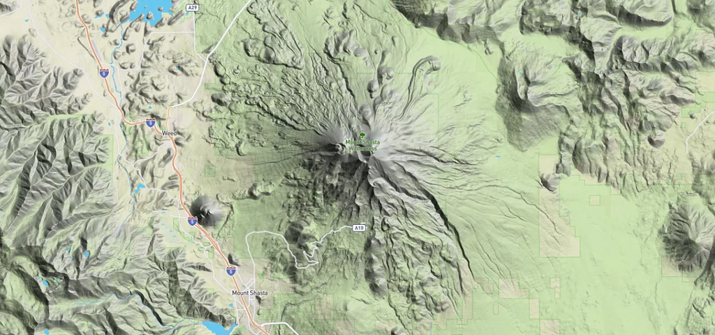
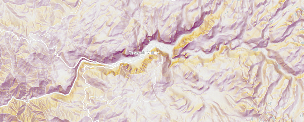
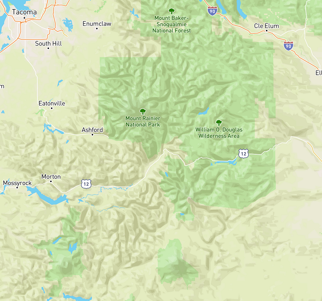
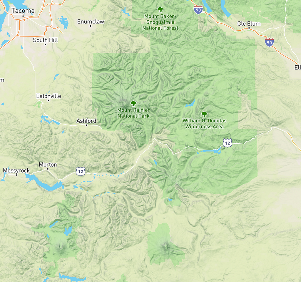
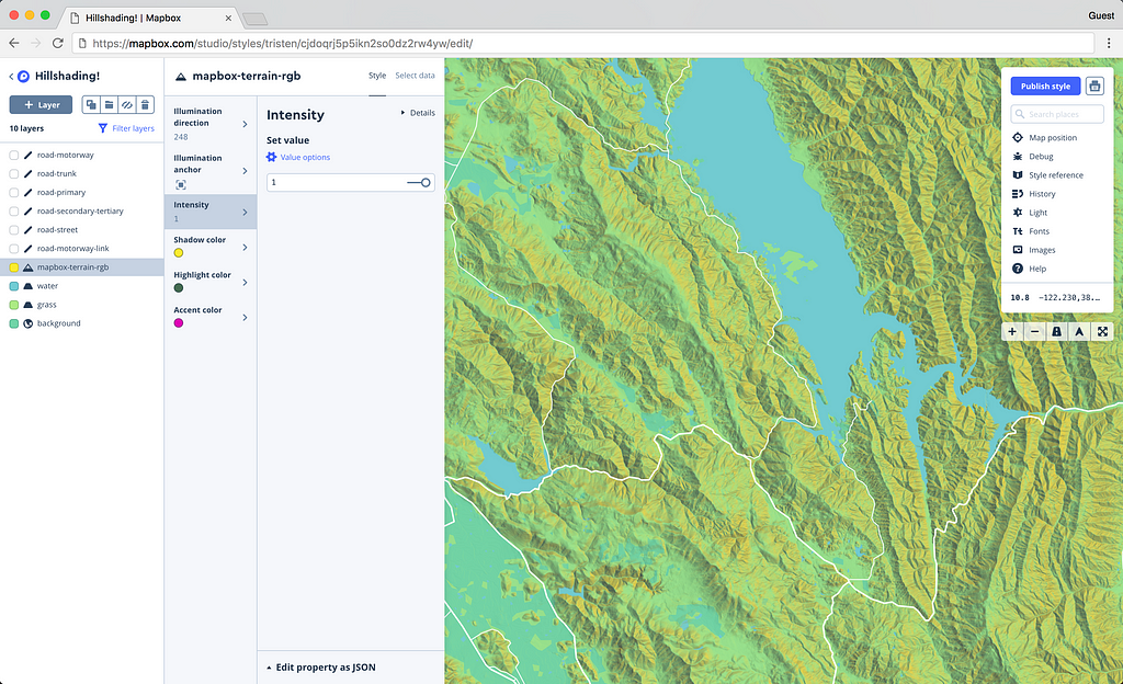
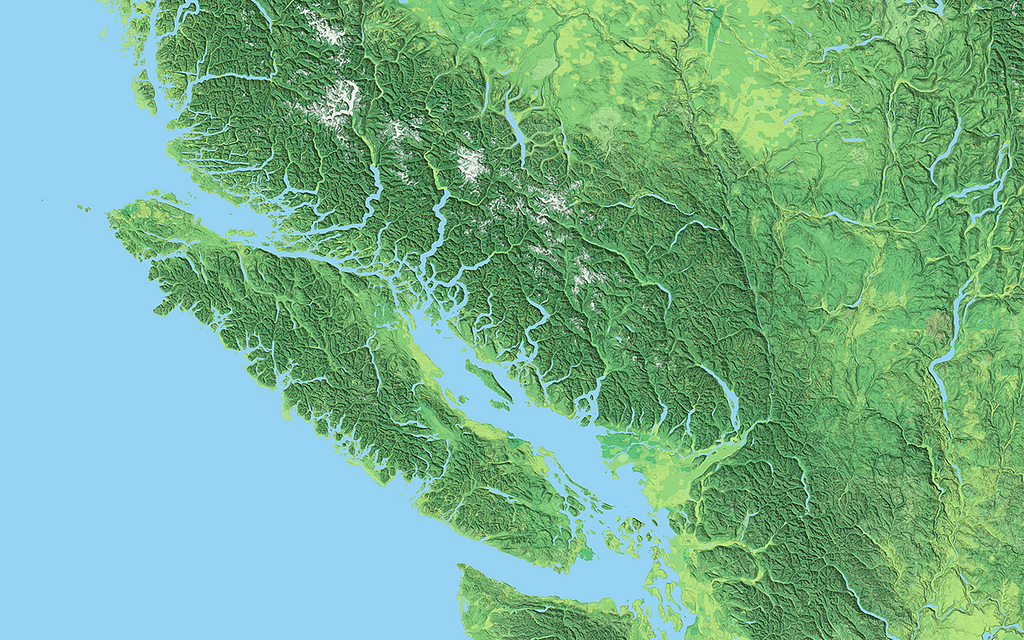
With our new hillshade layer type, you can create a more detailed, realistic model of terrain (aka shaded relief map), representing a 3D view of hills, valleys, and mountains across a 2D surface. The rendering happens on the client, so every aspect of the visualization can be customized.
For example, more accurately simulate how the sun moves across terrain in the real world:
Our hillshade layer type uses a raster digital elevation model (DEM) — high-resolution elevation data encoded into raster image tiles — to calculate the precise shadow or highlight for every individual pixel on the map. Because we calculate the slope and shadow pixel-by-pixel on the user’s computer, the resulting hillshading is much more detailed than the shading that is possible with a vector-terrain tileset. It’s the difference between styling individual pixels vs. broader, less detailed polygons.
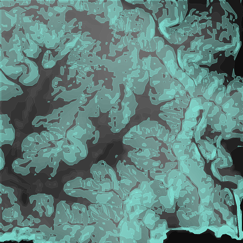
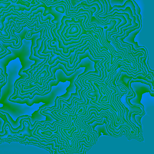
(left) Vector-terrain precomputed hillshade shadow and highlight polygons | (right) A terrain-rgb DEM tile where each pixel’s color value is its elevation encoded into the red, green, and blue channels
You can see the difference side-by-side below. The current Mapbox Outdoors style (image left) uses the vector-terrain tileset’s hillshade layer to color polygons based on whether they represent a shaded or highlighted area. The new client-side hillshading layer (image right) references a raster DEM source that encodes elevation into the red, green, and blue color channels of each pixel in the tile. The result is terrain with more definition and detail.
(left) Hillshading in Mapbox Outdoors | (right) New client-side hillshading
Matt is a journalist and among the founding team at The Pudding, which explains ideas debated in culture with visual essays. He is a fan of media analysis with wide-spread coverage of his projects on music and film.
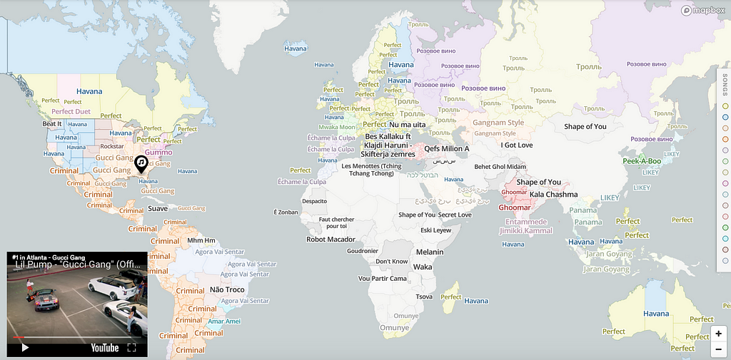
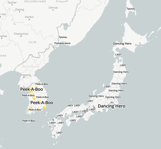
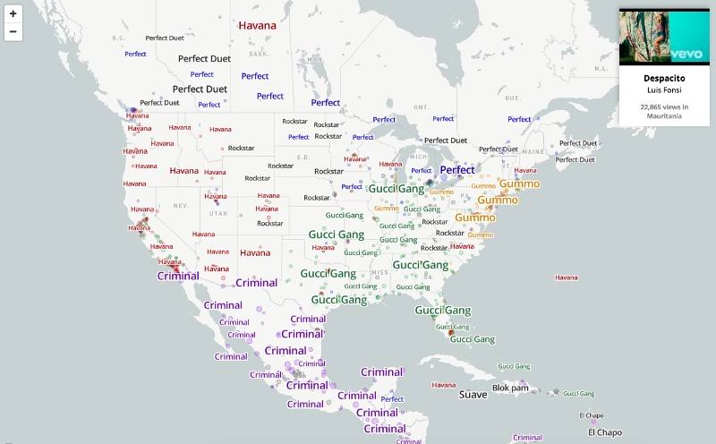
Last month I released this project on the cultural preferences for music. The idea was to blend Radiooooo and radio.garden with a Risk-style empire map (i.e. convex hulling). That is, if we were to think of Gucci Gang as the musical Roman empire of the US, how far would it span? When does Lil Pump’s empire end and a new, locally-relevant one begin? Every country has its own “Despacito,” and I thought this would be a good way to get out of my own musical filter bubble.
The internet is way better at describing my work than me. This tweet pretty much summarizes it:
This is a really cool look at the organic borders created by cultural pockets https://t.co/yMoNGOfC2Q
I spent a ton of time looking at cartography packages. I found Mapbox to be, by far, the fastest experience out there with the most complete JS library for doing cool map stuff on the internet. The GUI for Mapbox (called Mapbox Studio) was also one of the best user experiences, allowing me to play around with music data before getting into any code (more on that later).
The Data
I decided early on to make it simple: just focus on the top song by city. To determine which song is “most popular,” I scraped the data from YouTube because the service is more widely available for free, unlike Spotify which biases the data towards people who can afford streaming.
I had song views by city and a lat/long associated with each city. All of the data is here. This is an example of the headers and the first row of data for Nicos’s hit in Sanaa, Yemen:
We can map this pretty easily in Mapbox Studio (a GUI map tool) without any code! I started exploring my data by uploading the dataset to the web-based tool and styling the circle-size based on the song’s popularity. Mapbox also has amazing label collision detection so it only adds labels to the circles when they don’t overlap.
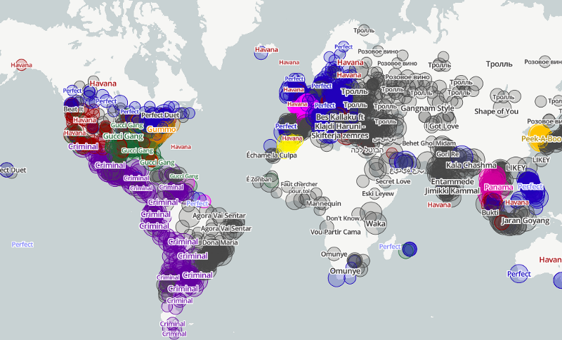
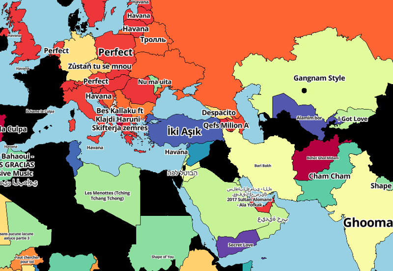
I was able to start seeing some regionality around cultural preferences, but it was a little intense, and I wanted to have one shape for each song’s “region.” For example, that whole area of purple from Mexico to Chile, let’s make it one big purple shape as opposed to 1,000 overlapping circles.
The first thing I did was make a country-based choropleth, just to see what it looked like:
It sort of displayed what I wanted: a simplified regional picture of song preferences.
To do this, I added country boundaries to the map usingmap.addLayerand followed the style specifications to customize the fill-color based on stops in the data. We’re basically saying: “if country X, give it color Y”. In this example, CountryStopsFill is a big array of all the world’s countries and a corresponding color, where each song is always the same color eg [US, blue].
But most of the interesting-ness would be at a sub-country level. For that, I needed more granular polygons/tiles to fill-in with their respective #1 song.
There are countless resources out there for sub-country (state, regional, county) data, but Mapbox has them all beautifully rendered at every zoom-level in a single, easy-to-add tileset.
It’s only available to their enterprise customers, so I asked the internet for a hook up with Mapbox.
internet friends. i'm looking for a hook up at @mapbox for a special request from their team. anyone know anyone?
Luckily, several folks replied, and Paul Veugen set me up with their product team. They graciously gave me access to the enterprise admin boundaries and were immensely helpful setting me up.
TileQuery FTW
Aggregating up to the country level is easy — every city is associated with a country, so the logic is simple. But for a smaller shape (e.g. a county in Greece), it’s a bit harder. How do I query which cities are in that county, and how do I make sure the county corresponds to Mapbox’s county polygon?
Mapbox’s point-in-polygon query makes this straightforward, avoiding all of the crazy geo-hierarchy-mapping-stuff typically required for an idea like this.
Basically you say, “I have this point (a city). What polygons does it fall in?” I then iterate through every city in my dataset and pull the corresponding polygon at 9 different geographic levels, from zip code to state.
You can find the results here in this Google Sheet; every lat/long has an associated polygon ID.
For example, NYC has a polygon ID at a state level of USA136 (New York State) and a county level ID of USA236061.
Making the Choropleth
For the final project, I decided to use boundaries_postal_1 (a larger, aggregated polygon of zip codes); boundaries_admin_1 (state); and boundaries_admin_0 (country).
I added these pretty easily:
And then:
So same thing as before: the fill-color is a big array of state IDs and colors (each song gets one color). I did all of this in JS.
The first thing I did was nest the dataset (each city and its top song, as well as its associated polygon IDs) by every tileset (e.g. boundaries_admin_1).
This nests the data by that particular tileset’s polygons and declares a top-song based on a sum of views.
From there, we assign it a color:
This is a big array of each polygon’s ID (d.key) and a color that’s consistent across the dataset eg [d.key,color], therefore, “Gucci Gang” is always green.
Label-click -> YouTube Video
I created click events on the song labels, triggering the YouTube video to begin playing.
In D3 (or some other library), this would be an absolute nightmare. At any moment there are up to thousands of labels visible on the map. It’s just that they are hidden due to automatic collision detection by Mapbox, which means everything is legible. We want an event to fire only when a visible label is clicked.
I already had the track data on the label properties. I uploaded the label dataset via Mapbox Studio and positioned it based on its city’s lat/long.
This says “if someone clicks on the map, check if it was only on rendered labels in X, Y, and Z layers. If true, get the properties (i.e. the data) joined to that label.” With that data, we can use it to trigger a YouTube video to begin playing.
Same thing on the hover events:
On mousemove, we look for whether it was over a certain rendered layer, in this case the admin-0-fill (which is our country polygons). If true, we then take the country’s name and place it in a tool tip.
Explore the map and keep building
There’s many more features in this map, but it’s all vanilla JS and D3. The project is entirely front-end code so feel free to check out the source code and email me with any questions.
Thanks again to Mapbox for making this project possible!
Consumers need personalized services and hyper-local content, which is why location is such a valuable ingredient in the next generation of software and mobile applications. Location services — maps, navigation, search — are driving innovation across industries supporting real-time decision making, autonomous vehicles, and data visualization at a new scale.
After surveying the current state of location-based services, consulting firm Frost & Sullivan, has singled us out as a leader in the space. They reviewed key players in the industry, honoring us with the 2018 North American Location-based Services Enabling Technology Leadership Award 🏆.
Frost & Sullivan found that our platform enables new levels of location context for mobile and web users, and that because of our open-source approach, we’ve been able to tackle some of the key hurdles in the space.
Each year, Frost & Sullivan presents this award to a company that has developed a pioneering technology that not only enhances current products but also enables new product and application developments. The award recognizes the high market acceptance potential of our platform. We’re thankful for the honor and humbled at the acknowledgment of our work.
Alongside the award, Frost & Sullivan created a full analyst report exploring how Mapbox fits into the greater location-based services community. View the full report on their website.
Frost and Sullivan award was originally published in Points of interest on Medium, where people are continuing the conversation by highlighting and responding to this story.
Hotels.com uses Mapbox.cn, our in-country infrastructure, to maintain a seamless map experience for Chinese users both in China and out. Fast and efficient map performance is essential to the hotel booking process, allowing customers to quickly locate accommodations and explore added context.
Due to Chinese-specific mapping laws, many traditional map providers are either blocked from completing map requests or suffer slow loading speeds, making it a difficult and complex location service environment. Mapbox.cn helps avoid this problem, through our legal, accurate, and performant endpoint based inChina. Network requests to our China endpoint reach our local partner’s data centers, enabling 10x faster map loads for users based in China. This allows users in China to experience map loads as fast as users would outside the country.
I’ve been using Tableau since 2013, and during that time I’ve seen some awesome data-driven maps used in dashboards. With Tableau and Mapbox, we’re able to bring additional geographic context to our maps, render massive amounts of data, and make that data interactive.
Here are just a few of my favorite collaborations, and some dashboards suggested by the Tableau Community on Twitter:
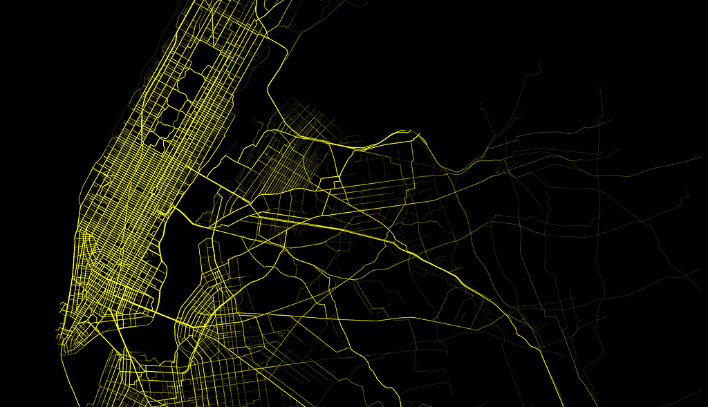
100,000 NYC taxi trips
Tableau 8.2 was a major technical breakthrough — the first 64 Bit version — it gave users the capability to plot massive amounts of data and share up to 1 million rows on Tableau Public. This allowed us to create this visualization mapping 100,000 taxi routes in NYC.
Tableau Dashboard of 100,000 taxi routes in NYC. Click through image to see more.Left: Animated Tableau Dashboard showing Taxi shortest path routing | Right: Animated Tableau Dashboard with near neighbor points of interest
- By Allan Walker, Anya A’Hearn & Noah Salvaterra.
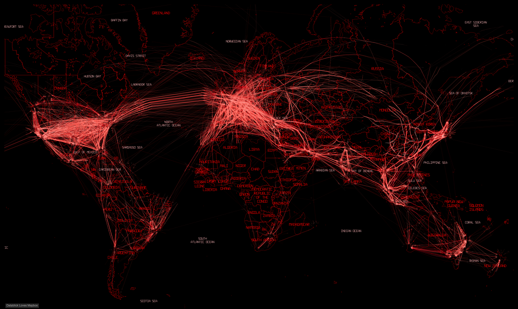
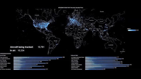
100,000 aircraft flights
This data visualization was made possible when Tableau (version 9.2) first integrated Mapbox Studio styles. Anya A’Hearn designed the custom map style, and Joe Mako wrote an Alteryx workflow that scheduled the download and parsing of the ADS-B JSON data into Tableau.
Tableau Dashboard with custom Mapbox Studio style. Click through image to see full-screen map.Animated Tableau Dashboard tracking aircraft with airport metrics
- By Allan Walker, Anya A’Hearn & Joe Mako
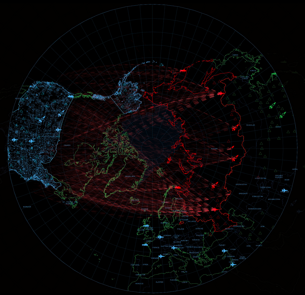
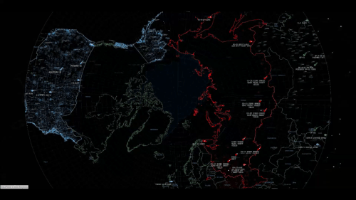
Wargames
Here are the nuclear missile sites and paths of the world’s nuclear arsenal, inspired by the 1983 film “Wargames.” The map uses a custom polar projection and incorporates Great Arcs, which allows us to visualize the trajectories from launch to targets.
Tableau Dashboard with custom Mapbox Studio polar projection style. Click through image to see full mapLeft: NATO v Warsaw Pact Wargames | Right: Nuclear MAD-ness
- By Allan Walker, Anya A’Hearn & Chris DeMartini
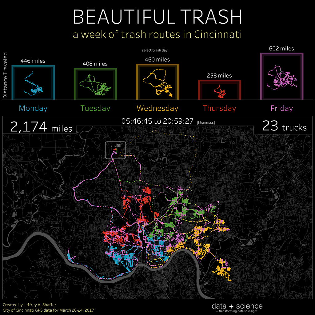
It might be a “stinky” subject matter; but Jeff uses a bar chart, small multiple line charts, a detailed data-driven map and a retina-popping, neon-effect color palette to make this a beautiful and insightful dashboard!
Tableau Dashboard visualizing a week of trash routes in Cincinnati, OhioAnimated Tableau Dashboard of trash collection in Cincinnati.
- By Jeffrey Shaffer
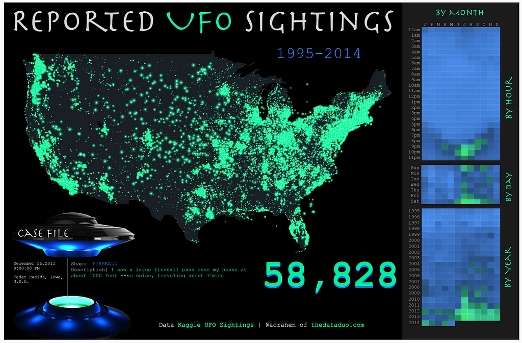
Reported UFO sightings
I want to believe…that this Tableau Dashboard would look great on Agent Scully and Mulder’s FBI desktop computers.
Tableau Dashboard of Reported UFO Sightings 1995–2014.
- By Adam Crahan
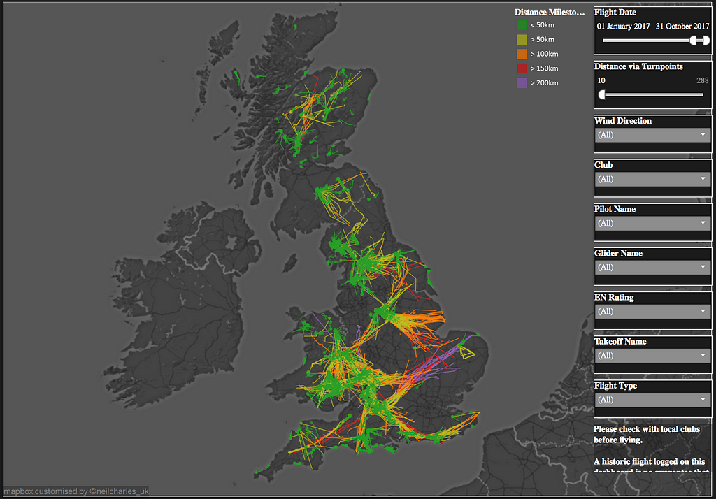
UK Paraglider flights
Paraglider pilots use this Tableau Dashboard to benchmark their own flights and plan how to fly further.
Tableau Dashboard visualizing UK Paraglider Flights.
- By Neil Charles
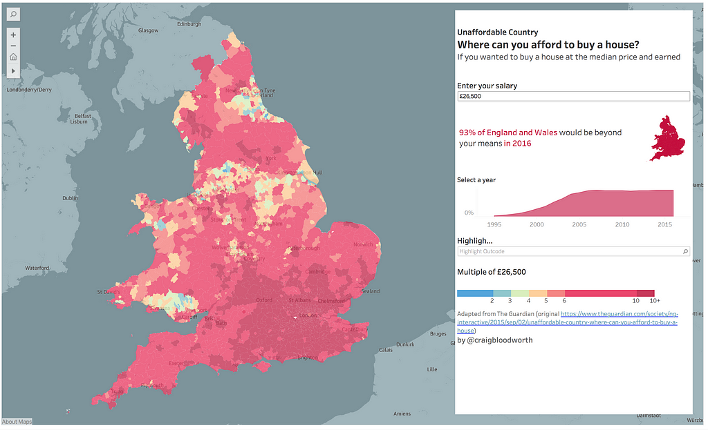
Unaffordable country
Craig uses an effective color palette and a choropleth (filled map) in this Tableau Dashboard. Users can enter their salary, and find out where in England and Wales they can afford to buy a house.
Tableau Dashboard analyzing housing affordability in England and Wales.
- By Craig Bloodworth
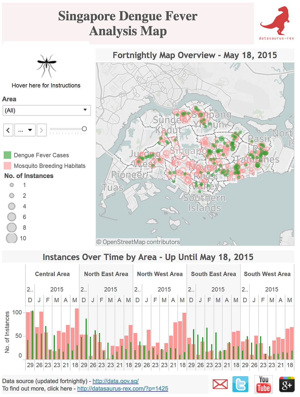
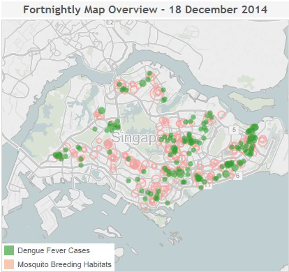
Singapore Dengue Fever analysis
David correlates mosquito breeding habits and cases of Dengue Fever over time in Singapore with this informative Tableau Dashboard.
Tableau Dashboard visualizing correlations of mosquito breeding habitats and Dengue Fever cases in Singapore.Animated Tableau map showing correlations of Dengue Fever cases and mosquito breeding habitats in Singapore.
- By David Murphy
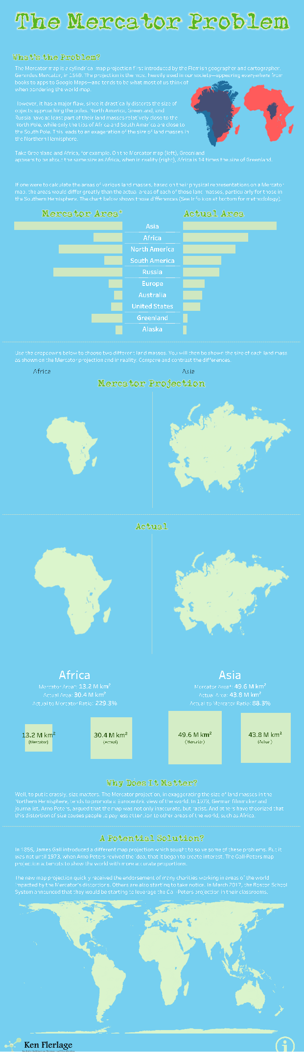
The Mercator problem
Ken uses a “long form” style dashboard to advocate for alternative map projections. The dashboard lets users compare areas, visually showing the difference.
A “longform”-style Tableau Dashboard.
- By Ken Ferlage
Fried chicken
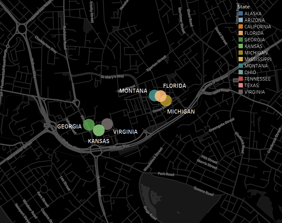
A very odd phenomenon exists in England. There are lots of chicken eateries that prefix “Fried Chicken” with states that aren’t Kentucky! In this map, Gwilym identifies Fried Chicken stores in Oldham, Greater Manchester — “Alaskan Fried Chicken” anyone?
Tableau map of fried chicken stores in Oldham, Greater Manchester, England.
- By Gwilym Lockwood
The subject matters of these maps are very diverse. They can be really funny and out of the left field, or very serious and insightful; but either way, the map is the hero and the star of these dashboards.
Our 1,000,000th registered developer just made a map! We want to hear your stories and milestones, so celebrate this moment by sharing your own memories using #1millionexploring.
Every time someone uses a map, the map gets smarter. Almost 10% of our registered developers are actively hitting our map APIs each month, meaning we’re in apps touching more than 300 million people, all around the world. Over 60% of our developers coming from outside the US, from over 217 countries. The more people in more places touching our maps, the more anonymous data streams back into the map, making a live updating more of the world for everyone. Cheers!
Hotels.com uses Mapbox.cn, our in-country infrastructure, to maintain a seamless map experience for Chinese users both in China and out. Fast and efficient map performance is essential to the hotel booking process, allowing customers to quickly locate accommodations and explore added context.
Due to Chinese-specific mapping laws, many traditional map providers are either blocked from completing map requests or suffer slow loading speeds, making it a difficult and complex location service environment. Mapbox.cn helps avoid this problem, through our legal, accurate, and performant endpoint based inChina. Network requests to our China endpoint reach our local partner’s data centers, enabling 10x faster map loads for users based in China. This allows users in China to experience map loads as fast as users would outside the country.
Valhalla is now up and running on Mapbox’s global infrastructure, using Docker containers on AWS with multiple layers of targeted caching that can autoscale to support traffic spikes worldwide.
Valhalla Bike Isochrones Centered Over the Mapbox Lancaster Office
Our Valhalla team just joined a month ago, and we immediately got to work on our combined navigation offerings for auto and logistics.
Valhalla running at scale allows us to combine its open source APIs with real-time traffic, powered by 225 million miles of anonymized mobile sensor data we collect each day.
“Mapzen originally built Valhalla because we saw a real need for a global, open, multi-modal routing engine, and I’m very proud of the results. I’m excited that Mapbox is continuing the work with the Valhalla team and extending it to real-time traffic. This means that users will continue to be supported, and they can expect the product to evolve to meet future market needs.” — Randy Meech, CEO of Mapzen
Valhalla brings more customizable and flexible routing features including support for public transit routing in 35+ countries, elevation-based routing, on-device streaming of map data, and the offline environment necessary for in-car navigation.
If you’ve recently migrated from Mapzen or are interested in Valhalla-powered services, please reach out to me personally at kevin.kreiser@mapbox.com and I will connect you to the right people on our team to get you started. If you want to stay up-to-date on Valhalla, follow this blog tag or subscribe to our newsletter.
We’re encoding millimeter precision into HD Vector Maps that define Protobuf (PBF) for serialization designed to encode data with variable precision, optimizing the data size for the exact resolution needed by the dataset.
Coordinates traditionally are represented in memory as double triplet (Latitude, Longitude, Altitude). Our HD map format turns real world coordinates into a local tile grid. This means a long sequence of coordinates is now represented as sequence instructions. This radically saves bandwidth for streaming data to a car and reduces storage size for larger area coverage offline.
The HD map format uses “pen” commands to move a cursor in the tile grid, making it possible to encode a coordinate into something as small as 32-bits integer. Describing a four points 3D line would look like:
MoveTo(+2,+2,+5)
LineTo(+0,+8,+3)
LineTo(+3,+2,+5)
LineTo(+1,+0,+2)
The local tile coordinates are then converted back to the source projection when decoding the vector tile, to be consumed by the autonomous navigation engine.
HD Vector Maps support encoding arbitrary metadata. This lets each automotive company or tier 1 customize for their proprietary HD map formats. A point representing a road traffic sign valid in only four countries in Europe could have properties like:
The metadata is flexible and can be used for encoding strings, numbers, arrays and serialized nodes used to reconstruct a connected road graph inside a car with full level of detail.
The data is tiled in small pieces, distributed with low latency around the globe and receive partial updates in real-time as the road network gets smarter. Basically this brings Snapchat level scale for HD automotive maps, giving your fleet the latest up-to-date maps, in the fastest way possible, anywhere in the globe.
Vectorized high definition centerline data.
The code to encode, decode, optimize, and visualize HD Vector Maps is open source. For example, take a look at vtzero, our favorite decoder for embedded devices. It has a small memory footprint, is highly performant and it is designed to minimize memory allocations. Our open source approach fosters a healthy ecosystem of tools and means OEMs and suppliers can modify functionality to fit their exact needs and then use the Mapbox platform for visualization and distribution of HD Vector Maps to global fleets of vehicles.
Our next Maps SDK release for Android and iOS lets you create interactive heatmaps with five lines of code. Show trends of where people are and what they’re doing in a social app, visualize activity data from thousands of users in your fitness app, or inspire travelers to discover the best spots in a new city at a glance. Combine millions of points into a single interactive heatmap.
Heatmaps in GL render on-the-fly. You can create heatmaps from massive datasets and make real-time adjustments to how points are getting clustered and how the heatmaps are styled. Adjust the intensity, color, radius, weighting, and zoom-level interactions at runtime to create beautiful interactive experiences that update based on user interactions, zoom-level, and real-time data.
Want to add heatmaps to your app? Hit up our sales team and keep an eye on our mobile releases this month. If you’re building for the web, check out our post on heatmaps for the web and this tutorial to start building.
We recently held a webinar in partnership with PubNub, a company that provides infrastructure-as-a-service for live data streaming. With our tools you can create dynamic map visualizations from real-time data and incorporate features like asset tracking, geocoding, and heatmaps.
Create heatmaps with millions of data points and make real-time adjustments to style properties.
In the webinar, sales engineer Chris Toomey shows you how to use PubNub and Mapbox to build an asset tracking app in the React framework — animate geospatial data, geocode its exact location, and predict arrival times from A-to-B. You also get to see heatmaps in action at scale. Watch the webinar, and check out more examples of Mapbox + Pubnub integrations.
Want more? Join us in our upcoming webinar on 2/21 where Chris teams up with designer and cartographer Amy Lee Walton. In the 45-minute, live session, they’ll walk you through creating custom dashboard applications, as well as how to leveraging the design capabilities of our platform for deriving better insights. Register here and tweet at #mapboxforBI with your questions.
Under the hood of this early release, all rendering for Mapbox core styles or your own designer maps happens on the client. Studio uses Mapbox GL JS to write WebGL to a canvas element — it’s this element type that allows you to export your map as a gorgeous image.
In the new print UI in Studio, the values of resolution, width, height are up to you. The only limit is a final output restriction of 8,000px width by 8,000px height. At that image size, you can print a 27” by 27” map with a 300 DPI resolution. Going bigger in print size? Try setting a lower resolution value, like 150 to capture a larger surface area. If you are printing something for a 4x6 frame, just make sure to use the highest resolution possible to ensure the details look crisp.
Once you’ve configured your image export to your liking, send it to your printer or your favorite local print shop to print beautiful, physical maps to hang on your walls or give away at your next event:
If you need map images at a lower resolution and lower budget, we’ve also launched a new API playgroundfor creating static maps, the Static API:
Click through image to find out more about the Static API.
To get started, review our print policy and check out the new Help guide for high resolution image exporting and printing in Studio. Tweet Mapbox with your best prints!
Everything from prices, legal risks, and brokerage services are difficult to navigate when buying a home in Russia. HomeApp.ru is improving the buying experience with detailed maps, real-time data, and AI-powered recommendations.
In 2018, online real estate search apps need to be mobile and map-based. User retention is critical for our business — the more our client uses our app for search, the more we know what he or she wants and the better services we can offer. It’s simple: Our customers want mobile, map-based search. -Alexey Igoshin, Founder/CEO
HomeApp.ru wanted to display thousands of homes, neatly organized by different geographic boundaries and zoom levels while also maintaining performance on mobile. They needed to create their own map layers and custom-style the data.
Because of the speed and customization, vector maps were on their radar from the beginning. Here’s why they chose us:
After extensive research on providers, we chose Mapbox because transitions between different zoom levels are smooth and clear. Each zoom level is fully customizable and provides so many opportunities for a better user experience like aggregating statistics at higher zoom levels and very detailed and specific information on low levels like 3D buildings. Mapbox Studio is also a powerful map customization tool that doesn’t require programming skills from our design team. -Viktor Kotlovsky, Head of UX/Design
A key factor for a lot of homebuyers is distance and mobility. How far are schools? Transit? and Entertainment? HomeApp.ru is leveraging our Directions API so users can explore this information while viewing a property.
Routing is a “killer” Mapbox feature. For our users, surroundings are as important as the real estate listing information. This gave us a powerful visual tool to highlight accurate distances to the most important places around like hospitals, schools, and public transport. -Viktor Kotlovsky, Head of UX/Design
As you explore the map, some of the finer details stand out like hover effects, fly-to animations based on scroll position, and custom markers. The ability to manipulate data based on map events allowed the developers to make content in the side panel responsive to map interactions, turning the map into an intuitive interface.
HomeApp.ru is taking data-driven mapping beyond the consumer experience. They’re using our heatmaps as a tool for the real estate operations team to better understand clients’ preferences based on actual search data.
Mapbox has a lot of great products that help us create really fast and beautiful vector maps. We used turf.js to prepare data for the map; Tippecanoe to create lightweight tilesets of custom layers like buildings and administrative boundaries; OSRM to normalize textual directions data, and Mapbox Studio for fast design prototyping.
Combining these instruments made the features that would seem impossible, easy and fast to implement. -Alexander Lashkevich, CTO
Use our SDKs and APIs to add context to real estate applications with custom data layers, directions, and fast maps. Have questions? Reach out to our team.
We’re now offering 3 government-certified map styles available via Mapbox.cn: Mapbox Streets Chinese, Mapbox Dark Chinese, and Mapbox Light Chinese.
These maps were built in collaboration with a leading Chinese mapping provider, eMapgo (EMG), and reviewed by the State Bureau of Surveying and Mapping for full compliance with Chinese mapping laws. As always, we provide automatic data updates to customers that launch with Mapbox.cn without needing to reconfigure any APIs.
Each carefully designed style features rich POIs, extensive road coverage, and public transit lines throughout China. Because the maps are hosted in country by our partner in China, users can expect up to 10x faster map loads than those hosted outside the country. Mapbox Streets Chinese, Mapbox Dark Chinese, and Mapbox Light Chinese are licensed under one publisher ID and are available on both web and our Maps SDKs for iOS and Android.
Each year tens of thousands of football fans descend upon one lucky U.S. city to see The Big Game. This year that city was Minneapolis. We wondered, how does this massive influx of people cause congestion in a city and affect travel times?
To explore this question, I explored a few hypothetical routes that people might take around the city that I could then use to query our Directions API and pull real-time navigation route and duration estimates.
Every day, we collect over 225 million miles of aggregated, anonymized telemetry data that feeds back into our Maps and Directions APIs, providing a real-time view of traffic patterns across the world. With the help of my colleague Scott Farley, I set up a lambda function on AWS S3 that gathered route data every 20 minutes in Minneapolis.
Route duration estimates on game day are compared to those at the same times on the Sunday before, January 28. If we were to replicate the study, we’d have aggregated data for multiple Sundays. Take a look at the full analysis, which includes multiple routes and simulated driver profiles.
Our latest map style, Carson, illustrates how to visualize geographic data over a map image for black and white print. The design is inspired by the fill patterns used in scientific journals. Explore the map.
The inspiration
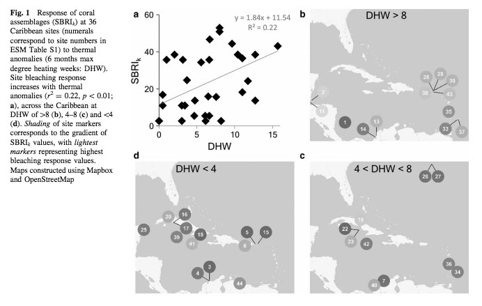
Two years ago, I was authoring a paper that sought to better understand how corals respond to seawater temperature anomalies in the context of their assemblages. To help demonstrate our conclusions, I needed to place some styled markers on a map. The process involved Mapbox.js, Mapbox Studio Classic, Adobe Illustrator, and some painstaking data updates.
Swain, T.D., DuBois, E., Goldberg, S.J. et al. Coral Reefs (2017) 36: 395.
Now, with the dataset editor and new high-resolution print feature, these figures can be managed entirely within Mapbox Studio. While recreating the above images with these new tools, I wanted to develop a style compatible with black and white journal specifications that’s also consistent with the types of fill patterns used in neighboring charts and diagrams.
Behind the design
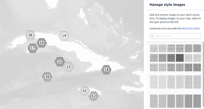
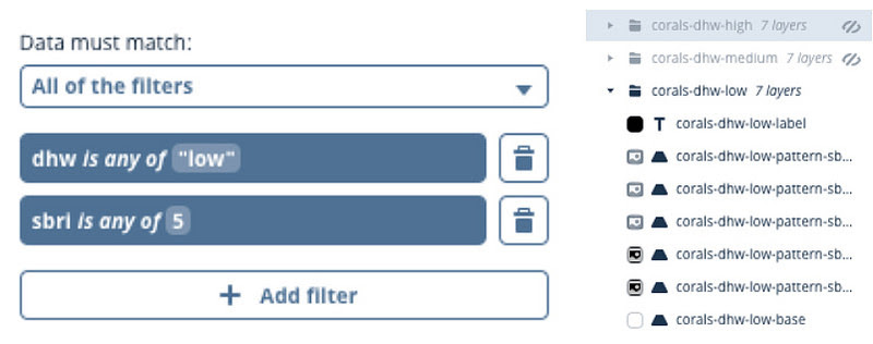
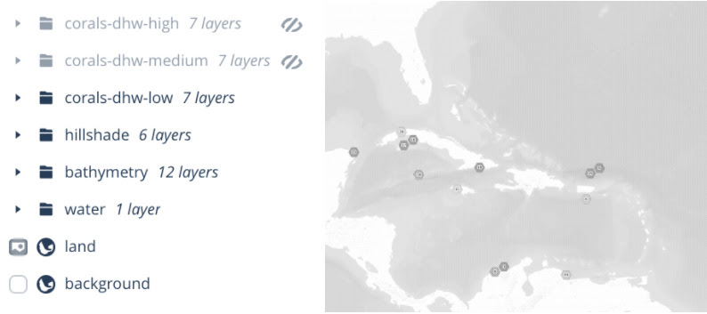
Carson is a simple grayscale style with an SVG fill pattern starter pack. The inclusion of subtly-styled hillshade and bathymetry data sources afford visual depth while keeping the focus on the data. I’ve also included the dataset used to create the original paper figures to exemplify how you can use fill patterns for your data visualization. Explore the corals-prefixed layers to see how you can leverage source data filtering on GeoJSON properties and layer grouping to visualize multi-dimensional data.
The process
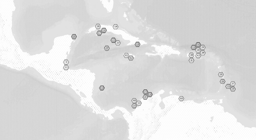
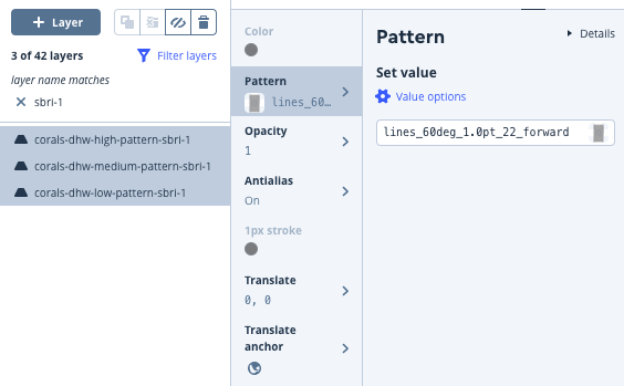
I used the open-source hextile library to generate hexagons for each of my data points and loaded the resulting GeoJSON features into Studio’s dataset editor where I tweaked feature placement. Each datapoint was then categorized by dhw, which determined the layer group it belonged to, and sbri, which determined the polygon fill pattern. I exported my dataset to a tileset and added the tileset to the style. In the style editor, I created a layer for every unique dhwand sbri value combination and grouped the layers by their dhw value.
I then used the Filter layers feature to apply the same fill pattern to all layers with the same sbri value.
Finally, I used the high-resolution print feature to export 3 images, each with only one of the coral data layer groups visible, to replicate the maps in the original paper.
Rightware’s Kanzi Studio is like Photoshop for designing and building the human-machine interface (HMI) in cars and other interfaces for the automotive industry. The latest Kanzi Studio plug-in now adds our HD Vector Maps into their 3D design environment. From digital instrument clusters to infotainment (IVI) systems to head-up displays (HUDs) the Kanzi software is deployed by 35 automotive brands and live in millions of cars worldwide. Here is a look at the new maps design studio:
The HD Vector Maps use Protocol Buffers for serialization and it is optimized to the exact resolution required by the dataset. This makes streaming streets, satellite imagery, and terrain data into Kanzi insanely fast and radically saves bandwidth for streaming data to a car and reduces storage size for larger area coverage offline. Vector tiles offer styling flexibility, and the result is accelerated development while introducing a unique appearance, true to the OEM brand identity.
Kanzi Maps provide car manufacturers, automotive suppliers, and design studios a streamlined tool for creating beautiful maps that run in digital instrument clusters, infotainment systems, and head-up displays.
We’re a Kanzi Technology Partner working closely with the Rightware team to make maps available out-of-the-box. Follow me @brunoabinader or @RightwareLtd to track our progress.
Under the available sources when you create a new layer, there’s a new raster-dem source: Mapbox Terrain RGB. When selected, it uses the hillshade layer type and provides a number of properties that you can use to style it.
Because we use a raster-dem source to calculate the slope and shadow pixel-by-pixel on the user’s computer, the resulting hillshading is much more detailed than the shading that’s possible with a vector-terrain tileset. It’s the difference between styling individual pixels vs. broader, less detailed polygons. You can read more about client-side hillshading here. It’s not yet supported on mobile, but that’s coming soon!
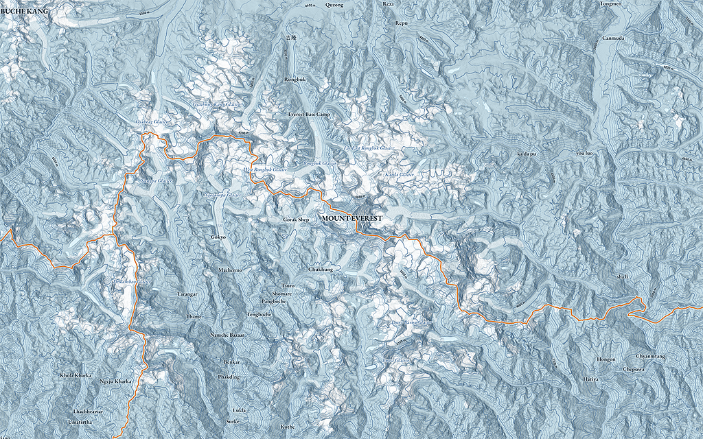
Try dynamic hillshading now in Studio. The studio manual will help you get started. Tweet @Mapbox with the styles you come up with.
Once Alexa hears that request, it reaches out to our Directions API, pulling down turn-by-turn directions and maps right to the car’s dashboard using Qt Automotive Suite (Qt 5.9), Kanzi, or Android. Our HD map format turns real-world coordinates into a local tile grid. This means a long sequence of coordinates is represented as sequence instructions. This radically saves bandwidth for streaming data to a car and reduces storage size for larger area coverage offline.
Alexa has better voice recognition than most car companies have been able to develop on their own. According to JD Power, the leading automotive research group, “In-vehicle voice recognition is failing.” Of all issues in new cars, navigation, voice, and Bluetooth receive the highest frequency of complaints. Alexa, and better maps, will change this. Alexa in the car adds access to more than 25,000 Alexa skills and will be in new Toyota, Fiat Chrysler, Ford, Hyundai, BMW, VW, Mercedes-Benz, and Nissan vehicles.
Obviously, the most common things you are going to ask Alexa to do in the car is to play music and get directions. But now you can ask practical questions, like finding a gas station before you hit empty.
“Alexa, where is the closest gas station.”
“There is a gas station in 2.4 miles up ahead, would you like to stop for gas?”
“Yes”
Alexa then talks directly to your maps, updates the directions to make a stop at the gas station using the Optimization API. After filling up with gas, and you can get back in the car and Alexa will remember your original trip. The API returns an array of waypoint objects. Each waypoint is an input coordinate snapped to the road and path network. The waypoints appear in the array in the order of the input coordinates, or in the order as specified in the destinationsquery parameter. You just say:
“Alexa, lets drive.”
And Alexa remembers the original address and says it right back to you:
“Ok, we’re continuing our trip to Costco on Wake Forest Road. Traffic is light, and you will arrive in 30 minutes.”
Developers at OEMs can now sign up for beta access, just email me (Richard.Hurlock@mapbox.com) to get set up. We’ll also be showing off our maps integration with Alexa at Mobile World Congress February 26 — March 1 in Barcelona. We won’t have a car, but we will have an fantastic demo for everyone to play with at our MWC booth. Find us in Hall 8.1, we’re just to the left of the entrance.
Alexa Auto Maps was originally published in Points of interest on Medium, where people are continuing the conversation by highlighting and responding to this story.