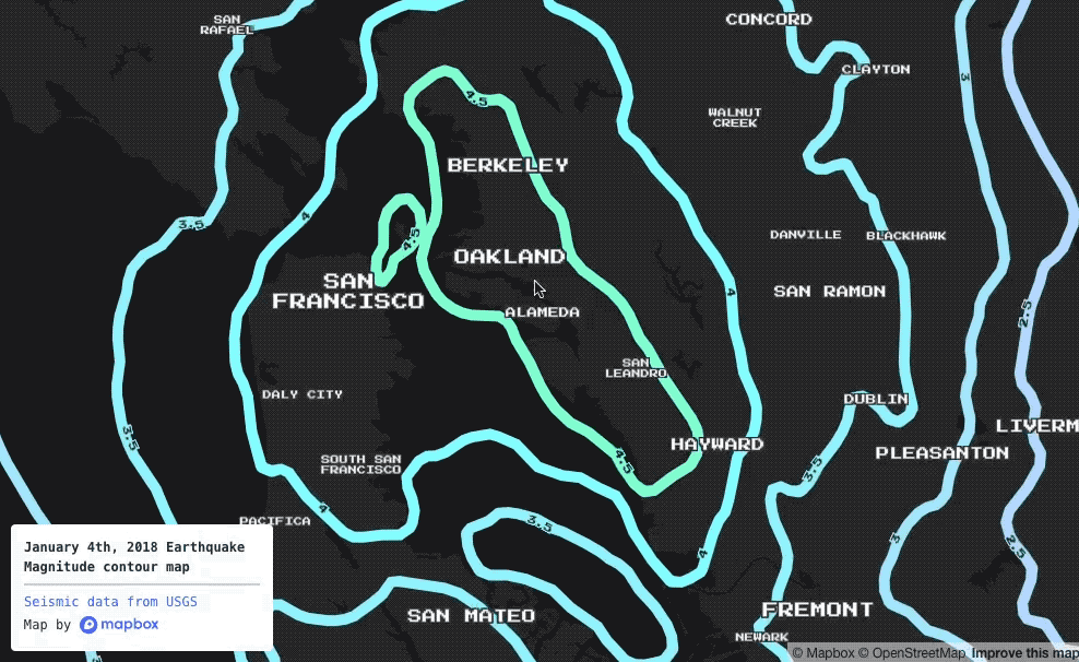
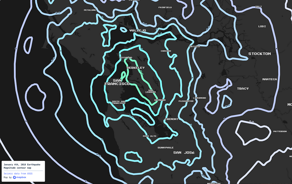
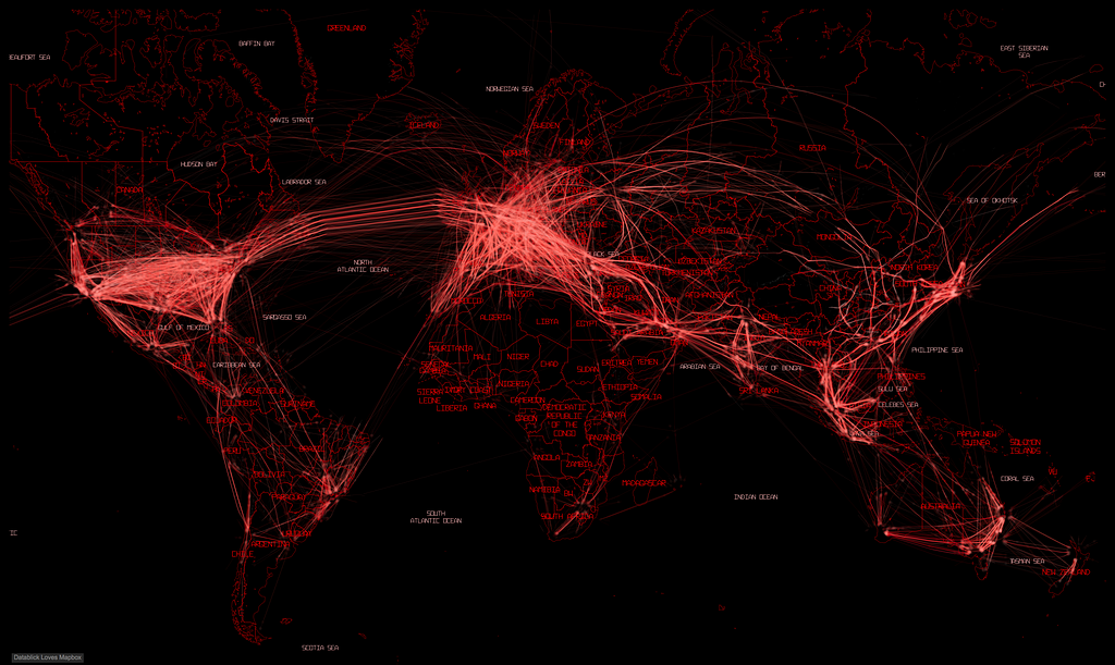
A few nights ago, along with many Bay Area residents, I was awakened by a 4.4 magnitude earthquake. The epicenter was outside of Berkeley, California. The earthquake was just the inspiration I needed to whip up a map with Studio.
Click through image to see live map.
Studio is great for one-off creative data visualization projects like this. Here’s how to go from a blank screen to an animated earthquake map in just a few steps.
Step 1: Get earthquake data
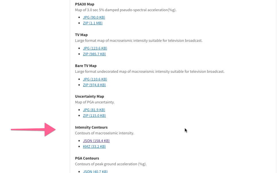
An excellent resource for earthquake data is usgs.gov. Lots of data on the January 4th, 2018 Berkeley earthquake is available, but we specifically want “Intensity Contours”, in geoJSON format. Go to the earthquake event page to download the data (or download it directly).
Step 2: Add the earthquake data to Mapbox
Go to the tileset page in Studio, click the “New tileset” buton, and drag & drop your earthquake geoJSON file onto the dialog box. The upload may take a moment to process.
Step 3: Create a style
When your upload completes, navigate to the tileset view page from the upload notification widget, then select “Add tileset to style” and pick a new blank style.
Step 4: Theme your style
Once you have a style, time to get creative. There are two main components to this step. First, color code your earthquake contour lines using their color property. Let’s use the following identity function to do this:
{
"type": "identity",
"property": "color"
}
Next, let’s add some context to the map style. The basic features we need include water bodies and place labels, so let’s add two more layers:
Experiment more at this phase until you’re happy with your style. Finally, click the “Publish” button to make your style available from the share page or via our SDKs.
Bonus: Animate your style
Now that we have an earthquake map, as a final step, let’s roll up our sleeves and write some JavaScript. Before starting, rename the contour line layer “contour-lines”. Make sure to publish again after that change. Then, visit this JS Bin that has some boilerplate code that performs looping animations in GL JS. I made sure to add code comments to explain what each function in the Bin is doing.
Want to try it for yourself? Add your own your Mapbox map style id and access token to the Bin to start, and experiment from there to create your own animated earthquake map! Share what you build on Twitter using #BuiltWithMapbox.
Late last year a leaked US Department of Agriculture slide deck revealed a worrying proposal: as soon as 2019, the data of the National Agriculture Imagery Program (NAIP) could move from open data to a licensed system. That would be a shortsighted move, and we strongly encourage USDA to keep NAIP as free and open data. We’ve seen its value for ourselves, and we believe it’s an important resource for the whole geospatial community.
NAIP shows the braided flats at the mouth of the Skagit River, Washington.
NAIP helped us grow
NAIP covers the continental US with 1 meter resolution imagery that anyone can use, without fees or restrictions. Its primary purpose is to support the agricultural sector, but it’s also useful for planning, environmental monitoring, visualization, and data pipeline testing.
We know NAIP’s importance from experience. In 2014, when our satellite team was building the capacity to apply color correction to images at scale, we used NAIP as a testbed. As we’ve grown and our options have increased, its share of our imagery mix has shrunk, replaced by newer and sharper commercial data. But we wouldn’t have come as far or as fast without it, and we think that anyone with a geospatial project deserves the same resource.
To understand why it’s so crucial that NAIP is completely free, consider its scale. In 2014, we used all 8 terapixels of NAIP. At a “nominal” price of, say, $10 per square mile — which might sound reasonable if you only imagine users with local interests — that would have cost $30 million. And if it cost anything at all, licensing would have meant we couldn’t redistribute it on our basemap in the first place. NAIP as anything but truly open data wouldn’t have been useful to us. The difference between cheap and free can be enormous.
NAIP powers innovation
Imagine a professor teaching a computer vision course at a small college today. With NAIP, she can have her class run their algorithms in the cloud on a defined, reproducible dataset. They can iterate on their analytical models and try to trace every road in Chicago, or predict wolf sightings from land cover in Montana, or map all the swimming pools in the entire continental US, for just the cost of processing and bandwidth. NAIP wasn’t intended for these kinds of use, but it can and does power them — more of them than could ever be completely cataloged. Because it’s open data, that professor doesn’t have to get permission, fill out paperwork, or pay nickel-and-dime charges to use the imagery for something no one’s imagined before.
The underlying topography and hydrology shows through patterns of cultivation south of Clovis, New Mexico, in NAIP imagery.
NAIP is good for business
NAIP adds vitality to the high-end imagery market, too. It’s a little like the free sample data that many companies publish, but instead of being specific to any one brand, it’s sample data for geospatial imagery in general. It creates customers by providing an “on-ramp” for students, small businesses, and organizations learning to work with remote sensing resources. As they need more sophisticated data and services, they will buy them. But without NAIP as free baseline data, they might never start the weekend projects and pilot initiatives that turn into big products and million-dollar data contracts.
Public data should be open
Besides arguments based on economics and innovation, it’s also worth considering NAIP as a national resource. The fact that any American can go to EarthExplorer and get a standardized image of their neighborhood has a civic value that isn’t denominated in dollars. It reflects the simple but important idea that publicly funded data about America should be free for all Americans. That alone is a good reason to maintain NAIP as we know it. In fact, we should use NAIP as an example of the value of public domain data.
A section of Escalante River, in Utah, shown in NAIP.
How to help support NAIP
We strongly support NAIP continuing as free and open data. Pragmatically, it benefits the whole geospatial community, especially by helping smaller players grow, and it creates much more demand than it could ever displace. And as a matter of principle, it should be freely available to the American people.
We understand that USDA, which is responsible for NAIP, has limited resources and must weigh and prioritize its responsibilities. We want to say, loudly and clearly, that NAIP is worth continuing exactly as it is.
If you agree, here’s how you can help:
Join the Save the NAIP mailing list to stay updated on this fight and how you can participate. Sharing your NAIP testimonials here will ensure that we get them to the right people.
Write about how NAIP has helped you or your business, whether it’s an article, blog post, or tweet. The proposal to close NAIP’s data isn’t finalized yet. There’s still time to convince the right people in government that NAIP must remain open.
If the proposal proceeds, there will be a public comment period before its finalization. You can be sure you’ll hear about it and how to participate if you read this blog or join the list above.
Keeping NAIP free & open was originally published in Points of interest on Medium, where people are continuing the conversation by highlighting and responding to this story.
On Friday, January 26th, we’ll be jamming with hundreds of game devs at the Global Game Jam. The Global Game Jam is a worldwide hackathon, connecting developers and challenging participants to use new tools for designing, developing, testing, and creating a new game in just 48 hours.
We’ll be on-hand all weekend to help you get the most out of our Maps SDK for Unity and incorporate real-world maps and location data into your games. We’ll also be streaming How to make a map on our Twitch channel at 2 pm PST on Friday, January 26th.
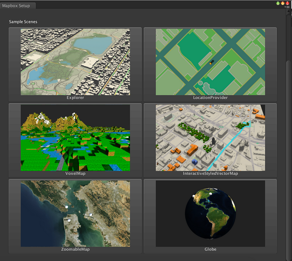
If you want to get a head start, check out some ways to use the Maps SDK for Unity for generating custom 3D worlds, immersive AR experiences, and unique content like real-time traffic in games.
Easily create entire cities
In order to destroy a city, you have to build one first. Use the Maps SDK for Unity to generate 3D buildings from real-world city data, like this demo of an angry Kaiju wreaking havoc across San Francisco.
Built-in AR functionality
With our geolocation data, you can anchor augmented reality experiences to the real world, wherever your players are. In this demo, we’re defending our office in downtown San Francisco from alien invaders. Thankfully someone put gun turrets on Second St.
An open world experience
You can use the Maps SDK for Unity to create worlds and populate them with AR objects and characters. This demo leverages data from paths in a local park to immerse players in a fantasy experience that feels real. Who doesn’t like strolling through a park with swarms of undead?
Add real-time traffic
You can stream traffic into games in Unity using our SDK. Traffic data works just like adding other maps, and you can query the maps for a particular location to get road congestion values and style it how you want. In the demo below, we’ve custom styled Central Park traffic in NYC with UV animations and colors corresponding to the congestion values — traffic never looked so beautiful.
While we were sad to hear our friends at Mapzen are moving on, we’d like to cheers to all the awesome work Mapzen has pushed forward in Unity.
During this time of transition, we’ve received a lot of questions about using our Maps SDK for Unity as a solution for projects built with Tangram or Mapzen’s metro extracts. We’ve just released an update with major performance improvements, dynamic zoom, and a new suite of example scenes for you to get started with. Below are some tips for migrating your projects from Mapzen to Mapbox:
Whether you’re building an Earth sim with satellite imagery and terrain, a location based game, or a city visualization, get started with the example scenes that come with the Maps SDK for Unity.
If you were using GeoJSON, you probably fetched the GeoJSON manually, parsing it into a JSON object and querying it for data like layers and features inside those layers doing something like:
var vectorData = new JSONObject(www.text);
var layer = vectorData[layerName];
Instead of using GeoJSON to deliver the underlying map data, Mapbox vector tiles use a protobuf format that’s optimized for file size and download speed. The Maps for Unity SDK takes care of decompressing and decoding the data so it’s accessible within Unity.
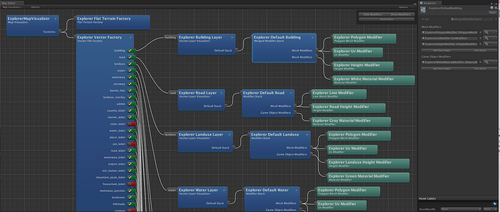
Use the Map Editor to customize and style your map visualizations in Unity.
For more information on how to use vector tiles, head over to the SDK API docs for the VectorTile class. You can query vector tiles for properties similar to a JSON object. For instance, vectorTile.LayerNames will give you all the layers in a vector tile, and vectorTile.GetLayer(layerName) will give you the data in a given layer.
This is only necessary if you want to use your own mesh generation though. Otherwise you can use existing world visualization structure as shown in our tutorials.
We’re taking the entire 5th floor of 740 15th Street NW, owning the corner of 15th and H Streets NW. It’s classic DC — an old bank turned hotel turned nonprofit-run office space. The details are exquisite — original mosaic tile, exposed brick, steel beams built to hold up a vault (the vault is now in the basement by the gym). The stairs are straight up old DC, think Eisenhower Executive Office Building. It’s just a block from the White House, with a ton of transportation options — four of six Metro lines are within three blocks; all six lines are within six blocks.
We’re building a custom space that’s just ours, and get to put our stamp on it so when you walk in you really feel, and know, Mapbox roots are locked in DC.
We’re aiming to move at the end of January, and will be moving in with old friends — New America has the top floor, and the owner is the National Community Reinvestment Coalition.
In short, after looking at 75 properties in the last year — from Glover Park to the Atlas District — we’re upgrading to a proper home. As construction and design work progresses, we will send out regular updates to show the progress of the new office and what the space will look like.
DC bound was originally published in Points of interest on Medium, where people are continuing the conversation by highlighting and responding to this story.
Domo’s business management platform lets employees — from the CEO to front-line workers — optimize business performance by connecting them to the right data in real time. As an example, freight companies use Domo to track global shipments with more logistics data than other software products could ever handle. Domo can also be tailored and extended by developers, and Mapbox mapping & location services can now easily be built into custom implementations for Domo customers.
With Mapbox, the time to build mapping & location into custom applications on Domo’s platform is greatly reduced, while also providing more flexibility to visualize the large varieties of massive datasets each Domo customer owns.
Vector maps rendering in real-time at 60fps can be combined with any type and size of CSV, GeoJSON, KML, or Shapefile dataset. GL JS can then be used to fully control the visualization of different dataset layers in new, interactive combinations. For example, data-driven styling enables dynamic changes to map content, so enterprises can visualize changes in their geographical performance in real-time as a hectic business day unfolds.
Mapbox GL’s flexible ecosystem also means the mapping & location tools inside Domo Custom Apps can be accessed anywhere Domo is available: client-side on an analyst’s browser, a CEO’s mobile phone, or even at a company offsite with slower wifi.
We’re looking forward to seeing what Domo Custom App is built next with Mapbox!
CARTO is switching to Mapbox to power a whole new class of location data analysis offerings to their customers. Mapbox enables CARTO customers to visualize big data at 60 frames per second in the browser. They’re leveraging our geocoding for location search and analytics, as well as our routing for analytics like isochrones so customers can analyze geospatial data and understand the impact of location on business outcomes.
This CARTO dashboard shows a projected storm track with simulated policyholder data to showing at-risk properties. Check out the live example here.
Adding the Mapbox mapping platform makes CARTO even more competitive to legacy GIS solutions. CARTO’s CEO, Javier de la Torre, explains:
“CARTO and Mapbox are the new GIS tech stack. We’re both betting on open data, open source code, and a race to the top for flexibility and functionality. With our move to Mapbox, we don’t have to worry about scale. We’re building a powerful location intelligence stack to enable new data streams, new methods, and new applications that will broaden support for users previously unable to incorporate location data directly into their workflows. CARTO users will also benefit from Mapbox’s high-resolution satellite imagery and powerful performance, rendering map data at video-game speeds.”
Learn more about CARTO and location intelligence, and discover how leaders in business intelligence and analytics are innovating with location data and beautiful map rendering.
There’s a reason the AR experiences you’ve used are siloed. Having multiple users interact and collaborate in real time is a big technical and design challenge. Current devices are unaware of their surroundings other than the basic planes they detect, and don’t know the position of other devices. Every time you start an AR session, everything resets. These are big problems.
I’ve always felt that the tools with the most impact allow people to collaborate and share ideas. After joining Mapbox, I wanted to tackle this. Our team has created the first multi-user AR experience, and it’s built using the Maps SDK for Unity.
Starting with physical tools
Years ago, if you wanted to plan a trip with a friend, you would roll out a paper map. When you highlighted a route or pinned places, it was immersive and tactile. Our entire lives we’ve been training our hands to engage with the physical world, and we didn’t want to abandon those innate interactions as we designed a UI for AR. We wanted the experience to feel immediately familiar, like picking up a highlighter and annotating a map.
This led us to some challenging design explorations:
What does it look like to annotate a digital map with a friend in real time?
If you’re together, how do you have more than one input device?
If you’re in a different city, how do you share both of your screens?
How do you manage the limitations of 2D annotation tools on a flat surface like a phone? It’s difficult to be precise with your thumbs.
Multiple people in AR
Apple’s ARKit and Google’s ARCore make it possible to build AR experiences with everyday devices and distribute them to billions of people. However, their crude tracking was a big obstacle for building out the collaborative aspect of our demo.
Our solution was to have the devices report back which plane they detected. By using the distance, angle, and position of the selected plane, we can build up a 3D model of the device’s relative position. When we share this data between devices, they know relatively where they are to each other.
We used the Maps SDK for Unity to anchor the 3D model of the devices to a map. Using the SDK we projected the map and displayed points-of-interest that the players (represented by astronauts) can explore.
Testing the model in Unity. The static astronaut is the laptop, the moving astronaut is an AR device.
When we build the demo on a phone, we can experience this in AR.
Because the communication is handled by a server, this demo also works when the players are in different places.
3D interactions
With ARKit and ARCore, the device is both the screen and the controller. To select a point-of-interest on the map, it seems intuitive to tap where it is on the screen. Translating this tap on a flat surface and projecting it like a laser-pointer into a 3D environment is called ray-casting. Traditionally, that method works well when there’s a precise controller, but fingers on a phone screen don’t have that same level of precision.
We expanded the concept of ray-casting by projecting a cone that increases its area with distance as opposed to projecting a laser of a fixed-size.
This allows for precise targeting when a virtual object is close and imprecise targeting when a virtual object is far.
In the coming weeks, we will expand this demo even further, and plan to release it as an open-source project. If you want to incorporate maps and location into your AR projects, download the Maps SDK for Unity and explore our tutorials to get started.
If you want to work on projects like this one, we’re hiring.
Multi-user AR experience was originally published in Points of interest on Medium, where people are continuing the conversation by highlighting and responding to this story.
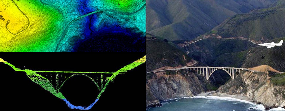
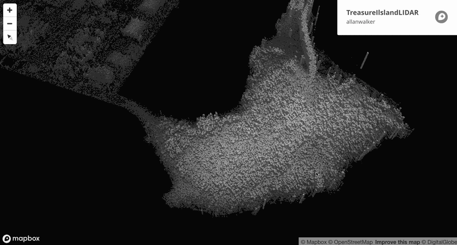
Here is a quick step-by-step approach to working with LIDAR data in Mapbox, bringing high resolution detail to your maps. LIDAR data is often collected by air, like this NOAA data collected by a survey aircraft over Bixby Bridge in Big Sur, California (image right). Here, LIDAR data reveals a top-down and profile view of Bixby Bridge (top left). LIDAR collects this high resolution data via a pulsing laser that measure ranges (variable distances) to the Earth, creating three-dimensional information.
I’m excited to use LIDAR because it can deliver a higher resolution and an even higher level of detail to my maps!
1. Get some LIDAR!
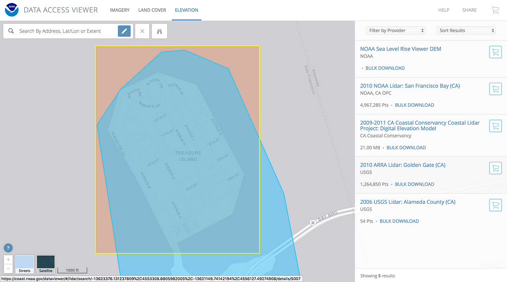
If you don’t have your own LIDAR data, head to NOAA’s website and download their open data. For this demonstration, I tried Treasure Island & Yerba Buena Island, California:
Making our selection of LIDAR from the NOAA Explorer website
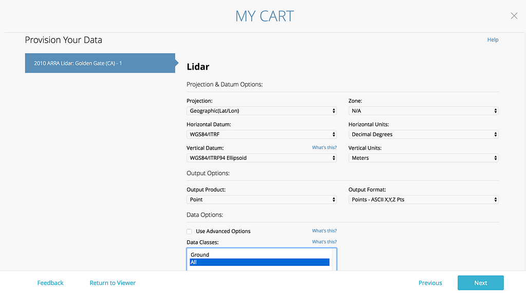
Then, make your choices:
Choosing the LIDAR data format
2. Ingest LIDAR into QGIS
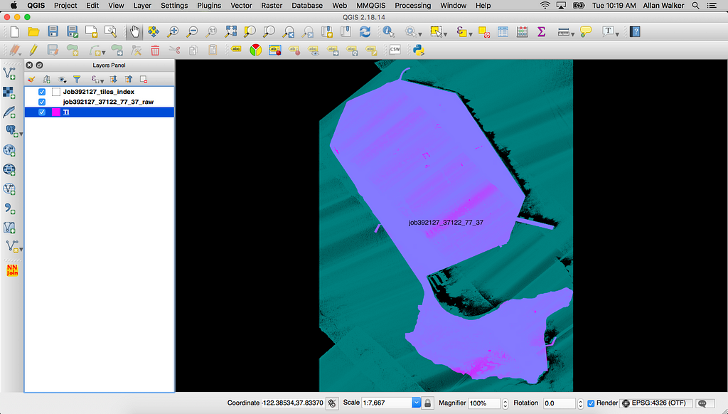
Open the ASCII XYZ.txt from the download link with the Menu → Layer → Add Delimited Comma Layer. This will look like lots and lots of dots on a map, usually in a square grid, and it’s a good time to save it as a geospatial file, such as ESRI SHP or GeoJSON.
Ingesting the LIDAR data
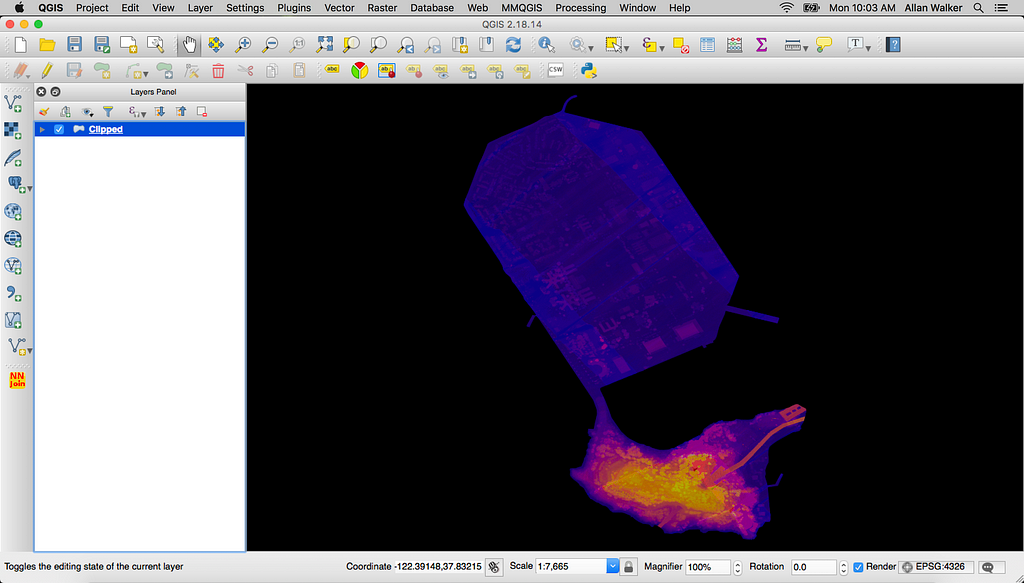
3. Intersect LIDAR
To get the points we need, we will use the Menu → Geoprocessing Tools → Intersect tool. We’ll use the ESRI SHP or GeoJSON file that you saved in step #2 as the input file, and a SHP or GeoJSON file of the area of interest (in this example, Treasure Island & Yerba Buena Island) as the Intersect Layer. Just be sure that the projections are the same. I normally stick to WGS84: EPSG:4326.
After clicking Properties → Style → Column → Elevation and setting a Color Ramp, you’ll get something like this:
Intersecting the LIDAR points with the Treasure Island Polygon
4. My first attempt — using buffers
The first process I tried was to use Menu → Vector → Fixed Distance Buffer, using a UTM Zone Projection (In my first test, I used EPSG:32618 18N for New York, as I had picked Manhattan as my selection above) with a buffer distance of the Nominal Point Spacing of the LIDAR (in this case, 70cm, which was described in the metadata link).
After re-projecting back my buffered Manhattan GeoJSON file to EPSG:4326 and uploading to Mapbox Studio, I added my Tileset as a Fill Extrusion layer to a style, and set the height (and color) based on “Elevation”.
I was more than happy to see some pretty detailed buildings, but this was still too much like Lego. Or as my data-viz-partner-in-crime, Anya A’Hearn put it — maybe more “Minecraft-ish.”
My first attempt using buffers
So how can I improve on this, while making it a scalable, repeatable process? Well, let’s look back to our original example of Treasure Island.
5. Delaunay LIDAR
Instead of buffering the points, we’ll use a technique called Delaunay Triangulation: in QGIS, this can be done via the Menu → Vector → Geometry → Delaunay Triangulation or Processing → Grass v.delaunay tools.
I won’t go into the mathematics here, but basically, it’s a way to tessellate the points, creating triangles (which have three edges, or vertices) rather than a buffer, which have a minimum of four. So at the very least, I won’t be dealing with overlapping, multi-edged polygons; but I’m now into the realms of Triangular Irregular Networks and meshes.
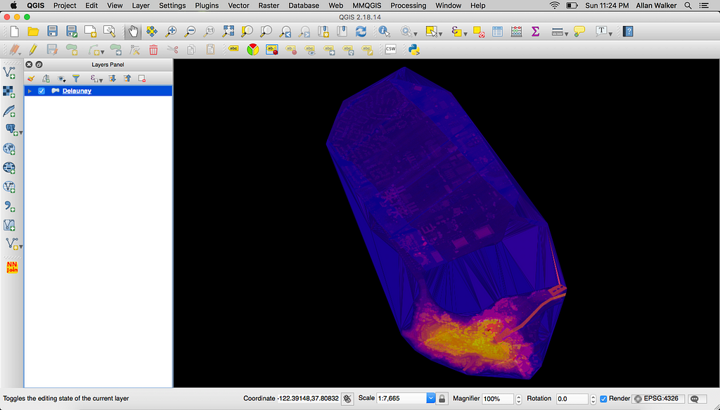
Splines, Nurbs, Bezier surfaces…all very Unity, or Rhino, or Blender, oh my! Anyway, here’s the output of the process in QGIS:
Unclipped Delaunay Triangles
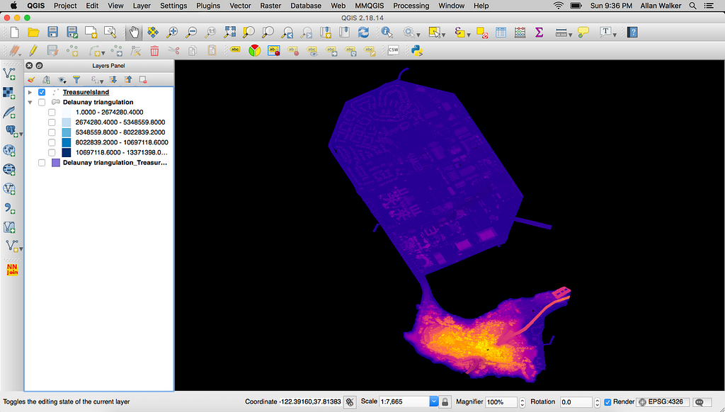
Which needs to be clipped (Menu → Geoprocessing Tools → Clip) by the Intersect layer we used in step #3 to get rid of the extraneous triangles that are covering the water between the shorelines.
Clipped Delaunay Triangles
Now we’ve made our LIDAR points into those tessellated triangles, it’s on to our final steps: Saving this back to GeoJSON, and then on with my new hobby: “Tippe-canoeing”. Yes, I made a verb out of Eric Fisher’s awesome tool to convert GeoJSON to Mapbox Vector Tiles, Tippecanoe.
6. Tippecanoe & Studio
Tippecanoe is a Command Line Interface tool. After downloading and installing Tippecanoe to your Mac or Linux box, do a “cd” to get to the directory that the converted GeoJSON is in. Then after the prompt (something like computername: directory username$) I’ll type:
What that is doing is instructing Tippecanoe to output Mapbox Vector Tiles with a name of TILIDAR.mbtiles, with a minimum zoom of 10, and a maximum zoom of 20, using the ClippedDelaunay.geojson file. The -aN switch dynamically combines small features.
Tippecanoe is a rocket ship. It completes the transformation of a 1.6 GB GeoJSON file with 13.3 million features, down to a very efficient 327 MB Mapbox Vector Tiles file!
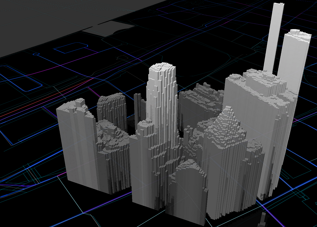
After uploading the TILIDAR.mbtiles file as a tileset in Studio, I’ll create a new fill extrusion layer: TreasureIslandLIDAR:
Set the Height value to data field elevation (understanding that the minimum value is -33 meters, but setting that height to 0; and the maximum is 97.91 meters, and thus setting the height to 131.58);
Set the Color value to the same to the height values;
Add the Satellite Raster layer, with a saturation of -1;
Add the Water layer as a fill, with a color of black;
Add a background layer, with a color of black;
Finally, the clip layer (the outline of the Treasure Island), with a color of black.
Hopefully a lot less like Legos or Minecraft!
Click through image to view map. Treasure Island, CA rendered with Mapbox GL 13.3M LIDAR Points, 33.9M Vertices.
Add LIDAR to Mapbox was originally published in Points of interest on Medium, where people are continuing the conversation by highlighting and responding to this story.
Liberty Mutual’s innovation team, Solaria Labs, recently launched Total Home Score to help homebuyers evaluate the ‘hidden’ livability factors associated with a home or apartment before they move in. The product currently offers a Road Score, which measures the prevalence of aggressive and potentially dangerous driving, and a Quiet Score, which estimates noise levels surrounding a home. Total Home Score is primarily an API-based data service, but the Solaria Labs team also wanted to visualize the data in an interactive way.
Total Home Score leverages Mapbox GL to render large, complex data for entire cities at 60 frames per second in the client. Solaria labs needed a solution that was powerful enough to handle the scale of data and flexible enough to customize the experience across platforms. Solaria Labs’ engineering team broke down the decision for us:
We settled on using Mapbox because its detailed documentation and examples made creating data-heavy 3D maps much easier. With Mapbox GL rendering we can create visualizations that really pop and allow the data to tell a story. We didn’t even have to worry about optimizing for mobile performance — the 3D maps rendered beautifully on mobile and tablet out of the box.
Solaria Labs is using Mapbox Studio to upload and manage their own data to use in the maps. With Tippecanoe, a command line utility for creating vector tilesets from large GeoJSON files, they could convert big datasets into performant vector tiles that can then be styled in Studio and rendered at 60 FPS on web and mobile. Here’s more on their process and what they learned:
For the building geometries we extracted building shapes and heights from OpenStreetMap data via Mapzen custom extracts. We combined Total Home Scores from our Shine API platform with building geometries based on the building IDs in OpenStreetMap. We plan to improve this part of the process in the near future by using more efficient geo-hashing functions.
We then wrote this combined structure into a large GeoJSON file. The GeoJSON file was then converted to an mbTiles file using Mapbox’ s Tippecanoe tool. We uploaded the mbTiles file into Mapbox Studio and used data driven styling to color the map and add user interaction, both in 2D and 3D. We then used these styles in our site. We scripted this whole process, so it needs no human interaction other than running the script.
The Quiet Score of this address is on the low side, which isn’t surprising given the location is a bar in Chicago, IL.
Homebuyers want to learn as much as they can about the places they want to live, so they can decide what they can and can’t live with beforethey move in. The Total Home Score product makes that complex data analysis digestible and interactive, allowing end users to quickly and easily explore a lot of information about homes, neighborhoods, and cities.
As developers, we get really excited about anything that is interactive and 3D in the browser. With advances in user hardware and WebGL support, we can create unique visualizations that incorporate a lot of data. We are constantly trying to innovate at Solaria Labs, and Mapbox helped us bring the story of our data to life in a really cool way.
For anyone interested in using Total Home Score for their applications, please check out the Shine API Developer Portal. Don’t hesitate to contact us with comments, questions, or feedback; we’d love to hear from you!
Thinking about creating a 3D visualization with large, complex sets of data? Sign up for a Mapbox account, upload your data, and create your visualization today.
Now that the construction is underway and into the final stretch, here is a quick look:
We’re keeping the integrity of the original finishes and architecture; we wanted to design a space that enhances the historic nature of the building but also add a fun, organic vibe.
We designed the layout like a racetrack, just like our San Francisco office. This setup will allow us to have walking 1:1’s, work in different areas of the office, and provides enough room for everyone to feel together but not too cramped. Workstations will be placed around the perimeter to take advantage of all the natural light, and conference rooms reside mainly in the interior. There will be 25 meeting rooms comprised of small, medium, large, and phone rooms. We’ve also included more lounge areas and casual places to work for a more creative atmosphere.
There’s still a lot more to-do 🙂, but here are a few pictures from this morning.
DC office updates was originally published in Points of interest on Medium, where people are continuing the conversation by highlighting and responding to this story.
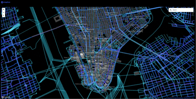
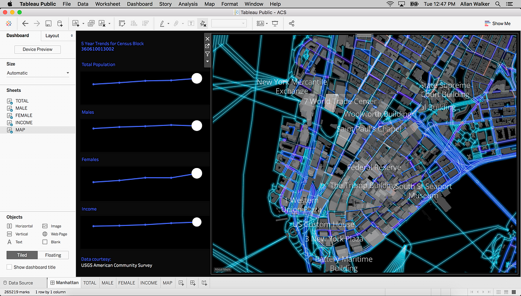
LIDAR lets us see super detailed 3D buildings, and when we place it on the map we have a powerful context for data analysis. With Mapbox GL, we can pan, rotate, pitch, and zoom taking full advantage of the detail LIDAR provides. The performance is stunning, rendering 150M features with dynamic Tableau Dashboards & Text-To-Speech (TTS) Popup Tooltips.
You could easily flip this to 2D: Below is a Tableau Public dashboard that has the same integrated Mapbox Studio style, but you lose the ability to use the full power of GL.
Tableau Dashboard of Manhattan Buildings and American Community Survey Data at the Census Block level
LIDAR Maps with Tableau was originally published in Points of interest on Medium, where people are continuing the conversation by highlighting and responding to this story.
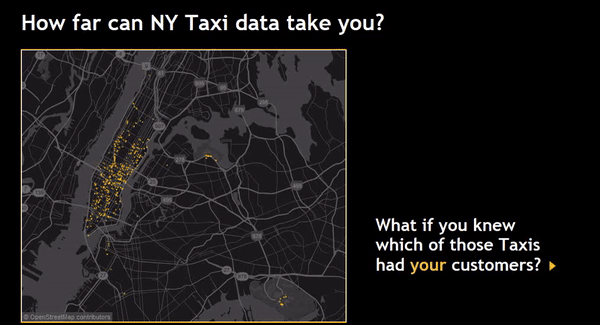
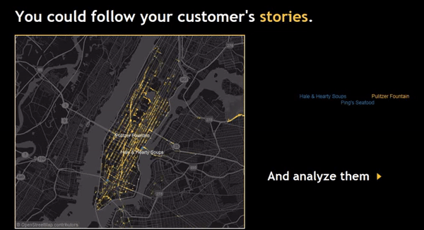
Even before I joined our Transportation and Logistics team, I was particularly excited about the capabilities the Mapbox platform brings to the industry. Whether you track shipments, rental fleets, bicycle couriers, or taxi cabs, the recurring themes are fast maps for real-time tracking, cross-platform integration, precise ETAs, map matching and geofencing. Here’s a look at five building blocks we offer to enable your asset tracking application:
1. Fast maps: display assets in real time
Speed and clarity of representation matter. We solve the difficult problem of displaying huge numbers of mobile assets at once on a map while keeping the frame rate fast. This saves valuable human operator time and decreases the likelihood of errors stemming from inaccurate or lagging representation. Check out this example of dispatching couriers in real time:
2. Cross-platform integration
Increasingly, assets aren’t managed solely from operations centers on stationary dashboards but by employees on the go. Our maps are available for web, iOS, and Android, allowing operators to monitor and direct assets from anywhere. The ability to integrate mobile also opens the possibility of tying asset tracking directly into in-app navigation for driver apps.
3. Distance & ETAs: Are we there yet?
Understanding travel time on a map is fundamental. This is where Mapbox ETAs (Estimated Times of Arrival) come into the picture. We build our ETAs and real-time traffic from more than 200 million miles of anonymized telemetry data that’s collected daily from applications running our maps. This massive amount of speed data gives us continuously updated ETAs that are measurably more accurate than any other travel time data in the market.
Explore actual travel times for a passenger vehicle in London in the example below. Here we’re combining the Mapbox Matrix API and visualization capabilities of our Mapbox GL JS API for the web to represent ETAs as isochrones.
Using real-time ETA’s and Isochrones to compute and represent travel time on a map.
4. Map matching: clean up and enrich GPS data
GPS traces collected from vehicles are noisy and lack any specific geospatial context. With our Map Matching API, you can match a vehicle trace to the road network giving you a clean, lightweight trace to display on a map. Additionally, map matching will provide the precise street names traversed by the vehicles and the realtime speeds along the way, for instance, for driver management.
Matching a GPS probe trace to the road network with the Mapbox Mapmatching API.
5. Geofencing: trigger actions when entering/leaving areas
Geofencing — virtual boundaries around geographic areas — unlocks location-aware automation, such as triggering a charge when entering a toll zone, automating check-ins when a truck approaches a warehouse, or deploying drivers to a location of high demand.
The example below tracks vehicles entering the downtown London congestion zone and tallies up fees incurred for all trips:
Augmented reality combined with rich, geospatial data is already changing how we interact with the world. Recently, we got our hands on an ODG R-9 to prototype new ways to experience navigation. Using our Maps SDK for Unity, we built maps, location, and turn-by-turn directions into a wearable display.
Why wearables + AR navigation
Navigating with a mobile device requires constantly taking it out of your pocket and performing a series of steps to orient while focusing away from what’s around you. Using the Maps SDK for Unity to provide location information and navigation in AR with ODG’s glasses, we’ve created a smooth, continuous, and intuitive experience. The map and navigation details are viewed on top of the world in front of you. Your hands are completely free, so you can stay mindful and in-the-moment.
Maps on a wearable display
ODG’s light-added display means that color palettes don’t translate exactly from what is designed on screen and what is seen in through the glasses. Blacks and blues are more transparent, and lighter colors are bright and opaque in contrast. We used Mapbox Studio to quickly design new, custom map visuals that compliment the strengths of the R-9’s unique display.
Developing within the Unity Editor (left) | Creating a dark style to accommodate additive light field display (right)
Map markers also need a new treatment for AR. Text has to be large, legible, and selectable from a distance. The R-9’s new 6DOF (6-degrees-of-freedom) functionality tracks the wearer’s position and rotation smoothly, letting users lean into the map to see more detail, as well as select a point-of-interest by gazing at it.
The 6DOF presents new challenges for selection UI, as users can constantly change their viewpoint on the map and its labels. We arrange labels dynamically with a force-directed layout and favor showing a limited set of relevant points-of-interest to prevent overwhelming the user in AR.
World-scale design
Any world-scale UX must incorporate the limitations of the device’s sensors. Creating believable interactions requires the app’s AR map to align with the real world. This is tricky because even though built-in sensors are getting better, being even 5 degrees out of alignment can destroy the display’s illusion. Strategies for improving automatic calibration in AR include GPS reading, filtering, and creating intuitive calibration experiences. We built an experimental AR library where we test new approaches and help developers tackle this problem in their apps.
With the R-9 glasses, we limited world-scale information to the immediate few meters. When displaying distant information, even the smallest calibration error would break the illusion and become confusing to users.
Beyond navigation
Great apps for AR glasses will move beyond the conventional navigation workflow. Leverage the Maps SDK for Unity to create new, immersive world-scale experiences. Tell us about your projects on twitter using #BuiltWithMapbox.
I’ve been using Tableau since 2013, and during that time I’ve seen some awesome data-driven maps used in dashboards. With Tableau and Mapbox, we’re able to bring additional geographic context to our maps, render massive amounts of data, and make that data interactive.
Here are just a few of my favorite collaborations, and some dashboards suggested by the Tableau Community on Twitter:
100,000 NYC taxi trips
Tableau 8.2 was a major technical breakthrough — the first 64 Bit version — it gave users the capability to plot massive amounts of data and share up to 1 million rows on Tableau Public. This allowed us to create this visualization mapping 100,000 taxi routes in NYC.
Tableau Dashboard of 100,000 taxi routes in NYC. Click through image to see more.Left: Animated Tableau Dashboard showing Taxi shortest path routing | Right: Animated Tableau Dashboard with near neighbor points of interest
- By Allan Walker, Anya A’Hearn & Noah Salvaterra.
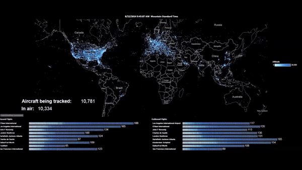
100,000 aircraft flights
This data visualization was made possible when Tableau (version 9.2) first integrated Mapbox Studio styles. Anya A’Hearn designed the custom map style, and Joe Mako wrote an Alteryx workflow that scheduled the download and parsing of the ADS-B JSON data into Tableau.
Tableau Dashboard with custom Mapbox Studio style. Click through image to see full-screen map.Animated Tableau Dashboard tracking aircraft with airport metrics
- By Allan Walker, Anya A’Hearn & Joe Mako
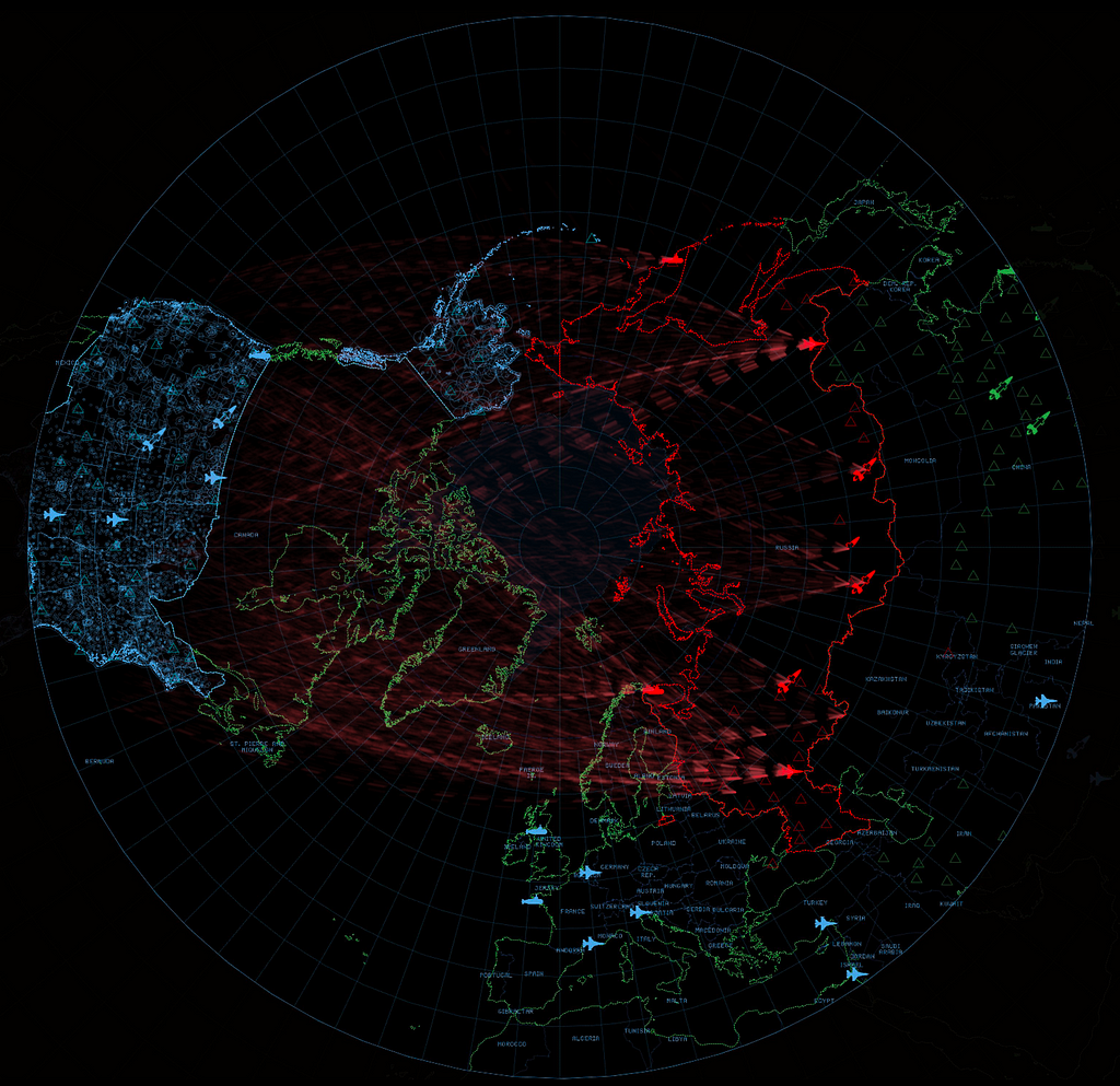
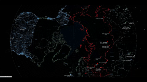
Wargames
Here are the nuclear missile sites and paths of the world’s nuclear arsenal, inspired by the 1983 film “Wargames.” The map uses a custom polar projection and incorporates Great Arcs, which allows us to visualize the trajectories from launch to targets.
Tableau Dashboard with custom Mapbox Studio polar projection style. Click through image to see full mapLeft: NATO v Warsaw Pact Wargames | Right: Nuclear MAD-ness
- By Allan Walker, Anya A’Hearn & Chris DeMartini
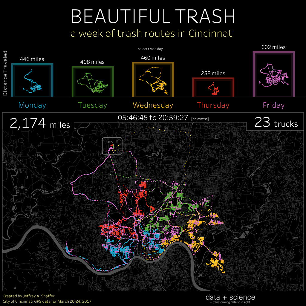
It might be a “stinky” subject matter; but Jeff uses a bar chart, small multiple line charts, a detailed data-driven map and a retina-popping, neon-effect color palette to make this a beautiful and insightful dashboard!
Tableau Dashboard visualizing a week of trash routes in Cincinnati, OhioAnimated Tableau Dashboard of trash collection in Cincinnati.
- By Jeffrey Shaffer
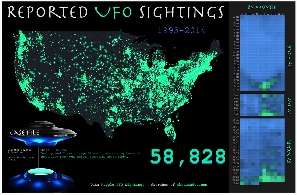
Reported UFO sightings
I want to believe…that this Tableau Dashboard would look great on Agent Scully and Mulder’s FBI desktop computers.
Tableau Dashboard of Reported UFO Sightings 1995–2014.
- By Adam Crahan
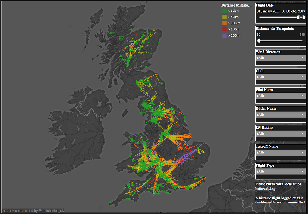
UK Paraglider flights
Paraglider pilots use this Tableau Dashboard to benchmark their own flights and plan how to fly further.
Tableau Dashboard visualizing UK Paraglider Flights.
- By Neil Charles
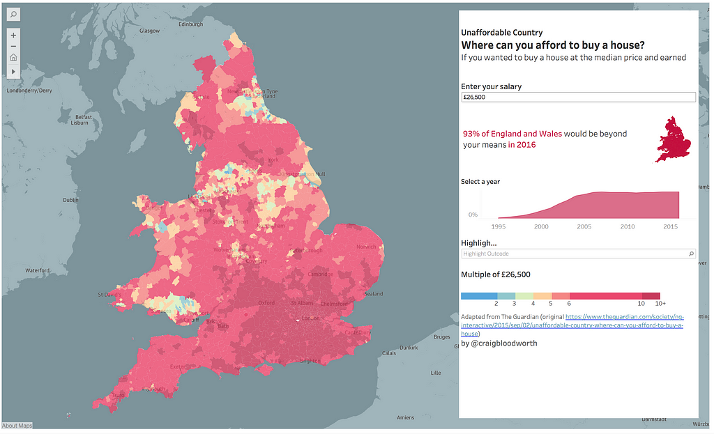
Unaffordable country
Craig uses an effective color palette and a choropleth (filled map) in this Tableau Dashboard. Users can enter their salary, and find out where in England and Wales they can afford to buy a house.
Tableau Dashboard analyzing housing affordability in England and Wales.
- By Craig Bloodworth
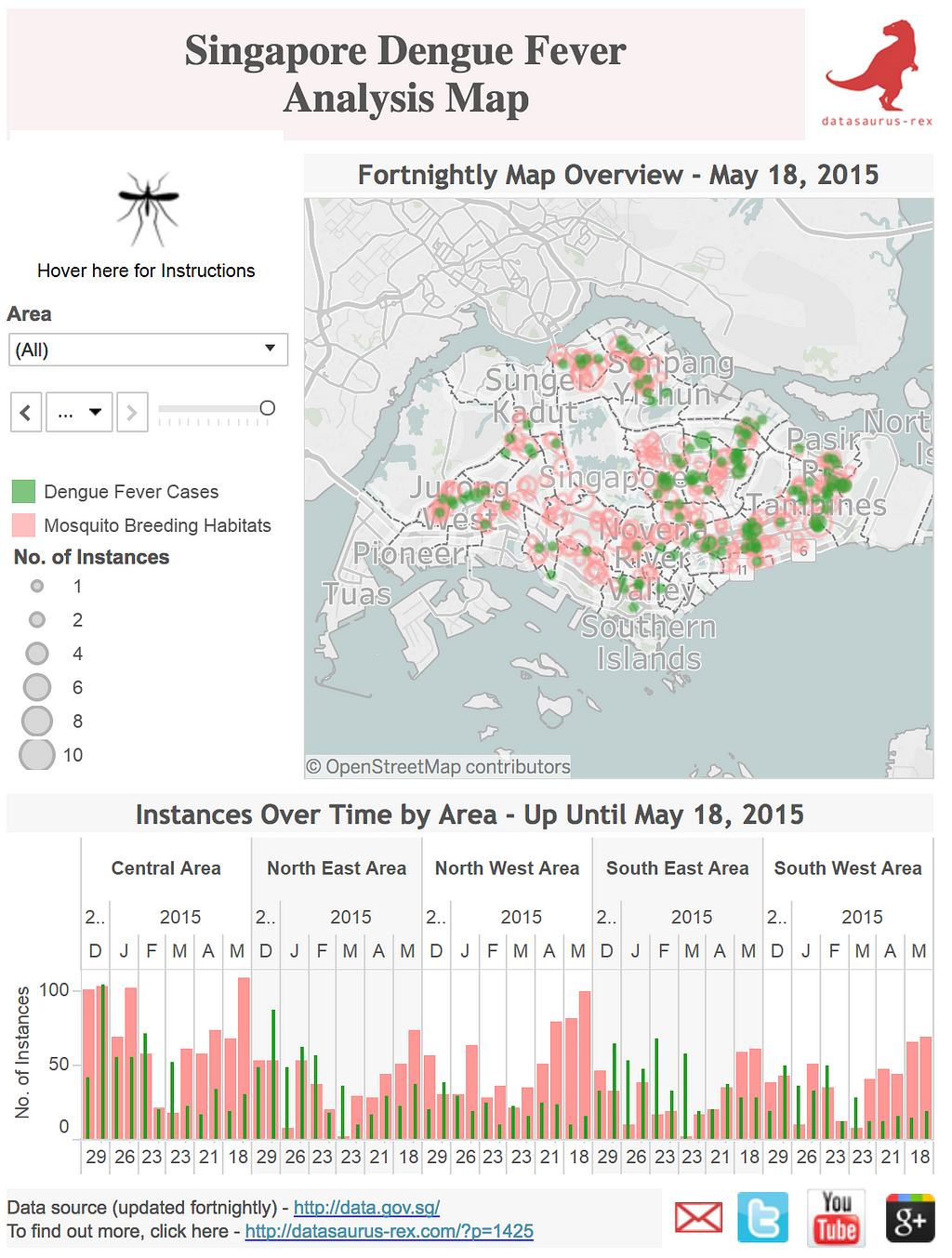
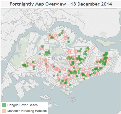
Singapore Dengue Fever analysis
David correlates mosquito breeding habits and cases of Dengue Fever over time in Singapore with this informative Tableau Dashboard.
Tableau Dashboard visualizing correlations of mosquito breeding habitats and Dengue Fever cases in Singapore.Animated Tableau map showing correlations of Dengue Fever cases and mosquito breeding habitats in Singapore.
- By David Murphy
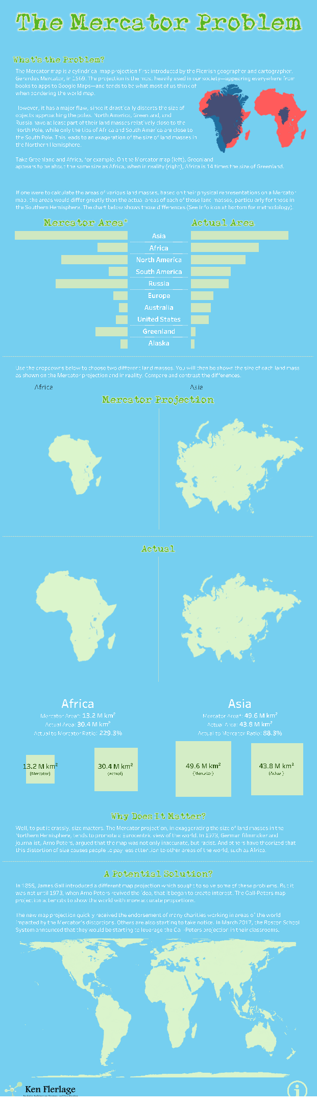
The Mercator problem
Ken uses a “long form” style dashboard to advocate for alternative map projections. The dashboard lets users compare areas, visually showing the difference.
A “longform”-style Tableau Dashboard.
- By Ken Ferlage
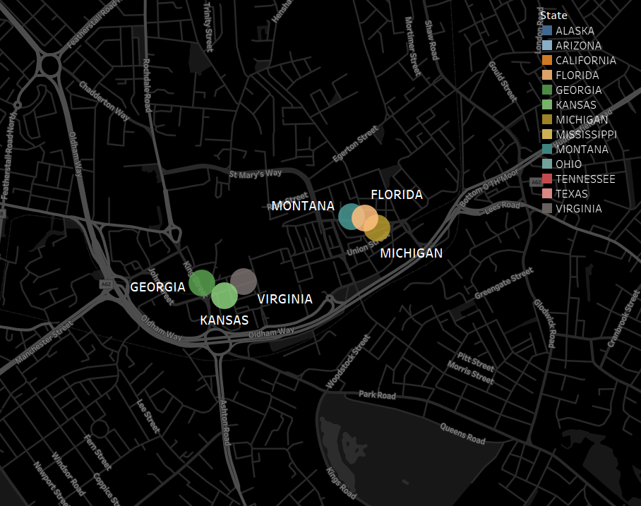
Fried chicken
A very odd phenomenon exists in England. There are lots of chicken eateries that prefix “Fried Chicken” with states that aren’t Kentucky! In this map, Gwilym identifies Fried Chicken stores in Oldham, Greater Manchester — “Alaskan Fried Chicken” anyone?
Tableau map of fried chicken stores in Oldham, Greater Manchester, England.
- By Gwilym Lockwood
The subject matters of these maps are very diverse. They can be really funny and out of the left field, or very serious and insightful; but either way, the map is the hero and the star of these dashboards.
The geospatial industry has always benefitted from open data. That’s truer now than ever before, with publicly funded datasets from the Landsat archive to real-time weather radar enabling public and private innovation. The National Agricultural Imagery Program (NAIP) is an integral part of that thriving imagery ecosystem, which is why we recently wrote about the threat to NAIP’s continued existence as open data.
Since publishing our post, we’ve seen many other accounts of NAIP’s importance as open data, from major satellite companies to independent consultants. Here are a few representative testimonials:
Just as highways enabled the whole automotive and modern logistics industries, so too do open datasets like NAIP enable the whole geospatial industry. New companies can build valuable products and services by leveraging the value that is open to all. And they are doing so with NAIP today — for the year of 2017, one external source of data access saw nearly a half million programmatic requests for the data from roughly 15,000 unique IP addresses corresponding to access of 650TB of freely available NAIP data. Without a baseline of foundational open data in the United States, we believe geospatial innovation and value creation would be unnecessarily throttled.
The USDA’s FSA proposal for a new acquisition strategy of NAIP imagery seems best to be viewed as a cost-savings effort, a commendable and challenging act in most government budget offices. However, the proposal to use commercial imagery for the NAIP, and the associated licensing restrictions that might prevent broad distribution, would result in a significant loss to the public.
I use NAIP almost weekly for volunteer work with local non-profits. Several of these organizations rely on NAIP to make decisions on areas where they can make an impact for clean water or for land to be protected from development. They can’t afford commercial imagery and LANDSAT is too coarse for what they need.
I also use NAIP in my commercial consulting life. Many of my customers are small businesses around the Georgia/Tennessee area. NAIP provides these firms the opportunity to use aerial imagery to make informed decisions with regard to forestry, agriculture, and environmental concerns. The temporal span of NAIP is important. Most of my clients have the ability to look back on over a decade or more of imagery to see changes to the landscape. It’s a very important resource with an important economic impact that will be felt if this resource goes away.
Calvin Harmin, GIS Specialist for the Town of Fuquay-Varina:
NAIP going to a closed/paid model would be a barrier not just for myself but for all the other people like me, in college or in GIS/environmental research positions, or in organizations that do not easily resort to paid services for non-critical issues.
NAIP as a public resource allows me to freely explore all kinds of answers to small and large questions as they arise. Those questions (and answers) would probably be abandoned to the pile of “not worth it” by managers if NAIP became a paid service.
Delaware NAIP imagery and OpenStreetMap data are used to train a TensorFlow model that can find unmapped roads elsewhere.
The usage numbers cited by Planet for a single NAIP data redistributor in a single year should give pause to anyone who doubts the impact of NAIP going closed: “nearly a half million programmatic requests for the data from roughly 15,000 unique IP addresses corresponding to access of 650TB of freely available NAIP data.” A license change would mean that all of this redistribution would be rendered impossible. How much of this use would become merely more expensive and how much would cease to happen at all? Past experience with open data suggests that the latter of these would be the larger and more worrisome effect of closing NAIP.
There’s still time to make our case that NAIP should remain free and open, and a number of ways to get involved:
Join the Save the NAIP mailing list to contribute your own story and be alerted to developments and advocacy opportunities.
I’ll be speaking about NAIP at the NSGIC Midyear Conference next month. If you’ll be there, let’s connect about how you use NAIP and what we can do to preserve it.
Cedar Creek Wind Farm in Weld, Colorado as captured by NAIP.Experimental karst sinkhole detection near Cadiz, Kentucky, using NAIP and machine learning techniques.
Open imagery is essential was originally published in Points of interest on Medium, where people are continuing the conversation by highlighting and responding to this story.
It’s easier to navigate indoors when you can see your surroundings. Not just look at a dot on a grid, but move through space naturally as contextual information conforms to your view — not the other way around.
Learn more about using Mapbox in Unity or read on to learn how we built the demo. You can download the project here and open it with Unity 2017.2.0f3 or later. Then, set up an access token, and open the ButtonSyncronizationWorldScalescene.
We divided this project into 3 phases:
Import indoor map data to Mapbox: In phase one we uploaded a GeoTIFF image of our office blueprint to Mapbox Studio and created a dataset containing vector features such as walls, rooms, and hallways.
Consuming the custom data in Unity:In the second phase, we rendered a 3D map in Unity, so the rooms were scaled and positioned 1:1 with real-world space.
See it localized in world scale AR: In the third phase, we created a seamless augmented reality navigation experience with localized 3D features of our office space.
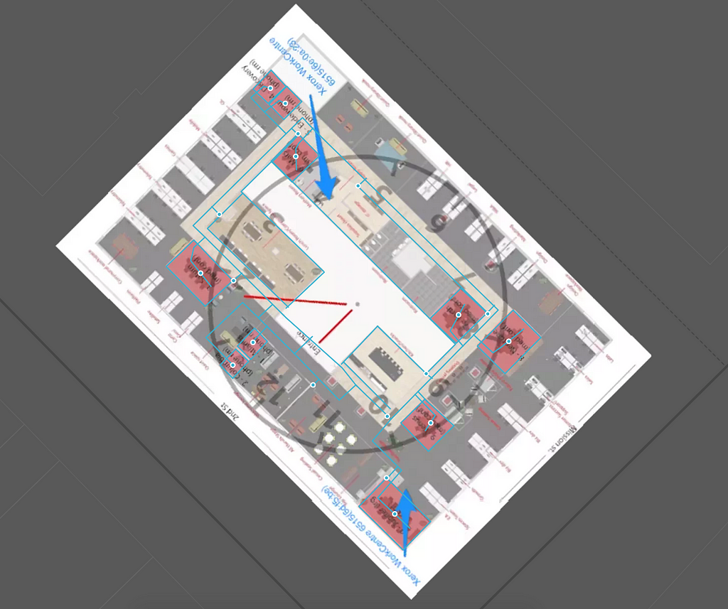
Phase 1: Importing the indoor map
For building vector features and adding indoor map data, we had to first add a geo-referenced image to Mapbox Studio. After that, we added walls, hallways, and conference room features to our dataset along with custom properties designed for consumption in Unity.
A preview of all the features in our Mapbox Studio dataset
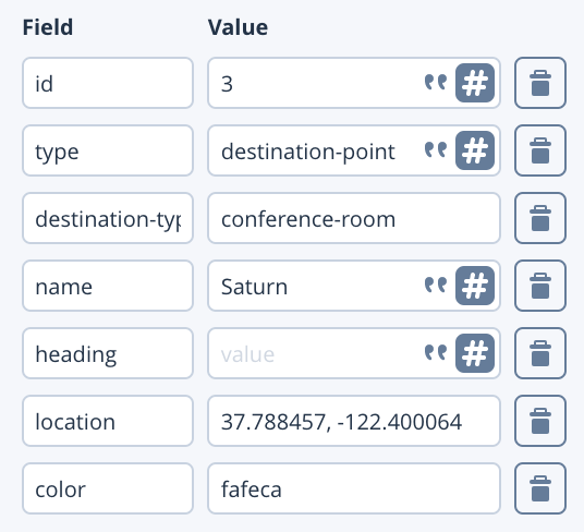
The conference rooms were digitized using points. Each point feature was assigned properties to help with identifying and navigating to the corresponding conference room. Here’s a snapshot of the properties we added:
After adding the necessary features and properties, we exported that data to a tileset which we used in our Unity project.
Phase 2: Render in Unity
For rendering the features from our tileset, we used a MapAtWorldScale with a RangeAroundTransformTileProvider. We chose MapAtWorldScale because we wanted the map to render at the real-world scale to support the augmented reality experience. RangeAroundTransformTileProvider uses the AR camera’s root transform to load tiles around it. The rendered tiles contain the vector data information that we added to our dataset.
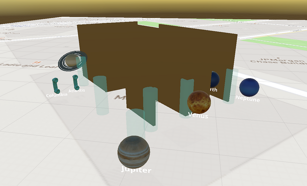
For rendering the conference rooms, we used a POI Modifier for instantiating 3D prefabs of planets with their names under them — our conference rooms are named after planets in our solar system.
Additionally, we used height and material modifiers to extrude the walls and render them with a masked shader to provide occlusion in AR.
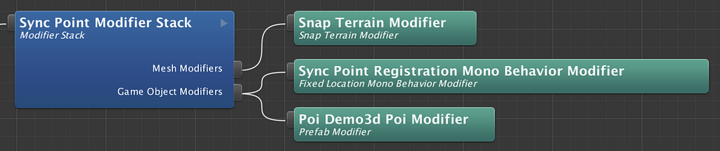
Here’s an overview of how we set up our modifier stack to render the features listed below:
Synchronization Points
We introduced a new modifier called FixedLocationMonoBehaviorModifier, which registers the location data associated with synchronization point with the help of SynchronizationPointsLocationProvider. The registration process sets up the required UI elements corresponding to the sync points.
2. Destination Points
To set up the destination points, we used SpawnPrefabModifier, a variation of FixedLocationMonoBehaviorModifier, which in addition to registering the destination points, also spawns a prefab (3D model of a planet) to represent the conference rooms.
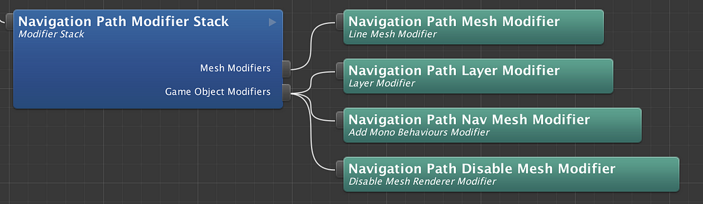
3. Nav Mesh
We use Unity’s NavMesh to compute the navigation path for this demo. NavMesh requires a mesh as input that’s used as a navigable path. To create this navigable path, we added line features in our dataset connecting corridors with synchronization and destination point locations.
To consume the navigation path data, we use a modifier stack as shown below.
Phase 3: Localize in world-scale AR.
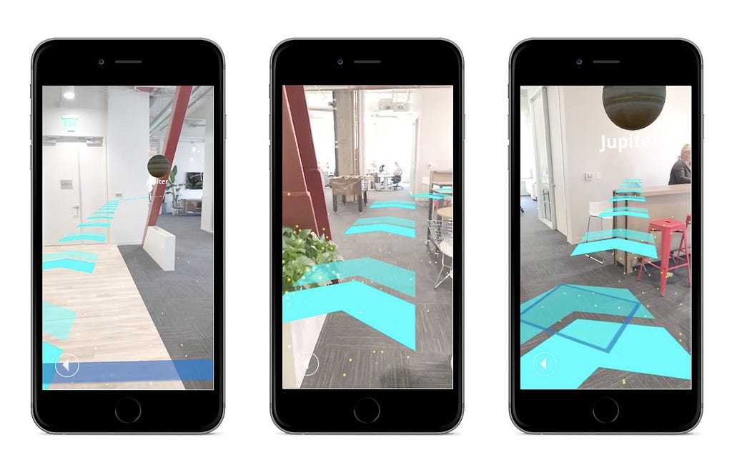
The real challenge is positioning, orienting, and tracking a user’s device in the AR world. Before starting the experience, we had to ensure that the 3D features in Unity were perfectly aligned with the real world position and orientation of the device. We solved this by adding a two-step process that a user had to complete before seeing the AR world positioned and oriented properly:
In the first step, a user has to scan the surrounding floor for a ground plane.
After completing the first step, the app brings up a UI showing different sync point ids. The user has to then walk up to a sync point and press the corresponding button to position and orient the AR map with respect to the device’s position and orientation.
For easy identification, we marked nine spots in the office with the corresponding sync point ids from our dataset. The table below shows the set of properties we added for those sync points:
Once the 3D map is aligned, we show the list of destinations that the user can navigate to. Then, based on the destination, the app places a continuous chain of arrow sprites on the NavMesh to show the directions to the chosen destination.
Future improvements
The primary purpose of this project was to take advantage of Mapbox Studio’s abilities to serve indoor map data, visualize it in AR with the Maps SDK for Unity, and implement map-based navigation in an indoor setting. For that reason, we restricted ourselves to synchronizing device position and orientation with a basic manual synchronization step that’s dependent on user input.
However, the experience would be significantly improved with the use of Bluetooth beacons. By tracking a user’s position and orientation continuously, this would provide automatic synchronization context at regular intervals. It would also allow a seamless transition between indoor and outdoor navigation, covering a wide variety of use cases.
Next steps
Experiment with the project and let us know what you build on Twitter, #BuiltWithMapbox. To get started, explore the tutorials on our help page and learn more about location-based games, AR, and VR applications.
Lè Shine is inspired by a globe Tristen Brown and I came across. It was sitting in a store: a beautiful relic to set a tone and convey the lifestyle brand of the company. But where globes once helped us enter the larger world as interactive day-dream tools (spin the globe, put your finger down and that’s where we’re headed next), their function has seemingly shifted to a static object within the mosaic of a ubiquitous aesthetic. I cannot blame this usage or non-usage of globes, as I find them incredibly beautiful even as dusty objects. And it’s here where I set off to transfer this globe’s style into an interactive, digital map.
The Globe
Unlike others I’ve seen, this globe has a monochromatic blue color palette. Some of the prominent features we liked were the country distinction through color, beautiful Futura place labels with a hierarchy based on population, predominant ocean currents, and dot-patterned hill shading.
In translating this static map into a digital one, we wondered what this globe would be like if it could move in and out of regions, cities, and places, and what would it look like at these smaller scales. What would Paris look like, or Fresno? What would the road network look like? What would the globe suggest to do with buildings and parks?
Behind the design
The map is divided into two parts: lower zoom levels present predominant ocean currents, colored country polygons, natural and built-up areas and place networks, whereas mid to high zoom levels show road networks, cities, transit systems, and points of interest.
To keep track of my high-level stylistic goals and ideas, I created a map taxonomy chart showing the rules of the map — road widths, color palette, label hierarchy, symbols, etc. If you want to customize this style, this chart is a good place to refer to as you make changes, especially if you want to change the colors. Since this map revolves around a primary color, it can quickly be transformed to match your brand’s palette.
Add Lè Shineto your account to use as is, or customize it to use in your next app or website. If you’re new to Mapbox, sign up to start creating custom maps for your next project.
Rise and Lè Shine was originally published in Points of interest on Medium, where people are continuing the conversation by highlighting and responding to this story.
With our tools for asset tracking and design, you can build interactive maps for events that incorporate real-time data showing where people are and what they’re experiencing as it happens. Whether it’s a marathon, a stand up paddle-board competition, or a race across the desert, every event has unique data, and there’s a lot you can do so fans can engage wherever they are.
Red Bull Heavy Water
For the 2017 Red Bull Heavy Water Stand-Up Paddle Race, we built a custom event map showing real-time locations of athletes along the course, as well as dynamic event data like wave height and speed/heading of currents.
The event organizers partnered with SpoonDrift to drop ocean buoy’s along the course and track live conditions. We built this real-time data into the map and styled the map’s features based on the data.
For example, markers update with live positions of racers; you can see who deviates from the course. A color gradient shows wave height with directional arrows indicating both speed and heading of currents. Using Mapbox GL JS, our web API, we added interactivity so users can hover over the base map to get a reading of the conditions for that location.
The surfers move with the current until they have to fight through a vortex-like pattern as they pass beneath the Golden Gate Bridge. Surf heights reached up to 15ft as the racers paddled from the beach through the heavy break zone
If you missed the SUP race, watch a sped-up recap of the event on the map. Red Bull has incorporated live content from the race into the map replay so fans can watch video footage where it actually happened.
Grant Washburn, organizer of Red Bull Heavy Water told us what inspired this year’s live map:
Before the event map, people just checked how they finished online after the race and our content was recorded for post-event commentary. Every little piece of data you add helps insert viewers in the experience. First you have a map, then you start asking yourself, ‘Ok how many ways can you experience this map? How can you fly through it and view the course from different perspectives?’ The more I looked at Mapbox and played with it, I thought there’s so much potential.
Rebelle Rally
We recently partnered with the Rebelle Rally, a women’s endurance rally where competitors spend 8 days driving and navigating public dirt roads, double tracks, and sand dunes across Nevada and Southern California. Drivers rely exclusively on traditional tools like compasses, paper maps, and plotters.
Rebelle Rally’s map tells the story of each team day-by-day. We overlayed checkpoints and interactive pins on top of our Satellite Streets map style, which shows roads and real imagery of the terrain. For anyone who couldn’t make it out to the desert, this was a way to check in each day, note the progress of teams, and explore the obstacles ahead.
Mapbox opens up a world of opportunities for our event, fanbase, and community, not only from a rich content experience, but from a business perspective. We’re able to go far beyond “dots on a map” and make these places and experiences come to life.
- Emily Miller, Founder of Rebelle Rally
Iditarod
This playback of the Iditarod helps spectators track the sled teams venturing through white-out conditions, sub-zero temperatures, and gale-force winds; they cover more than 1,150 miles in 8–15 days.
Crowds gather to cheer the dog teams off from Willow, AK but quickly lose site of the action, relying on static list-views to “watch” the leader’s jostle for position. It’s difficult to comprehend the distance, terrain, checkpoints, and standings, so we created a birds-eye-view with an updating leaderboard on the left. Using run-time styling, the map’s style changes with the time of day.
Drop your fans right into the dessert, ocean, tundra, or any action-packed arena with our developer toolset for live, updating maps. Get started with our tutorials for web apps, grab a Commercial subscription for tracking up to 1,000 assets, or contact our team for licenses that scale for however many athletes you’re tracking.
John Bonney is joining Mapbox as our Chief Financial Officer. His time as a finance leader/CFO at both public and private companies shows a track record of repeated success, having led all aspects of finance — Accounting, FP&A, Investor Relations, and M&A — which will allow him to be a core business partner across all of our teams.
When I shared details on what the team is building, John immediately grasped both the strategic and financial value of our location data platform. We dove deep into details around our financials, business, and operations — from our long-tail developer self-serve metrics, to our telemetry data processing, to our use of Spot with AWS. Then we jumped right back to business strategy going into areas like Auto, AR/VR, then on to people and organizational development.
During conversations with the team and board, John showed not only a mastery of running a finance organization at high growth, but also a sincere appreciation of our business, our strategy, and our people and organizational dynamics. Most importantly, John is genuine, passionate, and prioritizes people growth and development, demonstrated by the number of folks John hired and mentored previously on his teams who are now CFOs at various companies.
John was previously CFO at FinancialForce for over three years, driving the growth of the company from ~200 employees and ~$35M in revenue, to over 650 employees doing ~$100M in revenue. During his time at FinancialForce, he helped raise over $180M in equity and debt. Before FinancialForce, John was the Global VP of Finance and Divisional CFO of SAP Cloud, a $1B SaaS business, which he joined through the sale of Ariba to SAP. During his time at Ariba, he saw the business grow from $150M to over $350M in less than four years. He also played a key role in the $4.3B sale of Ariba to SAP.
John is excited to be a part of the team, saying:
“I could not be more thrilled and honored to be joining the amazing team here at Mapbox. The availability of real-time location data has never been more important in our increasingly data-intensive and on-demand world. Mapbox is already helping thousands of companies across multiple industries radically improve their own businesses by leveraging the feature-rich and data-rich Mapbox platform. I look forward to working with the entire Mapbox team to help the company scale to new heights while continuing the hyper-growth trajectory and fantastic culture.”
Welcome aboard, John!
P.S. — We’re growing — if you are looking to help us make a live map of the world, check out our jobs page.