Well, here we are again. On Thursday, the Federal Communications Committee will decide the future of the internet as we know it.
Despite analysis that the net neutrality rules established in 2014 have had no negative impact on their profits, FCC Chairman Ajit Pai believes that net neutrality is an undue burden on broadband companies. He thinks that by establishing strong net neutrality rules, “we decided to abandon successful policies solely because of hypothetical harms and hysterical prophecies of doom.”
We don’t believe these harms are hypothetical. Just before the passing of the current net neutrality regulations, Comcast slowed down Netflix until they agreed to pay for prioritized service. And the former CEO of AT&T is on record declaring his intent to charge for access to customers. There is a reason why network owners have spent so much time and money fighting net neutrality.
In cases like these, Chairman Pai believes that the market can regulate discriminatory practices or they can be brought before the FTC to arbitrate. He thinks that if a customer is not able to access Netflix from one provider, they can simply switch to another ISP. However, this is not a real option if competition does not exist. I looked into how much choice in ISPs there is across the nation, and what’s clear from the map is that it is not equal everywhere.
Click image to view live map.
Explore the map by searching for an address or by clicking on a location within the visible map area. Check out the full version of the map here.
The map only displays ISPs that provide service to consumers (some ISPs only offer service to business consumers) and does not include satellite providers. The ISP data comes from the FCC, and the census block data is provided in the form of shapefiles by the U.S. Census Bureau.
In metro areas, there is a high saturation of internet providers with areas in DC having up to 7 options. However, in more rural parts of the country, many are lucky if they have two options.
Take a look at the map to explore the options in your area.
Fuquay-Varina, NC
As we’ve said before, we strongly support a free and open internet. It is what allows us to thrive, create jobs, and build innovative products and services that drive economic activity. Like most startups, we face big competitors. Strong internet protections allow us to compete on the quality of our products, not on our ability to pay internet gatekeepers.
There is still time to voice your opinion on net neutrality. If you believe in the importance of a free and open internet, call your Congress person and ask them to support #TeamInternet.
Fliggy, formerly known as Alitrip, just launched with our Maps SDK for iOS and Android, adding fast, feature-rich maps with POIs and street labels in Chinese. Fliggy is a travel platform designed for millennials, who make up a significant portion of the 100 million Chinese traveling internationally each year.
The mobile app is a one-stop shop for travel services made possible through partnerships with major airlines, ticketing, and travel agencies. There are over 200 million registered users worldwide, and the new maps are available in popular destinations like Bangkok, Dubai, Los Angeles, Paris, Tokyo, and Sydney.
Travel with Fliggy was originally published in Points of interest on Medium, where people are continuing the conversation by highlighting and responding to this story.
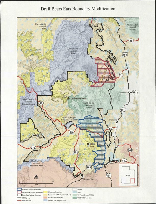
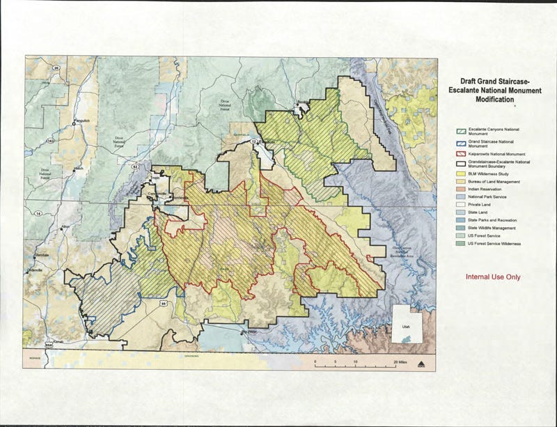
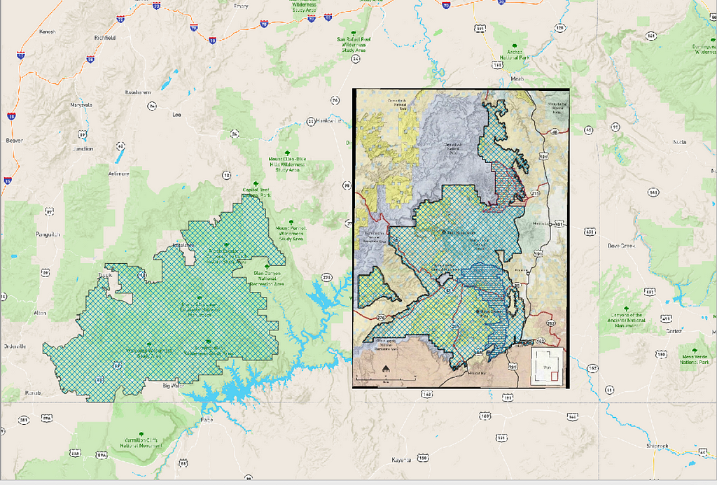
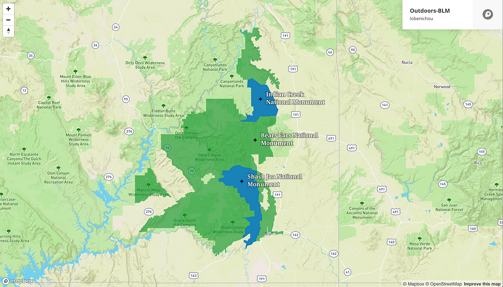
On November 30th, 2017, The Wilderness Society published leaked government maps showing the possible boundary modifications to Bears Ears and Grand Staircase-Escalante National Monument in Utah. Unfortunately, the leaked documents are not geo-referenced, and the data is currently unavailable elsewhere. This guide will walk you through geo-referencing, tracing, and finally, publishing a map with manipulable data.
Setup
To get started, you will need to download and install QGIS. QGIS is a free and open source geographic information system. It comes pre-packaged with GDAL, a python library, which you are going to use to geo-reference the boundaries.
Once you’ve installed the necessary software, sign up for a Mapbox account. It’s free! We’re going to use Mapbox’s Dataset feature to draw polygons and upload them into Studio.
Step 1: Geo-reference in QGIS
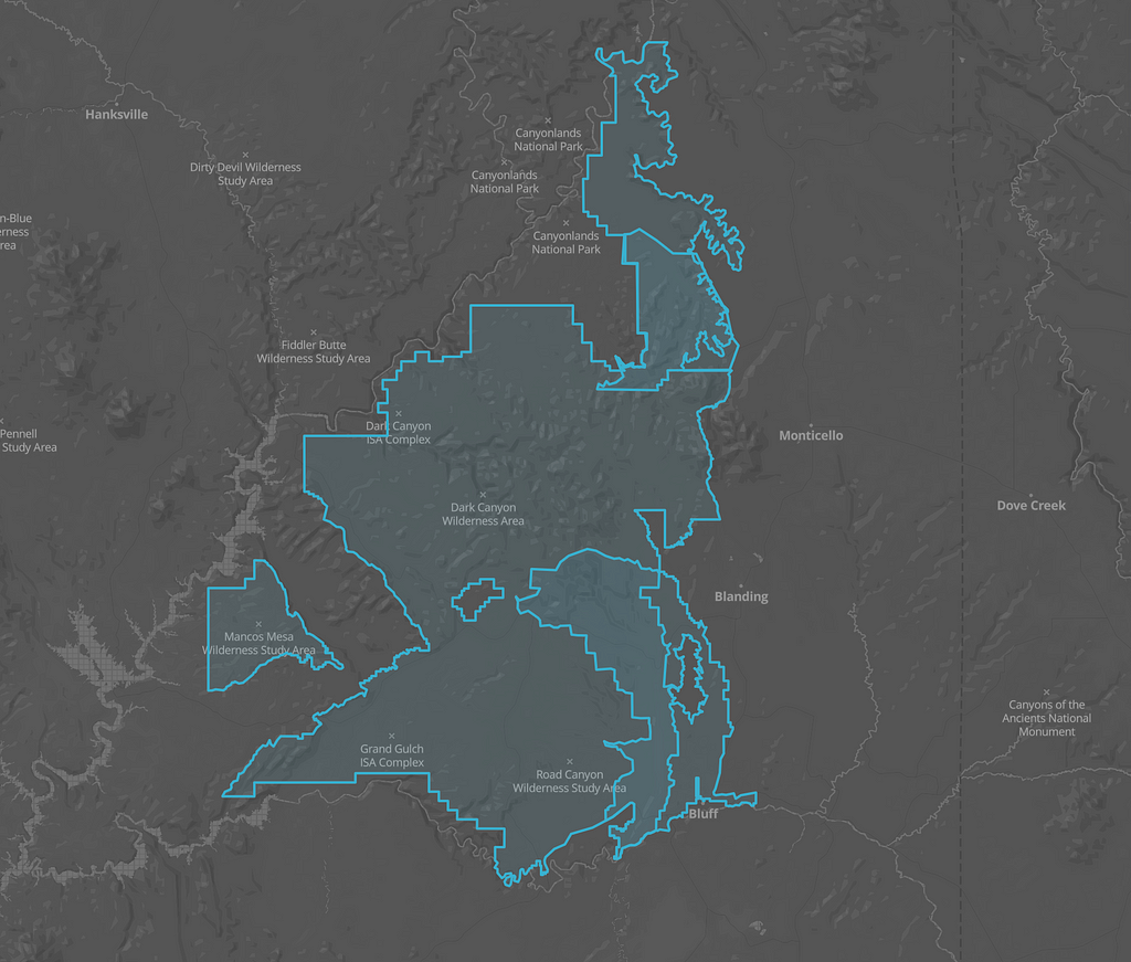
First, download a copy of the PDFs you’d like to transform. In this example, we’re using the two scanned maps below.
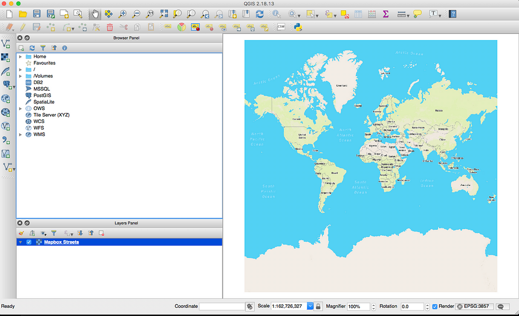
Then, open QGIS and add a Mapbox style as a layer. This will serve as a guide when you start geo-referencing the areas on the map. You can follow these instructions.
Now that you have your Mapbox layer setup, you’re ready to tackle geo-referencing.
Initial Setup with Mapbox map as a layer
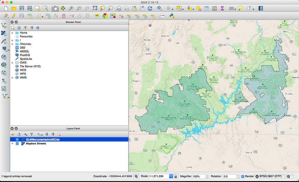
The best way to geo-reference a static map is to set up as many visual aids as possible. In this case, you have access to current monument boundaries. Add them to your current project and use them as guides.
Current Monument Boundaries in QGIS
From there, follow this detailed guide on how to reference scanned maps using the ‘Georeferencer GDAL’ plugin. Make sure to reference at least 4–5 points and to use the correct projection (EPSG:3857).
Once geo-referenced, the scanned map and the boundaries should match
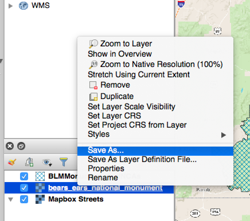
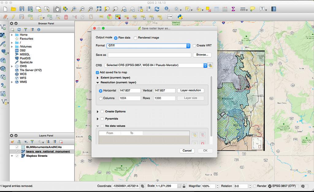
Once you’ve processed the image, you should see a new layer appear in your layer panel. This new layer is a raster image, or a geo-referenced version of the static map. Right-click on the layer, and select “Save As…”. Save the .tif file in the desired location. Next, upload the raster image as a tileset in Studio.
Save the raster
Step 2: Tracing in Mapbox
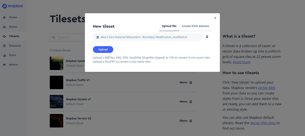
Uploading the raster as a tileset in Mapbox Studio will allow us to use the static map as a visual aid to trace the boundaries, using the Dataset feature.
Go to your Studio dashboard, click New Tileset, and select the correct raster file. Click Upload.
Upload the raster file
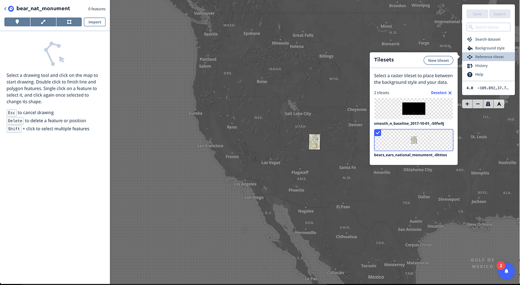
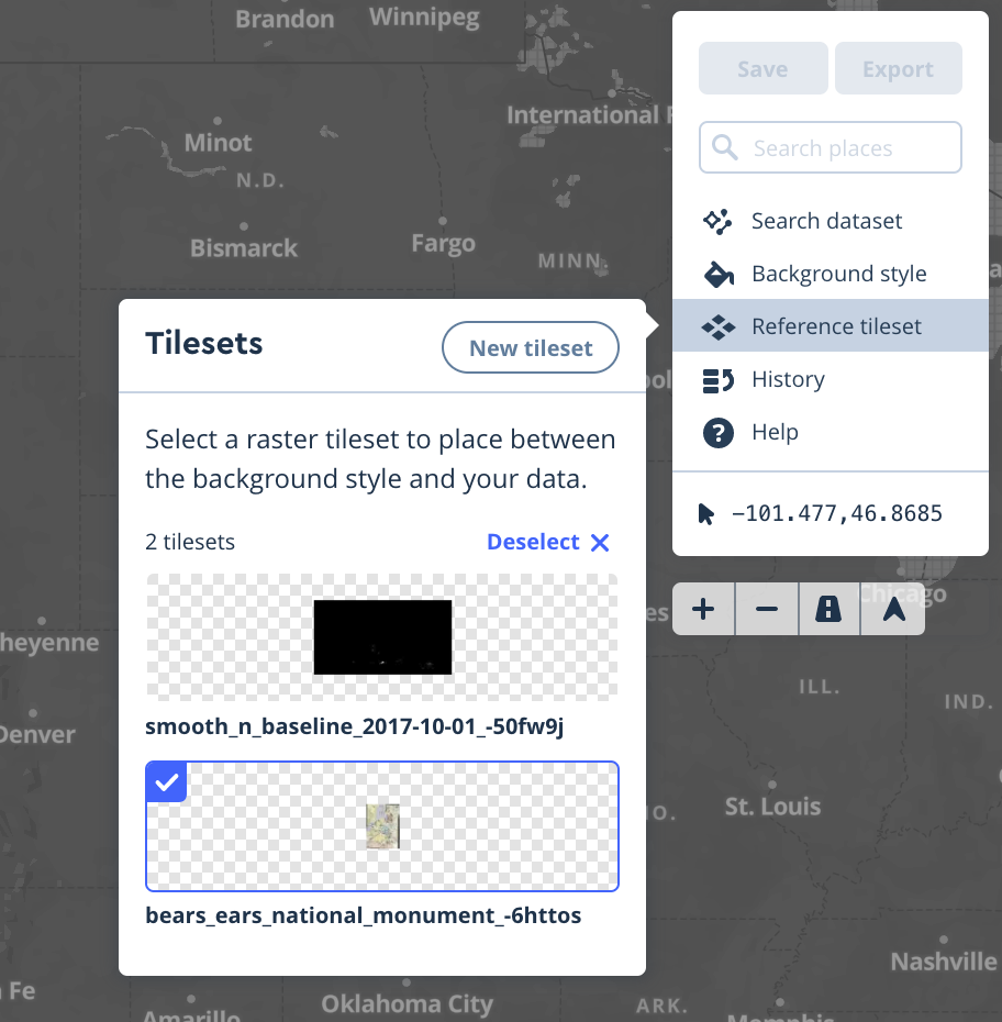
Next, go to Datasets on the right, and create a new dataset. On the left, click on Reference Tileset and select the tileset you’ve just uploaded. You should see the monument area added to the map. Now, let’s trace!
Select the reference tileset
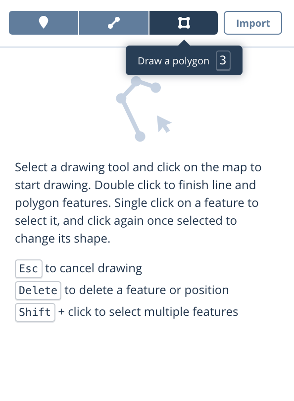
Click on Draw a polygon and start assigning points following the proposed boundary you’d like to reference.
Draw polygons, following the proposed boundaries
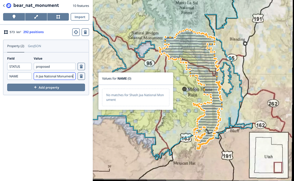
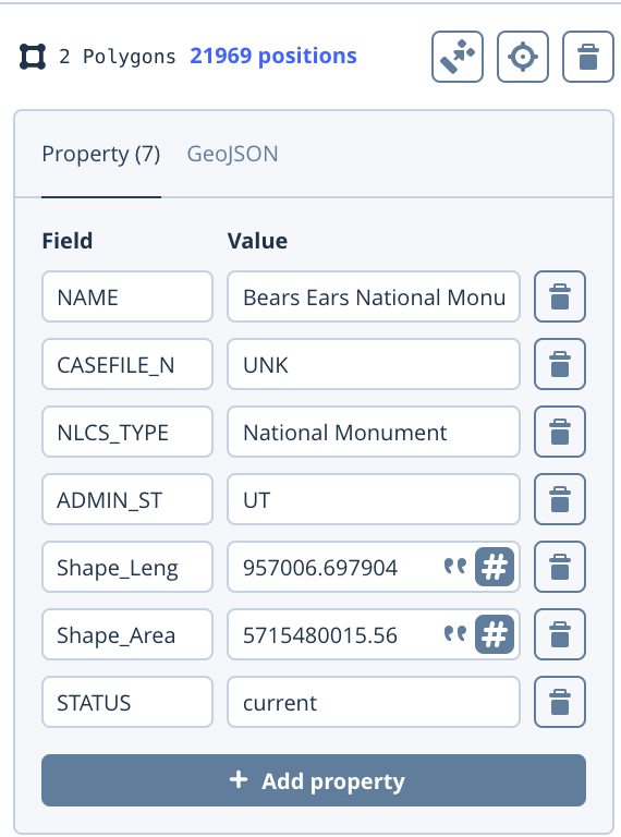
Once the first polygon is fully traced, start tracing the next one. You can also assign custom properties to the shapes you’ve just drawn. Here, I’ve added the name of the area as well as a status property to be able to distinguish between current and proposed boundaries.
This is optional, but you can also add the current boundaries’ polygon and get all your data in one place. In order to properly differentiate, I added the status property and set it as current.
After tracing the proposed boundaries and uploading the current ones, you should see the following shapes. Optionally, you can add points in order to properly place labels for each region on the final map.
You can now save and go back to the Dataset dashboard. From here, you can download the data as a GeoJSON or add it to a map in Studio by exporting it as a tileset.
Use our tools to tell a story with location data, especially when the stakes are high. Check out some recent projects from the The New York Times and VICE, and explore our tutorials for creating maps and adding interactivity. Have questions? Ask us on Twitter, @mapbox.
In 2016, over 3,000 homeless people were living in Sonoma County. The City of Santa Rosa wanted to take a data-driven approach and make public services more discoverable. The challenge was aggregating a large volume of data across multiple departments and presenting it in a useable format for the public.
As a solution, the city worked with Socrata to launch its Citizen Connect platform. Citizen Connect makes 311 data more accessible, surfacing information around public services, community facilities, and citizen inquiries. The platform is built with our tools, making it easier for the public and agencies to visualize and manipulate 311 data on a map.
The map component of Citizen Connect uses our Mapbox Streets style as a base for data layers. Users can upload their own data or add open-source datasets accessible through the system like local parks, schools, and libraries. Data can then be filtered by properties and visualized using different techniques like a heatmap and choropleth view. The platform also relies on our geocoder to translate addresses into map coordinates.
So far, visualizing data in this way has made it easier for the city to see trends and drill down into their causes. For example, the Santa Rosa Police Department used the heatmap view to identify hotspots of service calls. They could determine exactly where the incidents were occurring, as well as at what time of day. This led to the discovery that most incidents were actually around a homeless shelter in the morning when the shelter was releasing guests into the public. This occurred when the volunteer’s shift ended, coincidently the same time as rush hour when crowds of people were walking to work.
By simply having the volunteer stay an extra hour, incidents were decreased and therefore police no longer needed to staff up at that time of day, saving many dollars in police FTE hours.
The city was also able to use the maps to locate areas with the highest concentration of homeless encampments and allocate resources efficiently. For example, they discovered there were close to 70 people under three highway overpasses that were resulting in a large percentage of service calls.
Responding to public sentiment with data is easier as well. An agency in Santa Rosa was providing services for at-risk children, and residents in the area claimed to observe an increase in police calls. However, the data of police and fire calls showed no pattern of increase for that area. The city had tangible evidence to quickly address a perceived negative impact of its public assistance programs.
Landsat RGB (true color), Peron Islands and Channel Point, near Darwin, Australia. Landsat imagery is courtesy of NASA Goddard Space Flight Center and U.S. Geological Survey
Rasterio wraps the powerful features of the Geospatial Data Abstraction Library (GDAL) in idiomatic Python functions and classes. It is the most active Python project in Mapbox’s GitHub organization and one of the most active open source Python GIS projects.
Rasterio is in a period of pre-releases leading up to a 1.0.0 next year. Extensive testing and delegation of heavy lifting to GDAL makes it one of the more robust alpha packages out there. We’re using it in our raster processing pipelines, and it’s a part of related projects like gdbxtools and Marblecutter.
There are so many new, advanced things you can do with Rasterio. We wanted to run you through the most exciting updates for leveraging public datasets and computing resources in the cloud.
Cloud-friendly packaging
The Rasterio packages (“wheels” in Python parlance) that we are publishing on the Python Package Index are much more ready for production than they were when we introduced them at the beginning of 2015. They include the latest stable versions of open source geospatial workhorses GDAL, GEOS, and PROJ.4. We’ve added support for more formats, including NetCDF so you can access the AWS GEOS Public Dataset and JPEG 2000 for access to Sentinel-2 data.
Even better, the new generation of Rasterio wheels for Linux are a third of their former weight, which means that they’re simpler to deploy in applications on AWS Lambda like Mapbox’s landsat-tiler.
Three generations of NASA Mars rover wheels
Rasterio’s batteries-included wheels are built using the same tools and techniques used to make wheels for Numpy and SciPy. We’re indebted to the Python wheel-builders community for the trail-blazing it has done.
The best source of binary Rasterio packages for Windows and the conda platform is Conda Forge.
New advanced features
Rasterio turns five GDAL features into solid, idiomatic Python patterns suited for building applications that run in the cloud.
Access to datasets stored in RAM
Access to datasets in zipped streams
Efficient access to metadata of rasters served via HTTP
Quick overviews and subsets of cloud-optimized GeoTIFFs
Lazy warping of cloud-optimized GeoTIFFs
When you can read raster data directly from zipped streams uploaded by users and analyze or process in-memory representations of rasters, you can deploy to computers with very limited filesystems. Rasterio makes this easy for developers with spatially-aware drop-in replacements for Python’s BytesIO and ZipFile.
Likewise, the ability to use data stored in the cloud directly without prior download lets you process large amounts of data on computers with little or no permanent data storage. To do this, Rasterio uses identifiers and idioms that will be familiar to users of the AWS CLI or boto3 package.
What is a cloud-optimized GeoTIFF? The format and practice are described at http://www.cogeo.org/.
Cloud Optimized GeoTIFF relies on two complementary pieces of technology.
The first is the ability of a GeoTIFF to not only store the raw pixels of the image, but to also organize those pixels in particular ways. The second is HTTP GET range requests, that let clients ask for just the portions of a file that they need. Together these enable fully online processing of data by COG-aware clients, as they can stream the right parts of the GeoTIFF as they need it, instead of having to download the whole file.
This is a new industry best practice 18 years in the making.
There’s a browser in GDAL
There is a web browser in GDAL that can navigate GeoTIFF files on the web. It’s a sophisticated browser that will fetch the least number of bytes required when you call the read method of a Rasterio dataset object. It isn’t extremely new or revolutionary: HTTP/1.1 range requests were standardized in 1999 and GDAL’s curl-based virtual file system goes back to 2010. What has changed recently is an increase in our attention, driven by the exploding availability of cheap “serverless” computing resources and the freely-available, massive datasets hosted alongside those resources. More attention means more development. Authentication features have been improved. Preliminary HTTP/2 support is implemented. Finer control over caching of requests is in the works.
The role that the cloud-optimized GeoTIFF media type plays in this emerging architecture is very important. HTTP knows nothing about raster data, nothing about rows and columns, blocks and stripes. It is blissfully ignorant of NoData. HTTP has requests and responses, with a handful of generic methods including partial retrieval of a resource’s representation. The quick access to overviews and subsets that is a hallmark of this cloud-native architecture is possible due to a well-designed and standardized media type, GeoTIFF, and the GDAL browser’s understanding of the capabilities of a GeoTIFF. Do you see what we have here? HTTP plus a GeoTIFF as engine of our application’s state¹.
Notebook on advanced features
If you’d like to take a deeper dive into Rasterio’s new advanced features, including a look behind the curtain at HTTP transcripts demonstrating range requests, see our Advanced Rasterio Features Notebook. GitHub displays a non-interactive version of the notebook, but you can download and run it on your own computer after following the instructions therein.
We hope this notebook will help you understand how to use Rasterio’s advanced features, cloud-optimized GeoTIFFs, and the AWS Landsat Public Dataset. We welcome helpful comments on the notebook gist. Please feel free to ping me on Twitter (@sgillies) with any other questions about this post.
[1] That’s right: Representational State Transfer (REST)
On World Migrants Day we’ve asked data journalist Jacopo Ottaviani to share his team’s recent mapping work for Médecins Sans Frontières (MSF). He provides an exhaustive picture of MSF’s search and rescue operations for migrants attempting to cross the Mediterranean Sea fleeing violence, war, persecution, and poverty.
Can you tell us about the Mediterranean migrant crisis and MSF’s work?
According to IOM, the Mediterranean is the most unsafe region to travel for migrants in the world with more than 15,200 recorded deaths from 2014 to 2017. Hundreds of thousands of migrants coming from Africa and the Middle East — from countries like Syria, Iraq and Afghanistan — try to reach Europe from the Mediterranean Sea every year. Migrants mostly travel on overcrowded, shaky boats provided by illegal networks of smugglers who charge to make profit. Most boats make it to Italy or Greece, but a number of accidents occur each year. As boats capsize and migrants risk to drown in the sea, MSF and other actors, including the Italian Coast Guard, respond with at-sea rescues, provide first aid, and transport people to a safe harbor.
This is such important work. What was MSF hoping to achieve in mapping its S&R operations?
The main aim of this project was to bring transparency in the public debate around search and rescues operations in the MedSea. MSF decided to release and visualize their data to demonstrate that they do not intend to hide their activities in the Mediterranean Sea. They want journalists and CSOs to access the data, explore it, and tell stories.
MSF first connected with my team at Code for Africa. They knew me from previous migration data projects, such as Borderline and Migrants’ Files, where we largely used public databases to explain migration flows to Europe. We assembled a team to build the map, including designer Isacco Chiaf and developer Emma Lewis, plus Latte Creative, who worked on the microsite.
The map uses our tools to bring together a lot of complex data. How did you approach the map design?
MSF wanted to provide a complete picture of their activities over the last few years. After brainstorming a few ideas, we came up with an idea of an interactive map combined with a timeline and a dashboard.
One of the challenges was to visualize the exact itineraries of all the MSF vessels, from starting port, their routes through the sea, and back to destination port. We used Mapbox in our main map and the mini map. The time series was implemented with D3 brush functionality and is helpful for sorting through hundreds of MSF voyages. The date pickers are Pikaday, and they are coded to respond to/update the brush using a Publish/Subscribe pattern.
Specifics on each voyage are displayed in a separate part of the page, with space to share all of the details on the profile of people who were rescued, medical issues, and a mini map of the exact route of the voyage.
MSF undertook extensive data collection on these voyages. What was required to prepare the data for the map?
MSF have been collecting data about their search and rescue operations in internal spreadsheets. We teamed up with their data experts to polish the data, refine it, and finally mapped it on our interface. Every operation has a unique code number. MSF’s datasets included fields on geographic information, date and time of the rescue operations, number of people transferred, as well as wind speed, wave height, and number of dead bodies collected. This data was added by human operators, so there were some manual adjustments needed.
Some of the challenges came from the data format because those who collected the data didn’t always follow a standard. To visualize the vessels’ routes the team largely used data coming from MarineTraffic and VesselFinder.
We’re proud to support mission-driven designers like Jacopo and his team, as well as the courageous efforts of MSF. Tell us how you’re using our tools to support humanitarian efforts worldwide. Get in touch or send us a tweet @Mapbox.
This year’s Hack the World competition is complete! Between October 18th and November 18th, we received 43 reports from 16 unique researchers as participants competed to improve our security and earn a top spot on the leader board. Thank you to all who contributed! We’ve been hard at work on triage and resolution.
As announced, we’re awarding the top report with double its bounty (up to $5000), and the two honorable mentions will take home $1000 bonuses.
Top Report
The award for top report goes to geeknik for a fascinating data parsing issue in one of our libraries. Additionally, they submitted 20 of the 43 reports we received. Every report was excellent and put a number of our libraries that rarely see HackerOne activity to the test.
Honorable Mentions
Our first honorable mention goes to wangela for outlining a way in which some mobile developers are using our tools without following best security practices. It was detailed, well researched, and initiated some great discussion about how we can further encourage secure use of our tools and improve documentation.
Our second honorable mention goes to sahilsaif for a subdomain takeover that highlighted a very tangled CNAME misconfiguration. They are a regular contributor to our HackerOne program, and we appreciate their continued consideration of our security.
Thanks to all!
Thank you again to the security researchers who participated in this event and kept Mapbox in mind. And, as always, many thanks to the team at HackerOne for organizing great events like this one.
JUMP Mobility, owned by Social Bicycles (SoBi), just launched the first electric-assist, dockless bike share system in the country. Our Maps SDK for iOS and Android is powering the app riders use to locate bikes. Our maps are also a key feature of JUMP’s behind-the-scenes tools for tracking and maintaining the bike-share system. If you live in the Washington DC area, you may have already seen the bright red electric bikes.
For less than the price of a bus ride, residents can unlock a JUMP bike and use pedal assist (a gentle boost) for longer commutes, challenging topography, or an easy ride. One of the aims of e-bike sharing is to solve the “first and last mile” problem of public transit, making the bus and rail systems more accessible to residents with a longer walk.
The dockless bike-share model, where riders can pick-up and leave bikes anywhere in the service area, is still relatively new. Nelle Pierson, Director of External Affairs at JUMP, explained the advantages for cities:
Traditional station-based systems are expensive and often constrained by the capital costs of the stations, which leads to reduced service areas. Under the dockless bike share permit in DC, we operate a fleet of our own e-bikes, which means we pay for everything but still have to play by the rules of DC’s permit. Our JUMP e-bikes lock to normal bike racks, which means that capital cost for stations is not a problem. Plus, we can provide residents with as many bikes as a city is willing to allow, which for DC is 400 right now.
The dockless system relies on live-tracking of GPS enabled bikes — people need to know where to find bikes, and JUMP needs to know where its bikes are. JUMP used our Maps SDK for iOS and Android to launch a rider-facing mobile app so it’s easy to locate a bike and any bike hubs across the city. Hubs, shown by polygons on the map, are geofenced areas where JUMP bikes are consistently available.
Like traditional bike share stations, these virtual hubs offer predictability for people looking for bikes as well as operational benefits for bike techs. To incentivize parking in hubs, riders actually get $1 off their trips.
JUMP is also leveraging our maps for its internal tools so bike technicians have a real-time, birds-eye-view. They track bike locations and repair status, ensuring there’s a sufficient number of working bikes available. That also means making sure bikes stay in the right areas. If a bike pops up on the map where it doesn’t belong, they dispatch a team to relocate it as quickly as possible.
Nelle told us why JUMP chose to build with our mobile SDKs:
For us, the SDK had many advantages over other native tools. Full control over the map layers is very important to us because our map is the first thing our riders interact with. It’s a crucial element of our product. We also needed to extensively customize our basemap, and we love the ability to add unique elements whenever we need to.
There’s also a growing network of developers using Mapbox, so solving problems or learning new things was easy for us. On top of that, the Support Team has always been very helpful and responsive. We have an engineer-centric culture at JUMP/Social Bicycles, and our engineers love working with Mapbox.
The JUMP engineering team is working on new map features like integrating our Directions API. The goal is to use our Navigation SDK to build an efficient turn-by-turn solution for mobile so riders don’t have to kick-out to other apps for directions.
We tested the bikes out around the office. Pictured is the pure joy of peddle-assist.
In the last Studio release announcement we mentioned that we’ve been doing a lot of user research to improve Studio. Today we’re releasing an update that revisits core style editor interactions to make designing maps easier and faster. Here are the highlights:
A new layout for editing complex values
The previous version of the style editor had a lot of complexity inside contextual popovers. We’ve done away with the popovers to offer more room for fine-tuning properties like color and line width directly in the editing pane. With the new layout, it’s straightforward to transform a property from a literal value to a zoom or data-driven value.
When selecting multiple layers in your style that use different values, the editor makes it clear how to apply a shared value across all selected layers:
Documentation about individual properties is now readily available from the property form:
The editing pane paves the way for upcoming advanced features like expressions. Look out for expressions in an upcoming Studio release.
A new way to navigate your layers
Map styles are complex systems of interrelated but distinct layers. Selecting more than one layer at a time to adjust relationships across your style is a common way of working in the editor. We received a lot of feedback that users wanted more ways to select layers that related to one another so they could work on their styles more systematically.
Making batch changes by property or value had existed for some time in Studio from a dedicated properties pane. The pane was detached from the usual editing flow, and many users found it confusing.
Faceted layer filtering serves a similar purpose to the properties pane, allowing users to select related layers and adjust them all at the same time. There’s a myriad of different ways to filter the style to find related layers:
New font & image workflows
Until now, users had a hard time knowing where to go to add fonts and images. You can now manage your assets directly from the toolbar. Here’s how you add an image to your style:
And here’s what that workflow looks like for fonts:
Language coverage is an important reference based on the font(s) you have chosen for a layer. It remains under the editing pane. Find it under the globe icon:
Try Studio and send us your feedback
Incorporating user feedback into the development process of Studio has been critical for us. We always want to hear from you! Try out the new Studio and reach out to the Studio team by mentioning @mapbox on Twitter. As always, share what you’re working on by using the #BuiltWithMapbox hashtag.
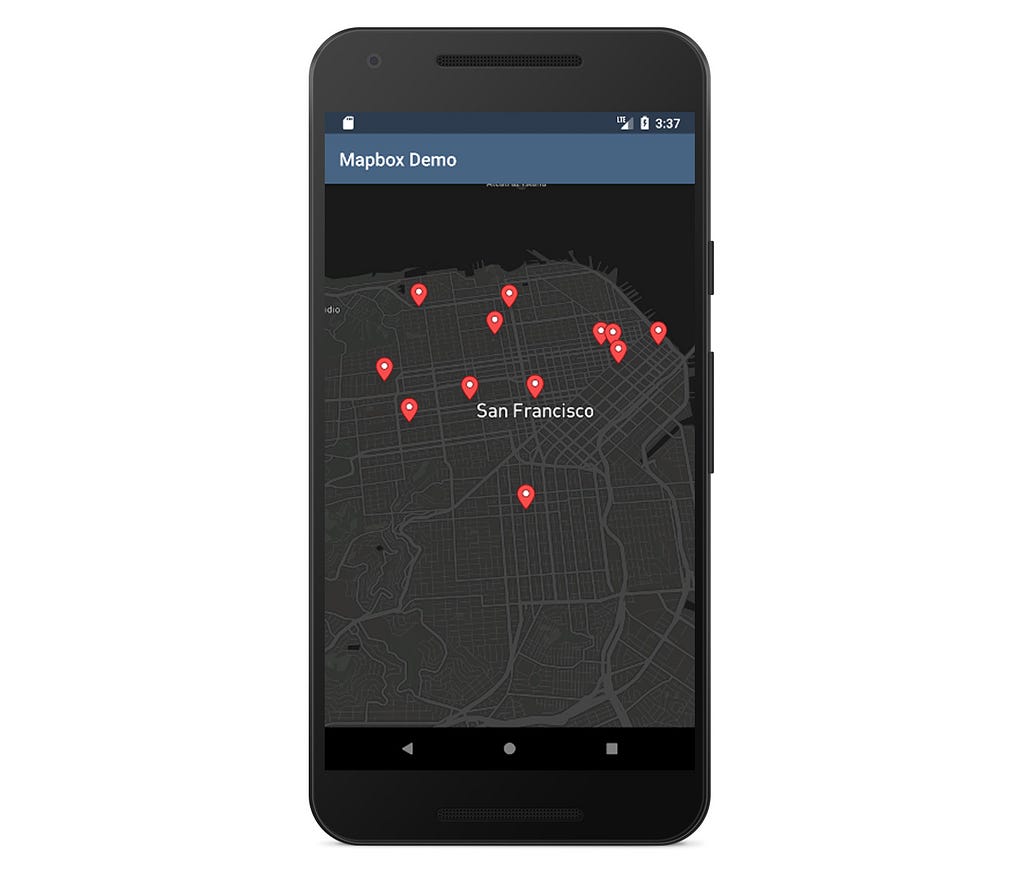
Our Maps SDK for Android includes several ways to add a marker to the map, and one of the most useful is with the SymbolLayer API. This approach is ideal for situations where the app requires more flexibility around the marker’s setup while remaining performant, like adding full z-index support for example. Full z-index support is part of the map Runtime Styling API, which allows full separation of data from its visual representation.
To show the benefits of runtime styling, we put together this 7-step guide for managing and interacting with data that’s being displayed via the SymbolLayer API.
Add data to the map
The first step is organizing your data as a GeoJSON object. For this you can either start with a JSON file or create a FeatureCollection programmatically (the Maps SDK has native support for GeoJSON objects). Because we want to add a Marker to the map, the underlying GeoJSON feature should be of the type Point.
Here is an example of a GeoJSON object we will use. It contains a bunch of other properties that we’ll cover later on.
When we have data ready, we can add it to the map:
2. Add a visual representation
Separating data from visualization in our case means having a separate Source that powers the Layer which we ultimately add to the map:
This call will add a layer to the map, but will not give us any visual representation of data yet. To have our points represented by images, we need to use layer properties to attach an image:
Now all the points in our data file will be represented by this icon. However, what if we want to have different icons for different points?
3. Set different icon images for different points
Fortunately, we don’t have to create a separate layer for each image.
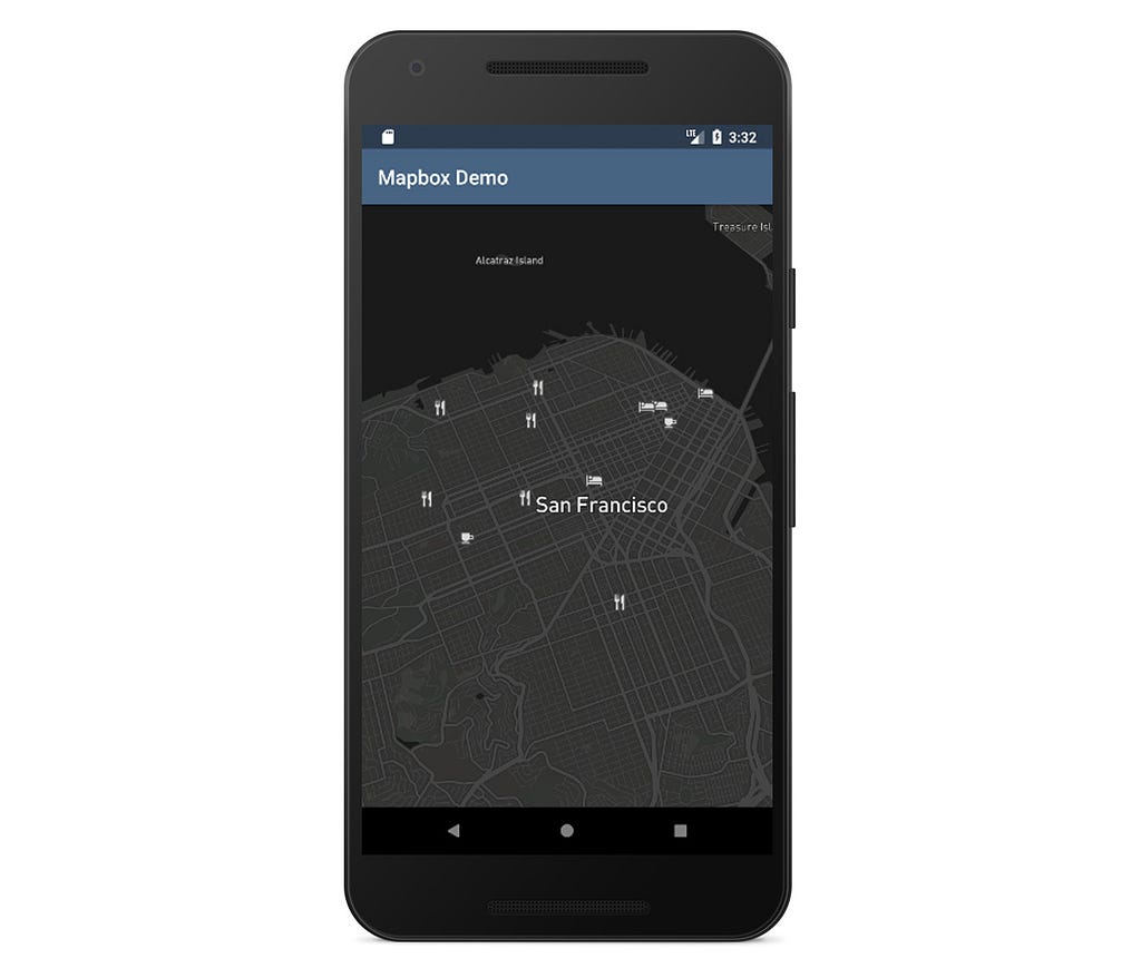
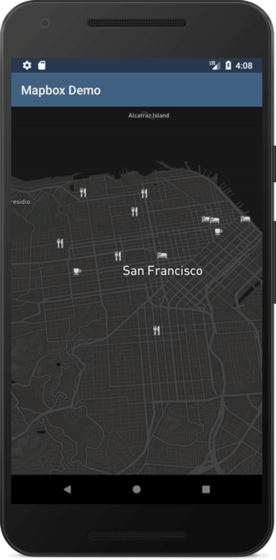
What we are doing here is using a tokenized poi property from our GeoJSON data file. This means that for every entry in our collection array we will extract poi property and search for an icon named like this property (adding its expected size, 15 in this case). For example: restaurant-15 is an icon pre-shipped with everyone of our map styles (more information here).
4. Handle click events
Now that we have our data nicely laid out on the map, we can interact with it.
To capture when one of our symbols is clicked, we need to implement the standard OnMapClickListener interface using MapboxMap#setOnMapClickListener. Once we receive a callback, we can start querying the map for the features we have defined in the source. This can be done by using MapboxMap#queryRenderedFeaturesAt(PointF screenPoint, String layerID):
For example:
This method returns features sorted by their z-index, and in this example we are selecting the top one.
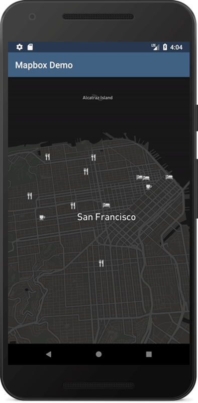
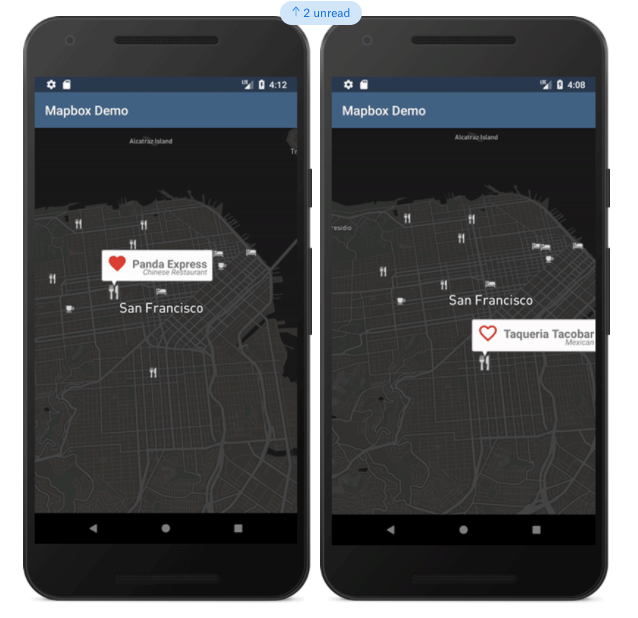
5. Update data
A common feature with a Marker API is the ability to change markers to a selected state. To do this, we need to first adapt our data to take the state into account. We are going to scale the selected icon image so that it’s visually different from the other items.
We start by searching for the selected feature in our previously loaded GeoJSON dataset (stored in a FeatureCollection object) and updating its property:
Then we let the map know the property has changed by resetting the source of our layer:
source.setGeoJson(featureCollection);
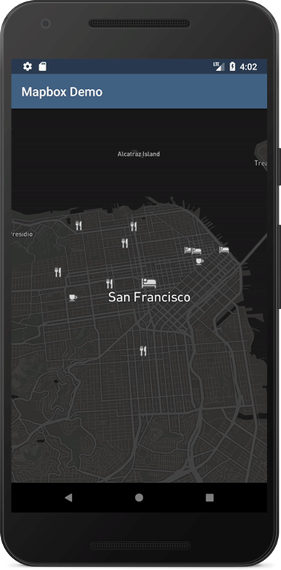
Now we need to modify our layer to respect the selected property of our dataset. We can achieve this by adding the iconSize property, which can either take a fixed ratio to scale the image or a function. In the example below, we will use the property function to scale our icons by 1.5f (when selected) and by 1.0f (when unselected) based on two categorical stops:
To deselect all symbols we need to update the FeatureCollection object again:
and reset the source.
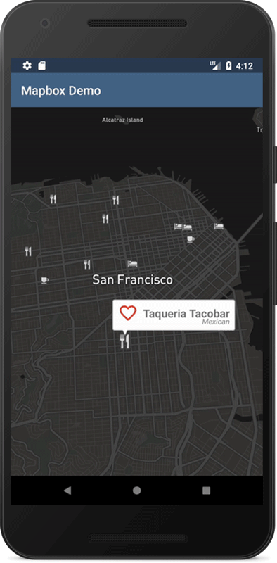
6. Create a callout window using an Android SDK View
Another common request for annotations is adding an InfoWindow. The solution described below is using a separate SymbolLayer backed up by our original source.
First of all, we need to create the layout that we want to show after a symbol click. The one we used can be found here.
After that, we should inflate it and set up its views based on our data. We’ll generate a Bitmap that we’ll be able to add to the map:
The bitmap itself is generated with the SymbolGenerator that you can see in our full example.
Views prepared this way can be added to the map:
// calling addImages is faster than separate addImage calls for each bitmap.
mapboxMap.addImages(imagesMap);
We are finally ready to create a new Layer, based on our original data, that will host InfoWindows:
As you can see, we are using tokens again to match previously generated bitmaps that were added to the map with the title key. Also, note that we are using withFilter, that will show our new InfoWindow only for selected features.
7. Handle view clicks inside the callout window
Finally, we can also handle click events inside an InfoWindow. This can have the same or different behaviour from the regular Marker click we implemented above. To do this, we keep the reference to our inflated Views in a HashMap with keys being the title properties of our callout symbols.
We can now use that information to handle clicks on each child view of the callout layout:
In this example, when we click on InfoWindow’s text we show a Toast, otherwise we toggle the favourite icon:
Since the beginning, our work with humanitarian, civic, open source, and non-profit partners has been core to who we are as a company. As our team grew to over 300 people this year, we worked on new ways to support local and global communities. Here’s some of the progress we made this year:
Donation matching
We started 2017 with a new commitment to match employee donations to the causes we stand by. Many of these are global causes like International Rescue Committee aid to those uprooted by conflict and disasters and the Electronic Frontier Foundation’s defense of civil liberties in the digital world.
On November 28th, we reached our goal of donating $50,000, meaning that as a company we’ve collectively donated $100,000 to 125 organizations this year ❤️ 🙌
The top five organizations we donated to in 2017 were:
Check out their great work and consider joining us in supporting them!
Connecting with our local communities
In October, we started our first local volunteering initiative to get out of our offices (and home offices) and connect with amazing social and environmental organizations nearby.
The response from our team was enthusiastic, to say the least: 146 people across Mapbox volunteered a collective 630 hours over our month-long campaign, supporting 27 volunteer projects with 24 local organizations. It was a global effort, with teams organizing ways to give back in San Francisco, Washington D.C., Portland, Chicago, Detroit, Bangalore, and Ayacucho. We donated our muscle, minds, and maps!
Muscle
Most of our volunteer teams found ways to support local organizations with their time and labor. A major theme was food security and helping those who have limited access to healthy food.
Two volunteer teams in D.C. took on the pre-Thanksgiving food donations rush with We are Family and Food for All DC,and two other teams helped to prepare meals with Food and Friends DC and DC Central Kitchen’s Food Lab, transforming wasted food to feed thousands of people a day.
Teams in San Francisco prepared ingredients for nutritious, healing meals for the clients of Project Open Hand; prepared bags of groceries for Groceries for Seniors; and served dinner to 200 people at the main Saint Vincent de Paul shelter for people without housing in the city.
In Detroit, remote Mapboxer Matt Greene helped with orders for a nutrition-focused pop-up grocery, supporting people with limited access to affordable, healthy foods.
Volunteers in Ayacucho visited the Padre Saturino senior’s home to prepare lunch, help around the center, and spend time with the residents.
Two teams in San Francisco assisted with meals at Family House, an organization that provides housing and living support to families who need an affordable place to stay in the city when a child is going through treatment.
Another theme was giving time to help organizations support their causes.
Volunteers collected donations of socks and candy, packing them into care packages for At The Crossroads to use when helping homeless youth in San Francisco.
We participated in GLIDE’s annual toy sorting marathon.
Our San Francisco office held a holiday card-making session to make hand-made cards and care packages to be given to isolated seniors by Little Brothers Friends of the Elderly.
Three volunteer teams also supported environmental organizations:
Our Friends of the Urban Forest team worked on a sidewalk beautification project, preparing sidewalk garden areas for neighbors to plant; this reduces stormwater runoff.
Our Bangalore office volunteered at the Bannerghatta Rehabilitation Centre (BRC), which houses and treats displaced, injured, and orphaned urban wildlife.
More volunteers in Portland helped sort donated building materials for The Rebuilding Center.
Minds
Other volunteers donated their time and talents:
One team in Ayacucho spent a day tutoring orphans in English, math, and geography at the Hogar Urpi center. They even used OpenStreetMap in their lessons.
Remote Mapboxer Carol Hansen is providing technical support to the Chicago Community Bond Fund to help strengthen the backend of their donation website.
A team from our San Francisco office spent a day with middle school students at 826 Valencia’s Tenderloin Center to support a Podcast Field Trip, helping students write and record podcasts on the theme ‘Where I’m From.’
We learned about the operations of the Shanti Project’s PAWS program so we can help them design new maps. We also enjoyed washing 27 dogs belonging to elderly and disabled clients of PAWS.
A team spent a morning with Meals on Wheels preparing and loading 290 bags of groceries to be distributed to seniors and other neighbors across San Francisco. Meals on Wheels SF distributes groceries each week as well as 7,200 hot meals every day in San Francisco — our team is now exploring maps, routing, and navigation tools for the organization.
It’s been a busy year, and we’re only getting started. As we gear up for 2018, stay tuned for more minds, muscle, and maps supporting positive change. If you have an organization we should connect with, contact our Community team. Happy holidays!
Recently, we’ve been thinking of a visualization that cuts directly to the way in which people make decisions about where to go: what would a map look like if we swept the physical world away completely, in favor of the time needed to move around it?
This year, I decided to finally confront my fears and build something non-trivial with WebGL on my own. 2D wind simulation looked like a perfect opportunity — it’s useful, visually stunning, and challenging, yet it still felt attainable in scope. I was surprised to discover that it was much less scary than it looked!
When I start designing a map I consider: How do I want the viewer to read the information on my map? Do I want them to see how a measurement varies across a geographic area at a glance? Do I want to show the level of variability within a specific region? Or do I want to indicate busy pockets of activity or the relative volume/density within an area?
❤️ to all developers, partners, and customers building with us over the years. As a platform, we live vicariously through what you create with our tools — your success is our success. The passion, focus and desire to win by the entire Mapbox team built this amazing platform. We’re just getting started.
Let us know your favorite blogs of the year on twitter, Mapbox. Cheers to more maps and more stories in 2018! 🍻
SpotAngels is mapping parking in cities with spot-by-spot detail, gathering data on street cleaning, alternate side parking, meters, and more. They license their parking maps to automotive OEMs which supports a free consumer app for iOS and Android. The app is helping people find parking and avoid the feeling of indescribable rage when discovering a parking ticket on their windshield. Co-founder Hamza Ouazzani Chahdi tells us about the recent launch with our Maps SDK for Mobile.
What is your approach to mapping parking in cities?
We first record 360° images of the streets we want to map and then extract parking information with proprietary computer vision technology. We also partner with cities and parking companies to gather parking prices and other information you can’t obtain from imagery. Finally, we rely on our users to send us pictures of parking signage when the map needs to be updated.
Can you describe the initial challenges you faced in designing parking maps?
We were using Apple Maps on iOS and Mapbox on Android. The iOS app was lagging when users explored the map or zoomed out to see more data. Additionally, we didn’t have much control over the style of our map, and we had to push a new version of the app each time we wanted to do UI modifications. Mapbox is amazing for us because we can load more data faster, and we’re able to control the style of the map from Mapbox Studio without pushing a new version of the app. It is way more convenient to have the same map for both iOS and Android.
What made you seek alternatives for displaying map data?
GeoJSON quickly showed its limits. We had to implement our own tiling logic and restrict the amount of data shown because it was using a lot of memory. After meeting with one of your engineers, we realized vector tiles were the solution for us, even if our data is dynamic and changes every few minutes.
You mentioned the map is significantly faster since switching to vector tiles.
Simply put, switching from GeoJSON to vector tiles made us progress from displaying data in small batches (maybe 10 x 10 blocks) still with performance issues to being able to display data for the whole city of San Francisco smoothly. The map itself is styled using Studio, so we basically moved most of the client-side logic and styling to the backend, making an easily unified experience that can be updated without pushing new versions of the app.
Can you tell us about some of the new interactivity you’ve built in?
One of the main challenges was to make the parking spots “tappable”. When a user selects a parking spot, we display detailed information like time limits and street cleaning hours. We used Studio to add icons to our segments so it’s easy for our users to understand that parking spots are interactive. Overall, Mapbox made it super easy to implement our ideas in terms of design and engineering. From the rendering of the map to the styling, what would have taken months to build was done in a few weeks. The support offered by your mobile and engineering teams was top notch and priceless.
Adventure Projects began in 2005 as a grassroots effort to crowd-source data on climbs, mountain bike trails, hikes, and skiing routes. Before its network of websites and mobile apps, much of that information was fragmented. If you were a climber, you probably owned a library of guidebooks, scoured obscure internet forums, and regularly weighed advice from strangers on the trail with your own intuition.
While some of that hasn’t changed, Adventure Projects has grown into a definitive resource with location and metadata for thousands of trails and climbing routes. It has a thriving community of contributors, and its website sees millions of unique visitors per month. REI, the nation’s largest outdoor retailer, purchased Adventure Projects in 2015.
As co-founder Nick Wilder humbly put it, “REI wants to get people outside, and our site very directly helps people do that.” The purchase was a big deal, showing a real commitment from an industry leader in digital tools and maps, as well as a community-supported resource.
As the user base and scale of data grows, so does the need to make the maps faster and more interactive.
Fast and efficient maps
Initially, the maps were built on OpenLayers, which doesn’t support vector tiles by default. They were drawing raw data on top of base layers using a complicated process. “It was a ton of code and very CPU intensive,” Nick told us. This build wasn’t an ideal experience for users; it would sometimes take around four seconds to load data on to the maps. They’re now leveraging Mapbox GL to render vector tiles efficiently on the client at 60fps (the speed of a video game). Here’s what Nick had to say:
Vector tiles are so much more lightweight, and now that Mapbox hosts the data, we don’t have to worry about sending it down to the client, which was challenging to implement. We’re now loading map data in less than a second.
A clean, interactive UX
The Adventure Projects maps feature a ton of metadata and rely on distinctly different datasets for each sport. For example, a single track mountain bike trail is drawn very differently than lines for hikes or point data for climbs, and when users click on a route or trail, the contextual information is presented in a format unique to the activity. The custom visual experience is a challenge, but it’s also what makes the maps so useful. Using Studio and GL JS, they’ve completely customized the basemap, data overlays, and user interactions.
We always felt that lines on a map were old-school; a piece of paper has lines on a map. Our value is the built-in text descriptions, the difficulties and ratings, condition reporting, all of that added value… Mapbox Studio is super cool, we appreciate the ability to style hundreds of properties on the fly. With raster maps, you could change the opacity, and that was about it.
For the climbing map, routes are clustered using graduated circles, and hovering launches a pop-up with info about how many types of climbs are in the area. When users select a region from the drop-down menu, the map “flys-to” the location and populates a side-menu with details on the climbs nearby.
One of our favorite design treatments is the way they’ve styled mountain bike trails: dashed route lines vs. highlighted access roads, directional arrows, colors signaling difficulty, and pop-up images along the route lines. Hover over a route to see distance and community ratings. Users can also filter data by difficulty, distance, and rating within the map view. It’s a lot of contextual information presented carefully and intentionally.
Another important design need was the ability to fine-tune the basemap and provide multiple base style options to users. The soft-palate, terrain layer is a custom version of our Outdoors map style, and they’ve also incorporated our Satellite map style. Nick explained:
We wanted our data to stand out from the background… Our designer literally tweaked hundreds of properties in Studio.
Today we’re introducing the Account Dashboard, a separate space outside Mapbox Studio for all your account information. This means your usage statistics, access tokens, invoices, billing, and other account settings are now available at www.mapbox.com/account.
The Dashboard serves several purposes. Specifically it:
Lets you keep a clear mental model of where to find all of your account related info (Account Dashboard) and where to design maps (Studio)
Provides more immediate access to your account information.
Gives us a flexible space to surface important news, links and product offerings.
The Dashboard also includes easy-to-use navigation to find more information about your account:
Billing and plan widget
On the right side of the Dashboard, you’ll find a snapshot of your current billing cycle usage, making sure you always know where you stand. This information is also available within the Account settings page, or in more detail by clicking view billing.
In just a few hours, I built a driver app for a food delivery business using the Mapbox Navigation SDK for iOS. It combines contextual information and navigation in a single app. A courier can view routes for multiple deliveries and seamlessly transition into navigation mode to receive turn-by-turn instructions. Finally, the app launches a task checklist upon arrival to each destination. I’ll explain how all the pieces fit together.
Displaying the map
The first screen is an interactive map with a list of all the deliveries in the queue. The deliveries are displayed on the map, and the route-line is color-coded by the order the deliveries should occur (darkest first, lightest last).
For the map, I customized our Mapbox Streets map style in Studio to display necessary contextual information for the courier. For example, I color-coded building types in purple, yellow, and green based on whether they are an office, apartment, or university. Using a zoom function, the map reveals nearby restaurants when a user hones in on an area.
Calculating a route
To calculate each route I use the following function and pass an origin and a destination waypoint.
The NavaigationRouteOptions allows me to specify the information I want to get back, which in this case is:
The route’s geometry
The turn by turn steps
A route for driving (as opposed to walking or cycling)
From the route’s geometry, I can then draw a polyline on the map. For more information on this, check out an example you can use from our library.
Adding turn-by-turn navigation
When the courier taps the Start button, the application launches the navigation screen right inside the app so they don’t have to kick out to third-party applications.
Using the drop-in Navigation UI makes it easy to add navigation with just a few lines of code. In this view, I’ve made a few tweaks to the off-the-shelf interface. I wanted the route-line and the instructions to be easy to read. For this reason I chose a predominantly light background to signal that the driver is in navigation mode, while also allowing my custom-branded route-line and custom-marker to stand out.
To customize the route-line and the marker I used the available delegate methods:
With in-app navigation, we’re able to monitor progress and detect specific events such as when the courier arrives at a specific waypoint. In this example, when the user arrives, we kick off the delivery workflow and provide step-by-step checkboxes for completing the delivery.
When the workflow is complete, the courier returns to the first overview screen, where the delivery is removed from the list and the finished route is removed from the map. The courier then views only the routes that have yet to be completed.
To achieve this, I tie into the navigationViewController(_ navigationViewController: NavigationViewController, didArriveAt waypoint: Waypoint) delegate method and present a brand new UIViewController containing the workflow’s logic.
Create a seamless user experience
Don’t kick your users out to third-party nav apps; it’s easy to implement a custom navigation experience using our Navigation SDK. The SDK ships with map styles optimized for navigation, live traffic data, and a drop-in UI to get moving quickly. Facing more sophisticated routing problems? Take a look at our Navigation APIs. They can handle complex routing calculations like ETAs based on live-traffic conditions for a large matrix of waypoints and route optimization for multiple pick-ups and drop-offs.
I recently mapped ISP providers across the country so we could have a data-driven view of the Net Neutrality debate. Users can search an address or click an area on the map to see exactly how many ISP options they have. To do this, I made a custom base map using Mapbox Studio, generated a tileset from the massive GeoJSON files for each state using Tippecanoe, and I built-in search logic that incorporates our geocoder. I’ll walk you through how I built it.
Preparing the data
The first step was to download the Internet service provider data from the FCC, which is in CSV format. The file contains 68.4 million rows, one line per provider and census block pairing, and weighs in at 10.65 GB. At first, I considered keeping the additional provider information associated with each entry in the new data I was creating, but I soon realized that this made the size of the file too unwieldy. Instead, I opted to just maintain a count of the providers per block that would determine the color of the census block on the map.
In order to generate the data I needed, I wrote a python script that counts the providers in each census block, filtering out satellite provider entries and entries where the ISP doesn’t provide consumer service (some ISPs only provide business service).
Generating a tileset with Tippecanoe
Next, I downloaded the census block shapefiles from the U.S. Census Bureau. The Census Bureau provides the census block data as shapefiles by state, so I ended up with 51 (don’t forget D.C.) separate shapefiles to work with. Since the census block data is so granular, I decided to first go ahead and simplify the shapefiles a bit — enough that it wouldn’t really be noticeable to the user, but would save gigabytes of space and hours of processing time. While there are many ways to do this, I chose to write a python script to handle this for me. The script opens the directory that all of my shapefiles are in and simplifies them a tiny bit using ogr2ogr.
Now that I had my FCC data and my census block shapefiles in usable formats, there were a couple of different routes that I could have taken to map the data. That said, I chose to convert my shapefiles to GeoJSON so that I could add the provider counts as a property to each census block. Then, later, I could use the provider property value to set the color of the census block.
Script to convert shapefiles into GeoJSON:
Script to add PROVIDER property to each census block:
Now I have a folder containing 51 GeoJSON files (again, one per state) that also includes the provider count associated with each census block. Rather than combining these 51 files into one giant GeoJSON file, I opted to skip this step and let Tippecanoe handle this for me.
Tippecanoe creates tilesets out of collections of GeoJSON features, which made it perfect for this project. Trying to load 10.27 GB of GeoJSON data on a map would have been, well, impossible. Tippecanoe to the rescue.
The command I used outputs a tileset with a minimum zoom of 14, detects and combines shared polygon borders, merges all of the GeoJSON layers into one, and only includes the PROVIDERS property, dropping all others.
Command to run from inside the folder with GeoJSON files:
After generating my tileset with Tippecanoe, I uploaded the output as a tileset using the Studio editor.
Then I added it as a layer to my map style.
And styled the layer according to the PROVIDER property that I included for each census block in my GeoJSON.
Now I have a basemap with a census block overlay styled according to the number of providers for each census block.
Creating the search logic and adding the geocoder
Rather than storing all of the detailed provider data for 11 million census blocks, the app queries two FCC APIS to return the relevant ISPs for the current location. First, the app obtains the latitude and longitude of the current specified location one of three ways:
If the user allows the app to use their current location, the latitude and longitude is sourced from the response provided by the browser’s geolocator
If the user enters an address in the search box, the Mapbox geocoder returns the associated latitude an longitude
If the user clicks a location on the map, the latitude and longitude are pulled from the click event
After obtaining the current coordinates, the app queries the FCC’s census block API. The latitude and longitude are fed in as parameters, and the response includes the census block FIPS code for those coordinates.
Here’s an example request and response:
After parsing the FIPS code from the response above, the app queries the FCC Fixed Broadband Deployment Data API to get the providers currently serving that zip code.
While the API returns all providers, the app filters out any providers that only offer satellite service, as well as those that don’t provide consumer service (just like we did when aggregating the provider counts above before adding them to the GeoJSON).
Keep building
Here’s the full map. You could add a way to zoom out farther on the map in order to get a regional, or possibly even countrywide view of the provider diversity, or lack thereof. Additionally, it might be nice to include the speed offering associated with each listing.
We’re bringing on the team behind Valhalla, the open source routing software, and doubling down on our navigation offering for key auto and logistics customers in 2018. We could not be more thrilled to welcome Dave, Kevin, Kristen, Duane, and Greg to the team, based out of Lancaster, PA.
For the past three years, this team has been working on Valhalla at Mapzen, building a flexible routing engine that can be customized at the time a user makes a request. Adding Valhalla to our navigation stack gives developers the ability to write custom logic to prefer or avoid certain roads dynamically based on specific use cases. This makes it possible to build products like electric vehicle routing that dynamically routes to recharge stations when fuel is low, and elevation-based routing — important for bicycles and electric vehicles. The Valhalla team optimized the engine for running in a disconnected, offline environment, particularly important for in-car navigation. They’ve also built out transit routing in 35+ countries and multi-modal routing. This is the perfect compliment to our highly performant navigation services and investment in OSRM, which allows developers to generate many routes at scale while factoring in real-time traffic from the Mapbox platform.
Before building Valhalla, the team was together for over a decade building navigation at MapQuest. Together, we’ll continue providing the building blocks for navigation, building on our deep open source expertise. We’ll partner to better provide developers all the tools needed to build custom navigation experiences.
Welcome to the team, Dave, Kevin, Kristen, Duane, and Greg! 🏎 🚲 🚚 🚀
Mapbox ❤️ Valhalla was originally published in Points of interest on Medium, where people are continuing the conversation by highlighting and responding to this story.
After running strategic sales at the ‘Uber for tow trucks’ Urgent.ly, leading business development at deCarta until the Uber acquisition, and building INRIX’s real-time traffic sales up when connected GPS sensors were just coming online — Tom joins Mapbox.
“It’s an amazing time to join this team. Yesterday Mapbox collected 250M miles of anonymized telemetry data, feeding into maps and real-time API’s. The industry has never seen this amount of real-time data. We can give companies ever more accurate traffic data and route optimization to drive efficiency wins and new products. Ultimately it is the quality of the product that gets me really excited and I’m looking forward to bringing this to the larger market.”
Tom brings incredible industry perspective. As Strategic Accounts Lead for Transportation and Logistics, Tom’s deep experience in fleet, automotive, traffic, and mapping will expand our work in last mile delivery, ride hailing, line haul, and fleet management.
Want to hang out with the Mapbox community? Head to our new Events map to explore upcoming meetups, conferences, and other events where you can learn from our team as well as other Mapbox users.
Our new Events map makes it easier to see where you can meet our team. You can still check out the details of each event and see who from our team is attending.
If you’re hosting a meetup about Mapbox, we’ll help connect you with other Mapbox fans. Just fill out this form with a link to your public meetup listing and the event details. We’ll list your meetup on our map and promote it so that people in your area can find and attend your event. (Plus, we’ll send your organizing team some swag as thanks!)
If you missed an event or aren’t near any upcoming events, subscribe to our Learn from Mapbox YouTube playlist where we post talks from team members. And make sure you save the date for Locate, our first user conference, May 30–31 in SF. Let me know what you’re most excited to learn about at our upcoming events, and see you soon!
Join our community was originally published in Points of interest on Medium, where people are continuing the conversation by highlighting and responding to this story.