In anticipation of GIS Day, Indiana University is celebrating the exciting work the community is doing with Geographic Information Systems (GIS). Together with our partner, The City of Bloomington, we’re launching the Open Data Challenge, leveraging the wealth of data made available on Bloomington’s open data portal.
In this contest, students hone GIS skills and use data to solve real needs for the city. Registered students of Indiana University or any other university are eligible to submit maps, tools, and solutions for two challenges the City of Bloomington has identified:
Using open data, visualize crash locations in Bloomington showing additional details such as type of road user, cause, and traffic volume at that location.
Help City of Bloomington Volunteer Network connect people to volunteer opportunities by creating a web map showing the locations of service organizations in the community.
Excited to test your skills?
If you’re a registered student, sign up and get started. The submission period for the contest is 11/8–12/13.
With the new Mapbox GL heatmaps, you can add powerful map data visualizations to your applications with minimal code. Integrating our maps natively keeps your customer data private and allows you to control the entire experience for users. Visualize large point datasets, enable users to identify trends with heatmaps based on any data property, and integrate our heatmaps with other developer tools.
Create heatmaps with millions of points
Create heatmaps from massive telemetry, web traffic, and social media data. Real-time adjustments to style properties like color work with any data source — from live twitter streams, to database queries via an API endpoint, to any vector tile source. Try it yourself with this map of automotive telemetry data across London.
See trends in any data property
With our heatmaps, you can do spatial data aggregations to quickly understand average, minimum, and maximum trends, such as this example of home insurance values and property aggregation. Users can interpret data at the state level down to individual homes. Explore the full map.
Stay within your workflow
Data scientists face many of the same challenges as BI developers, often exporting data into a third-party data visualization tool. Mapbox integrates with tools like Jupyter Notebooks to visualize analysis results all in one place. Whether you prefer Python, Scala, or R for model training and data munging, our tools help you understand and share results quickly.
The latest versions of our Maps SDKs for iOS and Android are live 🙌 v5.2.0 for Android and v3.7.0 for iOS. These SDK versions contain new features, like generating thumbnail images of maps on the client, and a host of performance improvements so maps load faster.
Generate “snapshots”
The ability to create a “snapshot” of a map on the client side has been in high demand. Our new Snapshot API ships with this release, so now you can generate a static image of a map for use as a thumbnail or preview inside your application (see documentation for iOS and Android). Since snapshot generation can happen on any thread, you don’t have to worry about compromising the user experience. Take a snapshot of any Mapbox map and incorporate it into another page in your app, like a home screen or a list page.
Load maps and map data faster
Our core GL team made two key performance improvements in the latest versions. We decreased synchronous initialization time from ~200ms to ~1ms by initializing OfflineDatabase asynchronously, and we replaced our vector tile parsing code with a new library; this slashed parse times by 25%. We’ve also made core improvements so you can add raster overlays or other geo-referenced image sources to your maps for both iOS and Android.
Platform-specific updates
On Android, we removed our dependency on the LOST SDK as a location provider, making our SDK lighter and letting you choose how you determine the location of the device. We also implemented asynchronous rendering so the map moves more smoothly by rendering on a dedicated GL thread, reducing stutter.
An important note about “our new freshness” policy
We recently updated our Terms of Service to include a “freshness” policy, requiring developers to use a version of our SDK that’s been released within the preceding 12 months. This policy ensures our engineers spend their time building the best new releases possible and allows you to feel confident you’re using an SDK version that is fully supported by our team.
For a full list of updates, see our changelogs for iOS and Android. Install the latest Maps SDK for iOS and Android and start building. Let us know what you create on Twitter, #BuiltWithMapbox.
We’re now serving satellite maps twice as fast as last year, thanks to:
New in-region caching
Targeted cache clearance in our imagery update pipeline
Parallelized cross-region requests
New in-region caching
Compositing and stitching imagery together into a map is very fast on our platform, but fetching the raw map imagery from thousands of miles away can feel comparatively slow. The most latent part of each satellite map request is in the i/o the application has to do out of region.
The further away the imagery is, the slower the imagery loads on the map. While this sounds obvious, the solution is not simply reducing the distance by just replicating our satellite imagery to more global regions. Copying petabytes of data split across hundreds of billions of objects is a non-trivial operation. Instead, we focused on our in-region caching layer: re-architecting our infrastructure so we could store more tiles in-region, period.
Imagery processing pipeline now flushes the cache
Adding in-region caching alone has other complications, like making it hard to update when you have fresh imagery.
Typically, when a tile is stored in our look-aside caches, we set a relatively low TTL (time to live), maybe a few minutes, so that we don’t serve stale content to our users. However, satellite imagery doesn’t change as quickly as our streets data. We realized we could crank up the TTL as long as we had a way to clear stale content as we processed new imagery. So we implemented two changes:
Custom cache TTLs depending on the type of data. For fast-changing streets data, we can continue with a low TTL, but for satellite data, which updates less frequently, we can store tiles for much longer to enhance performance around the globe.
Targeted cache clearance as part of our imagery update pipeline. Given the longer TTL on satellite imagery we needed a way to force-clear old content upon updates. We now do this whenever we roll out new imagery in a certain geographical area, so that we don’t delay delivering the freshest imagery possible.
Parallelized cross-region requests
In addition to launching new in-region caching and updating the imagery processing pipeline to update this cache, we also parallelized any and all cross-region requests that an application must perform in order to serve a satellite tile. That way, our most latent component is the single slowest request, not two slow or more requests performed sequentially.
Today, we serve satellite traffic twice as fast as we did last year, and we still have some tricks up our sleeve to improve performance. Stop by our booth at AWS re:Invent 2017 (booth #422) to learn more about our latest releases, from heatmaps to navigation.
Pole Star Global is helping maritime companies improve the way they track vessel routes and activity. Using our maps, they are displaying vessel routes in near real-time, while also showing zone-alerts for dangerous areas that should be avoided. If a vessel enters one of the pre-defined zones, event notifications are automatically triggered via SMA and email alerts.
Fleet management companies can use our Uploads API to stage data and process it into Mapbox Vector Tiles, so it can be visualized on a map. It’s also possible to add data from external sources and create overlays like live weather or sea conditions. Customize every aspect of the map from the underlying map data like labels and administrative boundaries, to the presentation of data at each zoom level, to the style properties of each layer. You can also build in interactivity like animating marine traffic.
Tracking a lot of moving pieces and want to improve your maps? Create an account and start designing a custom map in Mapbox Studio. If you have questions about how maps can support your business, reach out to our sales team.
It’s time. Join us May 30–31st in San Francisco for our first user conference, Locate.
At Locate, we’re bringing together developers, designers, and anyone interested in the future of mapping together to learn and explore beyond the map. Sign up now to be the first to hear the latest updates and speaker announcements — the first 100 signups will get a 25% discount when tickets go on sale.
Locate will include keynotes from our team and major players in the location data space. Talks will cover AI, data viz, AR/VR, autonomous vehicles and beyond. We’ll be leading code labs and workshops to help you troubleshoot your projects. Finally, get a chance to play with our tools and demos from our users in the Exploration Hall.
For a preview of what’s in store at Locate, come hang out with us at our developer meetup tour. Take this opportunity to make new friendships and get inspired to build. You can find us in:
Locate was originally published in Points of interest on Medium, where people are continuing the conversation by highlighting and responding to this story.
Here’s a look at what’s new and updated in Help from the past few weeks. We cover everything from creating your first web map with GL JS, to adding real-world terrain in Unity, to building a driver app for iOS and Android. As always, you can find guides and tutorials on our Help page to get started with our tools or gain more hands-on experience for advanced projects.
Our heatmaps were a long-anticipated release, so we created a step-by-step guide to help you implement them right away. Heatmaps are a great way to explore massive point datasets in a way that is visually engaging.
We just introduced expressions for GL JS. Use expressions to style data with multiple feature properties at once, apply conditional logic, and manipulate data with arithmetic and string operations for a more sophisticated relationship between your data and how it is styled. Take a look at this tutorial to learn how to write expressions in GL JS.
Our new SDK for React Native is a cross-platform solution that provides reusable JavaScript components for building mapping and location into Android and iOS apps. Learn the basics, including how to customize your map, add annotations with callouts, and display a user’s location on a map.
Use our iOS Store Locator Kit to create a custom store locator map that you can integrate into any iOS application. With the Kit, view several locations, browse additional information, and retrieve the distance and route to each from your user’s location. Start with one of five different themes and customize everything from store location data to marker icons and individual store cards.
We go to great lengths to protect the security of your account, your data, and your users. This guide contains recommendations and resources for building secure applications and keeping your account secure.
The performance of your Mapbox GL JS maps can depend on the render time, the source update time, and the layer update time. This guide walks through the performance model and provides suggestions for making more performant maps.
Let us know what other resources and tutorials you’d like to see on our help page via @mapbox. Our support team explores every aspect of our stack, building out the educational tools and experiences our users rely on. If you’re relentless about learning, we’re hiring a technical writer.
Today we open sourced a wrapper around Amazon Web Services’ new GuardDuty offering to help detect threats and compromise in AWS cloud accounts and EC2s. We worked with AWS to help test this new product and developed this wrapper in the process. At any given moment, Mapbox runs thousands of EC2s and tens of thousands of ECS containers. While we take several steps to secure our infrastructure and applications, the faster a threat or compromise across our fleet can be detected, the more likely we’ll be able to safeguard against it.
GuardDuty adds a massive level of visibility into threat detection on our AWS accounts and resources, delivering a product which would have otherwise been a massive internal engineering project difficult to equal. Without having to build any integration, GuardDuty can continuously analyze all of our CloudTrail, VPC, and DNS query logs for threats and signs of intrusion. Logs are compared against threat intelligence feeds, using heuristics and machine learning to help pinpoint anything from a server being probed by a malicious IP, all the way to whether an EC2s is communicating with a known bad actor such as a DDoS command and control server, bitcoin mining botnet, or other.
Nearly three years ago we wrote Patrol, a security monitoring and detection framework for AWS which utilized our lightweight lambda creation and deployment framework called lambda-cfn. patrol-rules-guardduty is an addition to our Patrol ruleset and allows high risk GuardDuty findings to be sent to our 24/7/365 security operations on-call team via CloudWatch Events and PagerDuty.
Join us for a Live session on Wed, December 6th to learn how to build with our Maps SDKs for iOS & Android. Presenters Jordan Kiley (iOS Engineer) and Langston Smith (Android Engineer) will explain how to add mapping and search directly into your app to drive mobile engagement. You’ll learn how to get started with our tools to add maps and location search to social media, travel, real estate, fitness, and weather apps.
Can’t make it on December 6th? RSVP anyway. We’re recording the session and sharing the video with everyone who RSVP’ed so you can watch it when you’re free. See you there!
To keep the momentum going, our community team supported Ragtag volunteers to build a map for March On, the organization “galvanizing the millions of us who marched to create lasting, transformative political power.” We are thrilled to announce the launch of their new website, which includes a custom map of their upcoming marches and events.
Rendering maps at a high frame rate is critical for a smooth user experience. On Android, this is challenging given the broad range of devices in circulation. With our latest release of the Maps SDK for Android, we reworked large parts of our codebase so that you can now use a GLSurfaceView with a dedicated thread for map rendering; this is known as “asynchronous rendering.”
Using separate rendering or “worker” threads frees up the main UI thread so the device can handle intensive processing in the background. The main UI thread can keep running at 60 fps, resulting in smoother map gestures, faster camera animations, and more dynamic data visualizations — a better user experience overall.
GLSurfaceView, unlike TextureView, provides a dedicated drawing surface that is embedded in the View hierarchy. This way, drawing to the surface can be handled by a separate thread, and there is no need to wait for the rest of the UI to be ready to draw.
Although SurfaceView is very efficient, it might not fit all use cases as it creates a separate window and cannot be moved, transformed, or animated. For these situations where you need more flexibility, it’s usually best to use a TextureView. This is less performant than SurfaceView, but it behaves as a standard View and can be manipulated as such.
In previous releases, we’ve included a TextureView backed map to support more dynamic user interfaces, and we’ll continue to do so. With the latest release, the TextureView also uses a dedicated rendering thread, significantly increasing performance.
As before, enable a TextureView instead of the default GLSurfaceView using this layout:
<com.mapbox.mapboxsdk.maps.MapView
...
app:mapbox_renderTextureMode="true"/>
Or in code:
MapboxMapOptions options = new MapboxMapOptions().textureMode(true);
MapView mapView = new MapView(this, options);
Take advantage of these performance upgrades and download our latest Maps SDK for Android. Let us know if you have questions on Twitter, @mapbox.
We’re excited that the Fitness AR team is joining Mapbox to help us design the future of location data and maps.
At Mapbox, Adam Debrezceni and Eric Florenzano will apply their experience and drive for designing and building for core AR and VR, to exciting new projects that mix our real-time location data and the world around you. They’ll help bridge the gap between the art-of-the-possible and everyday value for mobile apps in industries like weather, social, fitness, sports, and travel. We’re thrilled to team up with Adam and Eric to help developers build magical new experiences and drive engagement with our SDKs.
After the introduction Apple’s ARKit and Google’s ARCore, hundreds of millions of people can now get an early glimpse of the future with new experiences in AR on their everyday device. Within a day after Apple released the first beta of ARKit, Adam shared an early proof of concept visualizing one of his Strava activities on his coffee table using the Maps SDK for Unity and ARKit. In the weeks leading up to the public iOS 11 release, he teamed up with Eric Florenzano to turn his proof of concept into a polished interactive experience, shipping right on time to make a big splash on the App Store. Following their progress and working together with them to push what’s possible with our SDKs was an amazing experience and made us even more excited to work together.
AR is all about context. Building on top of our real-time map of the world, we let developers mix location data into AR experiences to build contextual experiences and help people understand the world around them. Every day, we process over 225 million miles of anonymous data to build a real-time map of the world. With every user using our maps, our maps become a bit better. We’re enabling developers to build on top of real-time anonymous sensor data to create magical new experiences, and we learn a little bit more about the world around us with every single interaction.
To build engaging, immersive AR experiences, as designers and developers, we need to learn and adapt our thinking, our tools, and inspire users to try and learn new interaction patterns. Designing for AR requires new skills and the ability to mix physical space, time, and real-time data in our products. Together with Adam and Eric, we’re going to build up a product design team to explore what maps and location experiences will look like in the future, working closely together with our customers and community. Reach out if you want to learn more.
As one of the first showcases of AR and Mapbox, you can now download the Fitness AR app on the App Store for free. We’ll continue to support the app with SDK updates and are excited to explore what other AR experiences in different categories can look like.
Mapbox ❤️ Fitness AR was originally published in Points of interest on Medium, where people are continuing the conversation by highlighting and responding to this story.
Bikers can download the Ride Report app for iOS and Android and start tracking miles, mapping routes, and earning trophies. Beyond route tracking, Ride Report has a greater mission — they are using our tools to visualize patterns in biker behavior and help cities improve bike infrastructure. Their partners receive access to a web analytics tool that lets planners explore Ride Report’s custom map and data layers. Michael Schwartz, Director of Transportation Planning, explained how they’ve scaled with our stack.
What are the challenges you faced initially to collect and visualize bike route data?
The idea behind Ride Report was to identify trends in route behavior by aggregating data across a high number of trips and street segments. In the beginning when we only had a small number of trips as inputs, GPS noise clustered around sensible patterns. As soon as the app collected more than 1,000 trips, we needed a new approach to snapping the many millions of GPS points to the street grid.
We then wanted to visualize aggregate data to our public users through our comfort map, which shows the most comfortable and most stressful routes in a city on a block-by-block level. This is available to our mobile users for wayfinding purposes and also available to partner cities in a paid client dashboard via desktop browser. We tried using a couple of other solutions, but the performance was too slow.
What was the solution for handling all of that GPS data?
The Mapbox supported Open Source Routing Machine (OSRM) was a godsend for normalizing all of the noisy GPS traces to a set of street segments. Not only could we show useful data to our mobile users but also create a paid product, providing cities with a web-based, point-and-click dashboard. Planners use the dashboard to manipulate the GPS data and draw conclusions about how the bike network is used.
Mapbox GL made the loading of all the information in real-time possible — it raised the bar. Also, the fact that Mapbox uses the same API across the desktop browser, iPhone, and Android platforms saves us a ton of time and motivates us to make improvements. Because the style rules and data sources are also compatible across platforms, we can design the map view once and then re-use on each platform. If we had to make these improvements separately, we may not have done many of them.
Ride Report’s Comfort map showing stressful bike routes in red and least stressful routes in green
How did you approach building maps for the web analytics tool and mobile apps?
On the frontend, we use Mapbox GL for all of our maps — web, iOS, and Android. We use a custom set of style rules to show bike routes and to overlay our stress data on the base map. The base map is made using the Mapbox Streets vector tiles, which are themselves based on OpenStreetMap data. We use the geojson-vt and vt-pbf modules to generate vector tiles of our stress data.
Mapbox GL’s ability to handle huge GeoJSON files is transformative. Our backend engineer didn’t believe geojson-vt’s capabilities were possible until he saw it in action. It would have taken a lot of effort and customization to develop something similar in house. This wouldn’t have been possible given the constraints of our business and team size.
The app knows when you’re riding. Tell us about the user experience.
We use the smart phone accelerometer to determine mode which uses a much lower amount of power than GPS. We trained the app by carrying the phone on different modes of transportation. It’s not perfect, but it gets more accurate all the time as our users send us error reports, allowing us to improve the machine learning algorithm. Even the biggest stat tracker will forget to push start and stop, so we created something that would help bikers track rides automatically.
Users also rate trips right from their lock screens, so sending data to the larger cycling community, bicycle planners, and city decision makers isn’t a chore. We wanted the app to feel like it’s a natural part of riding a bike, not something that pulls you out of that lifestyle.
Our product marketer took the app for a spin in downtown San Francisco — not the most comfortable ride
What’s on your roadmap, any other features of our stack you plan to explore?
In the medium term, we will combine our stress rating data with other route information to create a user-customized, turn-by-turn direction service. This would involve custom profiles on OSRM and also the Navigation SDK.
We also plan to use more of Mapbox GL’s interactivity so users can create their own trophies and rewards in the app. Imagine if you could challenge your friends or the public at large to bike to work at least ten times in a given month and then create virtual or even real rewards for achieving it.
Ride Report users have logged over 4 million miles biked, and the app is powering insights in cities like Portland, Oakland, Austin, and Atlanta.Building a mapping application that’s leveraging large location datasets and custom inputs from users? Reach out to sales about building with our tools or hit us up on Twitter, @Mapbox.
Having lived in Los Angeles for four years, I was excited when the Los Angeles County Metropolitan Transit Authority (“LA Metro”) reached out to me about building our maps into their online trip planner. Los Angeles’s rail and bus system is one of the largest in terms of ridership, and it has been lauded as one of the best public transit systems in the country. It’s now easier for LA residents to plan trips ahead and explore the various modes of travel LA Metro supports.
LA Metro’s website, metro.net, opens right into the trip planning interface. A full-screen map with real-time alerts takes the center stage, while supplemental transit information is neatly organized in the side panel. The map itself is a custom style built with Mapbox Studio. Interactive pop-ups provide added context to features like route lines, stops, and alerts. Pins for start and end points are draggable, so it’s easier to make quick adjustments to a route. When users type in a place, the map automatically zooms and snaps to a bounding box for that location.
Los Angeles is investing heavily in expanding its public transportation infrastructure and improving the user experience; we’re excited to be a part of it.
Derek Ling just joined the People team as our new Head of Talent Acquisition supporting business teams. Derek will also be focused on Talent Development initiatives to build employee capabilities across the company. Most recently, Derek was leading Talent Acquisition at Helix, a consumer genomics startup. Over his 20 year career, he has had the opportunity to make an impact on a myriad of industries including Digital Health, Transportation, Consumer Technology, IT, and Hospitality. Derek will work closely with our COO, leadership, and business teams to hire and onboard the best talent globally.
Derek’s leadership and consultative style will allow us to ensure we’re hiring the right talent into the right roles. We’re looking for diverse team members to build the next layer together. Build with us, grow with us!
Both John F. Kennedy International Airport (JFK) and Newark Liberty International Airport (EWR) are about the same driving distance from Manhattan, yet many New Yorkers are stubbornly loyal to JFK. United Airlines, who moved their New York area base of operations from JFK to EWR in 2015, worked with creative agency McGarryBowen to challenge the perception that JFK is the faster drive.
To prove this, McGarryBowen is using our real-time traffic data to power live ETAs in ad units across the city, pitting travel times to EWR and JFK against each other. EWR is most frequently the quicker drive — it’s hard to argue with real-time data.
Our Directions API provides global, real-time traffic conditions powered by over 225 million miles of mobile sensor data collected daily. It’s typically used in conjunction with our other APIs to provide routing and optimization for use cases like asset tracking, on-demand logistics, and transportation.
The Directions API powers the dynamic messaging from the McGarryBowen campaign, and this is apparently the first time live traffic data has been incorporated into standing digital ad units in NYC 🏆.
Mapbox real-time traffic conditions in New York City on a Monday morning
McGarryBowen brought the campaign to life using over 120 electronic LINK units on sidewalks throughout Manhattan, moving billboards on buses, and an absolutely giant billboard above Penn Station. Each ad unit pings our Directions API every five minutes, showing ETAs from that unit’s unique location to each airport. The ETAs on buses update dynamically as they roam the city.
LINK ad unit locations across Manhattan
Congratulations to United Airlines and McGarryBowen on an innovative, effective, and informative campaign — we hope to see more like it. The campaign will continue to run until the end of the year. Send us a picture in front of an ad, and we’ll send you a t-shirt!
Mobile phones have become the preferred device for navigation, entertainment, and communication for many people while driving, which presents serious safety concerns. Also, switching between multiple apps for each service isn’t an ideal user experience. This problem inspired Bosch SoftTec GmbH — a subsidiary of German electronics and engineering company Bosch — to launch its consumer-facing Bosch Driving App. This is exciting new territory for Bosch, who is the largest automotive tier one supplier in the world, dealing primarily with OEMs.
The Bosch Driving App (www.bosch-driving.de) combines all major phone functions into a single app: navigation, music, messaging, contacts, and more. Drivers use voice control to access all of the app’s features, providing a safer way to engage while on the road.
Bosch SoftTec used our Navigation SDK for Android to build turn-by-turn navigation natively into the app because it was the only solution that could work seamlessly with the app’s other key functions. The design team also used Mapbox Studio to create custom map designs consistent with the company’s brand.
Dr. Gerrit de Boer, Director, Product Division Smartphone and Cloud Solutions told us “Everything we wanted to do was possible”.
Bosch just launched the Driving App for Android in the Play Store in Germany, but stay tuned for an iOS version in 2018. Our Navigation SDKs provide all the tools you need to build custom navigation experiences for your app and control the user experience. Have questions? Reach out to our sales team.
The Bosch Driving App was originally published in Points of interest on Medium, where people are continuing the conversation by highlighting and responding to this story.
Robin is a remote sensing expert with an environmental focus. He was a co-founder of Global Forest Watch, tracking tropical deforestation in near real time using satellite imagery. He led imagery analytics efforts at Planet, and is a product manager at the data science startup Domino Data Lab.
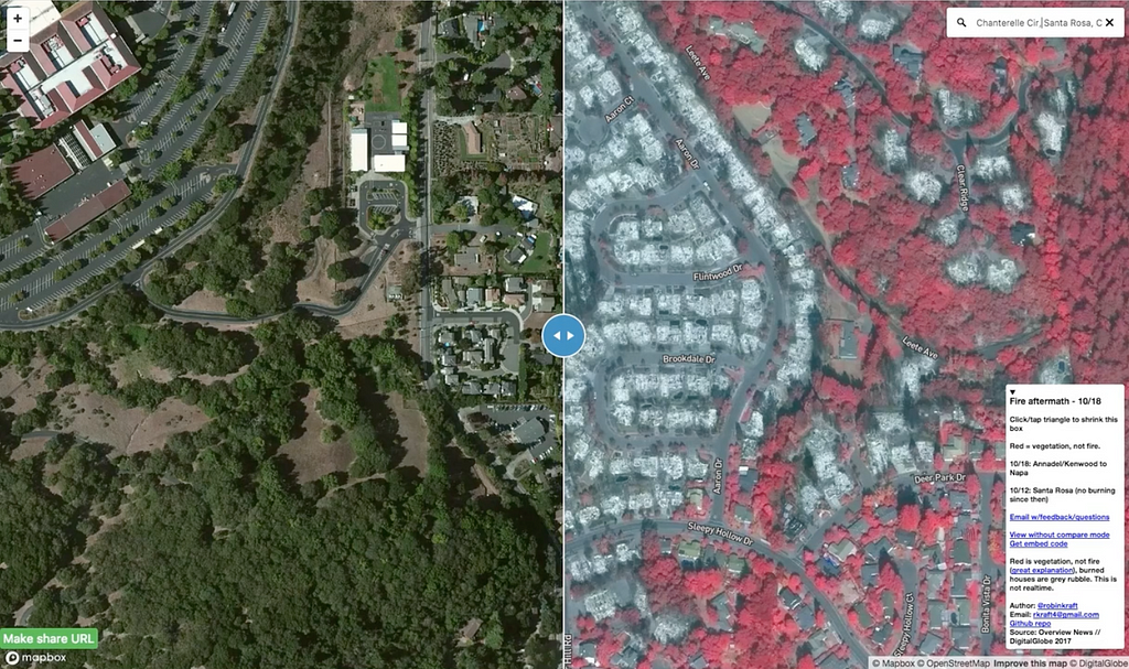
During a disaster, reliable information is unbearably rare. I learned this the hard way during the October wildfires in Northern California that threatened my hometown. As authorities, local news, and people on social media raced to share updates about where the fires were spreading, the inconsistent information they provided reflected the chaos and uncertainty on the ground. My family and friends needed a clearer picture.
🚨 There is another fire raging in Los Angeles right now — if DigitalGlobe and Planet release their data, you can use this guide to make your own map. 🚨
I spotted an opportunity to help when DigitalGlobe and Planet started releasing high-resolution satellite imagery of the region through their open data programs. The imagery covered most of the affected area and was fairly clear, but it was locked inside a few hundred gigabytes of GeoTIFF files — not much use if you escaped the fires with just your clothes and a smartphone. I set out to build something that more people could use.
I chose to build with Mapbox because I needed a platform powerful enough to process and host the imagery files, but also nimble enough to make a map that would load fast and be intuitive to use. In this post I’ll describe the simple, manual workflow that I used to publish an initial map of the fires as quickly as possible. I’ll then dive into optimizations I added to update the map and improve the user experience.
The easy way
The first time around, I downloaded a few images, stitched them together with gdal_merge.py, and uploaded the mosaic to Mapbox Studio. Once tiling was done, I added my new tileset to a new style based on Mapbox’s Satellite Streets template and clicked publish. This got me a fast, mobile-friendly map in less than an hour, from finding the imagery to texting the URL to a friend. When my friend asked why everything looked red, I overloaded the title to include a very brief explanation of false color imagery. No coding, no styling — sensible defaults for the win!
But this process wouldn’t scale. As more and more imagery became available and traffic to the map started creeping up, I realized I needed a better way to do updates.
The better way
In the end, I used largely the same tools for preprocessing: GDAL and Mapbox Studio. But I also used the Mapbox Uploads API and Amazon Web Services’ EC2 and S3 services. My code is available on Github here.
Working in Amazon’s cloud environment made a few things much better. First, DigitalGlobe and Mapbox operate on AWS already, and Planet is on Google Cloud — which has a fast pipe to AWS. Working within AWS would save me a lot of time on data transfer. Second, on my Ubuntu instance I used screen to keep processing going even if my laptop was off. I didn’t want to have to rely on a constant internet connection for a process that could potentially take an entire day to complete. You can check out this script to see how I installed my dependencies and prepped extra EBS storage.
The other major improvement was the efficient use of GDAL. This was important as data volumes exploded once I expanded the area covered by the map and new imagery became available. Naively mosaicking and projecting hundreds of high-resolution, 1-gigabyte images together using gdal_merge.py was taking too long. Also, Mapbox has a 10GB limit so I couldn’t upload the giant GeoTIFFs if I’d tried.
In the end, I relied on virtual rasters (VRTs) and TIFF compression. VRTs are great because they are text files describing processing steps; they don’t actually apply the operations until you convert the VRT to a “proper” image file, like a GeoTiff. This “lazy” processing technique simplified my workflow so that I didn’t have to manage multiple long-running processes or hundreds of files.
Step by step
My first operation was to create a single mosaic of all the files for a single day — which might be 50 files. Add the filenames to a text file, and you’re good to go!
“Mosaicking” finished in < 1 second! This isn’t a “real” mosaic yet, but GDAL treats it as one thanks to the VRT format.
Then, I wanted to save Mapbox some work and project the mosaic from its initial WGS84 CRS to Web Mercator — the standard map tile projection — per the docs. Otherwise, this would have to be done on Mapbox’s end while it created the tileset, and I was already seeing some timeout errors.
“Reprojecting” a massive “mosaic” in < 1 second? Excellent!
Finally, I had to create a real GeoTIFF I could upload to Mapbox. Only at this point do the mosaicking and reprojection actually occur. I again followed Mapbox suggestions for optimizing these images and threw in a few compression flags I learned about on StackOverflow.
The most important optimization for the purposes of processing time and file size was using internal JPEG compression. JPEG compression is lossy, in that it throws away information in the image (mostly stuff that our eyes are less likely to notice). Normally for remote sensing that’s not ideal, but given the disaster, a bit of fuzziness at zoom level 22 for faster processing seemed like a reasonable tradeoff.
This step took 15 minutes or so, instead of many hours.
Now I needed to get the GeoTiff over to Mapbox for final processing. I wrote a simple uploader script using the Mapbox Python SDK that would get the tiling process started. The SDK handles authentication and request formatting for you. You just provide the data and the tileset name, upload the file, and start the tiling. Here’s the bare minimum:
python
from mapbox import Uploader
u = Uploader()
tileset = 'username.tileset_name' # yes, you must include your username
url = u.stage(open('mosaic_final.tif')) # upload happens here
u.create(url, tileset, name=fname) # starts the tiling job
A better map experience
The standard “shareable” URL for a Mapbox map style is super convenient. But I learned three ways to optimize it and my map.
First, the default URL bypasses caching. This makes sense given that you typically use this to preview a map you’re working on. But it’s really bad if your map goes viral. If you’re satisfied using the default map, do yourself a favor and tweak the URL you share: change one of the URL parameters from “fresh=true” to “fresh=false”. Even with caching turned on, the map will update within a few minutes if you change something, and you won’t overload the servers.
Second, the default view that appears when you share a map on social media is the extent of all the data. The Mapbox Satellite Streets layer is global; the default view covers Null Island and Africa.
You can control this in Studio using the Map Position tool by clicking “unlock”, then browse to the default view you like. Lock it again and re-publish.
Third, the default map for a style is great, but there’s no address search or much else. In the case of the fire map, the content was what really mattered, and this default map got the majority of views. But I wanted a better user experience, so I needed to embed the map in my own website.
I used Github Pages, which can handle a lot of traffic to a static website. Embedding the map in a website gives you more freedom to add layers to the map and other map controls. With the help of the Mapbox team and a few tutorials, I added address search and a comparison slider so that people could compare the fresh imagery to the standard Mapbox Satellite layer, which is older. It’s shocking to see what the devastated neighborhoods looked like before and after the fire.
I’ve been working with satellite data and maps for a long time because I believe in the power of maps and geospatial data. But this disaster made me understand viscerally how powerful they can be. Using this imagery, I was fortunate to see my family home and wedding site intact.
Many others were not so fortunate. I was surprised that so much of the community found solace in this map, particularly since it put an intense loss on display for the world to see. But it turns out that it helped a lot of people move on. As one person wrote to me, “There are many homeowners in evacuated zones that have no idea whether their homes are still standing. This puts the power and knowledge back into their hands. It’s just awful waiting in suspense.”
My family, friends, and community are all grateful to Mapbox, DigitalGlobe, and Planet for their support during this disaster. Things like geocoded address searches, mobile-friendly maps, and rapid imagery updates are standard fare for those of us working in the geospatial world. But they make a huge difference for people in the midst of disaster.
There is now a fire raging in Los Angeles. Hopefully, DigitalGlobe and Planet will release their data ASAP, and then you can make the next viral fire map.
Today, we’re releasing our React Native Store Locator Kit, a plug-and-play solution that reduces the time it takes to set up and develop a beautiful store locator in your app. Use the kit to quickly create functionality like browsing several locations, interacting with each point to view additional info, and previewing the distance and route to each store. To preview a route, we’re rendering Mapbox Directions on top of our maps using React Native.
How to add Directions to your React Native app
The first thing you’ll need for adding directions to your app is mapbox-sdk-js, an open source JavaScript client to Mapbox services. Not only does mapbox-sdk-js work well when bridging our APIs with our Maps SDK for React Native, it’s perfect for building cross-platform applications for web and mobile.
To add this to your project run this in your favorite command line:
npm i --save url
npm i --save mapbox
Since React Native does not ship with the URL module that node comes with, you’ll need to add it as a polyfill, as well as include the javascript SDK. After you pull this into the project, it’s time to set your access token, which is needed to use any of our tools, APIs, and SDKs.
const mapboxClient = new MapboxClient(<access token>);
Once the access token is set, everything is ready to make requests to our Directions API. In order to do this, you must know your start coordinate and end coordinate. We like to refer to these as origin and destination.
Now that you have directions in your application, it’s time to render them onto the map. In our kit, we created a Directions React component that takes in origin, destination, access token, and callback for when directions are fetched. This component handles the whole lifecycle of fetching data to rendering it on the map.
This is our render function inside of the component:
The directions object returns with a handy geometry property as a LineString, so we’re able to directly add this object as the shape to our source. Your route line will then be rendered on your map; nothing else is required.
Get started with the React Native Store Locator Kit
Check out our Github repo for detailed instructions on building with the kit. This is the first of several plug-and-play “kits” we’re releasing for React Native so stay tuned. If you have questions or suggestions, hit us up on Twitter or Github.
As wildfires rip through Ventura, California we’re partnering with DigitalGlobe to share imagery and critical data through their Open Data Program. DigitalGlobe is publicly releasing their satellite imagery for Ventura and surrounding communities and will expand coverage based on the fire’s reach.
DG has worked with us to use this imagery to update our fire tracking map, a tool we shared during the Northern California wildfires earlier this year. The map includes address search and zoom features that allow you to check specific areas in or near the fire zones, and it includes the latest fire perimeters provided by first responders on the ground.
As we saw in the NorCal fires, this imagery can be crucial in coordinating responses as well as providing much needed information to those forced to evacuate.