Dylan Moriarty is a cartographer & designer who recently joined The Wall Street Journal as an interactive designer. He’s also worked extensively with the Humanitarian OpenStreetMap Team, & nonprofit groups like the Town Hall Project.
Town halls are a longstanding American tradition, where representatives have to listen and respond to their constituents; it’s one of the most accessible venues for expressing political views. The Town Hall Project is an open source, volunteer based initiative making it easier to locate where town halls are and how citizens can participate.
Using open data from The Town Hall Project and the Mapbox Maps API, the Mapbox Community team introduced a map last year that addressed the question that’s on a lot of American’s minds — “Where can I make my voice heard?”
That initial map was inspiration for how the Town Hall Project is currently visualizing it’s data. With help from Megan Riel-Mehan & Paolo Unger Dvorchik (of Town Hall Project) and the Community team, we’ve recently redesigned the map to solve some complex cartographic challenges.
Anyone familiar with gerrymandering knows that districts are all sorts of strange shapes. To handle these complicated boundaries and overlapping jurisdictions, we created two fills; a flush blue and a darker diagonal pattern. While we could have solved this with three color fills, the difference between Senate and House member was distinct enough to warrant a graphical change. The Senate fill was made the less visually forward of the two as it would cover the entire state.
One major difficulty involved with designing anything political is to avoid appearing partisan from color choices. We’re hard wired to accept blue= left and red=right, so you end up walking on eggshells to avoid association where there is none. In this case, while we ended up going with a light blue for branding reasons, we hoped that by avoiding the juxtaposition with any sharp reds, the association would be minimized.
Another major change we made was to classify the points themselves. Not all town halls are actually held by the representative themselves. Some teleconference in, others are held by the representative’s staff. We felt this distinction was important to be made up front, so we classified each town hall into a few categories: In-Person (blue); Call-in (green); Staff-only (pink); Activist Event (orange).
Finally, we also considered clustering the points to avoid having entire states carpeted with markers, especially during recess times. While clustering could make the map cleaner, we decided early on that seeing the exact location of the town halls from the full view was more important.
We hope this tool makes civic engagement more accessible and also holds representatives accountable to the people they represent. There are 166 representatives who haven’t held a single town hall this year.
Want to make your own map for civic engagement? Get started in Mapbox Studio, or let our Community Team know how we can help support your project.
Mapbox iOS SDK v3.7.0 will introduce full compatibility with the VoiceOver screen reader built into iOS. This ensures that those with blindness or visual impairment can interact with the map interface in a non-visual way — your application becomes useful to a whole new audience.
Users automatically benefit from this feature as soon as they enable VoiceOver, regardless of the style your application displays; you don’t write any additional code. As in previous releases of our iOS SDK, annotations remain accessible as well. Meanwhile, sighted users who leave VoiceOver disabled won’t notice any difference in behavior.
Let’s visit New Orleans to get a feel for how VoiceOver compatibility works. You’re standing in Jackson Square, and you want to know what’s around you. You open a Mapbox-powered map on your phone and it immediately locates you. As you swipe downward to zoom in closer to ground level, your phone reads aloud a summary of the available content: neighborhood names, prominent landmarks, and major roads.
Then you swipe left and right to have your phone read individual details back to you: businesses, museums, and parks are all accessible. You hear not only the names of these places but also short descriptions such as “café” and “village green”. Each road name is read aloud along with its general direction of travel.
Combining VoiceOver support with our other building blocks gives you the flexibility to craft custom, non-visual interfaces. For example, Mapbox Core Navigation powers turn-by-turn walking directions with natural-sounding spoken instructions, and MapboxGeocoder.swift makes it easy to add location search, whether it uses a text field or SiriKit voice commands for input.
Follow our iOS SDK releases page to find out as soon as the next beta release comes out. If you’re attending State of the Map US in Boulder, Colorado, this week, try out VoiceOver-enabled maps in person at our booth.
Thirty-six all-women race teams just started the started the 2,000 kilometers 8 day race across Nevada and California deserts. The first couple days have been crazy — here is a look along the route.
Heather Lewis of Team Meraki plots their next course.
We’ve mapped the checkpoints, which increase in difficulty based on color. A green checkpoint is marked on the course with a big green flag and an official from Rebelle Rally. For a blue checkpoint, there is a much smaller blue flag that in some cases may only be a Rebelle branded stake. A black checkpoint has no physical marking, and competitors must reach the target to get full points.
Mapbox is participating in HackerOne’s Hack the World event, their largest hacking competition of the year. All reports submitted to the Mapbox bug bounty program between October 18th and November 18th, 2017 are eligible for Hack the World’s prizes, and we’re offering some special awards of our own. We’re rewarding the best report, as well as two honorable mentions.
Up to $5000 bonus for top report
We are doubling the bounty for the best Hack the World report that we receive — not only based on the impact of the vulnerability, but the quality of the report itself. In the event of a tie, report quality will be the tie breaker.
$1000 bonuses to honorable mentions
This bonus is five times our minimum payout and is not restricted to any bounty amount, meaning that a minimum bounty vulnerability is still eligible for an honorable mention. Again, if there’s a tie, the quality of the report will be the deciding factor.
Penetration testing powered by bug bounty platforms like HackerOne and collaboration with security researchers working to protect our users are a fundamental part of how we secure Mapbox. Check out our retrospective on one year with HackerOne, or if you’re heading to the O’Reilly Security conference in New York this month, watch our own Alex Ulsh discuss how our team built out our bug bounty program.
What next?
Sign up on HackerOne and start hacking Mapbox Studio, our SDKs, APIs, and public website. We’re particularly interested in security reports related to our SDKs and APIs. To learn more about the competition, visit the Hack the World page.
Sonoma County and the Alameda County Sheriff’s Office just released two-centimeter drone imagery of Coffey Park and Journey’s End after last week’s Tubbs Fire. Government officials are releasing the maps with roads and other context needed by residents and those running post-disaster analysis:
The authorities are working with drone pilot Gregory Crustinger of Drone Scholars to publish this high-resolution drone imagery as residents begin returning to the areas destroyed by the fire. As we saw after Hurricanes Harvey and Irma, drones are playing a critical role in imagery collection following historic disasters.
Being able to quickly visualize massive UAV datasets and share them across coordinating agencies has been incredibly valuable for this disaster in Northern California. I firmly believe we have set a new precedent for how geospatial data will be used by first responders in emergencies moving forward. Thank you to the Mapbox team for their rapid assistance on the projects.”
— Commander Tom Madigan, Alameda County Sheriff’s Office
The devastation to the community is staggering:
Gregory captured this imagery flying a DJI drone and then processed the images with Pix4D and Hangar.
If you or your team are collecting imagery in the wake of the fires in Northern California or another disaster and need help publishing it, email our team or reach out to @mapbox on twitter and let us know how we can help.
For those wishing they could help rebuild, please consider donating to the Red Cross which is supporting all residents including the 28,000 undocumented workers that have been affected by the fires.
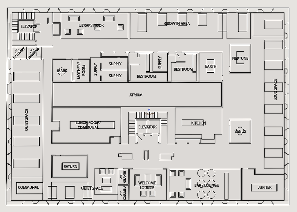
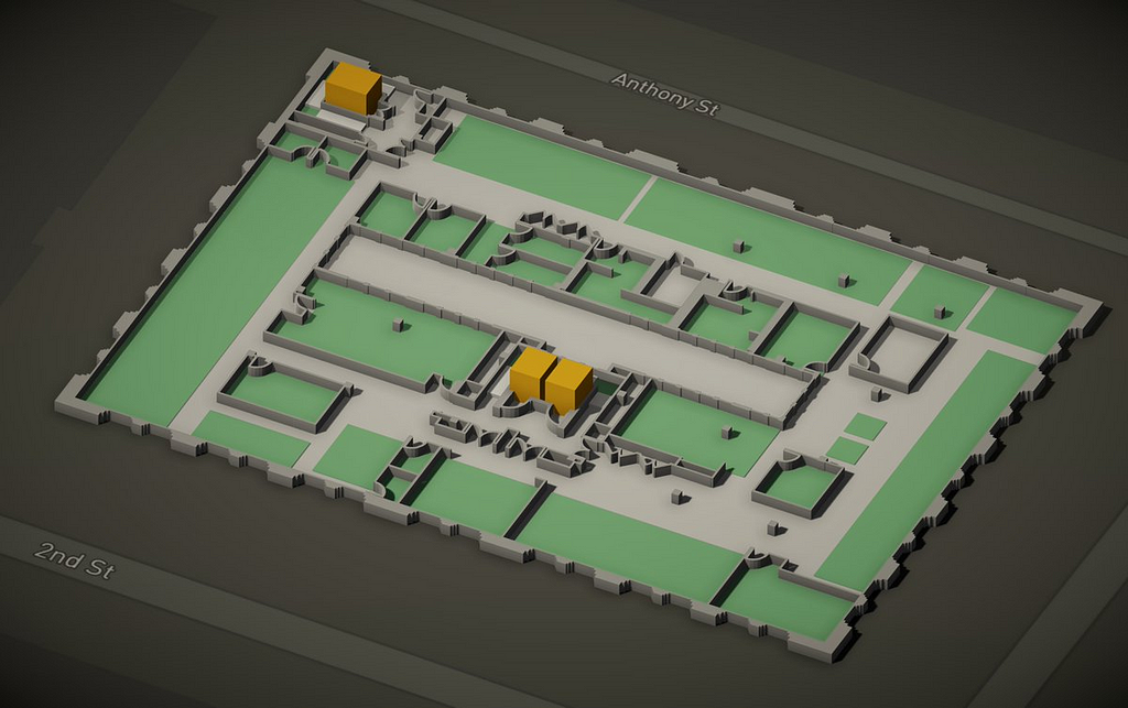
The Unity Maps SDK lets you create indoor maps. Here is the floor plan of our office in San Francisco recreated in the Mapbox Studio dataset editor. The floor plan is made using the polygon and line features we use in building and road maps so it plays well with our Unity SDK.
Using that floor plan dataset, we created a 3D visualization in Unity. Walls are rendered as polygons and doors as lines, visualized the same we way we render buildings and road segments. If you want, you can even use point features to place office furniture and decor.
This is a basic example, you can create multiple floors, interactive rooms or doors, or even build a game with seamless indoor to outdoor transition using the Unity SDK.
We’re working on creating new tools and features to make indoor maps easy to create. Stay tuned to the blog for the latest and be sure to share your demo and mention @Mapbox on Twitter or Instagram using the hashtag #BuiltWithMapbox.
Indoor mapping in Unity was originally published in Points of interest on Medium, where people are continuing the conversation by highlighting and responding to this story.
Retrieve and draw GeoJSON data for your Android applications using our GeoJSON plugin. You can fetch the data via a URL, a file stored in the app, or a file stored somewhere on the device. A huge 🙌 goes to Behrouz Khezry, an Android developer based in Iran, who contributed the plugin.
The GeoJSON plugin in action
Behrouz uses our Android SDK to render Mapbox vector tilesets in his mapping projects. He also frequently uses Mapbox Studio because it allows him to load multiple data formats as layers within a custom map style that he can then add into a mobile application. Because GeoJSON is a data format we use extensively in our SDK and API services for powerful features like data-driven styling, he saw an opportunity to improve his workflow with a plugin. All Mapbox users can access his work and contribute their own ideas — the value of having open source SDKs is the feedback we get from our community.
“One of the great things about the SDK is that it’s well-documented. When I wanted to contribute, there were step-by-step instructions to follow. To get started, I would recommend studying other Mapbox plugins published on Github. When I started the GeoJSON plugin, I studied the Traffic plugin very closely.”
Splitting specific functionality into plugins makes our Map SDK lighter and more nimble for you to use; it also lets us iterate faster. We can release plugins more often than the SDK, which requires a slower pace because of its larger codebase.
The Mapbox Android team builds plugins, but the plugins repository is also an open-source project similar to our other SDKs. Plugins’ lightweight nature makes them simpler to contribute and more efficient to review, so we can help you along the way.
Marena Brinkhurst joins the Mapbox team in San Francisco. As a member of our Community team, she supports non-profits, social ventures, and other organizations using Mapbox tools for projects having a positive social and environmental impact.
Mapping community boundaries in Turkana county, Kenya
Before joining Mapbox, Marena worked to secure customary and indigenous land rights in Africa and Asia with the non-profit Namati. She also facilitated participatory planning efforts with indigenous communities in Canada. Her work has taken her to far reaching places in Liberia, Kenya, Uganda, Mozambique, Nepal, and Myanmar, where she helped local organizations design and implement community mapping programs. She’s spent a lot of time on the ground gathering data via Land Rover, dugout canoe, and a dusty pair of trekking boots.
When not in the office or traveling the globe, Marena loves to be as close to the ocean as possible.
Rebelle Rally, the 2,000 kilometers 8 day race across Nevada and California deserts, is underway.
Drivers no longer return to basecamp — for the next few days of the competition, everyone is camping on their own in the dunes with no outside support other than fueling. So far, the teams have hit Kibby Dry Lake, a dry lake bed that was once part of the Great Basin, and Dumont Dunes, an area of the Mojave Desert containing large sand dunes ranging from 700 to 1200 ft in elevation. Along the way, drivers ran full throttle for 12 hours navigating 16 checkpoints in the Monte Cristo Mountains.
Over days 3–5, drivers gained a new appreciation for the Dumont Dunes. In last years race, the dunes reeked havoc on a few cars. This year, all vehicles came out intact, but the team standings did not.
Map styles created in Mapbox Studio can be added to the Unity Maps SDK, incorporating terrain and 3D buildings. I love the texturized feel of AJ Ashton’s pencil drawn style, and I wanted to extend the aesthetic to 3D in Unity.
I applied a texture to the building meshes to match the palette in AJ’s original style. I then used his style as terrain and building texture and applied some post process effects, to solarize the colors and add depth of field effect, as finishing touches.
You can use any Studio style like this to create either 2D or 3D environments in Unity.
Paper style maps in Unity was originally published in Points of interest on Medium, where people are continuing the conversation by highlighting and responding to this story.
San Francisco has been in the midst of a housing shortage since the early 1990’s. While there isn’t much room to expand horizontally, I was curious how much room there was to grow vertically. That led me to ask the question “Given the existing zoning rules, are SF buildings as tall as they could be?”
I couldn’t find any maps that combined the zoned height information with the as-built height information. San Francisco’s open data portal, DataSF, provides datasets for Height and Bulk Districts and Building Footprints. So for a recent internal hack day, I decided to merge this data and visualize the difference between allowed and actual building heights.
⚠️ NOTE: The Building Footprints dataset uses LIDAR-derived measurements without much manual verification. As a result the building height data is the median height of the volume and not accurate for many buildings in downtown and others with high variance in elevation (eg: AT&T park)
This map is a naive visualization of buildings that have room to add at least one floor while remaining within their zoned height restrictions. I used a height of 2.75m (9ft) to represent one floor, which isn’t applicable to all types of buildings but gives us a broad metric to apply. There are many laws and regulations beyond just zoned height that determine the final building footprint — this map shows us simply where there’s room to grow.
What immediately stood out to me is that most of the residential neighborhoods have the capacity to add an additional floor to their buildings without any change to zoning policy. Currently, city ordinance 162–16 forbids adding additional dwelling units (ADUs) through building height increases. It’s a constant struggle for cities, especially SF, to manage infill development without changing the character of the city.
Pan through the map below to see unused height allowances across SF, what stands out to you?
How I built it
Initial Prototype
I started by downloading the Bulk Height districts as a GeoJSON file and making an interactive prototype to see if there was, in fact, a difference between built height and allowed height of existing buildings.
To do this, I used a mousemove event handler along with map.queryRenderedFeatures() to compute the join whenever the user hovered over a building.
Merging datasets
The DataSF datasets are served using the Socrata Open Data API (SODA) which allows geospatial queries including polygon intersects. This allowed creating a geospatial join tool to generate the intersection of bulk height zones with building footprints and merging the relevant properties.
The merged data was written back out as a GeoJSON file with only the required properties. Using Studio, I was able to upload this file and convert it into a vector tileset which loads and renders faster than using the file directly as a GeoJSON source.
Styling the Map
I used data-driven styling with multiple fill extrusion layers to display the existing building height and the unused height allowance.
actual-height layer uses a filter to select only buildings that have a height_delta greater that one floor. This layer shows the actual height of existing buildings
allowed-height layer uses the same filter, with a stop function to create a color gradient for the additional allowed height for buildings. The fill-extrusion-base property is set to the building’s existing height, to create the 3D overlay.
Explore the building heights map for yourself. Interactive maps with open data from cities allow us to understand better our urban environments and the policies that shape them. Check out our tools for data visualization and how we’re helping global cities address their most pressing needs.
Today we’re introducing Mapbox GL expressions, available in the latest version of Mapbox GL JS (v0.41.0). Expressions build on data-driven styling, a feature that allows you to dynamically style spatial data based on its properties. Use expressions to take data-driven styling one step further with more flexible and powerful operations. Style data with multiple feature properties at once, apply conditional logic, and manipulate data with arithmetic and string operations for a more sophisticated relationship between your data and how it is styled.
Previously, a data-driven (or zoom-driven) style property was defined using a stop function — essentially a “ramp” relating a feature property or zoom value to style values. For example, here’s how you would style color circles on a green-to-red scale based on a feature’s danger property:
Stop functions enable dynamic, finely-tuned map designs that take advantage of rich vector data, but they do have some limitations:
One property at a time: Property functions, like the one above, can only reference a single feature property, so the only way to make use of multiple properties in your data using stops is to make multiple layers.
Simple input-output pairs: Stop functions are, by definition, based on a simple set of input-output pairs. This means that more complex control, for example, using arithmetic or conditional logic, isn’t possible.
Enter expressions
We built expressions to remove these limitations. Expressions enable us to specify not just a set of input-output pairs, but also many other kinds of relationships between the input and output, including arithmetic operations, string transformations, and conditional logic. Here are some examples of how they go beyond what stop functions can do.
Arithmetic
Sometimes, you need to do a little math. A classic example is when you’re visualizing quantitative data with circles. Since a circle’s visual size on the screen is really its area, the right way to scale circle-radius is with the square root of the input data. With expressions, this is quite straightforward:
Below, I’ve created a map that styles population data using this expression. Check out more examples of what’s possible with expressions in this tutorial.
In this map, the expression is saying, “make the circle radius the square root of the population feature (scaled down to 10,000s of persons).” Compare this with how we’d have to do it before using stop functions:
The designer’s intent is much less clear here. Also, the result is inaccurate because this function must be defined using a fixed number of stops; the actual circle size for a feature with, say, population: 3000000 would have to be interpolated between 10 and 31.6.
Conditional logic
A common challenge in designing and building maps is handling inconsistent data. Suppose you want to use bilingual labels for place names on your map, but your data includes some features with both a local name and an English one, some with only a local name, and others with only an English name. Specifying how your labels should work in each of these cases is straightforward with the new expressions syntax:
As in the previous example, there is a way to achieve approximately the same result without expressions, but it has real drawbacks. In this case, it would require using three separate (but repetitive) layers, and that number would only increase if we tried to accommodate more languages or more sophisticated rules.
What does this mean for developers and designers?
Data-driven styling is a powerful tool for making dynamic, highly individualized map styles, especially for building maps with large or complex datasets. With the launch of expressions, we’re amplifying this power. Check out the Mapbox GL style specification for the full list of expressions and an extensive list of all of the different style properties they let you control. We’re excited to see what you design with expressions.
Please note that existing style sheets will continue to work as before, including those that use stop-based functions. In the coming months, we’re also planning to roll out support for expressions in our Mobile SDKs and in Mapbox Studio. Mobile developers using runtime styling APIs will need to update their code to expressions in order to start using the next major SDK release, launching in the coming months. Stay tuned for more updates on using expressions for mobile.
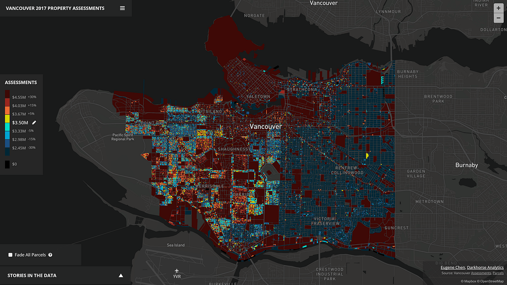
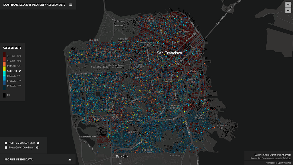
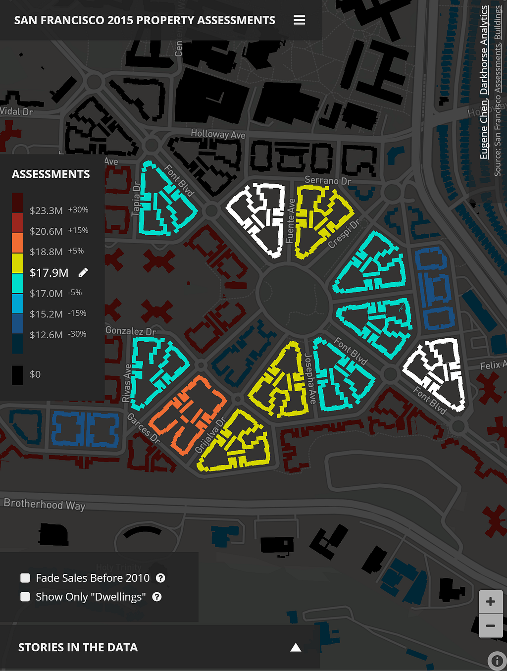
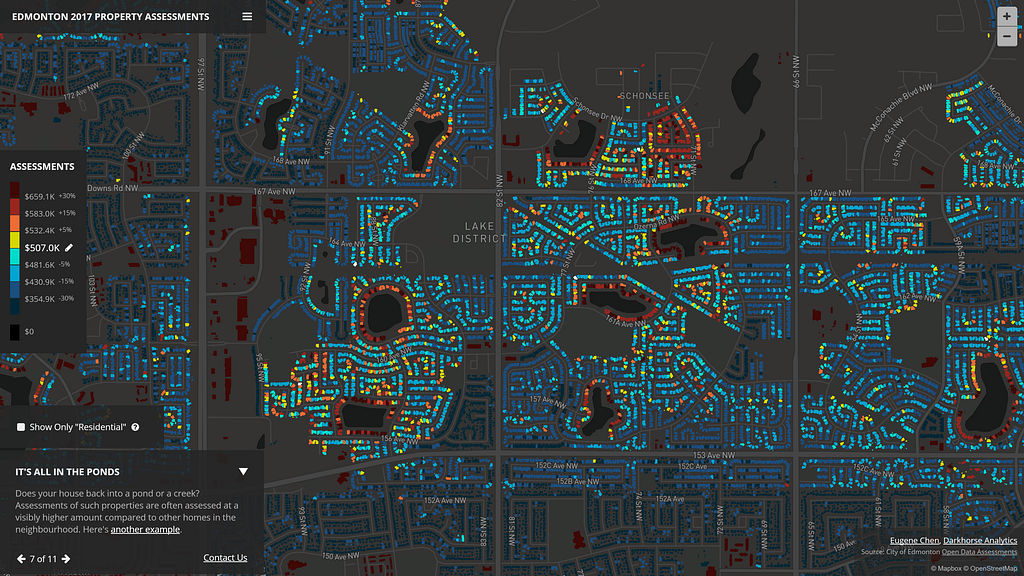
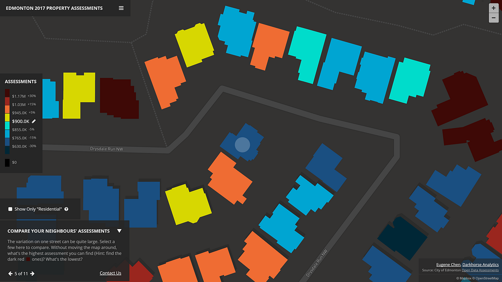
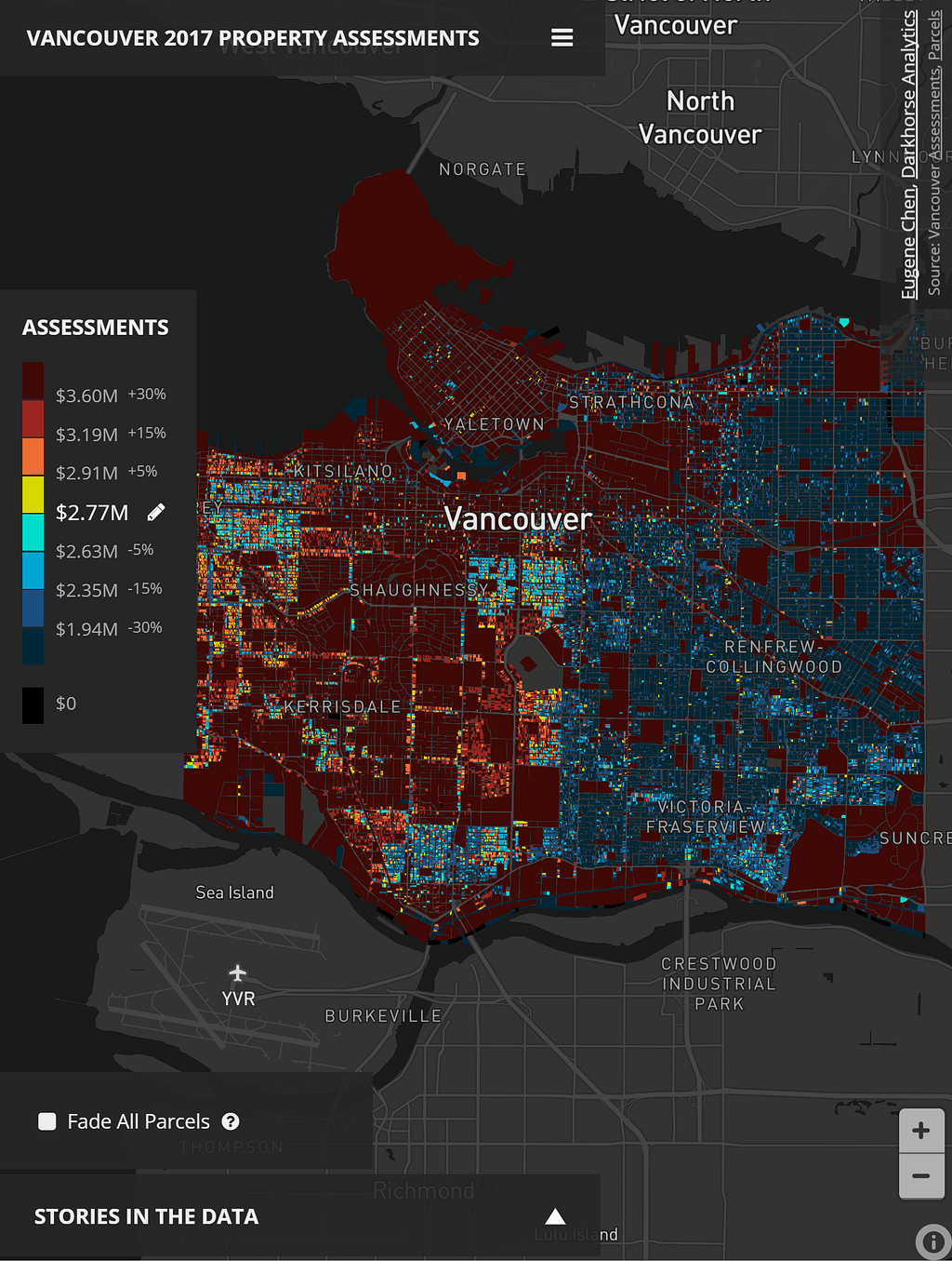
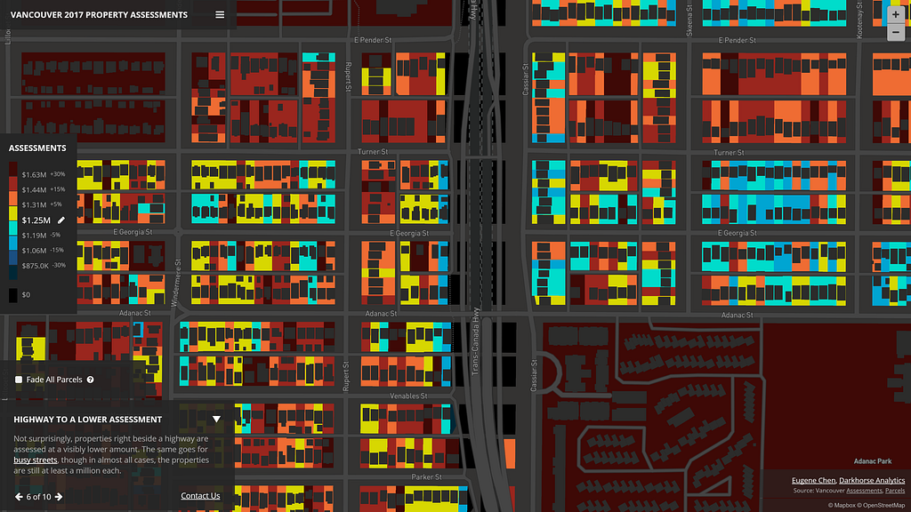
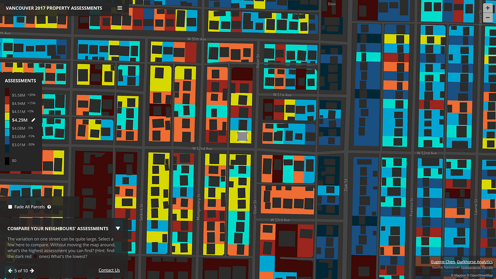
Is it possible to custom style every single building in an entire city on a map? This is the question Eugene Chen, of Darkhorse Analytics, wanted to answer while exploring better ways to visualize trends in property assessments from open data in his hometown of Edmonton, Alberta. What he envisioned would require the client-side to render hundreds of thousands of unique polygons efficiently and do so without sacrificing details of the buildings at higher zoom levels — Mapbox data visualization tools were the answer.
What Eugene built is an interactive tool for Edmonton, Vancouver, and San Francisco that you can use to contest or brag about your property assessment value. The visualization even includes a story mode, identifying all of the interesting trends discovered in the data for each city. Eugene tells us how it all came together:
Why use GL JS to build the tool? What other options did you explore?
Mapbox GL worked. I tried D3 and SVG first, which resulted in numerous crashes, loading and rendering times of over a minute. Canvas was next, and while better, it was still unacceptably slow. Then I tried other mapping libraries, which would always perform slowly unless the polygons were simplified at a lower zoom level (higher up in altitude). In those cases, the buildings didn’t look right; the simplifications resulted in either missing structures or strange zig-zag patterns for homes.
After exhausting the alternatives, I realized the only way to accomplish the visualization was with WebGL. I looked at Javascript libraries that provided an interface for drawing with WebGL, even as far as trying out PixiJS, a library with WebGL support meant for writing games. After a lot of time experimenting (and failing), I discovered the data-driven styling feature of Mapbox GL JS and gladly gave it a shot.
What was the biggest challenge getting started?
The initial data maps are created by combining a roofline shapefile with assessment data, and I had to make sure only the necessary information is available on the resulting polygon in the shapefile. Tie too much data to a polygon, and at lower zoom levels, it’s not possible to fit all of the polygons in without polygon simplification. Even after reducing the data, for all three cities, there’s still too much data to have it fit on one vector tileset because there’s a 500k limit on the data per tile.
So how did you build the vector tilesets given the limitations of working with so many polygons?
I ended up writing a script that took every nth polygon within the shapefile and split it to an nth shapefile, and then tried to get tippecanoe to build the vector tilesets for a zoom level that was appropriate for the given city. The lower the zoom level, the more data would compress into a tile, so I tried to pick one that shows the city at its boundaries, but no more.
The pattern of experimenting went like this: create GeoJSON from shapefile, get tippecanoe to build the Mapbox tiles (mbtiles) while specifying no reductions or simplifications. It would likely fail (couldn’t fit the polygons under the 500k limit), then I’d go to my script and split the original shapefile to, say 3 different shapefiles. I’d then go to the first of the shapefiles, convert to GeoJSON again, and try to get tippecanoe to build the tileset. If it didn’t work, you wouldn’t need to try the other split shapefiles. I’d continue this pattern until I got a number working (say, 7), but then move down to what was necessary (5 in the case of Edmonton).
Why go for a lower count? The user’s computer has to download fewer tiles, which are overlaid on top of one another. The goal is to have just one tileset if possible, so the user’s computer isn’t trying to download, render, and juggle all of these different layers. A lower count of overlaid tiles means better performance for a better user experience.
How else did you limit the amount of data rendered by the client?
You can also create an extra map for higher zoom levels. At lower zoom levels (say 9–12) it’s necessary to split up the data into multiple tilesets. However, at a given zoom level (say 13+) it’s possible to have all the polygons and data fit since they need to fit fewer polygons per tile. Users’ browsers will then only have to download and render one tileset when reaching the zoom level.
To further reduce the number of tilesets necessary, I limited the precision on the latlng coordinates of each polygon to 8 when converting to GeoJSON — it’s harder to compress random numbers. Additionally, I looked into the source code of tippecanoe and noticed what looked a preventative cap on file sizes that were at the edge of not being compressed enough for use as a tileset. Removing that cap and rebuilding tippecanoe allowed for more polygons within the tileset that was still acceptable for uploading and use with Mapbox.
Once the tilesets were uploaded, I used D3 to create the story-driven narrative using JSON files. The colors change on the map with data-driven styling and the animations that transition to different points are powered by Mapbox’s flyto commands.
What design considerations did you make in styling the data?
As a bit of an experiment, I chose to use a color scheme that would allow relative comparisons between a selected assessment value versus the assessments of buildings across the city. You can quickly compare if a property was higher or lower, and by how much. The buckets were made at +/- 0–5%, 5%-15%, 15%-30%, and 30%+ differences from the selected assessments, mainly to categorize a user’s mindset of “basically the same assessment”, “a little different”, “quite different”, and “wow, that’s substantially lower/higher”.
I chose relative percentage differences because they work better than straight assessment values. For example, a $4M homeowner might think his/her home is not that different from a neighbor’s at $4.2M, but the $200k difference is substantial for a homeowner of a property assessed at $400k.
You used open data from each city for this project. From the perspective of a data scientist, why is open data important?
Open data facilitates innovation. I couldn’t have created this visualization without that kind of access to data. I’m lucky to be living in Canada’s most open city, and it’s impressive to see what others have done with the continued rolling out of datasets and support from the city.
It’s also worth adding that open data creates value for citizens because it makes the local information accessible beyond the locality. I started out with Edmonton’s property assessments and building outlines, then incorporated both San Francisco’s and Vancouver’s data because they were open and available; that benefits the people who live there.
Sunday night around Central Park, camera angle looking slightly south-west By: Baran Kahyaoglu
You can stream traffic into maps in Unity using our Maps SDK for Unity. Traffic data works just like adding other maps, and you can query the maps for a particular location to get road congestion values. With each query, you’ll get the live traffic data. Then it’s all up to you to visualize it in any way you want.
In the demo below, you can see Central Park traffic, with UV animations and colors corresponding to the congestion values:
Wasted too much time to make this loop well. Anyway, working on some beauty shots again... #gamedev #indiedev #madewithunity #uniteaustin https://t.co/iPjmj1xQG9
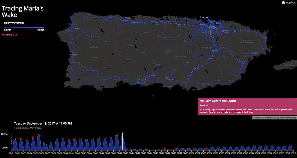
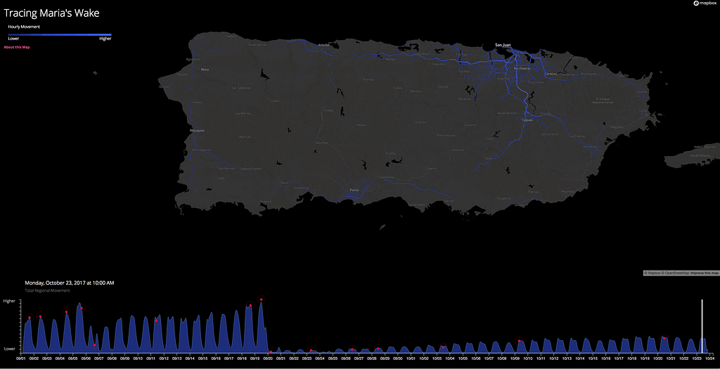
It has been over a month since Hurricane Maria made landfall on the island of Puerto Rico, destroying critical infrastructure and leaving millions of Americans without power, roads, or clean water. Anonymized data from our traffic sensor network gives a unique insight into the humanitarian crisis by revealing patterns in the mobility and connectivity of the island’s residents. These patterns allow us to understand how a city moves in everyday life, and in the wake of a disaster, it can also show us where it is hurt most.
Prior to the hurricane, regional movement patterns reveal the pulse of the city — how it ebbs and flows through the day as people commute to work, travel home for dinner, or relax on the weekend. After Maria, lack of electricity, communication networks, and driveable roads make recovery slow; even three weeks after the storm, regional mobility is primarily limited to the capital city of San Juan and is only at a fraction of pre-storm levels. Take a look at the movement in the video below or explore it for yourself in our full-screen map.
The day before the storm you can see a large volume of movement throughout the island as people prepare to seek shelter in their homes, schools, or public buildings:
Movement across Puerto Rico the day before the storm made landfall.
On September 20th, Hurricane Maria made landfall at 6:15 am. Movement across the island was minimal as some parts of the territory received over 30 inches of rain in a single day:
Movement in Puerto Rico is almost non-existent just hours after the hurricane.
35 days have passed since Maria made landfall. And yet, the region has only returned to 27% mobility, with most movement in the city of San Juan. To put this in perspective, after the previous hurricane, we saw a return to normal activity in about two days.
Movement in Puerto Rico as of Monday, October 23.
The data leaves open as many questions as it answers. We’re not sure if areas are coming online at different rates to due to electricity, connectivity, damage to road infrastructure, or all of the above. What we can see clearly is that recovery has been slow and the road to life as it was will be long.
The fastest route isn’t always what bikers need. Criteria like curviness, road quality, scenery, and elevation gain, can be more important than time and distance. NaviRider is a mobile navigation app tailored specifically to motorcycle riders.
With NaviRider everything is combined in one app — route search, POI search, social interactions, and turn-by-turn directions. Bikers can discover and evaluate new routes, track and share their own directions, follow the live GPS positions of friends, and seamlessly transition between the app’s content and the navigation interface.
The app is built using our Maps for Mobile SDKs, and NaviRider has customized the navigation experience using our Maps for Navigation SDK. A simple, intuitive display shows riders where they’re headed, allowing them to pause the route and toggle route-recording. For many bikers, safety is a significant concern, so the app provides custom alerts like upcoming sharp turns and road hazards. With our Navigation SDK you can customize every aspect of the interface, map data, and routing experience.
For addresses and place search, NaviRider is using our Geocoding API. If you’re cruising Highway 1 in Big Sur, CA and your gas light comes on, you can search for the closest station and either navigate straight to it or add it to the route.
Our Directions APIs enable NaviRider users to incorporate multiple waypoints into their routes. These APIs are accessible through our Navigation SDK and can handle complex routing calculations including multiple stops, pick-up/drop off locations, and live-traffic informed ETAs. For NaviRider, the ability to take advantage of these features provides more control over the experience — bikers can find a route they like, search POIs, create a custom itinerary, and hit the road without leaving the app.
NaviRider used Mapbox Studio, our visual design suite, to customize the map’s data and style for an adventure feel. The map emphasizes points of interests, terrain, contour lines, and road features, carefully displaying the information at each zoom level. The camera angle and user interactions are fine-tuned for searching and navigating on the go. You can switch between the base style of your choice — satellite, terrain, outdoor — to customize the map even further.
We recently helped the NaviRider team through a challenging design issue, and Vojta Knezu, CEO, had some nice things to say about it:
The customer support at Mapbox is great. Every question has been answered, and we’ve even been helped with hard technical issues. One of the biggest challenges for us was evaluating every single road in the US and Europe and how windy it was. It was a huge computational task. Mapbox helped us through it so we could visualize all of the rated routes in Mapbox Studio. This also required a lot of data space which was generously provided by Mapbox.
The design principle of density involves the finessing of both timing and intention in your map style. While map features may become available at a certain zoom level, features should not be styled based on availability. A well-designed map should reveal pertinent information at the correct time when the user can best comprehend it. In the video below you can see this idea in practice.
Achieving this balance depends on the amount of information shown (density) followed by the spatial distribution of information. While spatial distribution is typically defined by the map features themselves, you can ease the density by categorizing close-proximity objects with varying style or color. Be mindful to apply the principle or hierarchy to ensure that the user can discern the most important features first.
Interested in more tips like this? Take a look at our Guide to Map Design for our favorite tips and tricks for designing your best map. Tweet me @amyleew with #mapdesign if you have any other concepts you’d like me to explore!
At Mapbox we ❤️ working with data in streams, lakes, and other geographic features. We are a mapping company after all.
We’re building the future of data infrastructure, and we use our data lake to find real lakes, applying deep learning in spark sql via user defined functions:
select image, geocode(latlng) from mapbox.satellite where imagery_prediction(image) contains ‘lake’
Want to build data infrastructure for the whole world? Join us.
Ouliana Trofimenko just joined our team as Head of Talent Acquisition supporting technical teams. Previously, she was the Head of Talent Acquisition at Quid, leading the company through multiple stages of growth. She has spent the majority of her career supporting CTOs and VPs of Engineering at early stage start-ups to build out their core engineering teams. Ouliana will work closely with our CTO, leadership, and technical teams to build a world-class engineering organization.
Ouliana’s leadership and hands-on experience will allow us to build a recruiting function at scale to make sure we build the most robust and talented technical teams.
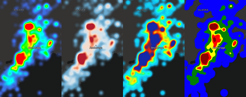
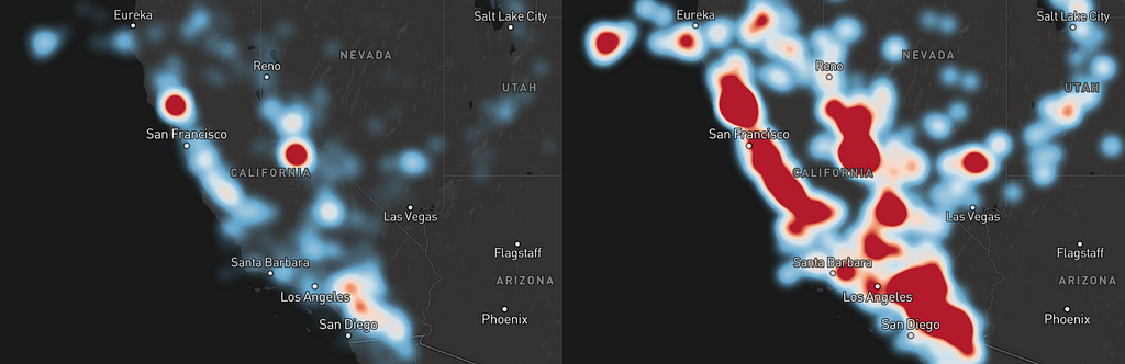
Circle (left) and heatmap (right) layers representing earthquakes in California
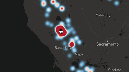
With the 0.41 release of Mapbox GL JS (and mobile SDKs to follow), we’re introducing heatmaps — a beautiful way to visualize and explore massive point datasets.
A heatmap is a data visualization where a range of colors represent the density of points in a particular area. Heatmaps help us see the “shape” of the data and highlight areas of concentration where many points are clustered closely together. The dynamic heatmap layer in Mapbox GL JS renders smoothly at 60 fps while panning and zooming. It’s fast and can handle large amounts of data (especially when combined with clustering). Let’s see what an interactive heatmap of 400,000 points looks like:
Getting started with heatmaps
If you want to get started with heatmaps right away, dive into our official example or take a look at a detailed tutorial. Want to know more? Read on for an overview.
You can start by adding a layer with type “heatmap” to your style:
Heatmaps can require a lot of customization based on your use-case. Thankfully, Mapbox GL JS provides a set of powerful paint style properties for controlling every aspect of the layer’s appearance in real time.
heatmap-radius
This property affects how detailed the heatmap will be by setting the “radius of influence” of each point in pixels (an equivalent of the bandwidth parameter in kernel density estimation). Higher values make for a smoother, more generalized look. The property can also be a zoom function, allowing you to adjust the look as you zoom in.
This style property controls the most important aspect of heatmap design — how the “density” value of each pixel on a map translates to color:
Examples of different heatmap-color values
The value of the property is a function which maps density values ranging from 0.0 to 1.0 to colors. This example will make the most sparse areas blue while gradually transitioning through yellow to red at the most crowded spots.
This property allows you to adjust the intensity of the heatmap appearance globally. The higher the value, the more “weight” each point will contribute to the look. The relation is linear — e.g., setting heatmap-intensity to 10.0 is equivalent to duplicating the dataset ten times and rendering it with the default 1.0 value.
heatmap-intensity is very useful for adjusting the look of the heatmap to different zoom levels — if you leave it constant, the heatmap on lower zooms will look much heavier because points will be visually closer together.
heatmap-weight
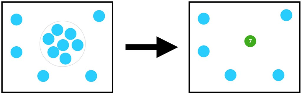
This style property works the same as heatmap-intensity, except that it can be data-driven, adjusting intensity of individual points depending on their feature properties:
In this example, a point with point_count value of 100 will look the same as 100 points with point_count of 1. Combined with clustering, this improves heatmap performance by drastically reducing the number of points to draw.
heatmap-opacity
This property controls the global opacity of the heatmap layer.
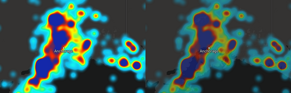
Heatmap with heatmap-opacity of 1.0 (left) and 0.5 (right)
One useful application of heatmap-opacity is fading out the heatmap for a more detailed look when zooming in:
How heatmaps work under the hood
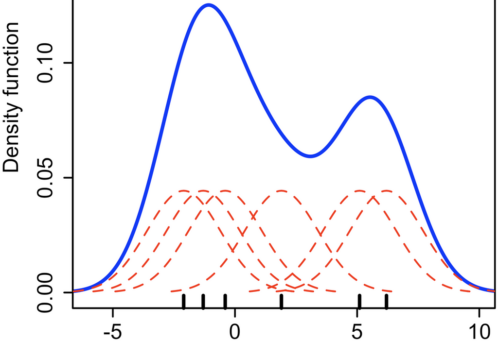
In mathematical terms, Mapbox GL heatmaps are a bivariate (2D) kernel density estimation with a Gaussian kernel. It means that each data point has an area of “influence” around it (called a kernel) where the numerical value of influence (which we call density) decreases as you go further from the point. If we sum density values of all points in every pixel of the screen, we get a combined density value which we then map to a heatmap color.
Individual kernels (dashed red lines) and the combined kernel density estimation (blue line). Source: Wikipedia
To implement this with OpenGL, for each data point, we draw the kernel (which looks like a blurred circle) into an offscreen half-float texture with additive blending (so that values are summed together when kernels overlap), and then we colorize this greyscale texture in a separate step.
Additive blending of two Gaussian kernels.
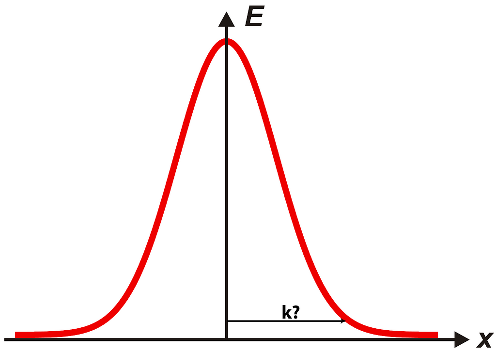
Ideally, we need to calculate density for every screen pixel separately for each data point because this value never becomes fully zero, even when far away from the corresponding point. But that would be too expensive — even a modest amount of points to draw would require billions of operations. To speed things up, we crop each kernel to a square that’s just big enough for all values outside to be very small (under a certain threshold — we arbitrarily picked 1 / 255 / 16). This size will depend on weight and intensity of each point; heavier points will need a bigger drawing area.
Additionally, for drawing the densities, we use a downscaled texture with 4 times smaller sides than the map resolution (resulting in 16 times fewer pixels to draw for each point), and then upscale the texture back with linear interpolation during the colorization step. For heatmaps, this is visually almost indistinguishable from full resolution rendering, but it makes it considerably faster.
A different approach to heatmaps
Other platforms render heatmaps as static image tiles on the server. Our approach to heatmaps takes advantage of Mapbox GL at its core, rendering smooth transitions at 60fps and providing the ability to control every aspect of heatmap layers at scale — from picking the right color ramp to adjusting the point radius at each zoom level. Combine heatmaps with other GL JS capabilities like data-driven styling, expressions, and clustering for more unique configurations of your data.
Thank you for reading! Check out this example and tutorial for heatmaps in GL JS, and stay tuned for the launch of this feature in our mobile SDKs later this year. Reach out on Twitter (@mourner) or respond here in Medium if you have questions or comments. Let us know what you make with the tag #BuiltWithMapbox.