Incorporating navigation into mobile platforms has historically been a tradeoff between kicking users out to a third party app or building natively from scratch. The updates to our Navigation SDK on mobile add a third option — easily build in-app navigation and customize as needed. To get started fast, we’ve added features like a drop-in user interface (UI), automatic day-to-night map switching, and automatic rerouting in traffic. For more customization, we’ve included special event milestones.
We also have a new tutorial on how to build a navigation app for iOS (Android coming next week).
On iOS, automatic day-to-night map switching between our recently updated navigation map styles improves map readability for drivers as light conditions change. Auto-rerouting looks for faster routes based on current traffic conditions and updates the directions without user input.
For Android, the drop-in UI includes a ready-to-use interface to handle text formatting, drawing of traffic-informed route lines, and high quality voice instructions from Amazon Polly. You can implement the UI with a few lines of code:
To improve customization, the framework for milestones on Android permits individualized alerts along a route line, which can accommodate use cases like a trucking navigation app that alerts truckers far in advance of a turn so they can safely change lanes. Alerts can be triggered at specified times and positions and provide additional relevant information to users, such as warnings or proximity notifications.
Get started with our new tutorial on how to build a navigation app in iOS (Android coming next week) or say hello to Mapbox sales to learn more about building with our stack.
Using the React Native framework, developers can build cross-platform mobile applications in half the time. Our React Native library will make it as efficient as possible to access our APIs and open source libraries, so you can focus on shipping features.
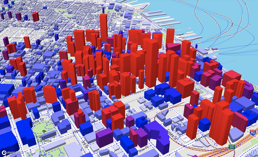
Reusable components are the strongest aspect of React, which is why we’ve created expressive and easy to use components for powerful features like runtime styling and data driven styling. With this in mind, you can render a custom styled map centered on San Francisco in just 25 lines of code.
First look runtime styling in React Native
Runtime styling is the first major feature with added support in this alpha release. Here is a preview of a couple examples you can find in our sample application.
3D buildings
Marker clustering
What’s next
We plan on bringing our React Native SDK to feature parity with our Android/iOS SDKs and want to be active in the community:
We have a Gitter channel where you can post any questions regarding the SDK.
If you would like to contribute to the SDK, please head over to our Github repository.
You can find the alpha here, stay tuned for more React Native updates and our upcoming beta release.
MySidewalk is changing how local governments use data, track progress, and share results. Analysts leverage mySidewalk’s geoanalytics engine to visualize data at any level of geography and chart progress with custom dashboards. Customer Experience Manager Jennifer Frunk, CTO Matt Barr, and Marketing Manager Lauren Nguyen, of mySidewalk, told us how the tools they’ve built on our stack are saving cities time and improving life for local communities.
What was the inspiration for mySidewalk dashboards?
There is no shortage of data in any city. What’s missing is an easy way to identify areas of focus, turn insight into action, and ultimately share performance results. We developed mySidewalk dashboards to make data more accessible, pinpoint places of need and progress, and help prioritize projects so analysts can track improvement (or lack of it) not only citywide, but in every pocket of the community.
You’ve changed map providers several times. How have your needs changed, and why make the switch to Mapbox GL JS?
It was clear that the experience for our developers and end users would be best with GL JS because of the functionality, performance, visual appeal, and ongoing support of the open source community.
With Mapbox, we have improved client-side rendering, substantially fewer connections and lower bandwidth between web clients and our own servers, and incredible new dynamic cartographic options. And our end users get enhanced navigation and control over the viewport of the map. Changing the angle and pitch or supporting non-integral zooms might seem like vanity features, but they’re actually huge when trying to publish an engaging narrative using geo data.
How do your maps help cities understand the data they have? Do you have stories you can share?
We believe it’s impossible to try and understand any indicator of progress without applying a geospatial lens.
We make it possible for cities to auto-generate maps and charts that show sentiment analysis, operational indicators, census data, and more. We also make it possible to display by any boundary: police districts, political districts, neighborhoods, planning areas, census geographies, and even hand-drawn or uploaded shapes.
We recently worked with the City of Kansas City, Missouri to build a dashboard that breaks down citizen satisfaction of neighborhood sidewalks by ZIP code, council district, and neighborhood. In the past, the City was only able to look at significant year-over-year change at the citywide level, now they can monitor at any level of geography with statistical significance and publish reports providing access and transparency for citizens themselves.
Julie Steenson, Deputy Performance Officer at the City of Kansas City, MO describes the benefit this way: “The amount of effort it takes to analyze existing data means that we are limited in our ability to deliver insights to the organization and community… mySidewalk will help us get more data-driven insights to more people, and save time and resources in the process.”
For example, the map below shows that residents in zip code 64127 are much less satisfied with their sidewalks than residents in other zip codes. There are a number of possible explanations, but this information can be used almost like a “wayfinding” tool, pointing cities in the right direction for asking questions, spurring discussion, and conducting further analyses.
What’s on the horizon? How do you plan to improve the dashboard?
We’re really just getting warmed up. In the immediate future, we want to enable visualizations based on data attributes tied to geometries besides polygons — street segments color coded by traffic/accidents; points sized or colored based on tax abatements; and heat maps.
Performance and scalability are always high on the list, and we’ll be looking at ways to keep the experience smooth on low bandwidth and smaller screen devices. We also want to make it easy for users to include parts of their analyses and reports in other content — exports and embedding are going to be important features for us.
Lauri Rustanius is a professional skater turned AR game designer out of Helsinki, Finland. Lauri tells us how he’s using real world data to drive AR game content. He’ll be sharing several posts on our publication about his upcoming projects, so stay tuned.
At GeneRealAR we’re using the Mapbox Unity SDK to push the boundaries of AR gameplay and mixed reality environments. Here’s a virtual portal we placed in the middle of one of Helsinki’s popular squares:
I thought that mixing first person elements with ARKit would be cool and even cooler would be a transition from AR to VR. This type of content is exciting because it adds a new layer of experience to the real world, but I felt like there’s more that could be done. I wanted to be able to walk next to objects that spawn in front of me instead of having to manually place them.
This is where the location data comes in. If you wanted to place portals in multiple cities across the globe, where would you put them? Using Mapbox you get access to a lot of data that you can use to place objects anywhere you can think of based on their real-world location. The Mapbox ARKit build by David Rhodes is amazing and saves the hassle of developing your own global tracking with ARKit so you can just start creating.
For example, using POI’s and park info from Mapbox data, we can populate a park with characters, flowers, buildings— you name it. The most amazing experience is when you walk up to an AR object that just seems like it was meant to be there. It creates a sense of concreteness, anchoring you in the real world.
In the park in Helsenki, I placed treasure chests guarded by sword yielding skeletons.
Using a global map dataset, you can generate any kind of content procedurally that covers the entire world. We used park data to get paths within a park and then utilizing Nav Mesh Agents we actually have the skeletons walk across the walkways within parks. How crazy is that?
Also with relatively easy scripting, you can setup some game logic so that the skeletons attack the player. I don’t think they like you looting their graveyard!
It's actually more fun to slay skeletons in the evening 🤙 #ARKit #Mapbox https://t.co/JdQsnfKMAF
At this point we are only scratching the surface of what’s possible. Machine learning, image detection, and natural language processing (NLP) combined with AR capable devices and accurate GPS are what’s shaping the future of mixed reality. We are slowly moving away from screens to location based experiences tied to real life objects.
Keep watching this blog. I’ll be following up with a deep dive on how to set up this project and how to utilize geospatial data to create believable AR games. To get started, explore the Mapbox ARKit library for Unity or begin with this basic mesh generation tutorial.
Truckers log over 64 billion miles a year carrying absolutely nothing as they search for their next delivery. To solve this, Transfix is changing the way companies view their supply chain, eliminating time and energy wasted by more efficiently connecting shippers with truckers. What used to take four hours of emails, faxes, and tedious back-and-forth to schedule a pick-up and drop-off, now takes fifteen minutes using the Transfix app.
Maps embedded in the Transfix analytics dashboard show customers where their shipments are along the route. The platform also relies heavily on accurate ETAs to keep customers up to date on the status of deliveries. Recently, Transfix switched to Mapbox to power its dashboard maps and offer more reliable ETAs after limitations with its previous provider were making it difficult for customers to track their shipments.
By early 2017, over 25,000 truckers were using the platform, as well as many of the largest retailers, CPG brands, and manufacturers. The rise in ETA and maps API requests caused an increase in delayed responses and outages. Jonathan Salama, Transfix CTO, explained:
“Our clients really need reliability. That’s why other web-mapping services were a problem for us. In order to serve our customers properly we need to have the highest SLA possible. That includes our maps and our ability to calculate ETAs.”
You can see below how Transfix has integrated our maps into their customer dashboards to display in-transit shipment locations. In the Notifications panel, they’ve connected our Directions API, which provides accurate ETAs that update with real-time traffic — customers can see exactly when a shipment will be picked-up, delivered, or is 1 hour late.
According to Jonathan, uptime for Tranfix’s maps dashboard has improved and the ETAs for shipments are more reliable. He told us:
“We felt comfortable switching to Mapbox because of the ease of use of the API; it’s well-documented, and the implementation was easy for us. It took us all of about 10 minutes to get up and running. The maps are also a new level of prettiness from what we had before.”
The latest Mapbox Unity SDK 1.2 now ships with a visual Map Editor — a graphical user interface for designing location based game components. Designing the Map Editor, we set out to make customizing map content intuitive and agile. The user interface is node based: Use boxes representing map functionality and connect them to extrude buildings, import raster maps, or spawn gameplay in locations like parks and more.
Node based visual map editing with the new Map Editor.Create any map based experience — like this dark reimagining of Manhattan.
You’ll find the Map Editor in the Mapbox menu after installing the latest Mapbox Unity SDK in your project. We built the Map Editor on top of the Map Factory framework, so you still have access to the underlying functionality on a code level.
Show us what you built. Share your demo and mention @Mapbox on Twitter or Instagram and use the hashtag #BuiltWithMapbox. If you’re at Unite Austin, drop by booth 608 to talk with us about maps and AR in Unity.
More than 30,000 people in the US die each year in traffic related incidents; it’s a public health crisis. Vision Zero is a multi-national road safety initiative working with cities across the world to eliminate all traffic fatalities. The challenge for cities has been where to focus education, enforcement, and road engineering to make roads safer. In other words, where do you start?
We’ve partnered with our hometown of Washington D.C. to help the city reach its Vision Zero goal of zero traffic fatalities by the year 2024. Using open data on traffic incidents from the District Department of Transportation (DDOT) combined with anonymous sensor data, we’ve identified the highest risk areas to focus interventions — the results surprised us. We’re sharing the full story of this project today at Smart Cities Week.
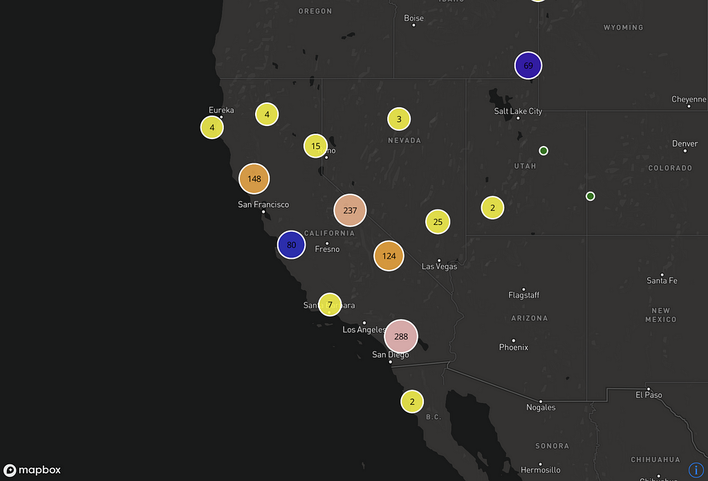
In collaboration with DC, we began by examining the distribution of crashes in 3D, aggregated to census tracts and census blocks. At the block level, you can see that Union Station stands out as one particular hot spot of crash incidents.
To identify high risk areas for crashes in DC, we built a collision frequency model that compares several open datasets and sensor data. Open data on traffic safety has the potential to make our cities smarter and safer, but it must be paired with sufficient traffic volume counts for proper analysis — either from manual counting, automated methods, or sensor data.
We looked at the number of incidents normalized by the volume of vehicles and pedestrians and analyzed how incidents correlate to the density of businesses, schools, intersections, employment, census data, and driving speeds.
Distribution of high risk intersections across DC. Explore this model here.
What we learned
Our initial hypothesis was confirmed — the more vehicles and pedestrians in a given area the higher the risk of injury. Lively urban streets with shops and restaurants attract more people and traffic, and as it seems, more accidents. Also as we expected, the more intersections on a stretch of road, the higher the number of crashes. However, the analysis did not find roads with higher observed speeds to have more crashes than those with slower moving traffic; roads with higher speed limits are more isolated and rarely lined with shops, restaurants, and pedestrians. Please note, we did not look at the severity of crashes in relation to speed limit, which has been confirmed before.
The output of the model uses all available data to identify high-risk areas for DDOT to better focus its Vision Zero efforts. The city can now take a more comprehensive, data-driven approach to re-engineer street design solutions, better support alternative modes of transport, reduce private vehicle usage, and revamp enforcement in the corridors that need it most.
Join us
We’re planning to test this collision model with more cities before we open source the code for all Vision Zero initiatives to benefit from this effort. Find me at Smart Cities Week, or connect with us through Mapbox Cities to learn more.
I’m particularly excited to show off the work being done by DC Metro based Leverege, whose IoT product suite adapts to the needs of the end user across hardware and interface.
Leverege offers next-generation productivity solutions directly to municipal decision makers with the same underlying technology that’s taken off in the on-demand logistics space. An example I love is this hyper-accurate waste management solution that incorporates realtime tracking for dispatchers to see where their fleet is working and optimized routing based on sensor data inputs like which trash bins are full and where foot traffic is picking up:
The heatmaps show where foot traffic is picking up, to easily identify hotspots where trash bins need to be emptied. The animated blue markers show the realtime location of the fleet of trucks.
One of my fondest memories growing up was gardening with my mother. I learned from a very young age that the best meals come from the freshest ingredients, and there is nothing better than growing food yourself. So when Dan McCollister and Roberto Reiner reached out to us about their new produce sharing app, Cropswap, I couldn’t wait to find out more. Cropswap’s mission is to make neighborhood markets an alternative to supermarkets by bringing wholesome buyers and local gardeners together to buy, sell, or swap produce.
The Cropswapp app is built using our iOS SDK and features a map with custom user interactions and a unique look and feel to match the friendly neighborhood vibe of the brand. Custom markers with profile pictures make searching your local area feel more personal. You can filter by distance and click on each marker to open a grower’s profile, which show’s what’s available from their garden.
The Cropswap story begins with Dan who was in an Indie band for 9 years. He was outside one night picking kale from his garden and realized that he had way too much and no clue what to do with it. The idea hit him — what if there was a whole supermarket’s worth of food just in his neighborhood? That idea kept him up at night.
That’s where Rob came in. Rob is a talented developer with a few successful apps under his belt. After using Mapbox tools to build Cropswap and several of his other projects, he had some really nice things to say about us:
“Mapbox is the easiest way to get to market without wasting time manipulating maps. They have an excellent library of tutorials and answered questions to get anyone needing visual localization live as quickly as possible. Emails are responded within hours and you have the support of the awesome people at Mapbox! Would stand by the entire company hands down and proudly have their logo on our app!”
Having bootstrapped with rent money and grassroots fundraising, which included a reading marathon where Dan read classic novels on the internet for 24 straight hours, the two are ecstatic about the official launch of their app. To kick things off they’ve headed out on a cross country tour to promote cropswapping and to show off interesting gardens and gardeners along the way. They’re posting updates here.
Have a cool idea for an application that needs a custom map? Contact us and let us know what you’re building.
Since our first release with Qt 5.9, we’ve added a number of new features for Qt 5.9.2 and Qt 5.10:
3D buildings: Create a more detailed experience with extruded 3D buildings, making it easier to orient with your surroundings and pinpoint your exact location.
Data driven styles: Style features on the map based on properties in the data, providing more flexibility with map customization. For example, style roads using different shades depending on real time traffic congestion data or extrude buildings for charging stations based on how busy they are.
Smooth transitions between styles: Switch seamlessly between day and night styles or other custom map styles for a more fluid user experience.
New styles optimized for navigation: Quickly add our new map styles optimized for navigation. They feature carefully curated and styled data, labels that always face the camera, and color pallets tailored to the cockpit.
Performance optimizations and bug fixes: We’re doing our homework 💪
Here’s a sneak peek, showing smooth transitions between our navigation map styles, as well as 3D building extrusions in action:
Join us October 12 at 13:55 hours in room B07 at QT World Summit to learn more. Interested in building with our tools? Reach out to sales.
The Mapbox Studio Preview app is now available for Android, complementing our iOS app released earlier this year. Preview any map style built in Mapbox Studio on an Android device. The app also ships with a debug feature, so you can see the exact lat, long, zoom, bearing, and tilt of the map. This makes it easier to fine-tune the map position as you build out your project.
Download the Android app from the Google Play Store and the iOS app from the App Store. Try them out with our out-of-the-box map styles like Streets, Outdoors, Navigation, and Satellite, or login to your account and preview all of your custom Studio designs. With these releases we wanted to make it easier for developers to prototype across platforms, so let us know what you build on Twitter with the tag #BuiltWithMapbox.
Mapbox’s work on humanitarian and development projects pre-dates our founding as a company and spans the entirety of our work. Working with partners like the United Nations, World Bank, and Doctors without Borders, our team mapped clinics in Nigeria, floods in Pakistan, and deforestation in Congo. Where we were working the maps were blank. The demands of working in these environments made it clear we needed better tools to do our job.
This history and mission is the reason so many of us joined the team. To deepen our work with partners taking on the toughest global challenges, we’ve formalized our Community team and charged it with finding new and increasingly meaningful ways of leveraging our platform — from helping cities be open and inclusive; to safeguarding human rights and the environment; to strengthening and growing open data communities.
It’s core to who we take investment from as well. For example, one of our key investors, DBL Partners, is one of the best known impact investors in the venture capital sector. “There is no trade-off, no compromise between building a successful company and being a purpose-driven company set out to change the world,” Mapbox board member Ira Ehrenpreis of DBL Partners said in response to our team’s recent work.
Working in Afghanistan and Haiti, 2009
In the summer of 2009, I met the team that would become Mapbox on a spartan national guard base in central California. At Camp Roberts, we worked around the clock in trailers next to an army landing strip. We met to rapidly prototype a system for monitoring the Afghanistan election and test novel approaches for creating and sharing data for disaster response. Using just released open imagery of Afghanistan and imagery taken by UAV, which literally took days to process back then, we patched together tools for data collection (with paper and SMS) and visualization. Open data, open standards, and open source software powered our work.
The work ultimately changed how we respond to disasters by setting up processes to share fresh satellite imagery following an event and organize volunteer mapping to assist on the ground relief efforts.
Mapping aid projects in Haiti to help coordinate earthquake response efforts in 2009.
Just four months later, a 7.0 magnitude earthquake struck Haiti. In a matter of hours we were mapping infrastructure from satellite imagery to support organizations working to distribute aid. That process now drives OpenStreetMap’s current response to the world’s worst disasters.
The maps built for Afghanistan election monitoring contributed to better systems for sharing critical location data in disasters. Ultimately, this laid the foundation for the Mapbox platform, as well as our Humanitarian program that provides direct support to crisis relief efforts.
Helping cities become more open and efficient
A distribution of intersections at high risk for traffic fatalities in DC.
Many local governments are figuring out how to use the Internet to make government data more accessible. The goal is to spawn useful web sites and mobile applications — and perhaps even have people think differently about their city and its government.
— The New York Times, in December 2009, profiling an early Mapbox open data project
The community team also continues Mapbox’s legacy of liberating data to improve how local governments operate. Since launching Mapbox Cities a year ago, we’ve worked with cities across the globe providing mentorship on open data visualization and free access to our geospatial tools. Melbourne uses Mapbox to visualize urban mobility and infrastructure and Washington, D.C. is using our traffic data to decrease traffic fatalities.
City officials may sign up for direct support and access to our platform of location and geospatial tools through Mapbox Cities.
Melbourne’s 3D Development Activity Model, a tool which visualizes the current state of Melbourne, buildings under construction, approved developments, and applications for building permits for the next three years.
Work with us
Our team is working on projects that span the globe. Partners like Direct Relief are creating maps that analyze health data from Uganda. We’re working with a coalition to model risk data in an effort to eradicate malaria. We’re also active in our local communities, organizing mapathons, supporting mapping and tech events like Unhack the Vote and the upcoming Indigenous Mapping Workshop.
As we expand our team and partnerships, our goal is to connect with more organizations working on critical projects. We want to hear about how our location platform can support your efforts for positive social and environmental change. Get in touch or send us a tweet @Mapbox.
👋 I work on the Platform team at Mapbox, which is responsible for building and maintaining the infrastructure that powers all of our customers’ applications. Every day, members of our team are learning technical concepts — often javascript, AWS, or specific parts of the Mapbox stack. These are my rules for when I’m working with somebody who is learning, whether it’s a recruit, a new hire, or a teammate who is scaling into something new:
They do 100% of the driving, even if it’s slow-going. No matter how harmless it may seem to you, taking control of someone’s keyboard or mouse is disempowering to them. It says: You are not capable of solving this problem. Use your voice to dictate directions (even to spell out words or syntax). If the problem you’re running into is out-of-scope, explain why & how, and help them navigate to a landing place where you can do a hand-off via git. Similarly, be wary of explaining something via you doing it on your computer — this has a low success rate.
Start with tests. Most people are already familiar with articulating desired outcomes — do it in English and then turn those expectations into code, together. Starting with tests provides structure and continual guidance. Tests chart a clear path for your work — points of reference that are not ephemeral like voice.
Always respect the way they approach a problem, even if it is different from your approach, unusual, or likely won’t scale past the immediate need. If they are headed towards a dead-end, explain the challenges they may run into, and let them make their own conclusions. Again, starting with tests will ease the mechanics around this. If you really want them to do it “your way,” explain why your approach makes sense to you. Don’t frame this in terms of “right and wrong” or “best practices.” Don’t worry about optimizing or style until there is an explicit need.
Use exclusively positive language. If somebody mistypes or otherwise makes a mistake, try not to say no, not like that, that’s not going to work, or your parentheses are wrong. Instead, say whoops, I meant x, instead of y, let’s try z, or heads up, you may run into trouble with the parenthesis on line 34. Avoiding directly negative language creates a sense of we’re in it together rather than you’re on your own.
Let them fail. Even if your code eyes can see a syntax error, out of place callback, or unparsed object ahead of time, let them experience failure and the valuable debugging that comes after the fact — this is where learning happens. First let them try to debug, then offer tips on how to debug (I wonder what you’ll see if you console.log ‘data’ on line 52), then describe the problem generally — try to get them to find the solution via context instead of pointing to it directly. Don’t abandon them here to “tough it out,” but don’t swoop in and fix everything.
Be happy about errors. Model a positive attitude towards error messages and test failures. Mostly, code fails right up until it works, so it’s important to associate code failure with grit & opportunities for growth. Try to disassemble and reframe negative reactions.
Be vulnerable, too. They are already in an incredibly vulnerable place, and you’ll move faster if you can meet them there. Speak of mistakes you’ve made, your learning experiences, and things that are hard for you. You don’t need to know all the answers — you’re not an expert. Be upfront about the pieces that you’re still unsure of. When you need help, show them how you get assistance from others — set an example.
Explicitly give them positive feedback. This is the fuel on which learning and risk-taking runs. Push them and show them how to get even better, but don’t do this without a healthy dose of positive feedback. Some examples: by the way, you’re doing great, this is hard — and you’re picking it up quickly, thank you for working on this, it’s awesome, I’m really enjoying working with you. Prioritizing personal growth is a risk — you need to make it clear why they should continue taking that risk.
Find a work style that works for them, and gently scale that. Prioritize in-person, and err on the side of too much attention early on. Then slowly back off as you both get more comfortable with the arrangement. I’ll often start by writing up a very detailed gist or ticket about what we will be working on together — including as much detail, examples, and starter code as they may need. Be explicit about what success looks like and how you’ll know that you’re ready to move on to the next thing. Capture your thoughts really well once, and this will be a reference point they can use over and over again.
Check in early and often. Go grab a coffee after you’ve been working together for a couple days. Ask for feedback — what’s working, and what isn’t? Dig into their experience and what they want & need.
Be relentlessly positive, patient, and calm. Be an emotional rock — level out somewhere around these qualities and refuse to budge.
The Mapbox team has used this list to focus on actionable, concrete steps to help people learning technical concepts. How do you support team members who are learning?
We’re excited to welcome Kyle Smith to the Marketing team! As a Field Marketer, Kyle leads Mapbox’s presence at a wide range of conferences and events worldwide. Working from our DC office, he works to strategically grow our profile across industries and platforms.
Before joining Mapbox, Kyle was a Strategist at Meredith Xcelerated Marketing, leading strategy-driven social, email, and CRM campaigns in the entertainment, auto, and nonprofit sectors. In his free time, Kyle enjoys planning memorable travel experiences, wandering art galleries, and trying out new restaurants. Kyle holds a bachelor’s degree in Media Arts & Design and International Affairs from James Madison University.
Welcome, Kyle Smith! was originally published in Points of interest on Medium, where people are continuing the conversation by highlighting and responding to this story.
We are mapping and measuring everything, live. About five minutes into the meeting with Masayoshi Son and his team, I knew SoftBank should be our partners. We didn’t focus on “mapping” directly — rather we discussed how real-time location data will flow from decentralized networks of low powered mobile sensors that are now inside everything.
The opportunity at hand for our platform extends into every industry, transforming the fundamentals of how everything — people and goods — move through our world. I was looking for more than just capital — I wanted someone who understands our vision and is willing to deploy a magnitude of capital for us to set a new trajectory. The SoftBank team gets it and understands how location data is transformational to every industry.
Today, the SoftBank Vision Fund is leading our $164 million Series C raise, along with participation from Foundry Group, DFJ Growth, DBL, and Thrive. This amount of capital is a step change for our platform, accelerating our work in three key areas:
Building out an automotive unit, including in-car navigation and autonomous driving by investing in our deep learning and vision capabilities.
Expanding our AR/VR/Gaming platform, specifically by growing the Unity Maps SDK team.
Accelerating our global expansion across Southeast Asia, China, and Europe.
This additional capital accelerates our speed of capturing the market, letting us focus on building tech, and executing on our current plan and priorities to address the massive opportunity ahead. We measure our success by developer traction. We win when developers are able to build amazing apps and expand their businesses. Every day we collect more than 200 million miles of anonymized sensor data, and process it in real-time, making continuous updates to the map — from live traffic, to adding new roads, to updating satellite imagery. The more apps use Mapbox, the greater the network effect across 350 million users every month.
❤️ to all developers, partners, and customers building with us over the years. As a platform, we live vicariously through what you create with our tools — your success is our success. The passion, focus and desire to win by the entire Mapbox team built this amazing platform. We’re just getting started. More details in the press release.
When you open Mapbox Studio today, you’ll notice it looks a little different. We just released the biggest refactor since launching Mapbox Studio two years ago. Take a look as Amy Lee walks you through the changes:
The most exciting updates in this release are behind the scenes. The redesign speeds up Studio, streamlines its current functionality, removes redundant features, and gives you new ways to preview layers. It also pays off design, product, and engineering debt in order to prepare Studio for other big changes in the coming months.
Our Studio team has been conducting interviews and surveys to identify how we can improve the overall user experience. Building on the feedback we’ve received, we’re doing two things. First, we’re revisiting some of Studio’s core interactions (like organizing styles and selecting layers) in order to make them more intuitive and speedy. Second, we’re introducing new features that enable more control over the map than ever. Stay tuned for the details as we get closer to releasing the next Studio update.
“I’m near the first pole to the front-left of the main stage” — that’s how most people at festivals find their friends. Woov founder Sebastien Westerduin wants festival goers to focus on having fun rather than wasting time navigating events. The solution was an app that allows users to download custom, interactive maps for the festivals they’re attending and track the real-time location of their friends as well as entertainment and activities at the event. What makes Woov unique is how much effort and detail goes into the design of each map; each one is artfully rendered based on the festival’s theme.
Woov uses Mapbox Studio, our visual design suite, to break the mold of flat, 2D graphics, and create world-like experiences.
This week Woov is launching a map with the Amsterdam Dance Event (ADE), a leading electronic music platform and one of the biggest club festivals in the world. ADE’s festival has 2,200 artists performing in 120 venues, attracting over 350,000 visitors from around the world.
“During ADE we will bring the city map of Amsterdam to life!” Sebastien told us. “Visitors will get a real-time overview of what their friends are doing, where their favourite artists are performing, and which events are interesting to them based on their preferences. This is unprecedented for an event of such scale.”
With such a massive lineup, it’s easy to understand why incorporating all of the festival’s content into an intuitive, brand conscious, and visually interesting map requires so much emphasis on design.
Woov’s designers have deliberately chosen a 3D style, reminiscent of a game-like, fantasy world. In their words, it’s playful but not too outspoken. The idea is that the treatment can be applied to every festival map without becoming dull or repetitive, while also remaining on-brand with the festival’s own curated look and feel.
The design team starts with a technical drawing of the festival terrain to ensure every aspect of the map translates to the real world. The next step is to generate all of the assets for the map and place them in their exact location using Mapbox Studio. These assets are things like trees, stages, vendors, signs, essentially any object relevant to the experience. The team creates many of these using the actual artwork from the event, which helps each map stand alone as a unique characterization of the festival it serves.
Sebastien explained, “The tools we use vary with every map we make. However, the tool we use most is Mapbox Studio. The ability to quickly build custom datasets combined with the many different options for adding SVG’s to our map style make our festival maps a lot more dynamic, meaning that the maps truly come alive.”
In addition to working each festival’s own colors, logos, and other creative assets, the designers also reinterpret the most important elements of a festival — like specific stage designs or landmarks — and reproduce them in Woov’s trademark style.
Woov is also experimenting with using location data to help festival attendees recap their experience based on where they went and what they actually did. Here’s an example the team put together of an “aftermovie” featuring Eric Gundersen, our founder and CEO.
Next year Woov will enter into a number of new markets, bringing its product to festival lovers from all over the world. The app set foot on US soil in early September when Woov partnered with Electric Zoo in New York City, so stayed tuned for more US events in 2018.
Looking to build a unique visual experience into your maps? Get started with Mapbox Studio or reach out to sales about designing with our tools.
In recent years, the amount of freely available Earth Observation data has grown significantly. Right now you can can access petabytes of high resolution imagery with a few lines of code or via web interfaces, but there is still progress to be made to make this easier. We are releasing a new open source Rasterio plugin and a serverless demo tool to help process data directly on the cloud.
To demonstrate this approach, I’ll walk you through how to set up a highly customizable serverless tile utility, based on Amazon Web Services (AWS) Lambda functions, that processes and serves USGS Landsat data. It’s open source so that you can deploy it, rewrite it, and customize it for other services.
The data source
As Landsat 8 data is collected, it’s added to an Amazon Public Dataset (PDS), where it can be freely accessed. The data is stored as individual bands for each Landsat scene in a cloud optimized GeoTIFF, instead of keeping all 12 bands zipped together. This decision allows us to access only the three individual bands needed to visualize an RGB image and save a great deal of bandwidth. (You can refer to this post from 2013 for the principles behind making RGB images from Landsat 8 data.)
Landsat RGB (true color) over northern Quebec. All Landsat imagery is courtesy of NASA Goddard Space Flight Center and U.S. Geological Survey.
Petabytes of data and no server
By combining the power of AWS Lambda with Rasterio, our open source library for handling geospatial rasters, we can create and serve Landsat map tiles on the fly without thinking about servers or storage. It’s faster than the desktop scripting approach, and while there is a limit on parallel call in AWS Lambda, it scales almost infinitely at very low cost.
AWS Lambda is a service that lets you run functions in node, python, or Java in response to triggers like API calls, file uploads, database edits, etc. You only pay for the execution of the function. You don’t have to pay for an always-on server, and you don’t have to care about concurrency, because each request is processed independently.
The good without the bad and the ugly
Creating a python Lambda package (essentially a script) to process satellite imagery can be quite an undertaking. Usually, to create a package you have to start an AWS EC2 virtual machine, compile the python module you need, zip everything, and upload it to AWS S3. You can read Matt Perry’s tutorial to do it “the hard way”. But there is a work-around to avoid those steps. By using docker you can do everything locally, and if you don’t want to spend 30 minutes compiling GDAL you can even use an existing docker image to build and create a Lambda package.
The Landsat Lambda Tiler
We’ve opened the code with all the information you need to create you own Landsat tile server! Check out the landsat-tiler repository.
… and a Landsat viewer to use it
When you’re done deploying your Lambda function, it’s time to use it! By combining Mapbox-GL with Development Seed’s satellite API, we can create a simple viewer to access everything in the Landsat public dataset. The HTML + CSS code for the viewer is also open-sourced in the landsat-tiler repository.
A fast and simple Landsat viewer powered by AWS Lambda
Pipelines in the cloud
Serverless architectures are important in our work on the Mapbox satellite team. We have found places where they make our processes much clearer, faster, and more cost effective, and I hope we can inspire you to look for similar opportunities.
We continue to invest in improving the tools we use and the ecosystem around satellite and aerial imagery. Sometimes this is very low-level, for example, we have sponsored Even Rouault’s work on providing random access to geospatial datasets on the web using HTTP range requests. GDAL is the library that underlies Rasterio, and the HTTP range read feature makes it possible to work with geospatial rasters across networks quickly and comfortably. Now you can get a remote GeoTIFF’s metadata very cheaply, and pulling arbitrary data from it is as easy as working locally. This is the kind of efficient abstraction that makes it easy to invent new architectures for solving problems with remote sensing data.
GDAL’s HTTP range requests is the feature that makes a serverless tile server so fast. Without random access to pixels in the GeoTIFFs on S3, we would have to download entire files to the Lambda function’s very limited temporary disk space — for every tile.
Live demo
Understanding the code is always better with a live demo. Based on landsat-tiler, I wrote my own Landsat viewer site, where you can see it working.
The combination of large volumes of excellent free data with serverless architectures is still very new, and there’s a lot of room to explore. I hope this project gives you a helpful starting place for further experiments.
Further reading
In Introducing the AWS Lambda Tiler Chris Henrik explains how to process data that you can store on S3 to support your own serverless tile server. He also introduces the OpenAerialMap Dynamic Tiler written by Seth Fitzsimmons, a pioneering serverless tiler that uses Rasterio and GDAL.
In GDAL and cloud storage Even Rouault says more about the new and enhanced cloud based virtual file systems coming in GDAL 2.3.0.
Eight days of driving through a desert with nothing but a paper map, a compass, and your wits to guide the way may sound like a nightmare to some, but to the women participating in the Rebelle Rally it’s the ultimate thrill. The Rebelle Rally is a women’s endurance rally where competitors spend 8 days driving and navigating public dirt roads, double tracks, and sand dunes across Nevada and Southern California using only traditional navigation skills and tools like compasses, paper maps, and plotters. The race begins tomorrow when teams leave from the base of the Squaw Valley Ski resort and begin their journey across the desert.
This year, we’re partnering with the Rebelle Rally team to provide real-time maps for fans to follow the progress of their team across the 2,000 kilometer course. As the Rebelles reach each of the 100 strategically placed checkpoints, you’ll be able to see their progress thanks to the Yellow Brick GPS Tracking devices installed on their vehicles. We’re reading that GPS data in real-time and displaying each vehicle on the map.
Want to see what this will look like? Take a look at a sneak preview of the map we made exclusively for Rebelle.
While the Rebelles competitors are cut off from technology and physically plotting latitude and longitude coordinates, you can follow their daily journey via our map. You’ll not only be able to follow their progress on the map, but also see and learn more about the area, points of interest, and terrain information. The map uses our satellite imagery and includes 3D landscape flyovers rendered in GL, making competition updates from the course come to life.
To follow the rally, log on to www.rebellerally.com tomorrow, October 13th, at 11 am PDT when tracking goes live.
Santa Rosa residents forced to evacuate can now see if their homes and neighborhoods are ok. DigitalGlobe has been capturing and sharing updated imagery of the fire all week. The largest satellite company in the world has super powerful sensors that can see through smoke at very high resolution. DigitalGlobe opened up the imagery to help first responders and the community see what is happening across such a wide area of destruction. This imagery is being processed by Robin Kraft, an earth observation expert and developer who grew up in Santa Rosa and wanted to see if his father’s house was intact. Since Wednesday, he has been updating the imagery daily to provide others with the same resource. Here is a look at Robin’s app:
In the video above, you can see imagery of the area from July 2017, and as the slider moves, it shows updated imagery from October 12 at 12:30 pm. Red indicates vegetation like trees and shrubbery, and in grey you can see burned houses and rubble. The map covers areas in and around Santa Rosa, Sonoma, and Napa.
Please share this map so everyone in the area has access to the imagery — it will be updating all weekend until the fire is contained.