Maps for a changing planet — Part 1
Making complex environmental data personal

Location tools can help us understand complex data, create engaging campaigns and stories, and create solutions to improve lives. Throughout this week, we’ll be profiling projects from nine builders who are using data and maps as part of their responses to environmental issues locally and globally.
By: Mikel Maron
The picture of our changing planet can be scary and overwhelming. Along with more and more people, I’m worried about the challenges my young children will face in their lifetime. We are directly experiencing a warming and more chaotic climate system, yet the footprint of our built environment continues to expand, and our collective consumption of energy, materials, and ecological resources is accelerating.
The ability to see and understand these changes is also accelerating, thanks to more powerful tools and massive amounts of data. That’s important because the human brain has a hard time processing complex information that isn’t linked to our lived experience. Data and maps — visual, rooted in science, and actionable — help us connect these vast concepts to our view of the world.
These three maps translate complex environmental datasets at different scales (local, national, and global) into visualizations that we can understand and relate to on a more personal level.
ProPublica: Visualizing natural gas wells across West Virginia

Resource extraction like mining or logging can be easy to ignore if you are not within the immediate radius of impact. And awareness of a single extraction location can still miss the larger cumulative effects or extraction activities across a landscape.
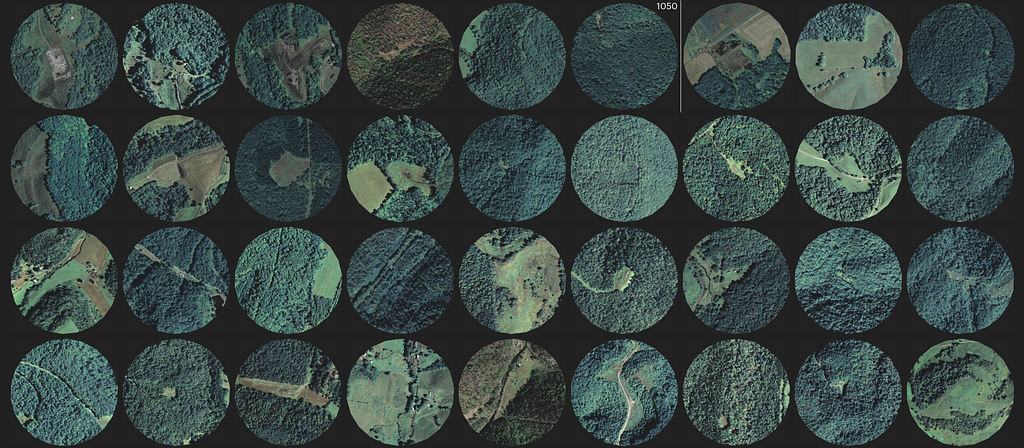
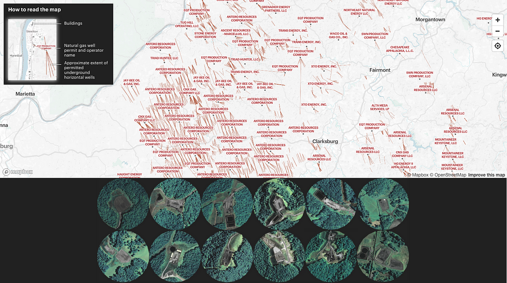
ProPublica and the Charleston Gazette-Mail visualized 1470 locations where natural gas well pads have been or could be built. With West Virginia’s mountainous terrain, land must be cleared and leveled to construct these installations. They originally decided to make this map because they found that even people who live literally right next door to well pads didn’t know where or how far the horizontal wells ran. Environmental reporter Kate Mishkin reflected:
The scale of wells and permits has definitely surprised people. I think that many people were struck by the scope of the industry, and how many horizontal wells there really are.
The article includes details on their methodology to identify the well pads using open data sources, including NAIP imagery. We were impressed by the creators’ attention to user experience and map legibility — for example, their custom legend in the overview map, that reused a sample portion of the map itself:
We wanted to make absolutely clear what the horizontal lines meant. Because the wells run underground, we wanted to express really boldly that the lines are not visible features, and that they’re not the actual paths of the wells. The lines coming out from central points are really striking in a view like this, but on the ground, these well pads are nestled up on hills, and may not always be apparent.
USGS: Visualizing wind turbines across the US

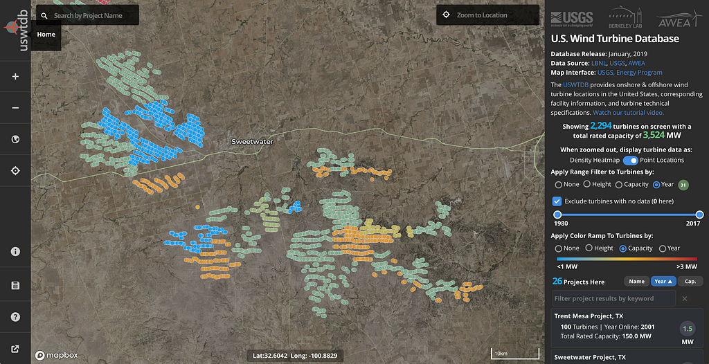
The transition is speeding up toward an upgraded energy infrastructure that produces less pollution. There are 58,449 wind turbines in the US, and the US Wind Turbine Database (USWTB) introduces you to each one with details on location and capacity. This dataset is the combination of open government data and previously private data, validated and updated by USWTDB partners. The USGS uses high-resolution satellite imagery to validate, verify, move, and add turbines. Since its launch in April 2018, the database, map interface, and API have seen close to 1.5 million visits.
The data have been used by state and county level planners, natural resource managers, citizens, students, and even technicians and engineers from wind energy companies themselves. The database supports analysis on topics ranging from energy grid stability, to wind energy impacts on local climate and surface temperature, radar interference, impacts of collisions with wind turbines on wildlife, public acceptance of wind energy, and changes in property values.
When the USGS built the map viewer for the data, they focused on making it fast to dynamically interact with the multiple dimensions available within the data using data-driven styling and queryRenderedFeatures to do client-side calculations. Chris Garrity, one of the developers on the project, shares some highlights:
One of the key features our users requested was dynamic turbine count and capacity calculations (tied to active filters), for visible turbines on the map. Our turbine features come from tiled vector data so we add a helper to avoid duplicates:
//Get unique features to avoid dups on tile boundaries
function getUniqueFeatures(array, pKey) {
        var existingFeatureKeys = {};
        var uniqueFeatures = array.filter(function (el) {
                if (existingFeatureKeys[el.properties[pKey]]) {
                        return false;
                } else {
                        existingFeatureKeys[el.properties[pKey]] = true;
                        return true;
                }
        });
Then we simply tie query parameters to a moveend event:
//Pass turbine counts
map.on('moveend', function () {
        var features = map.queryRenderedFeatures({
                layers: ['turbines']
        });
        if (features) {
                var uniqueFeatures = getUniqueFeatures(features, 'case_id');
                document.getElementById('turCount').innerText = uniqueFeatures.length;
        }
});
If we wanted to grab the values of a particular feature property (capacity “t_cap” below) in the same moveend event we could tie in a simple Array method to sum capacity of the features in the maps viewport:
uniqueFeatures.forEach(function(feature) {
var prop = feature.properties;
sumCap += parseInt(prop.t_cap);
});
Kilometer Labs: Visualizing microclimate predictions around the world

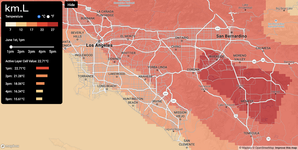
Kilometer Labs takes the best performing physics-based global climate models and simulates, refines, and visualizes detailed predictions of temperature, wind, and other climate conditions at an unprecedented level of detail — down to the kilometer. This model helps to localize not only the impacts of climate change, but can also inform adaptation planning — for example by anticipating which communities or which vulnerable species are expected to experience environmental changes most severely at a local level.
Geographic results from climate models are often distributed as gridded data in GeoTIFF raster format. While compact, raster data can sometimes be unwieldy to process in web-based interactive maps, like the maps that Kilometer Labs builds. Their approach is to “vectorize” their raster data so it can be dynamically styled in mapbox-gl-js. The gdal_polygonize utility distributed with the GDAL library makes this step simple. The Python GDAL/OGR Cookbook goes into more detail on how to integrate polygonize into your code.
The Mapbox Community team partners with world-changing organizations and individuals using location tools to help solve major social and environmental challenges. Are you building with data to understand our changing planet? Get in touch!
Maps for a changing planet — Part 1 was originally published in Points of interest on Medium, where people are continuing the conversation by highlighting and responding to this story.