Tell the best story with your data
By: Amy Lee Walton
When I start designing a map I consider: How do I want the viewer to read the information on my map? Do I want them to see how a measurement varies across a geographic area at a glance? Do I want to show the level of variability within a specific region? Or do I want to indicate busy pockets of activity or the relative volume/density within an area?
There a variety of ways I could approach visualizing data for quick and concentrated readability on a map. A few of my go-to’s are:
- Dot density — A map style that uses a dot or other symbol to show the collective presence (density) of a feature or phenomenon. For example, showing busy intersections or high/low volumes of activity within areas.
- Choropleth — This is a thematic map style that applies shaded color or pattern textures in proportion to the intensity of the data being displayed on the map. For example, showing population density or per-capita income.
- Hexagonal binning or hexbin — This map style is good for showing general themes over a geography. This style is less granular than dot density, and, not constrained by boundaries as with choropleth maps.
- Heatmap — This map style enables the map viewer to perceive density of points independently of the zoom factor. This style is the less constrained of them all, as it does not correspond to geographic bounds.
Examples
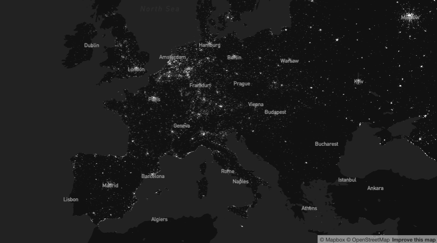
Dot-density maps are impactful when visualizing point data, typically to indicate volume or patterns in activity, features, and other geographic phenomena. Individual data points are not supposed to be counted, but to provide a show of presence and density in an area. Simple but effective, they can quickly give high impact context to your mapping narratives.
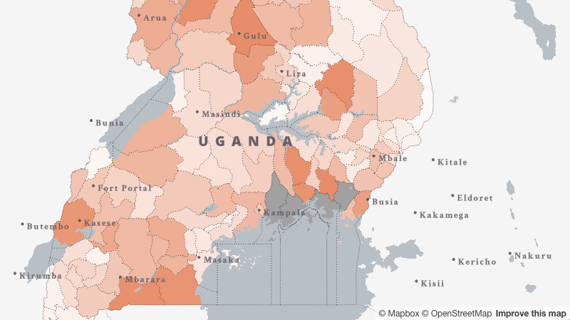
Choropleth maps are based on statistical data aggregated over previously defined regions. The classic example is an election map divided by electoral regions, here choropleths are preferred. Broadly speaking, choropleths represent two types of data: spatially extensive — like populations — or spatially intensive — like rates, densities, and proportions.
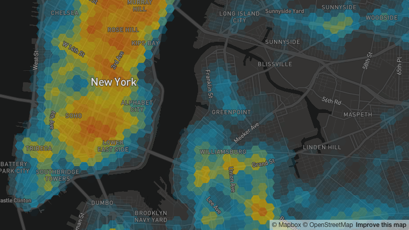
Hexagonal binning is useful for visualizing aggregated data with a more implied, but structured gesture. For example, rather than rendering a scatterplot of tens of thousands of points, you can hexbin the points into a few hundred hexagons to imply general distribution.
Heatmaps essentially use color as a data visualization tool. This application works well with multiple variables and can reveal similar patterns and correlations in your data.
Design considerations
Dot-density maps rely on the cluster approach, so I have to determine the appropriate values for sectioning the data. I usually use the Jenks optimization method to calculate and chunk the optimal values at which to switch either color or scale. In dot-density maps, areas with many dots show high concentrations of values and and areas with fewer dots indicate lower concentrations. I consider using scale, opacity, and/or color to visualize these variations.
When designing choropleth, hexbins, and heat maps I have to remember two important things: 1) darker colors are perceived as being higher in magnitude; 2) while there are millions of color variations, the human eye can only easily distinguish a limited palette. Generally, I only use five to seven color categories.
There are several different types of color progressions used by cartographers. Here are a few of my favorites:
- Single-hue progressions, these fade from a dark shade of the chosen color to a very light or white shade of the same hue. The darkest hue represents the greatest number in the data set and the lightest shade representing the least number.

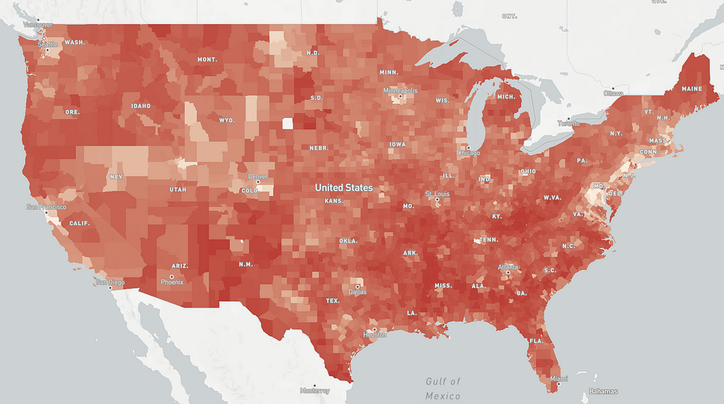
- Bi-polar progressions, these are normally used with two opposite hues to show a change in value from negative to central to positive. These type of maps show the magnitude of the values in relation to each other.

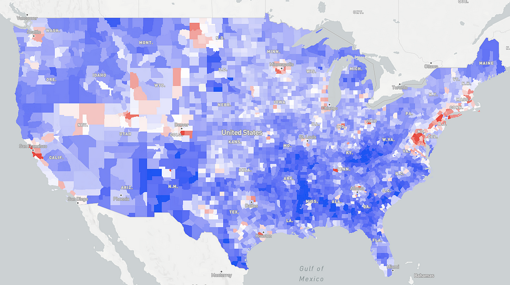
- Partial spectral hue progressions, these are used to map mixtures of two distinct sets of data. This technique blends two adjacent opponent hues and shows the magnitude of the mixing data classes.

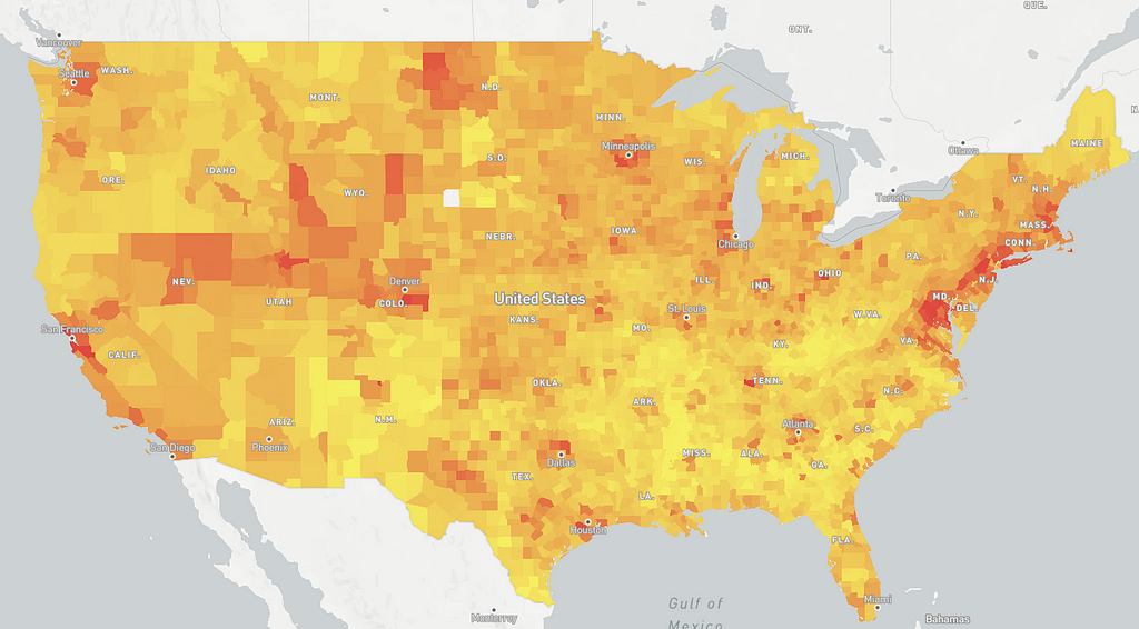
With color heavy map styles, I always consider accessibility and reproduction of the final piece. Will these be purely digital or possibly printed or photocopied? And are the colors and blends colorblind safe? ColorBrewer is an awesome tool for picking color progression and has a feature that allows you to check for these considerations. Color can greatly enhance the communication between the cartographer and their audience, but poor color choice can result in a map that is neither effective nor appealing to the map user. Simpler is often better!
Want to try it out? Mapbox Studio and Mapbox GL JS make it easy to illustrate dot-density maps using data-driven styles. Check out this step-by-step guide on making a Graduated circle map with Mapbox GL JS and data-driven styles. Or want to build a choropleth? Check out this guide to Make a choropleth map: Part 1 and Part 2.
Dots vs. polygons: How I choose the right visualization was originally published in Points of interest on Medium, where people are continuing the conversation by highlighting and responding to this story.