A better way to recolor highway shields to match your map style
By: Alex Parlato
We’re building an editor to help customize our highway shield and rail icons. While similar to our icon editor for the Maki icon set, which focuses on different points of interest, this new editor will allow cartographers to customize icons for navigation and transit. Until now, access to these icons required pulling them from a download of one of our core styles and recoloring manually in a code editor or graphics program. The Map Icon Editor simplifies this workflow dramatically.

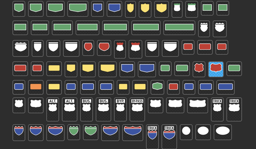
The editor will launch next month with 194 icons custom drawn by the cartography team. They are currently used in our core styles and match the data in our Mapbox Streets vector tiles. All of the icons are localized, for example, an icon image for the London Underground looks like the actual signage you would see in that region.
If you want early access to the Map Icon Editor tweet us, @mapbox.

How to create custom-colored icons in the Map Icon Editor:
- Start with all of our highway shield and rail icons or select to import just the highway shields or rail icons
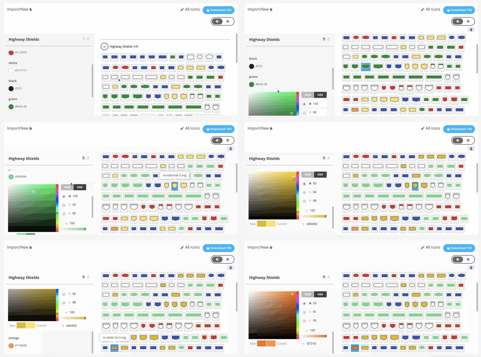
- Use the UI to recolor icons; it updates in real-time
- Download icons organized into folders — You can then add them to your style in Studio
One of the advantages of the editor is it lets you see all the icons at once as you work. The color choices you make are applied to all icons as opposed to the high potential for error in the previous workflow. You can now avoid a situation where a replace all on a hexcode for 200 icon files misses an icon because a character was off. Batch editing with a visual interface that updates in real-time makes this far less tedious.
You’ll also notice we used a limited palette for these icons; this is for consistency. It’s important that, for example, the red we choose works well for both U.S. interstate highway shields as well as red shields in Switzerland and elsewhere.
The challenge of recoloring highway shield and rail icons
The highway shield editor shares a lot with the Maki icon editor, both conceptually and technically, allowing us to think about bringing these two together in the future. There are some key differences however. For example, most of our maki icons are a single (compound) path of a single color with an optional stroke and background. Highway shields are made of multiple different colored paths and need to be accurate with real world colors, not just those on a map. Because of this, the tools in the editor are organized by color for now.
We want to balance keeping our source icon files structured for easy editing with making sure the final SVG files have the necessary complexity. This requires that we allow the SVG files to maintain multiple levels of structure by being transformed into a format that works best for editing in the Map Icon Editor, and then we convert them back to an SVG with the same levels of structure.


Long term road map for the Map Icon Editor
We are working on creating options to allow for scaling of icons and possibly stretching our shields as well.
In addition, we are rethinking the set of tools needed to edit icons within the editor. This will allow for more flexibility and custom icon uploads that fit our guidelines. In the long term, we hope to combine the Map Icon Editor with the Maki Icon Editor and incorporate these directly into Studio. The vision for Studio is for it to be the all-inclusive map design tool.
Don’t forget to reach out to us on Twitter if you’d like to demo the new Map Icon Editor. Create a Mapbox Studio account and begin designing beautiful maps.
The new Map Icon Editor was originally published in Points of interest on Medium, where people are continuing the conversation by highlighting and responding to this story.