At Locate, we covered everything from LiDAR sensors for autonomous vehicles to a new HD vector tile specification. Of the many talks and announcements, three stand out for Transportation & Logistics companies that want to crank up to 11.
Custom-built live tracking
With over 8 billion connected IoT devices and 2 billion GPS-equipped smartphones already online, real-time asset tracking is changing how companies view the supply chain. A combination of cloud computing, inexpensive hardware, and flexible APIs is making it more economical to create in-house tracking solutions. Four main components are powering these applications: location updates, stream processing, database storage, and dashboard tracking. Read more about the four things you need to track anything and stay tuned for deep dives in the coming weeks.
Advanced data visualization with the Custom Layers API and Kepler.gl
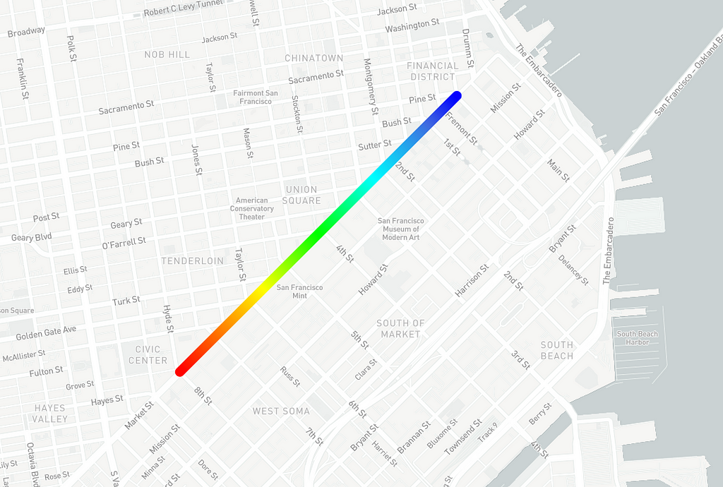
Visualizing billions of live location updates and gathering insights at a massive scale is getting a lot easier thanks to Kepler.gl, a new open-source geospatial analysis toolkit built by Uber’s data science team. Even better, the Mapbox GL Custom Layers API launching later this summer will bring these capabilities to our dev community.
Complex layers from Kepler like animated arcs and hexbins can then be instantaneously converted into map layers using our API, meaning they’ll integrate directly into any application built with our tools. For example, you could build an animated visualization of location updates every 15 minutes from all 250,000 aircraft flying daily in the USA.
Vision SDK
We announced the Vision SDK, which enables developers to build heads-up displays featuring Augmented Reality (AR) navigation, efficient image classification, and semantic segmentation on the edge device.
Image processing on the local device means a parcel delivery firm can use the Vision SDK on its trucks to map hard-to-navigate facilities like ports or distribution centers in real-time as drivers transit them. Every new truck driver could then have a complete map of key points like entry points and loading bays.
AR navigation increases driver efficiency and safety with contextual visual guidance. For example, a ride-hailing company could radically improve pickup experiences in crowded environments like airports or concerts. Imagine a driver navigating to an AR marker that indicates exactly where the rider is — much easier than trying to coordinate locations over the phone using landmarks and street names. Additionally, a corporate fleet manager could use the SDK’s traffic sign identification to automatically log and send notifications to a driver if their speed exceeds posted limits.
The Vision SDK is in private beta now and will be publicly available in September. Sign up for updates.
European Union legislators are close to voting on the proposed Directive on Copyright in the Digital Single Market. This directive would make a number of drastic changes to how information can be shared online, but as software developers, we’re most worried by Article 13. This section of the directive mandates licensing regimes and content filters for virtually any platform that accepts and organizes user-uploaded content.
Most observers believe that Article 13 was designed with large video-sharing sites in mind in order to address the so-called “value gap” between artists and distribution platforms. But Article 13 is not limited to audio and video; it would change how almost all kinds of uploaded content are regulated. Legislators appear not to have fully considered the implications this could have for open source software and other types of content.
We sent a letter to legislators in April explaining some of the unintended consequences that Article 13 will bring. We’re far from the only ones: nearly 12,000 people have voiced their concerns about Article 13’s effect on open source at savecodeshare.eu. Unfortunately, the changes made to the proposal since then have not reflected an understanding of what’s at stake.
Legislators will be voting next week. Although it is not the last step in the process, this vote is an opportunity to stop a bad policy in its tracks. If you’re a European, please consider contacting your representatives and asking them to stand up for open source.
Bust out your 🏳️🌈 rainbow flags 🏳️🌈 — it’s Pride Month. Across the globe, people are commemorating the 1969 Stonewall riots in Manhattan and the larger societal contributions of the LGBTQ community. This June, Pride Parades are happening all over the world — from San Francisco to Zagreb (and even Antarctica!).
To celebrate, use some of our new features to dress up your maps, Pride style.
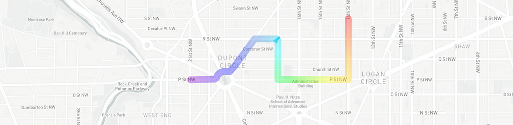
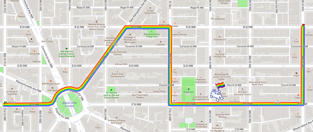
Line gradients for parade routing
Our new line-gradient property for GeoJSON in Mapbox GL JS lets you paint color gradients into lines on the map using expressions. Meaning the line dynamically changes based on properties you set. Use line-gradients to animate rainbow parade routes or show the progress of the parades.
Here’s a static line gradient route:
You can also animate route lines:
And you can animate a gradient line to show a parade’s progress along a route:
Easily prototype heatmap properties of weight, intensity, color, radius, and opacity without writing code with our newly launched heatmaps in Studio. Upload your own datasets or use existing layers in Studio to create heatmaps (from the select data tab). You can customize the colors to reflect your favorite rainbow hues.
Patterned line layers
You’ve been able to do this one for a while with our tools, but it’s just too good not to highlight. Our own AJ Ashton illustrated the DC parade route last year in Studio using a Rainbow SVG icon as a pattern for the line layer:
To make your own themed parade route, start by tracing the route as a line in the Dataset Editor. Then export that dataset to a tileset and add to your style of choice as a layer. In the Style Editor, upload an SVG to your images panel, and select the SVG as your pattern for the line, setting width to 20px. If you’re working with multiple parade routes, create unique datasets for each and take advantage of bulk editing (the shift key allows you to select multiple layers).
We’re celebrating this month in our offices with panels of our LGBTQ team members sharing their professional experiences. After the panels and parades are finished, we encourage you to support one of the many organizations dedicated to the LGBTQ community — particularly LGBTQ youth, whose risk of experiencing homelessness is 120% higher than their peers. These organizations include but are not limited to:
Today, our data team is excited to introduce RoboSat — our open source, production-ready, end-to-end pipeline for feature extraction from aerial and satellite imagery. RoboSat streamlines the machine learning workflow, making it easier and faster to gather insights from our high-res imagery or your own. Use RoboSat to track deforestation, fires, and landuse across the globe. Measure the impact of a natural disaster or humanitarian crisis. Or use RoboSat to validate changesets in OpenStreetMap in realtime (See our guidelines for Mapbox Satellite + ML).
Berlin aerial imagery, segmentation mask, building outlines, simplified GeoJSON polygons
We have a long history of working with the OpenStreetMap community, ensuring the database is as complete and accurate as possible. The on-the-ground efforts of contributors across the world are what make OpenStreetMap such a powerful data source and community.
As the needs of our users and partners evolve, and the scale at which we must process data increases, we have to think about new and exciting ways to detect data while also using traditional tooling to aid in the process. Learn more about RoboSat and contribute in the open repo on GitHub.
How RoboSat works
The RoboSat pipeline is categorized into three parts:
Data preparation: automatically create a dataset for training feature extraction models
Training and modeling: segmentation models for feature extraction from images
Post-processing: turn segmentation results into clean and simple geometries
The data preparation tools make it easy for us to start creating a dataset for training feature extraction models. The dataset consists of aerial or satellite imagery and the corresponding masks for the features we want to extract. We provide convenient tools to automatically create these datasets, downloading aerial imagery from our Maps API and automatically generating masks from OpenStreetMap geometries — and RoboSat isn’t limited to those sources alone.
The modeling tools help train fully convolutional neural nets for segmentation. We recommend using (potentially multiple) GPUs for these tools. We’re running RoboSat on AWS GPU instances and a GTX 1080 TI GPU to keep our Berlin office warm during winter. Predicting with these trained models will result in segmentation probabilities and masks for each image.
The post-processing tools help clean up the segmentation model’s results. They are responsible for de-noising, simplifying geometries, transforming from pixels in geo-referenced images tiles to world coordinates (GeoJSON features), and properly handling tile boundaries.
Here’s an example of the pipeline steps happening during prediction:
Aerial imagery, segmentation probabilities, masks, extracted features, merging features across tile boundaries
About the Imagery
You can access our tiled imagery via our Maps API. Our high-resolution satellite layer is the ideal medium for feature extraction. Extractions can be performed free of charge (subject to map view & rate limits) for OpenStreetMap contributions, as well as general non-commercial purposes. Read the guidelines about free ML processing using our imagery. To learn more about commercial extractions, reach out to our team.
The humans behind RoboSat
Of course, none of this would have been possible without a remarkable team. And so, a big shout out to the entire team of engineers and scientists who fought hard to bring this to life and open source it for everyone.
It’s not hard to think of hundreds of creative uses cases for RoboSat. Share your ideas with us, tweet @mapbox or comment in the GitHub repo. We’re interested in extracting everything from buildings, to streets, to parking lots — even lakes and rivers. We look forward to continuing to make RoboSat smarter and to keeping you updated on our progress.
If you’re interested in applying machine learning to mapping efforts, head to our careers page — we’re always looking to talk to passionate people.
Meet RoboSat 🤖 🛰 was originally published in Points of interest on Medium, where people are continuing the conversation by highlighting and responding to this story.
Uber just launched kepler.gl, a new geospatial analysis toolbox built on top of our open-source tools to make it easier for you to understand your location data. Since the launch, kepler.gl’s user community has visualized everything from solar energy potential to the Venetian cadaster of 1808. Here are a few of our favorite visualizations so far:
It's simply amazing what you can do for free and in less than 15 minutes these days! Thanks Uber and Mapbox https://t.co/RzQWVSm2gE if you want to check it out. https://t.co/qO28x3seg6
ICYMI A day at DriveU. I made this with #keplergl , a powerful opensource data visualisation tool from @UberEng . A simple query result, which kepler has turned into a beautiful interactive map! Read more here: https://t.co/6hVQfswKsShttps://t.co/Orh2VyOa8Z
https://t.co/VwAvwF8ABs is quite nice, visualizing the complete Venetian cadaster of 1808, leveraging rasters hosted at @Mapbox. And all of that in the browser? yes, please.
Want to learn more kepler.gl best practices and meet other kepler.gl users? We’ll be hosting an official kepler.gl community meetup on Wednesday, July 11th at Mapbox’s San Francisco office (85 2nd Street). The Uber team behind kepler.gl will share best practice tips & tricks, and attendees will get a sneak preview of our Custom Layers API launching later this summer. The Custom Layers API lets you turn any visualization made with kepler.gl into a Custom Layer that you can drop back into your Mapbox map. We’ll also hear from guest speakers at Lime about how they’re using kepler.gl to visualize the location of scooters, and how Uber’s Advance Programs team leverages kepler.gl too.
To build your own visualizations in minutes, drop your data directly into kepler.gl in your web browser (no download required). Read the tutorial and familiarize yourself with the user guide to build kepler.gl into your application. Better yet, try your hand at contributing to kepler.gl’s open-source development in the Github repository. The Uber team is also actively soliciting feedback on kepler.gl, so let them know what you would like to see next in kepler.gl!
In-car navigation just became a lot more user-friendly.
Apple recently announced with the launch of iOS 12 that third-party navigation apps will be able to integrate directly with CarPlay-enabled autos. Previously, CarPlay only supported the use of Apple Maps. This update allows any developer to create a driver-first experience using our Navigation SDKs in the over 35 million CarPlay-enabled automobiles that will be on the road in the next couple years.
Apple’s CarPlay technology brings the power of your users’ mobile phones — rich apps, personalized experiences and internet connectivity — directly into their cars’ infotainment units. Paring these large touch-enabled screens with our real-time traffic information, daytime/nighttime optimized styles, turn-by-turn navigation in 16 languages, and customized instructions, you’ll be able to deliver a more intuitive and safe navigation experience for your users.
If you are want learn more about how to integrate Mapbox with Apple CarPlay, fill out this interest form and we’ll be in touch shortly!
Bike share veteran, Tarani Duncan, just joined the team as a Product Manager for Navigation. She’ll work with our engineering and sales teams to chart strategic vision, set roadmaps, and build out go-to-market plans for our Navigation Product.
Tarani has spent her career improving the way people move around. As an early hire at Motivate, she worked with engineering teams to scale New York’s CitiBike program. In 2016, she launched and maintained the world’s first hybrid dockless/station-based bike share system, BIKETOWN. From there, she joined dockless e-bike company, JUMP Bikes, as the Director of Operations Intelligence.
Tarani is fascinated by micro-mobility! In her spare time, she enjoys fishing, taking leisurely bike rides, playing guitar, and drinking tea.
As head of Research and Innovation at one of the Pacific Northwest’s largest family-owned general contractors, Ryan McCullough uses AR, machine-learning, collaborative cloud-based design, and more to understand cities and change how buildings are made. McCullough used Tippecanoe to create a light-weight, fast loading dot plot map comparing property owners and renters. The map was styled using Studio.
While exploring US Census data, I started to wonder what the balance between renters and homeownership looks like geographically. Certainly, there are parts of cities known for having lots of condos, or apartments, or single family homes, but I was curious what this looks like at a larger scale. That’s why I built this nationwide map of every property renter and every property owner.
I pulled 2010 US Census data from the US Census API and TIGER/Line geometry database and grabbed both census variables of interest and their associated geometries. For this map, I pulled these variables: total population, population who rented their home, and population who owned their home. This was also a low priority project, so I coded it up the cheap way (brute force), set it running on a Friday evening, and enjoyed the weekend.
When I checked back on Monday, the output ended up being nearly 40GB of geojson files containing point features. My next question naturally was, “How on earth are we going to load this into anything?”
Fortunately, vector map tiling is a magical thing! Mapbox maintains a program for just such situations, called Tippecanoe. Tippecanoe takes in huge quantities of geojson geometries and converts them to the Mapbox Vector Tiles format, a highly efficient protobuf encoded SQLite database. This lets you serve your data as small digestible vector tiles, and will help to ensure the texture and density of the data is preserved across all zoom levels.
The resulting vector tile database, called a .mbtiles file, was around 2GB in size and uploaded to Mapbox’s tile servers easily.
All that was left then was to apply some styling in Studio. To help the points read well across zoom levels, their diameter is a function of zoom as well as their opacity. That way at low zooms, overlapping points create brighter regions.
This lets us compare structures of density and ownership in very dense locations like Manhattan:
And locations that have a visible spread from urban to suburban, like Washington DC:
Jump into the map, zoom and pan around the entire United States, and start asking questions. What historical forces, policies, and timelines created particular shapes and conglomerations of one type or the other? Or, by the same token, what gave rise to those areas with no discernible structure at all? I will admit I have no answers yet, but it’s an interesting jumping off point.
The Rohingya crisis gripped the news in August 2017, when Myanmar security forces escalated a campaign of violence that forced over 702,000 Rohingya to flee to neighboring Bangladesh. For nine months, Amnesty International has documented human rights violations, both on the ground and remotely. I asked Dan Miller and Akshay Mehra of SITU Research to share how they worked with Amnesty to turn a massive catalog of evidence into a poignant and striking interactive platform.
Tell me about what you’ve built with Amnesty International
Amnesty International’s Crisis Response program has conducted intensive research and monitoring since the beginning of recent violence against the Rohingya in Rakhine State. They’ve collected over 400 interviews — as well as corroborating evidence including satellite imagery, verified photographs and videos, and expert forensic and weapons analysis. The full report records all this evidence in detail, for potential use in investigation and prosecution of crimes against humanity.
Alongside the report, Amnesty wanted to create a platform to help a wider audience engage with the evidence. The map-based narrative takes users on an interactive journey through the weeks leading up to the violence in August 2017, through the military’s deployment and commission of atrocities, the subsequent flight of Rohingya villagers to Bangladesh, and recent construction on top of destroyed Rohingya villages.
“The explosion of violence — including murder, rape, torture, burning, and forced starvation — perpetrated by Myanmar’s security forces in villages across northern Rakhine State was not the action of rogue soldiers or units. There is a mountain of evidence that this was part of a highly orchestrated, systematic attack on the Rohingya population.” — Matthew Wells, Senior Crisis Adviser at Amnesty International
Why did you decide to augment a human rights report with an interactive map?
At SITU Research we help human rights organizations use innovative spatial tools and methodologies. We often use maps to highlight the importance of spatial context and help situate evidence like testimonies, videos, and photos — like an archive that connects evidence. For this project, we had to knit together an 8 month long story that spans multiple locations, multiple geographic scales, and a variety of forms of evidence. The map facilitates that synthesis and helps to make sense of it all.
This project, more than others we’ve done, is map-based because satellite imagery is such a core part of the evidence that Amnesty International collected — it shows the burning of villages, and the rapid construction of new military bases, mines, and roads on top of some of the village sites. We needed to use mapping methods to center that imagery in context and help explain what it shows.
You’ve made maps before, why did you choose to use Mapbox this time?
For other projects we’ve done a lot from scratch — setting up our own tile server and backend, converting between different formats — and it gets complex fast. We knew this project was going to have a ton of raster imagery to work with, so we wanted to try using Mapbox as a way to streamline our existing tools and make something lightweight and ultra-seamless. That way, we could focus on the other vector animations and interactivity that we wanted.
We were on a tight timeline with the Amnesty team regularly updating their data as we went. So we liked how the Mapbox Studio Dataset Editor could help us stay on top of these changes. Pretty much anywhere we have interactivity, or customs labels or annotations, we used the Dataset Editor to create the GeoJSON files we needed. And it was great how we could change the background map and annotate on top of it, even dragging in other datasets to make sure things lined up — like our brackets around the village locations.
How did you decide on the design of the map?
Since satellite imagery on a specific date is an important part of this narrative, we used a neutral basemap that was distinct from the imagery clips but still represented the broader landscape. That way, when you get to the moments where the exact date and location are very important that imagery stands out as discrete and intentional. To achieve this effect, we used Mapbox Satellite for the basemap, but we desaturated it to take out all the color. Then we added terrain on top to illustrate the mountainous landscape that the refugees had to travel through. We also included some simple layers for boundaries and water, but because data for this part of Myanmar is extremely limited, we had to be thoughtful of what we included.
Click through image to explore the map and research.
What was the user experience you wanted to create?
We didn’t want the platform to feel like a click-through presentation. Part of the innovation in this project was figuring out how to combine a linear narrative with open-ended exploration effectively. The interactivity helps connect all the pieces of the story, which is vital for communicating a series of events that happened across different and overlapping locations. So you can zoom in and out and move around within the map, and you can move forward and backward through the timeline. We’re inviting people to investigate this collection of spatial and visual assets thoroughly.
The map is there to provide spatial context and understanding of the connections between points in the narrative, while also providing some continuity of experience as you follow the story of the people who were displaced. We didn’t want the map to get in the way, so sometimes less was more.
How was the technical experience of building out this platform?
Our team has done a few of these types of sites, with Amnesty and other organizations, and this is the most polished. It’s been great to bring together all these components into a single static page and not have to stress about how to streamline the backend. We can just let Mapbox handle that and focus on things that allow us to create something super unique — like our basemap layering or our chained animation that follows the refugees’ path over the mountains.
We also really appreciated how some core components were ready-to-use. For example, we’ve struggled with creating before-after sliders from scratch in the past, so it was great to drop in an existing library and have it work exactly as we’d mocked it up. The sliders are crucial to this project, so not needing to work on something simple like that gave us time to focus on more custom development pieces.
Do you have any advice for other organizations that want to create maps like this?
If you are collaborating across teams, especially ones that have very different workflows like crisis response and web development, it helps to have people who can speak the same language. A member of Amnesty’s Crisis Response program has experience working with satellite imagery and spatial data, and this made such a difference because they could help translate between our two teams.
The tools you choose are also critical. Designing a platform like this requires you to work very iteratively. Choose tools that help you to work that way — ones that let you make changes right up to launch. And use as many off-the-shelf tools as possible — getting lost in the weeds of custom development challenges can be limiting.
SITU Research sounds like a fantastic team to work with — what’s next for you?
We definitely want to continue exploring how to use Mapbox, in particular for making maps that work both online and offline. We work on a lot of projects that are destined for the courtroom, to be used as spatial and visual evidence in legal cases, which usually requires that they work entirely offline. But many of our collaborators also want to be able to share these maps publicly once the case is submitted. And we want to find ways to make our sites accessible across our global audiences where there’s significant disparity regarding connectivity and hardware.
Support the work of Amnesty International’s Crisis Response Program by exploring the platform and signing the campaign on the final page. Inspired by SITU Research’s before-after imagery slider? Check out our tutorial on processing and comparing imagery.
Participating in an event like Ruby for Good, especially if you’re new and don’t know where to begin, helps usher you into the world of open source in a friendly, non-threatening way. People are around to help you, you’re part of a team, and you can choose a cause that you believe in so all the time you spend working on a project, you’re actually working toward the greater good. — Ruby for Good Organizer, Teresa Finn
The 5th Annual Ruby for Good event just wrapped. 80 Ruby developers participated in this 4-day “not-a-hackathon” in Washington, D.C. After a welcome from founder Sean Marcia and the team, leaders took the stage to pitch the weekend sprints they planned with nonprofit stakeholders like Namati, PDX Diaper Bank, OpenStreetMap, and more.
Events like Ruby For Good help developers grow as leaders and collaborators, offer non-profits access to technology built to their custom needs, and give sponsors an opportunity to develop deep relationships with tech professionals. A huge thank you to our own Kalimar on the organizing team, and all the individuals who came together to build collaborative and open technology.
Here’s a deeper look at some of the projects we worked on:
Amazon Terrastories
Read ACT’s full post on building Terrastories with Mapbox during Ruby for Good.
Our friends at the Amazon Conservation Team asked developers to build a geo-storytelling app that features video recordings of the oral histories that these communities share about their territory. The teams built Terrastories as a Dockerized Rails App to help users locate content geographically on an interactive, offline-compatible map.
The Terrastories team took the stage to demo their project:
OpenStreetMap convened a team of volunteers to improve the http://openstreetmap.org website. Led by Chris Flipse and Ben Reynolds, the team refactored routes to make them more resourceful and moved towards a replacement authentication system with the CanCanCan framework.
These improvements to the OpenStreetMap infrastructure will ultimately benefit the hundreds of millions of people who use OpenStreetMap data daily, including NGOs like MSF and the Red Cross, companies like Mapbox, Facebook, and Apple, and governments, educators, researchers, and mapmakers around the globe.
This is only a glimpse at the work accomplished during Ruby for Good 2018. We can’t wait to do it again next year. In the meantime, if you’re working on a project for social good our Community team wants to know about it! Drop us a line so we can connect.
Ruby for Good 2018 was originally published in Points of interest on Medium, where people are continuing the conversation by highlighting and responding to this story.
The City of Melbourne is using technology to visualize their open datasets and chart their future. As part of an initiative to make city data open and transparent, their Smart City team used GL JS to build it’s City DNA exhibit, an interactive exhibition at Melbourne Knowledge Week.
During Melbourne Knowledge week, Melbourne showed off a 1:1000 scale model of the city centre, that was 3D printed and augmented with projections of different citywide datasets like street tree data or pedestrian traffic. Interactive screens showed data visualizations illustrating Melbourne’s climate resilience plan, water-sensitive urban design, and ten-year tree planting schedule.
3D extrusions built with our Maps SDK for Unity help visitors explore Melbourne through phases of its historical development. Located on a natural bay, Melbourne’s hilly topography was flattened as development began in 1900. Over the years the city’s Central Business District evolved, growing denser and denser — it now houses five of the seven tallest buildings in Australia.
FOAM’s Spatial Index Visualizer lets you visualize location data stored on the blockchain and add in location-based contracts. FOAM relied on Mapbox GL JS and Deck.gl to build their spatial blockchain explorer on top of the Ethereum blockchain protocol. We caught up with Kristoffer Josefsson, CTO of FOAM, over email to chat about the map.
At FOAM we develop geospatial blockchain standards, protocols, and proof of location. Mapbox provides a feature-complete and robust maps API that fits our current and future needs for achieving this vision. — Kristoffer Josefsson, FOAM CTO
Why a blockchain map?
A blockchain is a digital version of a ledger where transactions are recorded over time, typically on a decentralized network. These records are sealed by encryption and cannot be altered in any way; only new records can be appended to the chain. FOAM’s technology lets you record location data on the ledger.
With FOAM’s Spatial Index Visualizer, you can give geographic context to blockchain transactions. Regardless of the blockchain industry — IoT, mobility, property rights, supply chains, or otherwise — blockchain can now answer, verify, and secure the “where” of a transaction.
The FOAM explorer allows users to view where ledger entries are made along with associated metadata. You can visualize when the contract was signed, who signed it, and what the contract was for. The map interface also allows you to add your contracts and watch the ledger update — known in database terms as “write-back”. You can customize the map style, adapting the design to a specific use-case.
What industries benefit from a blockchain explorer?
Real estate markets, where location is central transactions, can learn a lot from a blockchain map. Businesses can authenticate and record vendor/buyer contract history on a blockchain; and homebuyers can use that map to compare the data against market prices.
A blockchain map lets cities ensure building surveys comply with local laws. Property disputes could be resolved with a blockchain record of deeds and land registry.
FOAM sees an opportunity for a blockchain map among logistics companies moving people and goods all over the world. Imagine a transparent supply chain where both crude oil traders and regulatory agencies verify the history of every trade at every port.
Shipping companies can more reliably authenticate the position of goods as they travel en-route, letting businesses know their shipments are where they are supposed to be. You can build this into a consumer-facing tool, where buyers could use a blockchain map to verify that goods are manufactured as advertised.
Gulf of Mexico with US Coastguard Automatic Identification System (AIS) ship tracks and live traffic telemetry
Washington, DC just extended its dockless bike and scooter pilot, in part because feedback on the program is positive. DC’s program is remarkable not only for the warm reception it has received but for the open data provisions it has built in: participating companies are required to provide the public with APIs that show vehicle locations in the standard GBFS format. They’re also required to provide officials with ridership information through anonymized trips to help them plan a more integrated transportation system.
Other cities should consider similar requirements as they figure out their dockless futures: it’s not just about how people use the bikes and scooters, but about how the data gets used, too.
Some credit for this idea belongs to the District Department of Transportation’s work on Capital Bikeshare (CaBi), a dock-based network that launched in 2011 and which still dwarfs the volume of dockless trips. CaBi’s commitment to open data has empowered the analyses of area transportation planners (including their work on dockless bikes); made it easy for businesses to integrate the system into their products; and spurred a surprisingly enduring wave of urbanist hacking (DC Bikeshare Hack Night recently celebrated its eighth installment, with more than a few Mapboxers in attendance).
Compliance with the DC dockless program’s data mandate is still a little spotty, with JUMP leading the way and other operators providing varying levels of openness and polish. But we’re confident they’ll all get there eventually, creating advocates, integrations, and riders in the same way that CaBi’s open data program has.
We provide cities with free tools to work with open geodata. Reach out to our team to learn more about our Cities program.
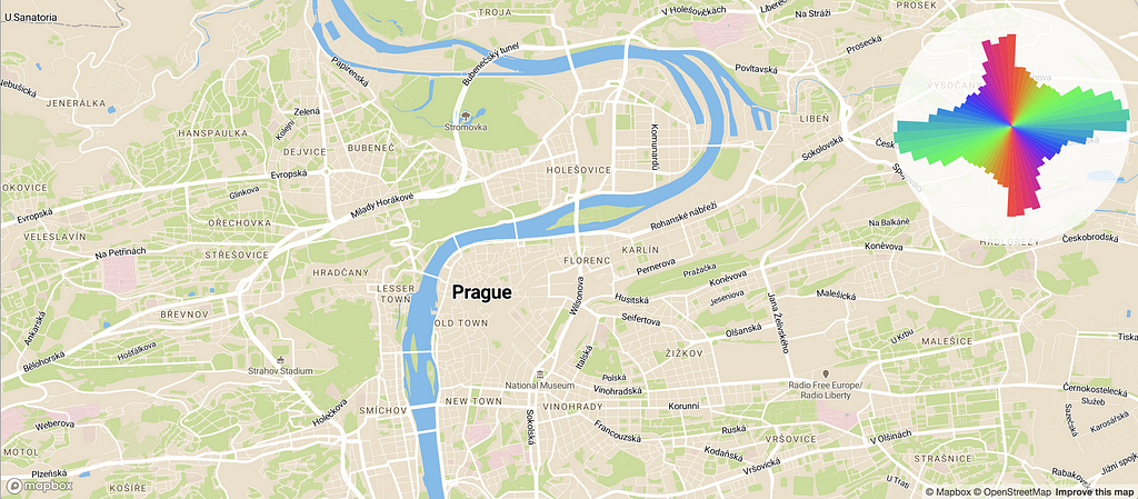
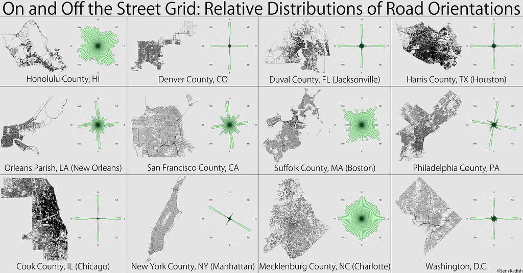
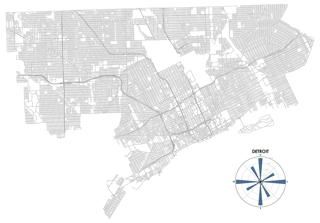
Cities can look and feel very different depending on how they were planned and built, and this is especially apparent when you explore them from above, on a map. Some cities strictly align to a grid, others seem like they grew without any structure, and in some cases, patterns only appear when you examine a city more closely, with each neighborhood having their own distinct style. Could we visualize these patterns?
Seth Kadish invented one great way to do this, and recently Geoff Boeing rediscovered it. They divided 360° into a set of orientation ranges, counted how many road segments belong to each range, and produced a polar histogram that gives us a profound insight into the street pattern of each particular city:
When I saw this, I was hooked instantly— what an ingenious way to look at how a city is built! But I wanted to explore more. How would such a chart look for my city, Kyiv? Or for some of my favorite but lesser known places? How would different neighbors of the same city compare? Or, on a larger scale, how would a European road network compare to the one in the US?
Extracting and processing the road data for every place of interest to generate a polar chart seemed like too much work. Could I do it on an interactive map? It turns out that this is a perfect use case for Mapbox vector maps — since the map data is there on the client, we can analyze and visualize it instantly for any place in the world. Play with the map below to see it in action!
How I built it
The full app is about 80 lines of code. After initializing the map, we set it up to update the visualization every time we move it:
map.on('load', function () {
    updateOrientations();
    map.on('moveend', updateOrientations);
});
In the update routine, we can fetch all the roads on the screen with a single line of code, getting the results in GeoJSON format for easy processing:
var features = map.queryRenderedFeatures({layers: ['road']});
To make sure we only visualize road segments that we actually see, not including parts of roads that go off the view, we use a tiny library called lineclip to clip every road feature to the current bounding box:
var clippedLines = [];
for (var j = 0; j < lines.length; j++) {
  clippedLines.push.apply(clippedLines, lineclip(lines[j], bbox));
}
Calculating orientations and lengths for every road segment can be expensive if there are hundreds of thousands of them in our view. So we use cheap-ruler, a library for very fast approximations of geodesic calculations like this:
var ruler = cheapRuler(map.getCenter().lat);
...
for (var i = 0; i < line.length - 1; i++) {
  var bearing = ruler.bearing(line[i], line[i + 1]);
  var distance = ruler.distance(line[i], line[i + 1]);
  ...
For every road segment, we calculate the “bin” it belongs to (we have 64 bins that cover 360°) and accumulate segment lengths for every bin, while also counting every two-way road twice (in both directions):
bins[k0] += distance;
if (isTwoWay) bins[k1] += distance;
Finally, to get those pretty, uniform rainbow colors for all orientations on our chart, we use the sinebow function popularized by my coworker Charlie Loyd.
That’s it!
Now play with the interactive map — I spent hours exploring it, and hope you enjoy it as much as I do! Check out the full source code, and hit me up on Twitter if you have any questions!
The Open University of Brazil is an educational network of public universities, regional governments, and the federal government to offer higher education online. Dr. Tel Amiel, his research team, and the team responsible for the Open University of Brazil (DED/CAPES) chose to migrate their interactive map of their university system from Leaflet to GL JS.
We wanted to improve the look and feel of the map experience. Mapbox GL-JS made the map load much faster and provided smooth in and out zooming. We were only comfortable migrating due to Mapbox’s open-source philosophy. — Dr. Tel Amiel, professor at the School of Education at the University of Brasilia and UNESCO Chair in Open Education
The updated map is part of a decentralized nationwide initiative to encourage openness in education and government. We worked with the team to implement Expressions for GL JS to ensure that the revamped map is customized and performant.
Expressions help you custom-style your data based on data property and zoom level. Implementing Expressions reduces the amount of code you need to write and cuts down on the number of layers needed in the map. Another plus: Expressions also allow you to organize and maintain your data flexibly.
The set-up
On the map, when a user clicks on a larger university its satellite centers appear:
Blue points are universities and the red points are satellite schools
We assumed each satellite center ties to one university to build this feature collection:
Here’s the way we show the satellite centers on the map:
A very brief intro to Expressions
You can suspect Expressions are involved when you see [] (arrays). Expressions are used in layout, paint, and filter properties to calculate the value of the particular property. Using Expressions here saves us the work of writing a lot of extra code. Without them, we would have to build a new FeatureCollectionthat found the relevant satellite school features and add them as a new layer on the map. With Expressions, we can iterate over all of the features and check if they match the conditions we ask.
Familiar with prefix notation? That’s when you perform arithmetic like this: + 1 2 instead of infix notation 1+2. That’s how Expressions work. Now imagine instead of 1 or 2 you have yet another expression. It takes a little practice reading because we write our statements across several lines but similar to + 1 2 we are writing "all", [expression1], [expression2]. We are using the "all" expression meaning all of the following statements will be Expressions which must be satisfied. All of the features in the collection will be evaluated. If they satisfy both Expressions then they will show up on the map. 👍
["==", ["get", "university], university] means “get the university property from this feature and tell me its value. If it matches the university name of the feature you clicked on, then you’re good.
["==", ["get", "type"], "satellite"] means “get the type property from this feature and check if it is the word “satellite”.
Ok done! Except…not really. Turns out we weren’t dealing with a one-to-many situation. The Open University is a many-to-many relationship.
So what does “many-to-many” even mean? In database parlance, many-to-many relationships look like this:
One university can be associated with several satellite centers. At the same time, one satellite center can be associated with several universities. Well darn. Looks like we’ll have to write some custom code that can deal with this, build a new FeatureCollection.
Turns out we can do this at least three different ways with Expressions.
Version 1 — nested key, value property
Here’s what three of our features look like. We have two universities and a satellite school with the property universities. The satellite school is associated with two different universities. That property has key, value pairs that correspond to the university name and the boolean true.
Plus the code for clicking on the University to show the related satellite schools:
This looks very similar to the previous example however there is a very different expression here that uses "has". We’re using the "has" expression to check if the "universities" property has a key that matches the name of the university. The satellite school above has the following universities property:
The keys are “UnB” and “UFMG”. That means the user could click on the University named “UnB” OR “UFMG” and that satellite school would appear.
This first method gets the job done, but it is very likely the person organizing this data is using a CSV file that gets converted to geoJSON and doesn’t have familiarity with key, value pairs. Let’s try to simplify our geoJSON file and avoid using the nesting.
Version 2: university names as properties
Let’s try to simplify our geoJSON file and avoid using the nesting. Here’s what features look like:
This looks somewhat similar to what we did with the embedded property except now we moved the features up a level and made them their own properties. This seems pretty reasonable for the end user. The only drawback is having as many columns in the CSV file as there are universities. If there are fifty universities, that starts to get pretty big. Let’s see how to implement this one:
This is very similar to Version 1. Now we are using the second implementation of "has". When you only specify [“has", university] you will have a feature that checks through all of the properties to see if any of them have the name of the university as a label. Can you parse the filter? If the feature "has"a property with the name that matches the university variable and its "type" is "satellite" then show it on the map.
Version 3 — university1, university2, etc as properties
For this strategy, we created properties called "university1" and "university2" assuming a satellite school could only be associated with two universities. Here are a couple of features:
This uses a very different approach so let’s see how we do the filtering:
Now we are getting into a nesting doll situation — hiding Expressions within Expressions. ["all", [expression1], [expression2]] now expands to ["all", ["any", [expression1], [expression2]], [expresssion2].
We have our old friends "all"and the second expression [“==”, "satellite", [“get", “type”]] but now we have a new Expression that uses the “any” operator. The “any” operator returns true if any of the Expressions that follow it are true.
The user clicks on a university and then we filter all of the features to see which ones might have that particular university. If the university name is present AND it’s a satellite school we show it on the map. We think this is the most straightforward solution.
We worked through all these examples with the University Team and in the end, they used them to implement their own custom solution using Expressions. To get started on your own custom-styled map, check out our Expressions for GL JS tutorial.
Early this year, we found out that the National Agricultural Imagery Program (NAIP) was under threat as an open data source. NAIP is an essential tool for researchers, businesses, and governments. We’ve continued to publicly talk about the problem and work with people inside and outside government to ensure that this resource remains available.
Today we can share some good news. NAIP data is safe for the time being, thanks to decisions reached in the past few weeks. Funding was found to cover collection cycles through fiscal year 2019. The program’s future beyond that date is uncertain; but for now, imagery users and open data fans can breathe a sigh of relief.
There is reason for optimism about NAIP’s longer-term prospects. The House’s initial attempt to pass a farm bill included dedicated money for NAIP. That bill failed and its successor didn’t include NAIP funding. Still, it’s encouraging to know that people on Capitol Hill are aware of this vital resource. Today’s news gives us two more years to spread that awareness.
As this NAIP funding saga unfolded, people we spoke to about the issue expressed varying levels of concern. Some felt that threatening NAIP’s openness was just a negotiating tactic — that the program’s voluntary funding model makes it difficult to win support from the agencies using NAIP data. Others think that the imagery market is moving inexorably toward a licensed model and that the implications this will have on open data aren’t being adequately reckoned with.
Whatever the case might be, this is a chaotic way to run a program that people depend on for countless research and business needs. We need government to recognize the importance of open data resources and make effective plans for sustaining them. And those of us in the private sector must explore more sustained ways of advocating for these datasets rather than responding in moments of crisis. If you’d like to join the conversation about the best way to do that, head over to the Save the NAIP mailing list.
NAIP is safe…for now was originally published in Points of interest on Medium, where people are continuing the conversation by highlighting and responding to this story.
In March we launched the Mapbox Visual for Power BI Preview, which included features like heatmaps, cluster aggregations, and custom map styles. Power BI users created some compelling visualizations with the preview:
Already enjoying the new @Mapbox custom visual for @MSPowerBI ... This is awesome and FAST! #PowerBI
Firefly cartography... @John_M_Nelson titled a post "Steal This Firefly Style Please", so I recreated this in #PowerBI. https://t.co/3jBkHHxM7z Here's the effect for the new Mapbox custom visual. No option for gradient in ArcGIS Maps for Power BI at this stage though.
We asked for your input on what we should build into the plugin next, and — wow did we get feedback! The new version now incorporates many of the features you requested. Here’s a rundown of some of the top requests that made it into this release:
Support for Safari, IE11, and Edge
Our top requested feature was support for more browsers and devices. We now support most major browsers including Safari, IE11, and Edge. You’ll now have the same experience viewing dashboards in Power BI Desktop as you do on iOS Devices.
Support for choropleth maps and drilling
You’re now able to add choropleth (fill) layers to multiple layers in your map and then drill down between them.
Custom boundaries
The new plugin also ships with boundary definitions for countries of the world, US States, and US postal codes. Administrative and postal boundaries for over 200 countries are available upon request. Use open source boundary definitions by uploading files to https://www.mapbox.com/studio/tilesets/ and connecting to your Mapbox visualization in Power BI.
Lasso selection and data wrangling
Community members asked for more tools to make it easier to handle large datasets. So we’ve added our new Lasso tool. Use the lasso to select and analyze the data points which are relevant to you.
Cross-highlighting and filtering
Making selections on the map will now drive the other visualizations on the dashboard. Trace geographies and watch dashboards react in a flash to your new parameters.
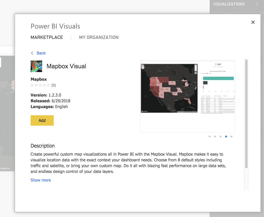
Getting started
To start using the Mapbox Visual for Power BI, you’ll need to get a Mapbox account and a Power BI account. Grab the Mapbox Visual for Power BI from the Microsoft Office Store. Just click “add from marketplace” and search “Mapbox”.
If you’re a business interested in a more customized business intelligence solution, drop us a line.
From the North Cascades to Mount St. Helens, from the Hoh Rainforest to the Snake River, the state of Washington is a hiker’s paradise year-round. Millions of people — including myself — use Washington Trails Association’s site to find the perfect trail and plan their hikes. This year, WTA launched a new version of their Hike Finder map (built with GL JS) to help hikers enjoy and advocate for Washington’s natural beauty. I caught up with Loren Drummond, Digital Content Manager at WTA, to learn more about their implementation.
Why are maps important to WTA and your members?
As a nonprofit organization, WTA works to reduce barriers between people and the trails, with a broader goal of supporting the protection of trails and wild lands. People will protect and champion the places they love to hike, from local parks to remote wilderness. Maps are often the first step a hiker takes on their journey towards becoming a steward for public lands. We have thousands of trails in Washington, running across so many different kinds of public lands — within cities, on county lands, in state parks, on national forests and parks. The Hike Finder map gives hikers a visual way to explore the possibilities.
What inspired the new map?
As more people discover the joys and benefits of hiking, we’ve seen a small number of popular trails experience a dramatic spike in visitation. We wanted to make it easier for hikers to discover alternative trails in their favorite areas and plan their hikes safely. Mapbox tools enabled us to add interactivity and improved map layers that make under-used trails easier to find.
We also wanted more control of topographic layers, and more accurate maps of national forest roads and land management boundaries — experimenting with Mapbox tools let us do this.We integrated a layer showing active wildfire perimeters to alert hikers of potential wildfire hazards when planning a trip.
How do your users like the new map?
An incredible volunteer built our original Hike Finder map, and it is one of the most popular resources on our website — we’ve heard nothing but rave reviews. The new map is now more mobile friendly, and we’re finding that people are spending about 14% longer on the page. I think a number of new features on the map encourage exploration, which in turn helps surface trails and natural features that may have been overlooked before.
How was the experience of building your map?
Donations from our members make all of our work possible, so we’re careful when we invest in technology. We want to make choices that will have the most significant impact. There are so many cool things we can do with Mapbox, but we need to stay focused on features that can affect the most change.
It has been great working with Mapbox because the team shares our goals and values. And individuals at Mapbox have also invested a ton of time into supporting us — we’d especially like to thank Sam Matthews, who is also a WTA member and volunteer, for mentoring our team through this process.
What’s next?
Maps and visualizations are powerful tools, and we’re just beginning to scratch the surface. We want to play around with storytelling visualizations to support our advocacy campaigns like our Lost Trails Found campaign. As people use our Hike Finder map to explore the statewide trail system, we also want them to call on policymakers to adequately fund trail access and maintenance.
We’re excited to continue improving the mobile experience for users, especially when they move out of cell range and want to continue having access to maps offline. Down the line, we’ve got some ideas around how we can improve the trip planning tools, too.
Check out the WTA’s Hike Finder map. If you find a new favorite trail, remember to be a good steward and pack out what you packed in. Enjoy the map and want to learn more? Visit our Community page.
LawnGuru, the on-demand landscaping service, uses high-res Mapbox Satellite imagery to give users a bird’s eye view of their property. Customers can then trace their lawns, driveways, and property boundaries on web or mobile and get an instant quote on lawn maintenance, gardening, snow removal, and more.
Internally, the team of 12 uses our Geocoding API and Maps SDKs for iOS and Android to create dashboards for business intelligence, visualize new job requests, map existing service routes, track their assets in real time, and send alerts based on geofenced locations. But it doesn’t stop there — LawnGuru wants to add live traffic and turn-by-turn directions, courtesy of our Navigation SDK, to give landscaping companies a seamless experience between accepting a job request and navigating to the location.
When asked why LawnGuru chose to work with Mapbox, Co-Founder Skye Durrant responded:
Working with the people at Mapbox has been an absolute joy. It’s obvious that they’re investing in their users’ success. This resonates across both sales and support. Our previous maps provider (Google) was the complete opposite when it came to communication; it was impossible to speak to anyone. Our dev team has found the documentation easy to follow and up to date. If they ever reach a wall, the Mapbox support team is quick to respond.
Co-founders Skye and Brandon originally started their own lawn care franchise but realized managing the company often came at the expense of the user experience. In 2015, they created LawnGuru as a way to focus on both improving the businesses of local service providers and creating a transformational experience for their users.
Maps are essential to our business. We use Mapbox across our website, web app, native apps and our internal tools for sales, support, and business intelligence.
With their scalable infrastructure and repeatable wins, LawnGuru has quickly expanded beyond their hometown of Detroit. You can now use LawnGuru in major metropolitan markets including Atlanta, Baltimore/DC, Chicago, Cleveland, Houston, and Philadelphia.
If you’re driving from Asheville, North Carolina, to Knoxville, Tennessee, the fastest route is via Interstate 40. However, if you’re on a motorcycle, the coolest route, by far, is via the Tail of the Dragon in Deals Gap, North Carolina — 318 curves in 11 miles. It’s a famous ride, one that’s on the bucket list for many motorcyclists.
In most turn-by-turn apps, it’s difficult to pull up this course because it’s not the most efficient route. With our new “Bring Your Own Route (BYOR)” feature included in our Navigation SDK, you can now plot custom routes like the Tail of the Dragon and get turn-by-turn voice, text, and banner instructions along the way — right in your app.
As is, our turn-by-turn Directions API directs your users on the fastest route from Point A to Point B, with accurate ETAs from our real-time traffic. BYOR uses our Map Matching API and Navigation SDK for iOS and Android to let you define specific turn-by-turn routes for your users.
Whether it’s the Tail of the Dragon or its sister path the Cherohala Skyway, BYOR allows you to set the course without sacrificing the navigation tools your users depend on. Download the Mapbox Navigation SDKs for iOS and Android to start trying BYOR today. Reach out to learn more about custom routes for turn-by-turn navigation.