Recently, developers have been asking us about ways to use our Directions API for designing routes (think hiking routes, bike rides, and road trips). While it’s easy to point folks to our Directions plugin — a quick, plug-and-play solution — it doesn’t always have the features they’re looking for like custom line styling, tidying routes, and configurable instructions.
To help you get a feel for what’s possible with our Directions API, I built this interactive bike-route planner. I’m using open source draw tools and calling the Directions API to return a duration-optimized route-line between multiple points. It also returns the distance, as well as an ETA for each route. Try it yourself.
Click-through and draw your own multi-stop bike route
For an application like this, you’ll need a few tools to get started:
GL Draw — the library that enables you to draw shapes on the map.
Directions API — our routing API that can calculate optimal driving, walking, and cycling routes and produce turn-by-turn instructions
To get started, setup your HTML and create a basic map. You can always use our GL JS examples for boilerplate code. Next, add the GL Draw plugin to create the draw tools and add an info box where we’ll store some results from the Directions API:
Customize the draw tool
Once we can access the GL Draw plugin, we can take control of the look and feel of the lines we draw on the map. Right after we add the map and info box to the page, add the following code to initialize the Draw plugin and customize the style of the lines:
The GL Draw control is aware when you create, delete, or update features so we can call a few functions when this happens:
Now let’s make those functions to create, update, and remove routes.
Get Directions
Coordinates from any features you draw on the map are accessible and can be referenced for your Directions API request. We’ll grab the coordinates in our updateRoute function and then pass them to our getMatch function that makes the directions request.
The response from the getMatch function will pass the response back to the updateRoute function and update our info box at the same time.
Add the route
We can setup the function that adds the route layer, addRoutewhich is invoked back in ourgetMatchfunction.
Tidy it up
We also need a way to remove existing routes on the map so they don’t pile up. Let’s make a removeRoute function to remove the source, layer, and zero-out the info box.
Finally, let’s update those draw commands we started earlier with our new functions:
And that’s it! With only a couple tools, we can get an interactive route planner up and running. See the full map:
And as far as customization, this just scratches the surface of what’s available with the Directions API. You can change profiles (walk, bike, drive, or drive with traffic), set radiuses to improve accuracy, return steps for turn-by-turn navigation, and more. We can also make requests like this for other Mapbox APIs and present them on custom maps.
Keep experimenting
Follow our blog for more map hacks and hit up our support team via support@mapbox.com or @Mapbox if you have examples you’d like to see. Explore our help page for step-by-step tutorials covering our full suite of developer tools.
We’re excited to welcome Peter Sirota, previously of AWS and Elastic MapReduce (EMR), as our new Senior Vice President of Engineering.
Peter was employee # 30 at AWS, directly working with Jassy & Charlie Bell building the early architecture and foundation for AWS back in 2005. He was then asked to build and grow a new product, Elastic MapReduce (EMR), where he was the General Manager from 2008 to 2014. EMR remains one of AWS’s highest grossing margin business, as AWS continues to build services “up the stack.” For the last three years, Peter has been running engineering and product at Quantcast, where he helped redesign services, scale the organization, and improve efficiency.
We’re excited to welcome Peter to the team and asked him to share what he thinks is critical for running a successful engineering team.
How do you see structuring our engineering organization?
We should have a set of teams small enough to thoroughly understand their operational footprint (customers, product, code base, metrics, tickets, graphs, etc.). Somewhere between 6 and 12 engineers depending on the service. If complexity increases, then we split the scope and partition the team. If you don’t actively partition these teams and make sure they understand their customers and operational footprint, overtime the attention drifts and engineers don’t understand their customers’ problems and/or how to operate the stack they are responsible for. Everything becomes slow and error-prone. Getting out of that state is difficult.
You need to delegate full ownership of a customer problem to a team and hold them accountable for all aspects of definition, delivery, and operation. Product management should be integrated directly into these teams so that they have resources required to define as well as deliver. On balance, full ownership drives better results faster. It is also more satisfying for the teams and requires less overhead.
Require teams to produce operational plans where they outline strategic objectives of their area, problems they are going to solve for their customers, and what resource do they need to solve these problems.
Make business/operational metrics, roadmaps, and goals visible to everyone at the company and review/audit them frequently. This introduces joint accountability and transparency where all employees understand where the company is going. Wherever possible goals should be organized in a pyramid structure, cascading from the most important corporate initiatives.
How many people should one person manage?
I’ve noticed that at scale (over 150 engineers), a good ratio of engineers to managers is about 7 or 8 to 1. This ratio allows many manager-in-training initiatives with a low number of direct reports and a number of larger teams with a line manager overseeing a dozen or so direct reports. It is difficult, even for an experienced line manager, to run a team over 15 direct reports for an extended period. This ratio accounts for the organization depth with department heads owning a number of interactions with managers.
How do you make sure managers support career growth for individual contributors (ICs) as well create space for up and comers who want a management track?
A healthy organization must be set up to grow talent from within. Systems must allow ICs and new managers to experiment with new responsibility safely so they either grow into it or fail and move back to the original scope of role without career repercussions. In case of managers, I’ve done several programs in the past that work, including “manager in training” which allows ICs to transition into management and LoL (leader of leaders) which enables line managers to grow into area heads.
“Manager-in-training” is a mechanism where any developer with a good track record of delivery could decide or be encouraged to try management. In that case, a small number of developers (2–5) and a corresponding scope of responsibility is given to that person for a trial period of typically 6 months to a year. If things work out, the manager title is given and the transition is formalized. If not, the person goes back to IC and their trial is celebrated.
IC growth is an important and multidimensional question. Each IC is responsible for their own career growth. Each manager is responsible for providing opportunities for growth. The organization at large has to have mechanisms where these opportunities are reviewed and invented for high performing ICs. First, an organization needs to know who the Top Tier employees for each level are so some calibration mechanism needs to exist that drives consistency in evaluation. Second, each manager should have a plan for their TT employees where they discuss specific areas of employee’s interest and how those intersect with the business need. Moving across the organization should be easy so that ICs can join other areas where their interests are better aligned. It is easy to have good intentions but to fail to execute on these programs. The organization needs to look at these programs frequently.
Another effective mechanism to stimulate individual growth across the organization is mentorship. To have an effective mentorship program an organization needs to have the right ratios of junior to senior engineers.
How do you help engineers understand the impact their work has on customers?
Insist they talk to customers, instrument customer pain metrics, and work with customer success teams. It always helps to have frequent “all hands” and bring at least one customer for each of those where they discuss the impact. For SDKs and technical products, a broad number of engineers should answer customer questions.
Welcome to the team, Peter! We’re excited to see how you will use your experience to grow and lead our team.
Often portrayed as continuous lines on a map, modern-day rivers are fragmented and impaired versions of their former selves. The average length of a river in the West has been reduced by 84 percent. -Nicole Gentile, Deputy Director, Public Lands Project
The beautiful, yet troubling map visualization — as designed by Gage Cartographic — uses Mapbox GL JS, our web mapping library, to style rivers based on the data itself, showing the extent of human disruption for hundreds of thousands of waterways.
High levels of alteration for San Francisco (left) and Eugene, Oregon (right)
Chief Scientist Brett Dickson captures the purpose of the project:
Rivers and streams are the life-blood of the West, and are under immense pressure, because of the ways we use and extract resources, such as urban sprawl, industrial-scale mining and agriculture, and climate change. We wanted to show compelling scientific information about how our past activities have stressed important waterways in a unique way, and to provide visuals and statistics to inform future actions and decisions that could protect or enhance our river-based landscapes and economies. -Brett G. Dickson, Ph.D., President & Chief Scientist, Conservation Science Partners
The Disappearing Rivers visualization brings to life massive amounts of data, and it also tells a compelling story with contextual menus describing key takeaways from the research. We spoke with developer Josh Gage about the process of wrangling, styling, and ultimately designing the experience:
Josh, what challenges did you face in creating the map?
Our biggest challenge on this project was visualizing almost 500,000 river segments and allowing for the user to interact quickly and retrieve information from the data.
Our datasets relied on complex, data-driven symbologies. There is variation at both local and regional scales, and we wanted to show this by symbolizing each segment appropriately. Additionally, we wanted to give users the ability to resymbolize the data on the fly and see those changes in the app.
For all these reasons, Mapbox GL JS and vector tiles were the best solutions for pulling this off. The documentation is excellent. The style spec was especially useful as we worked through applying styles to our datasets. Using a traditional stack with images tiles would have been less performant and would have limited the user experience.
This dot visualization shows the location of dams, scale based on circumference represents each dam’s capacity. “Dams are the biggest impediment to natural flow. With more than 12,000 major dams in the West, an average river flows only a third of its historical length.” — Nicole Gentile, Public Lands Project
Which of our tools did you find most useful?
We relied heavily on Tippecanoe in our processing workflow. Tippecanoe allowed us to reduce our dataset at smaller zoom levels, dropping unnecessary features but still giving the feel of a complete dataset. Once we had our .mbtiles created from our datasets, we then used Mapbox for hosting and serving our tiles back to the app, which we built using GL JS.
We used Studio as a bridge to figure out complex symbologies. To do this we would upload a tileset to Studio, work through symbology in the UI, download the source and then inspect the code for use and modification in our app.
What’s next, any new features you plan to explore?
We are thrilled about continued progress with GL JS and other opportunities for visualizing our data. The new dynamic hillshading looks great, and we look forward to using it for adding more detailed terrain and landscape visualizations.
Clicking the green button in the bottom right lets you tour a region. This visualization shows active and abandoned mines and their aggregate effects on water quality further downstream. By the time the Colorado River reaches Mexico, nearby residents are at risk of pollution from 20,138 upstream mines. Click through the image to view the map live.
The best thing we can do to protect America’s rivers
The research shows the healthiest river systems are not just those furthest away from densely populated urban areas, but also those with federally protected public land status. Nicole Gentile, Deputy Director, Public Lands Project, explains:
Protected public lands play an indispensable but under-appreciated role in supporting healthy rivers and streams. In fact, rivers that run through protected lands in the West are on average 50 percent more natural than rivers that flow through unprotected areas. Protecting the West’s wild places is essential to the conservation of the region’s water resources.
Take a look at the Frank Church-River of No Return Wilderness Area (below), which has a bright green glow as one of the healthiest areas on the map. This is no coincidence — in the whitewater paddling community, US Senator Frank Church of Boise, Idaho is a hero for sponsoring the 1968 Wild and Scenic Rivers Act, protecting free-flowing rivers.
At 2.36 million acres, the Frank Church-River of No Return Wilderness Area is it is the largest contiguous federally managed wilderness in the United States outside of Alaska
I personally am immensely inspired by this project and especially Nicole Gentile’s closing note:
“Rivers and streams are remarkably resilient, and smart investments in restoring watersheds can bring back much of what has been lost.”
Let’s keep the conversation on big data visualizations for environmental impact going at Locate, May 30–31, and if you’re mapping for ecological justice and/or environmental conservation now, we’d love to hear about it! Reach out to our Community team or tweet @Mapbox to share what you’re working on.
Barkly Pets uses customized, live-updating maps to give dogs (and their owners) a personalized dog-walking experience. Pet owners in Washington, DC, New York City, Philadelphia, and Baltimore can use Barkly Pets to find and schedule walks for their dogs with expertly trained pet care professionals. With steady user growth and a ballooning network of dog walkers, the startup was looking for a more flexible mapping services provider.
We weren’t thrilled with the pricing structure or the product customization options of our previous provider, so we migrated to Mapbox because it’s a really developer-friendly platform.
Changing map themes is a breeze — I can do it with just one line of code. We’re a small team, so having the location services and map customization taken care of freed up our time to focus on providing users with a personalized dog-walking experience. -Jim Camut, Cofounder and Technical lead at Barkly Pets
Maps in the app
The app contains two map-based interfaces: one view allows users to schedule walks and check in on their pup during and after the walk; and the second view, designed for dog walkers, alerts them to new walks, routes them to their next pick-up, and helps them navigate during their walks.
Styled with Studio: a minimal map showing only necessary contextual data guides dog walkers to their next gig. A walker can zoom into a more detailed map once they pick up their pup.
Making the migration
The team first updated their maps on the web using GL JS, our web API. It can be daunting to switch Map APIs when you already have an established product, but it was a smooth transition. Jim (the sole developer at the time) was able to make the switch to our APIs and launch the product within one week.
As a developer, I know how painstaking it is to provide documentation. The examples Mapbox provided were everything we needed — we didn’t need to reach out to the Mapbox support team at all during the switch.
After having success with GL JS, Jim dug into the rest of our stack, using our Maps SDK for React to reduce development cycle times between iOS and Android builds, and our geocoding API to build out in-app search.
What’s next?
Jim and team are considering adding some helpful features to the app’s dog-walker view.
Looking ahead, we’d like to add turn-by-turn navigation and optimized routing to our dog walker interface with the Mapbox Navigation SDK and the Optimization API. We’d also like to use Studio to custom-style a “night-mode” map for our dog walkers so they’re not going blind looking at their phone screen as they walk dogs in the dark.
If you’re a small team (or even a single developer) and interested in adding location-based experiences into your app with our developer-friendly APIs and SDKs, drop us a note. We’re here to answer any pricing, integration, and migration questions you have.
P.S. — Live in Barkly Pets service cities? Download the app for iOS or Android and enter the code MAPPING to get a discount.
When you host your imagery on our platform, there’s no need to worry about security, reliability, or data infrastructure. We’ve completed a lot of the heavy lifting in that department, giving you more time to concentrate on analyzing your imagery, styling your maps, and adding interactive elements to your visualizations.
Fast, secure infrastructure
We’ve baked a host of core services into our platform to make sure that it’s secure and reliable. We maintain 99.9% uptime and offer a services guarantee for enterprise customers. To ensure security, we adhere to industry best-practices, serving all our APIs over HTTPS by default, and offering two-factor authentication for logins. Built-in access management lets you track internal and end user activity across all of your map content. It’s all hooked into our automatic pay-as-you-go billing system, letting you monitor the usage volume as you approach your designated request limit.
Generate tokens and monitor organizational or end user activity
Extend with our APIs and tools
Now that your data is accessible and secure, it’s time to customize your experience. We provide a ton of APIs and tools to mix and match as you build out your imagery product. Quickly surface and style your imagery across web, mobile, automotive, and gaming platforms with our various distribution APIs. Annotate imagery and maps with custom vector labels, points, lines, polygons, and video using Studio. Edit datasets programmatically or in a graphical user interface with the Dataset Editor. Add imagery layers as a source for client-side GIS-analysis with our own Turf.js.
Use our toolkit to trace imagery, annotate scenes after a natural disaster, and perform burn analysis in fire tracker apps.
Third party integration
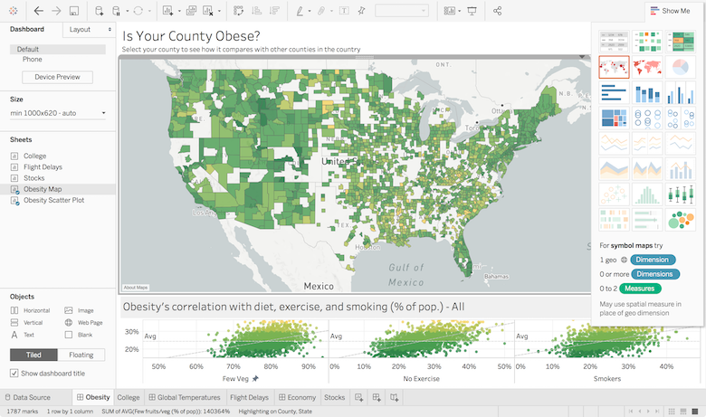
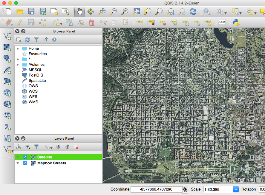
You can pull your hosted imagery into your traditional GIS platform of choice, too. Our platform is compatible with a range of leading analytic and GIS platforms including ESRI, QGIS, and Tableau. Perform analysis on custom map data in ArcGIS Desktop and ArcGIS Online with EsriConnect, compliant with the OGC® WMTS Standard, or pull map layers directly into QGIS. Build business insights against custom maps and datasets with the Tableau integration. Create immersive AR and VR experiences by draping your imagery on top of scenes with our Maps SDK for Unity.
Build visualizations in Tableau (left). Pull imagery into QGIS to perform analysis (right).
Have a unique use case? We’ll work directly with customers to deliver against infrastructure needs, whether that means building a custom SDK or a software plugin for direct imagery uploads.
Today’s travelers are seeking more comprehensive and streamlined services so they can discover destinations, book their itinerary, and start exploring as soon as they arrive — all in one place. In response, companies are adding more robust maps and location services to their offerings.
Just in time for PhocusWright Europe, we’re sharing our top three best practices from customers like Lonely Planet, Fliggy, Hotels.com, The Weather Channel, and Snapchat. They’re using our building blocks to add fast, reliable maps, search, and navigation natively into their apps.
1. Make recommendations based on real-time info
Show travelers what’s happening around the world in real-time to help them book a less crowded travel destination, or find the most popular spots in a city once they’ve arrived. Our heatmaps layer (available for both web and mobile) allows you to display real-time trends in a map style.
You can also help travelers maximize their time in a city by providing time maps (using our isochrones plugin) to show what destinations are accessible within a specified travel time or distance. Then, use our Navigation SDK to help them reach their desired spot.
Left: Heatmaps show real-time data in a map style | Right: Cool Cousin uses our isochrone plugin to help travelers find places close to them
2. Provide a great user experience for easy, engaging exploration
Use Mapbox Studioto customize every aspect of your map to meet the needs of your users. Choose the size of place labels, decide how each detail displays at different zoom levels, and add interactive features like dynamic popups, custom markers, and animations. You can even let users change the map text from their default language to the local language when they need to ask for directions!
Left: Kiwi.com built an interactive map interface that makes it easier to create complex travel itineraries | Right: Let users change their map language when they need directions from locals
If you want to push your UI one step further, use Mapbox AR to view your content in the context of the real world, instead of simply displaying a business’s details in a tile on a map. With AR, if your users are walking near a cafe you can show them something like this:
3. Ensure maps are reliable everywhere in the world and even offline
Support your users everywhere in the world, online and off. With travel to and from China on the rise, we built Mapbox.cn to address the typical lag-time experienced across the “Great Firewall.” By handling network requests at local data centers in China, we can render maps 10 times faster than other providers.
Hotels.com maintains a seamless booking experience for users in China.
You can also ensure travelers have the map info they need even in areas with poor connectivity or no network connection at all. Strip out unnecessary features from our SDKs to build for smaller phone screen and storage sizes. And use our offline maps to pre-cache data and styles, so your users can download maps without worrying about spotty coverage or roaming charges — you can cache an area the size of Greater London.
Let’s talk
Meet us at Phocuswright or learn more about using our tools to create custom travel experiences.
Not headed to PhocusWright? Join us at Locate, May 30–31 in San Francisco, where we’ll bring together speakers from National Geographic, Lonely Planet and more to dive deeper into how their companies are using maps and location data for travel.
Today, we’re releasing new features for the Maps SDK for Unity that make it even easier to build location-based experiences using points-of-interest all over the world. Add treasure chests in all the parks of a city, trigger gameplay that’s unique to your specific location, or create custom visualizations in 3D and AR based on your favorite places.
Place assets and trigger gameplay
We’ve made real-world POIs selectable and searchable from our SDK’s map component, making it easier to control where and how your assets appear in the world. For example, you can use prefabs with colliders to trigger events when users are near recreational areas using our POI data.
Placing custom prefabs at POIs allows you to procedurally create any event at those locations.
Access POIs in the map or place your own directly in the Unity Editor:
For example, use the POI placement tool to turn Yosemite Valley into a sci-fi landscape. A bio-dome is placed at every camp site in the park.
AR-enabled
Every addition to our SDK works out-of-the-box in AR. We’ve even provided some prefabs to speed up the process.
We’ll also be exploring the edge of augmented reality, maps, and sensors at Locate, May 30–31st, with speakers from companies like Uber, Snap, Tableau, Waze, and National Geographic. Register now and learn more about the SDK in person — tickets are almost sold out.
I just bought a Glowforge to print 3D maps. It arrives in the office later this week — I don’t know how I have lived without it. I ran into Dan Shapiro (CEO of Glowforge) last week, and spent hours talking about the future for 3D printing, and all the cool stuff people are building with Glowforge. I asked Dan to share some of his thoughts that have him so excited about lasers and DIY 3D printing, maker communities, and a future where you can bridge software and the physical world.
Q: So a Glowforge lets you print maps (and really anything) using real lasers — how does this work?
Short version: It uses a beam of light the width of a human hair to cut and engrave beautiful things out of natural materials with no ink, sawdust, cartridges, or basically anything other than wifi and power.
Long version: The Glowforge 3D laser printer falls into the family of CNC laser cutter/engravers. They’re normally big, they’re bulky, cost tens of thousands of dollars, look like they belong in a factory (because that’s where you find them), and the software is a giant pain in the neck to use. From the very start, we set out to open up the doors on the laser industry to your average consumer. What if you could sketch a design, then turn it into something real you could actually use? What if you could print things you wanted, needed, or just dreamed up on your desk, instead of relying on factories half a world away?
We refer to it as a 3D laser printer, because like a traditional paper-and-toner laser printer it can print at over 1,000 dpi, grayscale, black-and-white. Unlike a laser printer, it can actually cut, engrave, and create three-dimensional products.
So you’ve got a few different choices for how you can do that. When you cut, the laser moves slowly, at high power, and actually vaporizes the material underneath. The amount it removes is a tenth of a millimeter wide — about the thickness of your hair. It can also engrave. When it engraves, it moves back and forth, which is called rastering. The laser pulses thousands of times a second to vaporize material from the surface.
Creating your design can be as simple as drawing with a pen. Instead of going through complicated software, if you want a pendant, you can draw a pendant. Well, maybe you can draw a pendant… I’m a terrible artist. But I can trace a quarter, and draw a smiley face in the middle, and make my kids’ day with it. Real artists can do a lot more. In any case, each Glowforge has onboard cameras that will scan your design and transform it into a digital file that you can print, once or a hundred times.
Q: How long does it take to print?
Average print time is 12 minutes, but prints can take anywhere from a few seconds to a few hours.
Cutting speed is determined on a few factors, like the model you’re working with — the Glowforge Basic is quick, but the upgraded power and components of the Glowforge Plus and Pro print up to 20% faster. Thicker material will require more power and time. The chemical composition of the material can also make a huge difference. Some 1/4" plywood cuts quickly; some 1/8" plywood is impenetrable.
Engraving speed depends on the detail (higher detail is slower) and how big the area to be engraved is. The head has to move over the area, and while Glowforge is smart about setting its path, two dots an inch apart will take longer than two dots right next to each other.
Q: What are your favorite maps that your community has made?
It’s hard to choose just one, so I’m including a whole bunch.
Q: It can cut and engrave — is it safe to engrave maps into your laptop and iPhone? What materials can you use in the printer?
Unlike a traditional 3D printer which builds on layers of plastic, you can use all kinds of materials with Glowforge — its technology is subtractive, not additive. That includes things like wood or leather, fabric, cardboard, acrylic, and even chocolate.
In fact, you can print on hundreds of materials — a river rock, secondhand lumber, your iPhone — but to make things easier, we sell a line of materials that are ready to go. Proofgrade™ materials have a beautiful finish, so you don’t have to sand or shellac them. They have a protective coating, so when you’re done with the print you can peel it off and instantly have a perfectly finished product. But most importantly, they’re coded so the Glowforge recognizes them and programs all the settings for you automatically. That means you just say — cut or engrave, HD or draft mode, and off you go. It makes it really easy, with no fussing around about power, or speed settings, or the like.
As for engraving electronics, we just released a beta of engrave settings for the Macbook Pro Silver. It makes it super easy to engrave your laptop. We have lots more product engrave settings to come!
Q: So — why should someone get one?
34 years ago, Apple took a data center, wrapped it up in plastic and glass, and put it in people’s homes for $2,495. We’re doing the same thing, but instead of giving you a data center, we’re giving you a factory.
If you were one of the lucky ones who got access to computers first, you know how it changed your life. We think that having your own Glowforge could do the same thing.
You can catch Dan Shapiro and I talking at Locate — our two-day festival celebrating all things location tech May 30–31st in San Francisco — on rapid iteration and crowdsourced projects. He’ll also be running 6 Glowforges throughout the conference so after you hear him speak, go see them in action (and maybe even get something custom to take home). Tickets are going fast, so grab them now.
Last week, we launched a new version of our navigation maps, designed to be viewed in a small display, at arm’s length, or while in motion — perfect for drivers using mobile navigation.
We’ve updated both the day and night versions of the Preview and Guidance styles. The Preview styles were created for reviewing a route before you get moving, while the Guidance styles are for use while actually navigating to a destination.
Here’s a look at some of the key adjustments in this version, along with some of the original decisions we made while building our navigation specific map styles:
Based on where you are along your route, certain details of the map are more important than others. When a driver is planning a route, they usually have the map zoomed out so they can see more of the overall route, while specific details close to their destination are not needed yet. However, when a driver is looking for parking, they likely have the map zoomed in very close to catch details like public parking. Having a lighter background, while increasing the size and color saturation of critical navigation-related features based on zoom level, allows us to ensure drivers are oriented and have the most critical information when they need it.
Clearer differentiation of classes in the road network helps drivers get oriented faster. We’re using color and line widths to separate high traffic and limited access roads from the rest of the road network, as well as clearly distinguishing size differences for the different classes of roads.
We designed for optimal information at a glance, because we know it’s crucial for drivers to quickly get the information then get their eyes back on the road. That’s why we increased the size of labels on the map, so that drivers can more easily see the information they need quickly.
Both the larger labels as well as lighter background color of the map allow the labels to really pop, making them easily distinguishable at a quick glance. As you zoom in, important features for navigation, such as public parking lots, stand out with specialized styling (yellow below).
Left: Old navigation map style | Right: New navigation map style
Road shields are larger and more prominent, letting drivers better verify the signs they see in the real world with those on the map.
Left: Old navigation map style | Right: New navigation map style
We’ve also updated our night style for better visibility in the dark. Light pollution can cause eye-strain on drivers and can be a real safety hazard, so we made sure to use a more subtle color palette than the one we used for our day styles.
Left: Day style color palette | Right: Night style color paletteLeft: Old navigation style | Right: New navigation style
Importantly, we’ve made sure to optimize both the Day and Night styles to work well with the color palettes of our live traffic layers
Our new Navigation Map Styles are available today in Studio and can be added to our Navigation SDKs for iOS and Android. Take them for a spin and reach out to our team with any questions you may have.
An array of new technologies like cheap mobile devices, cloud storage, and improved software are underpinning a projected 20% annual growth of telematics. Forward-thinking logistics companies are amassing huge datasets with these technologies to improve their operations.
But collecting data is the easy part. Companies like Uber, Instacart, and DB Schenker, are using Mapbox’s data visualization tools to map thousands of assets globally, identify cost and performance trends along routes, and benchmark against historic ETAs.
Mapping your business geography
Flow and network charts can plot the complex relationships between dozens of points along a route or visualize connections between millions (or billions) of data points within a larger service area. One of those enormous service networks is the Russian postal system. In this network graph by Nikolai Lebedev, we see how mail flows between 42,000 post offices across 87 regional hubs in Russia:
Click the image to explore the full flow map. The Russian postal network, mapped by Nikolai Lebedev
Fast-rendering map visualizations like this make billions of data points accessible — zoom in, layer-by-layer, all the way down to a single post office to spot patterns in the data at the national, regional, and local scale. Supply chain analysts can build node and flow maps of their own, as well as a host of other visualizations, to spot unexpectedly large flows between two nodes, identify opportunities for cost savings, and analyze new markets.
Visualizing your temporal geography
Outside forces like traffic, weather, and elevation can all affect the time it takes for people or shipments to get from point A to point B. By mapping time onto your service area — by building a custom isochrone visualization — you can see how outside events have historically affected your assets as they’ve moved around the real world.
We used historical traffic data to build this isochrone illustrating drive, cycle, and pedestrian times across the Edinburgh metropolitan area. Note how faster drive times extend out into the suburbs along major highways. Isochrones can provide insight into which service levels are realistically achievable within new and existing service areas.
Fast-rendering, interactive data visualizations close the gap between data collection and insight. Use our data visualization tools to quickly spot inefficiencies in your operations, build new processes, and pass that value to customers.
Telenav customer solutions leader Sooner Heath joins our team to build the automotive solutions engineering practice at Mapbox. Sooner comes with more than a decade of experience shipping navigation and active safety systems at the cutting edge for customers like Toyota, Ford, General Motors, and Fiat Chrysler.
“What instantly caught my eye with Mapbox is this maniacal focus on enabling builders. In the end, if you want to create a delightful experience, you have to use both the best ingredients and the best tools to build it. Mapbox has this combination of huge sensor data and really easy to use tools for developers and designers that are absolutely needed to build the future of in-car experiences.” — Sooner Heath
When Sooner isn’t working with a customer to plan and build new technologies, he likes to spend time exploring the great outdoors.
Welcome aboard Sooner, we’re excited to see the amazing things you create with our customers.
We upgraded our voice guidance in both our iOS and Android Navigation SDKs to Amazon Polly, which generates audio guidance from the turn-by-turn text instructions streaming from our APIs. Developers don’t need to provide any extra access tokens or pay for accessing Polly services — it’s all included as part of our SDKs.
Polly lets us fine-tune instructions so they sound the way a person would naturally speak. First, listen to this comparison between the default speech synthesizer on iOS and our new navigation SDK voice guidance:
Both voices read: “In 400 feet turn left onto Coeur d’Alene Avenue and then turn left onto I-280”.
AV speech synthesizer:
Amazon Polly guidance:
Our new guidance isn’t just read by a more natural sounding voice; we also now correctly pronounce both the street name “East Coeur d’Alene Avenue” and the route number (as “eye two-eighty”).
Polly can even pronounce street names that have unintuitive pronunciations, like Houston Street in New York City:
On April 4, 1968, a short time after the murder of Martin Luther King Jr. had reached the ears of residents in D.C., riots sparked throughout the city, leaving 13 dead and 900 businesses damaged.
In an effort to contextualize the events that followed the death of MLK Jr., The Washington Post triaged data from more than 2,000 declassified Secret Service reports compiled by Brandeis University professor, Daniel Kryder. With that data, The Post created a powerful, immersive experience, combining audio interviews, archival footage, and a map built with Mapbox GL JS and Studio.
“In Washington, DC, the same address can exist in several quadrants, so one of the main challenges is always making sure that addresses are geolocated correctly […] The quadrant was not always specified in the Secret Service reports, so to be certain we were representing the data as accurately as possible, some data points had to be discarded, ” says Emamdjomeh
The maps in this piece are critical to the story and enabled the team to show “the spatial patterns of how the riots spread throughout the city,” according to Emamdjomeh.
“Using Mapbox to visualize the Secret Service reports, we could show that activity wasn’t confined to the three corridors that suffered the most damage. The riots were something that were felt throughout the entire city, ” he says.
The damage after the riots was extensive. The map above uses data-driven styling to color buildings based on the level of damage. To setup the buildings layer, Lauren Tierney, also a graphics reporter and cartographer on the team, digitized and geo-referenced building footprints from DC city planning documents. You can read our step-by-step guide on how to scan and geo-reference paper documents.
You may have noticed government buildings like the Capitol are drawn on the map and resized at different zoom levels. You can accomplish this by adding an image and interpolating the icon-size property at the zoom levels you specify.
The result:
And to add historical context to the map, Tierny used Mapbox Studio to style the base layer to closely resemble government maps of the 1960s.
“We found Mapbox Studio very useful for developing and iterating on different versions of the map. We started with the Mapbox Light map style and removed layers until we had a fairly minimalist setup, then started implementing our 1960s ‘Government Chic’ style, “ Emamdjomeh explains.
Left: United States Bureau Of The Census. (1960) Washington, District of Columbia, by census tracts and blocks. Retrieved from the Library of Congress, https://www.loc.gov/item/87694032/. Right: United States Army. Corps Of Engineers. Engineer Company, 9., United States Army Reserve, District Of Columbia. Department Of Highways And Traffic. Office Of Planning And Programming & Air Survey Corporation. (1964) U.S. Army Reserve centers, Washington D.C. and vicinity. Retrieved from the Library of Congress, https://www.loc.gov/item/88690553/.
Throughout the map, animated markers draw your attention to the location of incidents in the Secret Service reports. Using Mapbox GL JS and transitions, the animation can be reproduced by adjusting the circle-radius property of a circle layer. Check out our guide on how you can create your own animations.
When we asked Emamdjomeh what the team had in mind for their next project, he told us they wanted to explore creating their own tileset using tippecanoe, our open-source command line tool for building vector tiles from large collections of GeoJSON features. And they did just that…
In this mind-blowing piece, his colleague, Aaron Williams, visualized what modern segregation looks like in US cities. A technical deep-dive on how they built it is coming your way very soon…
Use Mapbox Studio to create custom maps, and use GL JS to make the experience interactive. We support powerful storytelling and data journalism — reach out to our Narratives Desk if you have questions, want to collaborate, or just want to show us what you’re working on. Contact lo.benichou@mapbox.com or @LoBenichouon Twitter.
FlyNex, based in Germany, makes drone operations software to help companies and enthusiasts plan, execute, and analyze their flights. German aviation restrictions change frequently and vary by locality, making it difficult to fully comply with laws. The Flynex platform uses our maps to display all of this real-time aviation data within their mobile and web applications — Map2Fly and Map2Fly_Pro — reducing flight prep times from hours to minutes.
For the tool to be useful, Flynex needed to display a lot of information and control every aspect of how the data was styled, from each zoom level to individual features and layers. Flynex developers Ingrid Rohloff and Nico Lehmann explain:
“From our point of view, Mapbox is the only solution that provides the full stack we needed for map development. Not only can we display all ground-based infrastructure, we can also display all different types of air space data potentially affecting a drone mission. It would be impossible for us to give our customers such a great experience without the flexibility and customization of the Mapbox APIs.”
Map2Fly visualizes entire cities and regions, including specific buildings that have flight restrictions. This is no small feat; FlyNex’s engineering team used Tippecanoe to generate vector tiles from more than 20 million features. The team then used Mapbox Studio to style all of the underlying map data, adding interactivity with GL JS (our web API) and our Maps SDKs for iOS and Android for the mobile experience.
The team is especially excited about what they’ve built with 3D extrusions, Ingrid and Nico tell us:
“Creating a 3D view has been especially powerful because our data is based on 3D space. For our users, the ability to rotate the map and explore all of the layers within the 3D view makes it much easier to plan missions and observe potential obstacles.”
“The key will be to provide the drone itself with real time data to enable autonomous flights. The drone has to know where it is, what rules and regulations are on their path, and also be aware of live-updating flight restrictions.”
Drivers can now plan their trip on the Raven mobile app and use the Raven in-car device to guide them from A to B. Our turn-by-turn directions, real-time traffic data, and precise ETAs ensure a safe and efficient experience.
Klashwerks Raven is a small device that sits atop the dashboard and can be connected to mobile phones via a companion app. It comes with a permanent connection to the internet and front and cabin-facing cameras. The displays show turn-by-turn route information, live ETAs, and speeding alerts, right in the driver’s line-of-sight.
“We found two major differentiators that made Mapbox the obvious choice for us: The ability to keep navigation features natively within our app instead of forcing users to kick-out to other applications and the ability to share real-time navigation instructions between the mobile phone and Raven’s displays. The integration was seamless.” -Dan Crawford, Klashwerks Director of R&D
With so many accidents caused by distracted driving, the Raven team used our Navigation SDK to create a full-featured navigation experience with a safer UI. Dan explains:
“There’s no need to pick-up a phone, tap on a phone, or even look away from the road. We accomplish this with hand gestures. When Raven detects a hand gesture, it knows there’s something of interest near or in the car and sets aside the relevant telematics data and video for safe keeping. Raven knows how to respond if you’re driving through an accident scene, witnessing careless driving or road rage, or if you want to capture a scenic drive.”
The mobile app, built with our Maps SDKs for Mobile, allows users to monitor their vehicle remotely. You can see the speed, fuel level, live streaming from dash cameras, and alerts of various driving and parking events. The app is also using our Geocoding API so you can search locations and discover points-of-interest.
Parent’s will love the Raven app’s location features, while teenagers will probably prefer the in-car video and social sharing
Beyond the consumer segment, Klashwerks is focused on adoption among ridesharing and fleet operators. The data capturing capabilities and permanent connectivity allow fleets to feed data in real time into machine learning algorithms for mapping and optimizing operations.
Our driver operations manager Okorie Puryear recently got to test a Raven device first-hand, here’s what he had to say:
“There are two things that I really love about Raven. First, you can record a short clip simply by waving at the device. It’s really useful if someone cuts you off or if you’re anticipating an accident. Second, the device gives you in-depth monitoring of the vehicle’s status: fuel level, RPMs, engine temp, compass heading, speed, air temperature and more. All things really useful for someone like me who manages fleets of vehicles.”
You’ll have a chance to meet our AR designers and engineers at Locate, May 30–31st. They’re building the tools for developers to create AR applications at world-scale, like the new updates to our Maps SDK for Unity that make it easier to bring real-world places into your games and experiences.
At Locate, see sessions like Map-Free Reality: Location in a Post-Mobile World, where developers share stories about building the next generation of spatially-enabled AR experiences, moving beyond 2D maps.
As we gear up for two days of maps, location data, and sensors, our team discusses some of AR’s most exciting developments and toughest challenges:
Miroslav Lysyuk is our Unity/AR Product Manager. He’s focused on the current and future applications of AR, as well as the tools developers need to push AR beyond where it is today.
Miro, how is location being used in AR currently? What does world-scale AR look like?
Left: Use HotStepper to navigate around the city with an AR avatar as your guide | Right: Track activities and visualize the experience in 3D AR with Chinese fitness app Codoon
Adam Debreczeni is Director of the AR team. He co-founded Fitness AR, and at one point designed a mobile app for Lady Gaga (he’s got some stories). He’s rethinking how we interact with virtual content in 3D space.
Adam, what is uniquely challenging about designing for AR?
We recently launched the first multi-user AR experience, where two people can collaboratively annotate a map whether they are in the same room or half way across the world
Morgane Santos is an engineer on the Unity team. She’s excited that we’re in the early stages of such a powerful technology. Or as she put it, “I’m really looking forward to being surprised.”
Morgane, what is your dream AR app that’s actually possible today?
We released new features for the Maps SDK for Unity making it easier to build AR experiences using points-of-interest all over the world
Siyu Song is the Engineering Manager for Unity and AR. He’s worked on visual effects at Lucasfilm and Dreamworks Animation, and now he’s working with developers and our customers to expand our suite of location-based AR tools.
Siyu, why is this such an exciting time for AR developers?
Learn more about Mapbox AR and grab tickets for Locate, May 30–31st. You’ll hear from leading companies in the mapping space like Uber, Snap, Waze, Tableau, and National Geographic. It’ll be a party, see you there.
One of the most common questions on our Support channel is “Can you refer us to developers experienced with Mapbox tools?”. Today, we’re excited to announce our Developer Network, a marketplace to connect you directly with mapping experts who can make your vision a reality.
If you’re looking for help on a project, head to the developers page to start making connections. If you’re a developer with skills to share, sign up now to be listed on the page.
Browse by skill, service, or region to find developers that match your needs.
We’ll be featuring projects regularly to highlight awesome work and provide inspiration to the community. Many of our Developer Network members are getting together at Locate, May 30–31, to share their maps, learn about our latest releases, and meet potential customers. Buy tickets if you haven’t already, it’s almost sold out.
Map developer Victor Temprano of Mapster tells us why his team is excited about the Network:
“We’re really psyched about having access to new dev projects and showing off our Mapbox skills. Our GL JS Digitizer and the Wordpress plugin are just some of our tools we’re eager to share with customers.”
Need expert help? Get in touch with a developer today. If you’re an expert with our APIs and SDKs, find me at Locate or sign up to be listed on the Developer Network.
Today Tinder launches Places, letting people find common ground (literally) with potential matches. The locations where we hang out say everything about us. Places lets you see potential shared interests of matches and gives you a ready to go one-liner once you swipe.
When you tap the pin at the top of the Discovery screen to opt-in, you’re able to discover new potential matches based on the places you have in common. Places is entirely opt-in, never shows your real-time location, and lets you add and remove your favorite spots, putting you in control of what’s shared.
“We’re excited for our users to try Places, which is our first step in bringing Tinder to the real world. Mapbox has been instrumental in helping us translate the Tinder look and feel to the map within Places, and customizing this new interactive space within the app.” — Samantha Stevens, Director of Location Products at Tinder
Places uses a minimalist map design, bringing key locations front and center. Tinder’s designers built the map from the ground up using Studio and our Maps SDKs for iOS and Android. They used a muted color palette and removed features like highways, building footprints, and other layers that could detract from points of interest and new matches.
Tinder’s Places is now available in Sydney and Brisbane, Australia and Santiago, Chile. Stay tuned — we’ll keep you posted with updates as Places rolls out.
Not only is the entire world not already mapped, but there are huge parts of the planet—particularly the oceans—that are unmapped. The planet is changing constantly and will continually need to be re-mapped. — Kaitlin Yarnall, SVP Media Innovation at the National Geographic Society
Kaitlin Yarnall has spent her career immersed in maps.
With more than a decade at National Geographic, Yarnall’s worked to expand the organization’s impact on journalism, photography, and data visualization. She’s held many roles within the organization, ranging from a researcher in the Maps department to Executive Editor of National Geographic Magazine. During her tenure, she’s seen mapping technology evolve from light tables to robust visualization software. Now, as the SVP Media Innovation at the National Geographic Society, she works with the researchers, scientists, and creatives of the Explorer Program to tell compelling stories that shine a light on three focus areas: Our Changing Planet, Wildlife and Wild Places, and The Human Journey.
We sat down with Yarnall to talk about the state of mapped storytelling and plot the future of cartography. Take a look:
How did you become interested in maps and cartography?
I discovered cartography at Humboldt State University. I was looking for a second major to take, and I walked into a geography class, and it immediately clicked for me. To me, geography was this combination of art and science — appealing to the math part of my brain with datasets and projections, and the art part of my brain with beautiful visualizations and storytelling.
After school, I knew I wanted to work with maps. I started at National Geographic in the maps department through a professor at Humboldt, where I had an opportunity to work on an atlas, and just loved it. After grad school, I returned to National Geographic publishing, where I had a variety of roles — Senior Research Editor in the maps department, Deputy Art Director, Deputy Creative Director, Executive Editor and Director of Cartography.
Now, I’m on the nonprofit side of the house as the SVP of Media Innovation at the National Geographic Society, where I build partnerships with Explorers — the world’s best scientists, researchers, technologists, conservationists, educators, journalists, and photographers — to tell compelling stories about our planet.
How has cartography changed from when you started at National Geographic? What tools did you use and how have they evolved?
I started in the maps department when we were doing desktop publishing, but software wasn’t yet the norm. No one was writing code then. We still had light tables in the department when I started. We still did a lot of hand painting and stitching. Now we use software — new mapping, design, and visualization tools. The technology has advanced a lot over the years, but the same basics are there: we’re still using maps to tell important stories.
What’s the Explorer Program?
At the National Geographic Society, we invest in bold people with transformative ideas to further our understanding of our planet and find solutions to some of the most pressing global challenges. Our Explorers embody this mission. They are researchers and storytellers who come to us with the very best ideas…and we want to fund them. Each year we award more than 600 grants to scientists, researchers, and creatives at varying points in their careers. Recipients range from grad students and postdocs who are just beginning field research, all the way up to luminaries at the peak of their careers.
At the Society, it’s our job to ensure that they can explore, they can discover, and they can educate. They’re out in the field, performing impactful research, and we’re providing the means for them to do their work.
How have Explorers integrated maps and visualizations into their work? What do maps tell that pictures or words can’t?
Maps give you a sense of location, space, and scale. We use them to give our readers context on where the story is in the world. We use them to illustrate movement through space, or show distribution over space — to show the movement of migrants, or to show the populations of local animals ballooning or shrinking over time. Maps are also a good way to layer different information sources together and tell a complex story in a simple, visual way.
Our Explorers can use maps in two ways, the first being in the field. Researchers on the ground can use maps as a tool to guide their work. Some Explorers even include mapping as one of their larger project goals, often trying to map underserved geographies or populations.
One Explorer doing this is Adjany Costa, the Deputy Director of the Okavango Wilderness Project. This team has been working for several years to map and protect the headwaters of the Okavango River in the Angolan highlands. Angola had a decades-long civil war, so this area was not only under-mapped, but it was also physically inaccessible for many years due to extant landmines. Costa and team are now working to map the river from its source up in Angola, through Namibia, and down to the Okavango Delta in Botswana.
The second way we use maps is to tell stories about our Explorers. Paul Salopek is an Explorer fellow who’s literally walking around the world. He’s been following the path of ancient human migration out of the Rift Valley in Africa. He wears a GPS unit on him which lets us track and map his movements. We use the map as the framework and visual guideline for all of his dispatches that he writes from the field.
Switching gears now — with all of the new visualization and mapping technology that’s emerging, what’s currently going on in the mapping space that excites you?
The public’s mapping literacy has gone up. We now walk around with incredible mapping tools in our pocket every day — our phones. Because of that, we’re now dealing with a readership that’s so much more educated and savvy spatially. They understand the difference between a satellite image and a vector map. As a storyteller that’s really exciting to me. Readers expect interactivity in maps — they expect to be able to zoom around and toggle layers on and off. Even six or seven years ago, that wasn’t something the average person was prepared to do.
The other thing that excites me is the recent advances in remote sensing — new forms and frequencies of satellite imagery and non-visual data-types. You can build interesting predictive models from large volumes of remote sensing data. People are predicting crop yields based on sensor data, and extrapolating that information out into the real world, building better field irrigation.
Up-to-date remote sensing data is also used for things like finding and mapping wolf dens in the arctic — tracking the health of hard-to-reach wildlife populations from space. I think it’s exciting from a conservation and science perspective because it allows us all to monitor the Earth in a non-invasive way.
What do you want to see in the mapping space over the next five years?
Right now, there are incredible amounts of remote sensing data available, but the barrier to entry is still quite high for field scientists or policymakers. There’s still a lot of non-visual data that needs a lot of interpretation, and I’d like to see tools made that put that data in the hands of people in the field (like our Explorers) without a data preparer or an analyst middleman.
In the past, when I would tell people I was a cartographer, they would say to me, “isn’t the whole world already mapped?” That used to frustrate me, but now I think it’s an exciting opportunity to tell people that: not only is the entire world not already mapped, but there are huge parts of the planet— particularly the oceans—that are unmapped. The planet is constantly changing and will continually need to be re-mapped. Look at Kilauea’s recent eruption — we’re already starting to re-map that. When you start layering human and animal data on top of geography, the world will constantly change… mapping will always need to exist.
Don’t miss your chance to catch Kaitlin Yarnall and a select group of National Geographic Society Explorers on stage together at Locate.
The Unfinished Map was originally published in Points of interest on Medium, where people are continuing the conversation by highlighting and responding to this story.
Locate is next week, which means you only have a few days to figure out how to see over 60 presentations, panels, and interactive code labs 😱. Explore the full schedule, and take a quick look at what’s on tap:
Kent Marten (Senior Product Manager, Maps and Spatial Analysis at Tableau) shares his take on how the emergence of IoT and real-time location data is revolutionizing the way businesses make decisions.
Virginia Ng (Data Scientist) will show how to extend our data visualization tools with machine learning. Matti Kakkori of Fracta.ai covers how they’re using machine learning to determine which water mains cities should replace, and Mapdwell CTO Nicolas Waissbluth shows how they’re applying similar methods to visualize neighborhoods and help homeowners assess solar potential.
Left: Visualizing the entire Russian postal network | Right: Treasure Island, CA rendered with Mapbox GL 13.3M LIDAR Points, 33.9M Vertices.
Logistics: planes, trains, autonomous vehicles, and scooters
From the early days of Google Maps to the launch of crowdsourcing via sensors on your phone with Waze. Hear from Manik Gupta and Di-Ann Eisnor on how they led the transformation of what maps would become today: a living network of decentralized sensors mapping the world live.
Leading companies building scooters and electric bikes talk about the challenges of building hardware, making sure the battery is always charged, and the changes in last mile logistics that we’ve seen this year.
If we’re going to replace drivers in the car, technologies that allow sensing and perception are going to have to mimic the human ability to understand the environment, identify safe paths and react to changes in real time. We’ll look at how those technologies will evolve with experts like Forrest Iandola, Nikhil Naikal, Austin Russell.
Left: Historical shipping route data, mapped across the San Francisco Bay | Right: Isochrone showing drive times across Greater London
Today’s consumers often need to know where something is before they need to know what it is. In this session, we’ll deconstruct popular consumer apps to understand how they are integrating maps and location into their experiences to better engage their users. Hear from companies like Lonely Planet, Uber, WeedMaps, Woov, Open Listings, and Creative Strategies.
A year ago, Snap launched Snap Map, which completely changes the way we explore the world, discover content, and connect with friends. Since launch, Snap has seen a 40% growth in snaps submitted to its Stories feature. In this session, Walt Lin, Director of Maps and Local at Snap, will discuss the origins of the Snap Map and how the company continues to innovate in the location space.
CEO of National Geographic, Gary Knell, and the Geographer of the United States, Lee Schwartz, talk cartography, sustainability of the planet, and how software is changing this age-old field. Tesla and Mapbox Board Member Ira Ehrenpreis of DBL Partners will facilitate.
Zooming into The Kaaba in Mecca during Ramadan on Snapmap
As static 2D maps fade away with the bezels of mobile phones, the future interfaces for navigation and gaming exist in augmented reality. App developers need new frameworks and reality-grade location data to build the next generation of spatially-enabled augmented reality experiences. It’s harder than anything we have ever done in mapping to date. Hear stories from the people building the invisible map.
To make world-scale AR work, location has to be accurate and reliable… better than the current blue dot in your phone. We’ll discuss how companies are solving the localization problem using computer vision.
In one tap your glasses turn into a camera and you hear a voice from hundreds of miles away in your right ear “This is Stacy from Aira. What can I help you with?” Stacy is now looking through her terminal, seeing what is right in front of you, and where you are on the map. In this session, hear how AR and location services make real-world impact on thousands of people’s lives.
And lots more
View the full list of speakers and presentations. Registration opens at 7:30 am on Wednesday, and we’ll kick off the opening keynote at 9:00 am. Ticket sales close at 11:59 pm PST tonight, and we’re expecting over 1300 explorers so make sure you’re there early to get a good spot. We’ve got some big announcements lined up.