This is a look at 3 billion tweets - every geotagged tweet since September 2011, mapped, showing facets of Twitter's ecosystem and userbase in incredible new detail, revealing demographic, cultural, and social patterns down to city level detail, across the entire world. We were brought in by the data team at Gnip, who have awesome APIs and raw access to the Twitter firehose, and together Tom and data artist Eric Fischer used our open source tools to visualize the data and build interfaces that let you explore the stories of space, language, and access to technology.
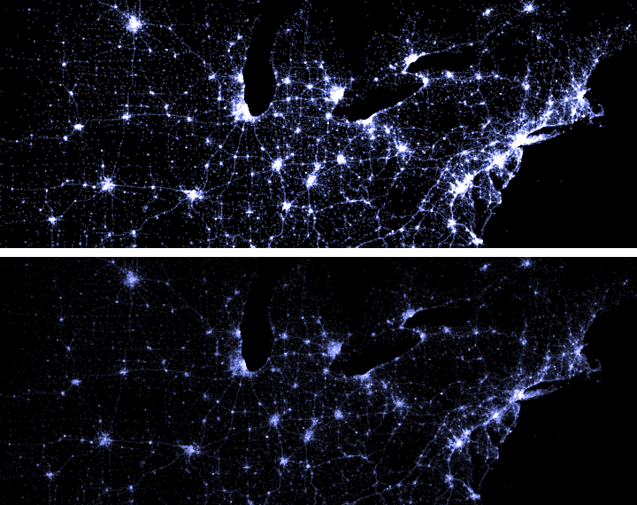
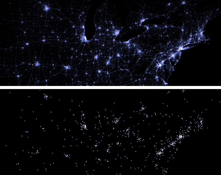
This is big data, and there's a significant level of geographic overlap between tweets, so Eric wrote an open-source tool that de-duplicated 2.7 billion overlapping datapoints, leaving 280 million unique locations.
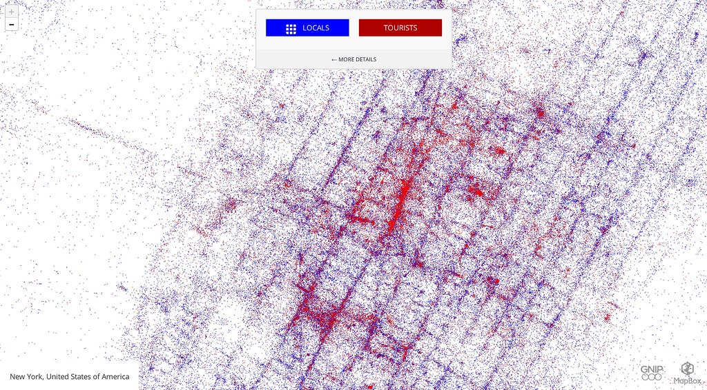
 see the full screen Locals and Tourists site.
Locals and Tourists analyzes behavior over time to highlight areas of cities popular with locals and places that are usually documented by tourists. It's a great expansion of Eric Fischer's previous work on the concept with Flickr data and city-level maps.
To make this map, Tweets are grouped by user and sorted into locals—who post in one city for one consecutive month—and tourists—whose tweets are centered in another city. Relatively inactive users simply don't appear on the map, since we can't confidently determine their group.
Mobile Devices is a map that reveals the information about phone brands that is stored when people use an official Twitter App and is hidden in the metadata attached to each tweet. Each brand of phone is a different color and can be independently toggled. The patterns of usage in each city often reflect economic stratification. For example iPhones, in red, are predominantly in wealthy sections of the city while Android phones, in green, have more coverage in poorer sections. On a global level, national trends reveal a complicated set of cultural preferences. (Tweets from web browsers and from other Twitter clients don't appear on this map)
Mobile Devices showing the domination of Blackberry in Indonesia. see the full screen Mobile Devices site.
Languages of Twitter is a high-definition evolution of an earlier world language map. It takes advantage of Gnip's language detection technology to identify the language of each Tweet so that the areas where each language dominates can have a distinct color. Because English is so widely used in Twitter around the world, it is colored gray to let other languages stand out.
 see the full screen Languages of Twitter site.
Spanish is the second most common language on Twitter, especially in the United States, so it is also individually selectable on the map. The other languages of the world are colored so that ones that are spoken near each other will be as far apart as possible on the color spectrum. In many cases they follow national borders, but in other cases language usage shows a more complicated pattern. Tweets whose language could not be determined don't appear on this map.
Each of the maps was made from the same set of 280 million locations, rendered to map tiles in different combinations of colors and layers to reflect the map's theme, using a program related to the one that Eric presented at State of the Map US.
Built with Open Source
These maps were generated with a variation of datamaps, a custom toolchain for visualization. This generated raw tiles, which were compiled to MBTiles with mbutil and uploaded with TileMill to MapBox.com. MapBox.js made it easy to build a dynamic interface around each map that lets users toggle categories and explore in detail. Each map uses a low-level geocoder to orient users if they're in an unfamiliar part of the world, and a forward geocoder to pop to their city or favorite place. The Language map includes a legend that doubles as a visualization of worldwide language distribution, and Locals and Tourists includes an index of the most interesting places to look - tourist attractions, airports, and transit in major cities.


