With more than 750 locations in more than 100 cities — including 80+ offices across 12 cities in Greater China — WeWork offers its members many choices for where to work. To help members around the world find the perfect workplace, wherever they are, WeWork.cn and WeWork.com are now built with Mapbox static and dynamic maps.
(Left) A static map on each office page identifies the location of a specific shared space and provides transit information. (Right) The dynamic map shows all shared spaces in the region, and additional office information including price.
People looking to find a new collaborative working space can do so with the ‘office-finder’ feature, displaying nearby intersections and subway stations.
Visitors can also compare prices of various shared spaces around the region from within the map-view.
Previously, WeWork.cn designers drew maps by hand for each new shared space. However, to keep up with WeWork’s growing pace, the team sought to find a more sustainable approach to creating beautiful yet simplistic static maps for each office location.
“Switching to Mapbox reduced valuable time spent drawing maps by hand. Now we’re able to quickly create beautiful maps with each new office on WeWork.cn”
- Ejoe HOU, Marketing Creative of WeWork China
Static maps of WeWork Beijing — Jianguo Rd, WeWork Guangzhou — Guangzhou Avenue, and WeWork Shanghai — Beian Changfeng.
Mapbox China works out of WeWork offices in HK, Beijing, and the flagship Shanghai office at Weihai Lu. Connect with our China team to learn more about building maps in China.
We had a great time last week in San Diego at the Mapbox Popup HQ, during the Esri International Users Conference. It was great to chat with Esri users who were curious about how to maximize their investment in Esri alongside Mapbox’s visualization and dissemination capability.
Mapbox Popup HQ in San Diego
Mapbox provides a cloud-native, scalable, and modern IT platform for live location data. Our maps are based on data collected from over 640 million end-users each month and over 300 million miles of road data each day, providing teams with real-time accuracy of traffic, road conditions, and more. Interoperability and standards are built into the core of this platform so we can support developers and analysts working in many different mapping environments and database systems.
For Esri users specifically, Mapbox works with traditional file formats (shapefiles, KML, GPX files, etc.) and we make it incredibly easy for users of these file types to use Mapbox Studio to upload their datasets, style the data, and view it on a Mapbox basemap. Once the data and map are styled, we support serving that data back out to the ArcGIS Online platform to provide a beautiful basemap in a familiar interface. Customizing the data via data-driven styles and controlling all aspects of the data layers will help your teams understand and interpret your data most effectively.
To get a sense for how your Esri data can look on a Mapbox basemap, check out our new ESRI Data Viewer. Drag and drop your Shapefiles (.shp) or GeoJSON (.geojson) files into the demo, and visualize the datasets right away on the basemap. If your data is in an Esri Feature or Map service, we can handle that as well. The Data viewer reaches out to the service, gathers the GeoJSON, and rapidly displays the data.
Mapbox Boundaries adds US Census boundaries and more
USA statistical layer in Mapbox Boundaries showing newly added US Census boundaries such as metropolitan/micropolitan areas, tracts, and block groups.
By: Jeff Butler
We just pushed a huge update to Mapbox Boundaries that includes over two million new boundaries, increasing our data coverage in over 100 countries. In this release, you will find highlights such as:
Statistical — Over 275,000 new US Census boundaries including metropolitan areas, micropolitan areas, tracts, & block groups
Statistical — Almost 2,000 new European NUTS (Nomenclature of Territorial Units for Statistics) areas across three hierarchical levels
Postal — Full detail Postal-4 coverage for countries such as the UK, Netherlands, South Korea, and Japan.
Administrative — Wikidata IDs, translations and aliases added for admin-1 & admin-2 boundaries
EU NUTS now in Mapbox Boundaries
Additionally, this update improves recency for the Americas, Europe, Africa and Asia that includes China, Japan, India, mainland southeast Asia, resulting in a highly detailed, global set of edge-matched polygons at all zoom levels that is validated by Mapbox cartographers and geospatial engineers.
Building with Boundaries
The quality of every boundary has enabled Mapbox Boundaries to be used in incredible analyses and tools across industries and the mapping community since its release. Some examples are:
One viral data visualization powered by Mapbox Boundaries was a map last year of the most popular song in every city created by visual journalists from The Pudding.
“Mapbox Boundaries is one of the most detailed set of geographies I’ve ever encountered. I was able to map millions of coordinates to highly precise regions, allowing for aggregations of data that I didn’t know was possible. Moreover, the detail of the boundaries is astounding, allowing for sub-country choropleths (i.e., heatmaps) on a global level.”
Today’s updates, paired with the core foundational product capabilities of Mapbox Boundaries — like localized world views and a vector tile-based rendering scheme — allow this release to support even deeper geospatial insights and data-driven problem solving across industries and government use cases.
Over the course of the new few weeks, we’ll highlight more examples of building with Boundaries. Let us know what you’re building by tagging your visualizations and interactive maps on twitter with #builtwithmapbox and we’ll share from @mapbox.
For more, check out the product page to see how Mapbox Boundaries can help with your use case. Mapbox Boundaries is available through annual commitment plans as well as in data visualization platforms like Tableau and MicroStrategy. If you’re ready to get started with Boundaries, reach out to our team.
New ways to share insights and get answers from our support team and developer community
By: Yaniv Markovski
As a platform built for developers by developers, it always amazes us how the community building with our tools not only creates complex and stunning creations we couldn’t dream of, but also works together to troubleshoot and collaborate on projects. For years, this community has answered questions, shared tips and tricks, and shown the limits of what our tools could do faster than we can keep up.
Last month, we passed over 1.7 Million developers building with Mapbox — as this developer base grows, so does the collective knowledge of our users. For the support team, we’ve prided ourselves on our ability to support the questions and needs of every builder — whether they’re a large enterprise customer or brand new developer just getting started with our tools. That’s why we decided to officially join our developers and jump in to Stack Overflow to start answering questions, replying to threads, and contributing to those collective answers. We’ve already added in some of our most common in-bound questions, including:
We want to make it easier and faster for anyone to find answers to their questions, especially questions that others have raised without needing to wait for a reply from our team. As a bonus, joining in on this community conversation creates a feedback loop that allows us to create better documentation and learn how we can improve our product.
That’s a lot of earthquakes. I wanted to see what that looks like, so I made a visualization with Kepler.gl. First, I grabbed recent earthquake data from the USGS. Then I dropped it into Kepler.gl:
Point data by magnitude saturates the visualization:
But the heatmap shows the incredible earthquake density:
Switching to a time series view let me visualize the sustained and intense activity:
Kepler.gl let me build this Ridgecrest Earthquake visualization in a few minutes, without writing any code. And since we integrated Kepler.gl with Mapbox Atlas, the on-premises version of the Mapbox.com platform, I created this visualization entirely offline.
With Atlas, emergency responders can create Kepler.gl visualizations on-premises or offline. They can visualize location data during disaster recovery exercise in air-gapped emergency operations centers. After an earthquake, they can deploy Atlas at field command centers and coordinate response teams — regardless of damaged or destroyed communications infrastructure.
Kepler.gl for Atlas will ship as an included feature with Atlas Standard or Atlas Enterprise. Contact sales to start a free Atlas trial.
We’re excited to be at SoftBankWorld in Tokyo this week, to launch Mapbox.jp and the start of operations in Japan with a new office opening in Tokyo, and to announce our partnerships with Zenrin and Yahoo! JAPAN.
We’re partnering with Zenrin, the leading provider of Japanese location data, to bring enhanced map data to its services in Japan. Zenrin has 70 years of experience mapping Japan, with data covering almost 100% of all Japanese roads and neighborhoods. Integrating Zenrin data into the living map platform will dramatically improve map coverage and will enable Mapbox to provide an extensive amount of real-time traffic and dynamic change detection in Japan. Every day these devices generate 14 billion anonymous, aggregated sensor readings that are used to deliver precise traffic data and update the map in near real-time.
We announced our collaboration with Yahoo! JAPANto transform the Digital Experience of Maps in Japan. Yahoo! JAPAN offers more than 100 services — including search, news, weather, shopping and auctions — to smartphone and PC users. In the Japanese iOS app store, apps from Yahoo! JAPAN occupy three of the top five spots in navigation, two of the top five spots in weather, two of the top seven spots in news, and three of the top 50 spots overall. On Android, the company has five of the top 50 apps in the app store. Through this collaboration, Mapbox will power the maps across all of Yahoo! JAPAN’s mobile and online apps. With its living AI map continuously updated with data from 14 billion anonymous, aggregated sensor readings every day, Mapbox provides developers with the building blocks that enable a high degree of customization. The teams will work closely together to create new experiences tailored to the needs of Japanese users.
“As the most visited destination in Japan, we need to provide the best, most performant map to our users. Integrating with live location platform Mapbox will help us deliver new and customized features for our user base. We pride ourselves on making daily improvements to our services, and using live location from AI-powered, continuously updated maps will allow us to bring more tailored personalized products and experiences to users,”
- Keita Hakoda, Unit Manager of Yahoo JAPAN’s Local Services.
Mapbox will be at SoftBank World on Thursday, July 18th and Friday, July 19th, at Booth #9 in the Exhibition Venue. Mapbox CEO Eric Gundersen will be speaking at the SoftBank keynote on July 19th during the Day 2 Keynote. Join us on Friday, July 19th at 2:10 as we demonstrate live location solutions for industries transforming consumer applications, automotive, logistics and ride-hailing, business intelligence, and telecom including 5G modeling.
Introducing Mapbox.jp was originally published in Points of interest on Medium, where people are continuing the conversation by highlighting and responding to this story.
How Moji Weather enables seamless weather animations with Mapbox GL
By: Macro Shen
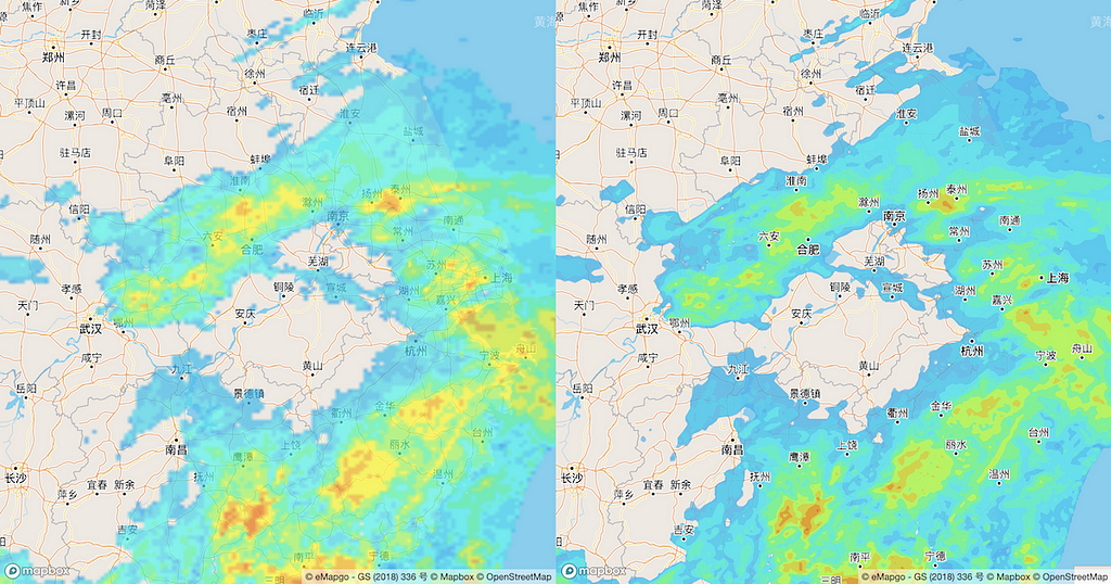
Left: using traditional raster images; Right: Using vector tiles with higher resolution.
Moji Weather, the creator of China’s largest weather app, visualizes radar data, AQI (Air Quality Index), and other weather conditions with Mapbox GL for its Android and iOS apps. Radar data are among the most difficult to render quickly on native apps — Moji Weather realized this challenge and reached out to Mapbox for a solution, eager to move away from their previous raster-based mapping platform. We created a solution that enabled fast and smooth visualizations overlaid on Mapbox Streets Chinese, our licensed base map in China. Below we walk through the building blocks that made this possible.
Traditional radar data visualization
Precipitation data are typically derived from radar sources — the format of these raw data are usually raster images. When visualizing these, the common approach is to add multiple images on the map as raster source, or generate to image tiles, and then display data with a time-lapse effect by showing different images per frame.
Many weather apps use this approach to visualize radar data, including Moji’s previous versions. However, there are two main shortcomings:
The resolution is low when zoomed in.
Animations are not smooth.
New approach to data visualization
Mapbox vector tiles enable data-intensive maps to render quickly while offering full design flexibility. These are the vector data equivalent of image tiles for web mapping, applying the strengths of tiling — developed for caching, scaling and serving map imagery rapidly — to vector data.
For Moji we decided to visualize radar data through vector tiles. First, we needed to convert raster images to vector format (GeoJSON), and then generate to Vector Tilesets.
1) Vectorize the radar data
There are many open source tools to vectorize raster image. For example, d3-contourgenerates contour polygon from images in a Node.js environment or use numpy / rasterio in a Python environment for generating pixel polygons from images.
In addition to vectorizing, we also converted the coordinate system from pixel to geo before generating GeoJSON data.
2) Interpolate the radar data to smoothen out transitions
If we look at the traditional radar images side-by-side, the jumps between frames are obvious. We know the breaks would be less obvious with more frequent data frames. So we try to create intermediate radar images to improve frames per second for more fluid animations. Then, we run the processing script and generate more vectors, which would allow the animation to run with more steps and possibly appearing more fluid.
The easiest way is to interpolate the data between adjacent frames:
Note, we can also create more than 1 (e.g, 2 or 3) transition frames between original frames to enable more fluid animations, but at the cost of data size.
3) Build Vector Tilesets from GeoJSON
To generate vector tiles we utilized tippecanoe, a powerful tool to build vector tilesets from large collections of GeoJSON, Geobuf, or CSV features.
The easiest way to install tippecanoe on OSX is with Homebrew:
$ brew install tippecanoe
After installing tippecanoe, we used the following command to generate mbtiles:
Note: -e can be used to write tiles to the specified directory instead of to an mbtiles file, supporting those wanting to publish vector tileset to a web service.
4) Visualize radar vector tiles using Mapbox GL JS or Mapbox Maps SDKs for iOS and Android
After the radar vector tileset is published, Mapbox GL JS or Mapbox Maps SDKs for iOS and Android can be used to load and visualize radar map.
Here is a sample code using Mapbox GL JS. There is also an example for Android SDK.
At last, we use `setFilter` function of Mapbox GL to animate the radar data smoothly:
The output is a map with improved UX: smoother and higher resolution renderings compared to traditional visualization.
Vector tile radar (middle) is visibility smoother than raster tile radar (left).
Moji’s radar map takes advantage of Mapbox vector tiles to display clean stutter-free radar visualizations. Contact our China team if you are interested in using our maps and technology.
Macro Shen is a Solutions Engineer for Mapbox.cn, based in Shanghai.
Improving traffic predictions for logistics and everyday drivers
Typical traffic quality in Denver (left), traffic quality in Denver during snowstorms (right).
By Camilo Sanín
Last winter was one of the snowiest on record, creating challenges in logistics and transportation across the United States. Mail and packages don’t stop on stormy days, but driving conditions do get more unpredictable.
In order to power more accurate ETAs for logistics and everyday drivers during unpredictable weather, the Telemetry Team conducted an analysis of the effect that storm weather had on traffic in Denver, where billions of vehicle-miles were traveled during the winter (estimated 21.7B annual VMT), and thousands of those were trips powered by Mapbox Navigation.
Between November 2018 and April 2019, Mapbox collected about 200M miles of anonymous telemetry that we use to power our traffic data. Of that 200M miles, we set aside 400K anonymous trips (<.05%, totaling 825K miles) to benchmark our traffic products to ground-truth.
With this small subset, we are able to infer very granular traffic dynamics in the city — from heavy-traffic rush hour, Friday nights out, and lazy Sundays. We further singled out moments throughout the winter when traffic was exceptionally slow to evaluate the predictive ability of our traffic models under two dimensions of quality: accuracy and symmetry. ETAs during storm days were consistently optimistic and more inaccurate than typical days. Predictions based on live-traffic data showed a marked improvement over typical-data only ETAs during storm days. This analysis shows the powerful insights that can be derived from a small portion of our telemetry data, and the value of the signal that can be extracted by our traffic models. Here’s a look at how we did it.
Understanding traffic dynamics from anonymous telemetry data
To measure general traffic dynamics in Denver, we calculate the pace (minutes it takes to drive a mile) of each of the trips set aside for evaluation. When we aggregate all those trips, we visualize the variation of pace at which vehicles move hourly though a typical week. It’s worth noting the regularity of traffic: high-pace rush hours during the weekdays as well as faster speeds (low pace) during off-peak times. Other details are also visible during typical weeks; for example, weekend nights are a lot more congested than business days, and traffic on Sundays is in general lighter.
Pace through a typical week in Denver
Assuming a constant VMT (vehicle miles traveled), we translated pace into “number of hours” estimating how much any given time during the winter (in blue in the graph below) deviated from the typical baseline we established (in gray). Positive numbers (in the y-axis) are the number of extra hours in which Denverites were collectively stuck in traffic with respect to the same time in a typical week, while negative numbers are exceptionally low traffic periods. For example, in the second week of December, traffic fell within the baseline and was never particularly fast or slow.
Time spent in traffic through time (in blue) compared to the baseline of typical traffic (in gray)
What happens when it snows
On March 13th a record-breaking storm hit most of the Central US causing major disruptions in Colorado. In Denver in particular, traffic was chaotic and our telemetry data captured a significant slow down in travel speeds.
Time spent in traffic through the storm (in blue) compared to the baseline of typical traffic (in gray)
For both March 13th and 14th, the extra hours driven were well above the typical week. Road conditions were so bad, that on average each person spent 30 minutes longer in traffic than usual (minutes lost per capita) on March 14th. However, this was not the only storm or irregular traffic pattern in the winter.
We repeated the exercise above for every day from November to April calculating the time per capita “lost” in traffic compared to normal conditions. For a typical day, the minutes delayed per capita were ± 5, however, for most days when a storm was reported (and for some holidays) traffic was exceptionally bad. For example, on the Wednesday before thanksgiving, on average 11 minutes were lost per capita, and most winter storms added between 10 and 15 minutes per person.
Mapbox Traffic
Throughout the winter, Mapbox powered the navigation of thousands of trips in Denver through our Navigation SDK and logistics services. ETAs for those services are calculated using traffic data created through two different processes: (1) typical data, which uses historical telemetry, and (2) live data which is created using only data from current telemetry. Because traffic is highly cyclical, typical speeds data maximize the coverage of robust traffic estimates, while live data allow us to navigate in real-time through unexpected conditions.
Mapbox’s turn-by-turn Navigation uses a combination of those two sources of traffic data, however some products like Predictive Navigation and the Directions Matrix API relay only on typical data. In such cases, atypical conditions as those described above reduce the predictive ability of our models. To understand their impact, let’s first zoom out to one of the ways we measure traffic quality in general in the Telemetry team.
ETA Quality and Fan Diagrams
To make sure we understand the strengths and weaknesses of our ETAs, we continually benchmark traffic predictions against ground truth. Daily, we collect about one million records, for which we calculate multiple versions of error with respect to actual travel times.
One such metric is MSE, which for each observation takes a value between -1 and 1. MSEs value for a record is 0 when there is a perfect match to actual travel times. Negative values represent records in which the ETAs were smaller than the ATAs, therefore we had an optimistic estimate. Positive numbers indicate that we estimated a trip to take longer than it actually did.
MSE = {eta-ata}/{max(eta, ata)}
When thousands of records are gathered and grouped together, we can analyze the trend of a population. These groupings can be geographical (e.g. European countries, APAC cities, US States), temporal (e.g. calendar days, business days vs. weekends), any other relevant classification (slow vs. fast trips, types of roads, etc) or even competing models or ETA providers.
For example, below are histograms of the MSE for groups A through D. Notice that there is a difference in (1) the spread of the distribution and (2) how centered around 0 the error is (symmetry).
Simulated distribution of error for four groups (A, B, C, D)
To capture both those dimensions, we can we summarize the above distributions in a fan-like graph, in which the x-axis is the mean error (which captures symmetry), while in the y-axis we plot the mean absolute value of the error (which is the overall error, regardless of its direction). Then we measure traffic quality in two dimensions given the location of a distribution in a polar plot: The magnitude (r) and the angle (θ).
Fan diagram summarizing the distribution of errors simulated above
The magnitude of the vector between the origin and each point (`r`) is related to the overall traffic accuracy — the further from the origin the lower our quality. For example, `A` and `B` in the figure below have similar overall accuracy, whereas `C` is better. The second dimension is the angle of the vector with respect to the dashed line (`θ`). Clockwise estimates are overall optimistic, and counterclockwise ETAs are too high (overly pessimistic). For example `A` and `D` have the same symmetry value (though `A` has greater accuracy), and while ETAs in `C` were overall the closest to the ground truth but when the estimates were off, they were almost exclusively too slow.
In summary — the closer a point is to the tip of the graph, the more accurate our estimates are; and the closer to the line in the center, the more balanced optimistic vs. pessimistic trips are.
Traffic Quality in Snowy days
Mapbox traffic data in Denver is generally very accurate. For more detail on how consistent our ETAs were, we can plot our evaluations grouped by day. In the figure below, each point represents the quality of the typical-only traffic estimates on a day. Similar to the figures above, blue points represent days with significant levels of snow and red ones holidays. “Normal” days (in gray) form a cloud in the high-quality and slightly pessimistic area of the cone, additionally some holidays (which we don’t treat as regular weekdays) have high predictive ability. During storms, as well as days surrounding holidays (e.g. Wednesday before thanksgiving) ETAs based on typical data are less accurate and very optimistic. In other words, for these days our prediction based on baseline-traffic produced business-as-usual ETAs, while travel times on the road were exceptionally long.
Fan-diagram plotting the error of typical-only ETAs for every winter day.
Effect of live traffic
Fortunately, our navigation is also powered with live-data traffic which is especially relevant during atypical days. Anecdotally, we have noticed that the contribution of live-data seems to be most beneficial during extreme conditions, but we also want to understand its impact on ETAs on regular days. For storm days and holidays, with atypical traffic, this seems to be confirmed when plotting the error side-by-side in a fan diagram (small markers below are the errors of typical-only ETAs and larger are ETAs powered by typical+live data).
Fan-diagram contrasting error of typical-and-live ETAs (large points) and typical-only (small points) for holidays and storm days.
While our turn-by-turn ETAs during storm days were still too optimistic, the magnitude of the error is much lower, getting our estimates significantly closer to what drivers were experiencing on the road, but while the improvement is more visible in extreme conditions, live-data overall improves quality every day. To assess the overall contribution of live-data, we quantify the improvement of the typical+live estimates vs. typical-only in the same dimensions described above. In the figure below, the x-axis is the difference in the magnitude of the angle θ regardless it’s direction, thus positive numbers mean that errors of typical+live are more symmetrical than those of typical only. In the y-axis is the difference in r or the over-all error. The vast majority of days fall in the positive-positive quadrant, meaning that live-data improve both the accuracy and symmetry of our ETAs, and this happens for all days, not only those with irregular traffic.
Improvement in traffic quality when live-data is added.
Winter is coming (at least once a year)
Although snow season in the Northern hemisphere is over, it will be back again; and traffic patterns are not only exclusively affected by snow. Other extreme weather phenomena, demonstrations, sports, and other events also change the speed that cities move.
The patterns recovered in this post used only a very small fraction of the total telemetry collected in Denver (less than 0.5%), so harnessing the strength of the millions of miles we collect every day, would enable our live-traffic models to nail these predictions even more accurately in the future. Lastly, there might be some regularity in the traffic during these atypical events. While our logistics customers cannot plan ahead using live-data for a future date, if we know a storm is approaching, providing predictions during a “typical snowy day” might be a significant improvement over our general typical profiles.
Want to incorporate Mapbox traffic into your routing engine, navigation app or embedded system? Access traffic-aware ETAs and routing via the Directions API, Navigation SDK for Android and iOS, or add it to any map including HERE, TomTom, or OSM.
The dashcam app Nexar just launched Nexar Live Map, an interactive map that allows anyone to see the world thanks to billions of fresh images and metadata from the Nexar network.
When people pair a Nexar-powered smart dashcam with the Nexar app, they join Nexar’s connected vehicle network, where every car is learning in real-time about what’s happening on the road thanks to the others around it.
Nexar Live Map is your window into what the vehicles in the Nexar network are seeing right now. Nexar’s development team uses extremely lightweight AI models running in the Nexar dash cam mobile app to pull the most recent images and data and plug them into the Mapbox mapping platform. They use the Mapbox Maps SDK to take Mapbox street data and seamlessly layer in live data from the Nexar network in real-time, resulting in a fast and snappy map to explore street-level imagery. Users can zoom into different areas of the map and filter images by construction zones, potholes, traffic lights and more. Nexar automatically anonymizes and aggregates all information so that neither the driver nor anyone on the road can be identified.
Nexar Live Map with Satellite base map, filtering by “Do Not Enter” signs
Nexar has rapidly expanded its connected vehicle network. People using Nexar’s smart dash cams have logged more than 500 million miles, and Nexar’s network has significant density in more than 100 U.S. cities. Combining our technologies in this way makes it possible to explore roads as they exist today — not as they may have appeared months or years ago—yielding fresher data for personal navigation, last-mile delivery, city management, and travel.
The Nexar Live Map is available now for New York City, with more cities to follow as Nexar builds out its network.
Welcome to this special edition of Location is Personal. It’s summer and what better time to share a list of books we love here at Mapbox. This is a giant “What we’re reading” section comprised of books recommended by Mapboxers. Enjoy!
Location is Personal is published once a month — sign up here to get it personally delivered to your email inbox, by an email sending robot named Kevin.
1 — “How to Lie with Maps” by Mark Monmonier
Lively, cleverly illustrated essay on the use and abuse of maps. The book teaches us how to evaluate maps critically and promotes a healthy skepticism about these easy-to-manipulate models of reality.
— Recommended by Paige Moody, Data Engineer
2 — “We, The Navigator” by David Lewis
Mind-blowing book about Polynesian navigators and the voyaging movement”
— Recommended by Jay Cox Chapman, Navigation Product Manager
3 — “The Lands of Ice and Fire (A Game of Thrones): Maps from King’s Landing to Across the Narrow Sea (A Song of Ice and Fire)” by George R. R. Martin
GoT is such a location-based fantasy world that they came up with some detailed maps of “the known world.” When we got the book delivered at Bangalore office, the whole lunch hour was delayed as we kept looking into the maps on the table.
— Recommended by Pratik Yadav, Satellite Imagery Engineer
4 — ” Imagined Communities” by Benedict Anderson
Benedict Anderson creates a framework for how systems, paradigms, the media, print, increasing digitalization converge to crystallize notions of nationalism, identity and nostalgia based on concepts of “place.”
— Recommended by Diana McCarley, Executive Assistant
5 — “Unfathomable City: A New Orleans Atlas”, “Infinite City: A San Francisco Atlas”, and “Nonstop Metropolis: A New York City Atlas” by Rebecca Solnit
Beautiful maps and essays that look at familiar places from super alternative points of view. I particularly love Unfathomable City : A New Orleans Atlas, but the New York City and San Francisco ones are also great.
— Recommended by Paige Moody, Data Engineer
6 — “W. E. B. Du Bois’s Data Portraits: Visualizing Black America” by W.E.B. Du Bois
Visualizing Black America is an inspiring collections of early data visualizations, including a pieces around location and race that offer a glimpse of the life of black America in the late 19th century. Personally, I am simply in awe with the fact that these are all hand-drawn and that they’re so diverse in shapes and colors. We spend hours on our computers and this is a good reminder that pencils are mighty tools.
— Recommended by Lo Bénichou, Interactive Developer
7 — “How to Do Nothing” by Jenny Odell
It talks a lot about using place (specifically public spaces) to re-orient yourself in the midst of the attention economy. It took a really strong stance on the importance of “non-productive” public space, especially in the Bay Area. I think about it everyday.
— Recommended by Jake Pruitt, Platform Engineer
8 — “Every Day Is For The Thief” by Teju Cole
“Everyday for the Thief is a window into growing up between places and cultures. It is rumination on how civic institutions are shaped by economics as well as a personal essay on belonging and not belonging, on where your parents are from and where you’ve found yourself living.”
— Recommended by Ian Villeda, Maps API Manager
9 — “Homegoing” by Yaa Gyasi
Homegoing explores slavery’s legacy through its impact on one family over 300 years and across two continents. It’s a powerful case for how memory, trauma, and violence are handed down through land as well as through lineage. Read this book! It might make you cry! It might change your politics!
— Recommended by Diane Schulze, Maps API Engineer
10 — “The City and The City” by China Miéville
Science Fiction story set in two cities that share the same physical space but are socially and psychically distinct. Touches on a lot of geography and urbanism themes.
— Recommended by Mikel Maron, Community Team
11 — “The Ghost Map” by Steven Johnson
Page turner non-fiction about Dr John Snow who used maps to find the source of the 1854 cholera outbreak in London.
— Recommended by John Branigan, Sales Engineer
12 — “The Arab of The Future” by Riad Sattouf
I love graphic novels and I needed to add this one to the list. Riad Sattouf’s graphic memoir is deeply moving, funny, and refreshing. I especially loved the way he portrays his dad’s attachment to his homeland, and his struggle in embracing two cultures that do not always play well together. There are 3 volumes in English and 4 in French with more to come.
— Recommended by Lo Bénichou, Interactive Developer
13 — Bonus from Twitter #Cartography: “The Map of Salt and Stars” by Zeyn Joukhadar
The Map of Salt and Stars is one of the most beautiful books I have ever read. I started listening to the audiobook from the Denver Library and already ordered a hardcopy to keep by the 1st chapter. To all my colleagues in cartography, READ THIS BOOK!
— Recommended by Aly D. Ollivierre, National Geographic Cartographer
Who we’re following
Rudo Kemper, pro-indigenous rights activist. Mapping and programs at Amazon Conservation Team. Team lead at terrastories.io.
Anita Graser, spatial data scientist, open source GIS advocate, and author.
Dr Sarah Taber, crop scientist. Ex-farmworker. Follow for intersection of tech, bio, biz, & people stuff behind it. Host at Farm To Taberpodcast.
Missing Maps, a humanitarian project that maps areas to meet the needs of vulnerable communities. An open collaboration building on OpenStreetMap.
EthicalGEO | Explore ethical challenges and opportunities posed by geospatial technologies. Enter for a chance to be selected as a AGS EthicalGEO Fellows | Deadline August 1, 2019
The World Health Organization (WHO) has officially declared the Ebola outbreak in the Democratic Republic of Congo (DRC) a ‘Public Health Emergency of International Concern’ — the highest level of alarm the WHO can sound, which has only been used four times previously.
It is the largest Ebola outbreak since the 2013–2014 epidemic in West Africa, and to date has claimed more than 1,650 lives — with about 12 new cases being reported every day.
Responding to this outbreak has been incredibly challenging for public health officials as the epicenter of the outbreak, North Kivu, is an active conflict zone. Beyond the obvious threat to life, the ongoing aggression against health workers has created challenges in the acquisition of relevant epidemiological, demographic, environmental and infrastructure data necessary to combat the outbreak of the disease.
In order to aid public health workers in the DRC, researchers at Ohio State University used Mapbox to create the Ebola Response Platform, an open-source, fully integrated visual platform that makes geospatial data related to the outbreak publicly available. The GitHub repository for the tool includes documentation for methodology and all source data. They hope that this tool, and the accompanying resources, will be to used to catalyze research and development efforts by organizations across the globe with an interest in improving geospatial intelligence for the North Kivu Ebola outbreak. I sat down with Sam Malloy, a researcher at OSU’s Battelle Center for Science, to discuss and learn more about the opportunities and limitations that his team faced when building this tool.
Location of incidents of violence in the region in 2018, by month
What are the goals of this project and why did your team decide to use Mapbox?
The additional complexity created by ongoing conflict in the region has placed normally stable variables into a state of flux: population density, infrastructure use, border crossings, land ownership, and land use can change rapidly and alter the spatial distribution of risk. Because of the difficulties of acquiring, analyzing and visualizing data relevant to the response, NGO’s and local governments are left unable to leverage the vast network of technical expertise available at universities and research institutions across the globe. Moreover, there is often a lack of clarity around the underlying sources of data used to characterize the current and projected future state of the outbreak making the work of decision-makers incredibly difficult. The outcome that we are pushing for is transparency regarding data sourcing, display and analysis, which we believe can play a transformational role in supporting decision-making.
Mapbox was a good fit for this project for a number of reasons, but chiefly because it enabled us to conduct end-to-end open-sourcing. This enabled us to take advantage of a broad community base when working through technical challenges. The Mapbox Community Team, for example, was critical in troubleshooting some of the thornier data problems we discovered. Additionally, the documentation of the API is very thorough. While there are some limitations to what we can do solely within the Mapbox ecosystem, we are exploring options to overcome these barriers.
In terms of gathering data, what are the biggest limitations you encountered?
We wanted to reduce the barriers to entry that organizations would face when working with this data, and these barriers can take a few different forms. One consistent challenge is finding data that is spatial in nature but is presented without geographically identifiable information. Another challenge is that datasets often contain samples about which we can be highly confident alongside samples about which we have low confidence, without identifying so in the resource. This means that data can be presented on a map as, for example, a series of points: a user will assume that they are of equal validity because they exist in the same data layer, but in reality we ought to be much less confident in some points than others. This is true of datasets as a whole, especially spatial datasets: does a region have null values because there is truly a negative sample in that region, or simply because it was not characterized during the data collection process? These are basic errors that can have considerable consequences when compounded in models and magnified over time.
Many researchers working on development projects are interested in using Facebook’s population dataset. Why is this data useful for your project?
Population data is built into so many decisions about risk and resource deployment, but the uncertainty in this data is rarely discussed. In the DRC, most population datasets are based on scalars of a 1984 census, which many end-users of this data do not know. The Data for Good team at Facebook has made great progress in characterizing population density without such heavy reliance on the historic census records. To display the data in our open-source web map, we used QGIS to polygonize the data for the region, then combined and compressed the datasets into a single tileset. We now have a format that can be displayed on Mapbox and downloaded for use elsewhere. However, we have the luxury of working out of one of the country’s largest research universities with easy access to computing resources and technical experts. I imagine that using this dataset in its current form could place unnecessary frustration on front-line NGO’s and government organizations that do not have the time and resources to work through data problems, so we hope to work with Facebook to make this data more accessible in the future.
Disaster risk management projects often rely on local government datasets, such as the ministry of health data that you used to examine Ebola cases and deaths. Can you describe your experience with accessing and using government data for this project?
A key issue for governments with regards to data is balancing security and privacy with accessibility. With Ebola this scale is tipped towards security, meaning researchers must scrape the web for the data they require. The Humanitarian Data Exchange, for example, has a bot that imports the newest line lists from ProMED mail (an informal health surveillance network), which are derived from WHO situation reports. This data needs to then be merged with spatial information, which introduces a manual step. The dataset is aggregated to the level of the health zone, which is roughly equivalent to a county-level aggregation in the US. Contrast this with data produced by the Kivu Security Tracker, a project of the Congo Research Group at NYU and Human Rights Watch, which produces reports of violent incidents in the region at the resolution of village level or below. Similarly, the population density data we utilize presents a 30-meter resolution. Characterizing meaningful relationships between these datasets is very difficult when the key parameter of interest, confirmed cases of Ebola, is aggregated to such a broad scale. Additionally, there is also the issue of cases being reported in different locations from where they originate, about which there is always a degree of uncertainty. It is important to include a consideration of confidence in the location of cases in the data, and to then include this consideration in both visualization and analysis — but this has to begin at the data collection step.
How could organizations improve their data accessibility and standardization?
One root cause of a lot of issues around data accessibility is a fear of misuse of underlying data — for example, that a bad actor might modify a database and then re-publish. There are also legitimate concerns about privacy. For this reason, organizations often publish sensitive data in static formats (pdf documents, for example) in an aggregated format, so that information is available but not all components of the underlying data. Our view is that nearly all data can and will be reverse-engineered, and that open-access/open-source is the stronger alternative because you mitigate the risk of faulty assumptions being built into that reverse-engineering process by helpful actors (e.g. the research community) and also can maintain a chain of documentation regarding any potential, and highly unlikely, case of a bad actor manipulating the environment.
The Mapbox Community team partners with world-changing organizations and individuals using location tools to help solve social and environmental challenges. Get in touch!
Ebola Response Platform was originally published in Points of interest on Medium, where people are continuing the conversation by highlighting and responding to this story.
Product Updates is a monthly newsletter highlighting recent product improvements and use cases so you can stay up to date on what’s new. Want to get it in your inbox? Subscribe here.
This month… new ways to build with Vision SDK, stand-alone Mapbox Traffic Data, +2M new boundaries, Studio improvements based on your feedback, and changelog.
🌱 What’s New
Mapbox Vision SDK is now in public beta
Developers around the world can build immersive navigation experiences with augmented reality, interpret signs and driving conditions on-the-fly, customize safety alerts, and monitor driver performance. Unlock a new dimension of navigation experiences for your users — all you need to get started is your Mapbox account.
Tell your Boss: Traffic Data works with OpenLR or OSRM
Need stand-alone traffic data for your own custom routing engine or business intelligence platform? Mapbox Traffic Data is fully compatible with Here and TomTom maps via OpenLR linear referencing, and it integrates with routing engines like Graphhopper and OSRM with native matching to OpenStreeMap node-pair IDs. Mapbox Traffic Data is compiled from more than half a billion live moving global sensors, and is verified and benchmarked by AI. Learn more.
Mapbox Studio’s new look (and new features!)
We’ve launched updates to Mapbox Studio to help our users collaborate and ship better maps — even faster. Improvements include highly requested features like draft mode, custom monochrome style creator, and a brand new UI. Start building in Studio now.
📦 New Solutions
Asset Tracking
Mapbox can provide you with all the necessary services to build a robust, scalable asset tracking solution to monitor real-time locations of fleets, shipments, or pets. Read our White Paper: How to set up an Asset Tracking architecture
Alteryx Modules
As part of the Alter Everything movement, we’re put three new Alteryx Modules into public beta: Search, Isochrones, and Spatial Lookup (powered by Mapbox Boundaries). All three modules leverage our world-scale APIs, so once they are in your workflow, you have global, accurate datasets at your fingertips. Contact us to request access to the Beta.
Atlas Field Kit
Natural disasters and humanitarian crises may disrupt critical infrastructure, but relief
efforts will require location information to help coordinate the response. Atlas Field Kit is a complete set of portable infrastructure packaged to run Mapbox Atlas anywhere, in as little as 90 seconds — just add power.
✨ New Demos
Esri Data Viewer — Drag and drop your Esri data to see it styled in a Mapbox basemap.
Itinerary Builder — Workflow, including source code, for creating customized maps like travel itineraries.
🛠 Product Updates + Improvements
GL JS v.1.1.0 — Enable zoom speed customization, improved rendering. See more.
Navigation — Hybrid Offline-Online Routing: Reduce data bills by using as little bandwidth as possible. Learn more in Android or iOS.
Navigation — Improved walking directions: You’ll now see better turn-by-turn instructions and can fine-tune your experience by adjusting for walking speed or path preferences. Get more info.
Search — Address accuracy: The Search API now returns an accuracy attribute, with levels covering: rooftop, parcel, approximate, interpolated, and street. Read the docs.
Search — Intersections: Get results for intersection searches like “2nd St & Market St”. Here’s how.
Accounts — Restricted Access tokens:Add URL restrictions to access tokens for your Mapbox GL JS web applications for an extra layer of security and to prevent unauthorized use.
What’s New | July 2019 was originally published in Points of interest on Medium, where people are continuing the conversation by highlighting and responding to this story.
As the Wall Street Journal just announced, Nitin Agrawal is now CFO at Mapbox. Now that Nitin has wrapped up his work at Amazon, we can finally be public about the news. Nitin has been CFO for Compute Services at AWS for the past 4.5 years, responsible for the entire division’s P&L, leading financial planning, pricing for new services, capital and free cash flow management, and controls and compliance for the division. When he started, he was one of the first two people on that Finance team and grew it to a 40-person team. Prior to AWS, he was at MSFT. We encourage everyone building with Mapbox reach out to Nitin and welcome him to our mapping community and share what they are building and designing. Nitin would love to hear directly from our customers.
As we grow Mapbox we need leaders across the company who can both support our teams and business today and be builders that expand our operations and drive our products and platform into the future. A few months ago, I shared what I was looking for in a CFO. I wanted to find someone who wouldn’t just sit and control budgets, but would get in the mix and be a true partner. I needed someone who not only intimately understood what we’re building, but also knew how to enable us to take risks and work directly for the benefit of our customers. We found that in Nitin, who has an intimate understanding of how to build and scale sustainably — without slowing down growth — mitigate risks, and how to fail fast and learn from it.
The WSJ nailed it:
Mr. Agrawal’s understanding of pricing models for technology platforms, as well as his focus on customer needs, made him an attractive candidate for the job, Mapbox executives said Wednesday. “The №1 thing I’m going to take along with me from Amazon is an obsession with the customer,” Mr. Agrawal said in an interview.
For Nitin, CFOs aren’t outside of the organization — they’re an indistinguishable part of the team and act as internal advocates for customers.
“The CFO’s job is to figure out a way to enable the team. My job is not to make the least risky decision, but to make the most calculated risk-taking decision, and put in adequate risk mitigating measures in place should the decisions go wrong. CFOs need to ask the hard questions, be convinced about the investment and the decisions we’re making, and be the person who’s enabling the business to serve our customers better. The function of finance has changed a lot over the years — it’s no longer a function that is limited to the core basics of control and accuracy of numbers. CFOs, and their team should work as advocates, working on behalf of the customer to optimize company resources to make faster innovations in the company and drive impact in the biggest opportunity areas.”
On that note, I think it’s best for everyone to get a feel for Nitin and how he thinks directly — in his voice. To introduce Nitin to the team, Brynne sat down and asked him a few questions. His answers show clearly why we’re excited about his leadership.
Understanding the product
Nitin began his career as an engineer consulting for Deutsche Bank to come up with a credit risk management system. He realized then that he wanted to go to school for finance, and got his MBA at Duke University. This dual understanding of both tech and finance means that he gets cloud and platform — and more importantly economics of cloud and platform services — like very few people.
“Being a cloud-native company allows us to scale the organization and the business in a way that is agile and economical for our customers. We’re one of the few companies in this space that started cloud-first, allowing Mapbox to meet customers with a consumption model they’re used to and expect. Equally, if not more important, Mapbox is obsessed with the customer experience. We want to give the power to the developer to actually have the dataset in their hands and leverage it in the way that is best for their applications, not dictate to them in terms and limitations of how they should use it.”
Love of the game
Nitin’s energy for passion and building is palpable from the first conversation. He is fearless when it comes to untangling interdependencies, much like we face in building a large platform. At AWS, he had the opportunity to essentially start-up many new businesses and high-risk bets. He describes it:
“Jokingly, I tell people my experience at AWS is kind of like flying the aircraft at the same time as you’re building it. This has been a unique experience where I’ve had an opportunity to start up several new businesses. Sometimes, starting those businesses and seeing them fly off the ground in terms of gravity-defying growth, or — on many occasions — kind of fall flat on our face, where we misread the customer needs and then stand up, dust ourselves, and resurrect ourselves from there.”
As he moves into a more traditional startup environment, he’s excited about the challenge.
“The thing that is unique about startups is agility and the focus on driving things end to end. It’s about having that complete ownership model of your destiny. There isn’t cushion or support that you have in terms of making mistakes. You do make mistakes, but you learn from those very, very quickly and move on, and that’s something that I’ve experienced here at AWS where you fail but you fail fast, learn from it, and resurrect yourself. That’s honestly what is kind of in my core DNA and something I’m looking forward to — building that business, taking it to scale, and learning from our mistakes very, very quickly.”
This role will require someone who is a true systems builder. Our growth is constantly forcing us to build new ways to manage size, needs, and complexities.
“As we go through the kind of high growth phase that Mapbox is in right now, what you recognize is it’s actually a new company every 12 to 18 months. The processes that you have, the controls, may not scale from one phase to the other. You have to have consistent iteration on those to be effective. Otherwise either the controls become insufficient, the accuracy gets lost, or they actually become too cumbersome, because what worked with a five-person team, ten-people organization, does not scale and bogs down the business.
The most important thing in this environment is to be scrappy and then put boundaries on failure, understand where the failure happens, and then quickly iterate.”
Customer obsessed
Being a partner doesn’t just mean for the internal functions. For Nitin, it’s also about taking risks and making investments on behalf of our customers, their teams and end-users.
“The thing about being a startup is that you’re close to the customers. You have the agility to deliver value directly to the customer. I see how Mapbox is closely integrated into understanding what the customer pain points are, what their unmet needs are, and I want to be a part of that.
Vision for the future
Even though he’s just getting started, it’s clear to Nitin what our obstacles and chances for success will be.
“I think the biggest challenge that Mapbox will have, is going to be our relentless prioritization. The opportunity that we have in front of us is enormous. We have to make sure that we relentlessly prioritize, with the limited and finite resources that we have, that we’re focused on the most important customer needs. We have to be focused in terms of understanding what the customer needs are. We need to get the data on what customers need to build their business on our platform. Then we need to tirelessly serve those customers, which is not going to be an easy task. But if there is a team in the world that can do it, I do believe Mapbox is the team that can deliver.
A few years ago, the types of business models that have been enabled by geospatial data would have been unthinkable. Like ride-hailing, on-demand delivery, and business intelligence. I think this is just the beginning. If we’re staying close to the customer and their needs, in five years time Mapbox will be at the core of the businesses that will be created and changed by connected sensors and geospatial data that we haven’t even dreamt of as yet.”
There’s an awful lot going on in this five second video clip from yesterday’s test drive of the Vision SDK — we’re enhancing the depth and feel of our augmented reality navigation. Whether you are building solutions to run on a smartphone, a connected dashcam, or an automotive heads up display, lining up projected 3D features while weaving through traffic is a tough challenge. Getting AR navigation to feel like reality requires harmonious fusing of our map data from the cloud with the live sensor data on the client: GPS, inertial measurement unit (IMU), and the camera.
In designing a novel navigation experience, customization is crucial. The Vision SDK invites developers to get creative with designing turn-by-turn directions in 3D. Opacity, thickness, and color of the AR driving line are all adjustable today. In this example, we’re also changing from a solid line to a tread mark pattern. By estimating the vehicle’s velocity from the device’s GPS and IMU, we’re able to animate the chevrons of the tread mark such that they stay in place as we drive over them.
Lane markings and a curb are used to find the horizon and vanishing point within the camera frame.
To create 3D features that look as realistic as possible, we need to draw on the camera frame with a perspective that closely matches the horizon and vanishing point of the roadway as viewed from your car. No one wants to go through a calibration procedure every time they bring up their navigation screen, so the Vision SDK uses scene segmentation to calibrate automatically. We use segmentation of key features in the environment, such as curbs and lane markings, to find the horizon and vanishing point. This allows us to project features precisely without relying on any feedback from the user.
Red outlines show where the Vision SDK dynamically obfuscates the AR tread marks.
We also use segmentation to intelligently alter the appearance of the AR line. In this example, you can see two ways we’re dynamically obfuscating portions of the tread marks. First, the interior dashboard and the hood of the car have been removed. Second, we’ve cut off the end of the path where it intersects with the car in front of us. Look closely to see how the shadows in the scene show up on top of the tread marks as well — AR features that dynamically interact with the real world enhance the feel of driving over an illuminated carpet.
Finally, we’ve improved the fit of the AR pathto the roadgeometry using lane detection; we can use our understanding of where the left and right lane boundaries are to more precisely center the AR line as we drive. This is particularly helpful in situations with poor GPS signal, like tunnels and urban canyons.
Ready to put your imagination behind the wheel? Download the Vision SDK and start building today.
Styling hypsometry and bathymetry for a different perspective on Earth’s contours
By: Madison Draper
Earth isn’t smooth like a globe or flat like a map, it’s an ever-changing and beautifully contoured geoid. The Bubble map style highlights these contours. Focusing the map on hypsometry and bathymetry — the measurement of land elevation relative to average sea level, and the measure of depth in water features relative to the average sea level — heightens the natural features and geometries. With no labels, roads, boundaries and other human-created features, Bubble provides a different perspective on the landscape itself.
The Design: Color
With only 12 layers, this a minimal style, but by no means is this a simple style. The inspiration for the hypsometric palette was based off the radiant color swirls of a bubble. The paths of mountain ranges contort in similar, abstract ways.
Bubble uses an elaborate palette to highlight changes within a single tileset. To do this in Mapbox Studio, I added the Mapbox Terrain V2 tileset’s contour layer and styled across the data range. Using a cubic bezier curve for the rate of change, the colors blend into one another as elevation climbs.
The terrain data is styled with contour fills painted over the Terrain RGB layer. The contour colors blend into each other to create a smooth transition between colors. Terrain RGB is styled with a light pink highlight and a nearly-black pink shadow to amplify the 3D terrain.
Grand Canyon (USA) z11.8Cévennes National Park (France) z10.7
The bathymetric palette uses different hues and opacities to accent the underwater elevations to a visible coherence. Instead of a linear progression, the lightest blues are exponentially lighter to mimic older maps that keep coastline areas clear for port and label legibility. This light blue presents a cleaner, less distracting canvas for the hypsometric data than a darker blue would.
Unlike the terrain data, each step in the bathymetry data is set to a specific value. Because this data is more expansive, it makes the distinctions between each value clearer.
With Bubble’s two unique palettes, it’s like getting two map styles in one. Bathymetry data and styling is visible at all zoom levels. Because the hypsometric data is granular, I decided to increase the performance by beginning the hypsometric tinting at zoom level 9.
Broken down and abstracted from its geographic context, this chart below describes the relationship between the different colors.
Play with Bubble as a canvas for your next hike or data viz app. Its minimal canvas gives you the freedom to add only what you need and style it exactly as you want. Explore Bubble today by adding it to your account in Mapbox Studio. Share a screenshot of your favorite view or a new place you’ve found with #MapStyleMonday and we’ll reshare on twitter.
Bubble map style was originally published in Points of interest on Medium, where people are continuing the conversation by highlighting and responding to this story.
Fast data visualization offline, with Atlas + Kepler.gl
By: Adam Koeppel
July 2019 is shaping up to be the hottest month on record, following a pattern of record high temperatures —the hottest June ever was recorded last month, and previous temperature records were set in July 2017, 2016, and 2015.
I wanted to see what the July 19–21 heatwave looked like across the Eastern United States. So I made a visualization with Kepler.gl.
First, I needed data from the National Oceanic and Atmospheric Administration’s Climate.gov site. Their Climate Data Online Search page makes it easy to grab historical weather data from all over the world. I grabbed data for Virginia, Washington D.C., Maryland, Delaware, New Jersey, and New York. Then I combined the data sets and dropped them into Kepler.gl:
Now I had a visual of all the reporting weather stations, but I want to see the maximum recorded temperatures:
I want to make this a time-series visualization so we can see the heatwave unfold:
The last things to do is increase the size of the point data radius, so the data stands out:
And add a tooltip so I can mouse over weather stations and see recorded maximum temperatures:
Kepler.gl let me build this heatwave visualization in a few minutes, without writing any code. And since we integrated Kepler.gl with Mapbox Atlas, the on-premises version of the Mapbox platform, I created this visualization entirely offline.
With Atlas, weather forecasters and emergency responders can track dangerous weather events and create Kepler.gl visualizations on-premises or offline. If a heatwave knocks out power or communications they can still visualize weather extremes and help organize a response.
Kepler.gl for Atlas will ship as an included feature with Atlas Standard or Atlas Enterprise. Contact sales to start a free Atlas trial.
Guaranteed response time and no contracts or long-term commitment
By:Yaniv Markovski
Today we’re launching our Essential Support plan, making it easier to build and grow your product with our tools at any stage of development.
Whether you’re just getting started or building at scale, every Mapbox developer has access to help and support when you need it — from community resources and documentation to our team of product experts.
Essential Support provides developers assistance and guidance from our Support engineers, with the predictability of guaranteed response times. For $50 per month, we’ll help you get where you’re going faster, answering all your questions within 3 business days or less.
Just like our new pay-as-you-go pricing, there are no contracts or minimum commitments to get Essential Support. Whether you’re going through a high-growth period or deploying new functionality, it’s easy to subscribe to Essential just for the months you need it.
Essential Support rounds out our full support offering, including our Business and Premium Support options for enterprise customers, and a suite of community resources and documentation for developers at any stage. Our support now offers a range of packages, allowing developers to choose the level of SLA and TAM they need including:
Developer forums and documentation resources: In addition to the comprehensive body of product documentation, and tutorials at docs.mapbox.com and the Mapbox blog, we’re excited to support the growing developer community knowledge-base at Stack Overflow.
Email the support team: We’ll continue to offer any Mapbox developer the ability to email our support team. With 1.7 million developers, we can’t answer every email or guarantee a response time, but we continue to value the feedback on high priority issues and the opportunity to connect with builders just getting started.
Guaranteed Response: Guaranteed response times rely on an inquiry’s priority level. Critical issues will immediately move to the top of the list. Available only on Essential, Business, and Premium plans.
Dedicated Technical Account Manager: A dedicated Technical Account Manager who is familiar with your business goals and can partner with you to get the most out of Mapbox technology, partnering with you on your implementation, roadmap, and operations. Available only to Enterprise customers on a Premium Support plan.
Dedicated communications channels: Including private GitHub repository. Available only to Enterprise customers on a Premium Support plan.
Dosh, a fast-growing app based out of Austin, is making it easy to earn instant cashback on everyday purchases, like shopping for groceries, dining out at restaurants, or booking a hotel for their next trip.
Dosh’s new hotels feature lets travelers getcashback on hotel bookings. The Dosh team wanted to find a flexible location platform to customize their search feature, and set specific search parameters to help users find the right place to stay from over 600,000 hotels around the world.
Powered by the Mapbox Geocoding API, users can start searching by typing in names of cities, neighborhoods, or major POIs like airports. The autocomplete feature provides suggestions for a more accurate and complete search within their database. Dosh will then display a list of properties in that region and the average cashback per booking.
Dosh hotel search was originally published in Points of interest on Medium, where people are continuing the conversation by highlighting and responding to this story.
Figma is a cloud-based design tool that helps designers and teams work together efficiently. I love that it is an in-browser app, super-fast, and makes sharing files as easy as sharing a link. Figma just recently launched a ton of awesome plug-ins via live stream yesterday and one of my favorites is Mapsicle, created by Remix Designer, Chris Arvin. With the Mapsicle plug-in, you can drop your Mapbox map into your Figma design project with 2–3 clicks and 0 lines of code.
The Mapbox map is interactive, so you can zoom and pan around to the perfect spot or use search in the UI to find an exact location. In addition to using Mapbox core styles, the plugin allows you to bring in your own custom styles from Mapbox Studio.
Once you’ve placed a map in your designs, making changes is seamless. You can re-open your map in Mapsicle to adjust the location or style. This means you can quickly iterate by trying out different map styles, or you can save time mocking up different steps in a user flow that involves different zoom levels. Need to design for a larger breakpoint and need more map? You can extend the area of your map in one click.
And because the details are important, Mapsicle creates your maps as high-resolution images, meaning your designs will look sharp on a retina screen, even if you’re not using one when you make a map.
Mapsicle is super simple and pretty dope. I had to grab Chris Arvin, Mapsicle creator and Product Designer at Remix, for a quick Q&A:
Where’d the idea for Mapsicle come about?
Mapbox maps are central to the design work I do. Almost everything I’m designing these days involves a map in some way. As a designer, I find that it’s important to design with real content — and that includes the maps! And, from a visual perspective, making sure your UI and your maps work well together is key.
But over time, I found a number of challenges in working with maps in my designs. When I was iterating on a map’s content or style in Mapbox Studio, I had to keep taking the same screenshot with each change to see how it worked with the rest of my design. When I wanted to design for a larger breakpoint or increase the area that my map used, I had to go back to my browser to take a larger screenshot of the map.
Having to switch back and forth between a browser and a design tool took me out of my workflow, and caused me to spend time working with map images instead of designing.
What do you do for work and on the side?
I’m a product designer at Remix, where I work on our transit planning product. Planners at transit agencies use it for everything from quick route changes to entire transit network redesigns. I also have a number of transit-oriented personal projects. My partner and I created streetcar.live for the Market Street Railway nonprofit. It’s a web app that allows you to track San Francisco’s historic streetcars and see which ones are near you. I also created Bay Area’s Lost Streetcars, a set of interactive maps and photo galleries that show the long-gone rail lines of San Francisco.
What made you pair Figma with Mapbox?
Figma and Mapbox have both changed the way I work; Figma with its real-time collaboration and the simplicity of being web-based, and Mapbox with its super-powerful customization options for maps. Even before Figma announced plugins, I knew I wanted to make a way to make it easier to work with these two tools together. And when I posted a peek of my first prototype to Twitter, I got a great response that let me know I wasn’t the only one who would find this plugin useful.
Start Building Now
Start dropping Mapbox maps into your Figma projects right now! Just install Mapsicle from the Figma plugin page. When you’re in your Figma project, either open Menu > Plugins > Mapsicle or right-click directly on your canvas > Plugins > Mapsicle. It’s that easy!
We’d love to see what you make! Share your projects with @mapbox or tweet with the hashtags #builtwithmapbox and #figmaplugin.
Mapsicle plugin for Figma was originally published in Points of interest on Medium, where people are continuing the conversation by highlighting and responding to this story.