Mapbox product updates


Changelog:
- Mapbox GL JS — v1.8.1
- Maps SDK for iOS — v5.8.0-alpha.1
- Maps SDK for Android — v9.1.0-alpha.1
Hey Builders,
Elections in the U.S. and the Coronavirus are both top-of-mind this month.
For election mappers, we’ve added two resources:
- New Albers USA projection map style to help you reproject U.S. data
- New guide to feature state — including promote-id to make data joins way easier
Gentrification is also on the move — BuzzFeed News mapped five of the most gentrified US cities using a methodology that relies not on racial or ethnic demographics, but on census data for income, home prices, and education. The maps still show where black populations have left and where white people have moved in. Explore the data with the interactive map.
So what about this summer’s 2020 Olympics? Qualifying events are being held without fans in stadiums in Italy and the Czech Republic, but the competition is still scheduled to begin July 22nd.
View from the gallery
Mapping the ‘where’ of an outbreak
“Fighting epidemics, or stopping them from spreading, has a cost. When we’re ahead of them, we have relatively cheap, non-disruptive tools — like vaccines. When we’re behind them, economy-rattling quarantines, movement restrictions and health-system strain become more likely…”
- Prognosis, Coronavirus Daily Newsletter from Bloomberg

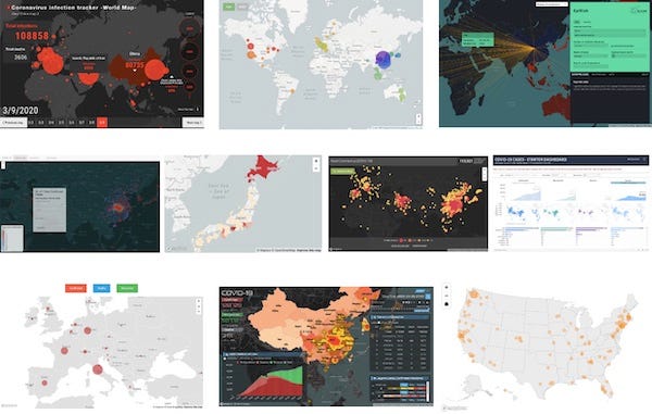
During an outbreak like nCoV, our team sees the varied and substantive ways that researchers and tinkerers use Mapbox tools to visualize reality and model potential outcomes.
Map credits, top-to-bottom, left-to-right:
- Nikkei Asian Review map with data from WHO, China’s National Health Commission, other sources: vdata.nikkei.com
- Nextstrain is an open-source project to harness the scientific and public health potential of pathogen genome data. Map: nextstrain.org/ncov
- EpiRisk is a computational platform designed to allow a quick estimate of the probability of exporting infected individuals from sites affected by a disease outbreak to other areas in the world. Map: epirisk.net
- @svscarpino’s (Emergent Epidemics Lab) map and dashboard for exploring data collected by Moritz Kraemer, Bernardo Gutierrez, Oliver Pybus, and Bo Xu: scarpino.shinyapps.io
- @reustle’s map with live updates for the outbreak in Japan: covid19japan.com
- HealthMap brings together disparate data sources, including online news aggregators and validated official reports, to achieve a unified and comprehensive view of the current global state of infectious diseases. Map: healthmap.org/ncov2019
- Tableau Foundation teamed up with @allanwalkerit and other Tableau Zen Masters to create a public data resource hub that leverages the Johns Hopkins University data with tools from Alteryx, Tableau, and Mapbox: tableau.com
- Boston Globe maps tracking the path of coronavirus with data from WHO, CDC, and sources compiled by Johns Hopkins University: bostonglobe.com
- Sinomaps + Mapbox China map using real-time data and heatmaps to display current and historical spread: mapbox.cn/coronavirusmap
- USAToday maps updated daily with data from WHO, CDC, and sources compiled by Johns Hopkins University: usatoday.com
New Solutions

In the style of `Dirty Reprojector`
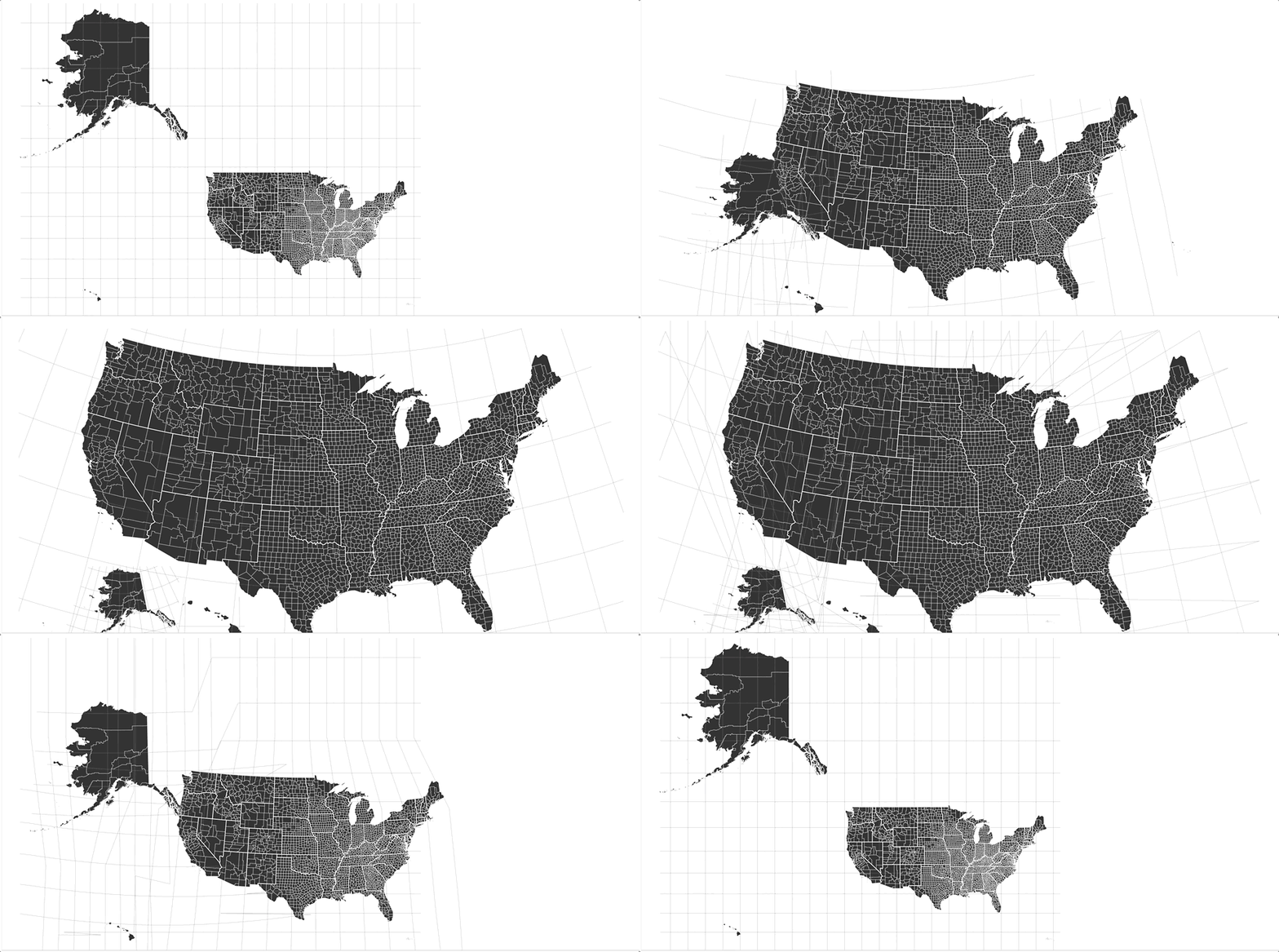
We recently released an Albers USA map style featuring all 50 U.S. States, Puerto Rico, and their counties that you can add to your own account. Albers USA is a popular projection for US-centric visualizations because it shows a scaled-down Alaska and Hawaii close to the rest of the states.
We built this style using Matt Bloch’s Mapshaper and Development Seed’s Dirty Reprojector. Click the link to our guide (above) to learn how to prep your own data and reprojections to use with the Albers USA map style.
While it has some limitations, this process allows for cartographic freedom and is especially efficient if you do not need Mapbox data like roads and streets. All your custom data can be reprojected and you can use Mapbox GL JS to add interactivity like hover, click, and zoom, or to join live data to the geometries on the fly using feature-state.
TAKEAWAY
With a little preparation, you can use Mapbox to render geometries in a projection other than Mercator. Yet we do not expect this will increase the popularity of Dymaxion.
On-the-fly
Runtime Styling
Here’s how runtime or “data-driven” styling works, in a nutshell:
- as votes are counted, counties flip from red to purple, or blue
- as 10 Coronavirus cases are added, point radius increases 1pt
Your Mapbox GL map can dynamically change with any of your map’s style properties in real-time, without having the rendering engine to re-parse the underlying geometry and data. This offers a significant boost in performance, especially when data is live and changing every few seconds.
Before GL v1.8, feature-state relied on the top-level feature id attribute which had to be unique and had to be integers or strings cast as integers (e.g. “03989” or 3989) which made preparing data very tricky.
Now, with promote-id you can promote any property (e.g “california,” “03989”, “US06”) from a feature as a top-level feature id as long as it is unique. Mapbox GL JS will create a lookup table and match the property to an integer. Also, it now accepts strings like FIPS code or GEOID which sometimes start with a 0. This change will make mapping live election results significantly easier — just in time for 2020 elections.
- See feature state documentation here
- Touch sample code on bl.ocks.org/lobenichou
- Read “2020 guide to feature state” blog post
TAKEAWAY
We launched mapbox.com/elections and we’re here to help you map what might be the most important U.S. Presidential election of our lifetimes. Reply to this email if you need help with election mapping resources. We’ll connect you with a member of our team for support.
Code Mechanics
Shaping things up
Mapbox GL JS v1.8.1 includes a fix for broken label placement on some Windows devices. Other highlights include:
- Implemented a new tile coverage algorithm to enable level-of-detail support in a future release
- Added a showAccuracyCircle option to the GeolocateControl that shows the accuracy of the user’s location as a transparent circle.
- Improve the layout and spacing of the Scale control, and use more accurate distance calculations
- Fixed a general performance regression
- Fixes to dashed line rendering
- Internal performance improvements
h/t to @gely @pakastin @meekohi for their contributions to this release. Thank you!
NEXT IN LINES
Our next beta release will fix several longstanding bugs and unintentional rendering behavior with line-pattern. The fixes come with a visual change to how line-patterns scale. Previously, patterns that became larger than the line would be clipped, sometimes distorting the pattern, particularly on mobile and retina devices. Now, the pattern will be scaled to fit under all circumstances. The PR showcases an example of the visual differences. For more information and to provide feedback on this change, see this ticket.
Bonus Bytes
Dank Maps
- Amazing things Baran creates with Unity 3D when he is “slacking”
- @Raychaser42 made this w/AWS, Mapbox, Docker + OS tools
- Mapbox Quick Launch demo in 140 seconds
Fresh Docs
Watch and Learn
Join our team
- Senior Product Manager, POIs & Addresses — SF or DC
- Product Manager, Map Rendering -SF or DC
- Senior Engineering Manager, Search -SF or DC
- Security and Quality Compliance Manager — SF
- Senior Field Marketing and Events Manager — SF
Skimbox is our monthly newsletter highlighting recent product improvements and use cases so you can easily stay up to date on what’s new. To get every issue of this newsletter, subscribe here.
Maps feature data from Mapbox and OpenStreetMap and their data partners.
What’s new | March 2020 was originally published in Points of interest on Medium, where people are continuing the conversation by highlighting and responding to this story.