Five of my favorite visualizations
By: Roque Leal
Roque Leal is a data scientist and software developer with a passion for location intelligence. If you follow Roque, you’ll be inspired by the fun, snappy data visualizations he shares, built with Mapbox Studio and the Mapbox Visual plug-in for Microsoft PowerBI. We asked Roque about some of his favorite dashboards to date and how he uses location to reveal and communicate insights.
I like to explore geographically localizable data — like geo-tagged social media posts — that can reveal fascinating patterns and trends in the millions of interactions between users. These paint a landscape of emotions, mobility, tastes, and needs in constant change. I find new ‘geoinsights’ every time, and I love using maps to communicate them. They are perfect for engagement — people are naturally fascinated by maps and how they can shape how we perceive our space.
Mapbox Visual in PowerBI is now an important part of my analysis process. It is so simple and yet gives amazing results for interactive and dynamic visualizations. I like to use it early in any application project to quickly experiment with a map-driven user experience.
Geo-tagged emotions at #GIRODITALIA
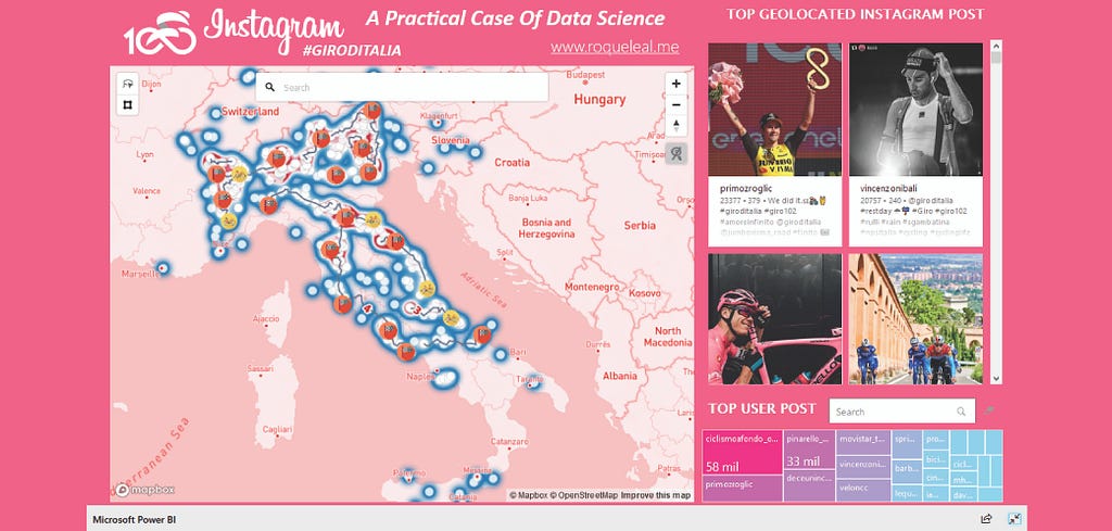
Sporting events are full of emotions of triumph, joy, and dedication. Geotagged Instagram data allows me to tell these stories spatially. Using the Azure platform with algorithms that allow deducing the semantic meaning and location from an image URL, it’s possible to visualize these data in a simple way that invites users to explore the experience of fans. This is also fascinating if you work on marketing strategies.
I love to design a custom style in Mapbox Studio. Here, I used Studio’s new monochrome style generator to add a unique look, inspired by the branding of the #GIRODITALIA event posters. I can have the artistic freedom to style my data story in a way that draws us into the event.
A gastronomic map of Mexico
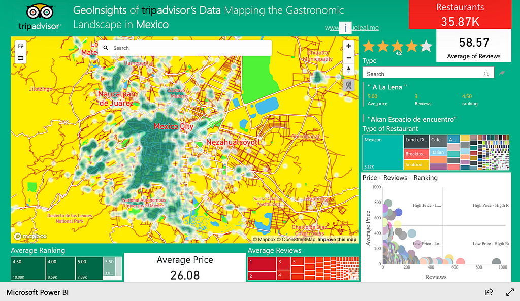
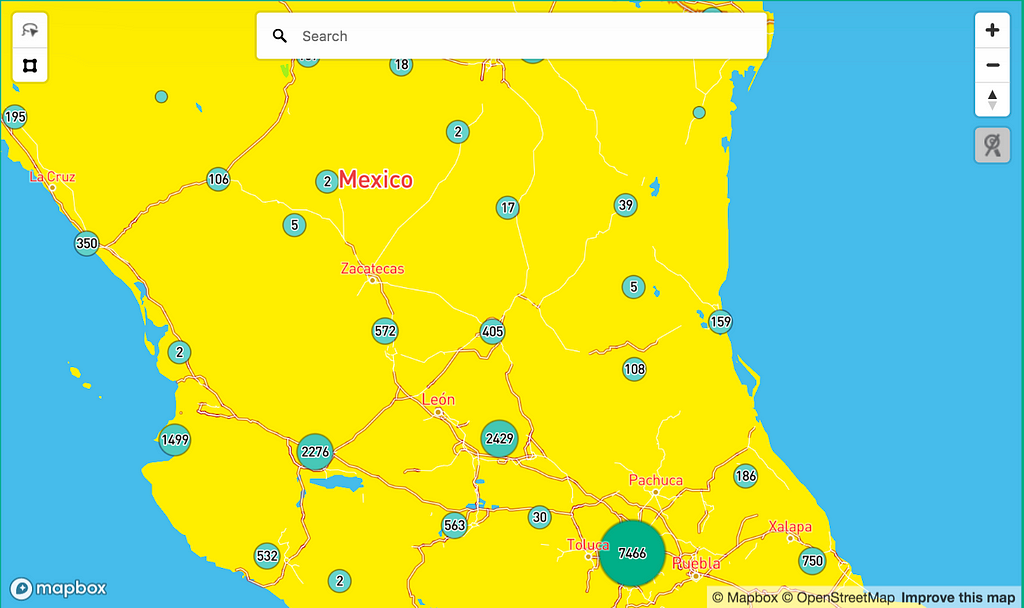
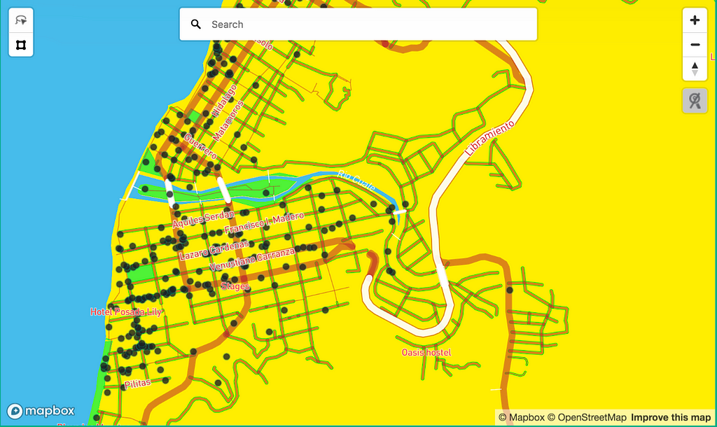
A great way to connect with various cultures is through food and cooking. I used TripAdvisor data to create a visualization of Mexico’s culinary landscape. I used MapBox Visual in Power BI to generate a multi-scale analysis: starting with an overview with a cluster map to identify the largest aggregations of restaurants and then more detailed layers to let users explore each place in detail. The map view interacts with the other visual elements of the PowerBI dashboard without the need for any additional code. Working with multiple scales like this helps me find a balance between communicating patterns and preserving the details of each data point.
Understanding the rental landscape in Perú
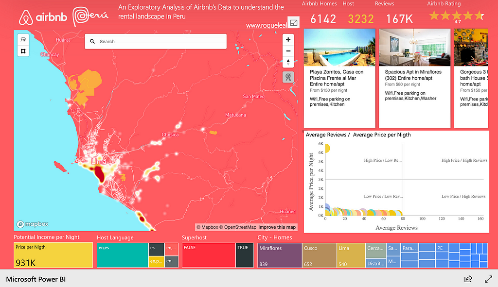
Nowadays, tourists are more aware of rental accommodation options in their selected destinations. Airbnb has seen a phenomenal rise in Latin America and this dataviz highlights a few trends to give an overview of the Peruvian rental market. I chose to use a heatmap to highlight areas with greater availability hosts. Useful Mapbox controls like the lasso and geocoding tools let users delve deeper into the data from their specific areas of interest.
The state of traffic in San Francisco
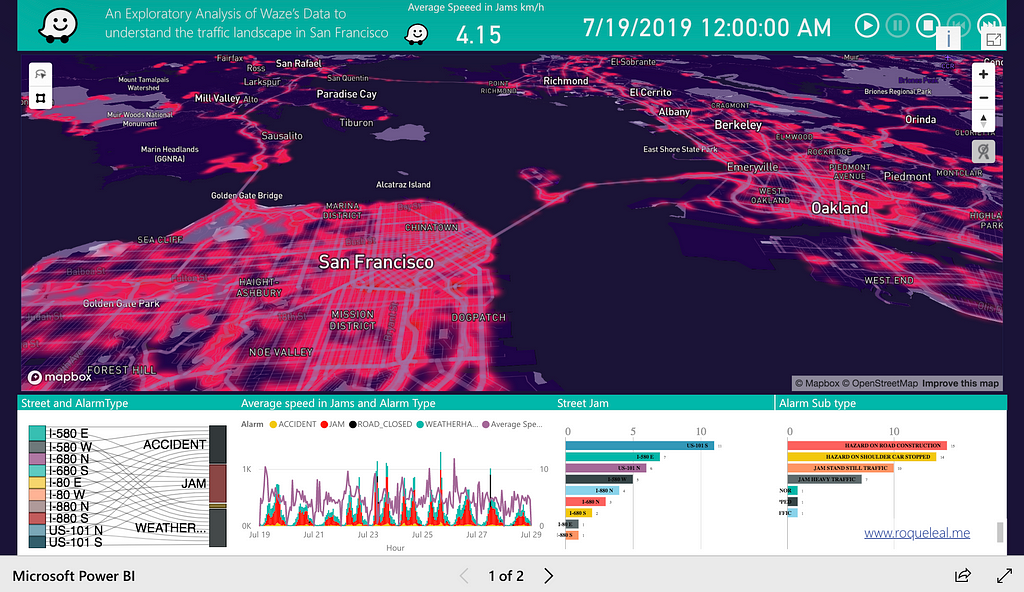
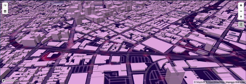
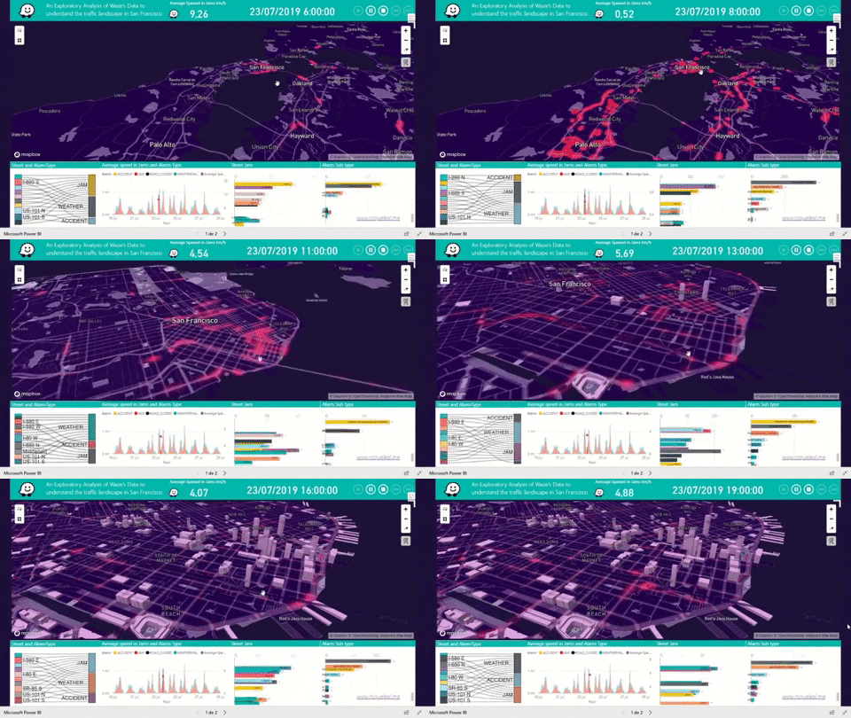
I’m fascinated by opportunities to use data to better understand cities in a living, moving way. In this visualization, I had fun using Waze data with Python and R scripts in Power BI that interact in Mapbox Visual to analyze changes in intersection traffic and vehicle congestion in San Francisco over the span of a week.
This is animated so you can see the patterns over time. I used 3D buildings to improve the visual experience. A heatmap of the traffic volume shows subtle variations per hour while frequency graphs in the dashboard change based on traffic alerts and street events, all in sync with the map view. It is a dynamic view of an urban fabric that’s constantly changing.
What happened in the Strait of Hormuz
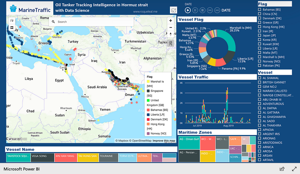
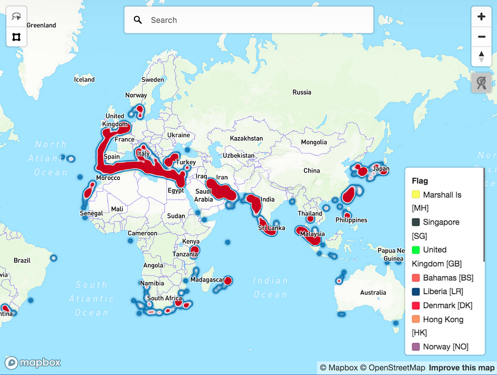
As storyteller as well as a data scientist, I’m always curious about how new stories relate to the wider global context. In this visualization, I explore fears about maritime security in the Strait of Hormuz, a vital route for oil shipping. Marine traffic data is a very large dataset, so I needed a way to explore gigabytes of interactions and bring them to life. Here, I render oil tanker routing to identify sensitive areas for petroleum transport and dig into the actors and the dynamic timeline of recent incidents in the Gulf.
Follow Roque for more great projects and get started building your own Microsoft PowerBI dashboards with the free Mapbox Visual plug-in. Need sample data to get started? Check out these visualizations and download the data to customize your own dashboards.
Bringing data to life with PowerBI was originally published in Points of interest on Medium, where people are continuing the conversation by highlighting and responding to this story.