Designing a map style inspired by The Amazing Spider-Man
By: Madison Draper
Throughout the early 2000’s, my dad and I watched the Spider-Man trilogy in theaters while shoveling popcorn into our mouths. I’m the type of person to get invested in a cast, so I never saw any of the remakes. But my roommates’ obsession finally got to me, and I entered the Spider-verse films last weekend.
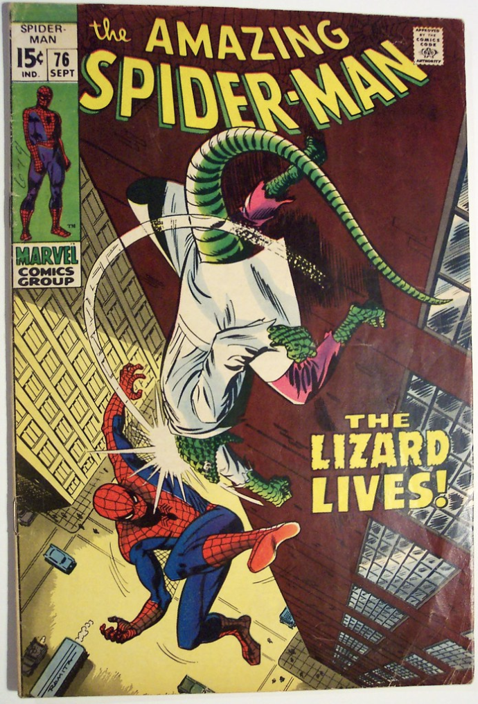
I appreciated the different art styles and outfits each Spider-hero wore. As Edna Mode taught us, “No capes” and “Red makes a statement.” With those thoughts in mind, I decided to make a map inspired by the Spider-Heros’ outfits and comic-book aesthetic.
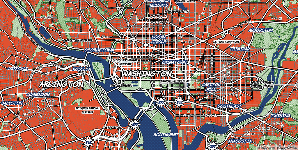

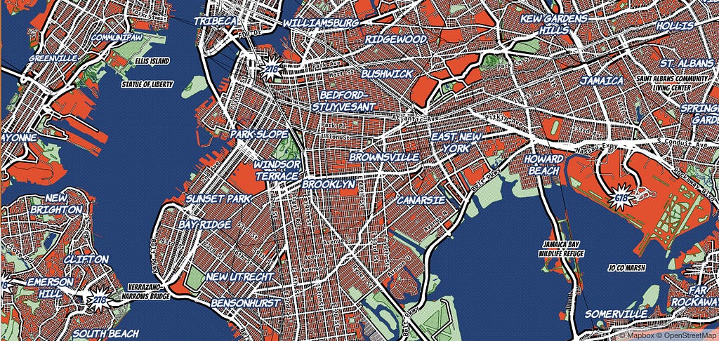
I started by taking several design elements from Whaam!, Amy Lee Walton’s designer style from 2017, built on Mapbox Streets v7. To build this style on our most recent map data tileset (Mapbox Streets v8), I reviewed each individual layer of Whaam! to recreate this style’s foundational pop-art aesthetic that captures the feel of the early 60’s comic book.
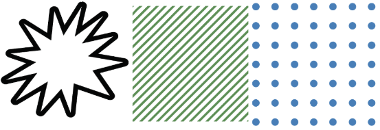
Iconography
This is a small but mighty icon set. The repeating patterns resemble old printing techniques. The highway shield icon looks exactly how an onomatopoeia sounds — you’ll never miss an exit again using this map.
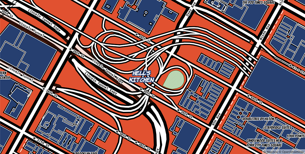
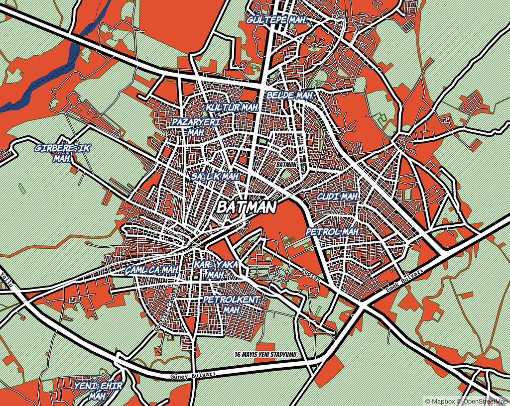
Spider-Man’s costume has a light dotted texture, like for breakability. To replicate this, the map has a soft dotted texture throughout land and water.
Road Network
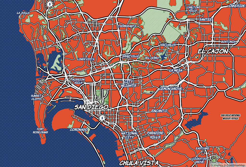
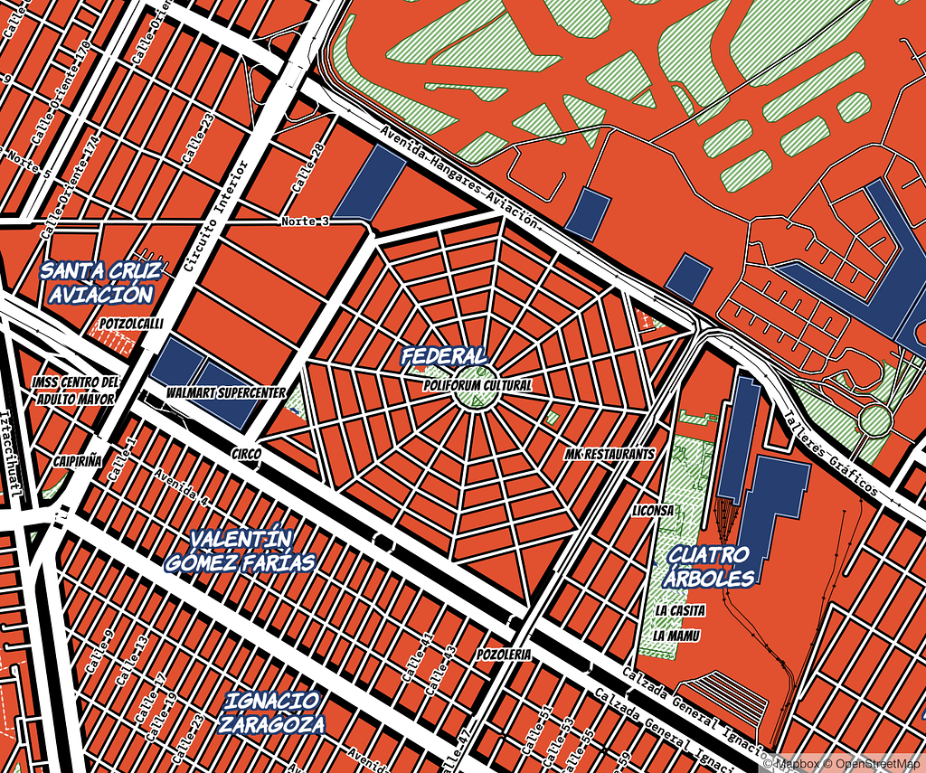
The road network’s thick white lines capture Spidey’s powerful webs, shooting in every direction. Inspired by eyes on Spider-Man’s costume, the roads have thick black casings to accent the varying widths of white roads to display road hierarchy.
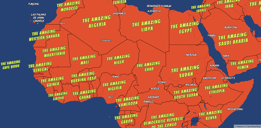
Amazing
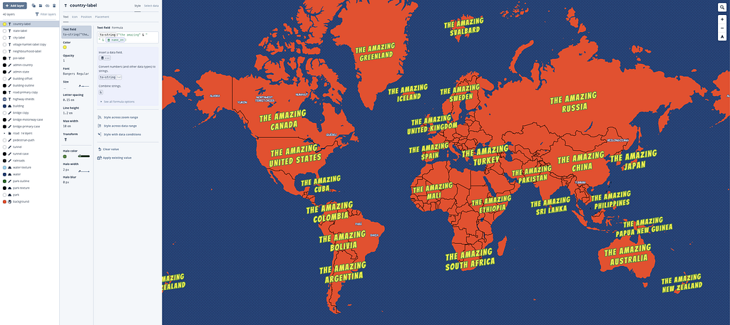
Since the comic’s actual name is “The Amazing Spider-Man,” I tried putting “The Amazing” in front of every country name using Expressions. I added the expression below to country-label layer.
Make it yours
Add The Amazing Spider-Map into your Studio account and begin customizing the layers to make it your own! Try changing the typeface and color palette first, then make custom vector patterns of your own and swap them in for the water or landuse patterns I’ve used. Or replace the starburst with your own SVG shield.
The Amazing Spider-Map is the seventh designer map we’ve released this summer. Make sure you try out the others:
- Upside-Down — An animated map inspired by Stranger Things.
- 80’s — A neon map style with 8-bit fonts.
- Bubble — A hypsometric map inspired by a bubble.
- Treasure — A nautical navigation map for seaward wayfinding.
- Wheatpaste — A throwback to our one of our popular Studio Classic styles with chaos as the aesthetic.
- Pencil — A tribute to another popular Studio Classic style with a handwritten feeling.
Just for laughs
Here’s Batman, Turkey.
The Amazing Spider-Map was originally published in Points of interest on Medium, where people are continuing the conversation by highlighting and responding to this story.