Legendary nautical styling meets practical navigation
By: Madison Draper
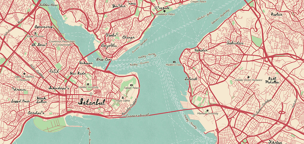
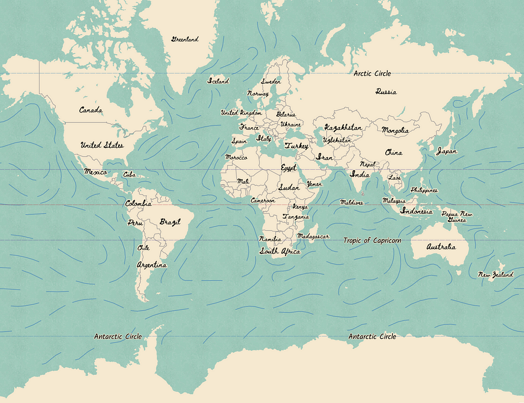
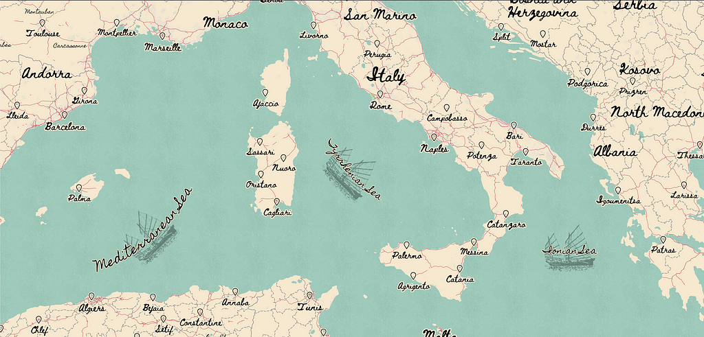
I was looking through Mapbox’s older styles Standard and North Star and thought about blending an auto-navigation focused map with a nautical sea navigation map. The handwritten font on top of a navigation styled map made the perfect playground for treasure hunting, and so Treasure was born. With clear seaward navigation features like currents, circles of latitude and distinct ocean and sea markers, Treasure’s features will help viewers know exactly where they are and how to get to where they're going next. Inspired by older nautical maps, Treasure uses a repeating icon texture and a couple of non-repeating icon embellishments to give age to the map.
Patterns
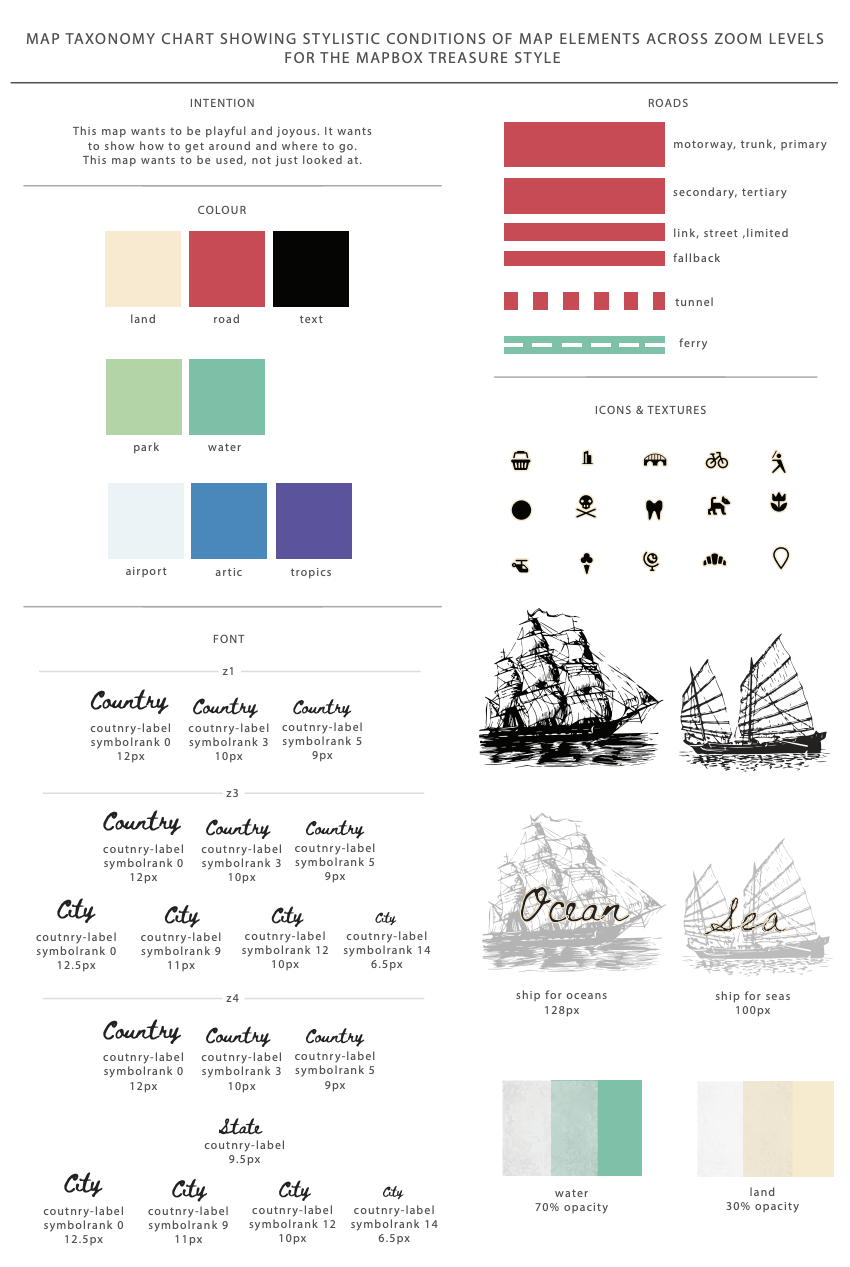
Patterns give depth to the map, as though the map could be touched and felt. This map has two types of patterns: non-repeating and repeating. The non-repeating icons are single icons typically used on point data. In Treasure, these icons are the ships behind the sea and ocean labels. Check out the Maki Icon Editor to create non-repeating icons for your map.
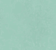
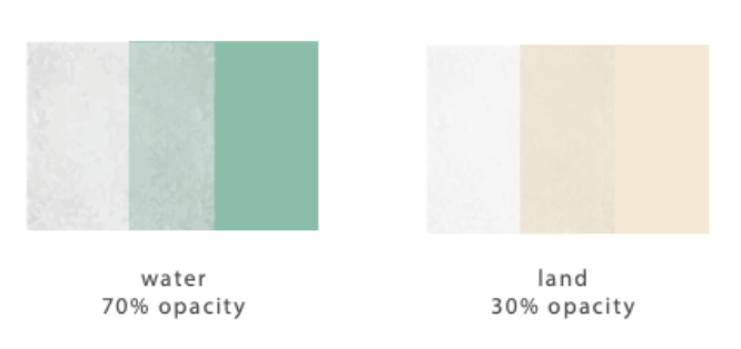
The repeating icons create seamless patterns that flow from end-to-end. Patterns like these are used to fill polygon or line data. Mapbox uses 512px by 512px tiles to generate maps, meaning repeating patterns need to be of a size that can divide 512 perfectly to make the icon flow perfectly. Treasure uses two textures, one for the water (water64) and one for the land (urban64). Both patterns are 64px by 64px, which perfectly fills a 512px by 52 px tile. When making a repeating pattern, make sure the entire canvas is filled with the pattern and that the design’s edges are compatible with each other. Check out our Add a custom icon example to see how to add an SVG pattern to your map in Mapbox Studio.
Styling Text over Lines
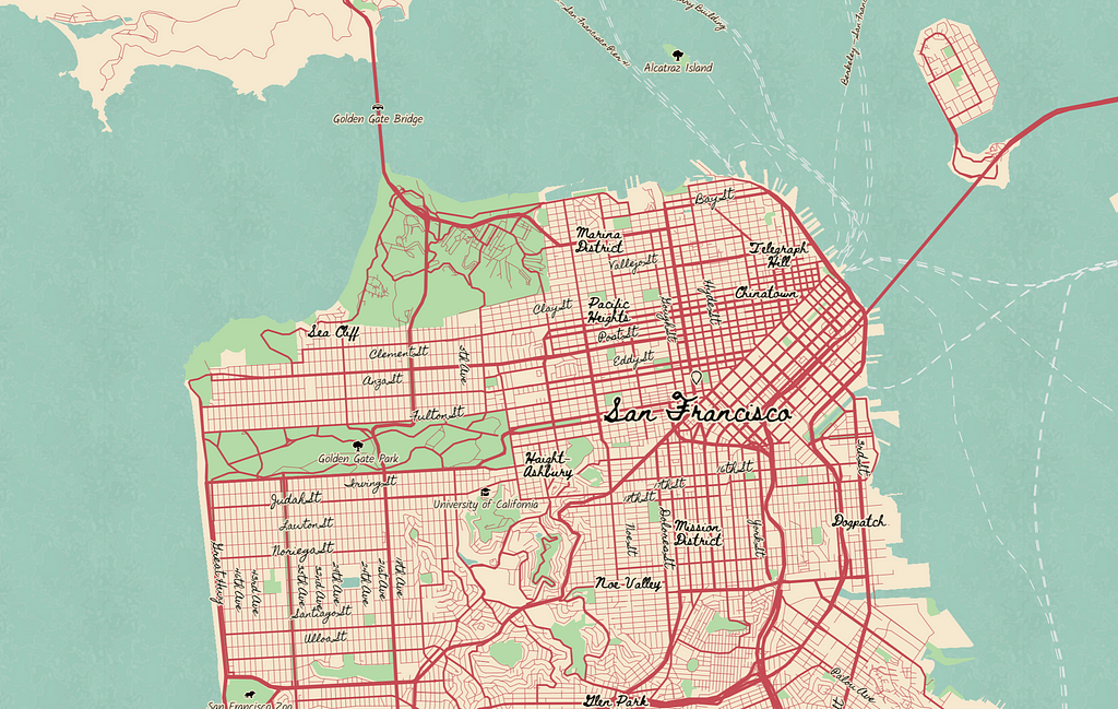
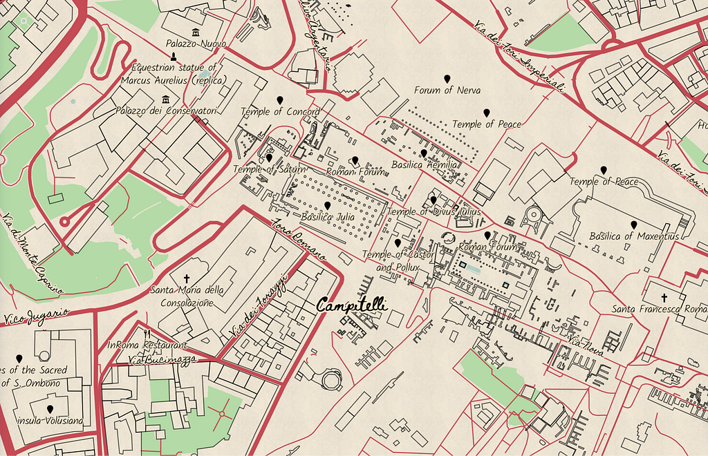
One of the harder parts of designing these maps was creating legibility of curved handwritten fonts onto straighter lines like roads and the Circles of Latitude. To make sure lines didn’t impact legibility, I added a thick halo to the text. By keeping the halo the same color as the background layer, it doesn’t distract from the design and acts as a simple 2-pixel buffer between the text and the lines.
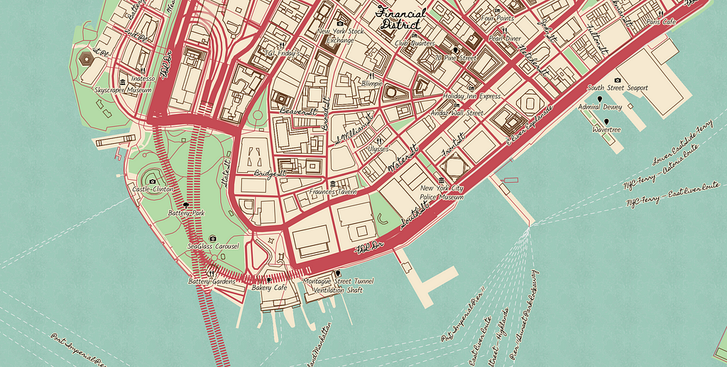
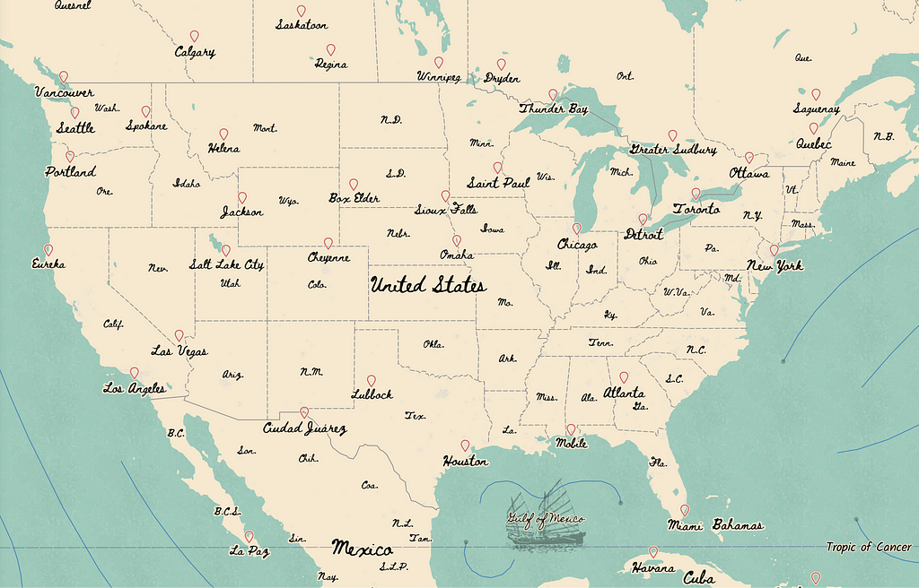
Ready to seek your own adventure? Add Treasure to your account and begin routing your journey! With details down to the street level, Treasure is a great map for a scavenger hunt. Plug Treasure into our Navigation SDK to get started on a mobile navigation app. If you’re new to Mapbox, sign up to start creating custom maps for your next project. For more guidelines and tips on styling maps, check out our Guide to Map Design.
Madison Draper - Designer - Mapbox | LinkedIn
Designing the Treasure map style was originally published in Points of interest on Medium, where people are continuing the conversation by highlighting and responding to this story.