Highlighting natural features, not political boundaries
By: Madison Draper
Often the first thing we see when looking at world maps is not a unified view, but one of separation. The borders of individual counties and territories jump out, causing us to lose sight of the story being told right on the surface.
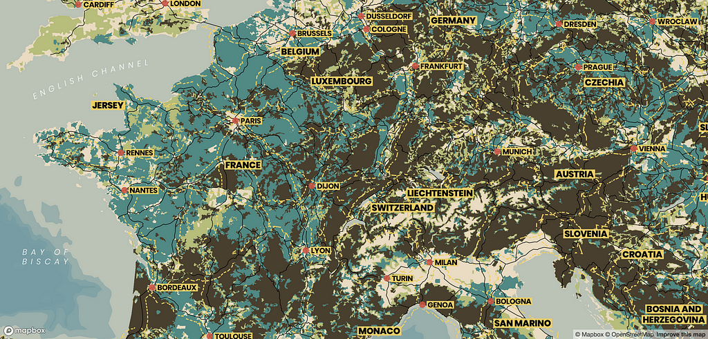
Mineral is a map without manufactured boundaries. Instead, it showcases the world’s natural features: wood, grass, and scrub landscapes. Railroads lay loosely on top of the map, not as a division between spaces but as a means of connection between people across the natural landscape.
The Inspiration
Mineral was inspired by a British map from the 1940’s called “Great Britain: Her Natural and Industrial Resources.” The colors separate Great Britain into different land uses, but the flows tie the country into a cohesive landscape. The iconography represents the human relationship with these resources and how we interact with the landscape. Mineral honors this map by joining the natural landscapes with the industrial railroads. Together, Mineral shows a long history of moving people and resources to different communities with different resources.
As the map displayed only Great Britain, I wondered what this map would become at other scales? Cities are dense and industrial, and their natural resources have been replaced with roads and buildings. When looking at the whole world, natural landscapes are visible, but industrial features are too small.
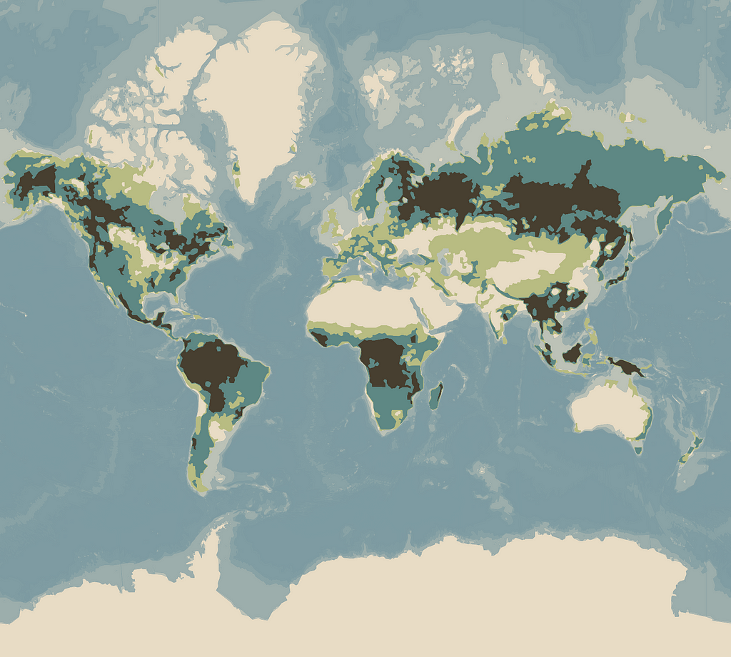
The Design
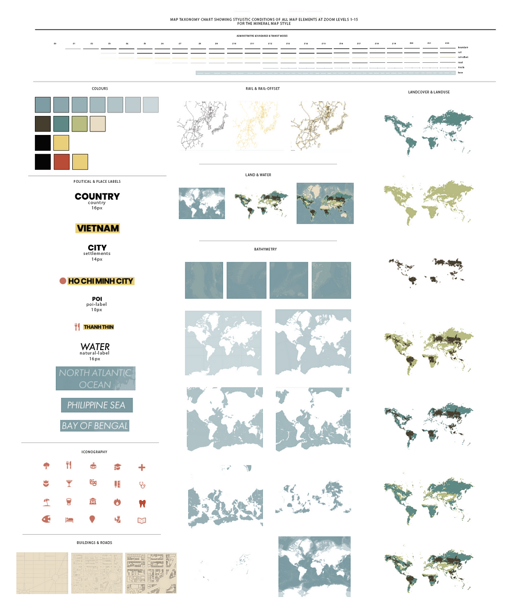
As a planning and process document, I created a map taxonomy chart to separate design and location. This abstraction helps to keep a consistent design style across zoom levels and geographies. If you’d like to customize this style further, this chart is a good place to get started.
As a map without political borders, use this map style to tell fantasy stories or showcase uninterrupted migration patterns across landforms. Being a relatively modest palette, it’s easy to swap the colors of the landscapes, to match your brand’s colors for example.
The Result:
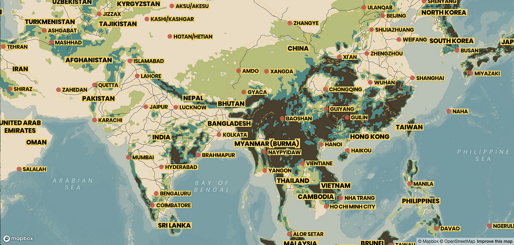
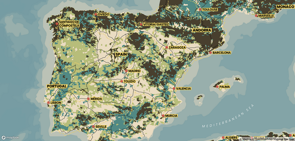
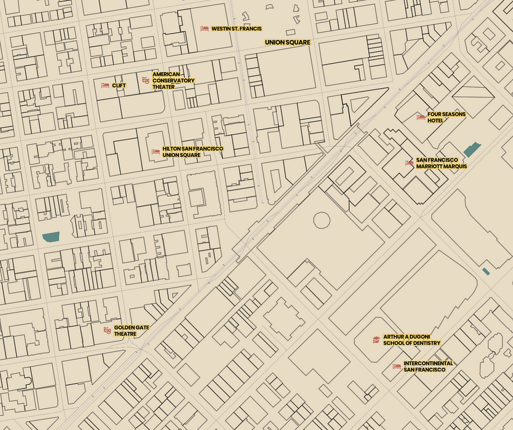
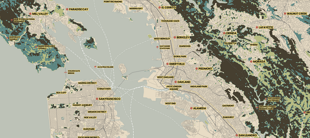
Add Mineral to your account to use as is or customize it further to use in your next app or website. If you’re new to Mapbox, sign up to start creating custom maps and designer map styles like Mineral to your next project.
Once this map is in your account, you can take high-resolution prints in Studio and put it on display at home or in the office.
Madison Draper (@mzdraper) | Twitter
Designing the Mineral map style was originally published in Points of interest on Medium, where people are continuing the conversation by highlighting and responding to this story.