By: Taya Lavrinenko
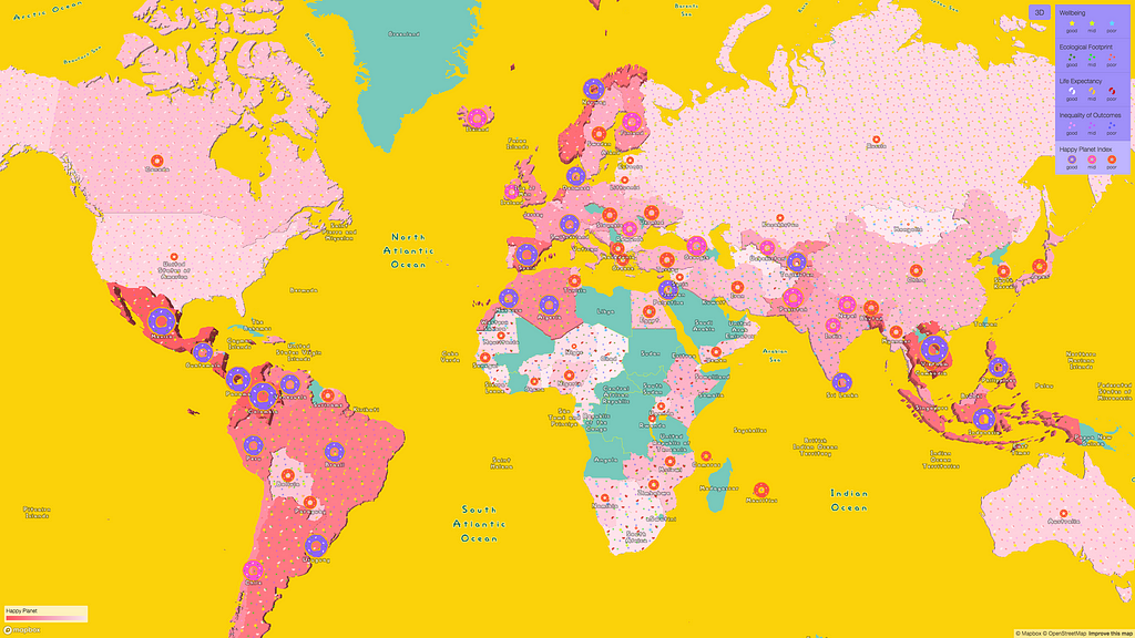
The Happy Planet Index (HPI) looks beyond GDP and explores the sustainable wellbeing for each country based on four properties: wellbeing, life expectancy, inequality of outcomes, and ecological footprint. I was curious what HPI ranking looked like across countries so decided to display all 141 ranked countries on the map.
To start, I need the right basemap. A happy planet visualization should embody the delight and happiness the index itself explores. Cartoons and donuts — more specifically Homer’s love for donuts — captures that energy.
Building the map from scratch
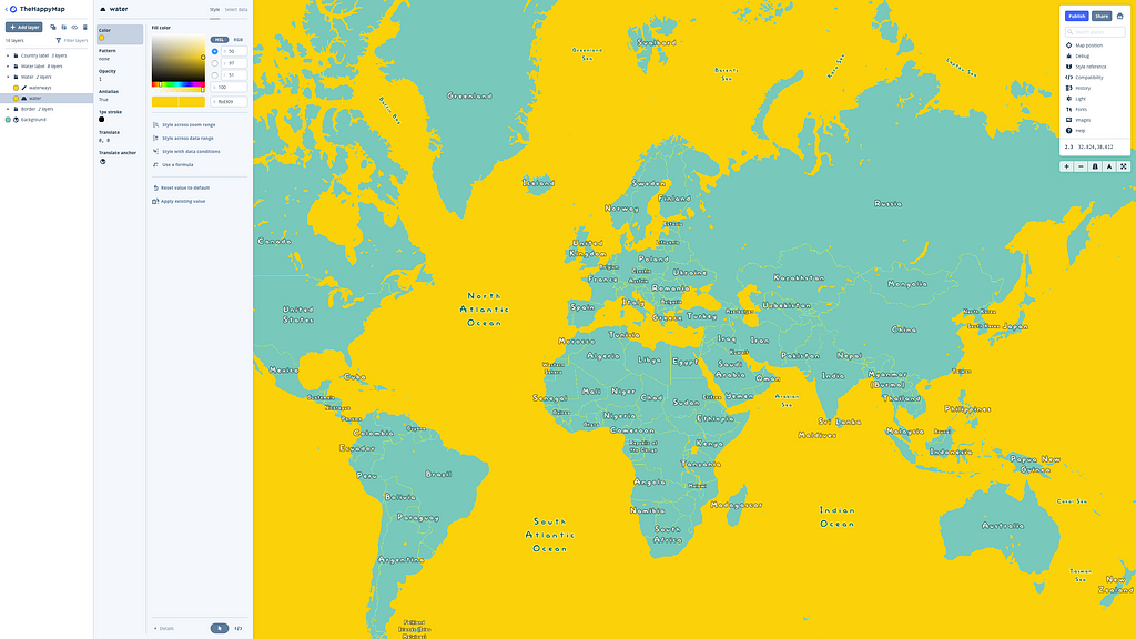
The HPI provides country-specific data, so I only need to show country borders and water on the map. Using Studio, I’ll remove all other layers and set the zoom level to a minimum zoom of 2 and a maximum zoom of 4.
To make this really feel like the Simpsons, I’ll change the water to a Simpsons-inspired yellow and upload the official Simpsons font, which is conveniently under an open license.
Understanding and processing the data
With the basemap done, it’s time to focus on the data visualization piece. After downloading the HPI dataset, we will georeference it. I did this in three ways:
- for country polygons, I’ll use Natural Earth data;
- I combine Natural Earth polygons with the Happy Planet Index by joining the two datasets in QGIS by the country name;
- to make proportional symbols, we’ll calculate the central points using the polygon centroids algorithm in QGIS.
Now, we’re ready to upload and style the data in Studio.
Visualizing the data
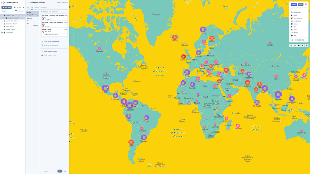
What kind of style should we choose for each element? Well, what makes Homer happy? His family, donuts, beer… wait that’s a whole different visualization. I’ll go with the donuts and use the proportional symbols to indicate the HPI scale.
Next, we can use expressions to adjust the donut icon for each category, to change the icons’ sizes depending on zoom level, and to style the labels.
Hmm, that’s looking a little plain. Let’s make the map look a little more donut-like. The Happy Planet ranking of the index can be the glaze and we’ll change the color of the gradient according to it.
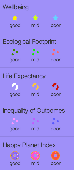
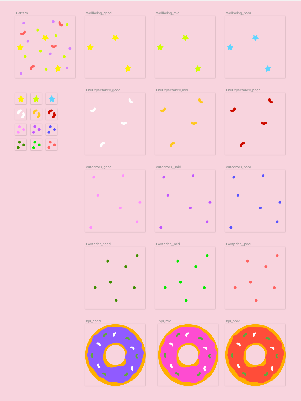
Next, let’s add the four elements of the index as the “sprinkles”:
- Star sprinkles represent well-being;
- Dots represent the ecological footprint;
- Beans represent life expectancy;
- And the other dots (yes, we are out of shapes) will represent the inequality of outcomes.
To make the map volumetric, let’s use fill extrusion:
For each of the four happiness parameters, there are three classes: good, medium, and poor. We’ve created a pattern for each parameter, so every country has it’s own “sprinkles”:
At the moment, setting patterns via expressions isn’t supported, but the feature can be used to filter the parameters. Here’s how we did it for the Ecological Footprint:
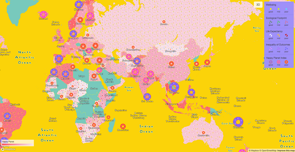
Combine all of this together and we’ve got a beautiful cartoon map! Explore the interactive map.
Want to try expression for yourself in Studio? Add a simple version of the map above so you can get the hang of using expressions with custom data in Studio.
Taya Lavrinenko (@tayalav) | Twitter
Taya Lavrinenko is the Lead Map Designer at Urbica, an urban data analysis and visualization company from Moscow, Russia. Urbica experiments with data exploration UI/UX, including AR, and works with a number of Russian and international companies: Mapbox, Maps.me, Moscow Department of Transport, Yandex and others
Doh! Making a Simspons-inspired map with expressions was originally published in Points of interest on Medium, where people are continuing the conversation by highlighting and responding to this story.