By: Alex Ulsh
With Atlas, analysts and visualizers across government and enterprise sectors can build powerful data visualizations, all behind their own firewall. Atlas now ships with our cloud-based mapping APIs, our design tool, Studio, and our smooth, fast vector maps, capable of visualizing billions of data points at 60fps.
Here’s a look at our top 5 ways to visualize large datasets in Atlas.
1. Choropleths
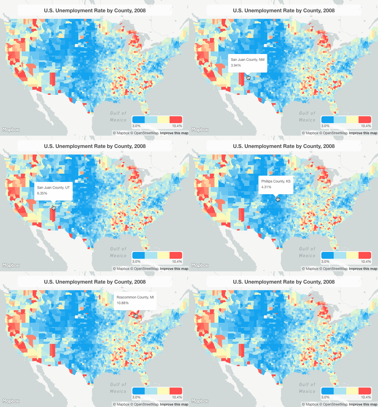
Choropleth maps let you style geographical areas based on data values. Use choropleths to view your data across local, administrative, or international boundaries; or in customized regions or markets of interest to you or your analysts.
2. Dot Distributions
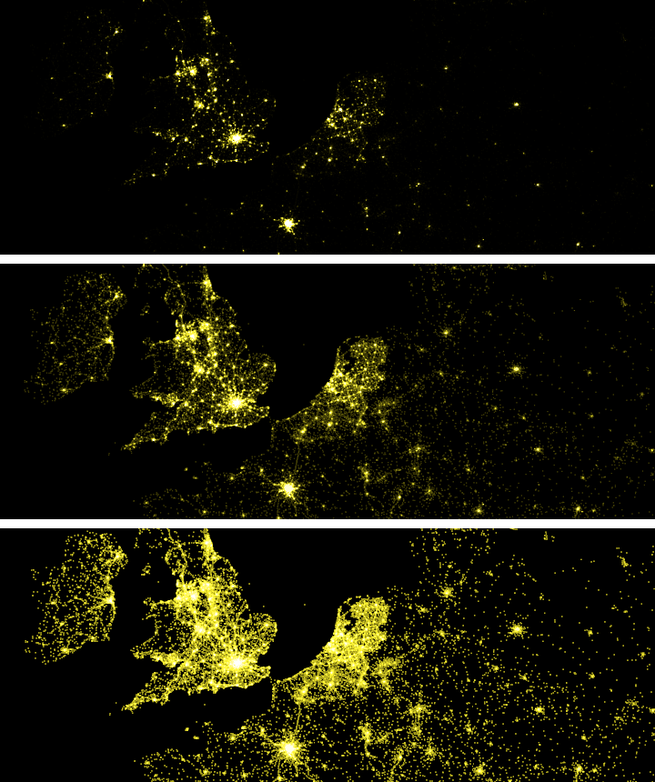
Dot Distribution visuals communicate density trends in very dense point data. Website traffic, vehicle telemetry, and social media posts all make for incredible dot distribution visuals. Check out Eric Fischer’s tutorial on dot density visualization design to get started.
3. Heatmaps
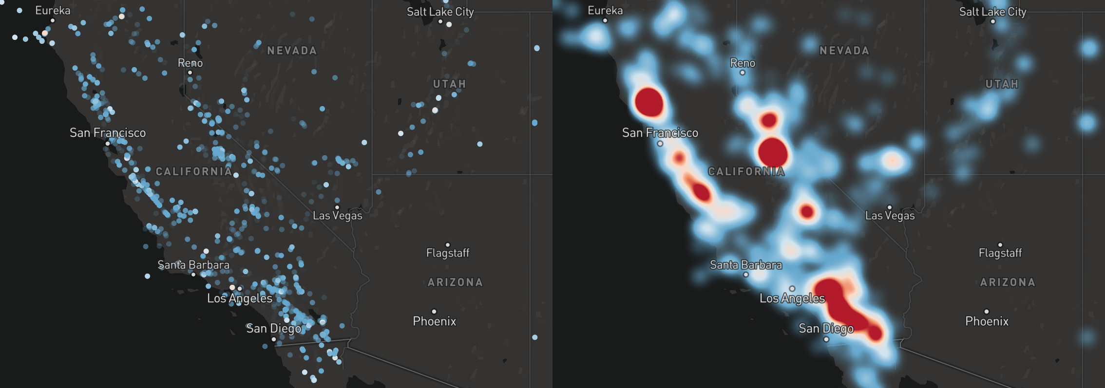
A heatmap is a data visualization where a range of colors represents the density of points in a particular area. The dynamic heatmap layer in Mapbox GL JS renders smoothly at 60 fps while panning and zooming. It’s fast and can handle large amounts of data (especially when combined with clustering).
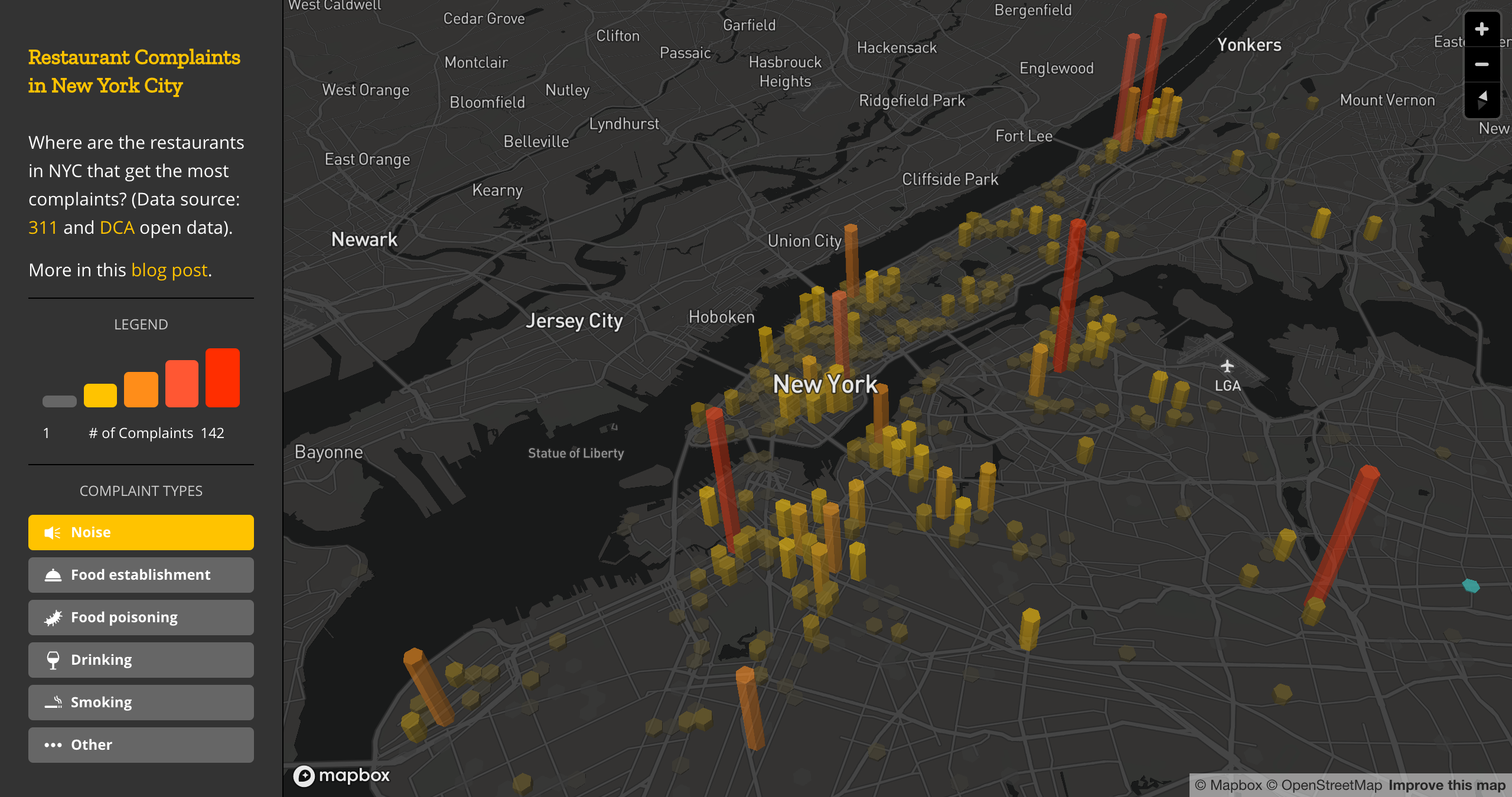
4. Hexbins + 3D extrusions
Use Hexbins to show general themes over geography. They’re less granular than a dot density map and not constrained by boundaries like choropleth maps. Some visualizers custom-style the color or opacity of a hexbin to represent different data quantity or quality. To kick it up a notch, try transforming your hexbin map with 3D extrusions. These visuals work well when your data has a natural z-element (like elevation), or if you need to compare the relative difference between dense regions, such as the population density of US Census blocks.
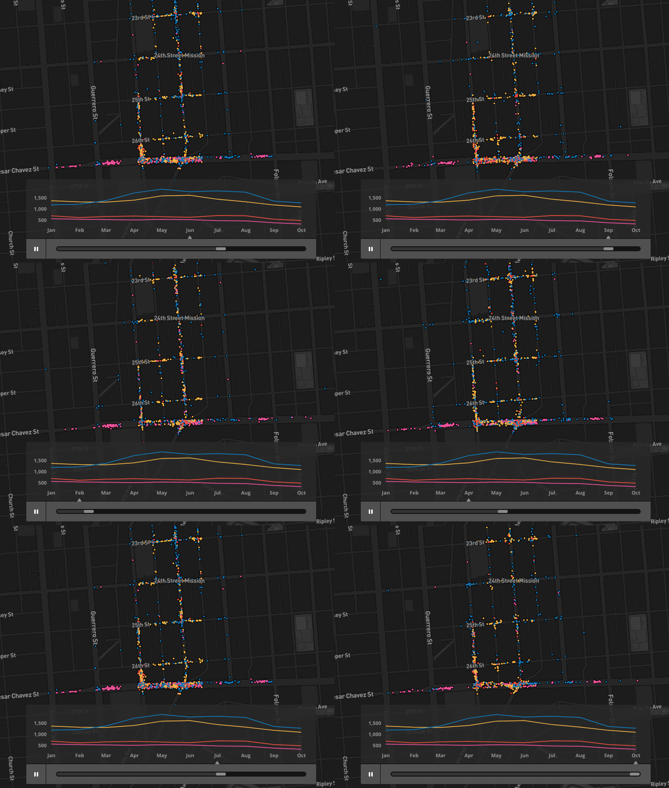
5. Animations
Animations let you show how your data changes over a dimension (usually time). For example, you can demonstrate how vehicle event locations have changed over a year (as shown below), or you can visualize the change in unemployment by county over a decade.
With Studio and vector maps now in Atlas, there’s no limit to your data visualizations in the security of your own environment. Find out more, or if you’re ready to start visualizing with Atlas, reach out to our team.
5 data visualization techniques for Atlas was originally published in Points of interest on Medium, where people are continuing the conversation by highlighting and responding to this story.