By: Nat Slaughter
When telling a story or exploring massive sets of information, your data needs to pop on the map. It’s the map’s job to fade into the background, adding just enough context to understand the data. I recently created Minimo, a simple but elegant style designed to do just that, by modifying existing map styles in Studio.
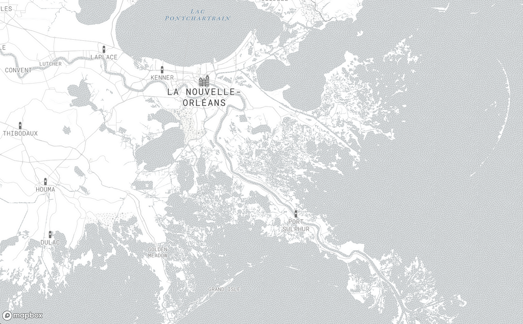
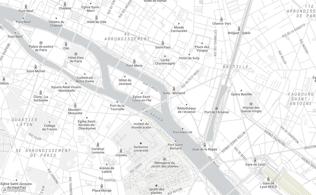
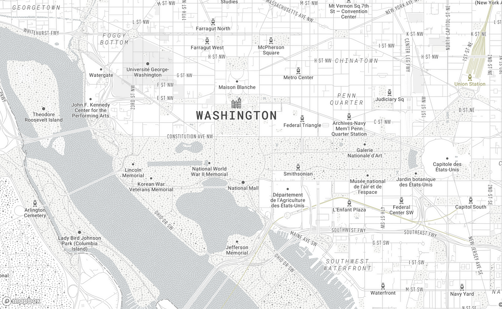
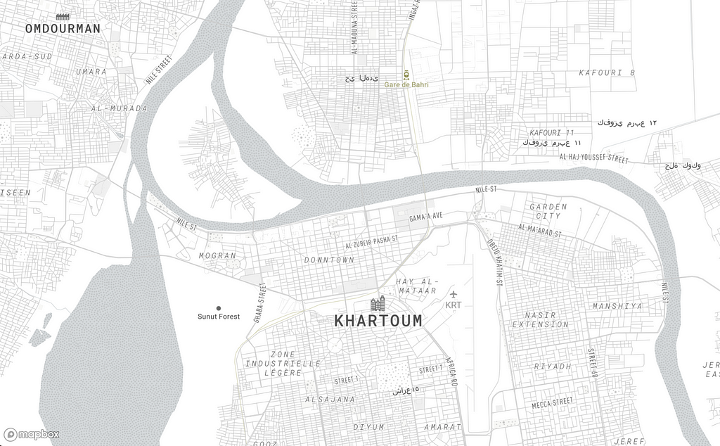
Designing in Studio
From Studio, I started with our Basic map style. I was able to make a highly customized map with just 7 changes, all housed in a highly performant style-sheet with minimal style layers.
Step 1: Start with the Basic style in Studio
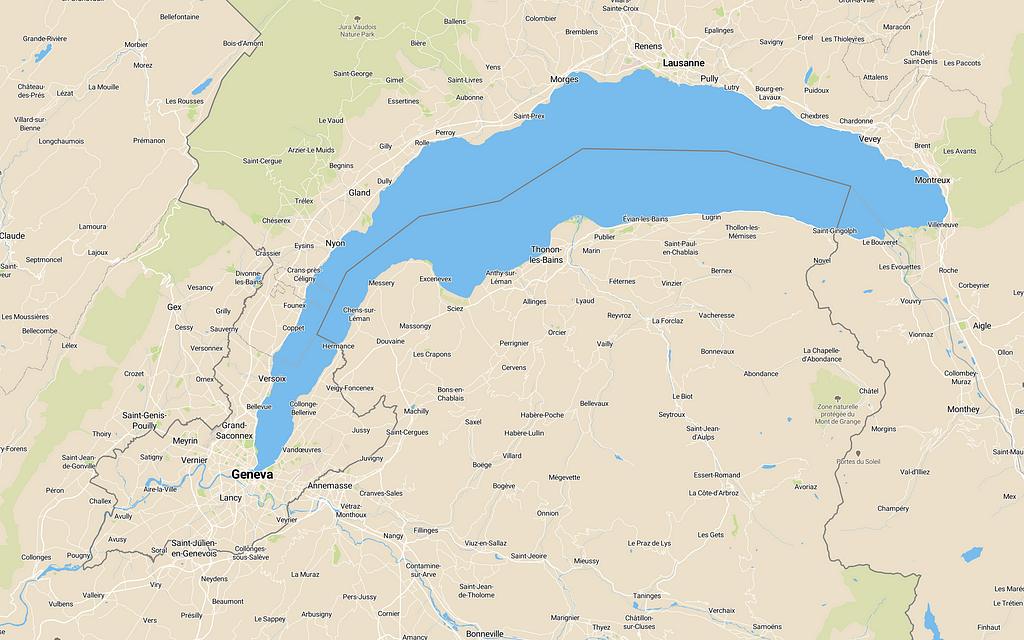
When we start with the Basic style in Studio, we get blue waters and green parks — expected geographic colors for a basemap used out of the box.
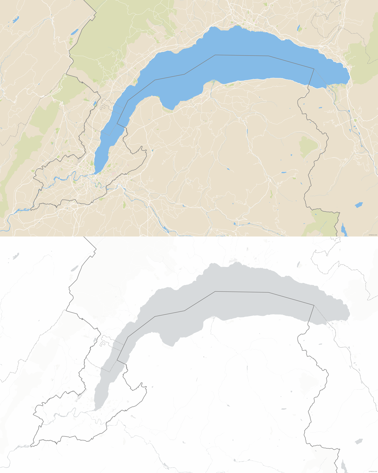
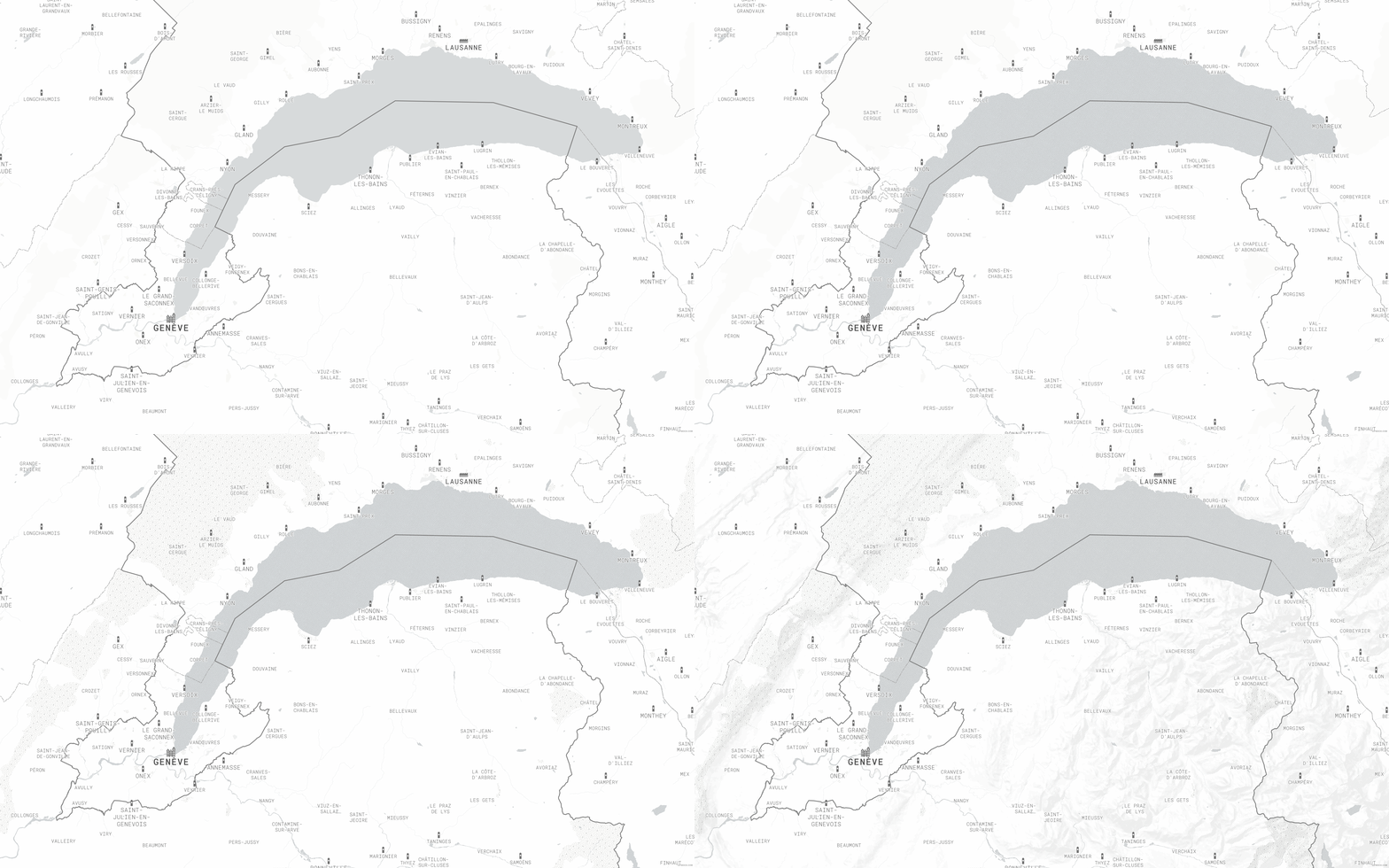
I wanted a duo-chromatic map for this new style, so I reduced the color palette to grey-blue scale:

Step 2: Update typefaces and place labels
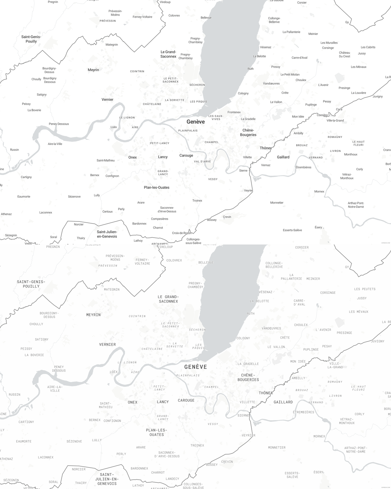
For a more consistent cap height and overall label weight, I changed the font from Roboto to Roboto Mono and the case to all capital letters. I also adjusted the kerning, emphasis and color to minimize label hierarchy.

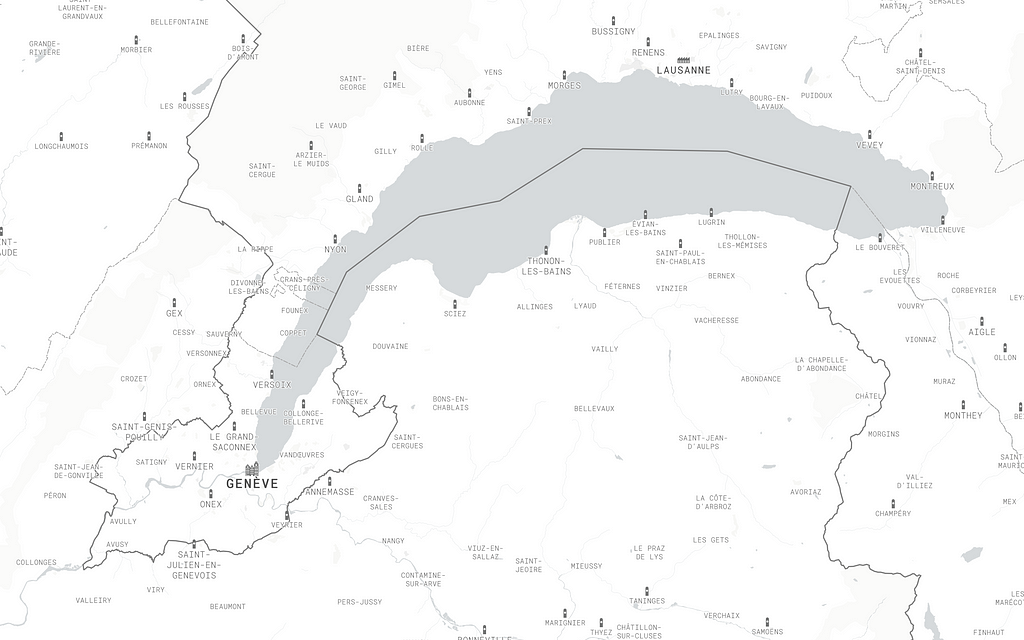
Step 3: Add custom building icons
Homogenizing the place label styling provided an opportunity to establish label hierarchy with another map feature: building icons.

Step 4: Add patterns and hill shading
I wanted to add some texture, so I incorporated subtle stippling patterns for water and parks, and a line pattern for hill shading using our recently released terrain-v2 tile-set.

Step 5: Adjust roads and transit
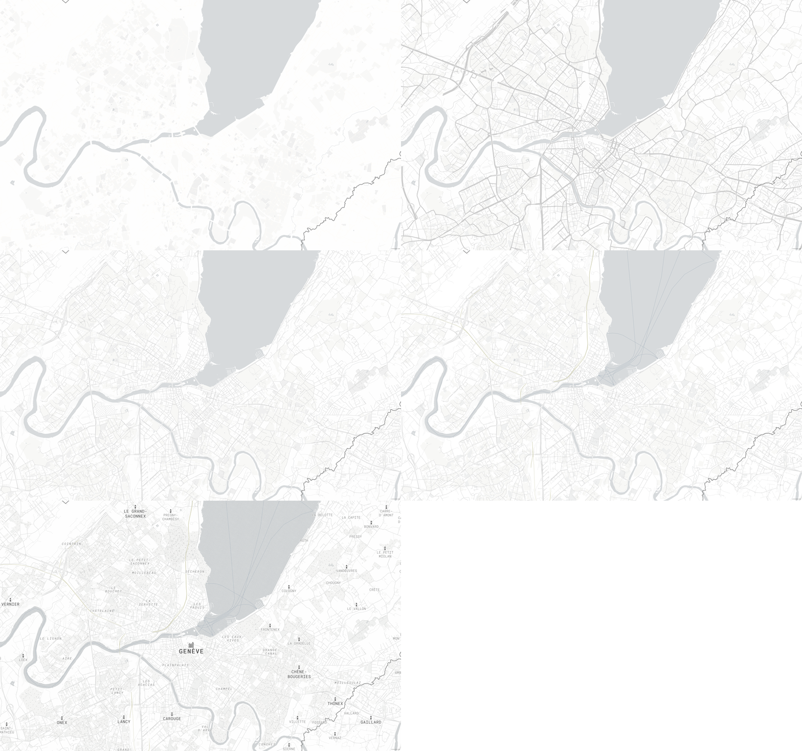
Starting with Basic gave us white roads, so I’ve changed the road color to grey. In addition, I have changed the varying road width — originally styled by road class — and given all roads a single width. I did this so that the base-map could be very minimal, but also so that I could incorporate other modes of transit and give them equal weight as the road network. Lastly, I added subtly colored rail and ferry lines.
Step 6: Add transportation labels and POI labels
I then styled road, ferry, waterway and water labels, and added ferry and rail station labels and icons. I reduced the level of detail found in the default Maki icons and used more general symbols for three levels of POI labels. This will help the user focus on any data applied to the map, and since I’m already using custom building icons, I want to be conservative with the remaining symbology.

Step 7: Add buildings
I wanted to use the building geometries to emphasize larger urban forms of towns and cities. To do that, I lightened the color of the road network — up until now, the roads have mostly been showing the urban form — and styled the buildings with a pattern: thin lines to distinguish between individual buildings and thick lines to outline block masses of buildings.
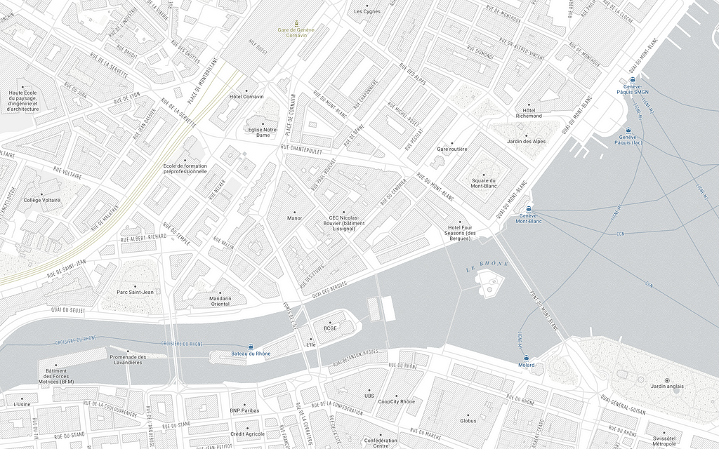
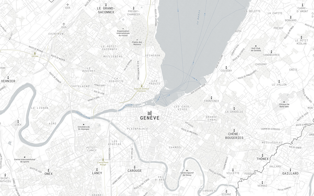
So here’s where I started and what I made with only seven main changes:

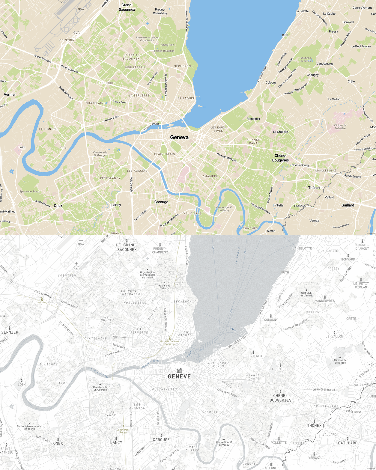
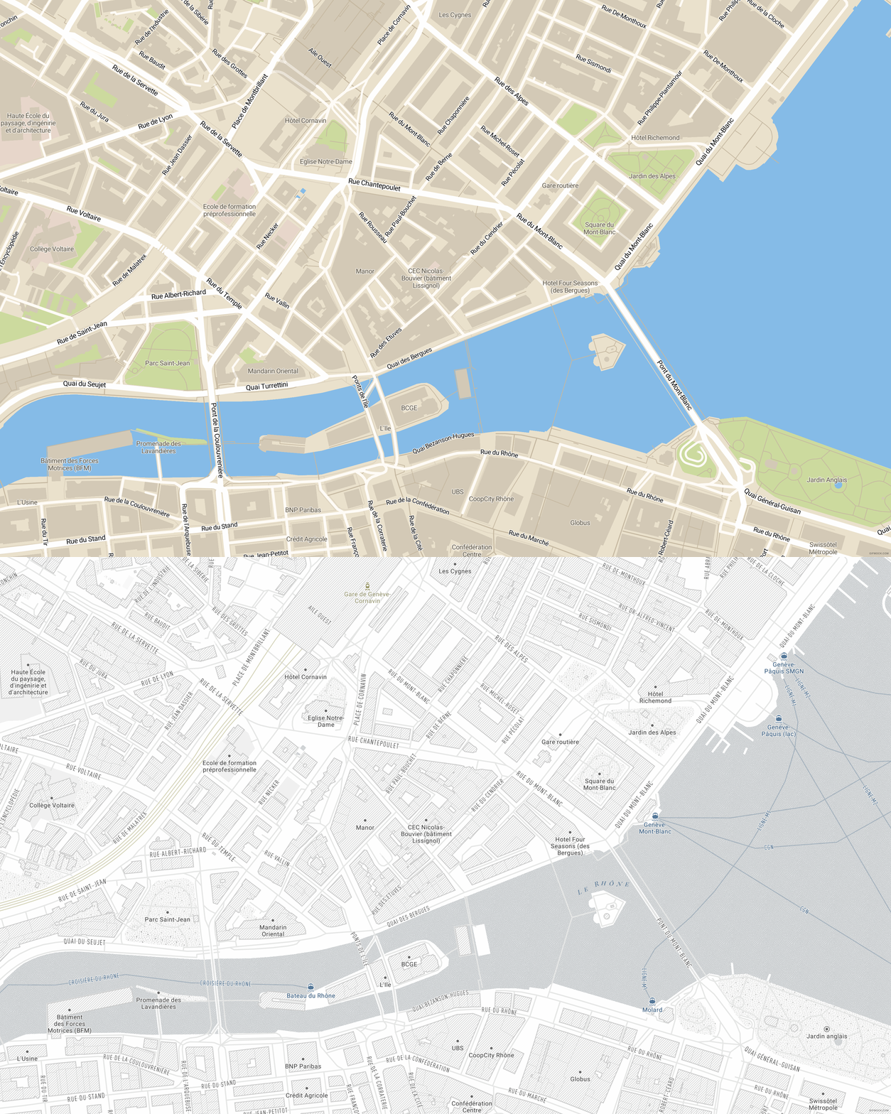

Add Minimo to your account to use as is, or customize it to use in your next app or website. If you’re new to Mapbox, sign up to start creating custom maps for your next project.
Looking for another style that works with data visualization? Take a look at Light or Dark.
Data needs to pop: 7 steps for designing an ultra minimum style in Studio was originally published in Points of interest on Medium, where people are continuing the conversation by highlighting and responding to this story.