By: Matt Daniels
Matt is a journalist and among the founding team at The Pudding, which explains ideas debated in culture with visual essays. He is a fan of media analysis with wide-spread coverage of his projects on music and film.
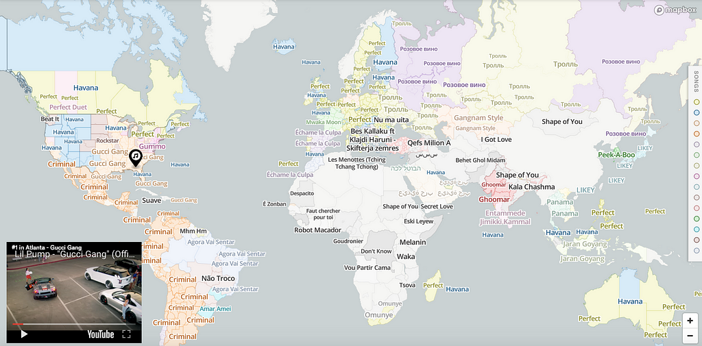
Last month I released this project on the cultural preferences for music. The idea was to blend Radiooooo and radio.garden with a Risk-style empire map (i.e. convex hulling). That is, if we were to think of Gucci Gang as the musical Roman empire of the US, how far would it span? When does Lil Pump’s empire end and a new, locally-relevant one begin? Every country has its own “Despacito,” and I thought this would be a good way to get out of my own musical filter bubble.
The internet is way better at describing my work than me. This tweet pretty much summarizes it:
This is a really cool look at the organic borders created by cultural pockets https://t.co/yMoNGOfC2Q
Mapping Tools
I spent a ton of time looking at cartography packages. I found Mapbox to be, by far, the fastest experience out there with the most complete JS library for doing cool map stuff on the internet. The GUI for Mapbox (called Mapbox Studio) was also one of the best user experiences, allowing me to play around with music data before getting into any code (more on that later).
The Data
I decided early on to make it simple: just focus on the top song by city. To determine which song is “most popular,” I scraped the data from YouTube because the service is more widely available for free, unlike Spotify which biases the data towards people who can afford streaming.
I had song views by city and a lat/long associated with each city. All of the data is here. This is an example of the headers and the first row of data for Nicos’s hit in Sanaa, Yemen:
"artist_name","latitude","longitude","views","track_link","track_name","rank","country_code","geo_name","geonameid"
"Nicos",15.35472,44.20667,108707,"ykPmM7Me2fM","Secret Love",0,"YE","Sanaa",71137
We can map this pretty easily in Mapbox Studio (a GUI map tool) without any code! I started exploring my data by uploading the dataset to the web-based tool and styling the circle-size based on the song’s popularity. Mapbox also has amazing label collision detection so it only adds labels to the circles when they don’t overlap.
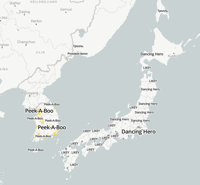
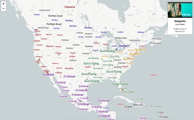
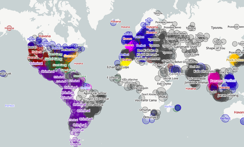
I was able to start seeing some regionality around cultural preferences, but it was a little intense, and I wanted to have one shape for each song’s “region.” For example, that whole area of purple from Mexico to Chile, let’s make it one big purple shape as opposed to 1,000 overlapping circles.
Choropleth’ing in Mapbox
You can use Mapbox Studio to create a choropleth, but I opted to do it programmatically using the web API, mapbox-gl-js. Here’s an example in the documentation of customizing a choropleth by zoom level.
The first thing I did was make a country-based choropleth, just to see what it looked like:
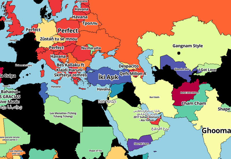
It sort of displayed what I wanted: a simplified regional picture of song preferences.
To do this, I added country boundaries to the map usingmap.addLayerand followed the style specifications to customize the fill-color based on stops in the data. We’re basically saying: “if country X, give it color Y”. In this example, CountryStopsFill is a big array of all the world’s countries and a corresponding color, where each song is always the same color eg [US, blue].
But most of the interesting-ness would be at a sub-country level. For that, I needed more granular polygons/tiles to fill-in with their respective #1 song.
Meta Choropleth’ing
Luckily I stumbled across Mapbox’s global administrative boundaries.
There are countless resources out there for sub-country (state, regional, county) data, but Mapbox has them all beautifully rendered at every zoom-level in a single, easy-to-add tileset.
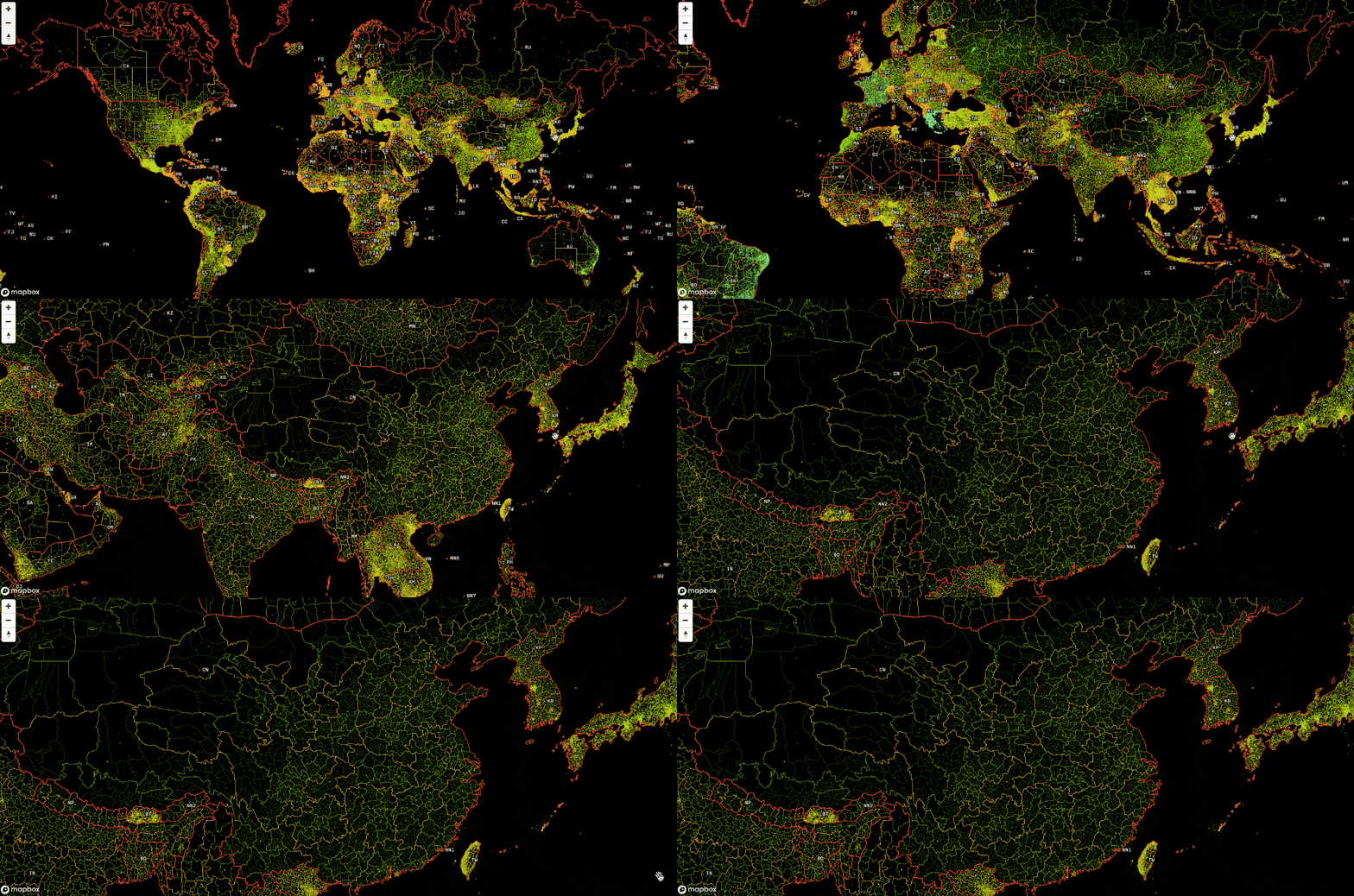
It’s only available to their enterprise customers, so I asked the internet for a hook up with Mapbox.
internet friends. i'm looking for a hook up at @mapbox for a special request from their team. anyone know anyone?
Luckily, several folks replied, and Paul Veugen set me up with their product team. They graciously gave me access to the enterprise admin boundaries and were immensely helpful setting me up.
TileQuery FTW
Aggregating up to the country level is easy — every city is associated with a country, so the logic is simple. But for a smaller shape (e.g. a county in Greece), it’s a bit harder. How do I query which cities are in that county, and how do I make sure the county corresponds to Mapbox’s county polygon?
Mapbox’s point-in-polygon query makes this straightforward, avoiding all of the crazy geo-hierarchy-mapping-stuff typically required for an idea like this.
Basically you say, “I have this point (a city). What polygons does it fall in?” I then iterate through every city in my dataset and pull the corresponding polygon at 9 different geographic levels, from zip code to state.
https://api.mapbox.com/v4/mapbox.enterprise-boundaries-a0-v1,mapbox.enterprise-boundaries-a1-v1,mapbox.enterprise-boundaries-a2-v1,mapbox.enterprise-boundaries-a3-v1,mapbox.enterprise-boundaries-a4-v1,mapbox.enterprise-boundaries-a5-v1,mapbox.enterprise-boundaries-p1-v1,mapbox.enterprise-boundaries-p2-v1,mapbox.enterprise-boundaries-p3-v1,mapbox.enterprise-boundaries-p4-v1/tilequery/"+longitude+","+latitude+".json?access_token=TOKEN
You can find the results here in this Google Sheet; every lat/long has an associated polygon ID.

For example, NYC has a polygon ID at a state level of USA136 (New York State) and a county level ID of USA236061.
Making the Choropleth
For the final project, I decided to use boundaries_postal_1 (a larger, aggregated polygon of zip codes); boundaries_admin_1 (state); and boundaries_admin_0 (country).
I added these pretty easily:
And then:
So same thing as before: the fill-color is a big array of state IDs and colors (each song gets one color). I did all of this in JS.
The first thing I did was nest the dataset (each city and its top song, as well as its associated polygon IDs) by every tileset (e.g. boundaries_admin_1).
This nests the data by that particular tileset’s polygons and declares a top-song based on a sum of views.
From there, we assign it a color:
This is a big array of each polygon’s ID (d.key) and a color that’s consistent across the dataset eg [d.key,color], therefore, “Gucci Gang” is always green.
Label-click -> YouTube Video
I created click events on the song labels, triggering the YouTube video to begin playing.
In D3 (or some other library), this would be an absolute nightmare. At any moment there are up to thousands of labels visible on the map. It’s just that they are hidden due to automatic collision detection by Mapbox, which means everything is legible. We want an event to fire only when a visible label is clicked.
I already had the track data on the label properties. I uploaded the label dataset via Mapbox Studio and positioned it based on its city’s lat/long.
This says “if someone clicks on the map, check if it was only on rendered labels in X, Y, and Z layers. If true, get the properties (i.e. the data) joined to that label.” With that data, we can use it to trigger a YouTube video to begin playing.
Same thing on the hover events:
On mousemove, we look for whether it was over a certain rendered layer, in this case the admin-0-fill (which is our country polygons). If true, we then take the country’s name and place it in a tool tip.
Explore the map and keep building
There’s many more features in this map, but it’s all vanilla JS and D3. The project is entirely front-end code so feel free to check out the source code and email me with any questions.
Thanks again to Mapbox for making this project possible!
Matt Daniels (@matthew_daniels) | Twitter
Mapping global music preferences: How I built it was originally published in Points of interest on Medium, where people are continuing the conversation by highlighting and responding to this story.