Adding context to data visualizations
By: Sam Kronick
Context is everything in data visualization — where is data in relation to things you recognize like roads, counties, streets, or rivers? How can you make sure that context is clear when you add a custom data overlay? Striking a balance between showcasing your data and maintaining clarity in the basemap is hard and I’ve seen a lot of visualizations that don’t get it right.
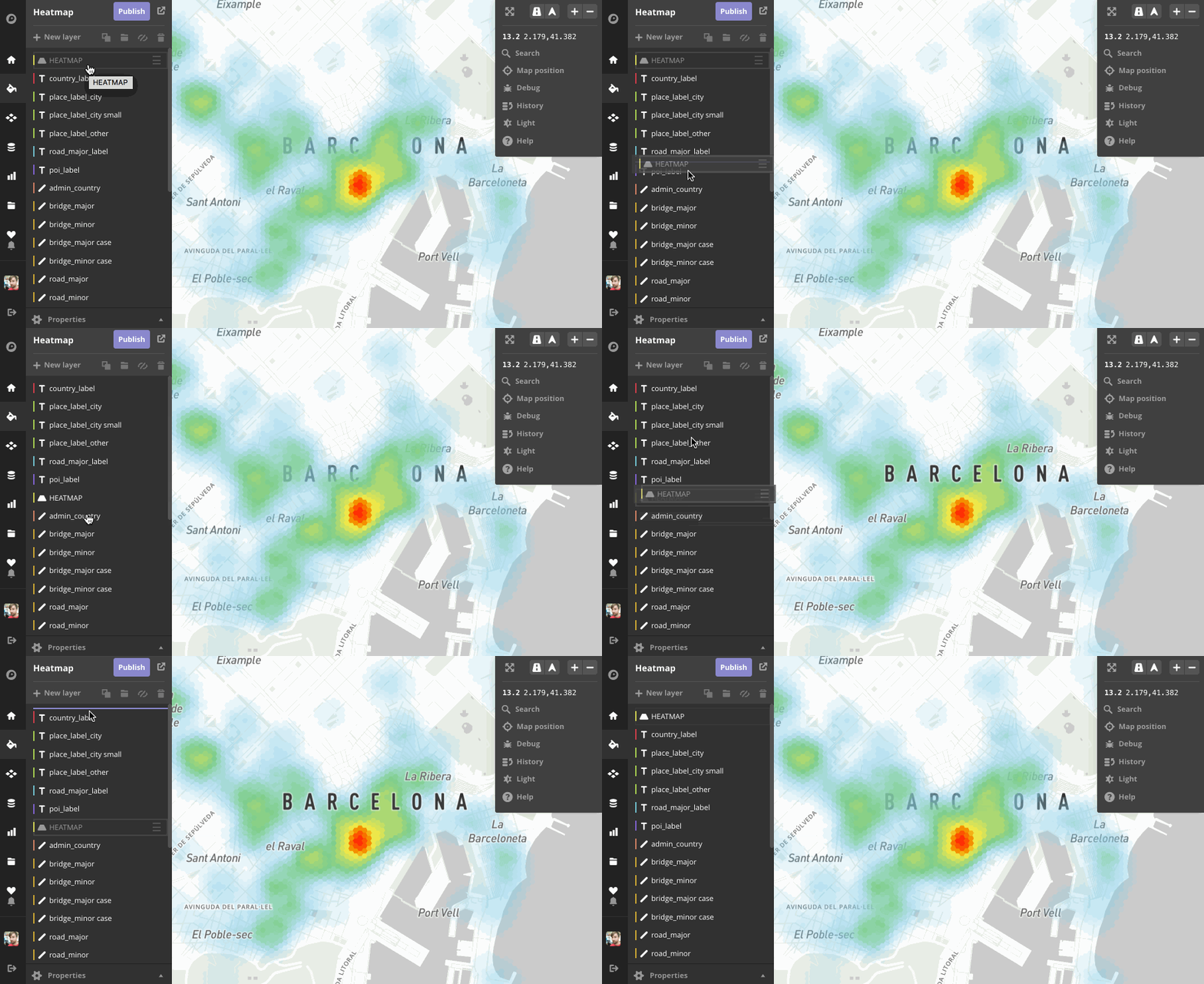
Instead of muting your data with transparency or blocking out your map’s labels entirely, Mapbox Studio and vector tile-powered Mapbox GL maps enable you to customize exactly how your data fits into your map. One of the biggest things you can do to make sure your data and map labels are in balance is to put your data layer underneath the labels. Here’s what I mean:

Let’s explore what this looks like by examining two common types of types of visualizations that are easily obscured by data or are confusing without labels for context: heatmaps and traffic.
Heatmaps
Heatmap visualizations built with other platforms don’t always allow you to have this layer-by-layer control, so designers have to go through some crazy contortions to try and make the map look right.
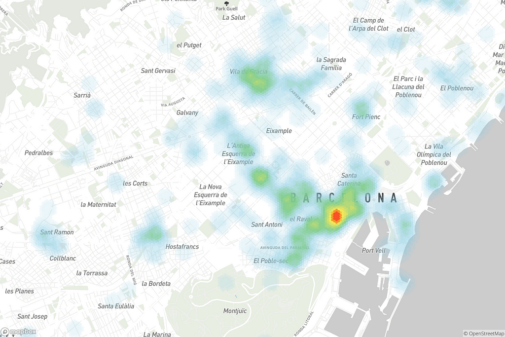
Bad: Data on top — labels are obscured making it difficult to interpret. Avoid this!

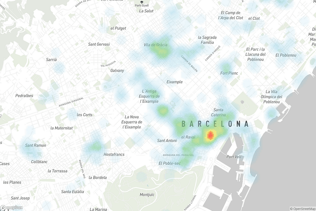
Better: Translucent data layer — This looks better, but it’s an unfortunate compromise and still feels messy.

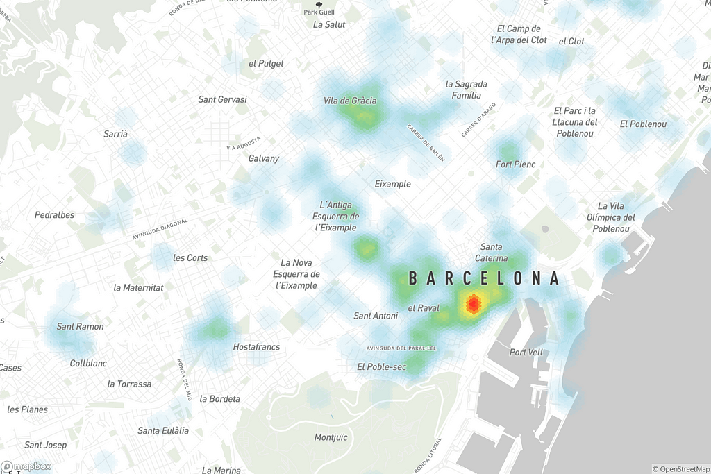
Best: Data layer underneath the labels — Looks tidy and is easier to interpret.

Traffic maps
The worst cases of data obscuring a map that I’ve seen involve realtime traffic overlays. Some traffic providers only provide this data in a raster format that sits on top of the whole map and blots out the street names — how are you supposed to use that kind of map to navigate? Fortunately, Mapbox provides a realtime traffic layer in our vector tile format, so it can be styled and integrated into your map right where it belongs — underneath the labels! Use the slider to check out the before and after below:
By placing data below the road labels, you are still able to see the upcoming traffic while following the directions and seeing alternative routes.
Try experimenting with your own data in Mapbox Studio and explore the Studio Manual to understand how to control the hierarchy. Show us what you build on Twitter using #BuiltWithMapbox.
Data underneath was originally published in Points of interest on Medium, where people are continuing the conversation by highlighting and responding to this story.


