By: Ryan Baumann
Data visualization is a powerful tool. As a developer or designer, you want your data to tell your story. With Mapbox, you’re tapped into location data viz super powers. Own your data viz story with your design, in your application, and on any platform.
Here are 7 techniques to bring your data to life with Mapbox tools:
1| Choropleths

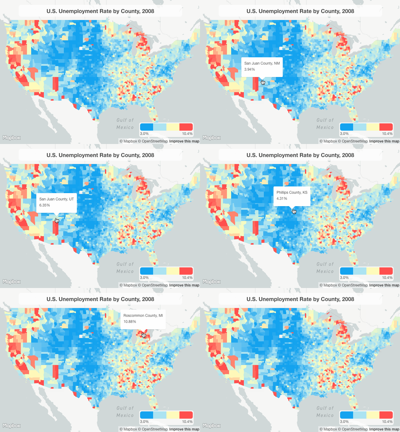
Choropleth (sometimes referred to as fill) maps style areas based on data values. Choropleths are great when you have a range of values across geographic regions, like this map of U.S. unemployment rates by county. You could use a choropleth map to show data trends by zip code, county, country, or sub market boundary.
2| Graduated Circles

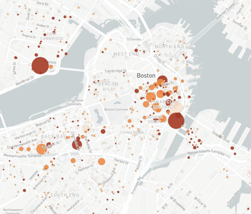
With graduated circles, you can show trends over multiple data dimensions in one visualization. In the example above, circle size represents a quantity, color represents a range, and the location shows the spatial trend of the data.
3| Dot Distributions

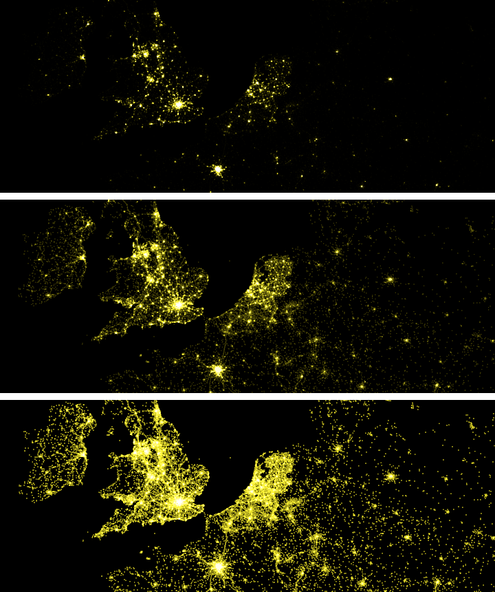
Dot Distribution visuals communicate density trends in very dense point data. Website traffic, vehicle telemetry, and social media posts all make for incredible dot distribution visuals. Check out Eric Fischer’s tutorial on dot density visualization design to get started.
4| Animations
Animations show how your data changes over a dimension (commonly time). For example, you can show how vehicle event locations have changed over a year (as shown above), or you can visualize the change in unemployment by county over a decade.
5| 3D Extrusions
3D extrusions unlock a powerful tool for your data visualization arsenal. These visuals work great when your data has a natural z-element (such as elevation), or you need to compare the relative difference between dense regions, such as the population density of US Census blocks above.
6| 3D Environments

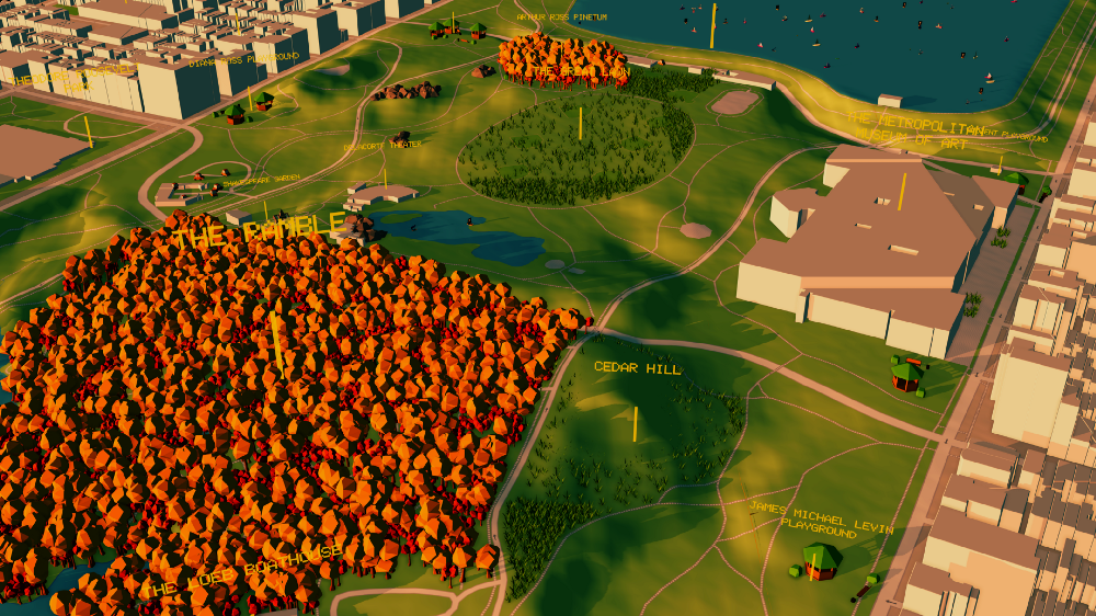
Instead of looking at your data, what if you could explore within? Create immersive 3D environments with our Unity SDK — see through walls, augment real world features, or visualize what your outdoor space will look like with a renovation.
7| Heatmaps (Coming soon!)
Heatmaps show location trends of dense point data using a color gradient. This type of visualization makes it easy to easy to identify where groups of data correlate to one another. A travel website could use a heatmap to show the density of restaurants near a hotel, or a city planner could use a heatmap to identify congested roads from car counts during rush hour.
Working on a data visualization application — or building a location visualization beyond what your BI tool can handle? Sign up and get started building for free with our tutorials.
7 data visualizations techniques for location was originally published in Points of interest on Medium, where people are continuing the conversation by highlighting and responding to this story.