Quantcast
Channel: maps for developers - Medium
Viewing all 2230 articles
Browse latest View live

July New York City Happy Hour

$
0
0

Join us for drinks at 6pm on Monday, July 21st at one of our favorite New York bars, Swift Hibernian Lounge. We’ve been busy since we last met, rolling out our Android SDK, launching Mapbox GL, and even mapping NYC taxi trips.

Eric, Alex and Garrett will be in town and ready to chat about open source maps + technology over beers. RSVP or just show up with friends – hope to see you there!


Pre-party for the TechLady Summer Hackathon

$
0
0

Come party with us before the TechLady Hackathon! We’re bringing together developers and those who want to learn for a party before a day of learning, teaching, and coding at the hackathon. The party is a great way to get to know others interested in programming and share ideas and strategies for teaching and learning — all over drinks and snacks in the Mapbox garage. Everyone is welcome, and we encourage you to bring a friend!

Friday, July 25

6:30pm @ the Mapbox Garage
1714 14th St NW (enter off the alley behind Peregrine)
RSVP

More details on the TechLady Hackathon and signup are here.

See you at the Open Mapping Happy Hour at Open Knowledge Festival

$
0
0

We’re heading to Open Knowledge Festival in Berlin.

Whether you hold a festival pass or not, come and hang out at the Open Mapping Happy Hour with our friends from the Humanitarian OpenStreetMap Team, CartoDB, Development Seed, and Zeit Online. We’ll end the first day of the festival at the beautiful Pratergarten just a block from the festival, talking open mapping strategies and tools with drinks in hand.

Wednesday, July 16

7pm @ Pratergarten
Kastanienallee 7-9, Berlin (just a block from the conference venue)
RSVP

Discover a run with RunKeeper

$
0
0

We worked with RunKeeper last month to visualize 1.5 million walks, runs, and bike rides. We thought it would be cool to use this same dataset to discover and plan your own route.

We worked with RunKeeper last month to visualize 1.5 million walks, runs, and bike rides. We thought it would be cool to use this same dataset to discover and plan your own route.

Explore the route-finding tool below or view it full screen. Clicking on a route will take you to Runkeeper and allow you to add the route to your profile. The underlying basemap is powered by Mapbox Outdoors, the map we created specifically for outdoor applications. Outdoors is available for Enterprise plans now and will roll out late summer for all of our Mapbox plans – get in touch if you want early access.

Don't fly drones here

$
0
0

Unmanned drones like quadcopters and fixed-wing aircraft are at the center of new airspace regulations by the FAA. While the FAA deliberates on rules and regulations, states, cities and other national organizations have implemented their own no-fly zones. To help people find safe places to fly, we’ve mapped established no-fly areas where drones are not permitted around all major airports, military bases, and national parks across the country. All the no-fly area data we collected to make these maps is now open data under CC-0. Go explore the map

Red denotes no fly zones. Explore the map

Where can you fly a drone?

We’ve constructed a map that shows drone pilots restricted airspace. Currently, the 3 no fly zones are:

  • US National Parks
  • US Military Bases
  • 5 mile radius around medium to large size airports

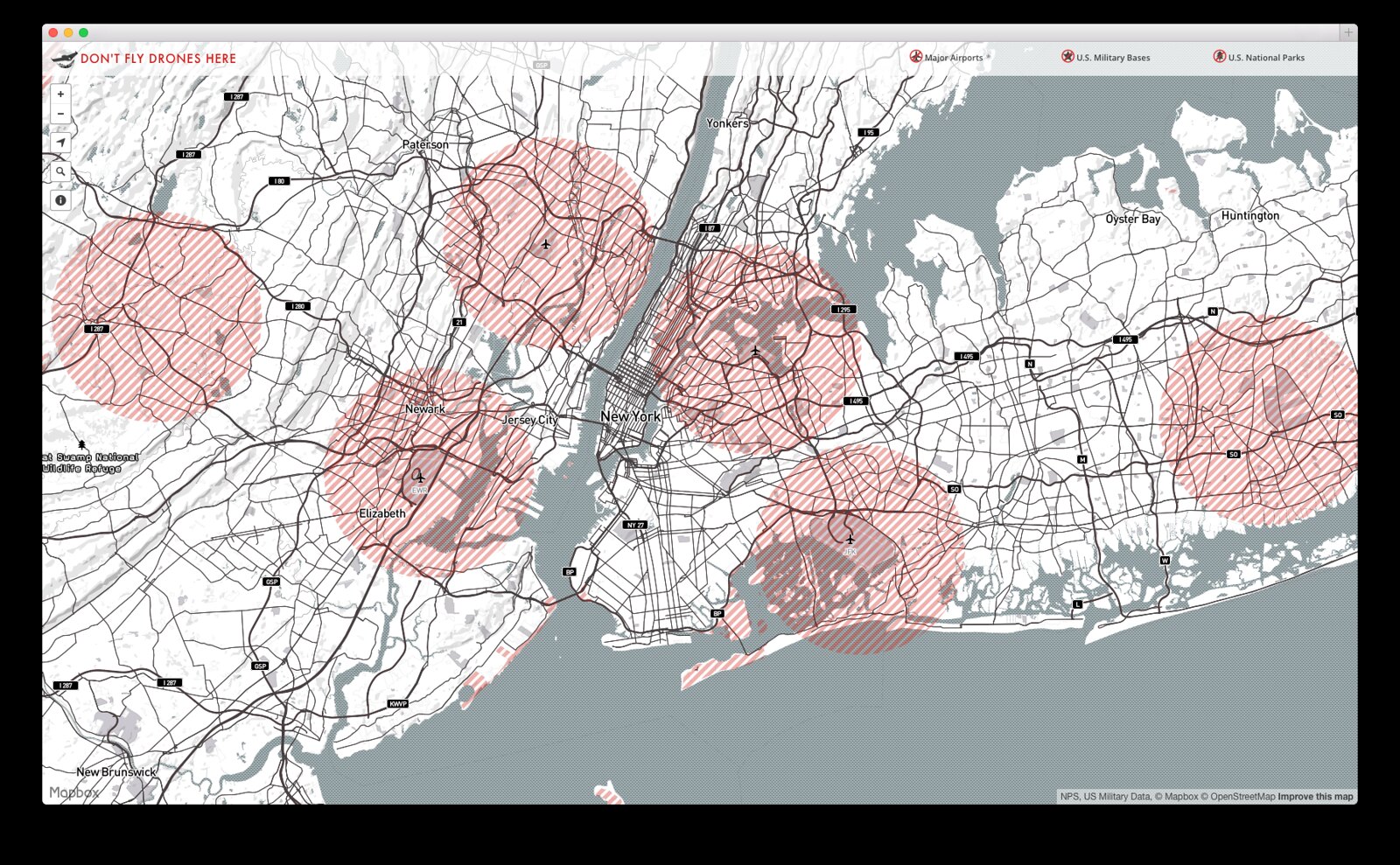
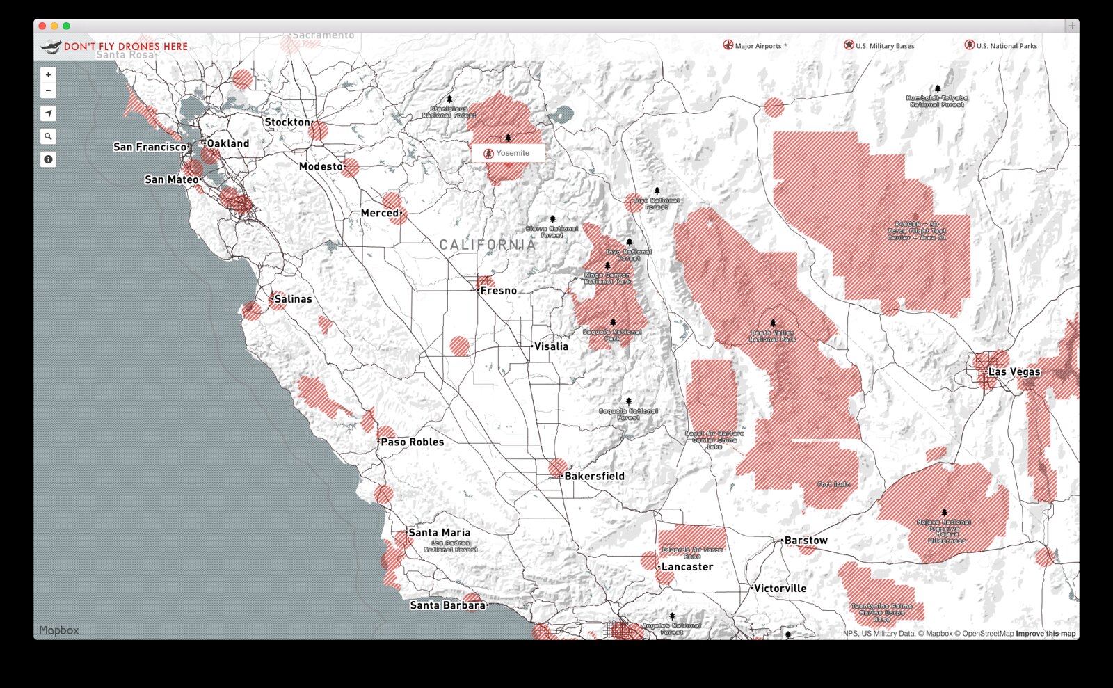
For example here is a look around New York City and Northern California.

No fly zones in greater New York City area. Explore the map

No fly zones in northern California Explore the map

This map is a just a start - if you’d like to add a source to the map, submit your feedback here. There are still many uncertainties around where and how one can fly a remotely operated aircraft. To find out more about local aircrafts restrictions and lean safety tips, contact your local aviation club before flying. We have also started a public Github repository for anyone to post other no-fly zones.

You can also embed the interactive map on your website:<iframe src="https://www.mapbox.com/drone/no-fly/?embed=true#5/38.651/-96.504" frameborder="0" width="100%" height="400px"></iframe>.

Find me on Twitter (@bobws) if you’d like to talk more about drones or ping @amyleew to talk about using this open data to make your own maps.

Morgan Herlocker joins the team!

$
0
0

Morgan Herlocker has joined Mapbox, working with us from the DC garage. He’s an accomplished geo and JavaScript hacker who is the principal author of Turf, a modular system for geospatial analysis. Before Mapbox Morgan worked on software that intelligently chooses locations for corporate real estate using statistics and GIS.

Follow Morgan on Github to see the other open source projects that we’re starting to build, like node-s2, and his awesome personal projects like geocolor.io

Announcing Mapbox GL for the Web

$
0
0

Announcing Mapbox GL JS — a fast and powerful new system for web maps. Mapbox GL JS is a client-side renderer, so it uses JavaScript and WebGL to dynamically draw data with the speed and smoothness of a video game. Instead of fixing styles and zoom levels at the server level, Mapbox GL puts power in JavaScript, allowing for dynamic styling and freeform interactivity. Vector maps are the next evolution, and we're excited to see what developers build with this framework.

Announcing

Mapbox GL for the Web

An open source JavaScript framework for client-side vector maps

Announcing Mapbox GL JS— a fast and powerful new system for web maps. Mapbox GL JS is a client-side renderer, so it uses JavaScript and WebGL to dynamically draw data with the speed and smoothness of a video game. Instead of fixing styles and zoom levels at the server level, Mapbox GL puts power in JavaScript, allowing for dynamic styling and freeform interactivity. Vector maps are the next evolution, and we're excited to see what developers build with this framework. Get started now.

In June, we launched a preview of Mapbox GL for native platforms, a powerful vector map renderer with initial support for iOS, OS X, and Linux. Today, we have open sourced its web counterpart, Mapbox GL JS to enable cross-platform styling. Mapbox GL JS is available on all browsers that support WebGL except for Internet Explorer (coming soon).

Shared style language

Mapbox GL uses a new JSON-based styling language that works on both native and web renderers. The format allows for fast and easy programmatic style changes. Zoom levels are no longer restricted to integer values, so style properties such as road or contour line widths can be specified as a function of zoom level.

VALUE: 0.1ZOOM 14ZOOM 16
..."style": {"line-width": {"stops": [[14, 1], [15, 3], [16, 4]] } }
Functions are specified in [zoom, value] pairs.

Multiple map classes can be specified in a single stylesheet to change map styling in response to user interaction, location, or other sensor inputs. Triggering a class change via the API smoothly transitions between style properties.

// toggle purple style map.style.addClass('purple'); map.style.removeClass('purple');

Read more about complex text rendering and placement for custom typefaces in Mapbox GL.

Development

The code for Mapbox GL (both JS and native) is open source and anyone is welcome to contribute to the framework. We aim to support the same level of map style customization available in Mapbox Studio— and beyond. In the meantime, you can get started building applications today. Check out our getting started guide, the API and robust style documentation and working examples.

Mapbox Satellite gets 48TB facelift

$
0
0

We just added 48 terabytes of updated aerial imagery for the entire continental United States. Starting today users will see the updated imagery at zoom levels 13-17 on Mapbox Satellite

Mapbox Satellite gets 48TB facelift

We just added 48 terabytes of updated aerial imagery for the entire continental United States. Starting today users will see the updated imagery at zoom levels 13-17 on Mapbox Satellite. The new imagery is beautiful -- and it's all made possible by open data from the USDA's National Agriculture Imagery Program.

Our image processing pipeline, built on top of Amazon Web Services' cloud infrastructure, ingested the 24 hard drives worth of orthoimagery and perform a series of image calibration and adjustment routines to produce a seamless mosaic basemap that is fast, accurate, and beautiful. We'll be going into more detail about the processing pipeline and how this relates to Satellite Live in a few days.

The west side of downtown Portland, Oregon, borders steep hills. On the left side of this view you can see Sunset Highway entering the Vista Hills Tunnel, and the switchbacks of residential roads. To their north, on the edge of this image, is Providence Park, home of the Portland Timbers soccer team. On the right you can see the green strip of the downtown park blocks, and just northeast of them is Pioneer Courthouse Square, “Portland’s living room”, paved in salmon-colored brick.

Crater Lake, the deepest lake in the United States, is famous for its rich blue color. It was created by a huge volcanic eruption about 7,700 years years ago in what’s now southern Oregon. Near the west edge of the lake is Wizard Island, a volcanic cone with its own relatively small crater – a mere 150 meters or 500 feet across. The image shows a range of colors in the volcanic rocks, the shapes of wind currents forming ripples on the surface of the water, and some tiny patches of snow.

Fort Baker, just across the Golden Gate Bridge from San Francisco in Marin County, was once used to guard the Bay from naval attack. It’s also a future home of Starfleet Headquarters. In the left of the image are footpaths in the Marin Headlands.

The Grand Coulee Dam, on the Columbia River in Eastern Washington, is the largest power plant in the United States. It was originally built as a New Deal project in the Great Depression, and was upgraded in the 1970s. Its reservoir supplies water to a vast area of farmland growing apples, wheat, and other crops.

The small lakes and wetlands in the Prairie Pothole Region are surrounded by fertile land in the Dakotas, Wisconsin, and Minnesota. More than half of North America’s migratory waterfowl pass through the region each year. Many of the potholes have been drained and their land converted to fields for oats, beans, corn, mustard, peas, wheat, and other crops, giving the area a colorful patchwork look.

Today's rollout includes the most recently captured NAIP imagery available, with half captured within the past year and all but three states captured in the past 2 years.

  • 2013: Alabama, Arizona, Arkansas, Colorado, Delaware, Florida, Georgia, Idaho, Iowa, Louisiana, Maine, Maryland, Minnesota, Montana, Nevada, New Jersey, New York, Ohio, Oklahoma, Pennsylvania, South Carolina, Washington, Wisconsin
  • 2012: California, Connecticut, Illinois, Indiana, Kansas, Kentucky, Massachusetts, Michigan, Mississippi, Missouri, Nebraska, New Hampshire, North Carolina, North Dakota, Oregon, Rhode Island, South Dakota, Tennessee, Texas, Vermont, Virginia, Wyoming
  • 2011: New Mexico, Utah, West Virginia

Recency in action

This new imagery is available for feature extraction for both the OpenStreetMap community and Mapbox Commercial Satellite users. Here are a few examples of the many ways that recency matters to our users. (Left: Before, Right: After)

Completed in April 2014, The Agua Caliente Solar Project in Arizona is the largest solar project in the United States to date, and now visible fully from Mapbox Satellite.
Completed in October, 2012, the new South Norfolk Jordan Bridge, in Norfolk, VA, is now shown in its finished state.
Construction on Marlins Park in Miami, Florida, completed in March 2012. Mapbox Satellite now shows the finished stadium with its retractable roof opened.
The Elwha Dam, on Washington State’s Olympic Peninsula, was demolished in 2011. What used to be its lake is turning into meadows and sandy riverbanks.
Updated imagery, in combination with our image calibration and adjustment pipeline, reveals a vastly different depiction of the Chihuahuan Desert near Albuquerque, New Mexico.

Early access to 2014 imagery

We’ll be ingesting the 2014 NAIP imagery as it comes in next quarter – sign up below if you’re interested in testing the 2014 imagery early. Today’s update is the first of many we have in the pipeline for Mapbox Satellite over the coming months.

<div class="ss-form prose"><form action="https://docs.google.com/a/mapbox.com/forms/d/1U581-UN97p73f4Ns4xa5wY4mWAxyfcBnBHVwHpO24wU/formResponse"
      id="ss-form" method="post" name="ss-form" onsubmit="confirmSubmit()"
      target='hidden_iframe'><div><div class="ss-form-question errorbox-good ss-item ss-text ss-form-entry"
              dir="ltr"><div class="ss-q-help ss-secondary-text" dir="ltr"><label class="ss-q-item-label" for="entry_1686175859"></label></div><input class="ss-q-short" dir="auto" id="entry_1686175859" name="entry.1686175859" title="" type="text" value="" placeholder="Full Name"><div class="error-message"></div></div><div class="ss-form-question errorbox-good ss-item ss-item-required ss-text ss-form-entry"
              dir="ltr"><div class="ss-q-help ss-secondary-text" dir="ltr"></div><input class="ss-q-short" dir="auto" id="entry_1819859858" name="entry.1819859858" required=""
                  title="Please enter a valid email address" type="email"
                  value="" placeholder="Email address"></div><div class="ss-form-question errorbox-good ss-item ss-item-required ss-text ss-form-entry"
              dir="ltr"><div class="ss-q-help ss-secondary-text" dir="ltr"></div><input class="ss-q-short" dir="auto" id="entry_107557424" name="entry.107557424" required="" title="" type="text" value="" placeholder="Company/Organization"><div class="error-message"></div></div><div class="ss-form-question errorbox-good ss-item ss-text ss-form-entry"
              dir="ltr"><div class="ss-q-help ss-secondary-text" dir="ltr"><label class="ss-q-item-label" for="entry_589637845"></label></div><input class="ss-q-short" dir="auto" id="entry_589637845" name="entry.589637845" title="" type="text" value="" placeholder="Are you interested in a specific area?"><div class="error-message"></div></div><input name="draftResponse" type="hidden" value="[,,&quot;-1439753783178228533&quot;] "> <input name="pageHistory" type="hidden" value="0"> <input name="fromEmail"
              type="hidden" value="false"> <input name="fbzx" type="hidden"
              value="-1439753783178228533"><div class="ss-item ss-navigate"><input id="ss-submit" name="submit" type="submit" value="Submit"></div><div id='confirmation' style='display:none'><p></p><h3 style="font-style: italic">Thank you! Your request has
                  been submitted.</h3><p></p></div></div></form></div>


Mapbox GL video: Drone edition

$
0
0

Video in Mapbox GL:
Drone edition

This past weekend I flew my quadcopter over a beach in northern California. At an altitude of 400 feet, the drone recorded video with a GoPro facing downward. I then used Mapbox GL JS to add the video to the map above. You can view the full screen video map here.

The built in gimbal and GPS help with stabilizing the drone

You can check out the code for this map here and the full screen map here. And as always, if you make something cool, let us know @Mapbox!

Welcome Camilla Mahon

Launching WorldView-3

$
0
0

The world’s most advanced high-resolution satellite, WorldView-3, will launch tomorrow – operated by DigitalGlobe, our primary provider of high-res imagery. With 31 centimeter (12 inch) resolution, it will set a new record for image clarity from space. That’s just one of several groundbreaking features.

Spatial resolution

The 31 cm pixels will provide sharpness that’s only available today in aerial imagery. As we demonstrated when DigitalGlobe was relicensed for 40 cm resolution, a decrease in the linear pixel size means an exponential increase in 2D resolution. At 50 cm, a given square meter is covered by four pixels, while at 31 cm, it’s divided into a little more than nine. We knew the math, but we wanted to see what it meant, so this morning the satellite team got out the scissors and tape and made some pixels:

Left: WorldView-3–size pixels, at 31 cm. Right: today’s typical high-res pixels, at 50 cm. This is the moment when our remote sensing specialist, Camilla, and our chief scientist, Bruno, noticed that he can just about fit behind one of the 50 cm pixels.

Spectral resolution

Spatial resolution lets you see things, but it’s spectral resolution that helps you understand them. Like most imaging satellites WorldView-3 will have a panchromatic band plus red, green, and blue to collect true-color imagery. But it goes much further. For distinguishing vegetation differences, it has a red edge band (on the border between red and near infrared), two near infrared bands, and a yellow band that’s good at picking up where plants are dying or ripening. (Think of a wheat farm: if a farmer can tell that the center of a certain field is reaching the harvest stage sooner than expected, that could save a lot of wasted resources.)

For geology and ecology, there are six separate shortwave infrared bands. Subtle differences between these bands will expose otherwise invisible variations in surface composition and moisture, vegetation, and even building materials. For marine applications, there’s a coastal band in the deep blue. It’ll help with atmospheric correction, but most of that will be done by a separate calibration instrument called CAVIS, for Clouds, Aerosols, Water Vapor, Ice, and Snow. These are five of the hardest things for satellites to deal with, and addressing them head-on with a dedicated sensor system is a bold move.

Data volume and accuracy

When a satellite carries so much interesting hardware, the catch is often that it returns very little imagery; but from its planned orbit, WorldView-3 can collect roughly the area of Texas every day. That combination of quantity and quality is unprecedented. To handle the space-to-ground transfer of so much data, the satellite will use an X-band radio link more than a hundred times faster than a home internet connection.

One detail that’s particularly important to our work - WorldView-3 will know where it’s pointing much better than most satellites do. A very slight change in look angle translates to a huge on-the-ground distance, so most raw satellite imagery could be anywhere in a surprisingly wide radius until it’s calibrated against known landmarks. But WorldView-3 will have an exceptionally good “sense of balance”. It’s expected to be able to judge its own look angle well enough to place imagery within 3.5 meters (at 90% confidence) before any on-the-ground calibration.

The launch

WorldView-3 is bigger than a Volkswagen van (even without its solar panels), and will weigh almost 3 tons when fully fueled at launch. It takes an Atlas V 401 rocket to put it in orbit. Once it’s there, a satellite so complex takes several months to test and calibrate before it starts producing commercial imagery. We’ll be waiting impatiently.

Join us watching the ground-to-orbit webcast on Wednesday morning. The launch window opens at 11:30 a.m. PDT (2:30 p.m. EDT, 6:30 p.m. UTC) and lasts for a quarter of an hour. Remember to tune in a bit early to catch the countdown. One warning: space launches depend on unpredictable factors like weather and ground safety, so there’s a always chance it’ll have to move back a day. I’ll update this post if it’s delayed.

Come build mobile at Mapbox

$
0
0

Want to be part of the team that’s changing the way app makers design and develop maps? Or just enjoy building frameworks for other developers? Or maybe you love graphics programming and squeezing every last ounce of performance out of the latest low-energy mobile chips? At Mapbox, you can do all of these. We’re looking for a few good Android and iOS developers.

Native

While having a background in maps is a bonus, what we’re really looking for is top-notch coders who love native development, be it Objective-C, Java, Swift, C++, or whatever’s coming next. We want people who love their craft and see unlimited potential in the new class of touch-based smartphones and tablets that have revolutionized what it means to carry a portable computer.

Open

Mapbox builds, and is built on, open source code. We maintain over 200 projects on GitHub, and internally we even run everything from office maintenance to sales as repositories with issues. Writing open source code is an excellent way to improve your skills, interact with customers, and take more accountability for your code.

Varied

Roles are fluid at Mapbox. As a mobile developer, you’ll find yourself affecting much more than just our mobile code:

  • Working on Cocoa, Java, or C++ libraries
  • Hacking on a headless GL renderer
  • Blogging about build systems
  • Hopping on a call with interested devs at a world-famous shop
  • Drafting a beautiful mobile showcase on the website
  • Strategizing new code libraries for new markets
  • Sketching ideas for a new server API

Our products and services are shaped by the whole team working as a tight, integrated unit to smooth out all of the rough edges and make elegant, well-documented, and fun tools that tens of thousands of developers love.

Get in touch

If you’ve got what it takes and have a deep and abiding love for native mobile platforms, we want to hear from you. Hit us up at jobs@mapbox.com or on Twitter at @Mapbox and let’s talk mobile.

Summertime BBQ at the Mapbox Garage

$
0
0

Next Thursday we’re tapping some kegs and BBQ'ing DC style, with half-smokes on the grill at the Mapbox Garage. We’re getting things started at 6:30 pm and going until late. Hope you can join us! RSVP here.

Karen Shea joins Mapbox

$
0
0

karen

Karen is a designer who immediately impressed us by not being afraid to use GIFs and vanity browser themes in her online porfolio:

GIFs

She is a recent graduate from MICA. A designer by training, we’re excited to let Karen’s curiousity loose in the space between between design, data, and programming to help us build tools and improve our data.

Welcome Luis Alanya!


Mapbox Swag!

Mapping #Ferguson

$
0
0

The protests and militarized police response have unfolded in real time on Twitter over the last ten days since police officer Darren Wilson shot and killed Mike Brown in Ferguson, Missouri on August 9th. Thousands of the #Ferguson tweets were geotagged with location data and Chris and I wanted to see what we could learn from those locations. In particular, we wanted to see if there was any difference between tweets from locals and those from people who traveled to Ferguson to participate in or report on the protests.

Tweets from West Florissant Avenue

To distinguish between locals and visitors, we compared geotagged tweets in Ferguson with previous tweets from the same people. Locals who had most recently tweeted within seven miles are displayed in green, and tweets from people who had come from further away in purple.

Clusters of tweets from both groups are densest along the few key blocks of West Florissant Avenue, from the Quik Trip convenience store at the north end to the McDonald’s at the south. Local people seem to have tweeted more from those endpoints, while people visiting were more likely to tweet from locations in between. Other clusters of tweets include the Target store in the south, police and fire department headquarters, and the apartment complex where Brown was killed.

On the map we built you can choose between seeing #Ferguson tweets from locals, visitors, or both over the last few days.

The lines on the opening map represent travel between previous and current tweet locations from people tweeting about Ferguson, showing the convergence into the area.

View Fullscreen

Processing Raw NAIP Scenes into Seamless Imagery

$
0
0

We just updated Mapbox Satellite across the continental United States with 48TB of open imagery from the National Agriculture Imagery Project (NAIP). The imagery captured by NAIP is incredibly diverse thanks to a variety of factors: different collection times, instruments, altitudes, weather, and lighting conditions. Before even beginning our processing, we reviewed the acquisition dates for all imagery we had on hand and found that there were 333 different collection dates from 2011 to 2013. To address these issues, we built a pipeline to calibrate NAIP against a consistent reference layer, adjust colors, and reduce seams in the final mosaic.

Before processing in our pipeline, the raw NAIP imagery showed stark seams.

Calibration

One way to address color inconsistencies in raster data is to calibrate images according to a reference layer. Histogram matching is a common technique where colors from a reference layer are borrowed and applied to the target layer. Applying a single reference across the entire survey reduces most of NAIP’s color inconsistencies, helping all scenes converge towards a more even color palette. We used Landsat images as a reference layer for calibrating the dataset.

histogram matching example

Landsat reference image (left), NAIP (center), Calibrated NAIP (right)

Using Landsat as a calibration layer presented a problem: Landsat imagery has a spatial resolution of approximately 30 meters, whereas NAIP’s resolution is roughly one meter. Many of the fine details present in the NAIP image are not present in the corresponding Landsat image. During histogram matching, these details are washed out by the colors of larger neighboring objects resolved by Landsat.

We used a weighted averaging technique to bring the finer details from the uncalibrated NAIP image back into the calibrated image. This technique allowed us to find a middle ground between color space convergence and fine detail.

Seamless

Histogram matching moved the entire survey towards a more uniform color palette, but seams were still present between neighboring images. To reduce the seams, we adopted a technique similar to the way that digital cameras stitch panoramic images. When panoramics are created, the camera positions the next frame so that there are some overlapping pixels between neighbors. Ideally, overlapping pixels should have the same value, but that’s rarely the case due to exposure inconsistencies. For subsequent frames, a transform function is applied to each overlapping pixel so that its value matches the corresponding pixel of the preceding image. The transformation is gradually reduced until it smoothly transitions to the response of the current image.

In the case of satellite and aerial imagery, there are often overlapping pixels between neighboring scenes. Overlapping regions are leveraged in a similar way, but the problem is more difficult. Panoramics are stitched across a single dimension (x axis), whereas satellite and aerial imagery are stitched across two dimensions (x and y axes). Also, most panoramic strategies adjust an image based on derived values from all images in the sequence in order to prevent drift effects. For satellite and aerial imagery, we have to adjust the image with knowledge of only its most adjacent neighbors, relying on histogram matching to prevent substantial drift effects.

Calibrated NAIP image. Left, processed NAIP with seams between scenes. Right, after applying our seamless code.

Moving forward

By combining the techniques above in our imagery processing pipeline, we were able to ingest a massive, diverse dataset and roll out a beautiful imagery layer from coast to coast. We’re continuing an exploration of new imaging techniques to improve our satellite baselayer and in the coming months we’ll be releasing new imagery. Drop the Satellite team a note if you’re interested in building out a robust raster pipeline.

Explore National Parks offline with Chimani and Mapbox Outdoors

$
0
0

Chimani recently launched with Mapbox Outdoors to give hikers detailed trail and elevation data for National Parks. All maps are also available offline. The park data comes from OpenStreetMap, allowing any Chimani user to add their favorite trails to the map. If you’re an outdoor adventurer looking to find the next great hike you can download their mobile apps, available on iOS and Android.

chimani-iphone

Mapbox Outdoors is available for Enterprise plans now and will roll out late summer for regular Mapbox plans. Get in touch if you are looking for early access.

Yosemite trail and terrain details on Mapbox Outdoors (full map)

Over 1 million New York City buildings and addresses imported to OpenStreetMap

$
0
0

Over the past year, our data team has worked with the OpenStreetMap community to do a full import of building footprints released as part of New York City’s open data initiative. The result is over 1 million new buildings and over 900,000 new addresses — adding value to OpenStreetMap, creating more context, and making the map more searchable. The data has been continuously available on Mapbox Streets within minutes of each edit.

Progress animation showing the import of one million new buildings and addresses in New York City to OpenStreetMap.

Imported buildings contain height information (full map).

Along with buildings, we imported over 900,000 addresses — as seen here in the Park Slope neighborhood of Brooklyn.

OpenStreetMap as a platform for data collaboration

From the beginning, one goal of this huge data import was to help the city government maintain its building and address datasets: edits on OpenStreetMap are a signal that the ground truth may have changed. Today, the New York City GIS department subscribes to daily email notifications of building and address changes in OpenStreetMap, indicating where updates in the original dataset are necessary.

Excerpt of the daily email notification going out to the New York City GIS team, showing changes to buildings and addresses.

Import process

OpenStreetMap’s biggest asset is data integrity informed by local knowledge. Hence, the top priority for the data import was to ensure highest quality and to preserve local knowledge. To this end, we involved local community from the start and ensured import quality by following OpenStreetMap’s import guidelines, making data conversions repeatable, distributing jobs with the Tasking Manager and by using Github to track import issues.

We have not only added data, but fixed existing map errors where possible. For instance, mappers involved in the import have added 959 layer tags to bridges and have realigned over 4,000 points of interest such as schools, fire stations and restaurants with building boundaries.

For a full rundown of the import process, read up on my in-depth post over on OpenStreetMap.org.

Continuously improving the map

We are not done yet. While all data has been imported to OpenStreetMap, there are final cleanup tasks we are tackling at the time of this post. Help us further improve the map: if you find a building or address related issue on the New York City map, please let us know by filing an issue on Github. As soon as new data is available from New York City, we will also take a look at updating OpenStreetMap where it makes sense.

Huge thanks to all contributors outside of the Mapbox team who have helped make this import happen. Through your work reviewing, coding, coordinating and doing data uploads you have helped make this import better than it would have been without you: Serge Wroclawski, Eric Brelsford, Liz Barry, Toby Murray, Ian Dees, Paul Norman, Frederick Ramm, Chris MacNally, and many others. A special thanks to Colin Reilly from New York City NYCDoITT who has helped on many occasions fully understand the source data and find the best decision translating it to OpenStreetMap.

Viewing all 2230 articles
Browse latest View live