Quantcast
Channel: maps for developers - Medium
Viewing all 2230 articles
Browse latest View live

Join Us for Spring New York City Happy Hour


Beer + bánh mì: Highlights from last night

$
0
0

Great seeing everyone at Mapbox San Francisco last night! Kegs + backup Bud Light + Bicycle Bánh Mì happened. Here are some highlights.

Checking out Eric Fischer’s “Locals and Tourists” map

Camille & Sean in the kitchen

Vlad & Josh

Nelson, Bobby, Max & Tom

Eric sabering — thanks Marc!

Finding Planes with Satellites

$
0
0

127 planes were reported in the past few days as people helped search Blackbridge imagery for missing flight MH370— out of more than thousand reports overall. While none of these finds pointed to the plane in question, most were airliners captured by satellites mid air, looking like a series of colored ghost images:

Aircraft mid air as captured by BlackBridge Satellite on March 20th [08°17'04"N, 094°56'46"E]

This characteristic pattern of ghost images stems from push-broom cameras used by many earth observing satellites. Images of such cameras are composed of single-row arrays of pixel sensors on the focal plane that scan the earth as the satellite orbits at 7.5 kilometers per second ( 4.7 miles per second ) — just like a scanner over a document. Each sensor row captures one color at a time. In this setup, objects that move fast leave ghost images in different colors, since their position underneath the satellite changes from one row to the next.

In BlackBridge satellites, these sensor rows are packed into two CCD array units. Blue and green sit next to each other in one array, and red and infrared bands in another. This is why the red ghost appears further out when using red, green and blue channels as in the imagery here.

Other examples:

Planes midairs on BlackBridge Satellite rasters: (1) March 18th 08°17'04"N, 094°56'46"E. (2) March 19th 06°28'17"N, 096°53'24"E(3) March 20th 11°37'39"N, 094°40'09.“E

Ebola mapping in Guinea: Humanitarian OpenStreetMap Team

$
0
0

Ebola has broken out in West Africa. As of this morning, about 60 people have died of hemorrhagic fever in southern Guinea, with Ebola confirmed in more than a dozen cases — and the the virus may be spreading into neighboring Sierra Leone and Liberia. To help Doctors Without Borders and other responders with their work, the Humanitarian OpenStreetMap Team (HOT) has set up a crowdsourced tracing effort to quickly fill in the inadequate existing maps of the area.

Until commercial imagery is available, we’re helping with open data. One source is Landsat 8, which turned out to be useful for Typhoon Haiyan efforts as well, since it can be processed so fast. This is a region where the best available maps are often antiques from the colonial era, two generations ago. Even medium-resolution imagery is useful if it’s from this week. Landsat 8 shows major roads, rivers, overall land use, and most importantly settlements: all vital information for planners who need to know where to send supplies and in which directions the disease might have spread. Another useful source is a USGS purchase of high-res data:

Tracing for HOT is important and not very hard. If you want to learn, get involved today. If you have the skills, check into the tasking interface and start mapping some high-priority areas!

Cloak: Anti-social network mapping

$
0
0

As seen on CNN, Time, Wall Street Journal, Newsweek, LA Times, Huffington Post, InformationWeek, Jimmy Fallon’s monologue, and seemingly everywhere else, Cloak, the new iPhone app for the anti-social networker in all of us, just launched. Cloak ties into Foursquare, Instagram, and other social networking accounts to help you avoid certain people at certain times, all on a map.

We love the branding: Radar green

Cloak is your radar for avoiding undesirable real-world interactions in an age of social media saturation. Dating to the Second World War, radar displays have long featured green to display their output. Like the original cathode ray tube on which they were based, radar technologies made use of the phosphorescent properties of their component materials. The glass screen of CRTs was frequently back-coated with phosphors, and since those which caused a green coloring had the longest color persistence before fadeoff, they became the favorite amongst radar operators for seeing objects on the display longer than just the radar signal-synced sweep of the oscilloscope voltage across the screen.

It’s subtle map design details like this that we love seeing developers use to make their apps super tight. Go download the app now.

Welcoming State of the Map US with a Garage Party

$
0
0

We’re excited for this year’s U.S. OpenStreetMap conference coming to Washington, DC. To welcome and get to know the 400+ OpenStreetMap contributors converging for the conference, we’re throwing a party in the Mapbox Garage on Friday, April 11. Join us to meet other OpenStreetMap and open data fans and talk mapping over beers, snacks, and foosball. RSVP here.

Mapbox Garage
1714 14th Street NW Alley
6:30 — 10pm

Taller OpenStreetMap y Mapbox alrededor del Foro Económico Mundial en Panama

$
0
0

Next week I´ll be in Panama giving a Workshop on OpenStreetMap and Mapbox. That week we are also talking at the World Economic Forum on Latinoamerica about Innovation and Technology.

El próximo Lunes 31 de Marzo estaré en Panamá dando un taller para ONGs sobre OpenStreetMap y Mapbox. El evento es abierto y organizado por Voluntarios de Panamá y Ponte en algo. Durante esta semana también participamos como panelistas y moderadores en el evento de Foro Económico Mundial en Latinoamérica sobre Educación, Innovación y Tecnología.

En el taller hablaremos, en español, sobre qué es OpenStreetMap, cómo usar y mejorar los mapas, y cómo aplicarlos al trabajo de una ONG o una empresa. No hacen falta conocimientos previos, pero sí traer un ordenador si es posible. La sala dispondrá de conexión a Internet. Apúntense mandando un correo a voluntariosdepanama@gmail.com.

  • Ubicación: Edificio 716 Paseo del Prado, Balboa Ancón — Panamá
  • Fecha y Hora: 2pm a 5pm — Lunes 31 de marzo de 2014.

Qué es OpenStreetMap?

OpenStreetMap - No tiene Street View ni la omnipresencia de algunas de sus alternativas, pero dejarse distraer con estas características sería no reconocer el poder real de este proyecto: OpenStreetMap son datos abiertos. OpenStreetMap es la Wikipedia de los mapas y como tal es la opción perfecta para todos aquellos que necesiten un poco más que un mapa prefabricado. Con este taller lánzate en el mundo de OpenStreetMap, conociendo desde cómo contribuir al mapa, a extraer datos, procesarlo y crear tu propio mapa. El taller dura una hora y media y tomará lugar a través de Google Hangout. Será guiado por el científico jefe de MapBox, Bruno Sánchez-Andrade Nuño.

Este taller es para todos que quieran aprender más sobre OpenStreetMap, tener un conocimiento técnico es útil, pero no es un requerimiento para participación.

Si te interesa este Taller o el evento del Foro Económico sígueme en Twitter en @brunosan.

CalGIS: Three days of mapping + a party

$
0
0

We’re kicking off CalGIS on Monday, April 14th with a party. Join us at the Cannery Row Brewing Company at 95 Prescott Avenue in Monterey at 6pm to talk maps + have some beers + celebrate CalGIS in its 20th year. Mapbox will be at CalGIS during the entire conference — so look for our talks, workshops & demos.

On Monday from 9am to 4pm, head to the Open Source Workshop with Alex to dive into OpenStreetMap, TileMill, and Mapbox. You’ll also see Alex on Tuesday’s panel on The Future of GIS/Geospatial (11am) and walk through many examples of applications created with Mapbox in Wednesday’s morning breakout session on Fast and Beautiful Maps for Web and Mobile.

Eric will close the conference at 2:30pm on Wednesday the 16th with a keynote on #CustomEverything and making maps custom. He’ll share why the future of geo is small pieces loosely joined, and where Mapbox sees the larger mapping space going in the next two years.

Be sure to sign up for CalGIS + the Monday night party when you register so you can meet us there!

Mapbox party at CalGIS: Monday April 14, 6PM at Cannery Row Brewing Company


Over 100,000 buildings mapped in Guinea where Ebola broke out

$
0
0

In the past 5 days the Humanitarian OpenStreetMap Team and volunteers mapped over 100,000 buildings and hundreds of miles of roads in Guinea where Ebola broke out. In just these few days since the outbreak, almost 200 mappers have made enormous progress filling in the map with the full range of detail needed by emergency workers, from major roads to individual buildings.

I overlaid the replication data feed from OpenStreetMap onto a satellite image from Landsat 8 to show all the progress from the past few days. The colors represent how recently each feature (building or road) was added to OpenStreetMap.

Moving around the color wheel from red through yellow and green to blue, the features in red were added to the map last Tuesday as the first stage of the humanitarian mapping, and the ones in blue were mapped most recently, on Sunday. The OSM tasking manager is tracking the work that remains to be done to complete the base map.

Background reading: “Ebola mapping in Guinea: Humanitarian OpenStreetMap Team” — March 25th by Charlie (@vruba) and “2014 West Africa Ebola Outbreak Response” — March 31st from the Humanitarian OpenStreetMap Team blog.

GeoDC Today: How To Use OpenStreetMap

$
0
0

Come out to GeoDC on Wednesday, April 2nd, at Stetson’s. Beers at 7:00 pm, presentations kick off at 7:30 pm. The annual OpenStreetMap conference State of the Map is right around the corner, so this month we will gather to talk about how to use OpenStreetMap.

Lightning talk lineup:

  • Josh Campbell from the U.S. State Department will talk about MapGive, a resource that helps new volunteers learn to map and get involved through humanitarian crowd-sourced mapping initiatives using OpenStreetMap.

  • Aaron Lidman of Mapbox about will talk about OSMLY, a project that makes importing new data into OpenStreetMap easier, more accurate, and collaborative.

  • Andrew Wiseman will talk about how USAID’s Office of Transition Initiatives uses and creates OpenStreetMap data to support overseas programs like Libya, Honduras, Haiti and Syria, including working with local groups to map areas and using the data for logistics.

We’ll be at the upstairs bar at Stetson’s near the intersection of 16th and U streets NW. We’re excited to chat over beers and look forward to seeing everyone on Wednesday!

The GeoDC group meets once a month. For updates, join the meetup group or follow @geo_dc on Twitter. For more details check out the event listing. If you have any questions ping me @jeff_hurlock

Zeit Online Launches Custom Maps

$
0
0

Zeit Online, the digital sister publication of Germany’s most widely read weekly paper launched new maps in a completely custom branded design, seamlessly integrating into the website’s look and feel. The new maps use German labels, all sourced through OpenStreetMap. Thomas Jöchler, head of Zeit Online’s interactive team says:

We’ve developed a design for our maps that would be Zeit’s unique canvas for anything geographic. Our maps needed to be functional for something as simple as showing context with locator maps or as complex as elaborate interactives. Our new maps carry the branding of Zeit Online, yet their design is subtle, not glaring, setting the stage for our content on mobile and the web.

Map showing how doctor’s offices concentrate in affluent neighborhoods of German cities.

All hurricanes between 2008 and 2013 mapped for a feature on emergency management on the Florida keys.

The map uses Zeit Online’s fonts on all zoom levels.

The Zeit’s new maps do not only cover the full globe but go down to the highest zoom levels, all sourced from OpenStreetMap data.

Labels are intentionally sparse to make space for information on data visualizations and locator maps.

Nuclear power plants in Great Britain from an article on how the UK doubles down on nuclear power. Note the German labels for Ireland, UK, Netherlands and Belgium.

Head over to Zeit Online to check out the new Zeit maps, for instance on yesterday’s article on how the Florida keys prepare for hurricanes or today’s interactive on how doctors concentrate in affluent neighborhoods.

New high resolution satellite images for Ebola outbreak region

$
0
0

We just processed high resolution imagery with DigitalGlobe for Mamou, a region within the center of the Ebola outbreak where more than 80 people have died and more are at risk as the virus spreads to urban areas. High resolution imagery of Mamou was previously unavailable; you can now trace the imagery and help map this area via the HOT Task Manager (_read more about the tracing efforts).

This satellite image was taken by GeoEye-1 on January 8th, 2013 at 11:18:44 UTC. Resolution is pan-sharpened 0.5 meters/pixel and processed and uploaded to Mapbox within one hour upon delivery of the data using our satellite imagery processing pipeline. If you are coming to OpenStreetMap’s State of the Map US next week you can lean more about DigitalGlobe imagery for OpenStreetMap from Kevin Bullock, who is presenting on “Mapping the World in Raster.”

Satellite image we just released with an overlay of Mapbox Streets. Since we source our data from OpenStreetMap, the map above is always updated with the latest contributions from the community. Swipe the slider to see streets overlay.

For a visualization of the amazing mapping activity in the past week, see Eric Fischer’s blog post.

Carol Hansen joins Mapbox

$
0
0

Developer Carol Hansen joins the Mapbox team in Washington, DC! Previously, Carol worked in web development, GIS, and volunteered as a developer with Code for Boston, the Boston-based CfA Brigade. She will be jumping in on the API and web services team, helping to make Mapbox tools even better.

Drone Adventures Imagery for Tracing in OpenStreetMap: Fukushima + Lima

$
0
0

Drone Adventures released four new UAV imagery layers of their recent deployments for tracing on OpenStreetMap. Three of the maps are from Fukushima, Japan, one from Lima, Peru. This release is part of our partnership with Drone Adventures to make drone imagery available to OpenStreetMap for tracing.

All imagery is hosted on Mapbox and can be traced on OpenStreetMap with any of its editors. You can get started tracing this imagery into OpenStreetMap by using the OpenStreetMap US tasking manager following any of these links:

  1. Tomioka, Fukushima
  2. Hisanohama, Fukushima
  3. Iidate, Fukushima
  4. Lima, Peru

The imagery was shot with a Sensefly eBee drone and is of very high resolution, capturing multiple square miles down to zoom level 21 — plenty for street level mapping.

The Fukushima imagery was sourced as part of a survey of the ongoing reconstruction effort three years after the Fukushima Daiichi nuclear disaster, read up on background over at the Drone Adventures blog.

Tomioka, abandoned city in Fukushima prefecture, Japan

Hisanohama, Fukushima prefecture, Japan

Iidate, Fukushima prefecture, Japan

Lima, barrio José Carlos Mariátegui

Mapping an entire city in a day

$
0
0

This is what you get when you combine community, open data, and awesome imagery. In 29 hours 68 contributors mapped an entire city (20,105 buildings):

Read more about how OpenStreetMap volunteers led by the Humanitarian OpenStreetMap team used new high resolution satelliteimagery published by DigitalGlobe to help Doctors without Borders assist with the Ebola outbreak.


Creating Maps From Drone Imagery

$
0
0

Here is an end to end walkthrough showing how to process drone imagery into maps and then share it online, all using imagery we collected on a recent flight with the 3D Robotics team and their Aero drone.

Flying with 3D Robotics in Berkeley, CA

Piecing together the imagery

The first step in creating a sharable map is stitching the images into one single image. Software like PhotoScan and Pix4D make this really easy for you. Here we are going to use Pix4d. Simply import images, select GeoTIFF as output option and let it run.

Adding flight data to Pix4D

Rendering and uploading the map

After Pix4D has completed processing the imagery, import the resulting GeoTiff into TileMill, our open source map design studio. In TileMill follow these steps to make sure your imagery looks great:

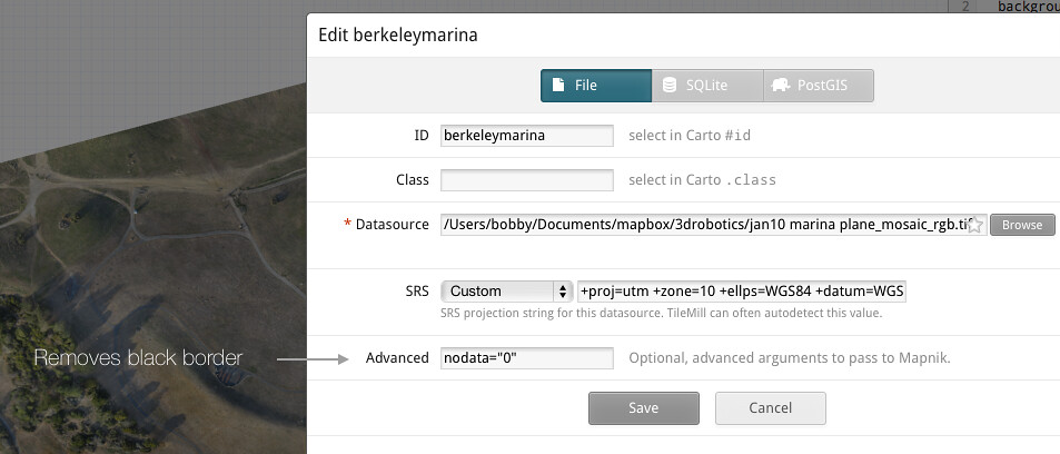
  • To remove the black border from around the imagery, set nodata=0. Usually this value is 0 but the value can vary and can be checked in QGIS
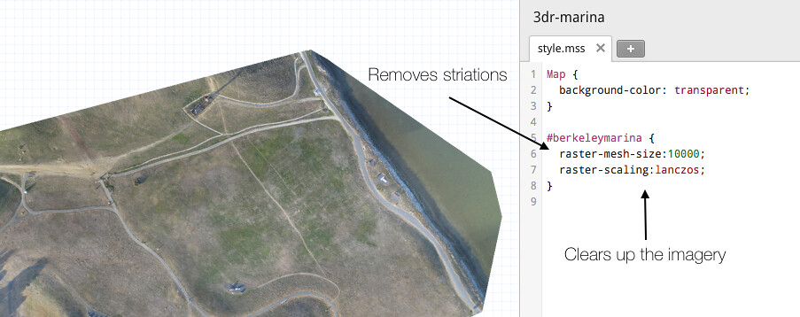
  • Increase the raster -mesh-size. This will make sure reprojection artifacts do not appear
  • Set map-background:transparent. This will make the map look better when overlayed on other imagery
  • Set raster-scaling:lanczos;. This will ensure your imagery is nice and clear. It will also increase your processing time, but it’s worth it.

Once all TileMill parameters are set, upload the imagery to Mapbox.com by clicking Export—>Upload.

Final Result on top of Mapbox Satellite once uploaded to Mapbox.com and styled with mapbox.js.

Sharing the map

Once uploaded to Mapbox.com, you can optionally combine the imagery with Mapbox Streets, Mapbox Satellite or any other layer you have uploaded previously. From there it is easy to share the map either by its URL or as a Youtube-like embed code. To extend the map further use mapbox.js. For instance, the example above is a simple time line built with mapbox.js.

If you have any questions around creating maps from drone imagery or if you would like to share results of your recent flights, hit me up on Twitter @bobws.

Women Who Code @Mapbox

$
0
0

Four out of five of our newest team members at Mapbox are amazing women who code. This is awesome, and it’s just the start. We’re growing fast at Mapbox and are looking for talented, hungry women — and men — to join our team. If this sounds like you, check out our current job openings and reach out to me directly at bonnie@mapbox.com or on Twitter @bonnie. I’d love to talk.

Audiolizing Server Query Rate

$
0
0

Project OSRM is audiolizing the server query rate on our demo site. It’s kind of like a geiger counter for monitoring usage, letting people feel what is happening in an abstracted way. An often (implicitly) applied technique to do this is Well-Known Patterns: Things you recognize without thinking. Like green in traffic means go. Or an X that marks a spot in a pirate map. Or even the famous Munich 1972 Summer Olympics pictograms by Otl Aicher. The list goes on and on, but these things have one thing in common. The combination of simplicity and immediate recognizability. In our case, I went with a geiger counter – here is what last night sounded like: (mp3, 93kb):

Listening to it, each click is a distinct query that is answered. Each click is a piece of communication that is send and connects us to someone else. You immediately get the idea of how much traffic is going on. No charts, no numbers, only the power of sound and simplicity.

When it comes to data visualization there are all sorts of patterns that spring to mind. Arrows going up or down, pesky pie charts, columns, colors, dots, dashes, lines. The list is endless. And more than often these building blocks are plugged together without thought. Either telling the story wrong or at least making it harder to comprehend. Or not telling at all by not abstracting from the raw data. And the more complex the visualization become the less immediate recognizability they bear.

In terms of OSRM I wanted to make it clear to a non-technical person how much is happening right now on our server, i.e. how many queries do we serve. The aim, again, is just right now and it has to be simple. We don’t need fancy charts as we don’t need history. We want to be able to plug into what’s happening and as soon as we are happy get out. The naive way would be to pick a period of time, let’s say 10 seconds. And print something that represents this interval, e.g. a column that changes its height and perhaps also its colors depending on the number. This is not only boring. It has absolutely no esthetic appeal to it. As said above. It is naive. First, there is no beauty to it. It is a rectangle changing its size. If it had beauty one would enjoy watching the thing. That’s hardly imaginable. And then it’s not what we set out to do. It gives us information about an arbitrary interval, in our case 10 seconds. We could make the interval smaller to capture the current moment, but then we don’t see much. Or we could make it larger to aggregate more, but then … You probably guessed that already.

Recall that we need to capture the moment. Moments are funny things. They do not have fixed beginnings or endings. It is a piece of now taken from a a stream. And conceptually the stream of nows is running for ever. Also, we don’t know when an actual query is going to occur. We assume our users to be independent from each other. At most, we can say something about the probability that it occurs (by looking at query logs). Assume we had a log of several minutes and we look at the number of queries of each minute. It is fair to assume that the numbers are different. The more minutes we analyze the better our idea of the median becomes. The distribution of these minutely numbers is described by what is called a Poisson Distribution.

The Poisson distribution occurs in many situations of life. For example in geiger counters are measuring the rate of radioactive decay. We all recall the clicking sound. Here’s a simplified explanation of how it works. Each time it collects a ionized particle, it collects ionizing current which in turn drives a speaker. As it is a simple spike in current, it generates a click. The more events it collects the more clicks it generates. Imagine a strong source of radiation and its burst of clicks. This is our well-kown pattern. We are not building a visualization with it. We are building an audio-lization!

What we need to generate is a click each time we serve a query. This is easy to do given we have access to a server log. In our case, it is a Linux server and a OS X machine that plays a click. Long story short, here is a quick shell script:

#/bin/bashUSER=userSERVER=my.machine.comPATH_TO_LOG=/path/to/query.logAWK_MODE=#-Winteractive # disable buffering on Linuxexport PLAY_TOOL=afplay # use aplay -q on Linuxexport PATH_TO_CLICK_WAV=/path/to/geiger_click.wav
ssh $USER@$SERVER tail -f $PATH_TO_LOG|awk $AWK_MODE'{system("$PLAY_TOOL $PATH_TO_CLICK_WAV &")}'

and of course the click file (wav, 10k). As every piece of OSRM, it is of course BSD licensed.

Monitoring Oil reserves from Space

$
0
0

Skybox Imaging is making it easy to monitor oil reserves and other resources from space. Oil is typically stored in tanks with roofs that float to avoid breathing and evaporative losses in the space between the top of the oil and the tank ceiling. With the roof’s moving, flat surface and basic trigonometry we can use Skybox’s satellite images to estimate the fill and volume of oil containers. The ratio of length of the tank shadow casted over the outside versus the inside is proportional to be volume of oil inside the tank.

Below is an analytics use case created by Skybox co-founder Dan Berkenstock and Skybox Product Manager Ty Kennedy-Bowdoin using two SkySat-1 images of the Ras Tanura Oil facility in Saudi Arabia leveraging our visualization tools. Using the method described above on both images we can monitor the change in volume for each tank:

Ras Tanura Najmah compound, Saudi Arabia

Here is the math of how this works:

This method can be easily expanded. Aggregating the volume values using the radius and shadows plus sun elevation we can fill the values in the formula and estimate the overall storage for the facility and how much the ship docked on the first image could have taken on board.

  • Area of the cylinder: taken directly from the image since we know the resolution.
  • Height of the cylinder: Using the the length of the shadow on a flat surface and the solar elevation (from the time/place but also typically part of the image metadata).

Our satellite pipeline allows us to process all kinds of imagery sources into orthorectified single strips and beautiful global mosaics. Continued integration with Skybox will further simplify the process of accessing and analyzing timely satellite imagery.

For more on the science behind this type of analysis, hit us up on Twitter using the links below.

GeoLadies Coffee Break at State of the Map US

$
0
0

Let’s have a GeoLadies get together at State of the Map US this weekend during the coffee break at 3:30 pm on Saturday. Grab a coffee and join us in Room 143 (lunch room). There’s going to amazing energy at this conference. Not only will it be the largest OpenStreetMap gathering to date, it will also be the most diverse with more women attending and speaking than years past. This is a trend we need to continue and improve on. So let’s get together to meet the women in the OpenStreetMap community, share our experiences, and talk about how we can grow.

Watch the Birds of a Feather board by registration for more details and any changes.

Viewing all 2230 articles
Browse latest View live