Quantcast
Channel: maps for developers - Medium
Viewing all 2230 articles
Browse latest View live

Your neighborhood as a woodcut

$
0
0

A week ago I posted screenshots of a woodcut inspired map I made. A lot of people asked for an interactive version, so I spent some time polishing the map for the entire world.

This time I added labels to make the map easier to navigate, customizing them at each zoom level with the help of Nicki and AJ’s typography and mapmaking expertise. I focused on avoiding label overlap and clashing – a technical detail that makes a huge difference on map aesthetics.

I also refined all of the wood textures to look great at a smaller file size. The original patterns from PixEden were seamless, but since the files were very large, I cut out small sections from the images to reduce map loading time. The patterns were color–corrected and smoothed to fit seamlessly into buildings, roads, and parks.

The map now has new city names, roads, parks, water bodies, and custom country name shields that better fit the color scheme of the oceans and land textures. Take a look at the interactive map and let us know what you think!

Washington, D.C.

Country label placards

State and highway lines

City buildings up close


Algae Blooms from Space

$
0
0

This algae bloom off the Coast of Estonia was captured by NASA’s Landsat 7 satellite at 30 meter resolution, on July 16th, 2002. This algae, a type of cyanobacteria, can be found in almost every terrestrial and aquatic habitat - but with the right conditions can bloom and be seen from space as blue-green patches that swirl following surface currents. Lines cutting across the image are the traces of ships.

This is a simple example of real time environmental monitoring using satellites. Factors that lead to these blooms include low winds, increasing temperatures, and nutrients such as phosphorus (often byproducts of fertilizer runoff along the rivers). The Baltic Sea, pictured above, is seeing an increased threat in the last years. These blooms can be toxic and create dead sea zones, and are often monitored from air and space.

The map above has been processed from a Landsat 7 raster. After applying LEDAPS atmospheric correction, it was rendered into a map using TileMill, and hosted on our system.

Tattoos & TileMill 2

Pinterest pushes maps to iPhone

Rasterio: GDAL especially for Python programmers

$
0
0

Rasterio is a GDAL and Numpy-based Python library designed to make your work with geospatial raster data more productive, more fun — more Zen. It’s a new open source project from the satellite team at Mapbox.

Rasterio is Python software, not GIS software. Whether you are an experienced Python programmer beginning to explore raster data processing and analysis, or a geographic data hacker branching out into Python programming, you can get more done with less code and fewer bugs thanks to rasterio’s use of Python language types, and protocols, and idioms. Advanced features such as a generator for raster feature shapes (demonstrated in the image above and documented here) are helping the Mapbox satellite team iterate faster and build more efficient data processing pipelines. We’d be pleased to have you join us in developing rasterio. See the installation directions and give it a try!

Foursquare: Maps designed for functionality

$
0
0

Foursquare users will notice a cool web update today: beautiful new maps, using a totally custom style we designed in collaboration with an amazing team at Foursquare. In addition to being designed around the Foursquare brand, using their colors, fonts, and iconography, these new maps are specifically designed for functionality. With 60 million venues in its database, Foursquare is the place to discover a trending new bar for an after-work drink, the search engine to find the best taco stand in a new city you just landed in, and your space to track all your favorite coffee shops. It’s unique, and its maps need to be designed to make it even easier for users to engage in this unique social searching. The details matter – from better references for neighborhoods and highlighted public transportation to a look-and-feel that’s 100% integrated with the rest of the platform. The map is the context for the app.

Maps make up a significant proportion of the Foursquare web interface, so it was important to create a seamless aesthetic between the maps and the rest of the app. To do this, we created a color palette that is similar to that of Mapbox Streets (previously used by Foursquare) but derived from Foursquare brand colors. We kept the colors lighter and more desaturated than the rest of the Foursquare UI though, so that key elements like place markers and headers remain in the foreground.

We typeset the prominent labels – such as country, city, and neighborhood labels – in Gotham, Foursquare’s display typeface. For smaller, less prominent labels – such as road labels – we used Helvetica, Foursquare’s body typeface:

We incorporated subtle patterns for parks and bodies of water, inspired by the design of Foursquare icons:

We did more than just customize colors, fonts, and patterns to match the Foursquare brand, however. One of the more interesting aspects of designing a custom base map is our ability to customize the information hierarchy, to highlight the most important information for users at each given zoom level. This map more prominently features the neighborhoods and local landmarks (important POIs), providing a more helpful point of reference. A slight decrease in the density of road labeling helps maintain this hierarchy:

At higher zoom levels, more road labels appear to help direct users to specific places:

Instead of departing radically from the existing map (our out-of-the-box Mapbox Streets, which already functioned well on the Foursquare platform), we focused on the subtle elements that really elevate this custom design. I’m excited to see Foursquare take advantage of our capability to customize their maps, down to the smallest of details.

Hyper-styled terrain

$
0
0

Our Vector Terrain layer is close and we’re having some fun with it in TileMill 2. Here is a highly detailed contour map of the Colorado Rocky Mountains. The styling itself is very basic–a single color and thickness for the lines. It’s the data that transforms it into something else.

Monitoring transit from Space

$
0
0

Remote sensing enables monitoring of transportation infrastructure across seasons and across the world. Above is an example of an interactive map made using Landsat 7 satellite images of Eastern Estonia. Landsat 7 captured the summer image, at left, in July 2002. We recently wrote about the algae bloom and ship traces visible in this image. The image on the right corresponds to the following winter 2002-2003.

  • Ice Roads. In the winter the sea can freeze enough to allow car traffic. In the case of Estonia, ice roads are set when ice thickness surpasses 22 cm (8.7 in) thickness. These ice roads have special regulations like no stopping, minimal spacing between cars, and avoiding certain speed ranges that would resonate with water waves underneath. When the snow is plowed away, the bare ice becomes thicker than the surrounding areas, delaying springtime melting. This blocks light longer, modifying algae growth.

  • Ferry. The Tuule Grupp 25 minute ferry connection between Virtsu and Kuivastu is kept open during winter using ice breaker ships. The summer image shows the Ferry midway through one of its crossings. The winter image shows the corridor free of ice as the icebreaker ships crosses several times per day.

  • Regional Harbor. The Port of Parnu is an important regional harbor serving the southwestern Estonia hinterlands, which provide much of the raw materials exported through Estonian ports. The port cuts an open corridor in winter using Ice breakers.

This is just an example of how remote sensing can be used to monitor and gather qualitative information. With more cadence of images, increased resolution or video capabilities, it could be possible to extend its potential into quantitative dynamics: When and how is the ice freezing and melting, how often are ice breakers working or how much traffic is using each infrastructure type.

Full screen map

Images were taken from USGS repository for Landsat 7, processed to surface reflectance, styled in TileMill, hosted on Mapbox and embedded using mapbox.js. Clear winter images are harder to get since winter at high latitudes only has a few hours of daylight. Winter raster actually corresponds to early Spring (March 29) which for Estonia still means ice season.


Smart Directions Powered by OSRM's Enhanced Graph Model

$
0
0

Offering effective directions for pedestrians, cyclists or drivers is much more than simply computing the most direct connection in the road network. The open source routing engine Project OSRM powering our upcoming Directions API implements an enhanced and detailed graph model that captures many features beyond the basic topology. With OSRM, you not only get the shortest or fastest route, but one that takes into account turn restrictions and cost like waiting at traffic lights, braking and accelerating at sharp turns, or steep hills for bicycle riders.

An OSRM route respecting turn restrictions using the OSRM graph model.

The Simple Model and Path Search

A graph is a mathematical tool for representing entities and the connections between them. In a simple graph model of a road network, the entities are intersections and the roads between them form the connections. Excess edges are added to model the curvature of the road, i.e. its geometry. The so-called weight of an edge denotes the cost to traverse it in the chosen mode of transport, for instance travel time for car routing, distance for walking directions, or a combination of time and energy-consumption for electric vehicles.

One of the basic algorithms for routing is Dijkstra’s Algorithm, which solves the problem of finding a shortest path, i. e. a path of minimum weight. In essence, it works like this: to route from A to B, start from a source A, and in each iteration, find and settle the nearest unsettled intersection. Settling means assigning a definitive distance. And this is the closest intersection to any previously settled ones which is still not settled itself Intersections adjacent to settled ones are assigned a tentative distance that may decrease if a lower distance — a better path — is found during the search. In a sense, the algorithm searches radially around the source until it finds the destination.

This looks like a decent way to find a path from A to B, but at a closer look it has major short-comings. First, it does not account for turn restrictions, a common occurrence in the road network. Even worse, this shortcoming is by design. Let’s look at a real-world example and its graph representation:

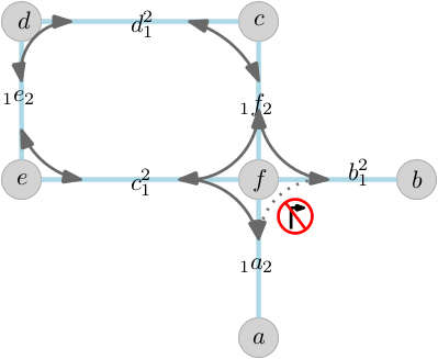
intraversible p-loop

A typical routing scenario navigating a turn restriction.

Assume we are trying to find a path from a to b. The search settles nodes a and subsequently f. The link to b is not explored as it is forbidden, and the search continues on the loop c, d, e. And then it is stopped, because node f is already settled previously with a lower weight. The bypass road is never found as a viable path. And if you allow the search to revisit the intersection after it is settled, you sacrifice efficiency and therefore practicality.

Our Detailed Model

The takeaway is that the simple model does not guarantee path finding when turn restrictions are involved. To solve this, OSRM transforms the road network graph. Instead of modeling intersections and the roads connecting them, it models roads and turns from one to the other. This is called the edge-expanded model. In the edge-expanded model we think of links between street when it is possible to turn from one street to other. In other words, roads are now our entities of interest and turns are the connections that we would like to model. Take a look at the following illustration of the edge expansion:

edge-expanded graph

Edge expanded model — OSRM models roads and actually possible turns rather than naively modeling the road network.

For every edge we add a node representing each direction of travel. The grey edges in the picture now reflect turning from one road to the next. The weight of each (expanded) edge is the cost of its first (original) edge plus the cost of the turn. Now, when going from edge a to b, we simply have to traverse the loop and so find the bypass road.

Obviously, we are adding much more detail into graph, which does increase the memory requirements of a factor of 3-4. After careful optimization the data set for planet-wide car routing consumes roughly 32 GB of RAM.

The Expressive Power of the Model

The detailed edge expanded model is obviously useful for car routing, but is it necessary for bike routes, which have many fewer turn restrictions? It turns out that the model has some features that make it useful for a variety of travel modes. Let’s look at two illustrative examples.

First, when traveling on a bike it makes sense to minimize the number of turns on a route. In urban areas with gridded streets there may be several equally long routes, but the best one would prefer long straightaways to stop-and-go turns, especially where a turn would cross traffic. Second, the angle with which you turn from one road to the other is important. The steeper the angle, the more you need to decelerate and accelerate again.

Second, look at this example of a route optimized for scooters with minimal number of turns and evading streets with an upper speed limit of 40 mph:

minimized number of turns

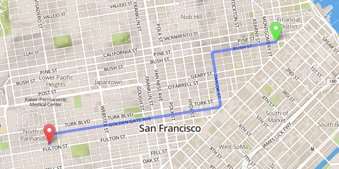
Optimized route for scooters through San Francisco avoiding turns and high speed traffic.

Turn costs are a factor for scooters, trucks, and bikes as well as cars. By explicitly modeling each turn, OSRM is able to account for the cost associated with each turn. For instance, how hard is the deceleration at a sharp turn, or how long is the average wait at an intersection? Turn angles, stop signs, traffic signals, and other factors are all taken into account.

Future Developments

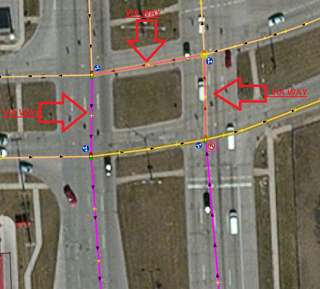
We are gearing up for what’s going to be a set of exciting new and powerful features. One of them is enhanced turn restrictions, like Michigan Lefts that not only forbid traveling over a certain junction, but over multiple ways. See the following example from the OpenStreetMap Wiki.

complex turn restriction

Example of a complex intersection not allowing for U-turns.

Finally, we believe that no single routing profile will fit every use case, and that people have diverse and subjective preferences that should be configurable at query time. We are working on delivering highly configurable routing profiles, and our first results indicate that it is possible to cut down preprocessing times and memory requirements even further. Stay tuned!

Interactive heatmaps with Mapbox.js

$
0
0

Just a couple of weeks ago, we’ve carefully picked and hosted the best plugins to use with Mapbox.js and its core, Leaflet. Today I’m happy to introduce a small but useful addition to the list — Leaflet.heat, a new, fast and simple plugin for interactive heatmap visualizations. Take a look at the example code, or use the plugin straight away.

Besides the plugin, I’ve released the heatmap drawing code as a separate, generic JS library — simpleheat. Enjoy!

Visualizing NDVI for Agriculture

$
0
0

NDVI is a common measure in remote sensing for agriculture — capturing how much more near infrared light is reflected compared to visible red. It helps differentiate bare soil from grass or forest, detect plants under stress, and differentiate between crops and crop stages.

We are currently working with our friends at Blackbridge (RapidEye) to expand our agriculture tools. Farmers need more than just pixels — so our goal is to make it easy for the agriculture sector to get information out of imagery. Here is a look over New Holland, Illinois, taken on June 9th, 2012 at 6.5m resolution. RapidEye’s push-broom sensor offers Visible bands (RGB) as well as Near Infrared (760-850 nm) and a Red Edge (690-730 nm) band. NDVI above was processed in python with rasterio and uses the Near Infrared and Red bands, using a rainbow color ramp. The red, orange, and yellow quickly show the healthiest areas of each field. You can mouse over the image to see the visible spectrum (aka the regular image).

If you are interested in using NDVI with Mapbox ping Chris (@hrwgc), Charlie (@vruba) or me (@brunosan) on Twitter, and follow @Mapbox for more updates, tutorials, and cool pictures.

GeoLadies --> OpenStreetMap

$
0
0

GeoLadies — this is an open invitation to join the OpenStreetMap community. Like many technology communities, OpenStreetMap has more dudes than ladies. But what makes OpenStreetMap great is that people are proactive about being welcoming to everyone. The last US conference was made up of 20% women. I don’t believe this reflects the true number of women who care about these open data, hot maps, and OpenStreetMap. Let’s change this.

We have scholarships specifically targeted to women for the next OpenStreetMap conference, in Washington, DC April 12 & 13. If you use or contribute to OpenStreetMap, or are just passionate about building an open map of the world, you should apply. The deadline is this Sunday, but the application process is short. Even if you can’t make the conference, join OpenStreetMap and get involved in your area or online.

Reach out to me if you want to talk — @bonnie on Twitter or bonnie@mapbox.com.

Expanding Leaflet's format support with Omnivore

$
0
0

Omnivore helps Mapbox.js& Leaflet eat more types of data. We love and support GeoJSON, but sometimes specific data is in other formats, like GPX from a running watch, KML from Google Earth, CSVs from your spreadsheets, or TopoJSON files with enhanced geometries.

Omnivore makes it all super-simple:

omnivore.gpx('run.gpx').addTo(map);

Check out examples with GPX, CSV, and KML data.

You can start using Omnivore quickly because it’s included in the Mapbox Plugins CDN— or download it from its GitHub project.

On a code level, Omnivore is what we’d call a ‘glue module’. The underlying code for parsing these formats has already been written & tested - csv2geojson for CSV, wellknown for WKT, toGeoJSON for GPX & KML, and TopoJSON itself for parsing itself. This is great, because it means the code has been tested & deployed already — toGeoJSON is behind the scenes on Mapbox.com’s drag & drop, and geojson.io, and several other tools. But it can be tricky to connect the dots between different APIs and Leaflet.

So Omnivore is an extremely simple project that connects the code of different modules into something more directly usable for web maps. This kind of part is possible because of the npm module system, which manages the dependencies, and browserify, which packages the library for browsers.

Randomness in map design

$
0
0

I introduced an element of randomness into a recent map design. Misplaced buildings and overlapping areas of texture bring energy and excitement to the experience of viewing a map. The end result is a little disorienting, but still mostly familiar:

View fullscreen map.

I balanced randomness with accuracy. Correctly placed map labels and roughly accurate landuse features make it difficult to ever feel truly lost when looking at the map. Towns, parks, and schools look a little broken, but they are where you expect them to be. By warping and misusing the data just a little bit, I was able to uncover unexpected rhythms and relationships. My normal urge to explore when looking at a map is even stronger: I don’t know what the next town over is going to look like, so I keep panning. Will it be layered and muddy like a Rauschenberg, rhythmic and minimal like a Kandinsky? Out of the randomness, an element of surprise emerges.

Here are a few interesting spots:

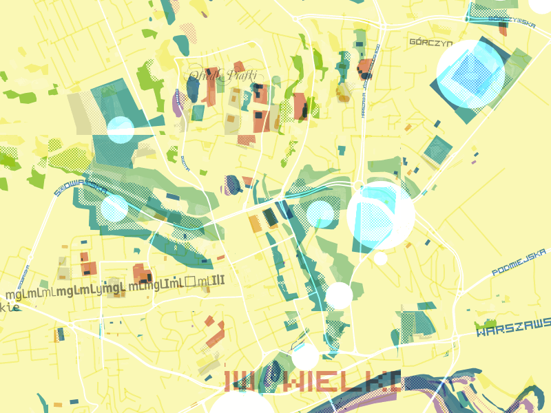
gorzow-wielkopolski poland

Gorzow-Wielkopolski, Poland

ho-chi-minh-city vietnam

Ho Chi Minh city, Vietnam

istambul turkey

Istanbul, Turkey

queensland australia

Queensland, Australia

mapbox-west sf

Mapbox West offices, San Francisco, USA

Some of my favorite places aren’t the major cities that we usually show off on our maps, but small towns and out of the way parks, where randomness seems even more pronounced. These half-complete places with half-complete data feel like little visual poems. Here’s Friday Bridge in the UK:

friday-bridge uk

I liked this series of towns along highway 71 in central Minnesota:

redwood-falls mn

This unnamed park in central Nebraska also stood out to me:

park nebraska

Having access to OpenStreetMap data for the whole world, and being able to style it in an instant, changes what is possible with map design. I threw dozens of textures, colors, and layer styles at my map and saw them appear instantly.

The main problems map designers dealt with historically like sourcing, managing, and understanding data were already solved for me. I spent my time on problems of a different nature: “Is it possible to randomize the fonts I’m using for labels?”, “How much can I break on this map while still recognizing where I am?”.

If you’ve only been looking at digital maps for the last dozen years, it’d be easy to forget that maps have a rich history as an expressive medium. From 12th century maps covered with mythical creatures and unknown lands, to the personal maps by contemporary artists like Duke Riley, creators have been using maps to do more than just describe reality from the beginning.

Again, here’s a link to the full interactive map and this was all designed using using TileMill 2, the next generation of our open source map design studio, which is currently under development on Github.

GitHub adds visual history for maps


Sochi, with love

$
0
0

OpenStreetMap has been in the news this month for its great coverage in and around the Olympic venues, particularly in comparison with Google Maps. Wired has a good piece on the subject, and Ilya Zverev of the Russian OSM community reminds us that the great data is no last minute rush job – most of the area has been well mapped for years.

But OSM doesn’t just win where it has more detail – it wins everywhere by being open. Whether you want to contribute to the map of your neighborhood, or dive in deep and learn how every piece works, or just take the data and make something new and awesome, you can do that. Being open is pretty cool.

View fullscreen map.

State of the Map US - Get In On Early Bird Rate Until Tomorrow

$
0
0

The next OpenStreetMap conference is coming to Washington, DC April 12 & 13, and you have through tomorrow — Saturday — to register at the early bird rate of just $75.

The conference is a great opportunity to learn more about OpenStreetMap and how it’s being used, meet other mappers and OpenStreetMap data users, and get involved in the largest open source mapping community creating a continuously updated representation of the world.

Register by Saturday, February 15 to save your spot and get the early bird rate.

Traveling astronaut by Tatiana Van Campenhout

Mapping + Jamón at Mobile World Congress

$
0
0

Sign up to get an invite to our Mobile World Congress party – lots of talk about maps on mobile! Uncorking starts at 6pm on Tuesday the 25th of February at the Spanish Pavilion in Congress Square.

We are going to show off our latest vector maps, specifically our soon to be released vector terrain Outdoor, Pinterest on mobile, the new foursquare neighborhood map - “designed for functionality”, and a preview of the next generation of Cloudless Atlas. All of this is going to be in context of our latest Android development and in conjunction with an OEM announcement.

The party will also be rocked by Javier de la Torre who leads CartoDB and is the host making this all happen and loves open source geo, and Tyler Bell of Factual who gets big data.

Sign up now for an invite!

Come help us eat this leg

Let's Meet Up At Wayra's 4 Years from Now Event

$
0
0

We are supporting Telefonica’s Wayra initiative, offering up free access to Mapbox APIs to Wayra’s next wave of tech accelerator startups. If you are a Wayra backed start-up or applying to be one come find us and let’s talk about maps and location for mobile. Be on the lookout for @ericg, @brunosan, @bobws and myself at Wayra’s 4 Years from Now event at Fira Montejuïc Hall M8 February during Mobile World Congress.

PLACEHOLDER

If you can’t make it to the Wayra event, meet us at our Mapping + Jamón party we’re co-hosting with Factual and CartoDB. We’re excited to talk about maps and mobile.

Photo: Canaan

Ubuntu mobile maps: open maps on an open platform

$
0
0

Today at Mobile World Congress we showed off Mapbox support for Ubuntu Mobile with direct Mapbox.js integration into any HTML5 Ubuntu Mobile app. Developers can design totally custom maps and integrate them into their apps in minutes and even get access to native features like the camera and the accelerometer using Cordova (previously known as PhoneGap). Across all web, mobile and desktop experiences on Ubuntu an app will look exactly the same. If you have ever added a Mapbox map to a website, you’re ready to start developing for Ubuntu Mobile using HTML5.

Eric routing us to the Sagrada Familia from MWC

This morning I demoed the above location app, which is loaded onto every phone at the Canonical booth at Mobile World Congress (section 8 in the main Fira). The idea is simple: we wanted to create a mapping demo app that displays both Ubuntu’s platform as well as Mapbox’s. The app allows users to search for points of interest and find more information about the location, then route there. The app utilizes Mapbox’s full API stack: a completely custom base map, geocoding, routing, and even Foursquare’s API to create a seamless Ubuntu experience.

Quick view of the Ubuntu Maps demo app

Getting going with Ubuntu Mobile and Mapbox is easy. I’ve created ‘a hello world’ app to get you started.

If you’re at Mobile World Congress, drop by to see us at WIP Jam event or hit me up on Twitter to talk maps and mobile.

Big thanks to David Pitkin and the rest of the Canonical team. We loved working with all of their engineers.

Viewing all 2230 articles
Browse latest View live