Quantcast
Channel: maps for developers - Medium
Viewing all 2230 articles
Browse latest View live

OpenStreetMap's Redesign Goes Live! More Focused, More Inviting, More Map

$
0
0

A redesign of OpenStreetMap.org has just gone live. Since we kicked off with State of the Map US in San Francisco, we have been working closely with the OpenStreetMap community to implement this new design that is more focused — a better experience for newcomers and creates more space for the map.

logged in vs not logged in

We introduced a stronger distinction between logged in and non-logged in user interfaces focusing on what matters for each.

image two

Actions like editing, browsing the history and exporting are all modes of the same map now.

about page

Clean sub pages under clear menu items replace the cluttered sidebar menu - here is the About page.

We continued to take an incremental approach to implementation, taking on areas where we could have an impact that was actionable, fit within existing constraints, and could be realized in relatively short order. Specifically, we've focused on the following areas for this redesign:

  • A better experience for first time visitors. On the main page, new visitors now see an explanation of what OpenStreetMap is and clear actions to learn more or start contributing, rather than a cluttered and narrow sidebar without a clear information hierarchy.
  • A better experience for contributors. One of the primary use cases of the website is as a tool for contributors to explore map data and changes. Functionality that was duplicated between browse pages, the map data layer, and "view on map" links is now consolidated and consistently presented in a sidebar and map view.
  • A modern look and feel. It's not 2004 any more. With this redesign, the site feels fresher and more modern, and better reflects the competence, experience, and capability of the OpenStreetMap community.

Because OpenStreetMap is built and run by a community of contributors, it was important that our design process be highly collaborative. We solicited feedback in multiple venues -- conferences, editathons, mailing lists, IRC, and GitHub -- and at multiple points during the process. That feedback led us to consider new aspects of the design and produced many important refinements.

image of huge pull request thread

A screenshot of pull request #498 implementing the redesign.

In the end, we responded to hundreds of comments on the redesign pull request and made over 250 commits. The result is a huge step forward, producing a site that works better for both new and existing contributors, with a design that does justice to the thriving project that is OpenStreetMap. We are planning to continue in the spirit of iterative improvements and there are clearly areas where the site could be even better. Please report issues you find on GitHub.

Head over to OpenStreetMap.org and check out the new design. If you don't have an account yet, get one and get started mapping.

mapbox-osm


Google Glass + Strava Map

$
0
0

We love wearables at MapBox. I have Google Glass, and almost the whole team uses Strava to track their running or biking. So last Sunday I went for a long run to check out the Strava app for Glass. I thought it would be fun to expand on our previous GoPro post by looking at integrating the video and pictures I captured through Glass while running.

I made this feature-by-feature map to show my new route to friends visiting DC. However the idea of mapping a course like this could easily be used by race directors to get people excited about an upcoming race or by anyone that just wants to share what they see while running or biking.

Google Glass is not on sale yet (thank you Silica Labs for the invite), but if you have a pair you can replicate this map. Recording the GPS track with Strava is as easy as just saying: "Ok Glass, record a run". This will show telemetry (distance, pace and time) on the Glass display, and Glass will operate in the new Immersive mode so my voice commands are restricted to the Strava app. To make a picture just push a button, or long click to make a 10 seconds video — tap to extend the video, tap to stop the video.

Videos and photos are automatically uploaded to Google, so we only need to make a map canvas with the track and all the images are pulled into the map. Here we are using our new vector layer for outdoors as the base map. Then I downloaded the gpx track from the activity page in Strava and styled it using MapBox.js. Not all media is geolocated, but I quickly added all the markers with an embedded a picture or Youtube id using geojson.io and MapBox.js. Check out our examples and tutorials on how to add markers with embeded pictures and Youtube videos on the MapBox.js examples page.

Ski Maps

$
0
0

Vail, Colorado is home to the largest ski resort in the United States.

Ski trails and ski lifts are just some of the latest outdoor features being added to MapBox Streets and getting special attention in our update to MapBox Terrain. We love them so much that we're styling a winter-themed terrain map especially for such snowy activities. Enthusiasts will soon have access to over 75,000 downhill and nordic trails mapped on OpenStreetMap, including names and difficulties. Here's to a great season on the slopes!

Mapping the open web using GeoJSON

$
0
0

GeoJSON is an open format for encoding information about geographic features using JSON. It has much in common with older GIS formats, but also a few new twists: GeoJSON is a text format, has a flexible schema, and is specified in a single HTML page. The specification is informed by standards such as OGC Simple Features and Web Feature Service and streamlines them to suit the way web developers actually build software today.

Promoted by GitHub and used in the Twitter API, GeoJSON has become a big deal in the open web. We are huge fans of the little format that could. GeoJSON suits the web and suits us very well; it plays a major part in our libraries, services, and products.

Mapbox.com

Download of your MapBox project markers as GeoJSON is just a single click from the details tab of any project.

MapBox API

You can get the same marker GeoJSON from the MapBox API. The map resources section of the Core API documentation shows the URL template to follow.

URL Description
/:map/markers.geojson api.tiles.mapbox.com/v3/examples.map-zr0njcqy/markers.geojson Markers GeoJSON for :map

Geojson.io

As you might expect from its name, geojson.io reads and writes GeoJSON data. You can load GeoJSON through the UI as shown below,

or pipe it in via data URIs like geojson.io/#data=data:text/x-url,http://api.tiles.mapbox.com/v3/examples.map-zr0njcqy/markers.geojson.

Leaflet and MapBox.js

Leaflet is a JavaScript library for mobile-friendly maps and MapBox.js is a Leaflet plugin. The pair firmly embrace GeoJSON; it is the only data format included in the core of Leaflet. Both of these libraries include excellent GeoJSON examples: Using GeoJSON with Leaflet, GeoJSON Marker from URL (mapbox.js).

GeoJSON support arrived in Leaflet after the the library had settled on latitude, longitude order for coordinates returned from functions like Map.getCenter(). There's a coordinate order partition in Leaflet and MapBox.js: [lng, lat] within L.geoJson() and [lat, lng] outside; respect this partition and you'll have no trouble. If you maintain your GeoJSON data in text, all [lng, lat] ordered coordinates will be isolated there. You can then develop your mapping JavaScript thinking only in terms of [lat, lng].

The functions L.geoJson() and L.mapbox.markerLayer() accept objects that may be serialized to valid GeoJSON Geometry, Feature, or FeatureCollection text. To get GeoJSON text into your map, use markerLayer.loadURL().

MapBox iOS SDK

One of the best parts about using simple, open formats like GeoJSON is that we're not even limited to the open web. For as long as we've had markers available as GeoJSON from our API, we've also supported bringing those markers into native iOS apps. Apple's Cocoa frameworks have supported native JSON parsing with NSJSONSerialization for several years now, and our open source iOS SDK builds atop this in RMMapBoxSource for bringing your MapBox maps and their markers into native apps. We have an example app, Weekend Picks for iOS, that shows this in action, with markers designed in our web editor being automatically turned into first class native objects in iOS code. This could allow simple editing of a web map to translate into updates to a real, native iOS app in the field.

What's more, you can use straight GeoJSON as well, including lines and polygons, as in this example from our code library. Here we iterate the features array directly, parsing out geometry objects and their coordinates. Take note that Apple's convention when building CLLocationCoordinate2D structures, as in Leaflet, is latitude, then longitude.

TileMill

TileMill has long supported GeoJSON as an input format. Add a File type layer and specify a local filesystem path or HTTP URL of a GeoJSON document – such as a raw URLs from a GeoJSON file on GitHub or a MapBox API GeoJSON URL (as mentioned above) – and you have a data source that can be stylishly rendered.

Open formats are healthier formats

In a marketplace crowded with geospatial data formats, GeoJSON has the distinction of being the only one designed with the open web in mind. It's also shown itself to be useful on native device platforms. We are committed to giving you tools to map and share GeoJSON and to helping ensure that the format continues to flourish.

Updating OpenStreetMap with the latest US road data

$
0
0

We can now pull the most current US government index of all roads directly into OpenStreetMap for tracing. Just go to OpenStreetMap.org, click Edit, and choose the "New & Misaligned TIGER Roads" option from the layer menu. "TIGER" is the name of the US road database managed by the Census Bureau. The TIGER layer will reveal in yellow any roads that have been corrected in or added to TIGER since 2006 and that have not also been corrected in OpenStreetMap. Zoom in on any yellow road to see how TIGER now maps it, verify it against the aerial imagery, and correct it in OpenStreetMap.

Pick yellow roads to update in OpenStreetMap with the latest TIGER data from the US Census Bureau. Use the aerial imagery to verify.

Get an overview at lower zoom levels to identify areas that need improvement.

If you'd like to use this layer in the desktop editor JOSM rather than the web editor, use this z/x/y URL to pull it in:

http://{switch:a,b,c}.tiles.mapbox.com/v3/enf.ho204tap,enf.ho20a3n1,enf.game1617/{zoom}/{x}/{y}.png

Configuring JOSM with the TIGER tracing layer

Smog from Space

$
0
0

This is what smog looks like from outer space. This true color VIIRS image was captured by the NASA/NOAA Suomi NPP satellite on October 22, 2013 and shows the deteriorating air quality situation across China. This smog cloud hovering over southeast China is roughly one-third the size of Germany. Last Friday it got so bad that flights were delayed or cancelled. In Shanghai, local authorities urged residents to stay indoors, asked factories to either cut or halt production, and closed several highways to reduce traffic emissions. In other cities schools have been suspended. The WHO recommends no more than 20 PM2.5 particulate matter per day. Current readings in China are beyond 500.

Real-time satellite imagery detects these particulates — tiny bits of matter suspended in the atmosphere as aerosols that are part of what makes up smog. When the smog is so heavy, these clouds of air pollution can be easily seen from Space. This has two reasons. First, smog is optically thicker in the visual range and thus reduces the contrast of objects below it, or fades them away completely. Second, unlike typical clouds, smog is not white and can have brown tones.

The Chinese government releases public readings, and the US Department of State tweets pollution levels for Beijing, Chengdu, Guangzhou, Shanghai and Shenyang.

Industrial pollution, including the burning of coal for energy and heating, releases tiny particles to the atmosphere. Factors such as unfavorable wind and weather patterns, the surrounding mountain's orthography, and the cold atmosphere suppress a layer of air and cause these particles to accumulate into thick, heavy smog.

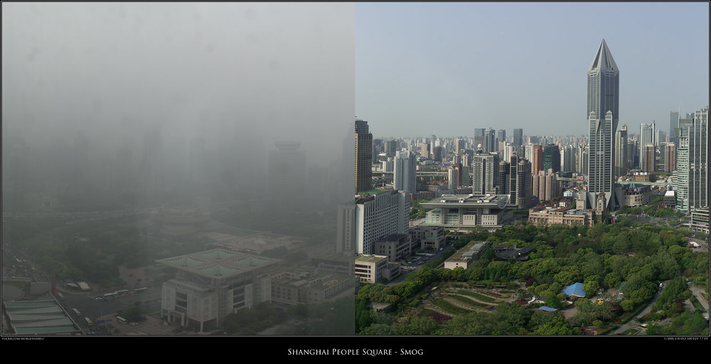
The photo on the left is Shanghai with heavy smog, while the one on the right was snapped three days later after wind and rain cleared the air.

Shanghai People Square - Smog

Drag and Drop with Maki Icons and Style

Kojo Nnamdi on the future of maps


Rafa Gutierrez joins MapBox!

$
0
0

Rafa Gutierrez is the new support hero at MapBox! He will be fielding developer questions on MapBox Support and Stack Overflow and producing on documentation, screencasts, and blog posts. He is here to help you get the most out of MapBox so email support@mapbox.com and say hello.

Rafa brings years of experience in the geo space and is a well known organizer in the Portland open source geo community.

Quick add for places in OpenStreetMap

$
0
0

It's faster and easier to add the location of your local Starbucks, Sparkasse, Сбербанк, or ファミリーマート to OpenStreetMap: just add a point and start typing a name, and the editor will autocomplete the rest. We added support for thousands of common restaurants, supermarkets, banks, clothing stores, and other chains.

This also improves the quality of the data people are adding since no one needs to know that by convention OpenStreetMap classifies Domino's Pizza as a fast food joint rather than a restaurant, or whether or not it should have an apostrophe -- iD's preset system takes care of that for you.

This new preset database is itself built using OpenStreetMap data: we mine OSM for the most common POIs and extract the correct tagging and spelling of their names. Thus it's a two-way street -- the presets will both help improve the quality of OpenStreetMap, and become more complete and accurate as OSM improves.

Read on for the technical details.

The traditional way of mapping a feature on OSM is to create the geometry (node, way, or relation) and then tag it with values like amenity=fast_food and name=Carl's Jr. This requires the user to know the OSM tags that exist and pick the best one for the type of feature they want to map. That can be a hindrance for new users who don't know the tags or in certain situations where something could be tagged in several different ways.

We made the name-suggestion-index with the goal of creating a canonical dataset that can be used for suggesting correct spelling and tagging in OpenStreetMap. The dataset is generated by going through the OSM planet, grouping names with their incorrect counterparts, and keeping track of how often they are used. Determining which names are correct and incorrect just comes down to usage: whatever is used most is considered the most correct. After processing, we have an index of about 1,400 of the most common values for the type of features we're interested in.

iD uses this index in two ways. First, when a user edits the name of a feature, iD autocompletes common names. For example, if a feature has been tagged as fast food and a user begins typing "McD...", iD suggests McDonald's. Second, we generate presets from the index. Presets allow users to quickly create features without needing to know the underlying tagging scheme. This allows for quicker entry for the most common features, encourages correct tagging and naming, and helps teach new users by examples from a vetted list of values.

Removing Atmosphere Scatter

$
0
0

Raw earth imagery from satellites is blue-ish — the atoms in atmosphere scatter the blue color of solar light the most. We are processing algorithms to make brighter colors that are truer to what you would see from ground. This is important not only for beautiful maps, but also for measuring vegetation indices, albedo, burned area, land cover type and temporal change — in short, removing atmospheric effects like “blue-ish” is key for remote sensing.

Here is a look at Venice, Italy, after effects of the atmosphere have been removed, using the NASA developed LEDAPS code. When we run LEDAPS, the code is essentially using a parameterized model of the atmosphere, getting ancillary data from other instruments, and running scattering physics to invert the process and find the input [surface] reflectance that produces the output image on the satellite. The code has to implement various techniques to exclude pixels such a clouds and cloud shadows, and has to use look up tables to optimize the highly computer intensive inversion process. NASA has been developing, refining and publishing this code since 2005 and they are currently implementing the necessary changes to support Landsat 8.

This scattering process is what makes the sky blue from the ground looking up, and the surface kind of blue for the satellites looking down. The smaller the wavelength, the more efficient the scattering is. Since Blue is the smallest wavelength the human eyes can see, the sky is blue. About 2/3 of the solar light gets deflected. Also, the more atmosphere, the more scattering. That is why clear noon skies are blue, and why humid sunsets have an horizontal red gradient.

Sunset picture, from ahumbleperspective

And yes, we also remove clouds.

Adam Phillips to lead Business Development

$
0
0

Adam Phillips is our new business development lead at MapBox, working out of our San Francisco office! He will be establishing strategic business direction, striking partnerships, and scaling sales efforts in tight collaboration with each of the MapBox product teams. Adam has worked in the mapping and mobile space for 10+ years, from Traffic.com to NAVTEQ/Nokia/HERE — he gets mobile and data. Also, el habla español — Say hi/hola at sales@mapbox.com.

Before and after atmospheric correction

$
0
0

Raw earth imagery from satellites is blue-ish due to atmospheric scattering. Above you can see the before-and-after comparison. On the left the blueish“top of atmosphere” reflectance, on the right the calculated “surface reflectance”. As I mentioned yesterday, we use LEDAPS, a NASA developed code, to remove this effect.

This correction is an important step in our processing pipeline not only to make beautiful maps truer to what one would see from ground, but also key for measuring vegetation indices, albedo, burned area, land cover type or temporal change.

Thanks @andershovmoller for the motivation to do a side by side picture!

Holiday party 2013

$
0
0

This week our team converged on Washington, DC for a sprint week and our annual holiday party, with 45 people coming together, flying in from the West Coast, Peru, Ukraine, England, and Germany. It’s been a blast to have so many of us working together in the DC garage. Here are some highlights from our holiday party, where we had a family style barbecue dinner, plenty of drinks, and played our annual homemade ornament contest. A big thanks to Justin for photographing the night!

For a history of how we’ve grown throughout the years check out photos from past holiday parties: 2012, 2011, and 2010.

Everyone enjoying their dinner

Bruno and Bobby

Dane, Alex and Matt

Chris and Rafa getting into the holiday spirit

Rockland’s delicious macaroni and cheese (the spoon took a beating)

Bruno grabbing some hot apple cider

Every holiday party needs a crackling fire!

Matt and Eric

Alex and Megan checking out the ornaments for our annual Secret Santa ornament-making contest. Everyone makes an ornament for a team member and we guess which ornament is made for whom.

Team members waiting to hear the ornament contest answers

Soon: powerful drawing tools

$
0
0

Soon you’ll be able to draw lines and polygons and add custom styles to make maps with even more data and interactivity.


Removing Cloud Shadows

$
0
0

These shadowy shapes (pink arrows) littered on the mountains are cloud shadows.

I just added a new method to our declouding algorithm that removes all cloud shadows for our next version of Cloudless Atlas. Now the only dark patches are things that ought to be dark, like dense scrubland in parks, and the shady sides of mountains:

I used this image for testing because it shows one of my favorite land features, the border of Lesotho and South Africa. South Africa’s agriculture industry is highly developed — for example, many decorative flowers that you buy in the Northern Hemisphere’s winter grow in this region. On the other hand, open land in Lesotho is mostly used for subsistence farming and livestock grazing. So we see Lesotho’s high, steep mountains in the bottom right of this image, a belt of tens of thousands of small farms and ranches running from bottom left to top right, and some of South Africa’s larger, more industrially managed fields peeking in at top left. At this resolution, land use differences make many national borders visible, but this is one of the most striking.

Hit me up on twitter (@vruba) if you have any questions.

Mapping the future

$
0
0

We’ve been thinking about the future of mapping in our solar system and beyond. We can’t wait to see what’s out there.

The Hidden Beauty of Congestion — Real Time Holiday Traffic Visualized

$
0
0

Thanks to a collection of traffic speed data from INRIX, we’ve been watching how waves of traffic formed, moved, and dissipated on the roads near Washington in the days around Thanksgiving.

I was expecting the greatest congestion to have been on the Wednesday evening before the long Thanksgiving weekend, but it looks like Tuesday was when the roads were actually the busiest. And it’s no surprise to anyone familiar with the area that Interstate 95 south of DC and the Capital Beltway were usually the worst offenders at any time. The Thanksgiving weekend itself was fairly quiet.

Check back soon for news about adding traffic to your MapBox maps, and if you’re traveling this weekend, have a safe trip!

Beyond the dot: a powerful new editor for Mapbox

$
0
0

Today you can draw and annotate maps in a whole new way with your MapBox account: we’ve added tools for polygon and line features, along with user-friendly styling options and more powerful import.

We’re building something that’s informed by our work on geojson.io and iD: a simple tool for people who need to think and work spatially. We want farmers to easily track crop areas, and for crisis responders to know where to go.

It should be easy to share your marathon route or favorite places to sightsee.

And everyone should have access: so we’re launching this feature for all paid account levels, and free users can create up to 20 non-point features a map.

This is powered by open source - Leaflet.draw is at the core of the drawing behavior, while a constellation of small open-source libaries by Mapbox and others handle everything from format conversion to parsing sexagesimal notation.

Swipe to compare tiles in Mapbox.js

$
0
0

Swiping between two layers is one of the most convenient ways to compare map imagery, and now it’s back in full glory in Mapbox.js! The interactive example below shows the seasonal change near the Lake Baikal between June and October. The imagery is captured by the USGS/NASA Landsat which is one of the sources for Mapbox Satellite.

Viewing all 2230 articles
Browse latest View live