Quantcast
Channel: maps for developers - Medium
Viewing all 2230 articles
Browse latest View live

Open Source Mapping at Global Health & Innovation Conference

$
0
0

Join us this Friday, April 12, 2013 for an OpenStreetMap workshop and happy hour in New Haven to kick off the Global Health & Innovation Conference at Yale University.

I’ll be in New Haven Friday through Sunday for the conference and to run pre-conference mapping workshops on OpenStreetMap and open source tools with the Yale University Map Department and the School of Forestry’s Risk Reduction and Adaptation for Disasters Student Group.

OSM Workshop

Friday afternoon at 1:30pm we’re holding an OpenStreetMap workshop and mapping party. We’ll learn about using OpenStreetMap and contributing to the community and dive into using the latest version of the iD editor. Check out the event page to sign up for the workshop (our morning open source tools workshop is sold out unfortunately)!

Happy Hour

At 5pm, we’ll be heading over to the Cask Republic for a happy hour. If you’re in town early for the conference or you can’t make it to the workshop, come join us for a round to talk about open source mapping, OpenStreetMap, or using geodata for global health and development!

The Cask Republic is at 179 Crown Street, just around the corner and down a block from the Shubert Theater. Bigger map.

Join us for a drink on Friday or ping me on Twitter if you want to get in touch during the conference: @nas_smith.


Design Weather Maps

$
0
0

We’re playing around with personalized weather maps – taking raw weather data and making our own cartography style in TileMill. The idea is that anyone should be able make their own Dark Sky styled custom map to match their site or app – or just do something crazy. Having access to the raw data means that you can visualize any kind of weather event in real time, like using a psychedelic precipitation colors scale or live animation for tracking a hurricane.

We started working with Weather Decision Technologies, using their raw weather data feeds. You can see two quick maps we started playing with below. We are not sure where this design work will go yet and are just experimenting, but we could potentially open them up on MapBox.com as an add on service, so we figured we would blog about it and see what people think.

Watch Warning Alerts

alertsWatch Warning Alerts

The National Weather Service issues hundreds of different alerts on a per-county basis. We’ve grouped them into recognizable, digestible categories and associated each category of event with large graphics to make it obvious what weather is happening where. I chose strong colors for the weather over a dark, low-contrast base map to grab user attention while providing unobtrusive context. Strong, saturated colors for alerts also communicate the urgency of the alerts.

Radar

radarLow altitude radar (precipitation)

Precipitation visualizations are really common. I wanted to work with the raw data to make something richer, with custom styles without compromising speed or user experience. Style-wise I went for a radically different color ramp - from dark blue to pink to white - using high contrast to highlight where the heaviest precipitation is happening. Animation via some javascript from Tom and the MapBox Core API, not only makes it obvious where precipitation is happening, but also where it’s headed. Displaying labels on top of weather is a good cartographic practice and ensures that even when viewing dense data, users know where they are and what’s happening in their area.

If you’re interested in custom weather data on your maps, ping us on twitter @MapBox and let us know what you think would be cool. If you are using TileMill and want to play w/ some of the weather data and CartoCSS I was working with, ping me @ian_villeda.

OpenStreetMap #Editathon at MapBox

$
0
0

On April 20th MapBox will be hosting a mapping party as part of the OpenStreetMap spring #editathon happening all over the U.S. Mappers of all skill levels will be present, so if you’ve never edited OpenStreetMap before this will be a great opportunity to learn how to. If you’re an experienced contributor, come out to connect with others and push on your favorite mapping activity.

Here are some of the projects we’ll be working on, but you’re welcome to come with your own ideas.

  • Use Maproulette to improve roads in the U.S.
  • Work with the new iD editor
  • Map your hometown
  • Contribute routing information like turn restrictions and one way streets for the roads you use everyday.
  • Whatever you want!

Editing OSM data in the iD editor

The only rule is to include ‘#editathon’ in all of your changeset comments so we can visualize and keep track of the progress we make over the weekend.

You only need to bring a computer and yourself - although many people find that a mouse makes editing easier. Meet us at our office on Saturday - see map below. We’ll have coffee and snacks. No need to RSVP.

Event Details

When: April 20th 12-5PM Where: MapBox office, 1714 14th St NW Rear Entrance

Community Mapping of Managua Bus Routes on OpenStreetMap with Pencils, Paper, and GPS Devices

$
0
0

This is the power of community mapping. Last weekend 28 mappers came together to put Managua bus routes onto OpenStreetMap. Using nothing more than pencils, paper maps, and GPS devices, they surveyed Managua’s most important bus routes and entered them into OpenStreetMap. Their goal is to use the resulting data for traffic analysis and public transit routing in Managua. This is all possible due to the simple fact that OpenStreetMap is open data.

The mapping party was led by long-time German transplant Felix Delattre, who plans to lead future mapping parties in Managua as well. Read Felix’s wrap up post on the event, and check out these photos of the weekend.


Mapping bus stops

Tracking bus routes with GPS devices directly on the bus

The group used OpenStreetMap Field Papers to survey bus routes

Entering data into OpenStreetMap

We’re happy to have sponsored the mapping party and plan to continue supporting local communities where people are doing interesting things with OpenStreetMap.

Announcing MapBox.js 1.0 with Leaflet

$
0
0

MapBox.js is now version 1.0 and we are joining forces with Leaflet, one of the most established and robust open source mapping libraries. Embedding maps in web applications with MapBox.js is now even easier, and you can tap into powerful Leaflet features and multi-platform compatibility. Specifically, one of the most frequently requested capabilities is native vector support – allowing for seamless combination of tile and vector data like in this example:

Vector overlay on MapBox map using MapBox.js 1.0 - view map and code

At the same time MapBox.js 1.0 continues to support simple convenience functions that make getting started with MapBox so easy:

// Load map "map-zr0njcqy" from MapBox account "examples".varmap=L.mapbox.map('map','examples.map-zr0njcqy').setView([0,0],2);

Simple example of embedding a MapBox map with MapBox.js 1.0 - view code

Starting today you can use MapBox.js 1.0 by including a few lines of code in your application. Read on for more details on the release here or head directly to our MapBox.js documentation to get started coding.

Leaflet

MapBox.js is now a Leaflet plugin, which means that our hosted library includes a fresh version of Leaflet as well as code that make it easy to integrate with MapBox tiles and services. The plugin provides a smart map object, L.mapbox.map, that extends L.Map, as well as types for MapBox layers, controls, and utilities. As a Leaflet plugin, MapBox.js can integrate with any other Leaflet code - plugins, default layers, and more.

Straightforward API

MapBox.js 1.0’s API removes stumbling blocks for new users. Following Leaflet’s convention we’re replacing ‘magic methods’ like url() with more straightforward setURL(url) and getURL() methods. When appropriate, it checks that arguments are reasonable rather than throwing cryptic errors.

// v0markersLayer.filter(function(f){returnf.properties.cool;});varfilter=markersLayer.filter();// v1markersLayer.setFilter(function(f){returnf.properties.cool;});varfilter=markersLayer.getFilter();

The version 0.6.7 API for managing MapBox’s fast UTFGrid-based interactivity and automatic settings through TileJSON was too difficult and error prone. To make this clearer, L.mapbox.map automatically updates when layers update, and controls like L.Control.Attribution will automatically show the attribution settings of new layers.

Examples

MapBox.js Examples are a great way to get started with MapBox.js quickly - find an example that does almost what you need, copy the code, modify it, and go. We’ve ported over 20 of the existing 0.6.x examples to 1.0 and will be continuously adding more to make it easier to understand and get started with the new code. The examples demonstrate everything from support for Retina tiles to WMS and polylines.

Of course, there are great Leaflet Tutorials that apply 100% to MapBox.js 1.0.

Available in Leaflet: Vector Layers

As mentioned earlier, you can now use dynamic vector features, like driving routes, polygons, and complete GeoJSON files in MapBox.js. This is implemented across platforms, backed by Leaflet’s tested implementation in HTML5 Canvas, SVG, and VML. We’re aiming for full browser support, ranging from modern desktop browsers like Chrome, Safari and Firefox to mobile browsers and Internet Explorer 7 - 10.

Leaflet’s vector layer features can complement TileMill’s deep styling control and fast raster output by providing a more dynamic, interactive layer for lightweight features.

Ecosystem of Leaflet Plugins

One of the biggest wins of switching to Leaflet as a basic map library is the availability of many map plugins. In the process of writing this API, we wrote several, including a fullscreen control and a point-in-polygon operation, and helped to improve others, like Michael Evans’sLeaflet.hash.

This open-source plugin community promises to make maps more extensible and flexible without weighing down the core Leaflet code.

The Leaflet marker cluster plugin is just one example of the many great Leaflet plugins now compatible with MapBox.js (click to see interactive version).

Tested & Supported

This release of MapBox.js is continuously tested with Travis CI and has a 115-part test suite. We’re aggressively testing IE8+, mobile devices, and modern browsers. As a Leaflet plugin, MapBox.js also benefits from the thousands of developers testing Leaflet, reporting bugs, and providing patches, and by the coverage provided by Leaflet’s own test suite. Thanks to John’s work in Mocha, these tests run quickly and easily.

MapBox.js 0.6.x Support

Existing apps linking to earlier MapBox.js versions will continue to work - every release of MapBox.js has a unique, versioned URL that is never updated or removed.

We’re planning on pulling in many fixes into a version 0.6.8 release that addresses bugs in Internet Explorer and Android, and will continue to support deployments using the prior API releases.

Open Source

As always, MapBox.js is an open source project on GitHub under an open license. This means you can fork it, download it, or learn from its design.

Create Heatmaps Using New Colorize-Alpha Image Filter

$
0
0

If you search the internet for ‘alpha to color’ you get lots of results describing how to convert ‘color to alpha’ and its applications. Here we will be doing the opposite: converting alpha channel to color and demonstrating how it can be useful for visualization.

Colorize-alpha image-filter is the son of the popular colorize-alpha compositing operator by Tom. We wanted to have more control over which colors are used, and how colors are distributed. To achieve this we moved colorize-alpha to image-filters.

How it works

The new syntax, and an explanation of how this filter is different from the original compositing operation, are best done through a working example.

OK, let’s make a map. Heatmap to be precise.

As usual we start with some data. In this case I downloaded London and neighbouring forces dataset 2011 from Police.uk. The dataset comes in CSV format and is quite large. To make it a bit more useful, I loaded it into PostGIS.

I use point geometries for this particular example but it can be anything else. The important thing here is that the symbolization should have a variable ‘alpha’ channel to achieve the desired effect. We’ll use a simple ‘marker’ icon with radially distributed alpha channel from $MAPNIK_SRC/tests/data/images/marker.png

marker

(NOTE: I used a modified version of the original image with more transparency and scaled down to 32x32 px).

Colorize-alpha is an image-filter and works at the layer level. Technically, we accumulate alpha channel values from densely positioned markers and convert this value to the color. Simple. The result? A poor-man’s heatmap.

#londoncrime
{
    image-filters:colorize-alpha(blue, cyan, green, yellow , orange, red);
    comp-op:multiply;
    marker-allow-overlap:true;
    marker-file:url(/heatmap/marker.png);
}

london-2011-11- anti-social-behaviour

  • Hotspots of anti-social behaviour in London, UK (November 2011)

Syntax

We have chosen CSS/SVG linear gradient syntax as a basis for this filter. In its simplest form, it should have at least two color stops e.g:

image-filters="colorize-alpha(cyan, pink)"

But it can also have any number of stops followed by an optional stop position (either a percentage between 0% and 100% or a normalized length (0…1)

Here is a rainbow filter:

image-filters="colorize-alpha(cyan, blue, green, yellow, orange, red)"

And the formal grammar:

colorize-alpha( <color-stop> [, <color-stop>]+ )
                \----------------------------/
                    List of color stops (2..N)
                where  <color-stop> :=  <color> [  <percentage> |  <length> ]?
                and <color> is any valid CSS color

Conclusion

As you can see this simple technique can be deployed to achieve interesting visual effects. While ‘hot-spot’ mapping above is the most obvious use-case, I bet there’ll be more awesome looking maps originated from creative usage of this filter.

Have fun!

Interfaces for Visualizing Rapid Satellite Imagery Collection

$
0
0

As TechCrunch just reported this morning, we are teaming up with Skybox, the microsatellite and analytics company, to design new interfaces for visualizing rapid satellite imagery collection. The timing of this collaboration is perfect - later this year, Skybox will be launching the first two microsatellites of a fleet of micro-satellites that will capture sub-meter satellite imagery and video (down to zoom level 17). We were just in Mountain View visiting with their team, checking out the nearly complete satellites in their clean room, their operational mission control center, and talking about the publishing interfaces possible with near real-time collection. Here is a first look at what we are building together.

To prototype publishing interfaces possible with high spatial and temporal resolution data, Skybox tasked the Ikonos satellite weekly over the last couple of months, looking at the Port of Long Beach, California. Here are two examples of time sliders built on the MapBox API to give a sense of what is possible with this type of analysis and publishing using open source tools. These kind of visualizations showcases the power of repeated, consistent monitoring of spot locations on Earth.

Interactive Change Analysis

View Fullscreen: http://mapbox.com/labs/skybox/long-beach

This interactive time series UI lets you toggle between 5 different capture dates and auto play the chance in time, all while interacting with the map just like any other web map. Changes in the port over the collection period jump out immediately with this type of display. An end-user can immediately identify dynamic areas within the scene, quickly orienting the user within the image and helping to assess where additional analysis should be completed.

Asset tracking

Time series data is also key for asset tracking. Here is a new concept for how we think about interactive briefing reports, specifically tracking a very large crude carrier operated by the Alaska Tanker Company unloading at the Port of Long Beach, and then going back out to sea, capturing it’s location each time and providing context. View Fullscreen: http://mapbox.com/labs/skybox/flyover

One of the key benefits of Skybox’s approach is their high performance at low cost – you can have a lot more of them in the sky, which means they will eventually capture imagery really fast, multiple times a day. Skybox is taking this to scale by letting people manage all their own tasking jobs directly online. Once your imagery is captured it will be dropped to one of two ground stations and delivered right to your inbox. You can then take the GeoTIFFs and analyze them in TileMill and export them out as web maps for the world to see, all in it matter of just hours.

The potential for rapid imagery is huge. We are especially excited about media organizations that want to better publish the imagery on the web and mobile in a fully interactive way.

As two start-ups embracing open-source and trying to bring the traditional aerospace industry into the internet age, it feels really natural to be working with Skybox to change the way consumers, businesses, and governments view the world.

The Skybox launch is on schedule for this year and we can expect commercial operations by fourth quarter this year. If you are interested in getting early access, email me (chris (at) mapbox.com) any questions.

High Resolution Upgrades for Antarctica

$
0
0

We’ll be releasing the new Antarctica imagery as part of our MapBox Satellite layer in the coming weeks.

Don Juan Pond

Don Juan Pond, with mountains from the Asgard Range to the left, Antarctica (latitude -77.208, longitude: 164.641)

Antarctica Updated Imagery

Melting ice between Masson Island and Mill Island (latitude: -65.395, longitude: 99.362)

Antarctica Updated Imagery

Antarctica coast off of Prydz Bay (latitude: -68.540, latitude: 79.329)

This work is part of our larger MapBox Satellite upgrades in the works, we are updating our coverage of Antarctica – adding significantly higher-resolution pansharpened Landsat imagery.

Antarctica Mosaic
REXML could not parse this XML/HTML: 
</div>

New seamless, natural color mosaic

Beautiful, Empty Land

The fifth-largest continent, with a total area of approximately 14 million square km, of which just 280,000 square km are ice-free, Antarctica has a population that ranges from about 1,000 in the winter months, to around 5,000 for the summer months – its busiest months.

Despite its sparse population, and being largely – almost entirely – uninhabitable, Antarctica is beautiful, and we are excited to let our users explore Antarctica with our new 15 meter pansharpened, natural color imagery.

Before and After | MapBox Antarctica

Before and After of MapBox Satellite Antarctica coverage | Left shows previous coverage; right shows new imagery. (latitude: -77.140, longitude: 165.793)

About the Data

The new Antarctica imagery was made possible thanks to the smart investments in remote sensing by the U.S. Geological Survey, National Science Foundation, National Aeronautics and Space Administration, and the British Antarctic Survey. Created in support of the International Polar Year (2007-2008), the Landsat Image Mosaic of Antarctica (LIMA) provides a cloud-free mosaic of the continent down to latitude -82.5 degrees produced from over 1,000 Landsat 7 ETM+ scenes.

Due to Landsat 7’s near-polar orbit, the LIMA mosaic does not contain imagery for latitudes below -82.5 degrees.

Antarctic color

LIMA Mosaic, showing gap at pole from contraints of Landsat’s near-polar orbit

For latitudes lower than -82.5, we’ve supplemented the LIMA Mosaic with the MODIS Mosaic of Antarctica (MOA), provided by the University of Minnesota’s Polar Geospatial Center.

OpenStreetMap contribution stats for Antarctica help add context. At the time of publishing, there were a total of 15,698,084 changesets made to OSM’s coverage world-wide, of which 1,216 coincide with the continent of Antarctica. Compared to the 326,863 unique users who have contributed to OSM world-wide, just 159 unique users have contributed to its coverage of Antarctica.


Open Government Happy Hour at the MapBox Garage

$
0
0

Join us for happy hour Friday, May 3, in the MapBox Garage where we’re kicking off Transparency Camp with a party. Over beers and snacks, we’ll talk open government, open data, technology, and more with the people working to make government more transparent and accountable. Come out to meet people and start conversations ahead of the weekend’s unconference over a few drinks and some spirited rounds of foosball. You can RSVP here.

The full schedule for Transparency Camp and the events around is up here. Chris, Tom, and Eric from our team will be attending the conference and demoing tools to build maps and data visualizations with open and government data sets. They’ll also be giving a crash course in TileMill, so look for them if you’re interested in web map design and getting an inside look at how our tools work.

The happy hour will be in the MapBox Garage at 1714 14th St NW - our entrance is off the alley. Hope to see you there!

Neighborhood Mapping with Dynamic Vector Data Layers

$
0
0

With last week’s release of MapBox.js 1.0, adding vector data to your MapBox map is a lot easier. A sophisticated example of mapping with vector data is Hipmunk’s hotel search. This post walks you though how to build your own neighborhood map combining MapBox Streets tiles and vector data from New York City’s Open Data portal.

An example of Hipmunk’s technique. Notice how easy it is to read the labels and see the neighborhood information.

The cool guys at Hipmunk wanted to layer neighborhood data onto MapBox maps in a way that retained the polished look of MapBox Streets, without disorienting users by covering up street and area labels. To achieve this, Hipmunk used a custom MapBox Streets that had a transparent land layer on top of their vector neighborhood layer, which allows the data below to show through.

This technique is only possible with MapBox Streets, which unlike other web maps offers custom styles for map features that can be used separately or composited together. Hipmunk’s finished map offers a seamless experience where vector layers dynamically highlight areas of interest on the rendered tile-based map:

Create your own neighborhood map with MapBox.js

The Hipmunk team used the open source Leaflet map library to create this map. Now that MapBox.js is based on Leaflet, you can take the same approach directly with MapBox.js. Here is how:

1) Create a new map on MapBox.com

2) In the customize panel, turn off the Land layer

Removing the land layer. The gridded pattern denotes transparency.

3) Set up the head of your HTML document. Here we define the map size, load MapBox.js 1.0 javascript and CSS files and the vector data, nycneighborhoods.js. For this example we are using New York City neighborhoods from NYC Open Data and processed using these steps.

<!DOCTYPE html><html><head><metacharset="utf-8"/><metaname="viewport"content="width=device-width, initial-scale=1.0"><html><head><linkhref='http://api.tiles.mapbox.com/mapbox.js/v1.0.0/mapbox.css'rel='stylesheet'/><script src='http://api.tiles.mapbox.com/mapbox.js/v1.0.0/mapbox.js'></script><script src='http://bl.ocks.org/rsudekum/raw/5431771/nycneighborhoods.js'></script><style>html,body,#map{padding:0;margin:0;width:100%;height:100%;}.leaflet-top-pane{pointer-events:none;}</style></head>

4) Next we load the map, define the vector layer styles and then move it to the correct z-index so it’s between the tile layers:

<body><divid="map"></div><script type="text/javascript">varmap=L.mapbox.map('map').setView([40.75,-73.94],15);// Set base style of vector datafunctionstyle(feature){return{weight:0,fillOpacity:0.5,fillColor:'#FFEDA0'};}// Set hover colorsfunctionhighlightFeature(e){varlayer=e.target;layer.setStyle({weight:10,opacity:1,color:'#09F',dashArray:'3',fillOpacity:0.7,fillColor:'#FEB24C'});}// A function to reset the colors when a neighborhood is not longer 'hovered'functionresetHighlight(e){geojson.resetStyle(e.target);}// Tell MapBox.js what functions to call when mousing over and out of a neighborhoodfunctiononEachFeature(feature,layer){layer.on({mouseover:highlightFeature,mouseout:resetHighlight});}// Add vector data to mapgeojson=L.geoJson(neighborhoods,{style:style,onEachFeature:onEachFeature}).addTo(map);// Here is where the magic happens: Manipulate the z-index of tile layers,// this makes sure our vector data shows up above the background map and// under roads and labels.vartopPane=map._createPane('leaflet-top-pane',map.getPanes().mapPane);vartopLayer=L.mapbox.tileLayer('bobbysud.map-3inxc2p4').addTo(map);topPane.appendChild(topLayer.getContainer());topLayer.setZIndex(7);</script></body></html>

5) Open the file in your browser

You should now see a map like the one below.

Notice how the neighborhood layer is below the tile layer, made possible with MapBox’s transparent tiles.

Again, hats off to the great team at Hipmunk for setting the bar on how to do this. Their service is awesome.

Get started building your own map

Get started creating your own neighborhood map by following this example or working from the full source code. Let us know how it goes on Twitter!

At the Edge of the Sahara

$
0
0

A convergence of three ecosystems at the edge of the Sahara: the desert of Sudan in the northwest, the savanna of South Sudan in the southwest, and the Ethiopian highlands in the east. In the northwest is Lake Taka, source of the Blue Nile. We made great progress last week on Cloudless Atlas in North Africa.

MeatText Featured by Apple

Visualizing the Progress of OpenStreetMap Around the World

$
0
0

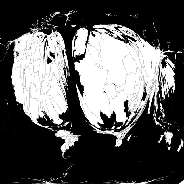
To visualize the progress of OpenStreetMap as its contributors map their local communities and the world, I’ve been using Mark Newman's cartogram tool to distort world maps, making the areas where OpenStreetMap has been edited the most appear the largest.

A cartogram from mid-2006 data highlights how focused the early OpenStreetMap project was on the United Kingdom, with most of the rest of the data in a few places in Europe. The map is comparatively tiny in North America, except for some areas of detail in Wisconsin and around the Chesapeake Bay. The relative prominence of Antarctica shows how little map data there was for most parts of the world.

Although active mapping continued in Europe, and other areas of the world began to be filled in, the OpenStreetMap globe was massively reshaped in late 2007 and early 2008 by the months-long import of the U.S. Census Bureau's TIGER/Line map data for the United States. (Many more additions and corrections have been made to TIGER since 2007. I’m also working on a project to merge the TIGER changes that don't conflict with other changes made in OpenStreetMap into OSM).

With the United States map filled in, the bulk of mapping activity moved back to Europe, where by mid-2009, the work put into mapping Germany made it visually dominate the cartogram.

2010 and 2011 saw great increases in mapping in Canada, France, and Japan, as well as continued additions and corrections in large US cities.

The most recent available OSM history file, from February, 2013, shows some recent map growth in New Zealand, and that the map has continued to improve in Canada and Russia. It also highlights, though, how disproportionately well mapped Europe and the United States continue to be compared to the rest of the world, in spite of some recent work in Africa and South America.

Forecast.io Precipitation Data Animated

$
0
0

Global precipitation data, from 0-360, (so South America is on the right). This powers forecast.io’s global and regional views. Just playing for now and enjoying working with the @darkskyapp team.

UPDATE: I originally identified this as radar data. It is modeled precipitation data that very closely approximates radar data.

Mapping Monsters

$
0
0

Replete with monsters and robots, our new video shows how social maps are, and how they are part of everything mobile.

For starters, I hashed out a storyboard. Visually representing the points we aimed to highlight took some trial and error, so everything started on paper - specifically notecards on which we had quickly drawn the ideas for individual shots.

notecards

The shots were arranged into cohesive scenes that flowed from one to another. Once the story was locked down, I got to start doing my favorite part of an animated project: everything.

More specifically: designing characters.

Colorful, furry monsters? Yep. Beer drinking robots? Sure. Mustachioed, tie-wearing aliens? Uh, of course. Ask a creative person what work they’re most proud of, and I can almost guarantee they’ll tell you about projects where they were given free reign to go nuts and make something fun. I hope it was obvious from the video, but that was certainly the case here.

characters #1

Initial sketches become refined assets (vector assets in this case), refined assets become characters, characters are digitally puppetized, allowing me to manipulate their arms, legs, tentacles, etc., over time, otherwise known as animation.

robot phone holder

Seeing your characters come to life through the animation process never ceases to excite me. Sure, it’s labor-intensive, but most projects you take pride in usually are. I mean, you are giving perceived life to a bunch of static elements. It’s a labor of love kind of thing.

AE scene

Each scene was constructed, animated, watched, adjusted, rewatched, readjusted, and then cut together. Timing is crucial - it’s one of those underlying principles that typically goes unnoticed unless it’s not quite right, so almost everyone at MapBox had a look at the video before it was released. I added the audio (cut specifically for this project by our own Ian Villeda), pushed the ‘render’ button, and cracked a beer.


2006-2013 OpenStreetMap Growth, Animated

Analyzing Infrared Bands with TileMill

$
0
0

We’re using TileMill more and more as an analytical tool, especially as we explore infrared bands. Infrared is not visible to the human eye, but it carries a wealth of environmental information, and many satellites capture it as well as – or even instead of – visible light. Since I’ve been working with a lot of visible data from the MODIS satellites for the Cloudless Atlas lately, I got curious about what could be seen in the infrared bands once they too were seamless and cloudless.

Here’s a look at the aftermath of the 2010 Russian forest fires using satellite IR data. You can scroll around and look at 2011’s EVI2 (a measurement of vegetation – read on for details), and to check whether a dark feature is a fire scar, you can pull across the red-green overlay showing year-on-year change. Or, with the overlay on, you can get a regional look at where vegetation was in midsummer 2011 as compared with a year earlier:

View fullscreen!The north and east of this view is covered in taiga– dense, cold-hardy forest that shows up brightly in EVI2 because of its heavy foliage. Across the middle and west is mixed forest with large areas cleared for cities and farms. If you zoom out, you might notice that this intermediate zone is mostly green, suggesting that it consistently improved from 2010 to 2011 – and you can clearly see the bright, taiga-covered southern edge of the Ural mountains interrupting it in the east. The southern edge of our view is mostly steppe, much of it converted to grain fields, verging into scrubland and desert (nearly black in EVI2) in Kazakhstan.

Using TileMill for analysis

I started with a raster layer of EVI2, an index that estimates plant density from the ratio of red and near-infrared light reflected to space. (Growing plants absorb red light for photosynthesis, while water in the leaves reflects infrared. When they die, their chlorophyll breaks down and they dry out, and the ratio tilts the other way.) I used this MODIS subset from NASA, pulling red data from the visible image and near-infrared data from channel 2 of the 7-2-1 false-color image. This layer used images from June and July 2011, around the time of peak growth in the year following the fires:

Western Russia’s EVI2, midsummer 2010. Which features are fire scars?

When I looked at the EVI2 alone, I saw marks that might be fire scars, but it was hard to say for sure. The dark patches could be naturally barren areas like dry lakebeds or scrublands – or even urban areas. To find out what was normal and what wasn’t, I needed to look at change. I made a second composite covering the same June-July period in 2010, a few weeks before the worst of the fires, and created a difference layer – a raster with values showing how each pixel changed between 2010 and 2011. In the difference layer, neutral gray meant EVI2 was unchanged year-on-year, dark gray meant it decreased in 2011, and light gray meant it increased. It was hard to interpret at a glance, so I used TileMill’s colorizing tools to show decreased growth as red and increased growth as green:

Year-on-year change in EVI2 (same view as above).

Land Use Borders in Southwest Africa

$
0
0

The border running east-west near the middle of this image is between Angola (on the north) and Namibia. On the Namibian side, cattle grazing is the norm, while Angolans in the area are generally crop farmers. Namibian cattle grazing across the border in Angola have been a source of political tension in past years, but the governments recently reached a deal. The Etosha Pan, a salt lake, is in the south. To the north, we can see some of Angola’s many deep river valley systems. Cloudless Atlas + OpenStreetMap labels from MapBox Streets.

Live Weather Data and MapBox.js

$
0
0

With Leaflet integration brought by the v1 release of MapBox.js, it’s easy to add live data feeds as custom-styled layers on top of your custom MapBox maps. In this post, I go over using MapBox.js to power a Live Flood Warning site, which is powered by Weather Decision Technologies’ live weather feeds.

WDT Live Alerts by MapBox

Following a choropleth map example, I created the blue polygon layer, which visualizes each county under flood warning, using client-side Javascript. This means that visitors will always have the most up to date information, as it is pulled from WDT each time the page loads.

Applying custom styles to the live data layer was simple with MapBox.js. For our alerts site, polygon opacity is scaled on how recent each alert was issued. This means that newer alerts are nearly opaque while alerts 24 hours or older approach full transparency - making newer, more critical information immediately eye-catching. All of these styles amounted to about 30 lines of javascript. Tooltips allow users to see exactly when warnings were issued and when they expire. Clicking on alerted counties zooms the user to that county for a closer look of where will be affected.

vargeojsonLayer=L.geoJson(data,{style:getStyle,onEachFeature:onEachFeature}).addTo(map);functiongetStyle(feature){return{weight:1,opacity:getOpacity(feature.properties.init_time),color:'#0077ff',fillOpacity:getOpacity(feature.properties.init_time),fillColor:'#0077ff'};console.log(getOpacity(feature.properties.init_time));}functiongetOpacity(d){varnow=newDate().getTime()/1000;return(now-d)>1440*60?0.1:(now-d)>720*60?0.2:(now-d)>180*60?0.3:(now-d)>120*60?0.4:(now-d)>60*60?0.5:(now-d)>30*60?0.6:(now-d)>10*60?0.7:(now-d)>5*60?0.8:(now-d)>1*60?0.9:1;}

This is just one example of what could be possible with WDT weather available to MapBox users. You can get started with MapBox.js right away. Just sign up for free and checkout the MapBox.js example gallery for more inspiration for your maps.

TileMill for Education

$
0
0

Today I am visiting Humboldt State University, along with Nathaniel Kelso, as a speaker in their first annual Geospatial Speaker Series and to lead two workshops on TileMill. HSU, like other innovative higher education institutions including Yale, UW-Madison, University of York, and University of Indonesia, is starting to adopt TileMill across geography courses and faculty projects.

I’m visiting to answer questions, offer guidance, and to learn how to further develop TileMill in ways that will help the people in higher education make better maps.

Changing times, changing tools

Historically Google maps have been used for online campus maps, and ESRI software has dominated the classroom curriculum. But increasingly cartographers are demanding more custom control over their campus maps designs. And they are introducing new tools in the classroom that can enable students to quickly publish high quality maps on the web. Academics are keenly aware that concepts and skills are more durable and important than any particular software, and I think this underlies the growing enthusiasm around TileMill, and companion open source projects like OpenStreetMap, QGIS, and R stats.

Open tools can adapt quickly and innovate as problems in society change, the job marketplace evolves, and datasources become more realtime, so students will be well equipped as technology moves forward. Faculty can also teach these tools without fear that students will lose access to them after graduating.

Advancing support for Education

We are hearing from faculty around the country who are seeking guidance for building curriculum that integrates MapBox tools like TileMill and MapBox.js into cartography and web development courses. We, at MapBox, are excited about helping the leaders in the education field in this effort and have just created a new support forum dedicated to education at support.mapbox.com/discussions/education. Consider this a place where you can connect and collaborate with others thinking progressively about teaching web cartography, design, and data visualization.

Viewing all 2230 articles
Browse latest View live