Buses are Bangalore’s favourite mode of transport. The Bangalore Metropolitan Transport Corporation (BMTC), one the oldest transport organisations in India, operates over 2000 routes with a fleet strength of about 6500 buses. BMTC recorded a ridership of 5.02 million every day in September 2015.
To understand this massive network better, we need open data. Public transit data in India are not available by default, but activist groups like Open Bangalore go out and create them. I spent some time last week analysing the network, location of bus stops, timing and distribution.
Longest route
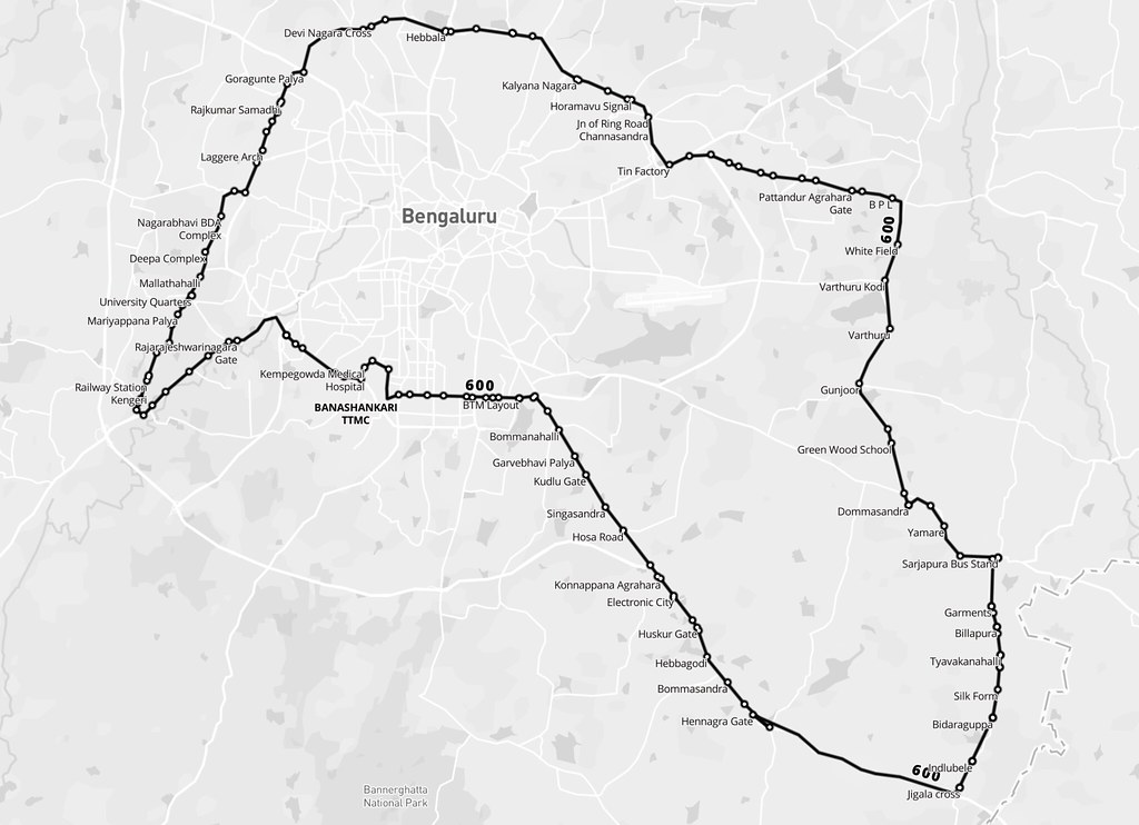
BMTC is known for its many long routes. Route 600 is the longest, making a roundtrip around the city, covering 117 km in about 5 hours. There are 5 trips a day, and these buses are packed throughout.
Frequency
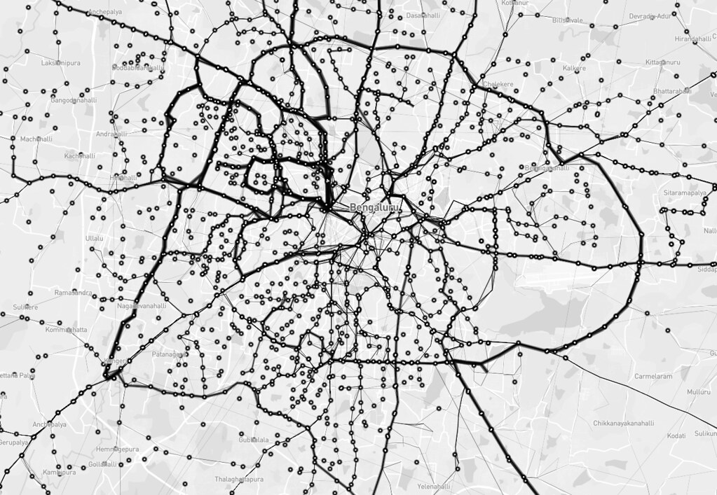
Next, I wanted to look at the frequency of different routes. In the image below, stroke thickness indicates how many trips each route makes. You can see north Bangalore has fewer, but more frequent routes, whereas the south has more routes with less frequency. You can also see the Outer Ring Road, which circles the entire city.
Reachability
I tried to define reachability as destinations one can get to from a stop without transferring buses. The BMTC network operates long but direct routes covering the entire city. The map shows straight lines between bus stops that are connected by a single route. The furthest you can get is from Krishnarajendra Market to the eastward town of Biskuru: roughly 49 km as the crow flies.
Direction
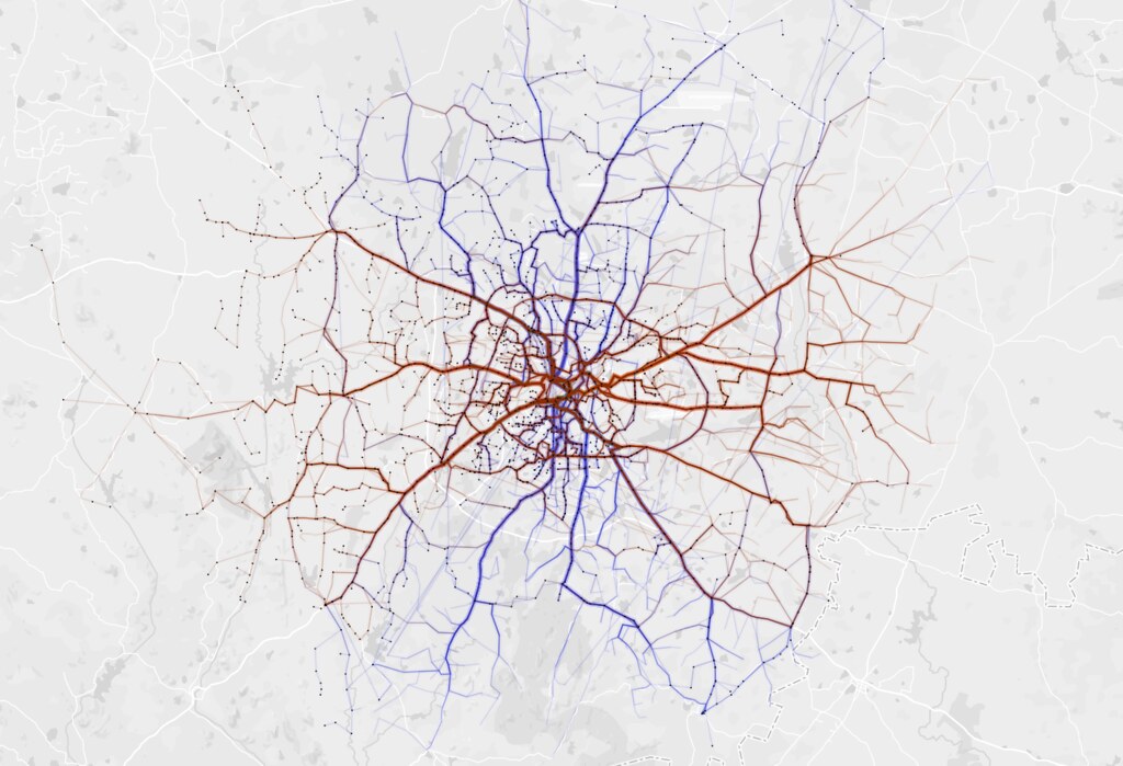
Which directions does BMTC run? It is interesting that BMTC covers the city North - South (blue) and East - West (brown) with almost equal distribution.
Coverage
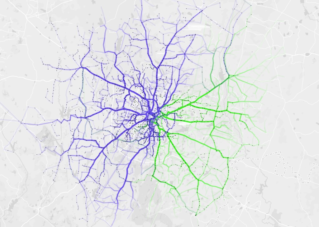
BMTC routes are classified into different series. Starting from 1 - 9 and A - W. I analysed coverage based on series 2 (blue) and 3 (green) and they make up almost 76% of the entire network.
I used a mix of tools like QGIS and Turf.js to inspect the route data. You can see some of the scripts on Github. The maps are all made using Mapbox Studio.
We are looking for a transit data specialist to help us research, collect and verify public transit data worldwide. Tweet at me if you are interested!


