I've made a lot of maps out of dots before, but the ones we made from Gnip's Twitter archives, which were featured in Wired Design a few days ago, were my first experience trying to make dot maps that would work at any scale, anywhere in the world. Here are some of the lessons I learned in the process about making dot maps look good on the web.
Image may be NSFW.
Clik here to view.
Scaling and brightness
The first thing that becomes clear when you start drawing the same dots at different scales is that it doesn't look right if you just scale the dots proportionately as you scale the area. Each time you zoom in on a web map, only a quarter of the area that was visible before is still visible, but if you match that and draw the dots four times as big as you did at the previous zoom level, the image is very crowded and fuzzy by the time you get zoomed in all the way. The Gnip maps instead double the area of the dots for each level you zoom in. Here's what it looks like to zoom in on Times Square with dots that quadruple, double, or don't change size at all with each zoom level.
Image may be NSFW.
Clik here to view.
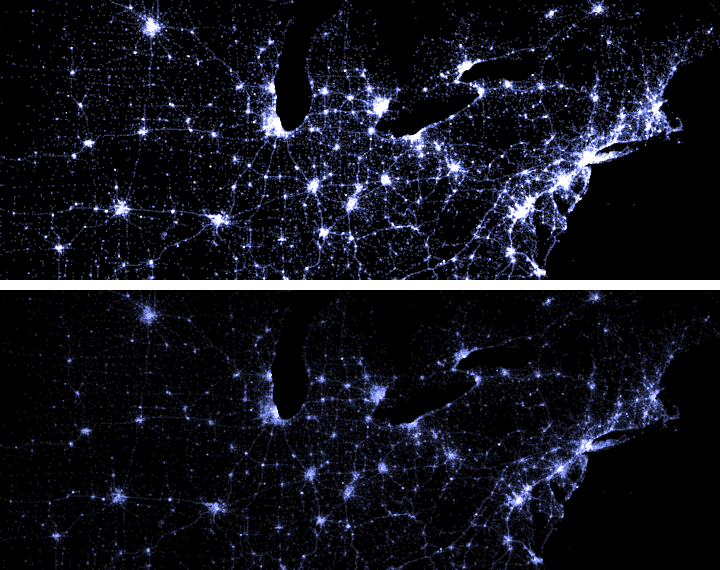
Doubling the dot size looks pretty good, but it still isn't quite right. If the brightness is right for the neighborhood level, by the time you zoom out to the continental scale it will be too bright there. To keep the density looking right you also have to increase the brightness of the dots as you zoom in and decrease it as you zoom out. By experimenting, I settled on 1.23 as the brightness scaling factor, so between that and the doubling of the dot sizes, the total brightness goes up by 2.46 with each additional zoom level. This isn't an exact science, and other numbers close to that also work pretty well. Here's the northeastern US and Canada with the large cities looking overexposed from strict 2x brightness change at each zoom level, and then moderated by the additional brightness scaling.
Image may be NSFW.
Clik here to view.
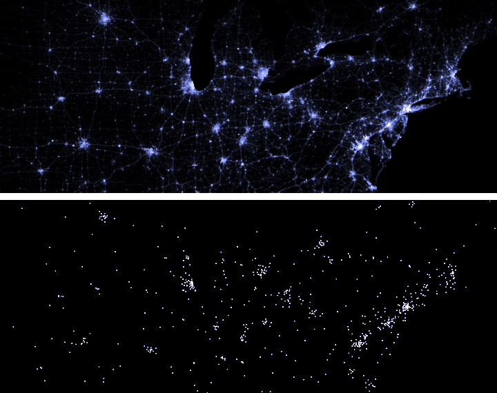
The other thing that goes along with this brightness scaling is to draw fewer dots at lower zoom levels. By the time you get most of a continent on the screen, the dots are so much smaller than pixels and there are so many of them to draw, that it looks the same and is much faster if you draw half as many dots at twice the brightness apiece. I actually do this at every level where the dots should be smaller than a pixel, and keep the size of the dots at a pixel and draw correspondingly fewer of them instead. Here's that same area looking pretty much the same without dropping any dots, and then looking terrible by dropping too many of them (4x per zoom level instead of 2x).
Image may be NSFW.
Clik here to view.
You also have to make a choice about which zoom level should be the baseline where each dot has an area of one pixel. At low zoom levels, it will look the same, but when you are zoomed in it will control how sharp or fuzzy the map looks. For most data sets, the right choice seems to be around zoom level 13, where each pixel is about 50 feet on the ground, which is pretty close to the width of a street or the size of a building lot. For sparser data sets, you might want to use a lower zoom level so that the bigger dots fill in the gaps. Here is Las Vegas Boulevard drawn with three different sizes of brushes (with base zoom levels 15, 13, and 11).
Image may be NSFW.
Clik here to view.
When dots overlap
One thing I wish I had realized earlier is to use the full range of color saturation. The maps of tweets use fully saturated color for the most densely geotagged areas, but it actually looks better if you have the color range run from black all the way through fully saturated color in the midrange, ending almost at white in the densest areas. It gives everything a nice glowing look and provides a wider range of distinguishable densities. Compare the glowing Tokyo at the bottom with the flatter one above.
Image may be NSFW.
Clik here to view.
Paying attention to saturation also helps combine colors more naturally. The Gnip maps suffered from being rendered as separate layers that could mask each other. The way it should work instead is that if points of different colors try to occupy the same pixel, each color is a vote for a particular direction on the color wheel, and disputed pixels end up in between, or in the middle of the color wheel in gray. In the case of this mix of tourists and locals in Barcelona, the red and blue mix to purple.
Image may be NSFW.
Clik here to view.
Antialiased drawing lets you see more detail in the data than integer pixel coordinates can convey. The Gnip maps positioned dots to half-pixel increments, but it would have been better to look at even more bits of detail. Taking full advantage of subpixel precision means that even when you are zoomed out pretty far, you can still see the grain of varying density instead of having it get mashed into uniformity by the aggregation to pixels, as happens in the top view of Toronto where all the dots are aligned to pixel boundaries.
Image may be NSFW.
Clik here to view.
The last thing I want to mention is that some areas of the Earth have a lot more people and a lot more going on than others do, and it is easy to end up making sparse areas too dim to see or dense areas so bright that you can't see any relative changes. Gamma adjustment seems to do a reasonable job of making areas of different density work on the same map. I had originally thought the adjustment should be logarithmic but ended up using the square root of the density instead.
Here are three versions of the same area, with the Netherlands in the center, Paris near the bottom, and Newcastle near the top. The top image is the most honest of the three, with a completely linear response curve, which means you really can't see much besides the major cities. The middle shows the square root of tweet density, which still highlights the densest areas but also lets you see some context. The bottom, I think, goes too far, with the fourth root of density, obscuring too much of the contrast in the attempt to make everything visible.
Image may be NSFW.
Clik here to view.