Our data team is now using our cumulative statistics to predict areas that need better tracing in OpenStreetMap. The world is huge, how do you find out where the map needs improvement? You can’t look everywhere. To better guide our data team’s work, we compared OpenStreetMap data density with satellite imagery data density and intersected the results with traffic data from Mapbox.com.
We aggregated our logs for ~30 billion tile requests for a period of ~100 days and exported the location and zoom level of the top 50k most requested tiles. With tilebelt and mercantile we could easily convert the location of those tiles into a heatmap:
Top requested locations for a period of ~100 days. Pretty much population density, plus other hotspots areas like Null Island - courtesy Mick.
With our list of popular places we turned to the OpenStreetMap planet file and mapped the number of nodes for each tile:
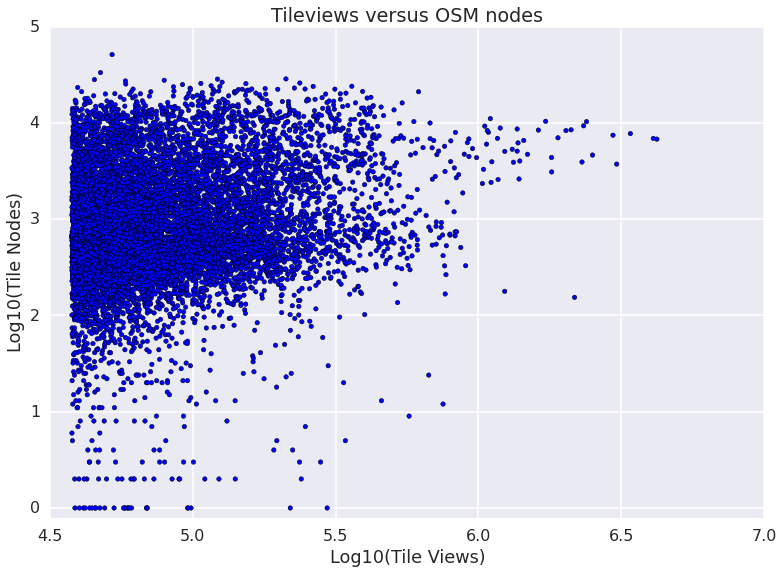
Plotting OpenStreetMap nodes against tile views gives an idea of the parameter space:
# Read and ranks tile nodes and requests from top 50k file
# z x y nodes lat,lon views
import numpy as np
with open( "./list.csv", "r" ) as txt:
    raw = txt.readlines()
lines = [ line.replace(' ',',').replace('\n','').split( "," )[1:] for line in raw ]
v=array([np.log10(int(a[6])) for a in out])
n=array([np.log10(int(a[3])) for a in out])
scatter(v,n,c='b')
show()
Tile view count versus number of OpenStreetMap nodes.
Most tiles are located in a cloud of dots with 10-10k nodes and 100k-1M views. We used decimal logarithms to emphasize the spread in the order of magnitude. We are interested in relatively untraced yet requested places, which correspond to the bottom half of this cloud of dots.
To get a sense of tracing needs inside a tile we used another dataset, our Satellite layer. The hypothesis is that the Satellite layer can inform us about features. Then we can compare if these features are either traced (e.g. known roads), traceable (e.g. untraced roads), or if tracing is not needed (e.g. dunes in the desert).
Flagging features could be done automatically using complex computer vision or machine learning techniques but we wanted a quick and easy first step. We settled on using the tile file size of the same pngs used in our Satellite layer. This serves as an unapologetically cheap proxy for the density of features: Tiles that are well traced would have both many nodes and a larger file size and tiles with few or no nodes would tend to be small in a satellite image (e.g. water or desert). Hence, even when the units of each dataset are not related, the ordering of tiles would follow these same pattern. The discrepancy in the ranking order could then inform the possibly of features present in the Satellite layer that are missing in OSM. Let´s plot that:
 Scatter plot of Satellite tile File size versus number of OpenStreetMap nodes inside the tile. The color is the discrepancy in the Ranking order.
Tiles with small file sizes tend to have fewer nodes and big tiles tend to have more nodes. The difference in the ranking is shown with a heat map color palette. Blue dots have more nodes than the typical file size indicating (for example low resolution, clouds or missing satellite imagery). Red dots indicate Satellite complexity with relatively few nodes. These are the tiles that might need tracing.
Isolating a list of the red section of the scatter we get tiles that are top requested and where Satellite imagery is complex and not traced. In many cases these are valid locations with untraced features but this quick approach has limitations. Places where no tracing is needed can show up, like coastal areas that are within the same view of cities (e.g. Manhattan). In addition, places with particularly high Satellite complexity and a low number of traceable nodes, like train stations, golf courses and urban parks (where a low density of nodes can fully map an area) can lead to false positives.
OpenStreetMap tracing candidate locations calculated with the method above. OpenStreetMap nodes are emphasized with a washed down Satellite layer underneath to emphasize contrast.
The end result is a list of tracing candidates ready to be traced, maximizing the impact of our tracing efforts. Stay tuned for more updates figuring out tracing needs and drop us a line if you want to know more or have some cool ideas to try.
