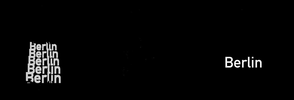
Last week, Ansis explained how labels are placed in Mapbox GL, but once we know where to place labels, we still have to figure out how to draw them.
Even in 2014 after over two decades of OpenGL, rendering text is not easy since OpenGL can only draw triangles and lines. Rendering text for maps is even harder because we need the same glyphs in many different sizes, and the text placement changes every single frame when the user is rotating the map. In addition, we need to paint text halos for better contrast.

Using a glyph atlas
The go-to open source library for rasterizing text is FreeType. Rendering text typically works by having FreeType generate a monochrome bitmap of the glyph in a temporary buffer, then blending the buffer pixel-by-pixel to the correct position on the destination bitmap. This means that we could pre-render all of the glyphs we need into a shared texture, called a texture atlas, then create two triangles (a quad) per glyph that map to the texture. This approach is also implemented by Nicolas Rougier’sfreetype-gl.

This works nicely until you start to rotate the text. While OpenGL’s linear interpolation is decent, it still looks rather blurry, so just rotating the glyph quads doesn’t work for us. We could regenerate the glyphs whenever a user rotates the map, but that slows down map rendering because we need to make a lot of CPU calculations in every frame and upload new texture and vertex data. This all means that we need to look for a different approach.
Signed Distance Fields
Distance fields (or distance transforms) have been around for ages and have lots of useful properties. In a distance field, every pixel indicates the distance to the closest “element”. Valve introduced the approach of using distance fields for rendering sharp decals in computer games a couple of years ago. And we decided to do just that when rendering glyphs as well.
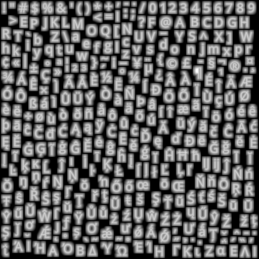
To render text with signed distance fields, we create a glyph texture at font size 24 that stores the distance to the next outline in every pixel, rather than the actual value itself:

Inside of a glyph, the distance is negative; outside it’s positive. As an additional optimization, to fit into a one-byte unsigned integer, we’re shifting everything so that values between 192 and 255 indicate “inside” a glyph and values from 0 to 191 indicate outside, plus we clamp the overflowing values. This gives the appearance above of a range of values from black (0) to white (255). In essence, we are using the pixel color values in the texture as a measure of distance from glyph edges.
Like in the previous technique, we create two triangles to form a quad and assign the corresponding texture coordinates so that the distance map of that glyph gets mapped onto that rectangle.
We enable OpenGL’s linear interpolation so that we get a smoothly scaled image. Then, the important part is the alpha test. Depending on how far we want to buffer the glyph, we choose a cutoff value and assign 1 as the alpha value to all pixels that are within the glyph outline and 0 to the ones outside. To get an antialiased look, we’re creating a small alpha gradient around the cutoff value with the smoothstep function. The entire pixel shader looks like this:
precision mediump float;

uniform sampler2D u_texture;
uniform vec4 u_color;
uniform float u_buffer;
uniform float u_gamma;

varying vec2 v_texcoord;

void main() {
    float dist = texture2D(u_texture, v_texcoord).r;
    float alpha = smoothstep(u_buffer - u_gamma, u_buffer + u_gamma, dist);
    gl_FragColor = vec4(u_color.rgb, alpha * u_color.a);
}
You can try text rendering at this demo.
Using signed distance fields for font rendering has a few advantages:
- Free accurate halos by simply changing the alpha testing threshold.
- Arbitrary text rotation.
- Arbitrary text size, though it starts looking a bit off at very large text sizes.
- A bitmap of a
24pxglyph is about 20% smaller than the vector representation of that glyph.
There are a few minor drawbacks too:
- Text appears a little more rounded.
- No support for font hinting.
Font hinting changes the glyph outlines so that they fit better in a pixel grid, which is especially useful when rendering small text. However, FreeType disables hinting anyway as soon as you rotate a glyph with a transformation matrix. Additionally, many of our maps are being displayed on very high density (high-DPI or “retina”) screens built into smartphones or tablets, so hinting is much less important on these screens.