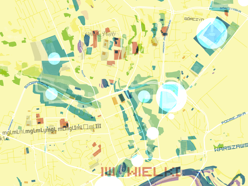
I introduced an element of randomness into a recent map design. Misplaced buildings and overlapping areas of texture bring energy and excitement to the experience of viewing a map. The end result is a little disorienting, but still mostly familiar:
I balanced randomness with accuracy. Correctly placed map labels and roughly accurate landuse features make it difficult to ever feel truly lost when looking at the map. Towns, parks, and schools look a little broken, but they are where you expect them to be. By warping and misusing the data just a little bit, I was able to uncover unexpected rhythms and relationships. My normal urge to explore when looking at a map is even stronger: I don’t know what the next town over is going to look like, so I keep panning. Will it be layered and muddy like a Rauschenberg, rhythmic and minimal like a Kandinsky? Out of the randomness, an element of surprise emerges.
Here are a few interesting spots:

Gorzow-Wielkopolski, Poland

Ho Chi Minh city, Vietnam

Istanbul, Turkey

Queensland, Australia

Mapbox West offices, San Francisco, USA
Some of my favorite places aren’t the major cities that we usually show off on our maps, but small towns and out of the way parks, where randomness seems even more pronounced. These half-complete places with half-complete data feel like little visual poems. Here’s Friday Bridge in the UK:

I liked this series of towns along highway 71 in central Minnesota:

This unnamed park in central Nebraska also stood out to me:

Having access to OpenStreetMap data for the whole world, and being able to style it in an instant, changes what is possible with map design. I threw dozens of textures, colors, and layer styles at my map and saw them appear instantly.
The main problems map designers dealt with historically like sourcing, managing, and understanding data were already solved for me. I spent my time on problems of a different nature: “Is it possible to randomize the fonts I’m using for labels?”, “How much can I break on this map while still recognizing where I am?”.
If you’ve only been looking at digital maps for the last dozen years, it’d be easy to forget that maps have a rich history as an expressive medium. From 12th century maps covered with mythical creatures and unknown lands, to the personal maps by contemporary artists like Duke Riley, creators have been using maps to do more than just describe reality from the beginning.
Again, here’s a link to the full interactive map and this was all designed using using TileMill 2, the next generation of our open source map design studio, which is currently under development on Github.