By: Peter Liu
Mapbox has great tools to visualize geographic information, with powerful expressions to harness raw data for rich visual styling. But at the heart of data visualization lies a catch-22: we build them to help us understand data, but we often need the understanding to make them in the first place.
For every great visualization, someone has to sit at an Excel spreadsheet, text editor, or Python terminal to process the raw data. Someone has to tweak colors, sizes, opacities to get things to look good. We think there should be a better way to automate this process, allowing developers to explore raw data.
We’re working on a prototype that minimizes the distance between getting data in hand and understanding it. Mapbox Data Explorer is a new tool to help developers preview their data before processing and uploading it. Using the Data Explorer, developers can brainstorm potential stories and reveal patterns, with little data preparation.
Visualize data fast
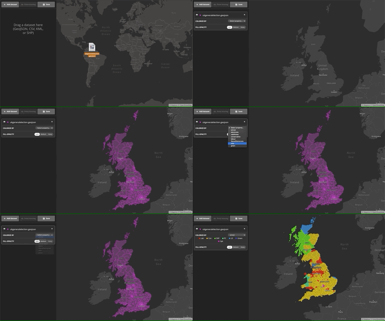
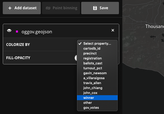
With the new Data Explorer tool, visualizing large datasets is as simple as drag and drop. You start with an empty map, and after you drop the file you can chose which property you’d like to colorize. For this example, we’ve populated the map with a sample dataset of UK election results and colorized the choropleth by the winner property using a categorical ramp.
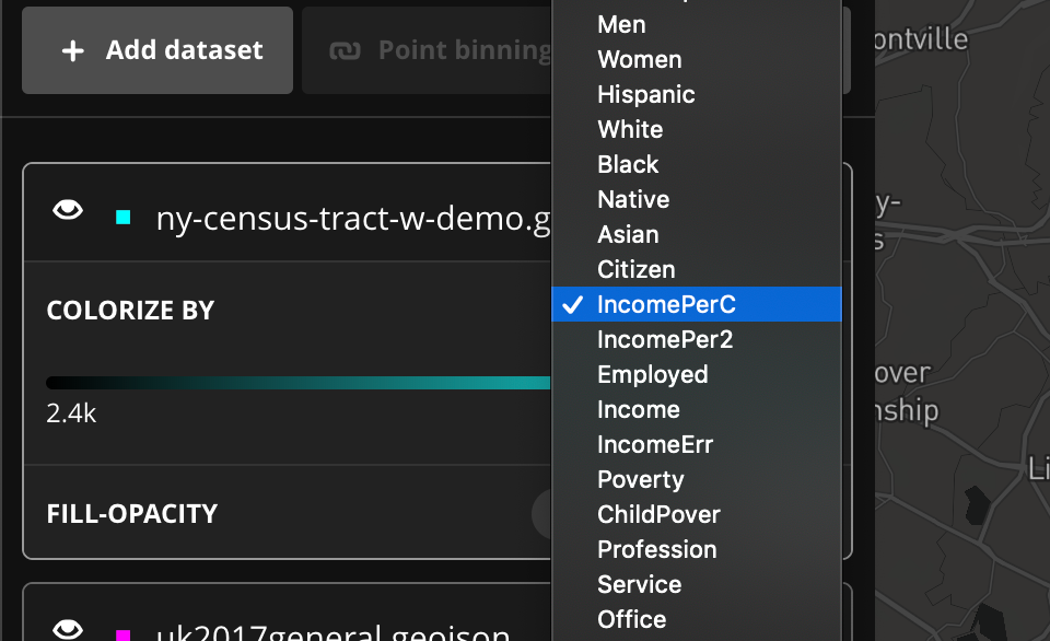
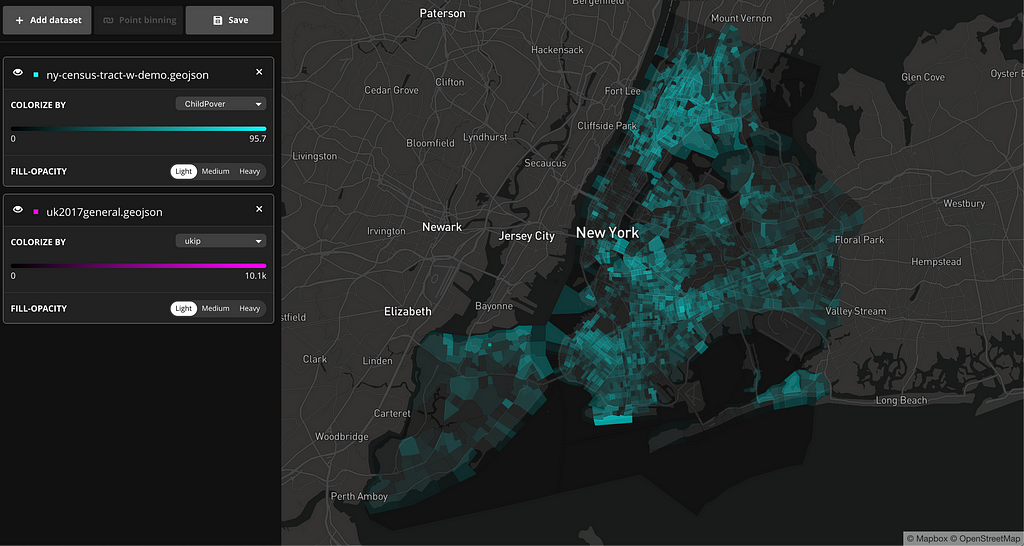
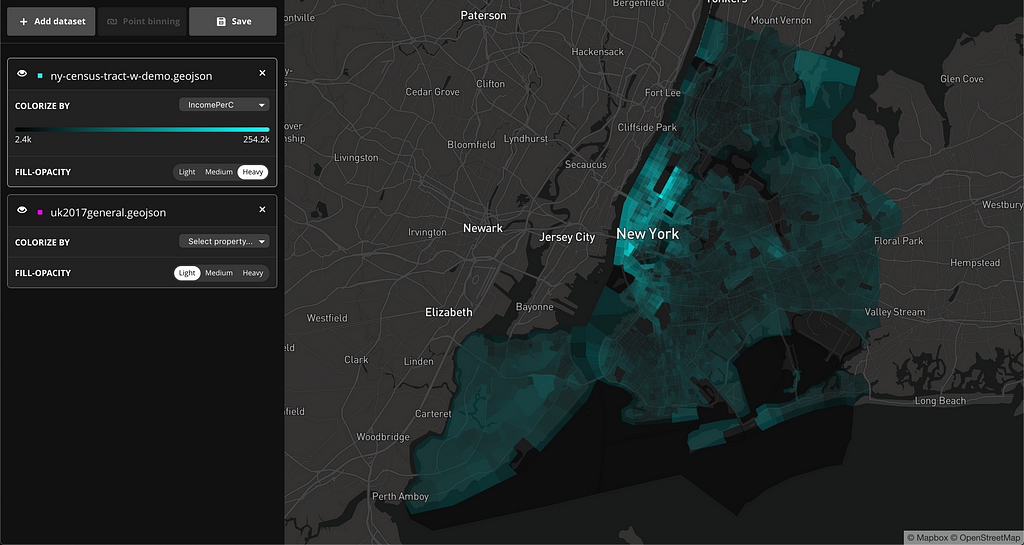
You can also visualize datasets using a continuous color ramp. In the example below, the dataset contains census tracks and census demographic data of New York City. This visualization is colorized by income per capita.
The Data Explorer also features a view url parameter. Once you’ve created a data visualization, use the Save button to download a .json which can be hosted anywhere you like (Github gist, Dropbox, etc.). Next time you need it, you can load it directly into the tool by pointing the view parameter to it, like so:
https://labs.mapbox.com/labs/mbxdataexplorer/?view=https://gist.githubusercontent.com/peterqliu/3fee09266f0bc16d4a86a71f1e5effc4/raw/14de4d78c972ecc5847c9432ced9ea589d7aafa1/example.json
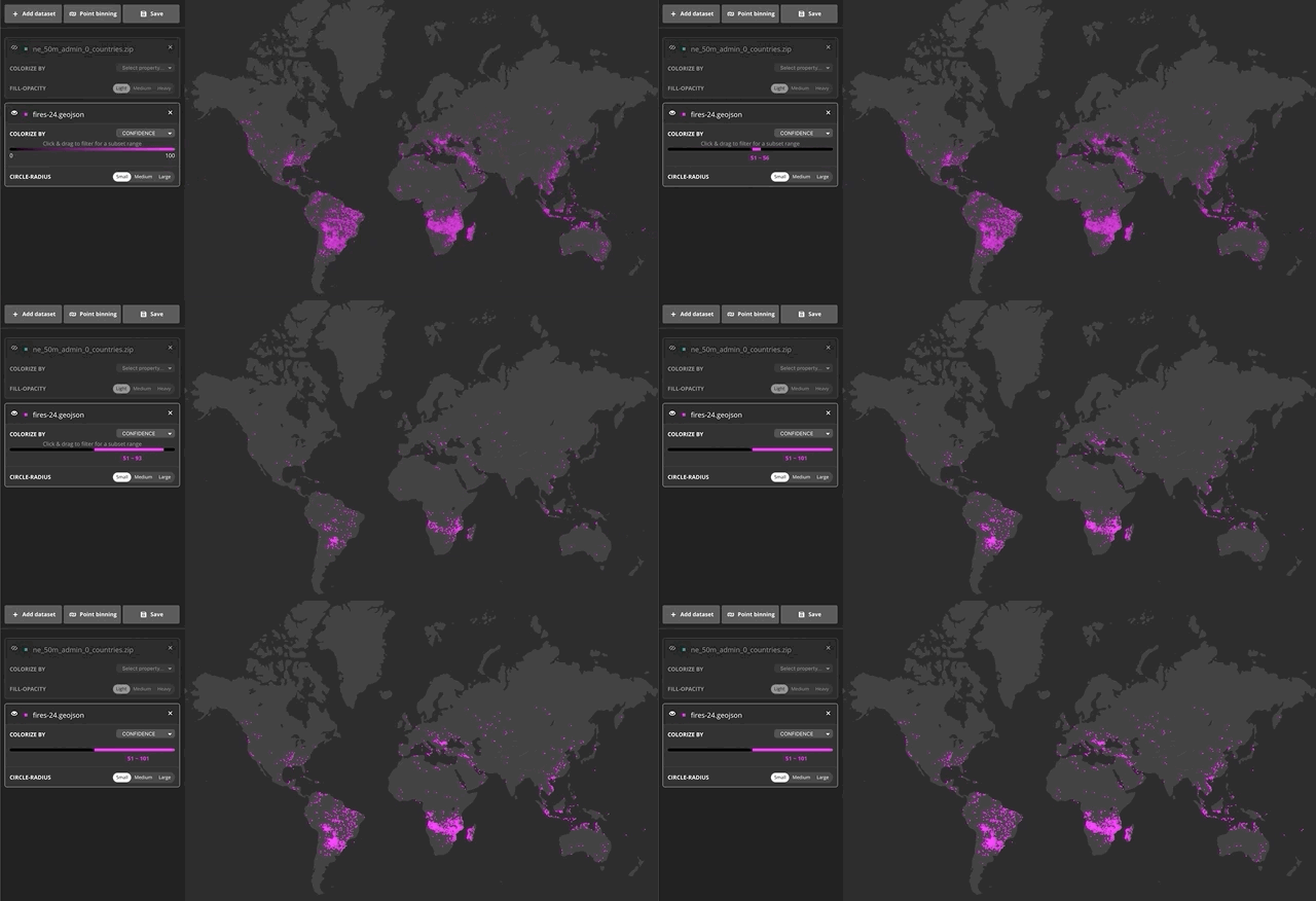
Additionally, you can also preview a sample set of data using a filter. This is helpful when, for instance, you want to reveal patterns in your data based on certain criteria. You can filter by selecting a range in the ramp to the left of the map. In the following example, I used the filter to only see fires or thermal anomalies above 50% confidence from MODIS.
Data-join: Point binning
One of the most common data-joins is called “point binning” — given sets of polygons and points, we identify all the points falling inside each polygon, and then calculate some statistic based on those member points. Whenever we want to answer question like “average city population of each state,” or “raw counts of crime in a neighborhood,” or “total cost of insurance claims in an area,” we would first have to do a point bin.
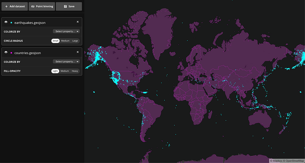
To see how point binning works in our Data Explorer, let’s use a set of the world country polygons, and a sample dataset of earthquakes across the world. You can find the pre-populated example here. After uploading the files, we already see the points clustering around several areas:
But, let’s say we also want to get statistics by country. If we click on “Point binning” in the upper left, a new dialog box appears, with our country shapes pre-selected. For the sake of this demo, we want two new statistics: the raw count of earthquakes in each country and the average magnitude per country. The interface allows us to do exactly this:
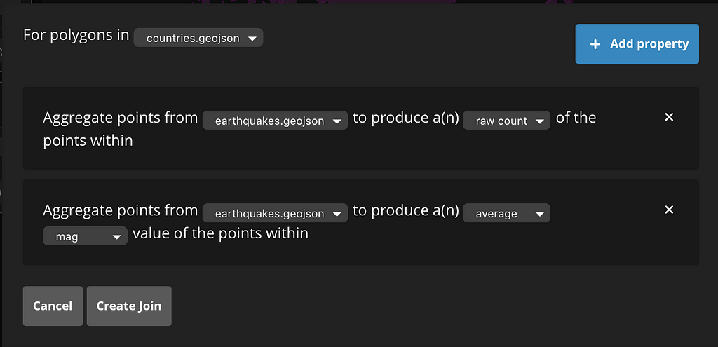
After we create the join, a new dataset appears on the sidebar. At first, the geometry looks identical to the countries dataset, but there are two new properties:
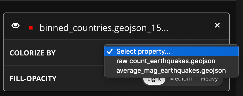
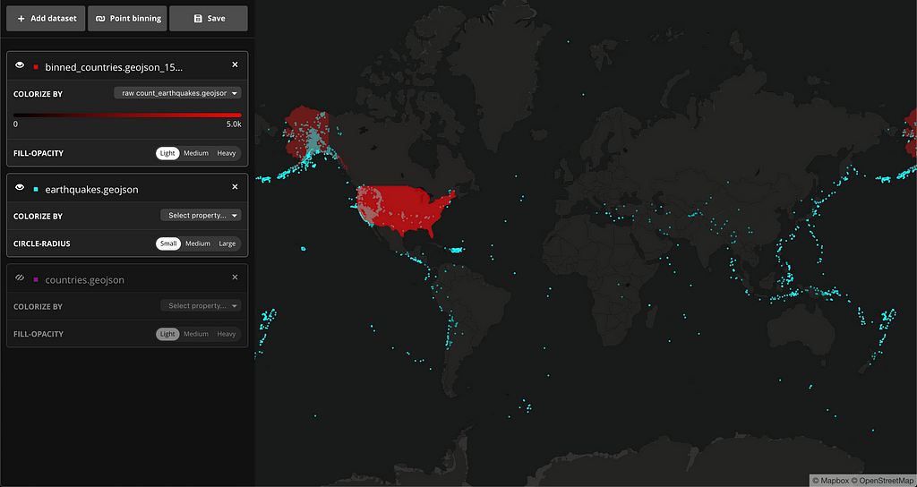
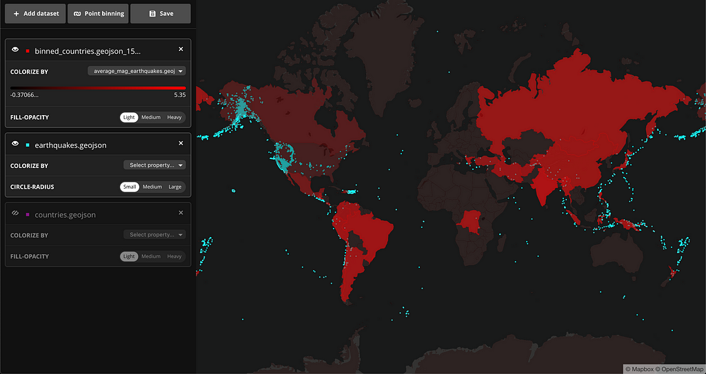
If we hide the other datasets momentarily and colorize this binned polygons using the new properties, a new story starts to emerge. There are more earthquakes happening in a handful of countries but the average magnitude is higher in countries where there aren’t as many earthquakes. Here are the countries colored by raw count:
And here is the visualization of average magnitude by country:
The Mapbox Data Explorer enables developers to get deeper insights into data with very little effort. Having a general sense of what your data looks like by exploring preliminary patterns can help inform the rest of your data processing and story building. Start building and exploring your data using Mapbox Data Explorer and let us know what you think on Twitter.
Introducing Data Explorer: A new way to quickly visualize data in the browser was originally published in Points of interest on Medium, where people are continuing the conversation by highlighting and responding to this story.