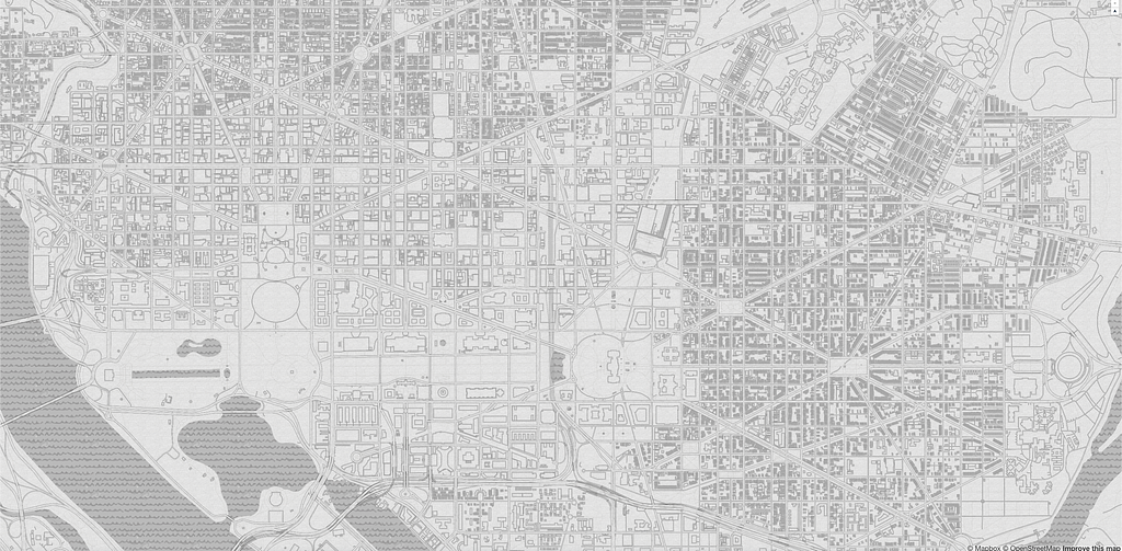
Customizing Mapbox Basic to recreate a vintage designer classic
By: Madison Draper
As the end of summer nears and the first day of school approaches, I’m reminded of back to school shopping with my family. Racing down the store aisles, I’d end up with a handful of pencils and colored pencils. (The permanency of pens has always been too intimidating for me.)
Now I work almost exclusively on electronic devices, making me miss the tactile pencil to paper interaction. In an act of dual nostalgia, I took our Basic map style and remade AJ Ashton’s Pencil Map style from 2014.
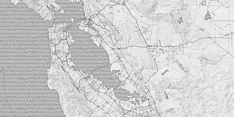
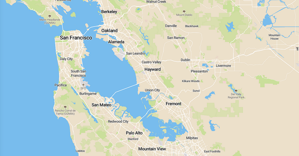
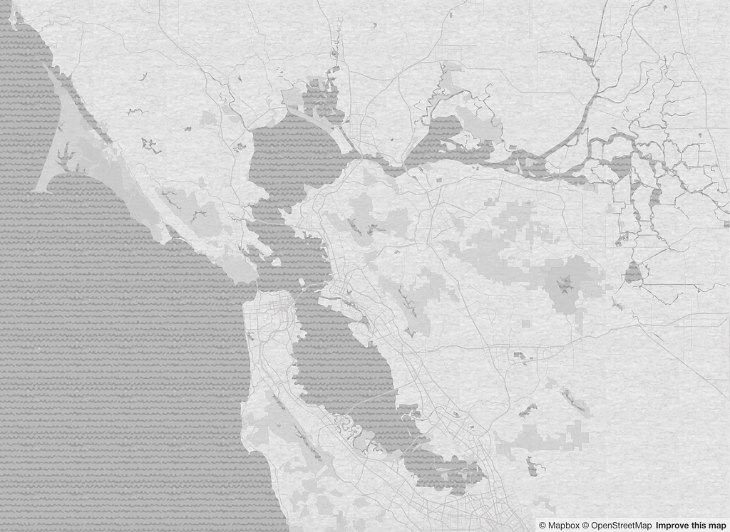
When redesigning this style I focused on three things: textures, color, and buildings.
Textures
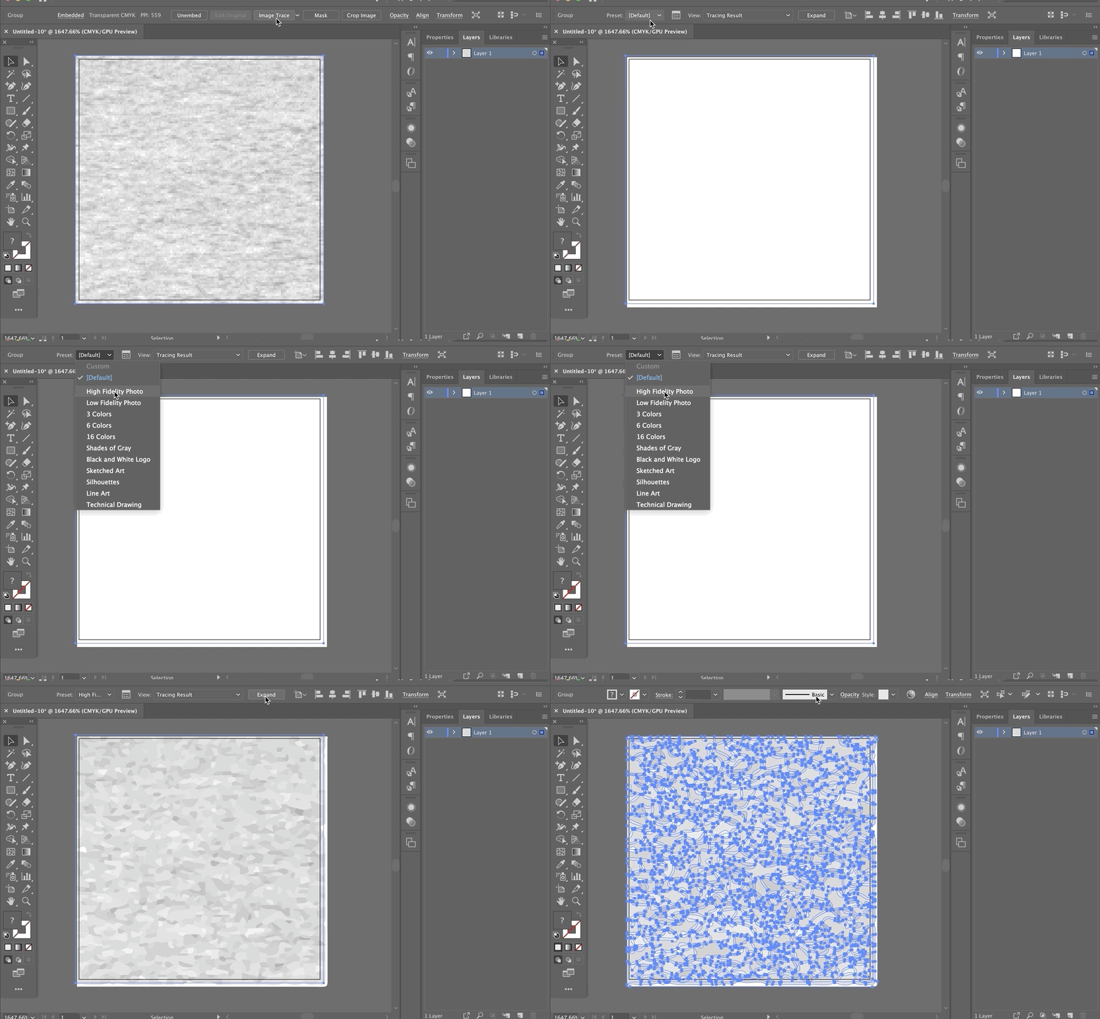
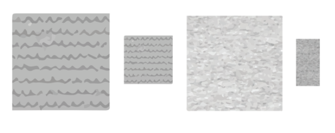
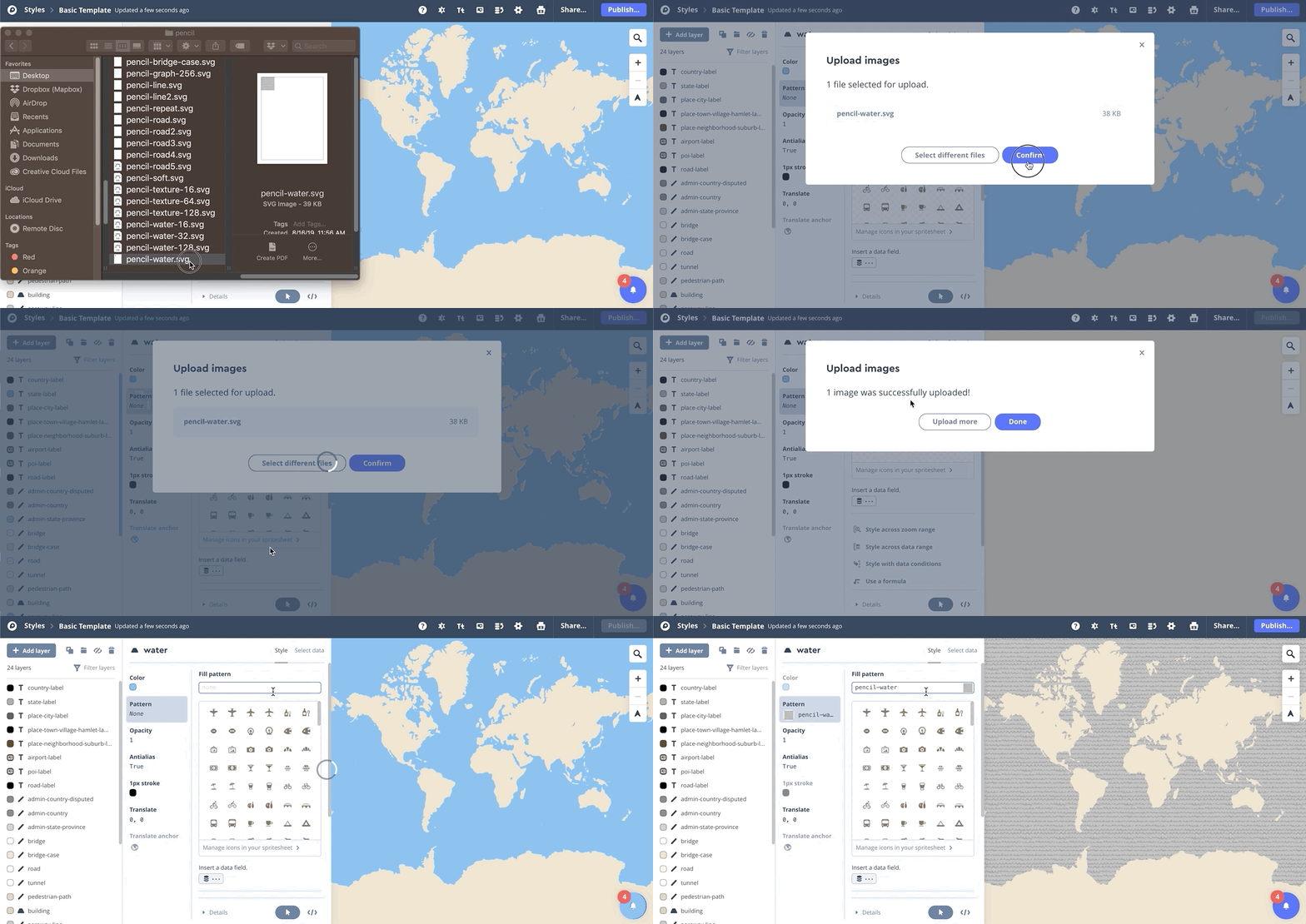
To create an uneven graphite pattern, I uploaded the images used in the original style to Adobe Illustrator and vectorized them using Image Trace with a High Fidelity result. If the SVG was too large, I minified it using an online minifier to reduce the file size so it could be uploaded to Mapbox Studio.
Color
Since Pencil is a monochromatic map, choosing the right color is critical because of the minimal contrast. To increase the amount of gray, I decreased the icon’s opacity and added a different shade of grey in the layer below it to get the exact color I wanted. This technique let me reuse the same textures and keep the spritesheet small.
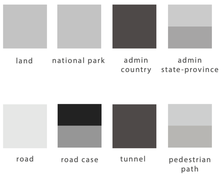
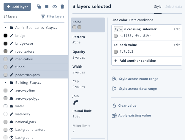
Pro tip: If layers are grouped together or multi-selected, several layers’ color can be changed at once in Studio.
Buildings
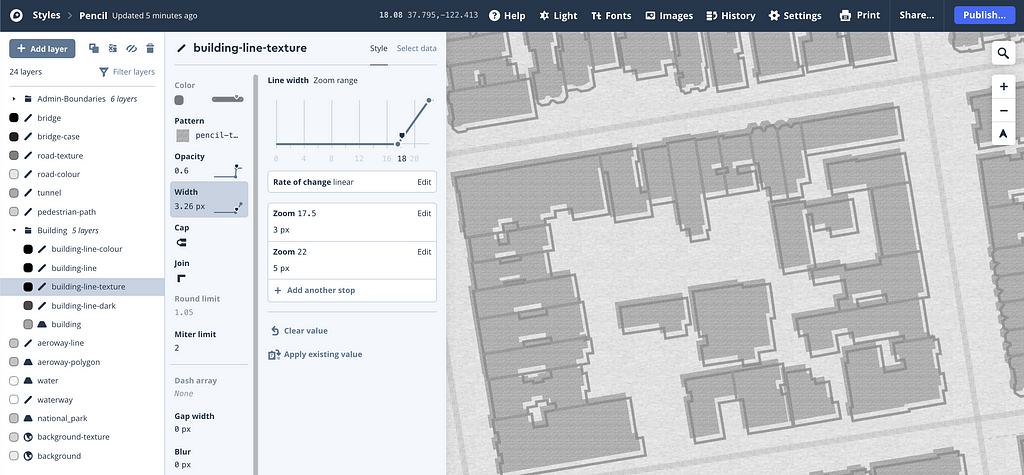
The buildings in the original Pencil style change across zoom level. At lower zooms, they’re outlined with a heavy shadow; and at higher zoom levels, the buildings are polygons with an offset outline. By styling across the zoom range, I recreated a similar visual effect. To recreate the sketched building outlines, I duplicated the layers and made the top layer a semi-transparent texture and the bottom a shade of grey.
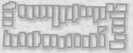
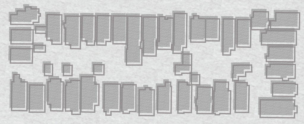
To make this part of the style unique, I only used the texture building outline from zoom 15.5 to 15.25 to create a dull pencil sketch effect.
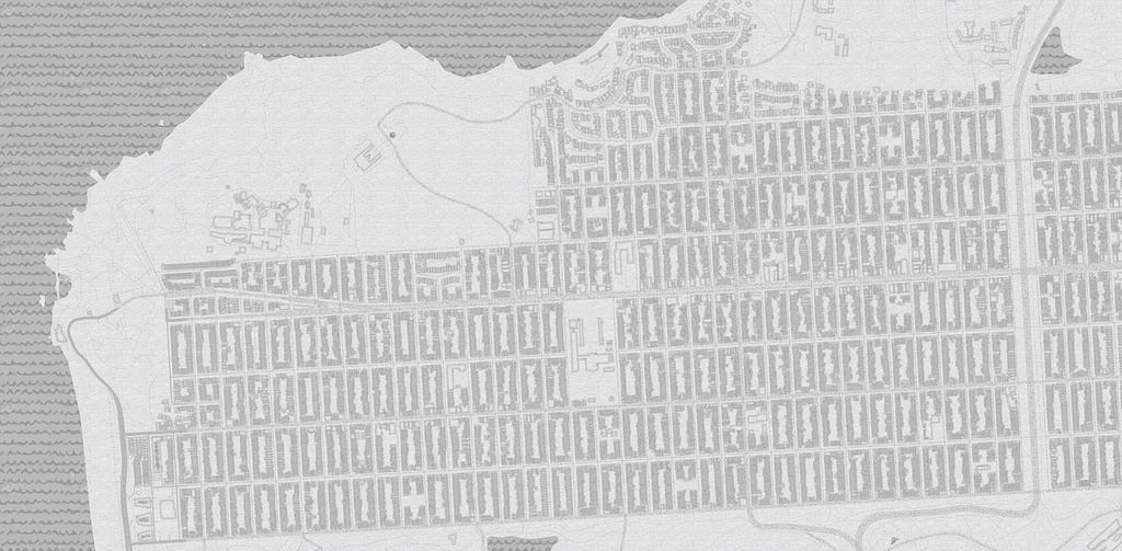
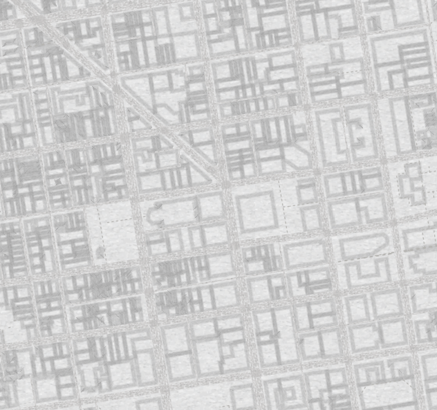
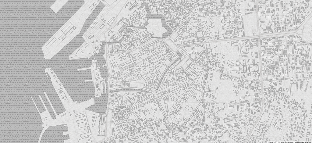
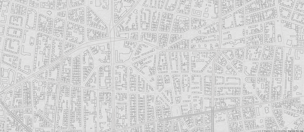
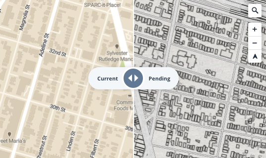
When publishing the map, a popup modal will show the difference between the original map and the changes made since the last publish. Look at the difference!
Add Pencil to your account to color it in any way you want or use it to remake your own version of Pencil. Pencil is great for any back to school themed apps your making or data visualizations because of its monochromatic palette. Tweet the maps you make at me with #builtwithmapbox, I’d love to see them all!
Designing the Pencil map style was originally published in Points of interest on Medium, where people are continuing the conversation by highlighting and responding to this story.