Behind the scenes with Graphics Editor Josh Katz

By: Ryan Mannion
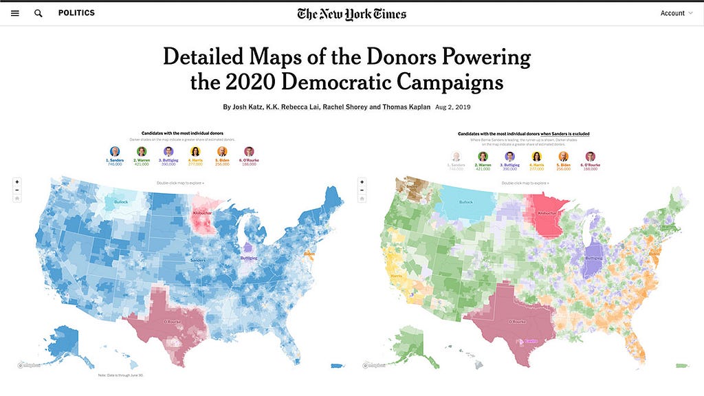
When the New York Times recently published an analysis of Democratic fundraising across the country, I was struck by the impact an interactive map can have on making complicated subjects more approachable. I caught up with Josh Katz, a Graphics Editor who worked on these maps to learn more about his approach.
Fundraising data has been key to determining which democratic candidates make it to the debate stage. What made you want to visualize that data geographically?
We thought it would give an interesting look at the state of the campaign, letting us really explore the geographic variation in candidate fundraising and support in very fine detail. So, working with my colleagues Rebecca Lai, Rachel Shorey, and Thomas Kaplan, we set to work creating these maps.

How was the data delivered? Was it easy to process?
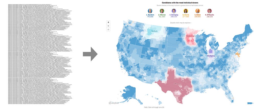
Rachel wrote some Python scripts to download and parse the FEC data. For the ActBlue filing, the FEC puts up a flat “.fec” file — not something standard — which we catch by monitoring either their API or an RSS feed. Once that was posted, Rachel downloaded the file and ran her code.
The end result is that I’m handed a nice, well-formatted CSV that I can use to generate the maps.
How did you tie the data to the map? What made you choose zip codes over something else like census blocks, addresses, etc.
We realized we needed to assign each donor a location from the FEC records before we could map them. We have their addresses, but not their locations. At first, we considered doing a geocoding query for each person, but we were looking at a few million records. So instead, we approximated each donor’s location based on the centroid of their ZIP code. It’s not perfect, but it seemed good enough for our purposes. And it made the whole process very fast, which was good because we were trying to turn this around pretty quickly.
New York Times has built with Mapbox for a while, but was there anything new that you tried out for this article?
One thing we did this time that was new for us was projecting the shapes in Albers instead of using web Mercator. We really liked the effect of it, and we’ll probably use it again in the future. There’s less spatial distortion than with a Mercator projection, and I think it just looks aesthetically better. And if you want to have Alaska and Hawaii and Puerto Rico all on the same map, that really gets tricky to do in Mercator.
Can you walk us through that? You used the Dirty Reprojectors from Development Seed, right?
Yes. We used their code and then modified it slightly to use an Albers projection with separate projections for Alaska, Hawaii, and Puerto Rico.
The downside to doing the reprojection is that you don’t get the benefit of those underlying Mapbox tiles, like roads and boundaries and city names etc. So everything that we wanted in the map, we had to run through that same reprojection script. We had to make a state boundaries layer and a cities layer, and then put in some roads, and then felt like that was enough.
Did you use any other tools to achieve this visualization?
R to do the initial spatial smoothing, and we used mapshaper to do a lot of the pre-processing of all of these different shapefiles. I used mapshaper a lot. And then Tippecanoe to generate the tiles and upload them to the Mapbox server.
If you had to do this without Mapbox or before Mapbox, would it have been possible?
I’m sure that with the help of some other graphics editors here, we would’ve been able to do it. I would not have been able to do it without additional help from other people, just because I don’t know how to do a lot of the things that it would have involved. We did the baseball fan maps five years ago, and I was looking at those maps as we were developing this one and remembering what that process was like. And it was, I would say, significantly more involved in terms of just generating the tiles and that whole process.
We love these maps and the work that goes into making them. We’re committed to helping journalists and others add truth and context to the election process. If you’re working on mapping election data publicly, Mapbox will offer free use of our platform for media and advocacy organizations. Check out our team’s guide to election mapping to get started. And if you need a hand, drop us a line.
Ryan Mannion - Senior Technical Account Manager - Strategic Accounts - Mapbox | LinkedIn
How the NYT mapped every dollar was originally published in Points of interest on Medium, where people are continuing the conversation by highlighting and responding to this story.