How I built the U.S. electric generation map
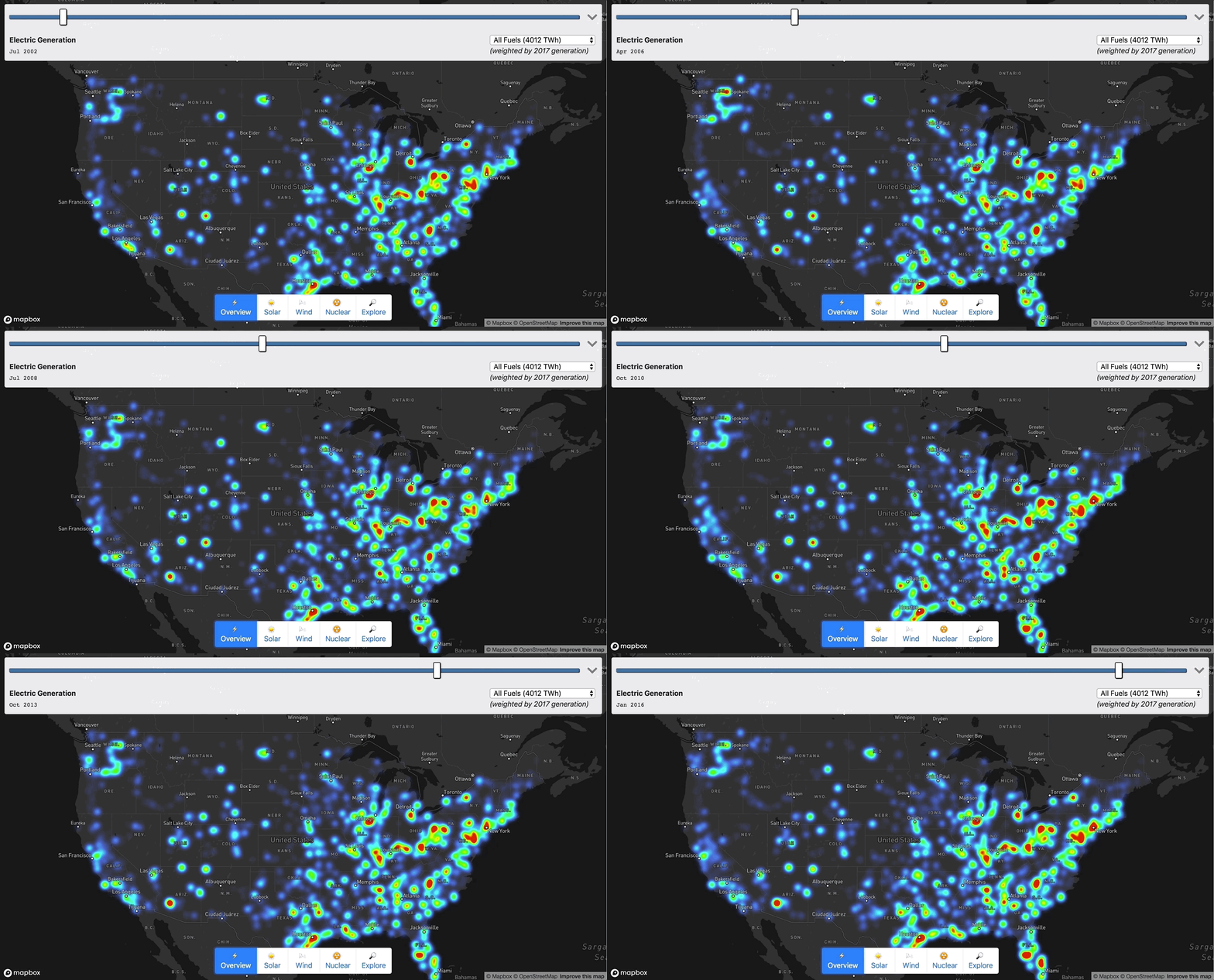
Chris Loer built https://electricitytransition.com to visualize 17 years of shifting electricity generation in the U.S. He originally shared this how-to post on his blog.
By: Chris Loer
This project grew out of my longstanding interest in energy transitions. The world urgently needs to shift away from fossil fuels, and we need to do it faster than any previous transition — but our existing energy infrastructure is gargantuan and difficult to understand. I wanted to find a way to tie quantitative energy generation data to time and place, in order to make sense of changing trends. So I started looking for interesting datasets at data.gov, and quickly found a treasure trove of public data maintained by the US Energy Information Administration. When I found Form EIA-923, with monthly electricity generation data for every single power plant in the US, I thought “OK, let’s put this on a map”.
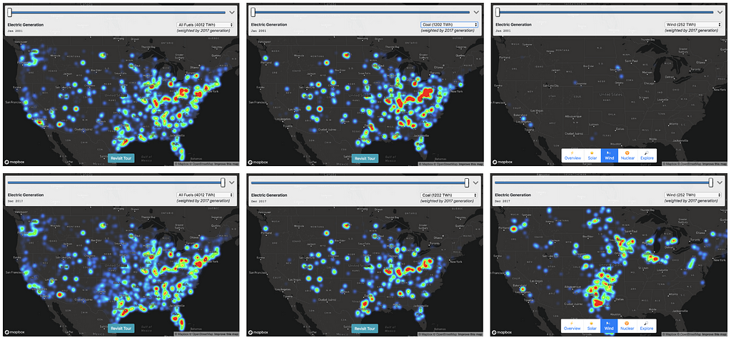
It was a massive amount of data — monthly generating data for tens of thousands of plants, ranging from tiny co-generation plants attached to factories to giant coal and nuclear power stations. To make the data intelligible, I decided to make a heatmap using Mapbox GL, with the “weight” of each plant set relative to its power output.
Step 1: Download, export to CSV
For generation data:
- Download 17 years worth of excel spreadsheets
- Export to CSV
- Normalize data to account for small format changes
For plant location data:
- Download 2017 plant location data
- Export to CSV
Step 2: CSV → GeoJSON
I wrote a small node script to join the data from these data sources into a single GeoJSON file.
- csv-parse module to parse CSV
- geojson module to output GeoJSON
- Simplify the “prime mover fuel codes” into nine major categories
- Join the location data and generation data based on “plant ID”, collect aggregate statistics
Step 3: Building the Map
I started with the Mapbox “Dark” style, which is designed with data visualization in mind. I added my GeoJSON as a data source:
map.addSource('plant-generation', {
  "type": "geojson",
  "data": "plant_generation.geojson"
});
I also added a satellite imagery source to allow users to see the actual plants at high zoom:
map.addSource('satellite', {
  "type": "raster",
  "url": "mapbox://mapbox.satellite",
  "tileSize": 256
});
Heatmap (low-to-mid zoom)
To make sense of the massive amount of aggregate data at low zoom I used a Heatmap layer:
map.addLayer({
  "id": "plant-generation",
  "type": "heatmap",
  "source": "plant-generation",
  ...
I used runtime styling to update the heatmap-weight whenever the date changed, interpolating in between adjacent values to get a smoother effect:
map.setPaintProperty('generation-heatmap', 'heatmap-weight',
 ["/", ["+",
   ["*", ["to-number",
     ["get",`netgen_${base.year}_${base.quarter}`]], baseMix],
   ["*", ["to-number",
     ["get", `netgen_${next.year}_${next.quarter}`]], nextMix]], 2000000]);
I also scaled the heatmap-intensity and heatmap-radius based on (1) the zoom level, and (2) the current fuel type. Without re-scaling the radius and intensity, the heatmap would either be over- or under-saturated when moving between fuel types (e.g. “gas” would be oversaturated relative to “solar”). To calculate the intensity weighting for each fuel type, I used the aggregate generation information I collected in Step 2.
var intensityRatio = totalGeneration /
                     fuelTypeWeighting[fuelSelect.value];
map.setPaintProperty('plant-generation', 'heatmap-intensity',
[
  "interpolate",
  [ "exponential", 2 ], // Exponential intensity curve matches
  [ "zoom" ],           //  exponential zoom curve
  0,                    // At zoom 0:
  intensityRatio,       // Start with the base intensity
  10,                   // By zoom 10:
  10 * intensityRatio   // Reach maximum intensity
]);
Labeled Circles (high zoom)
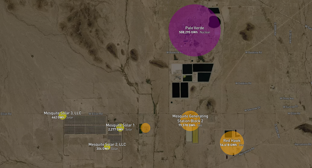
My goal was to make it intuitive to transition from looking at national/regional generation patterns to looking at the details of the actual infrastructure on the ground. I tried to accomplish this with a progressive transition as zoom increases:
- Fade in the satellite layer
- Fade out the heatmap while scaling up individual circles to represent plants.
- Color encodes fuel type, size encodes monthly generation, and label encodes name, type, and total generation over the 17 years of data.
Step 4: Telling a Story
At this point, I had a lot of fun exploring the map and finding interesting patterns, but I wanted to add a narrative element so I drafted up a list of stories I felt the map could tell:
- The decline of Coal — The biggest story in CO2-reduction.
- The rise of Gas — The twin of the decline of coal, and a staggering infrastructure build-out. Digging into individual plant data, I was surprised by how many coal-to-gas plant conversions showed up.
- The rise of Solar — Sunny and future-focused California is no surprise here, but did you know North Carolina had such a big solar industry?
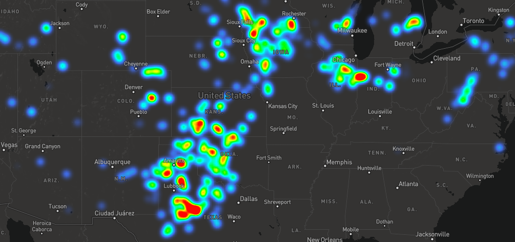
- The rise of Wind — Dominated by “red” states, and a hopeful reminder that if we get the technology and economics right, energy transition doesn’t have to be a partisan issue.
- The seasonality of Hydro — and its emerging potential as a “battery” for intermittent sources (although with monthly data, pumped hydro storage just looks like a small and boring negative value)
- The stagnation of Nuclear — The rise of solar and wind is inspiring, but discussions of carbon-free energy too often miss a sense of scale. Nuclear power still dominates our existing carbon-free energy production, and it’s the central technology used by the only countries that have already transitioned to carbon-free electricity, such as Sweden and France.
I explored the map on my own to look for “scenes” that matched those stories, and then encoded those scenes into animations. Once I tried looking at all of these scenes and their accompanying text from the viewport of my phone, I realized I had to strip the story down to its bare minimum to make it intelligible ✂️ 🔪 😬.
I also got a painful reminder that I am color-blind and a terrible web designer. I settled on using Bootstrap to get something “good enough”.
Step 5: Performance (GeoJSON → MBTiles)
Up to this point I was working with a 27 MB GeoJSON file, which was fine for testing, but way too big for a finished product. So I took a little detour in order to turn the GeoJSON into a tileset I could host with Mapbox. To make low zoom tiles fit within the 500KB per-tile limit, I had to cluster nearby plants.
My first attempt used Tippecanoe, using clustering arguments that looked something like:
tippecanoe -zg -o us_electricity_generation.mbtiles -r1 — cluster-distance=4 — accumulate-attribute=netgen_[year]_[month]:sum plant_generation.geojson
This basically said “make a cluster out of any plants that are within 4 pixels of each other on this tile, and aggregate the child generation amount for each month”. This was pretty easy, and very fast, but I ran into two problems:
- Tippecanoe implements clustering by finding adjacent points on a Hilbert Curve. This is really efficient on large datasets, but it gave me less control over how clusters get created. Specifically, I wanted clusters to tend to center on the largest plant in the cluster, so that the collective weight of the heatmap would look similar before and after clustering.
- If I clustered plants with different fuel types, I wanted to calculate separate “aggregate” generation properties per-fuel-type, but Tippecanoe’s “sum” aggregation operator didn’t give me a way to do that.
At this point, I experimented using Supercluster on the client side to do the same sort of clustering:
map.addSource('plant-generation', {
  "type": "geojson",
  "data": "plant_generation.geojson",
  "cluster": true,
  "clusterRadius": 2,
  "clusterProperties": {
    "netgen_2001_0": ["+", ["to-number", ["get", "netgen_2001_0"]]],
     ...
  }
});
This got me the results I wanted, but it was all done on the client side, and I wanted to make an MBTiles set I could upload to Mapbox for hosting. At this point my detour got a little out of hand and I implemented Supertiler, which uses Supercluster to cluster tiles, then uses SQLite to write each resulting tile into the MBTiles database format.
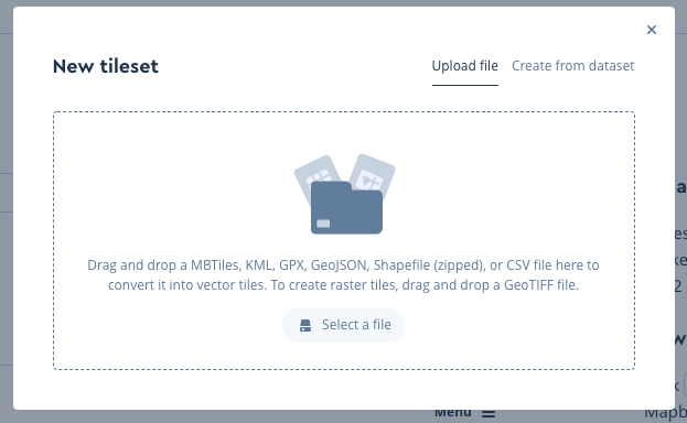
Once I finally had my clustered tiles, it was a cinch to upload the tileset to Mapbox Studio:
When I started playing around with the hosted tileset at low zooms, I realized that switching to a new data source was not that much more expensive than just applying a new fuel filter to an existing tile (either approach requires regenerating all the tiles on screen, the only difference is that switching to a new data source may require new tiles to download if they’re not already locally cached). Supertiler made it easy to generate a custom tileset for each fuel type, with the advantage of much smaller individual tiles.
I also realized through experiment that continually adjusting circle-radiusduring the animation was also triggering expensive re-layout of all the label text, since they both came from the same source (and Mapbox GL generates one set of tiles per source). I split the plant names into yet another source to solve this problem. Note that this trick only works for layers that you add via “runtime styling” — if I had added a layer with a separate source via Mapbox Studio, I believe it would have automatically “composited” the source, undoing my optimization.
You can see the code (including all of my foibles) on GitHub.
Chris is a father and a US Navy spouse. He currently lives in San Diego but is moving to Japan. When not chasing children, he aspires to be an energy nerd. Chris previously worked on Mapbox GL and its surrounding ecosystem, with a focus on expanding its typographic and multilingual capabilities. Prior to working with Mapbox, Chris spent a decade at the security and endpoint management company BigFix (and after acquisition, IBM). He also created the VoteUp iOS and Android apps.
Chris Loer (@ChrisLoer) | Twitter
Exploring 17 years of energy transition was originally published in Points of interest on Medium, where people are continuing the conversation by highlighting and responding to this story.