How I scaled California
By: Lo Bénichou
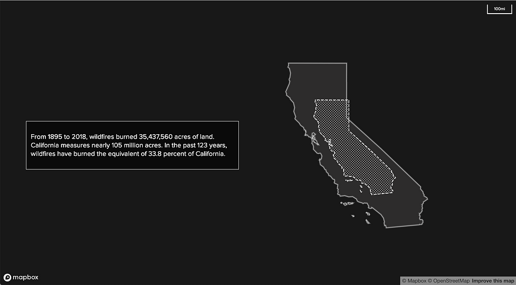
For our recent collaboration with the Huffington Post, I visualized 122 years of wildfire activity in California. To do so, Marc Janks, the director of multimedia at the Huffington Post, and I brainstormed ways to convey the sheer size of the area burned — 35,497,029 acres. How do you convey such a huge acreage? We first thought about equating the number of acres to a number of football fields. This proved to be quite abstract. That’s about 26,891,688.6 football fields. Do you get how big it is now? Yeah, I didn’t think so.
After a few more chats, we finally decided to explore scaling California down to give a proportional sense of how much had burned over the years. Coincidentally, I had just received W. E. B. Du Bois’ Data Portraits: Visualizing Black America. The maps and visualizations explore the different states of the black experience in 19th century America. Flipping through the pages, I found these maps showing the proportion of black Americans in the US. Du Bois scaled a polygon of the United States and it conveys the idea pretty damn well.
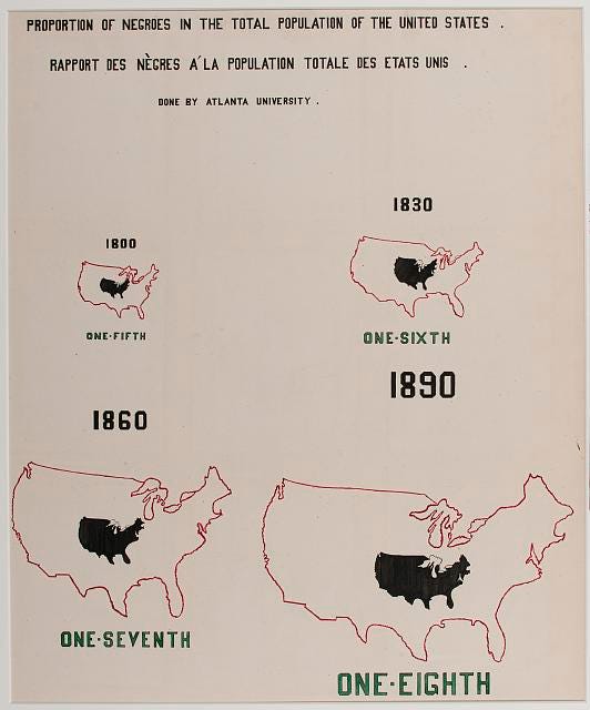
While Du Bois did this by hand (props!), scaling polygons while keeping the correct proportions based on the coordinate system you are using can be tricky.
Initially, I looked for a way to split California into multiple parts using percentages. This turned out to be harder than anticipated. Even though a plugin exists, it was super buggy and ended up being a dead end.
Then, I looked for a way to scale down a polygon to the percentage of its size. Turns out, you can do so with QGIS using one of the SAGA geo-algorithms from the processing toolbox.
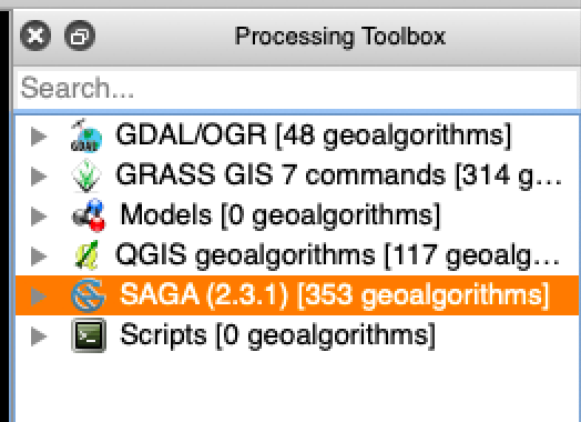
In the toolbox, you will find the “transform vector layer” algorithm under the “Vector general tools” section.
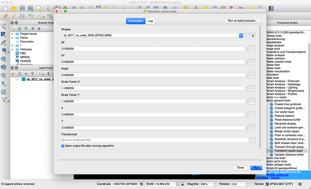
With that tool in hand, I was ready to accomplish my task. All I needed to do was to find the scale factor based on the original surface area and the resulting one. For those of us who weren’t paying attention during math class, here is a quick explainer:
35,497,029 acres of burned acres is basically 33% of California’s surface. Now, that doesn’t mean that I can reduce the polygon of California to 33% of its size. Size doesn’t equate surface. Reducing the height and width of a polygon by half, for instance, would mean reducing its surface by a fourth. That means that the scale factor for the area is the square of the scale factor for the size.
Here is a quick visual to help to understand why:
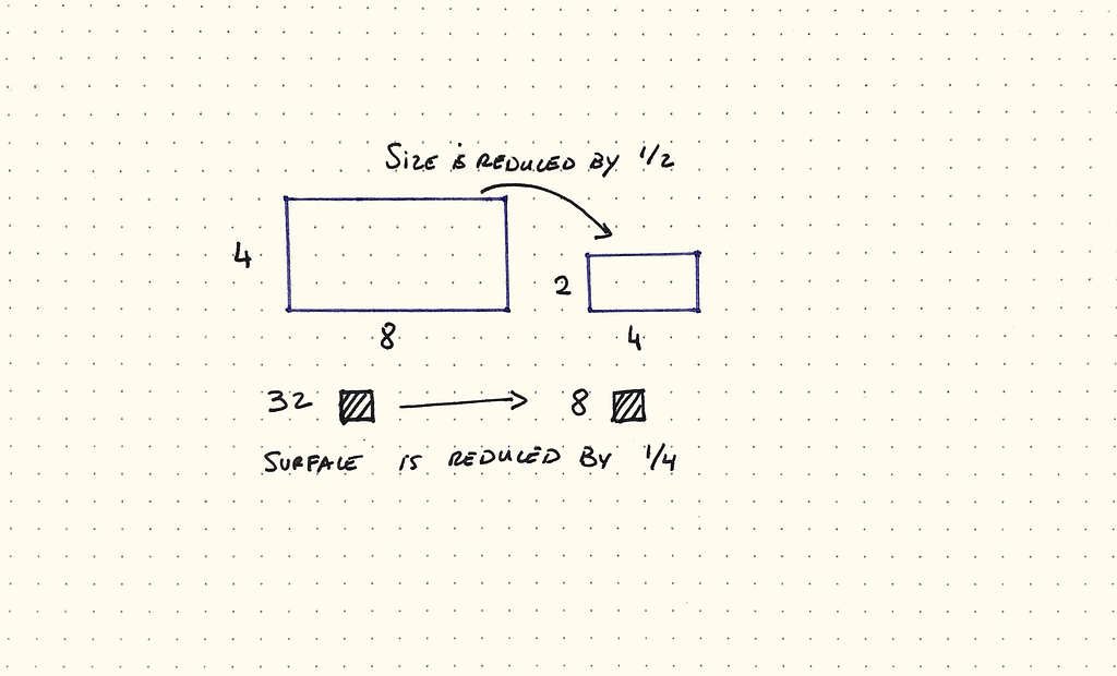
With that tidbit, I did the maths. California is 104,764,800 acres or 163,695 square miles (a). The burned area is 35437560.35 acres or about 55,371 square miles (b). That means the square factor to reduce the polygon is the square root of b/a or √1/3, which is 0.577.
Next, you can input 0.577 in QGIS under Scale Factor X and Scale Factor Y. Let’s see what happens.
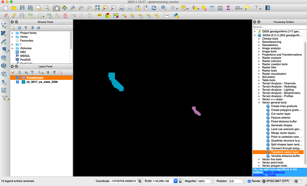
Obviously, we’ve managed to reduce California properly but we also need to preserve the original coordinates. Preserving the coordinates is important, especially when using projections like Mercator because new coordinates could result in a distortion of the polygon, like so:
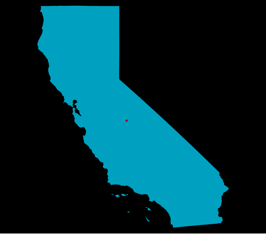
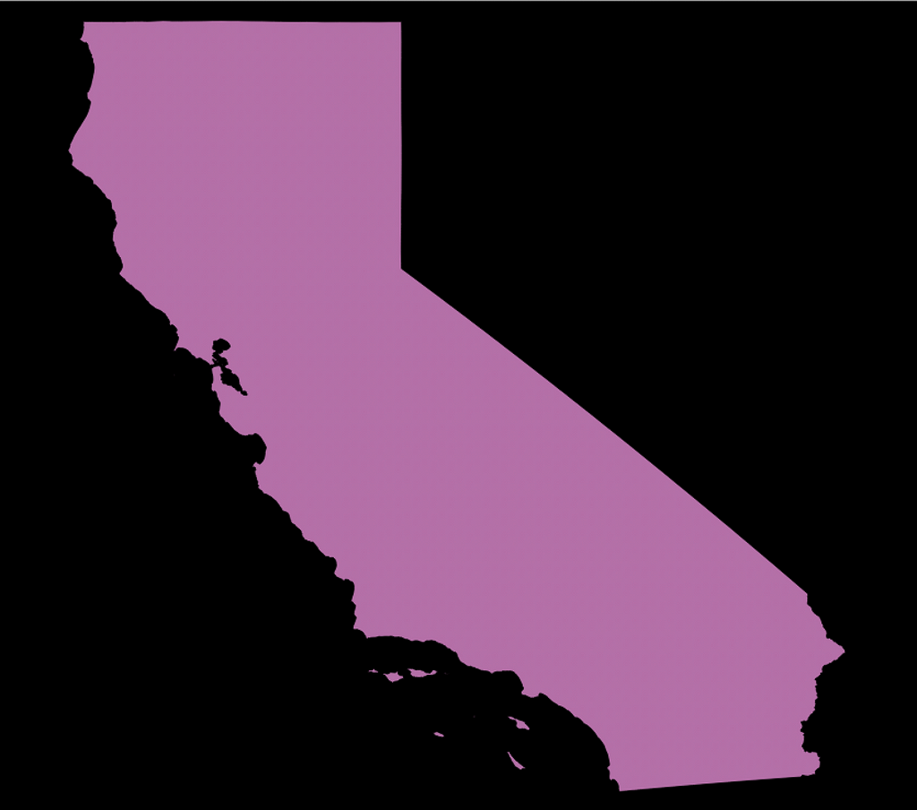
What we need to do find the centroid of the first polygon and input the coordinates during the transform process. To do so, go to Vector > Geometry Tools > Polygon centroids. Then select the original vector and run the algorithm.
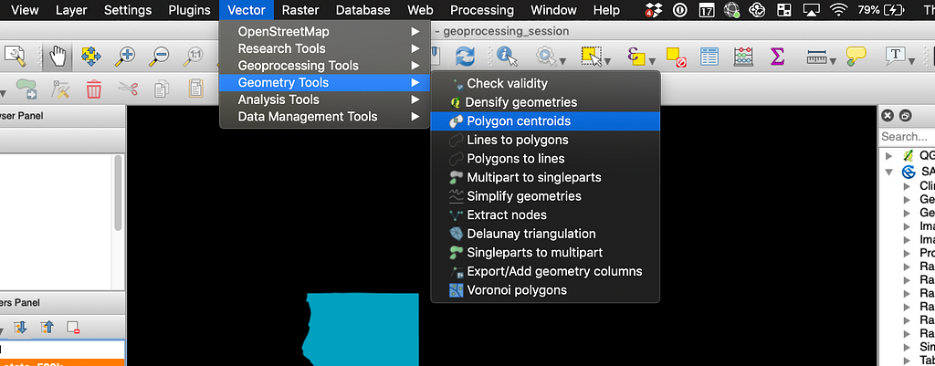
This should result in a new centroid layer. Next, to get the coordinates, go to Vector > Geometry Tools > Export/Add geometry columns. Select your centroid layer and run the process.
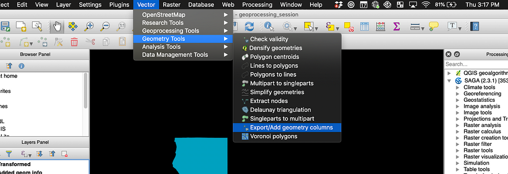
This should result in a new layer with columns for the x and y coordinates. To get to the table, right-click on the layer and click on “Open Attribute Table.”
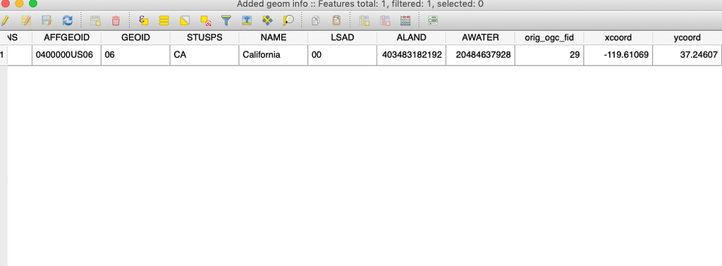
Once we have those, we can copy them over to the corresponding inputs when we reduce our polygon.
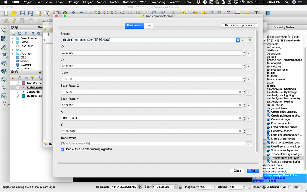
Run the process and voila! You should have your two Californias, happily overlapping and NOT distorted.
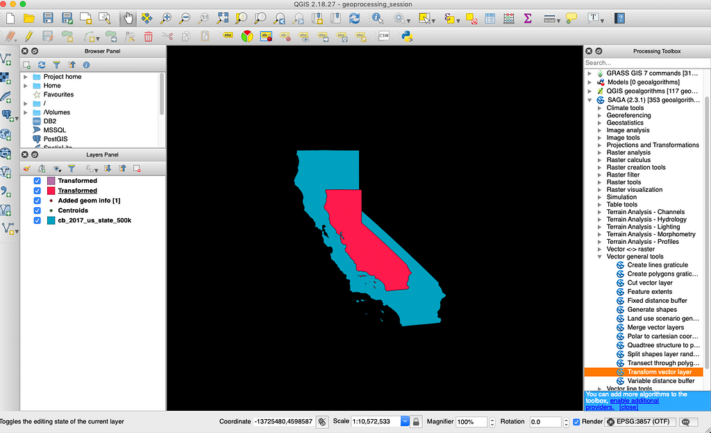
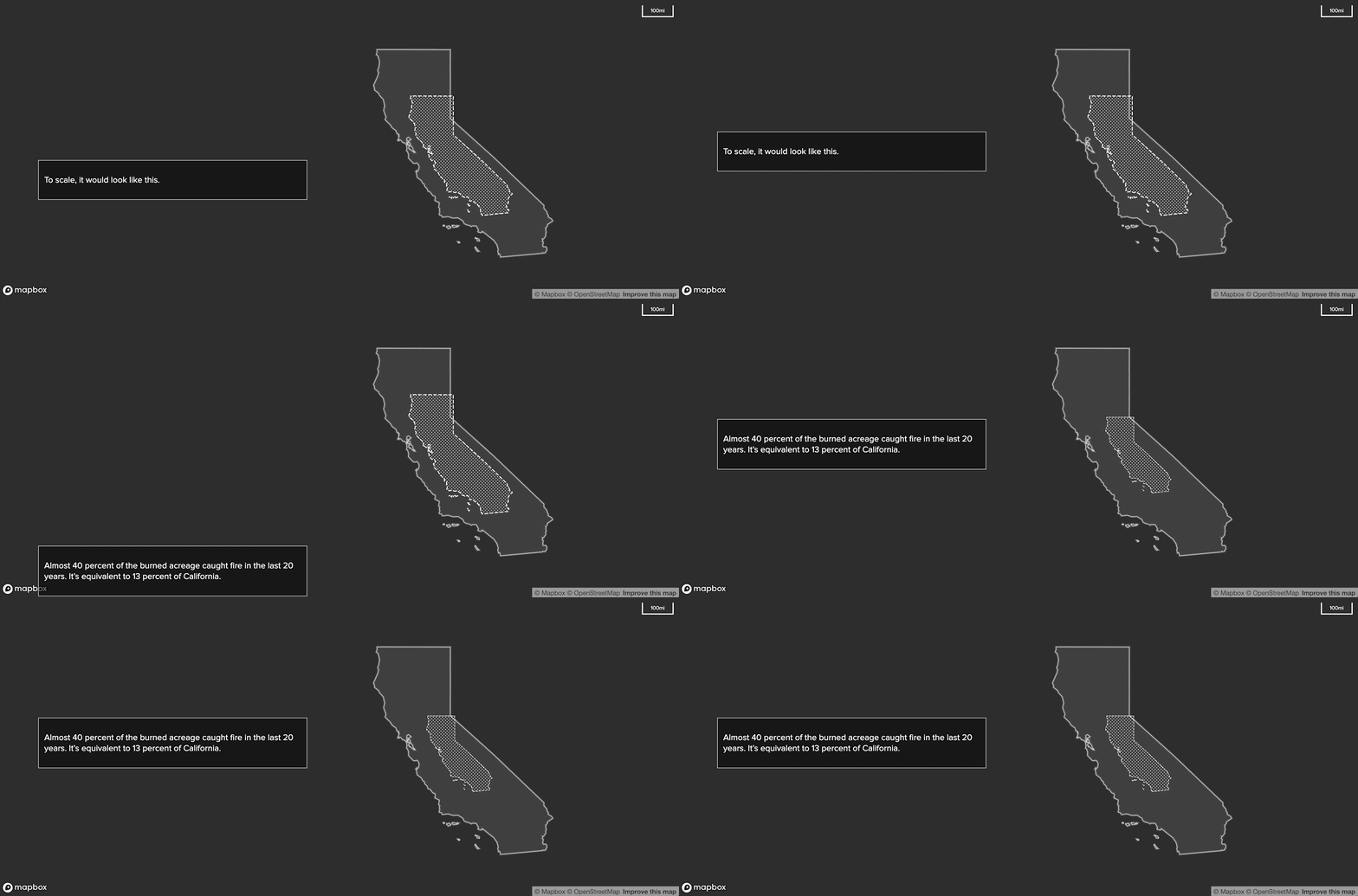
From there, you can upload your transformed vector into Mapbox Studio, style it, and tell your story.
Do you have questions about data visualization with Mapbox? You can email me at lo@mapbox.com or tweet Lo Bénichou.
Visualizing 122 years of wildfire activity was originally published in Points of interest on Medium, where people are continuing the conversation by highlighting and responding to this story.