By: Lo Bénichou
This is part one of a guide series on electoral maps and data visualization.
The 2018 election season is rapidly approaching and with that comes your slew of seasonal red and blue maps. At Mapbox, we know that maps play a huge role in visualizing voting trends, election results, and more. So we wanted to share some different tools you can use to map election data. For the first guide in this series, we focus on Mapbox GL expressions. Expressions are an extremely flexible and powerful visualization tool. With the aid of concrete examples, we will explore multiple types of expressions and ways to visualize election results.
For the following maps, we will be using two tilesets that I have created using QGIS, U.S. Census county shapefiles, and 2016 Presidential election data from Tony McGovern who scraped the data from Townhall.com. The first tileset’s geometries are polygons and the second tileset’s are points.
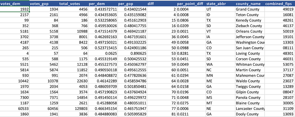
Here is what the data looks like in Excel:

- votes_dem and votes_gop are the number of votes for the democratic candidate and the GOP candidate respectively.
- total_votes is the total count of vote.
- per_dem and per_gop are the percentage of vote for each candidate.
- diff is the difference of votes between the two candidates.
- per_point_diff is the margin of votes in decimal form. per_point_diff is obtained by dividing the difference of votes, diff , by the total of votes, total_votes.
Now that we have our data, let’s take a closer look at expressions.
The anatomy of an expression
Expressions are represented using JSON arrays. The format is:
[type_of_expression, argument_1, argument_2, ...]
type_of_expression is the expression operator like get, *, or case. There are many more, including logical operators, math operators, etc. For a full list, check out our style guide.
The arguments can either be literals — like numbers, strings, or booleans—or they can be expressions as well.
Expressions can be used as a value for any layout properties, paint properties, or filter. That’s the gist.
Expression in action
Visualize a winner
In order to visualize the winner for a county, we want to determine the candidate with the most votes. Here is how to achieve that with a case and a > expression:
In plain English, the expression above says:
“Please look at both votes_dem and votes_gop, and if there are more votes_dem than votes_gop, then make the polygon blue — #1868d1. Otherwise, make it red — #be2d1e.”
Let’s break down this expression and apply what we’ve covered so far:
- ‘case’ is the operator for the expression and is used for conditional logic. We want blue if Democrats are leading or red if they’re not.
- [ is the start of a second expression, which is also the first argument of the case expression
- ‘>’ is the operator of our second expression. We’re comparing number of votes.
- [‘to-number’, [‘get’, ‘votes_dem’]] is the first argument of the ‘>’ expression. It is also two expressions.
- ‘to-number’ is type conversion expression operator. It will convert the value from [‘get’, ‘votes_dem’]into a number.
- ‘get’ is an operator. It retrieves the current feature’s property value.
- ‘votes_dem’ is the name of the property whose value we want to get.
- [‘to-number’, [‘get’, ‘votes_gop’]] is the second argument and will be evaluated against the first argument.
- ] End of our second expression.
- ‘#1868d1’ is the output if the conditional evaluates to true. So if democrats are leading, the fill-color should be blue.
- ‘#be2d1e’ is our fallback.
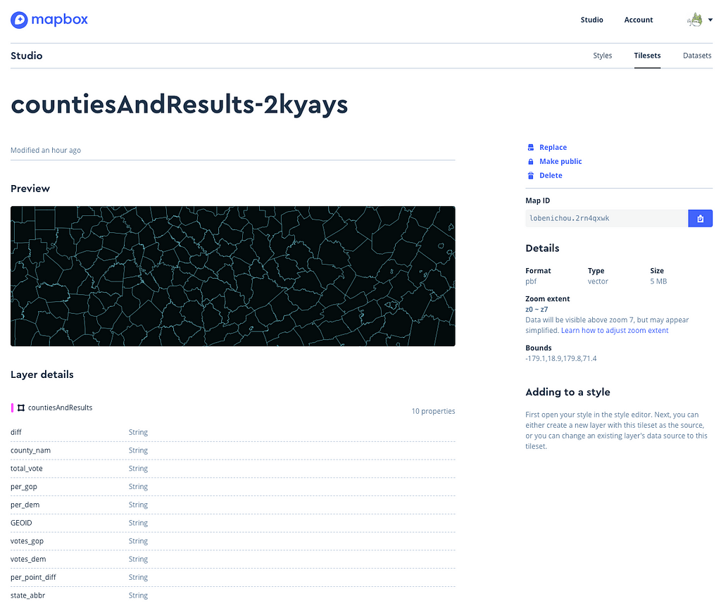
One note about the data types of your feature’s properties. You can check out the type of a property by clicking on your current tileset in the Studio dashboard:

In this case, all the properties are of type string. This means that any calculations using these properties will require a conversion with the to-number expression.
Visualize the vote margin with a single hue
In this example, we’re visualizing the percentage margin between each candidate. For this expression, we’re going to use per_point_diff property.
Once again, let’s break it down:
- ‘interpolate’ This is the expression operator. When creating a ramp, this will produce continuous and smooth results by interpolating between stops.
- [‘linear’] This tells our expression how to interpolate between stops. Here, we’re interpolating linearly.
- [‘*’, [‘to-number’, [‘get’, ‘per_point_diff’]], 100] Here, we are specifying which properties we want to interpolate and doing some basic math. The initial values for 'per_point_diff' are strings and decimals. We want numbers and percentages. So we use the * operator to multiply by 100, and we convert our value, [‘get’, ‘per_point_diff’], with 'to-number'. Voila!
- 0, ‘#f6edf6’ Here comes our stop! 0 is the value of our stop, #f6edf6 is the color we want to use. Same for 50 and 100.
Now, this is great but the information and the story aren’t very clear when using a single color hue. A better way to visualize this information is to color each county based on the winner’s political party.
Visualize the vote margin with winner’s color
In this example, we’re combining the case expression detailed in example #1 and the interpolate expression presented in example #2:
For each county, we’re determining whether the winner is from the GOP or the Democratic party and filling the feature accordingly.
To simplify the visualization, we can also use stepped results by using the step expression. We can then redefine our stops to emphasize any county with a margin over 30%.
With the step expression, you’ll notice that the colors do not blend. This can be useful for categorizing features within pre-defined ranges.
Visualize the size of the lead with circle radius
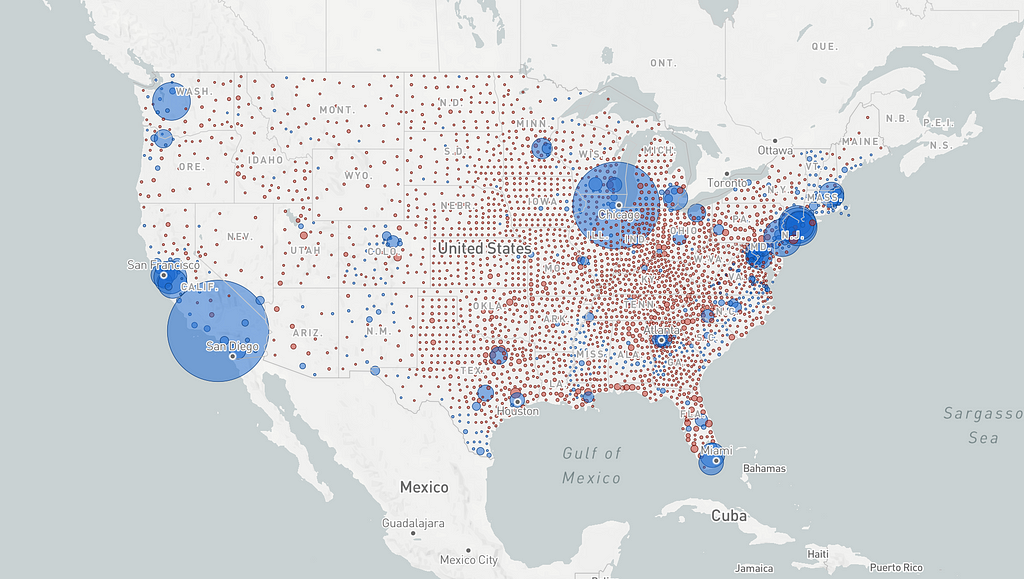
Now let’s try a different approach. In the previous example, we’re displaying the margin based on the total number of votes. We can see that margins are quite large in most of the country. But let’s say we want to see the actual size of each candidate’s lead by county. In that case, color hues aren’t going to cut it. We’re going to need circle-radius:
This visualization tells a very different story than the one above and all we’ve done is apply the same interpolate expression to another paint property in order to display the size of the lead.
Filter counties with less than 100,000 leading votes
Here, we’ve got the same code we’ve covered above except for a new filter property. The expression will filter the features to only show counties where the candidate led with more than 100,000 votes.
Do you have questions about expressions you’re working on? You can email me at lo@mapbox.com or tweet Lo Bénichou
Visualizing Election Data: a guide to Mapbox GL Expressions was originally published in Points of interest on Medium, where people are continuing the conversation by highlighting and responding to this story.