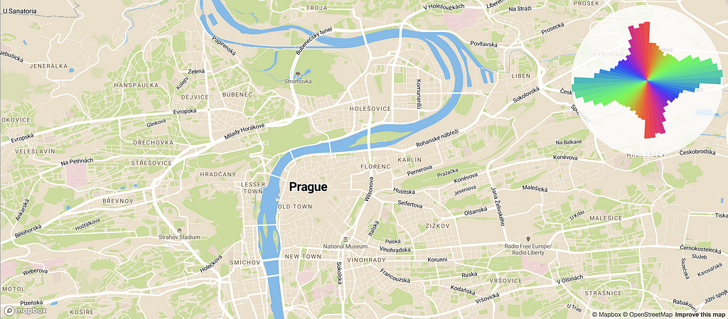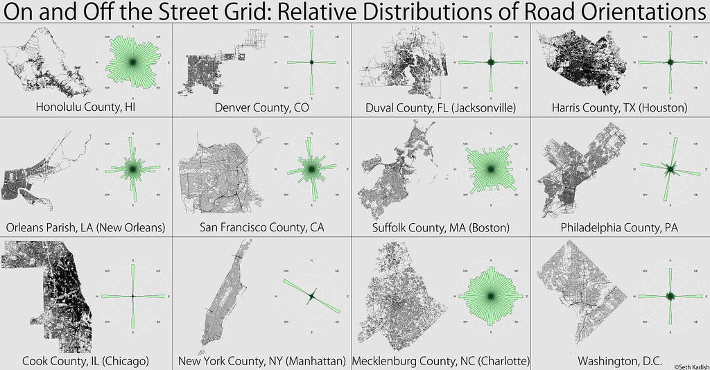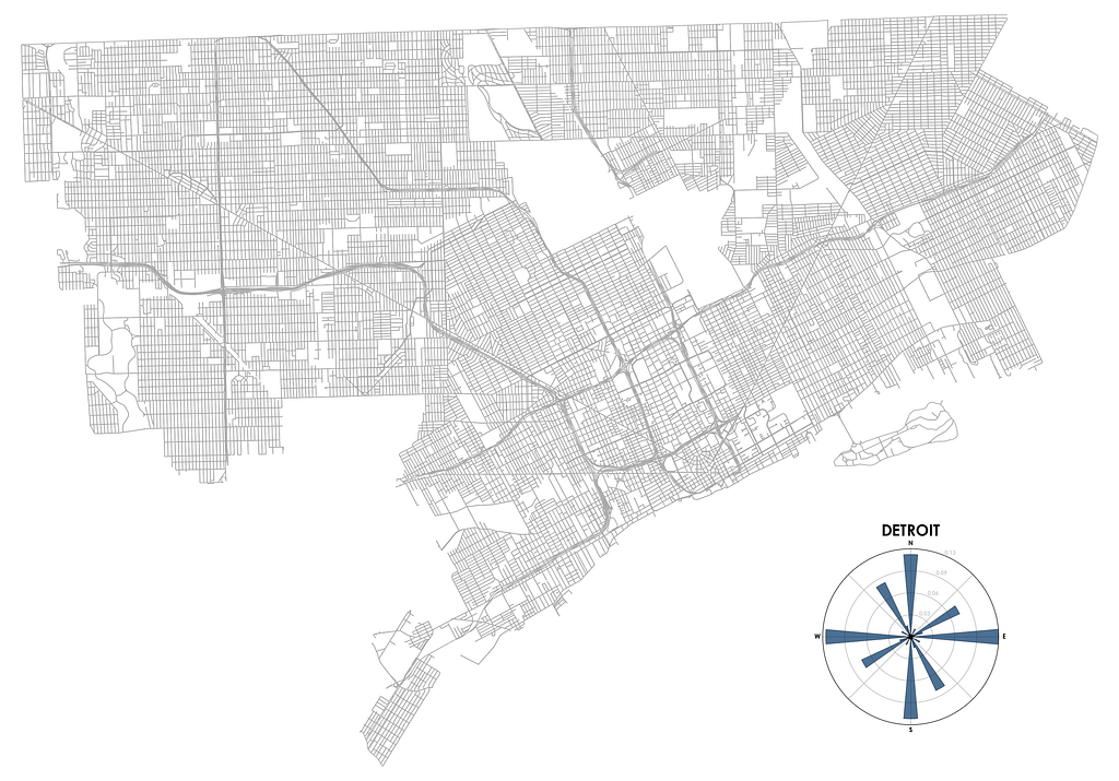
Cities can look and feel very different depending on how they were planned and built, and this is especially apparent when you explore them from above, on a map. Some cities strictly align to a grid, others seem like they grew without any structure, and in some cases, patterns only appear when you examine a city more closely, with each neighborhood having their own distinct style. Could we visualize these patterns?
Seth Kadish invented one great way to do this, and recently Geoff Boeing rediscovered it. They divided 360° into a set of orientation ranges, counted how many road segments belong to each range, and produced a polar histogram that gives us a profound insight into the street pattern of each particular city:


When I saw this, I was hooked instantly— what an ingenious way to look at how a city is built! But I wanted to explore more. How would such a chart look for my city, Kyiv? Or for some of my favorite but lesser known places? How would different neighbors of the same city compare? Or, on a larger scale, how would a European road network compare to the one in the US?
Extracting and processing the road data for every place of interest to generate a polar chart seemed like too much work. Could I do it on an interactive map? It turns out that this is a perfect use case for Mapbox vector maps — since the map data is there on the client, we can analyze and visualize it instantly for any place in the world. Play with the map below to see it in action!
How I built it
The full app is about 80 lines of code. After initializing the map, we set it up to update the visualization every time we move it:
map.on('load', function () {
    updateOrientations();
    map.on('moveend', updateOrientations);
});
In the update routine, we can fetch all the roads on the screen with a single line of code, getting the results in GeoJSON format for easy processing:
var features = map.queryRenderedFeatures({layers: ['road']});To make sure we only visualize road segments that we actually see, not including parts of roads that go off the view, we use a tiny library called lineclip to clip every road feature to the current bounding box:
var clippedLines = [];
for (var j = 0; j < lines.length; j++) {
  clippedLines.push.apply(clippedLines, lineclip(lines[j], bbox));
}
Calculating orientations and lengths for every road segment can be expensive if there are hundreds of thousands of them in our view. So we use cheap-ruler, a library for very fast approximations of geodesic calculations like this:
var ruler = cheapRuler(map.getCenter().lat);
...
for (var i = 0; i < line.length - 1; i++) {
  var bearing = ruler.bearing(line[i], line[i + 1]);
  var distance = ruler.distance(line[i], line[i + 1]);
  ...
For every road segment, we calculate the “bin” it belongs to (we have 64 bins that cover 360°) and accumulate segment lengths for every bin, while also counting every two-way road twice (in both directions):
var k0 = Math.round((bearing + 360) * numBins / 360) % numBins;
var k1 = Math.round((bearing + 180) * numBins / 360) % numBins;
bins[k0] += distance;
if (isTwoWay) bins[k1] += distance;
Finally, to get those pretty, uniform rainbow colors for all orientations on our chart, we use the sinebow function popularized by my coworker Charlie Loyd.
That’s it!
Now play with the interactive map — I spent hours exploring it, and hope you enjoy it as much as I do! Check out the full source code, and hit me up on Twitter if you have any questions!
Visualizing street orientations on an interactive map was originally published in Points of interest on Medium, where people are continuing the conversation by highlighting and responding to this story.