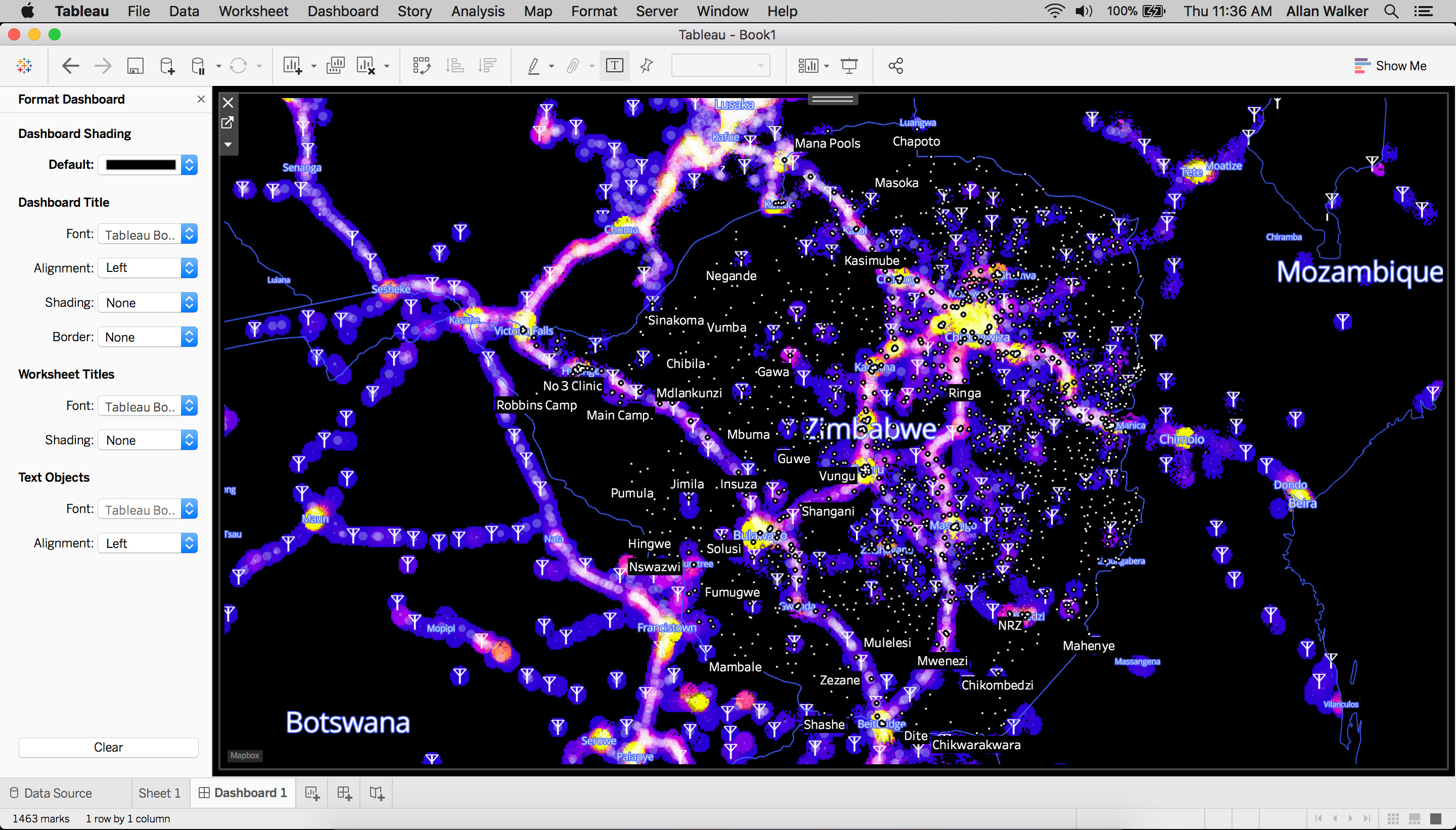
In an earlier post, we shared updates on Mapbox’s ongoing support to the #VisualizeNoMalaria initiative in Zambia and our commitment to helping scale the initiative to the other Elimination 8 countries across southern Africa. That post included a beta version of a web application that visualizes some massive open data sets spanning most of southern Africa. These data sets are input variables for situation dashboards and predictive models that the #VisualizeNoMalaria partners are developing to help public health workers track, respond to, and forecast malaria outbreaks.
Explore the web application here (view via desktop Chrome only, not mobile)
So far, the web app includes data layers for population density, elevation, cell tower visibility, and landcover. Processing and visualizing these 50+ gigabytes of data was a team effort, with major contributions from Eric Fisher, Ryan Baumann, and Sam Matthews. Take a look at how we built it:
Building out layers using QGIS and Mapbox
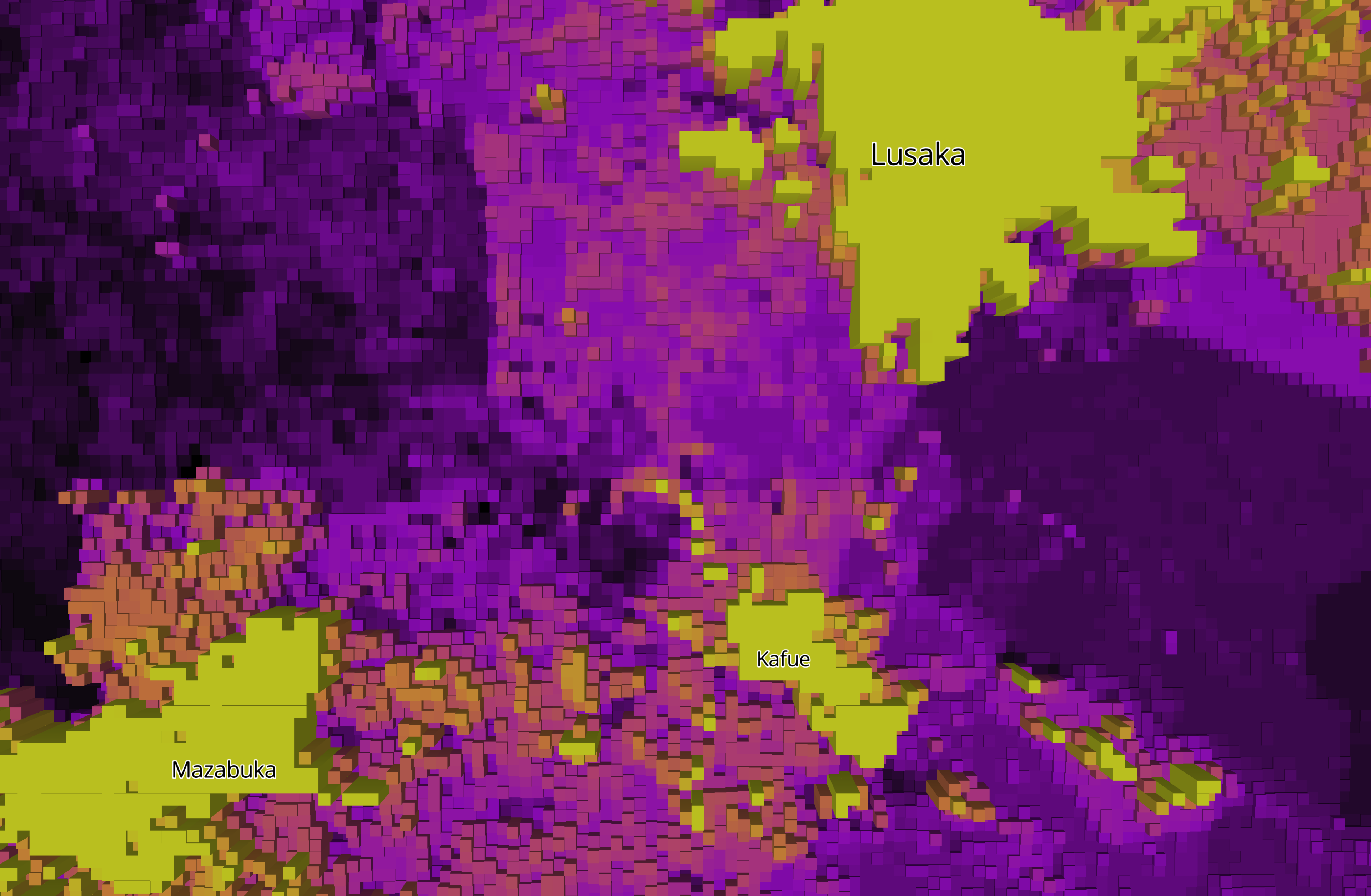
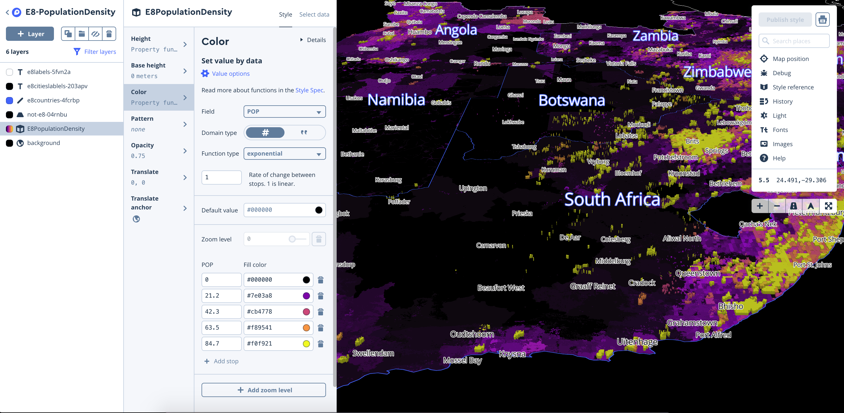
Population density layer
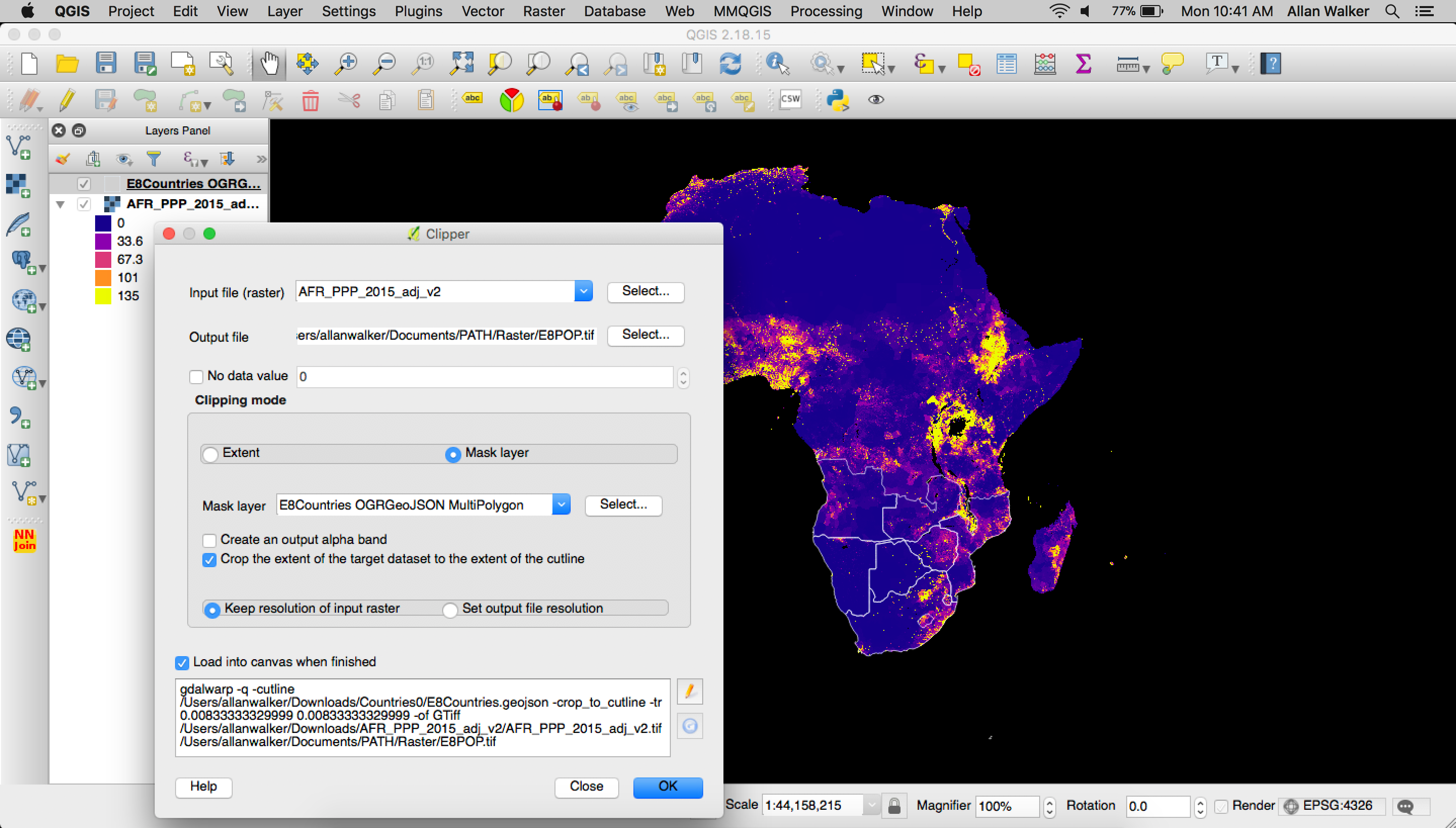
To build out the Population Density visualization we downloaded The WorldPop Africa 1km Population Datasets (2000–2020) for 2015, and clipped the raster geoTIFF with a mask (outline) of the E8 Countries in geojson format (Filtered Natural Earth Admin 0 Countries) using QGIS following: Menu→ Raster → Extraction→ Clipper
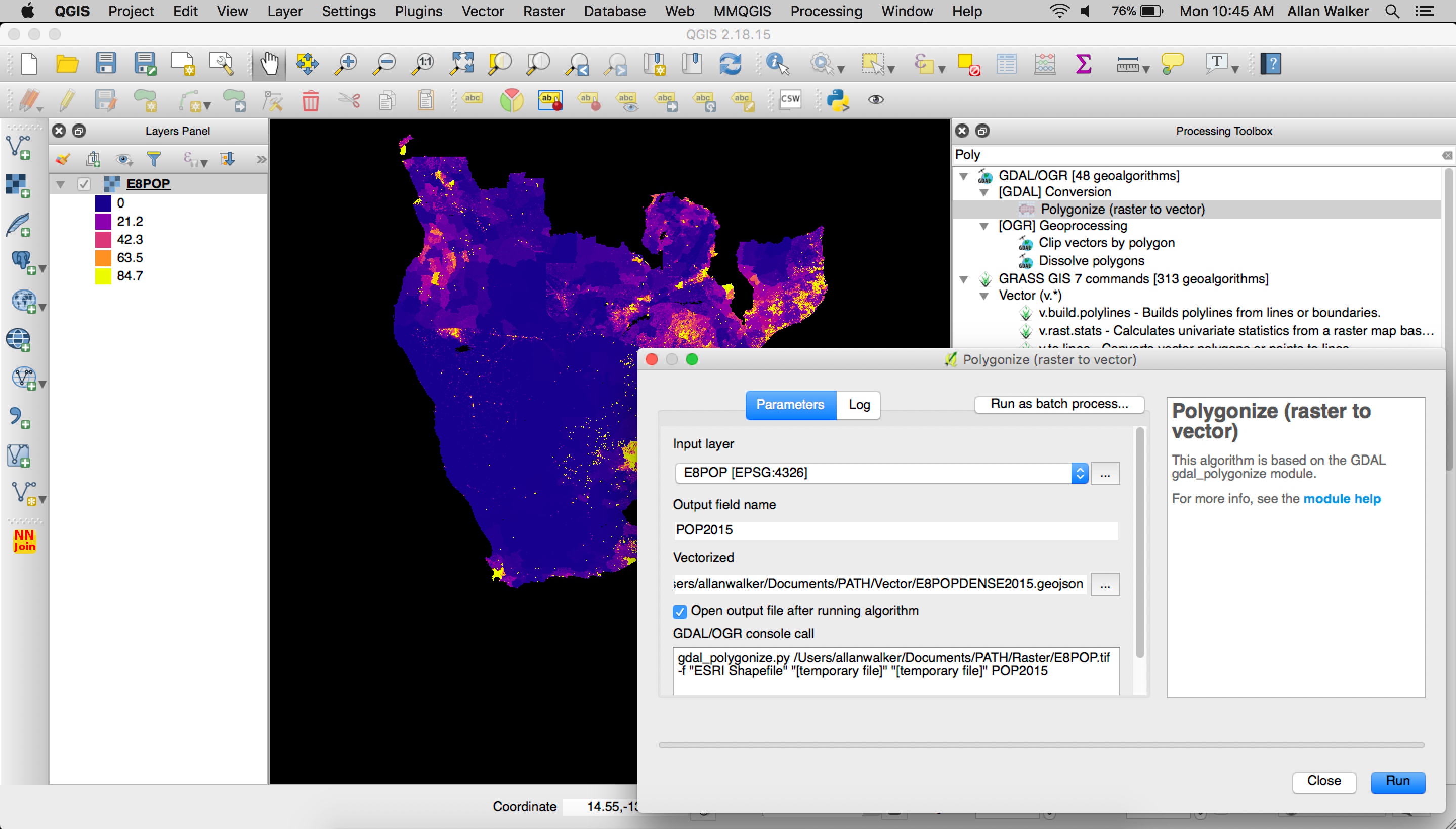
Then we polygonized the clipped geoTIFF by following the steps:
Menu → Processing → GDAL Conversion → Polygonize (Raster to Vector)\
After that, we used tippecanoe to convert the geojson to Vector Tiles:
tippecanoe E8POPULATIONDENSITY.mbtiles -f -P -D8 --reorder -ac --grid-low-zooms -z11 -Z5 E8POP.geojson
We then uploaded our tiles and styled the layer in Studio, using equal interval breaks for color, and extrude heights using the population field.
Elevation layer
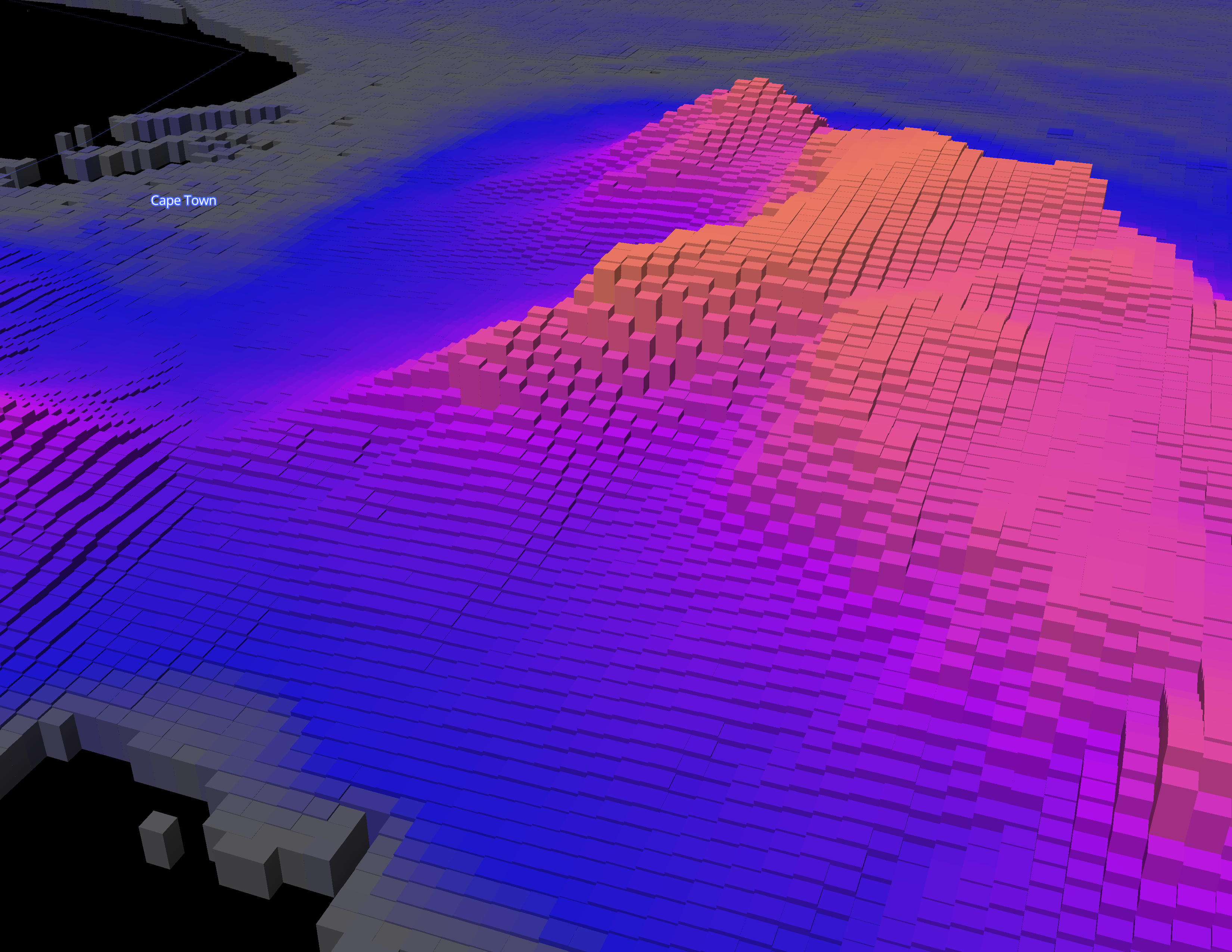
To build out the Elevation visualization we downloaded tiles from CGIAR STRM 90m Digital Elevation Database in geoTIFF format, and merged them using QGIS ( Menu → Processing → GDAL Miscellaneous → Merge). We then clipped the raster geoTIFF with a mask (outline) of the E8 Countries in geojson format as we did previously for Population Density.
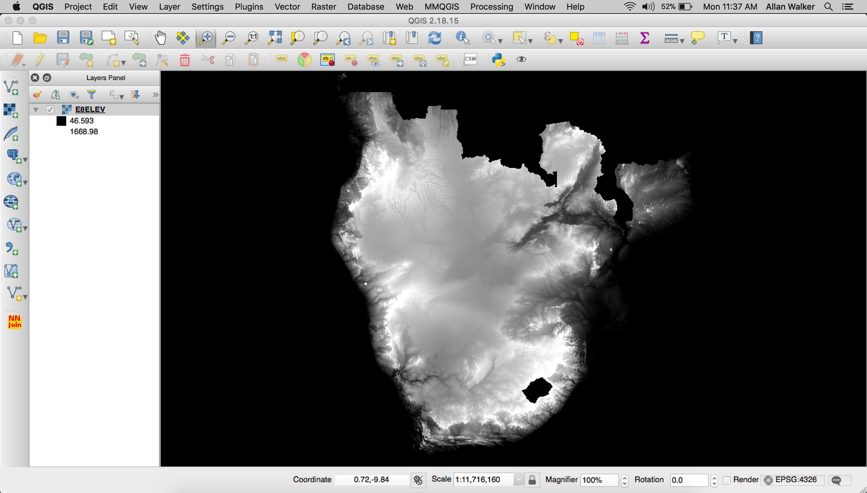
We then needed to polygonize the clipped geoTIFF by following: Menu → Processing → GDAL Conversion → Polygonize (Raster to Vector) and tippecanoe our resulting geojson:
tippecanoe E8ELEVATION.mbtiles -f -P -D8 --reorder -ac --grid-low-zooms -z11 -Z5 E8ELEV.geojson
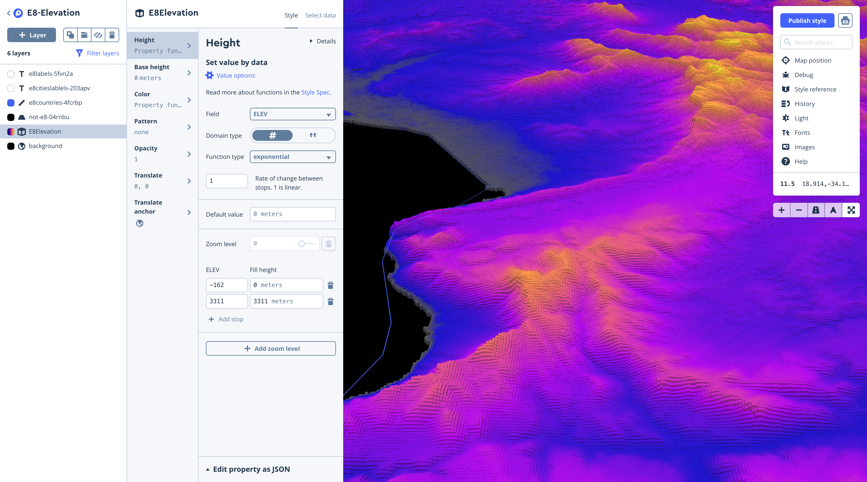
Next, we uploaded our tiles and again styled the layer in Studio, using equal interval breaks for color, and extruded heights using the elevation field.
Cell tower viewshed
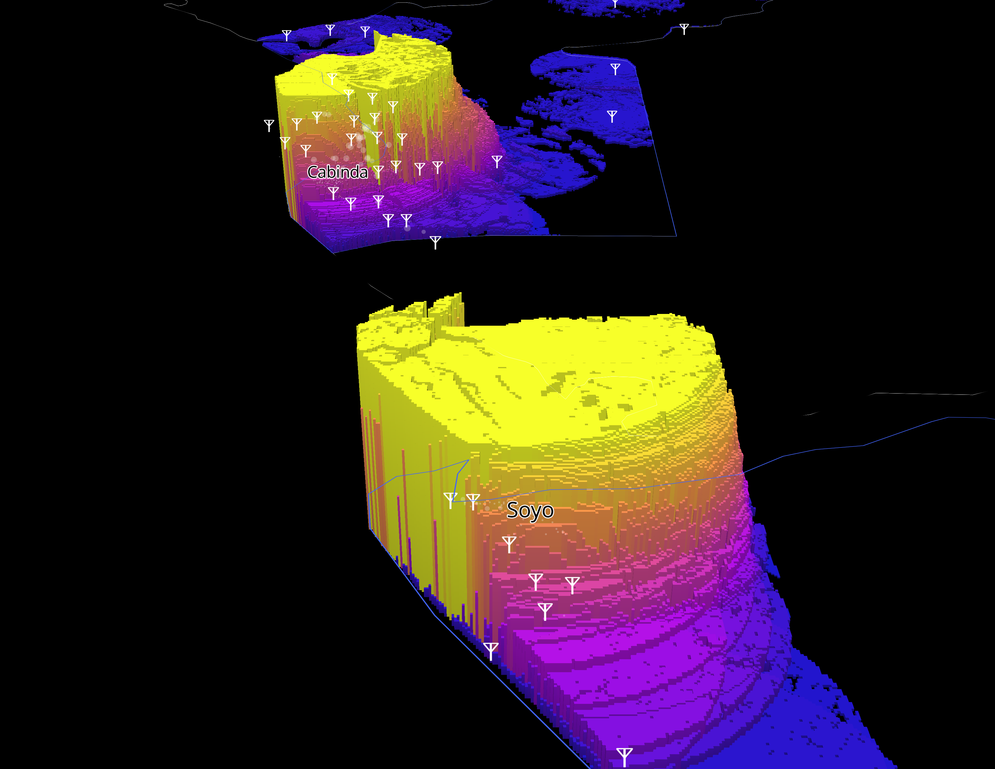
To build out this visualization we downloaded a CSV of the Global Cell Tower database from OpenCellid after obtaining an API key. This CSV was filtered down for the E8 Countries using the MCC Code.
Then we obtained the centroids of the Population Density geojson file by following Menu → Vector → Geometry Tools→ Polygon Centroids.
Next, we loaded in our Elevation GeoTIFF and start the QGIS plugin called Advanced Viewshed Analysis.
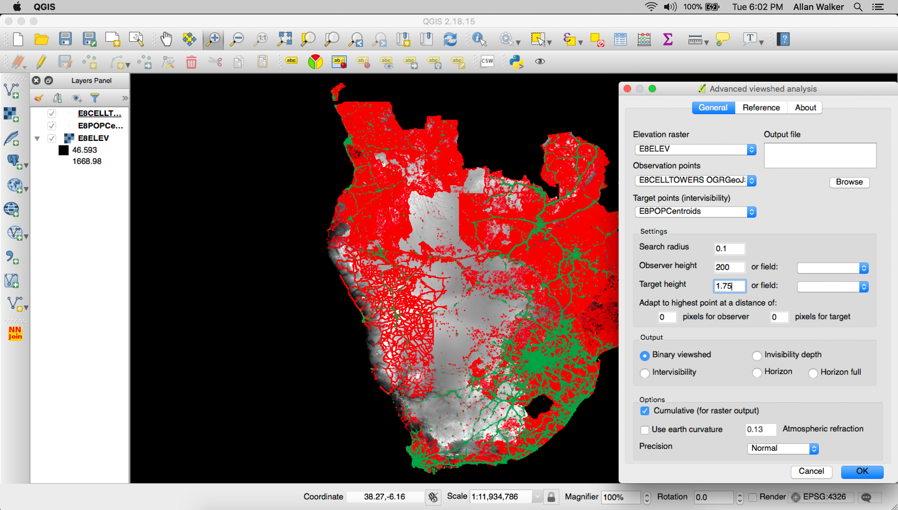
In this phase we:
- Set the Observation Points as the Cell Towers, and the Target Points as the Population Centroids.
- Set a search radius of 0.1 Degrees.
- Set the Observer Height as 200 Meters (above the Elevation).
- Set the Target Height as 1.75 Meters (above the Elevation).
- Output a cumulative binary viewshed geoTIFF
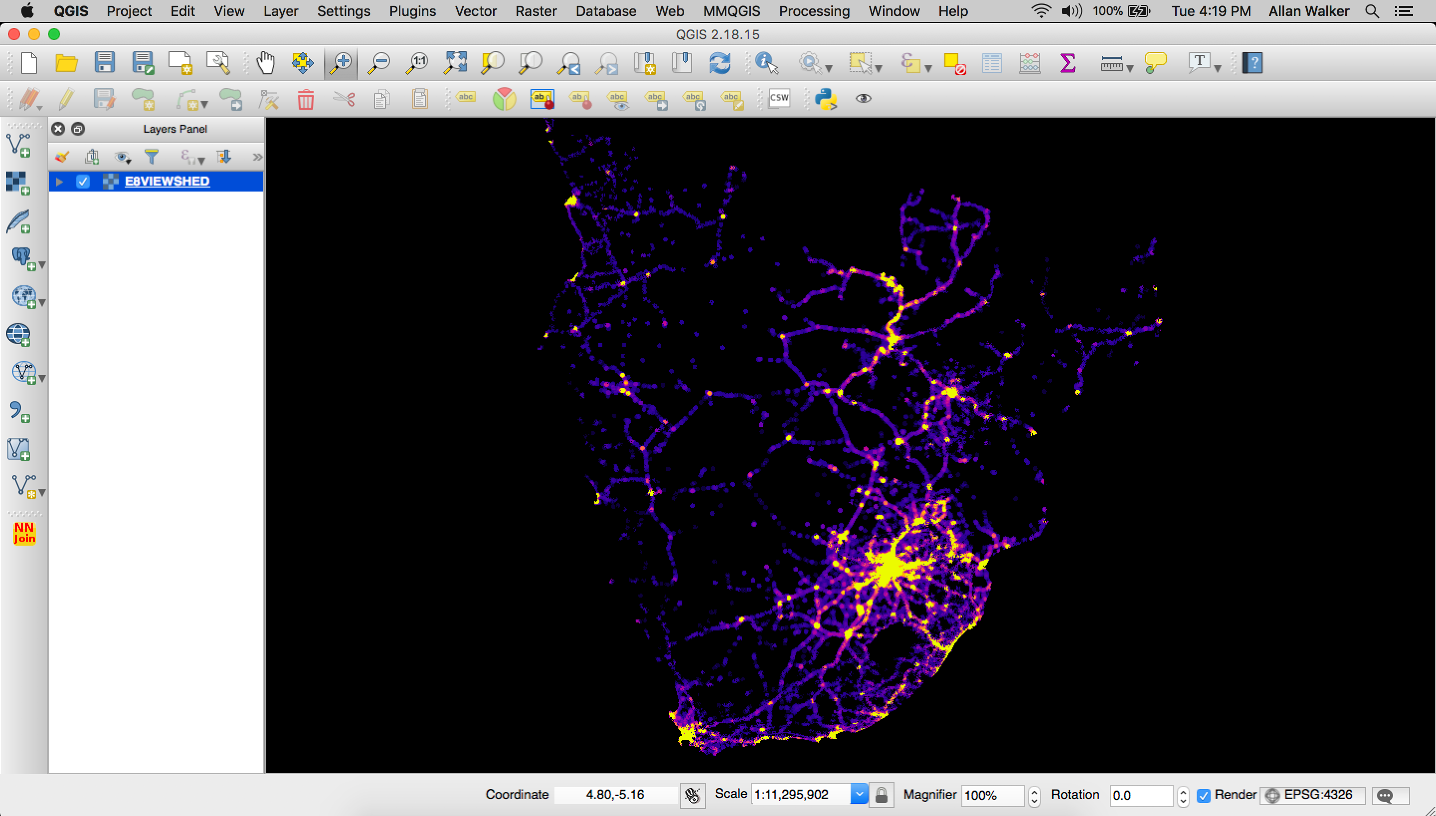
Then we polygonize the output geoTIFF:
Menu → Processing → GDAL Conversion → Polygonize (Raster to Vector) and tippecanoe our resulting geojson is:
tippecanoe E8VIEWSHED.mbtiles -f -P -D8 --reorder -ac --grid-low-zooms -z11 -Z5 E8VIEWSHED.geojson
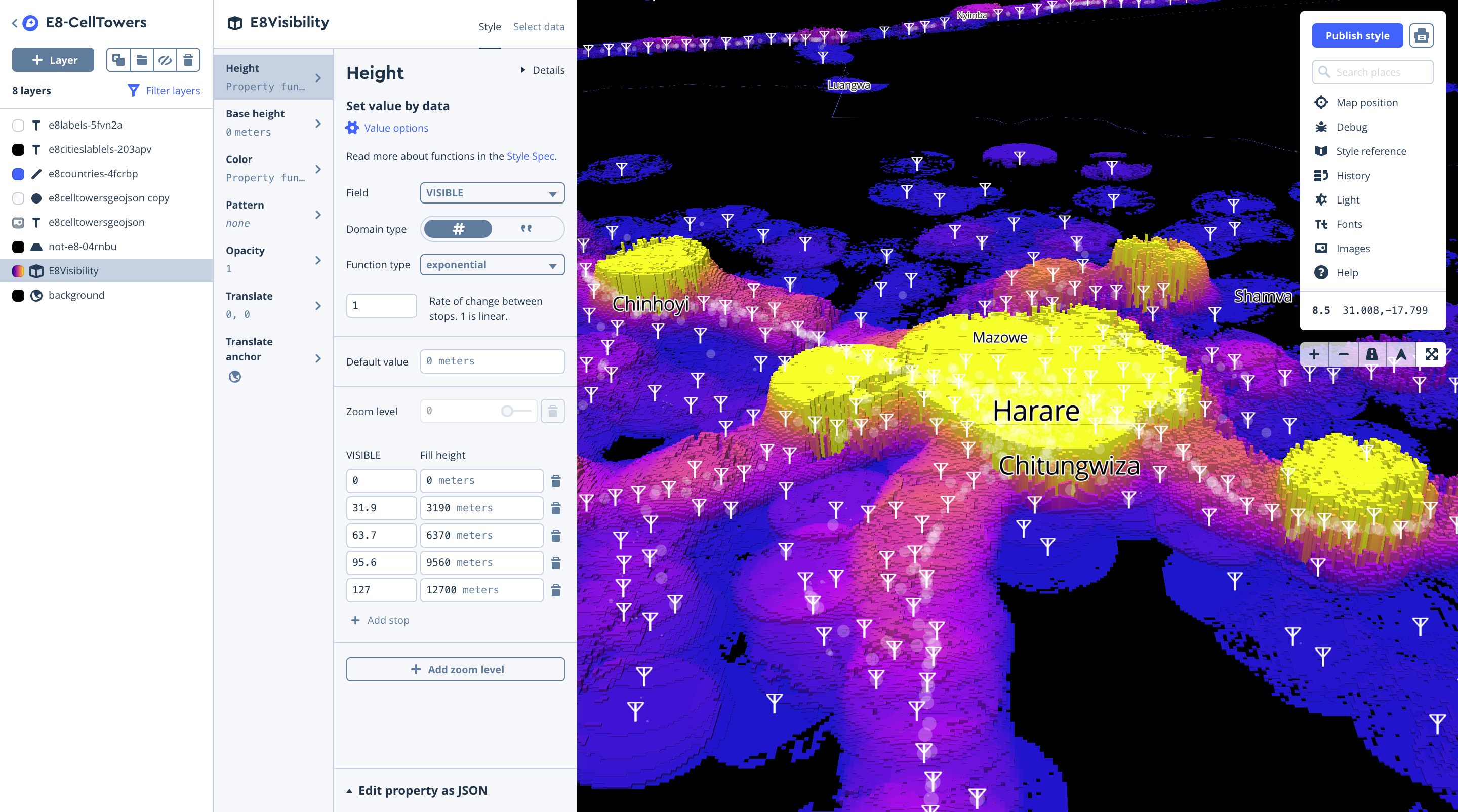
Like before, we uploaded our tiles and styled the layer in Studio, using equal interval breaks for color, and extrude heights using the visibility field.
Landcover layer
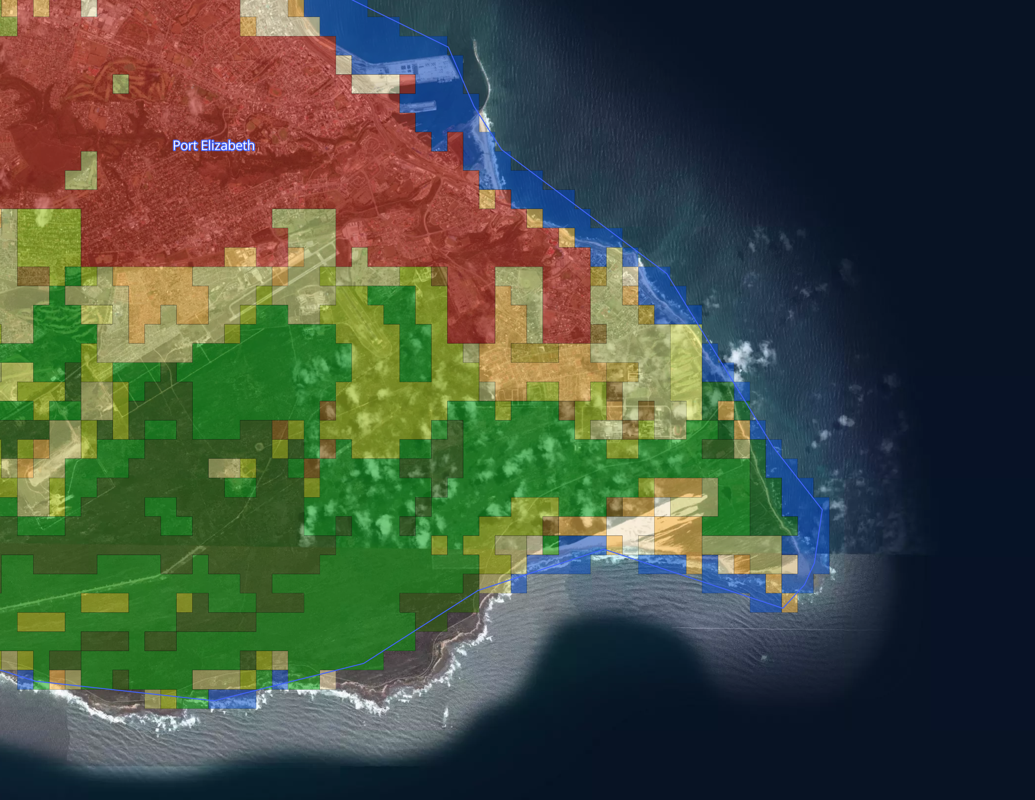
To build out the Landcover visualization we downloaded the Globcover 2009 geoTIFF from the European Space Agency, with the accompanying metadata legend in Microsoft Excel format.
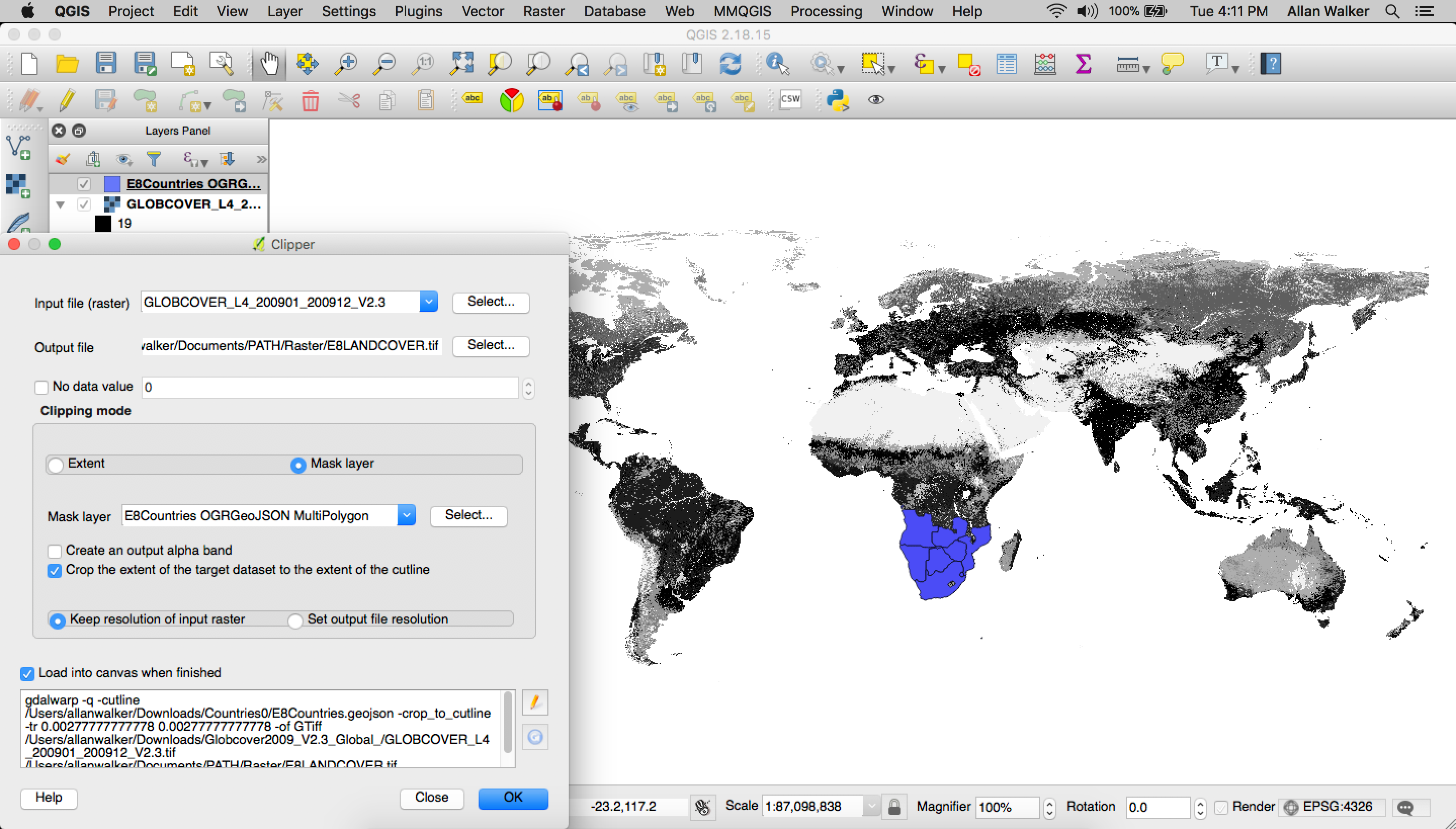
We then clipped the raster geoTIFF with a mask (outline) of the E8 Countries in geojson format (Filtered Natural Earth Admin 0 Countries) using QGIS following the path:
Menu → Raster → Extraction → Clipper
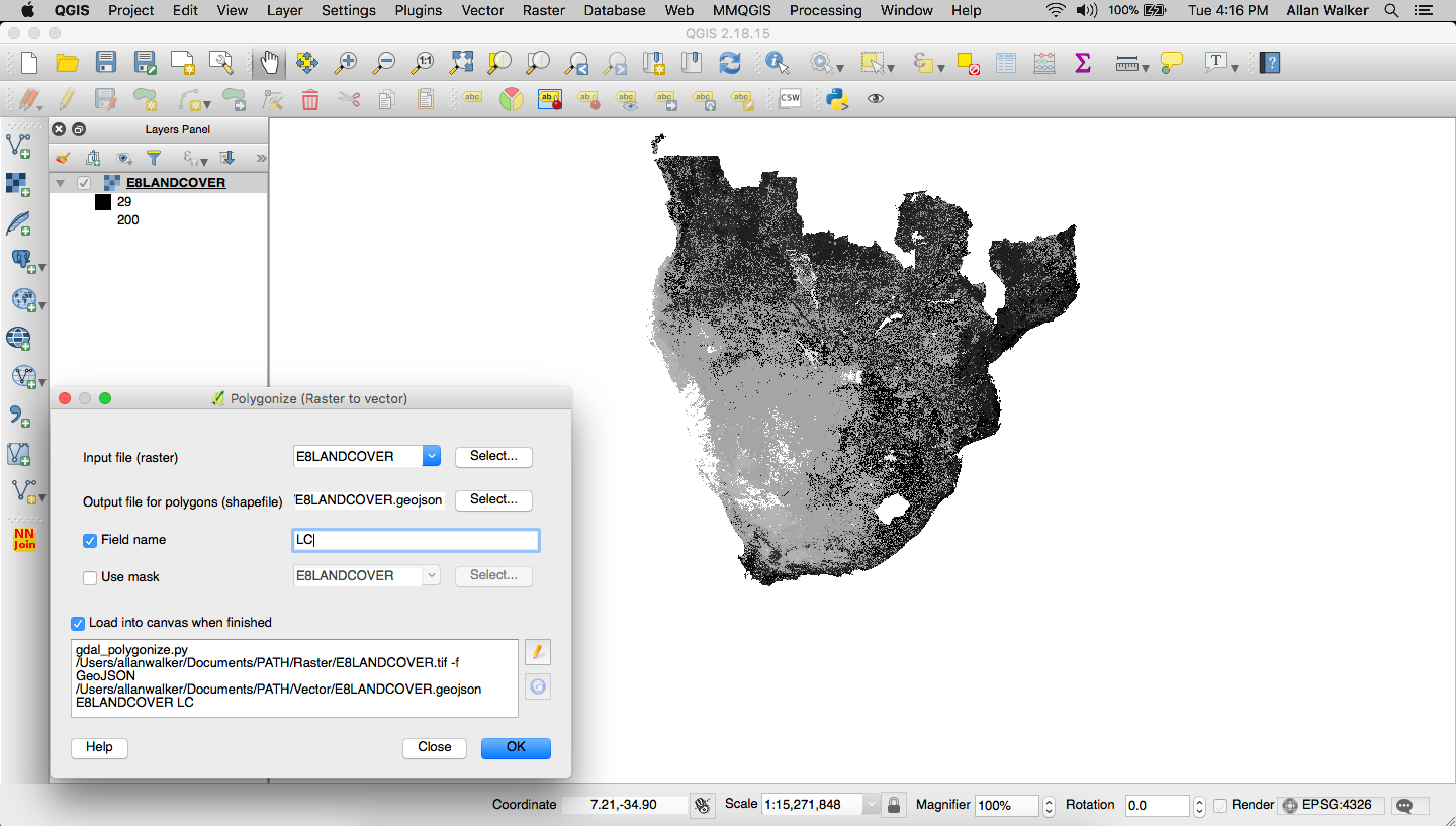
Then we polygonize the clipped geoTIFF:
Menu → Processing → GDAL Conversion → Polygonize (Raster to Vector)
When that was finished, we used tippecanoe to convert the geojson to Mapbox Vector Tiles:
tippecanoe E8LANDCOVER.mbtiles -f -P -D8 --reorder -ac --grid-low-zooms -z11 -Z5 E8LANDCOVER.geojson
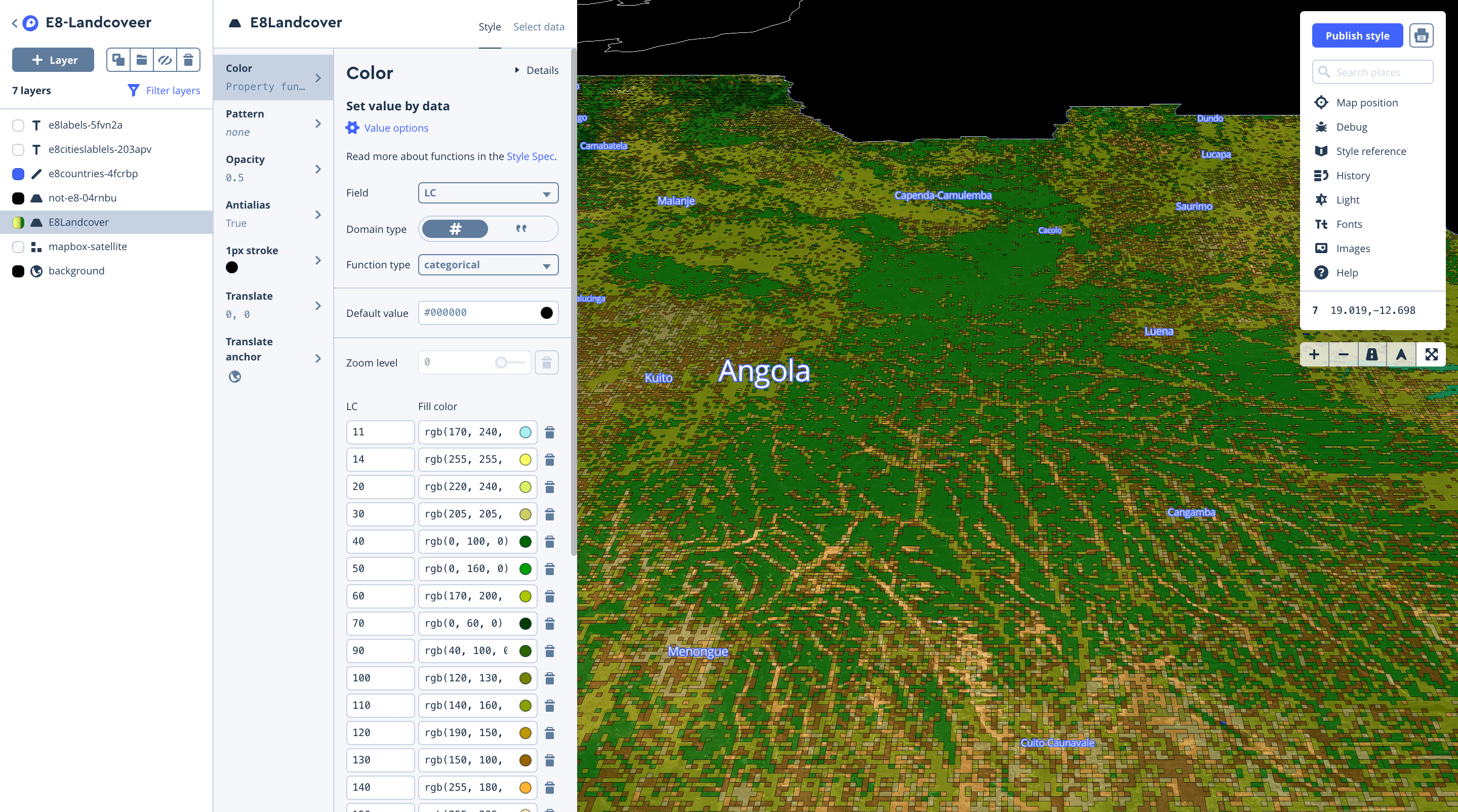
Then we uploaded our tiles and styled the layer in Studio, using categorical values from the landcover field, matching them to the RGB values in the meta data legend.
Building out the app
The web app uses similar logic from two Mapbox GL JS tutorial examples (Change a map’s style & Update a choropleth layer by zoom) to allow users to select which layer they want to explore and then shows the corresponding legend.
To give the users this capability, we used JQuery to select the layer with a drop down, and then conditionally show or hide the relevant legend.
HTML:
JQuery/Javascript:
Using the Mapbox Layers in Tableau
All of the layers we created above can be used as background maps with Tableau by copying the style’s integration URL:
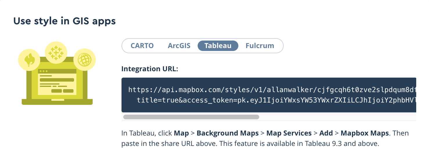
Then paste the URL in Tableau by following the path Menu → Map → Background Maps→ Map Services→ Add → Mapbox Services. The background map can also be used for additional context for further analysis.

Building tools with impact
We are continuing to process additional datasets and working with our #VisualizeNoMalaria partners to integrate these data layers into the #VisualizeNoMalaria situation awareness dashboards and forecasting model.
Want to learn more about how we’re supporting #VisualizeNoMalaria and other global health and development initiatives? Get in touch with our Community team.
How I Built It: Model Input Variable Explorer for #VisualizeNoMalaria was originally published in Points of interest on Medium, where people are continuing the conversation by highlighting and responding to this story.