By Erin Quinn
Recently, we released a new raster digital elevation model (DEM) source for styling terrain maps called Mapbox Terrain RGB. While styling any map in our cartography editor, Mapbox Studio, this data is available by adding the tileset as a new layer:
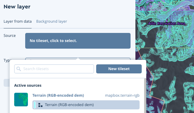
This guide specifically will use Tristen’s Relief style (← which you can add to your account from this link) as a canvas to build a custom styled terrain map. Let’s dig in!
Adjust the colors & intensity of your hillshading layer
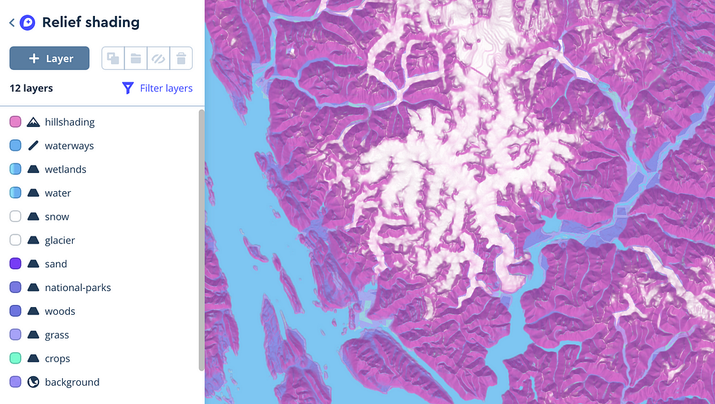
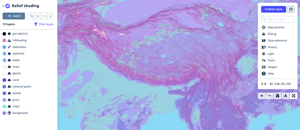
Take a second to orient yourself to the Studio interface. On your left is the layers list which details the types of data that make up your map. This style uses a short number of common land-use types which is ideal for a shaded relief map to really stand out.
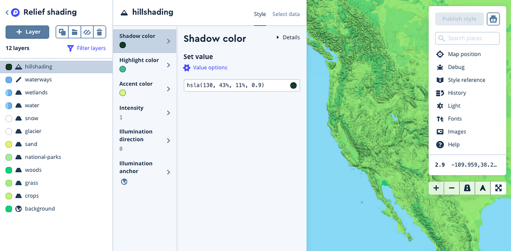
Let’s start by choosing a color scheme to make this map your own:
- Select your hillshading layer from the layers list (as shown above)
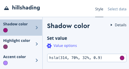
- Click into each panel — shadow color, highlight color , and accent color — to experiment with complimentary colors of your choice
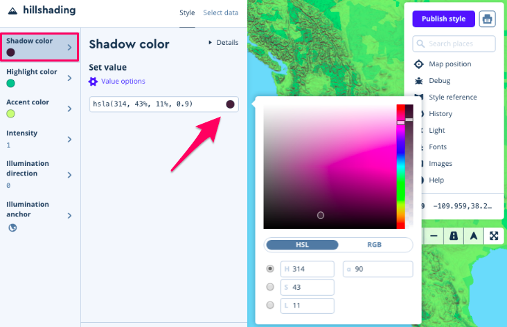
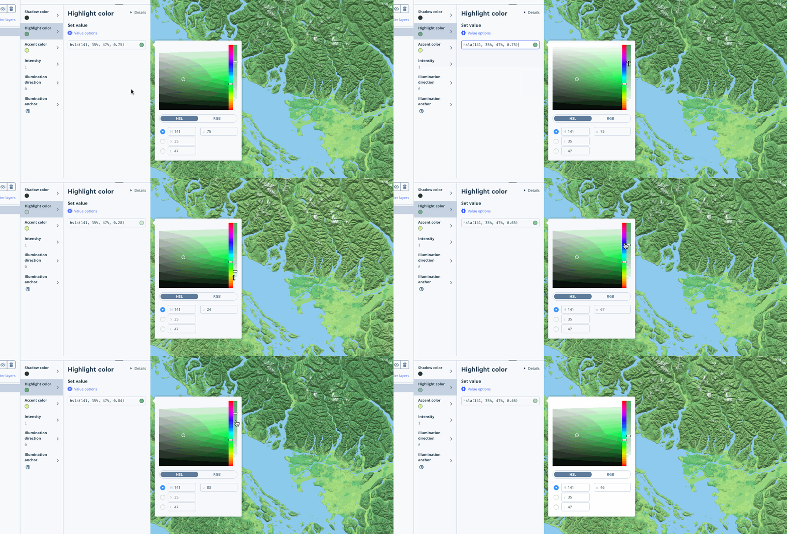
Note that accent color works well from a design perspective when the color opacity of the shadow and highlight properties are adjusted (using the right toggle in your color window):
For my style, I’ve chosen a festive, bright pink/purple/blue theme:
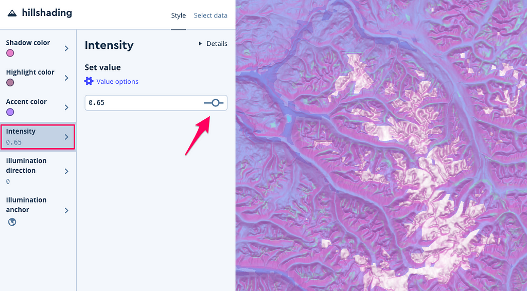
Another styling option is adjusting the Intensity of all the colors your layer uses — the intensity of this screenshot is set to .65 for a softer look, while the others below are a set to a full 1:
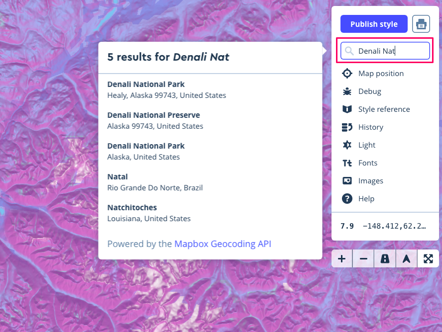
While you’re styling, you may find it helpful to use the search box to find mountainous territory — try Kathmandu, Nepal or Denali National Park, Alaska:
Continue styling color and intensity for all 12 layers
Click into each layer and choose colors that fit your theme as described above. My palette 🎨:
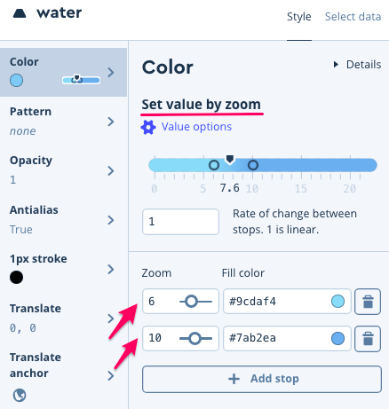
One interesting note about Tristen’s original map design — he uses the styling technique set value by zoom as described in the Studio Manual to create a better contrast between water and hillshading when shown at higher zoom levels.
Zoom in on the map yourself to see the water fade from turquoise → baby blue:
Styling illumination direction
Now that you’ve got the basics down, we can try to mirror Molly’s simulation of how the sun moves across terrain in her blog post Realistic Terrain With Custom Styling. For your hillshading layer, click into illumination direction and play around with the slider -
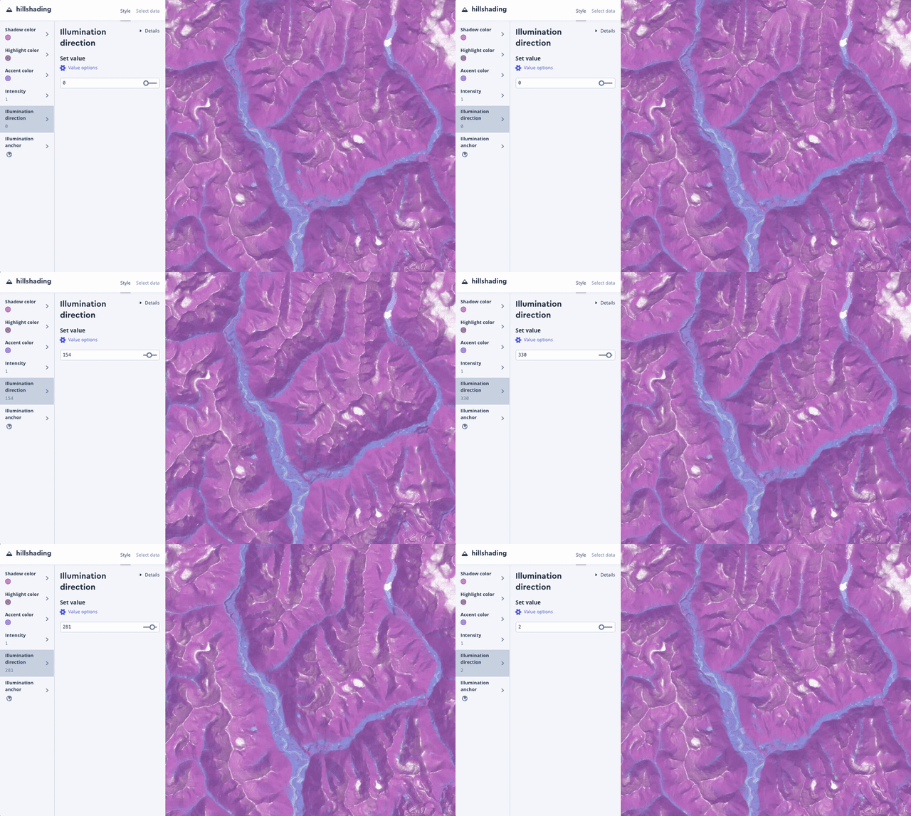
It’s worth noting that Molly accomplishes this effect in her post with the JavaScript library Mapbox GL JS. Check out the hillshade code example and the hillshade style spec to change any of these properties at runtime with JavaScript.
Share a screenshot or GIF on social 🎥
My favorite tool for Mac is Giphy Capture because you can edit your GIFs, but use whatever you’re comfortable with to grab a gnarly GIF zooming around your unique style. Share on Twitter with #mapwithmapbox to enter into the raffle for free Locate tickets, Mapbox swag, etc.
At least the author of the next #mapwithmapbox guide thinks it's 🔥😉 https://t.co/pbMgOhQilv
Stuck? We’re here for you!
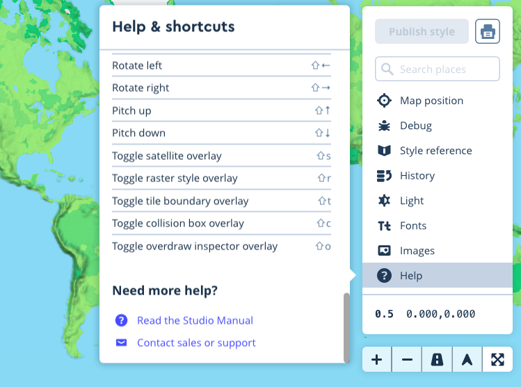
We’ll be on Twitter from this Thursday from 1–2 pm PST for #mappyhour answering questions. Send any questions taggin Mapbox and using #mappyhour and we’ll solve them with you, live. But don’t worry, we’d love to help you at any time on the chance you get incredibly stuck — reach out to us! While in the app — you can contact us from the Help panel on the right side of your screen -
Styling Mapbox Terrain RGB was originally published in Points of interest on Medium, where people are continuing the conversation by highlighting and responding to this story.