How we’re mapping the quality of our satellite tiles
By: Damon Burgett
We’ve been developing new ways to evaluate our satellite and aerial data at scale. On the Satellite team, we manage petapixels of imagery, covering the whole world. One of our main challenges is simply keeping track of what we have — and how good it looks. It’s far too much imagery to review by hand (scrolling through the whole satellite map at full resolution would take centuries), so I’ve deployed fast image evaluation algorithms in a random sampling framework. I’ll walk through how we’ve created a Satellite Health Index and how you can adapt our model to your own projects.
Pixelmonster puts images on the map…
We acquire imagery for our basemap continuously from dozens of sources, open and commercial, satellite and aerial. If we had to render every source manually, we’d need a team three times the size. Instead, we’ve built a pipeline to automate every automatable aspect of the image rendering process. Internally we call it Pixelmonster. Image reformatting, color adjustment, compositing, and quality assurance all happen within Pixelmonster.
…but then we have to update the map
What Pixelmonster can’t replace is our judgment in choosing where to update the map. Update prioritization is a big part of our work. We don’t see updates just as map improvements: the way we think of it, the updates are the map. In other words, our goal isn’t to make a great map and then patch it up occasionally. Our goal is for the map to continuously grow and change as the world does. It should be as close to live as we can make it.
So updates aren’t an occasional concern — they’re what we do. The question is where to update on any given week. It boils down to two factors:
- Where are our users?
- Where does our imagery need improvement?
We’ll come back to user location in a minute. First, let’s explore this…
What does it mean for imagery to be good?
Image quality is different things for different people. One of the challenges and joys of building a basemap — a general-purpose map — is that it has to work well for many different customers. For example:
Mappers
OpenStreetMap mappers use Mapbox Satellite to build and maintain maps for public use and in response to disasters. They tend to be most interested in resolution and contrast, even at the expense of aesthetic quality. For example, for many purposes, they’d be perfectly happy with black-and-white imagery if it were sharp, but that would be out of the question for…
API users
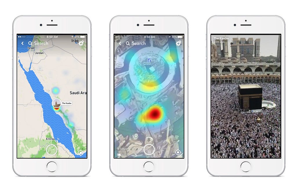
These are people seeing Mapbox Satellite through third-party sites and apps. They want clear, accurately colored images of where they live, the highway ahead of them, the house they’re thinking of renting, the location of the news story they’re reading, or where their friends are posting from.
Designers and developers
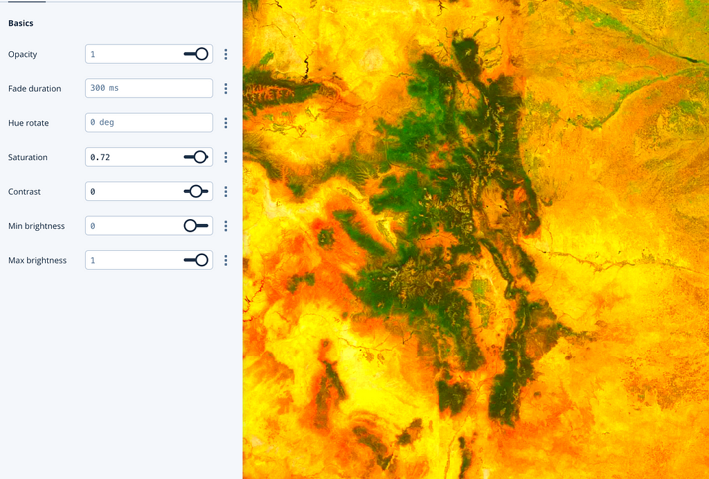
People developing geo projects need customizable maps. You can filter Satellite anywhichway, whether you want to turn everything green on St Patrick’s Day, apply a texture effect, or just crank up the saturation:
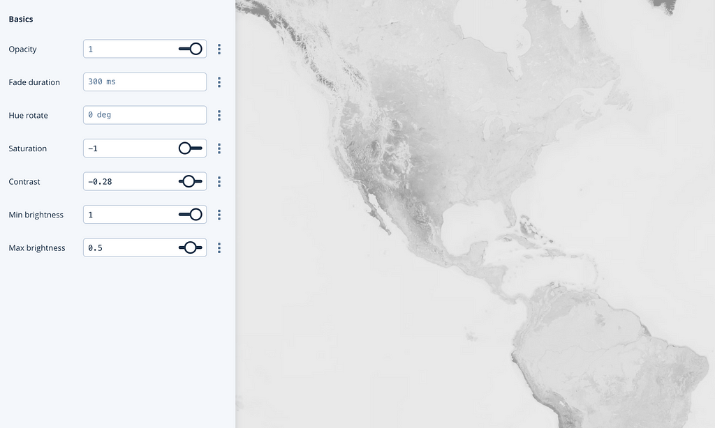
Or if you want a muted background (instead of a headache) for a data visualization project, try no saturation at all:
Where are our users?
We’ve learned to look at where users are rather than where they’re already using the map. If you open a map and see a cloud covering your location, you’ll probably just close the map. From our perspective, that means that those map tiles would never rise to the top of the list of most-requested tiles, and we wouldn’t know the area mattered. The bad imagery and low map use would spiral. So we give tile requests relatively little weight, and much more to our anonymized telemetry data.
Here’s a screenshot of an internal tool for browsing that anonymized data:
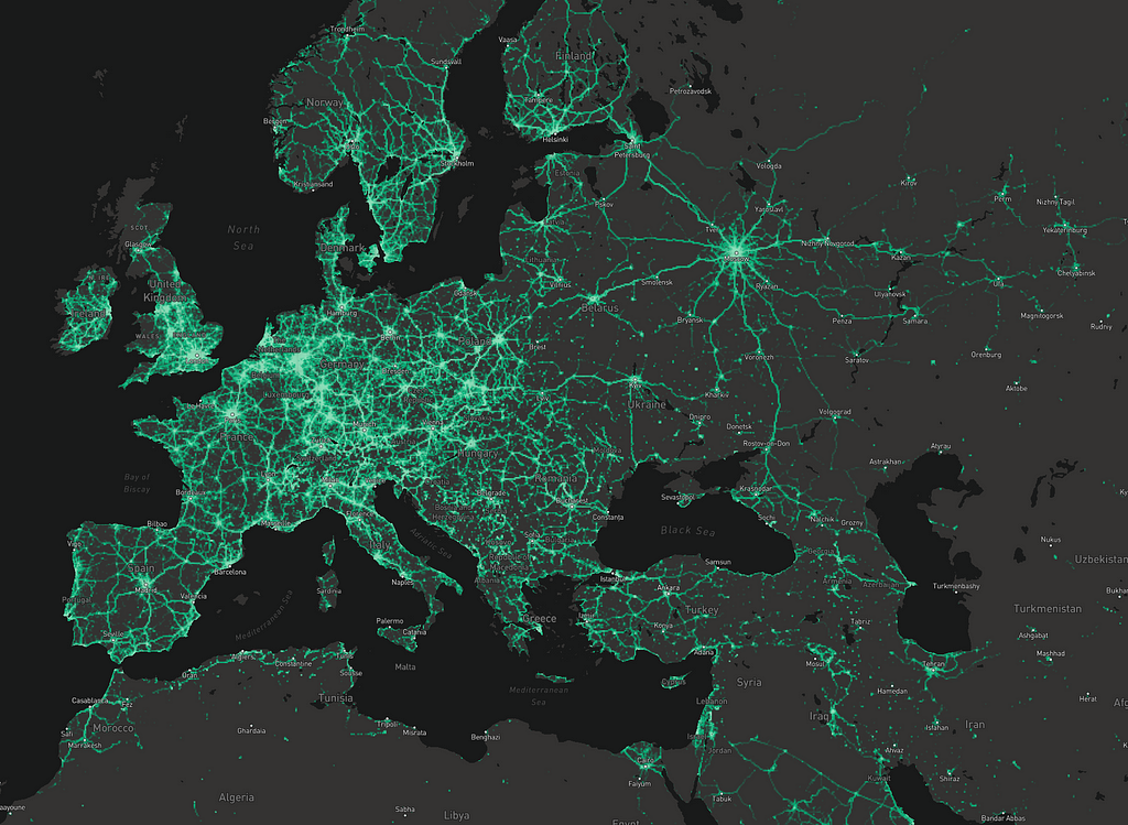
We only have access to general patterns, but they are incredibly useful. With this map, for example, you can clearly see that updates for Norway should focus on the coasts and main highway routes, whereas use in the Netherlands is more evenly distributed.
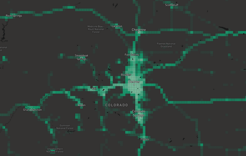
There are some artifacts in the data that come from anonymization. For example, we bin to zoom level 13 tiles, so if you zoom in, everything’s aggregated to a grid:
Furthermore, we can’t see exactly how many points have been collected in any bin. Instead, as part of the anonymization process, we normalize within each country. That means that where a more populated country borders a less populated one, you see a “shelf” — like the long straight border between the US and Canada in the image below:
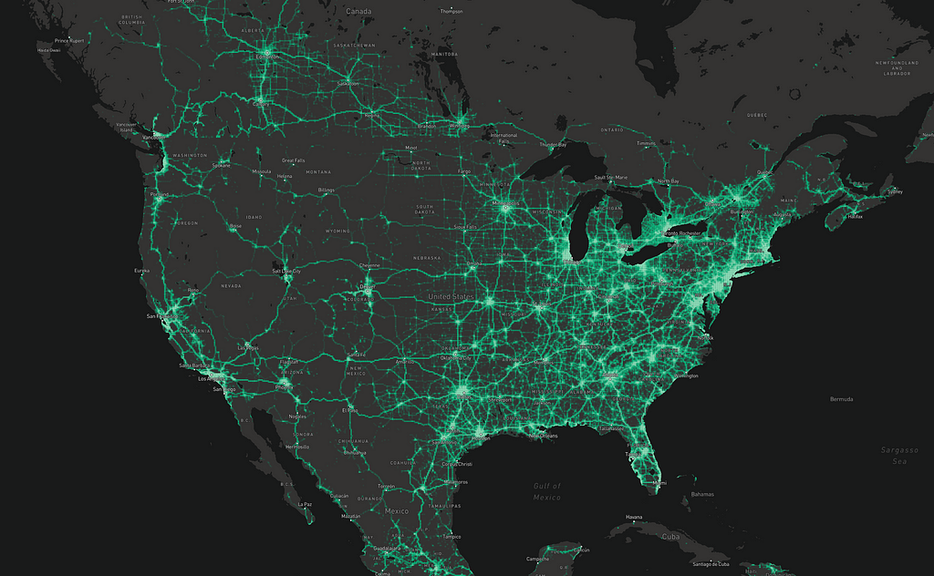
Normalization also encourages us to pay attention to patterns within smaller countries. We aim to support our users everywhere, not just in the most populated places in the world.
Where is imagery not good?
Finding low-quality imagery is harder from a technical point of view because there’s no proxy for it; you have to look at the pixels themselves. And imperfect imagery is a fact of life in the imagery business — no matter how sharp it is, someone will want it sharper. Plus, as imagery platforms and processing improve, our standards rise. So it’s all about relative quality.
We boil quality down to three primary dimensions:
- Clouds, haze, and clarity: can you see the ground?
- Color: does it look right?
- Sharpness: can you zoom in?
Clouds
Perfect cloud detection is a surprisingly difficult problem in remote sensing. For this project, rather than trying for a failsafe cloud detector, we use a simple algorithm that produces false positives (mainly for snow and playas). That’s fine for this particular task because those areas are relatively unpopulated and unchanging, and thus low-priority anyway. So I wrote the fastest cloud detector possible. All it returns is the proportion of a tile that’s a contiguous area of near-white!
Color
This detector is related but a little more robust. It looks for tiles with large contiguous areas with low variation between the R, G, and B color channels.
Sharpness
To measure sharpness, we blur the image (by down-and-upsampling), then look at the standard deviation of variance between that and the original image. There are other ways of measuring sharpness, but empirically this was fast and accurate for the particular kinds of poor resolution that we encounter most often in source data.
Scaling with montilecarlo
At zoom 18, there are 13,026,525,184 tiles. At roughly 40 kB per tile, that’s half a petabyte. And 18 isn’t the highest zoom level we serve. We’d rather not download all of that if we don’t need to, especially while testing algorithms.
We think of success here as an asymptote and take a statistical approach. Using a toolkit I’ve written called montilecarlo, we sample the map at high resolution and interpolate. It’s not exactly a true monte carlo analysis, but the pun was too good to pass up. I wasn’t sure about this at first, but in practice, the variables we’re measuring are highly spatially correlated. That means that if a tile has a problem, it’s likely its neighbor does too. To explain, let me employ an outdated yet highly relevant meme — Salt Bae.

Say we want to know the amount of marbling on bae’s steak. Let’s assume that bae’s forearm is configured to disperse salt in a random fashion, and he has, in his fingers, exactly 1,000 grains of salt. After completely and artfully dispersing these crystals, if we visited each one and recorded whether it landed on fat or muscle, we’d have a good estimate of the amount of marbling in the steak. If we knew the exact position of each grain of salt, we could also interpolate and “map” the marbling. Here’s an example showing pixel values sampled from a satellite image:
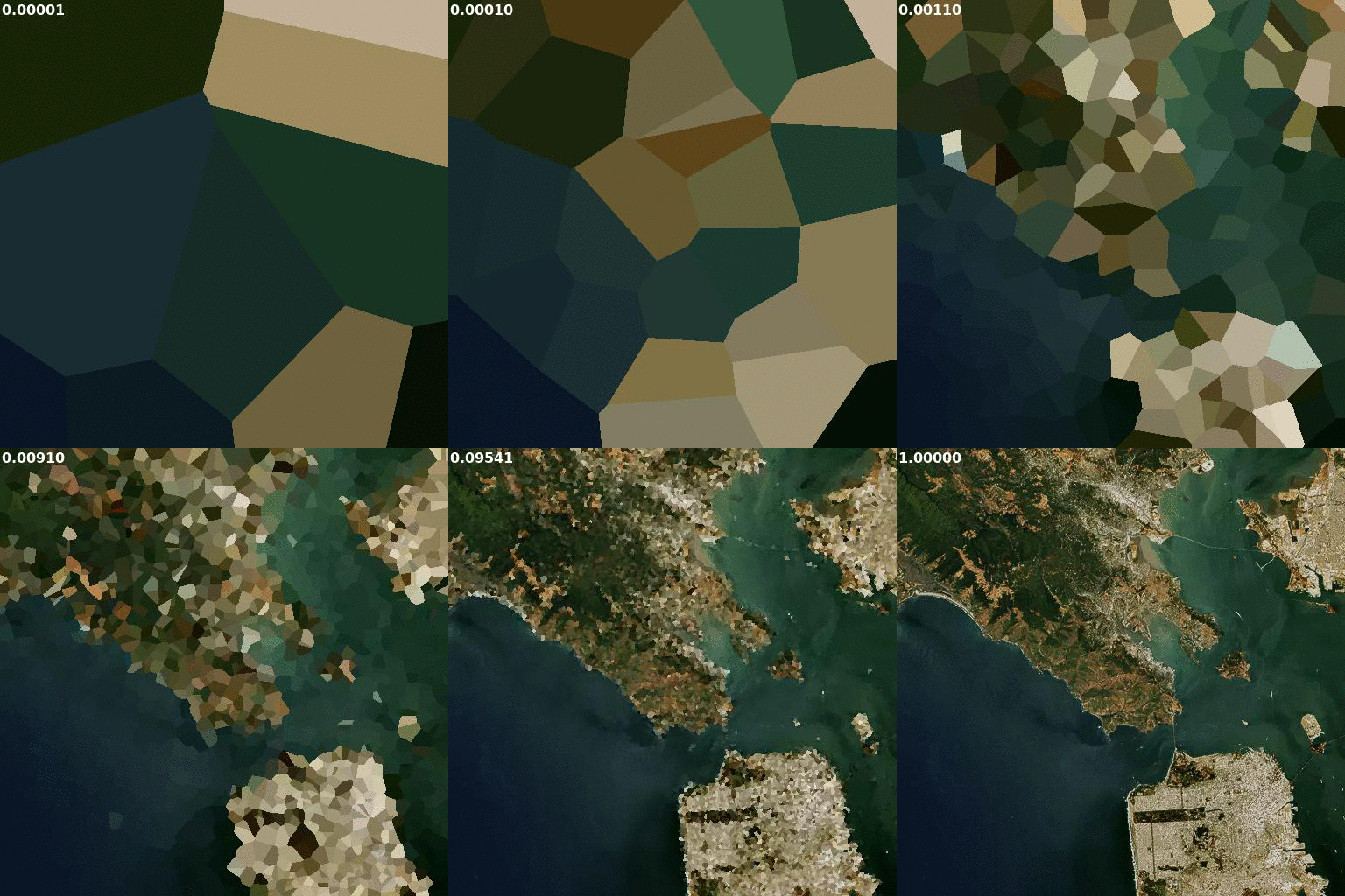
This image is animated to show sampling rates from 0.00001 to 1.
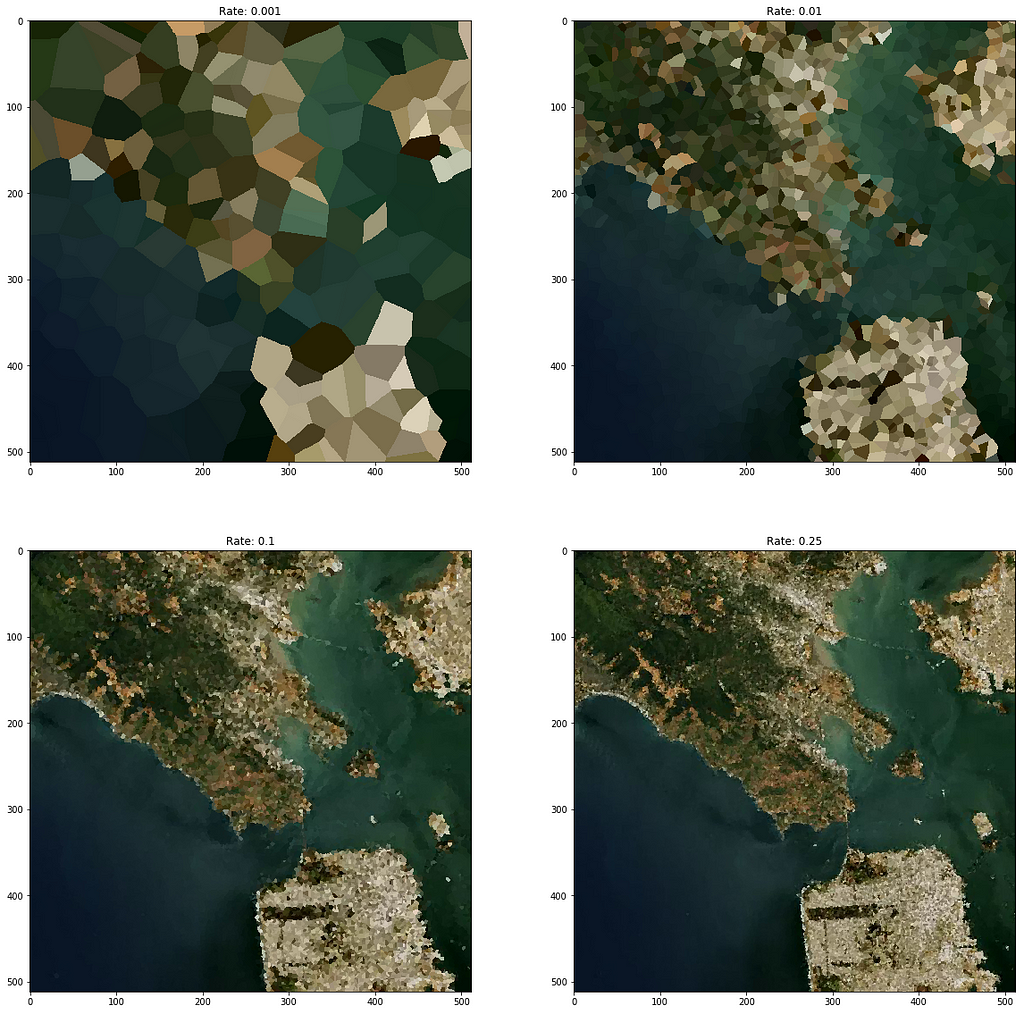
At ~0.001 (every 1000th pixel) you can make out the general shape of surface features. At 0.01 (every 100th pixel) you can clearly see the macro pattern of landcover. And at 0.1 (every 10th pixel) it just looks like a blurry image.
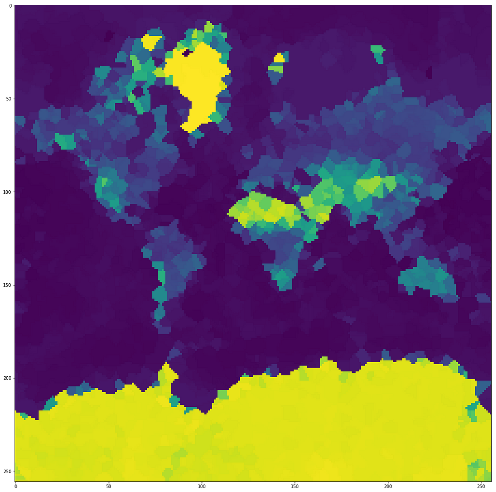
Montilecarlo works just like this, but at a higher scale: by sampling tiles instead of pixels. Given a bounding tile and a sampling zoom, it samples tiles and returns an interpolated output raster. Each internal tile becomes one output pixel. (This means that the dimensions of the output == 2 - (sampling zoom - bounding zoom)).
Exploring this approach
One key point here is that the constituent algorithms of a quality index, or anything in a similar problem space, can be very simple. For my task, looking at more imagery by running faster leads to more practical accuracy than spending a lot of energy trying to make the smartest possible judgment about each tile. That said, the same sampling approach can be applied to other kinds of problems where a sophisticated algorithm (say, a machine learning model) can be appropriate.
Here are a few real examples of the metrics I used:
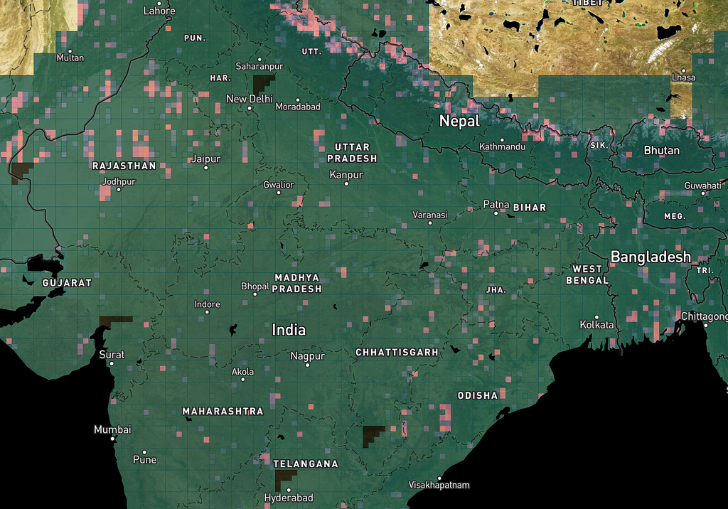
The cloud algorithm found some bad spots in India, plus some false positives on sand and snow:
Look how the Great Salt Lake and White Sands, for example, pop out when it’s run on the western US:
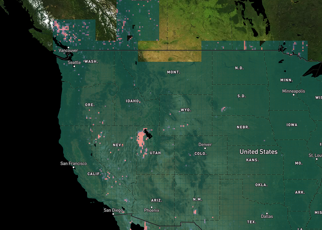
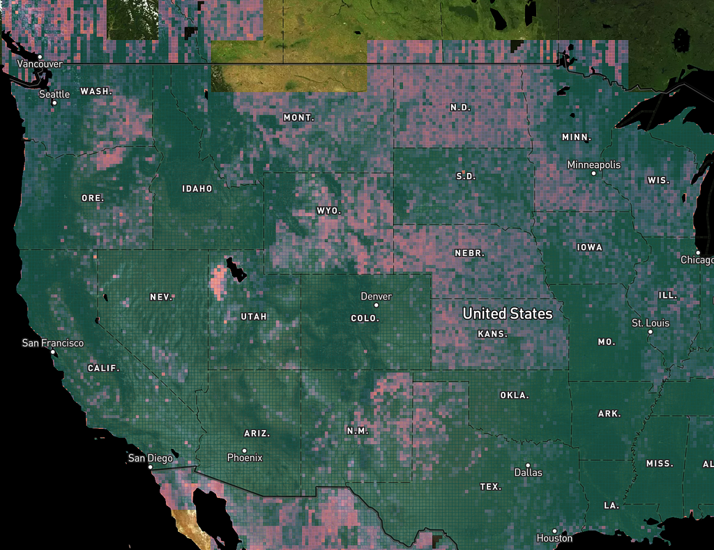
If we run the sharpness algorithm over the Western US at zoom levels that use NAIP imagery, the Great Salt Lake lights up again, but we also see slight variations between states with different NAIP characteristics:
Integrating the metrics
We combine the cloud, color, and sharpness metrics into a composite called the Satellite Health Index, or SHI.
We first tried using the geometric mean of the three subindexes, but it tended to miss spots that were really bad in only one dimension. Using the lowest of the three was too sensitive to false positives. We settled on the harmonic mean.
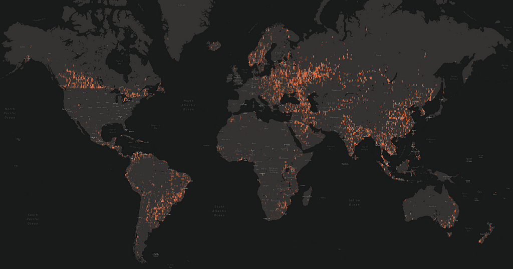
With the integrated SHI, we can create a “map of the map” in terms of imagery quality, for any area, at any scale, and at any sampling frequency for a particular update. Here’s what the SHI looked like when we ran the model over the world at the beginning of last year:
Part of the coast of South America:
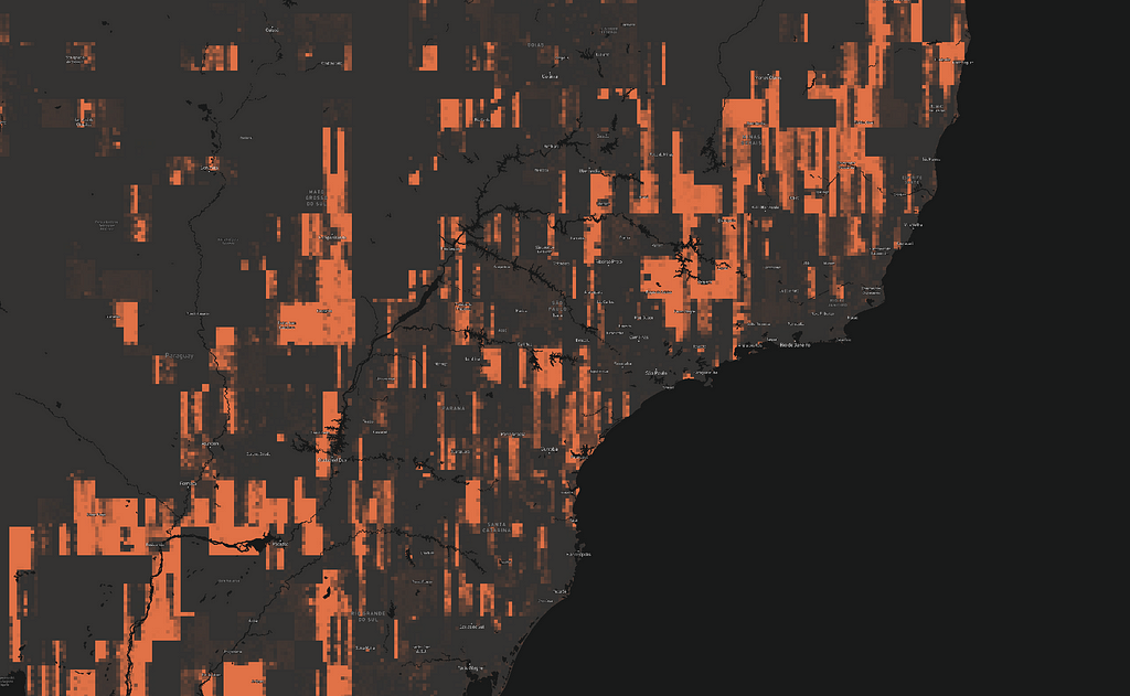
Notice the columnar shapes. Those are relatively poor image strips inside the satellite mosaic.
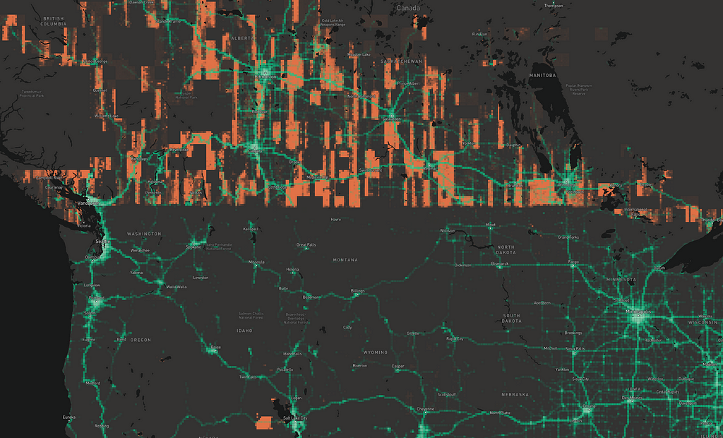
But of course, SHI by itself isn’t what we need — we have to combine it with the telemetry data, for example in the Pacific Northwest:
And South America:
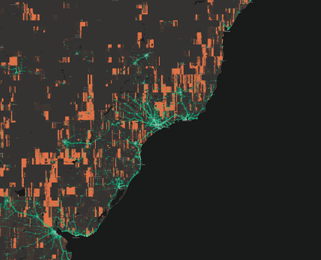
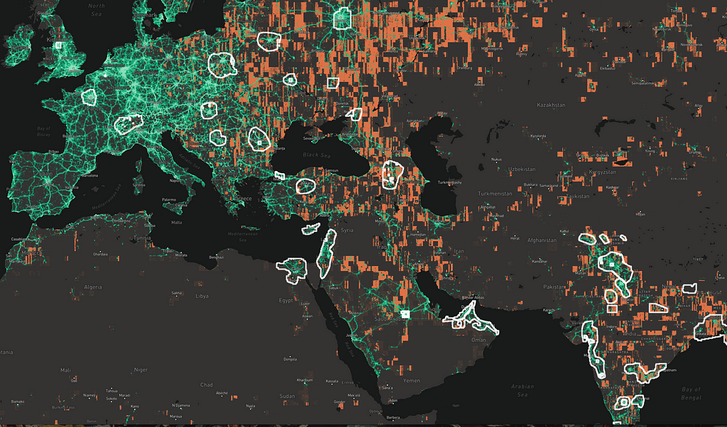
When we saw this, we knew everywhere that green (people) and orange (sub-par imagery) overlapped would benefit from updates.
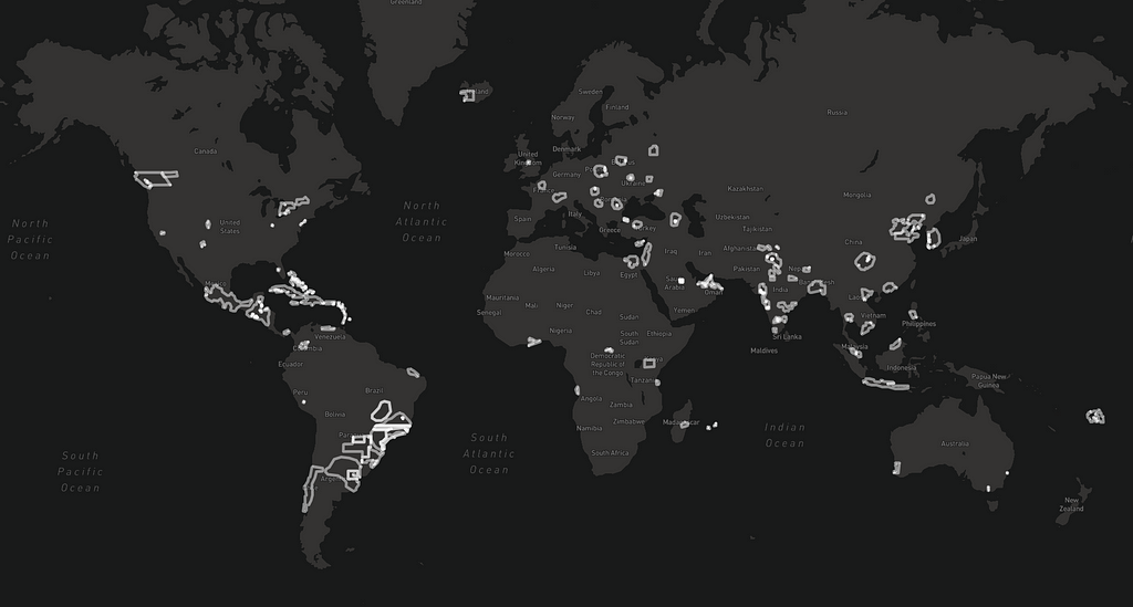
And now you know why we prioritized India and China for big updates over the past year. Here are the footprints of some of our recent imagery acquisitions:
Future work
While I’m always tinkering with the SHI algorithm, I thought it would be useful to break out the general tile-oriented sampling framework for other tasks that need a similar approach. If you’re a developer working on large web maps, I hope you find montilecarlo useful. Please try it out and contribute any improvements you make!
Assessing satellite imagery at scale was originally published in Points of interest on Medium, where people are continuing the conversation by highlighting and responding to this story.