Our designers spend a lot of time thinking about the complexities of designing map styles that visually communicate the information you need to understand the world, know where you are, and see where you’re going. These complexities schematically break down into the visual nuances and differences between motorways and trunk roads, city and town labels, and national and city park spaces. As such, we use map taxonomy charts to plan, track, and execute on design decisions that support a single map style.
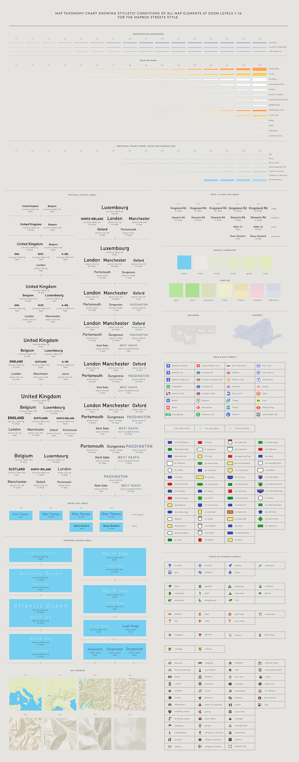
Here’s an example of the map taxonomy chart we built for our Streets style:
Clik here to view.
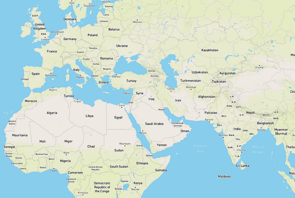
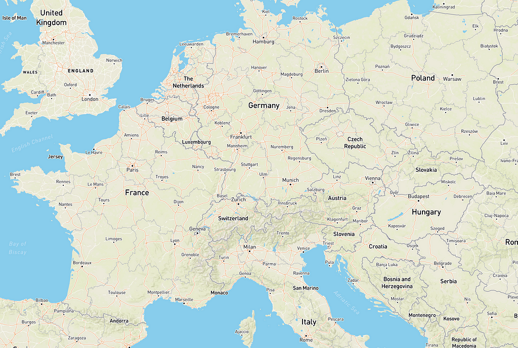
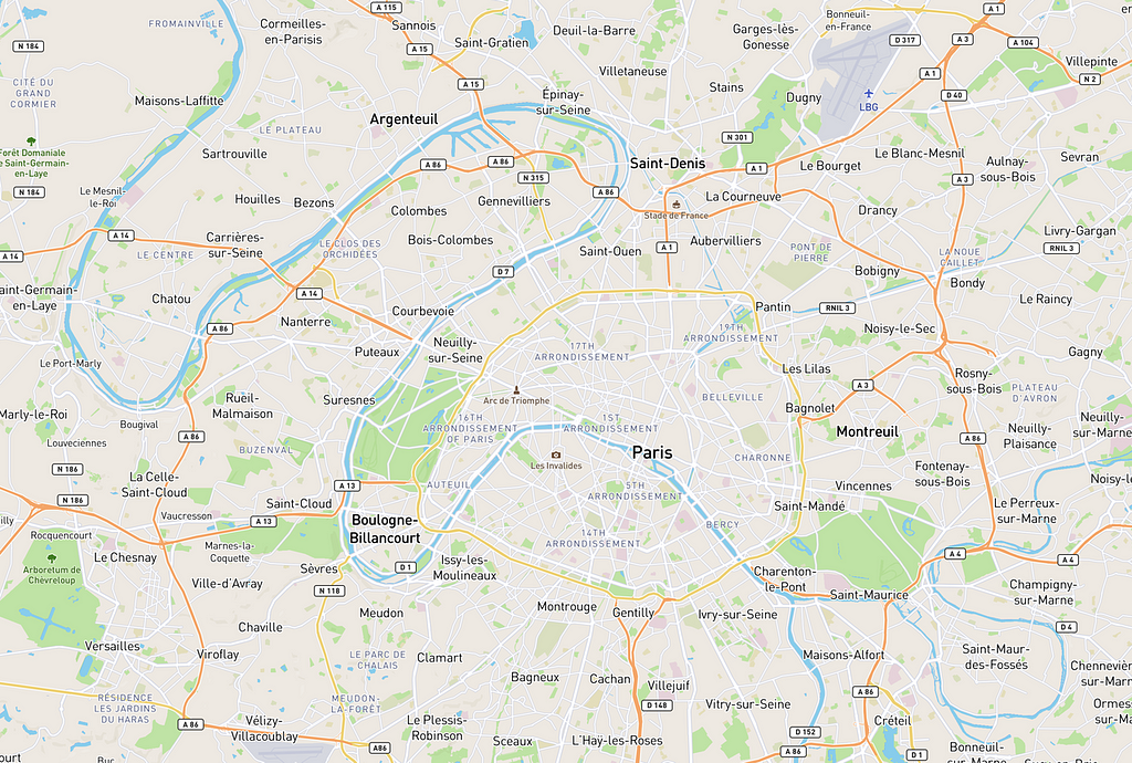
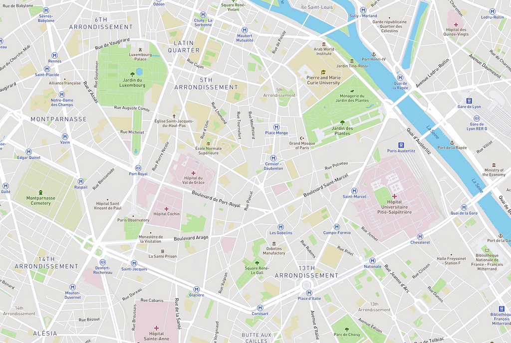
You can spot icons and elements from this taxonomy chart at different zoom levels in this world map:
Clik here to view.
Clik here to view.
Clik here to view.
Clik here to view.
We use a map taxonomy chart as a planning document, a design tool, and a documentation format showing the stylistic rules and structure of a map and its features. The chart divides the various map elements into their own sections and organizes them so they can be viewed separately. By observing, for example, place labels in isolation to see the relationship between each label’s type emphasis and size, we can fine-tune the label hierarchy and ensure those relationships are clear. Often it is difficult to successfully design the details in cartographic design within the visual complexity of the map itself, and it helps to have a tool that allows the designer to isolate map elements.
Planning document
As a planning document, the chart is the foundation on which you can layout your color palette, typography, and the primary visual components of a map. Well before designing a map in Studio, this chart can help you establish stylistic rules and hierarchies that will act as a guide throughout the design process. Ideally, this guide expedites the design process and increases the quality of the end product.
Iterative design tool
The taxonomy chart allows us to view map elements and systems outside of geographic context and in isolation. As an auxiliary design tool used with Studio, the chart can inform and verify stylistic decisions made in Studio. The chart can allow the designer to focus on a specific system within the map — place label hierarchy for example — and iteratively work between seeing the particular system in isolation and seeing it in broader, geographical context.
Review & documentation format
As a documentation format, this chart assists in the review process of map design, and can quickly relay a map’s visual rules and elements to clients and wider audiences. You can see elements of other design taxonomy charts in write ups of our Cali and Lè Shine map styles.
Currently, we make these charts by hand in Adobe Illustrator, and in the chart making itself, we are learning lessons that otherwise might have gone unnoticed. Moving forward, we want to strike a balance that will enable us to automate this laborious process, without losing the magic that’s gained in the manual generation.
To start building your own map style, check out our how-to guide.
Image may be NSFW.Clik here to view.

Building a map taxonomy chart was originally published in Points of interest on Medium, where people are continuing the conversation by highlighting and responding to this story.