Designing the Cali Terrain map style
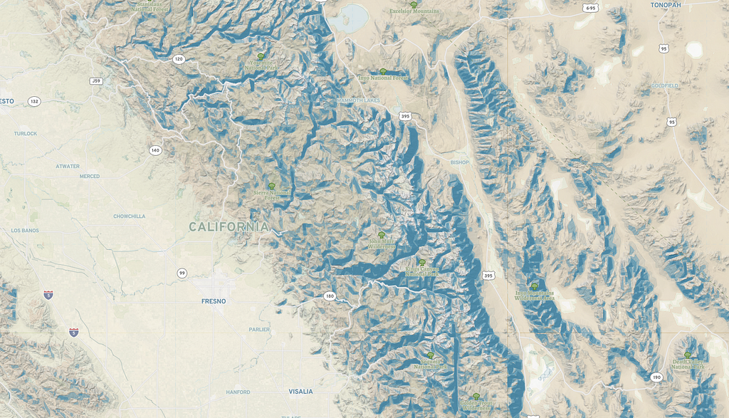
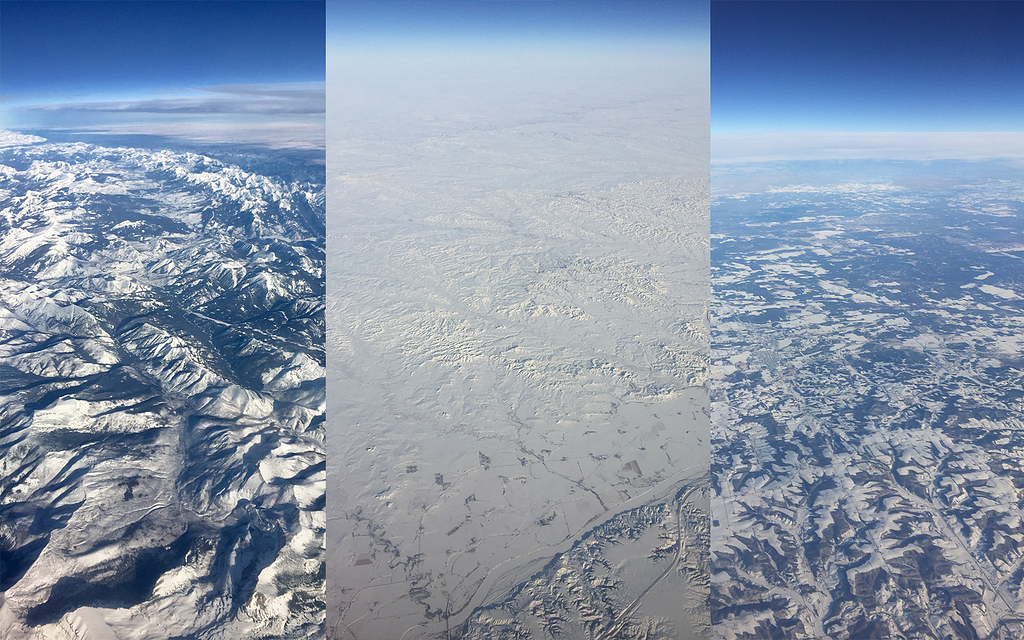
The Cali Terrain map style was inspired by a recent trip from DC to LA. I’ve flown many times from the East Coast to Pacific Northwest, but this was my first trip to Southern California. En route to LA, we passed the Grand Canyon, Navajo Nation Reservations over Northwest New Mexico and Northern Arizona, and entered LA, journeying across the thinly populated deserts and mountains in San Bernardino County. As I created this style, I wanted it to reflect the desert and mountain-scapes I saw from my window seat.
Beautiful Terrain
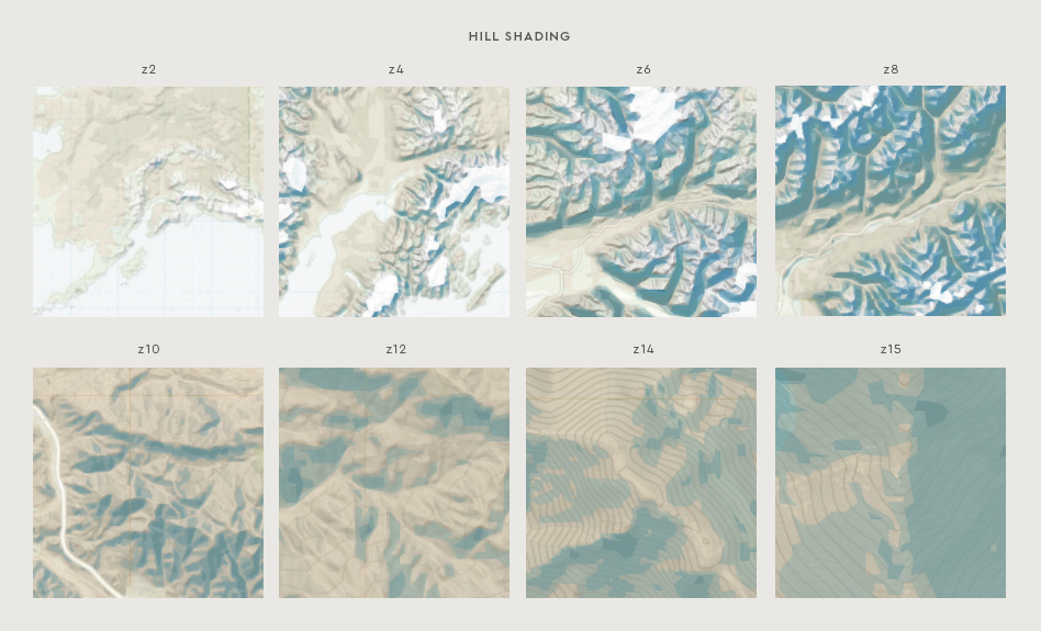
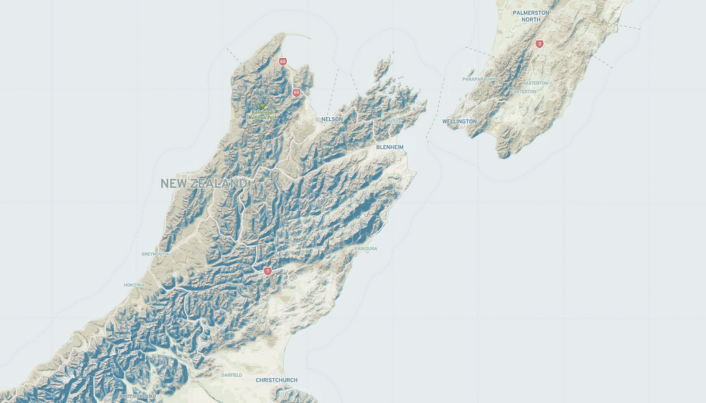
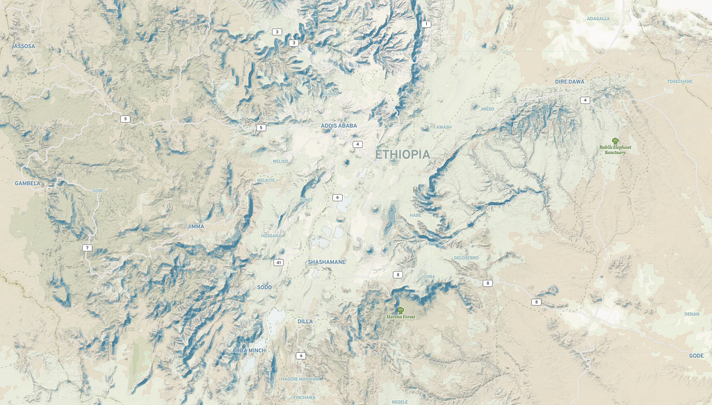
The secret to this map style is the Terrain RGB DEM, a digital elevation model. This new raster tileset can bring new levels of detail to your map style with advanced shading techniques and lighting effects. In my style, I focused on the intensity by bumping up the hillshade-exaggeration from the default 0.5 to 0.8 and brought in heavy contrast by making my hillshade-shadow-color and hillshade-highlight-color a deep desert brown and stark white respectively. I made my hillshade-accent-colorpure black to accentuate the rugged terrain like the sharp cliffs and gorges.
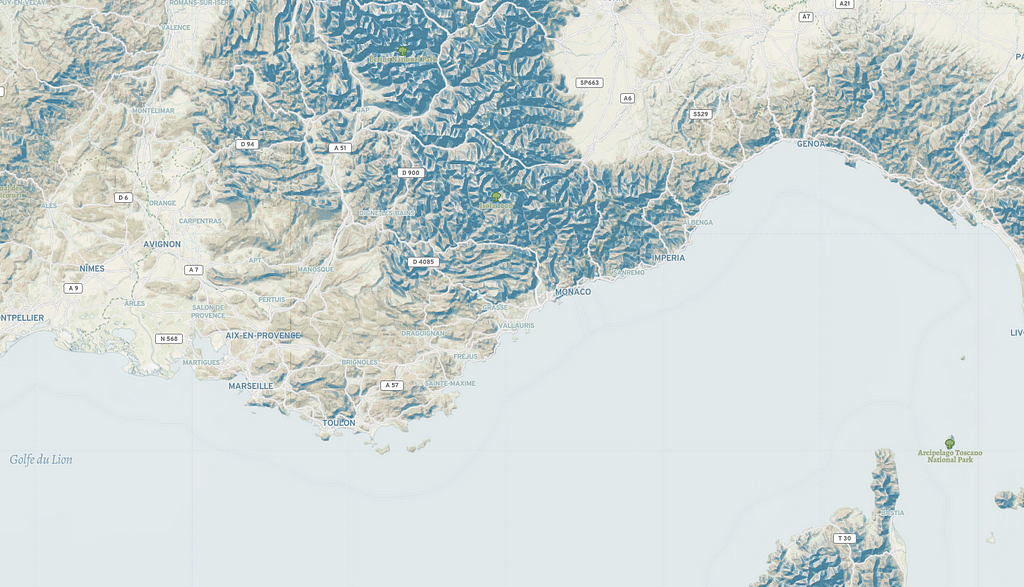
I paired the styling of the Terrain DEM with the traditional Terrain vector tiles. Then focused on blending my color palette with earthy, de-saturated tones starting with that deep desert brown. To complement these deep tones, I employed a vibrant blue in various shades. While brown is a blended color that doesn’t have a direct opposite on the color wheel, the hints of orange in my brown made blue the complementary color. These colors blended smoothly, and in some cases, enhanced the green in hilly terrain.

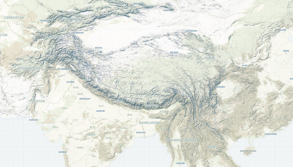
Cartographic typography
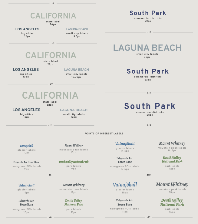
The subtle blended hues paired with the rugged texture in this map presented a unique challenge for legible typography across all terrains. Color, font style, and text halos played a large role in getting the place, island, archipelagos, and islet labels just right. The mountain peak, glaciers, and green spaces were particularly difficult due to the terrain, but with trial and error, the final style is an easy read even over the most mountainous of terrains.
This map style called for a bold typeface with maximum legibility paired with a softer, more conversational serif font. My bold font was the simple but robust Overpass, a sans serif typeface with styles from Thin to Extra Light to Semi-Bold to Black; 16 variations in total. This font was inspired by Highway Gothic a highly legible font developed by the US Federal Highway Administration for road signage in the Americas from the 1940s until present day. I set the place labels in all caps with 0.2em of letter spacing for a smoother read. Next, I paired this with a serif typeface Alegreya, a fresh and dynamic super family with 10 styles that all visually reference the original calligraphic letter.
Final touch
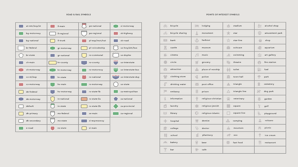
To make the map practical for outdoors and general purpose use-cases, I brought in the highway shield and transit icons, adding Maki icons for points of interest (POIs). I used the Maki icon and Map icon editors to quickly change the hue and saturation of 486 SVG icons. (Yes these tools are magical, try them out!)
To get started add the Cali Terrain style to your Studio account. Learn how to build your own cartographic styles with our guide to map design.
View from the sky was originally published in Points of interest on Medium, where people are continuing the conversation by highlighting and responding to this story.