By: Allan Walker
This is Part II in a series of projects for understanding and analyzing healthcare provider data. Check out Part I — Part II will walk you through further customizing your map and data, this time to assess illness incidents and reporting.
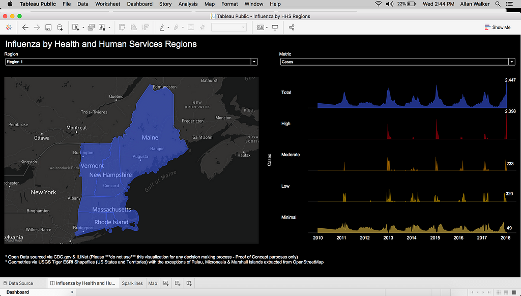
Healthcare organizations are usually split up into regions to help distribute efforts in recording incidents and reporting. For this project, I imagined that a regional manager or director would want to explore reports about each region using a map as the interface. Healthcare analysts can use our Business Intelligence tools in their own workflows to incorporate custom, interactive maps into dashboards. This makes it easier to derive insights by location and explore large datasets.
I’ll walk through creating a basemap in QGIS that displays labels for each region (including all islands and territories), customizing the style and presentation of the map with Mapbox Studio for use in a web dashboard, and then connecting the map to the data in Tableau. We’ll combine three distinct datasets, all without any code. This project is made entirely with open data — anyone with a Mapbox account and Tableau Public can make this visualization.
Something is missing
The United States Department of Health and Human Services organizes its Regions like this:
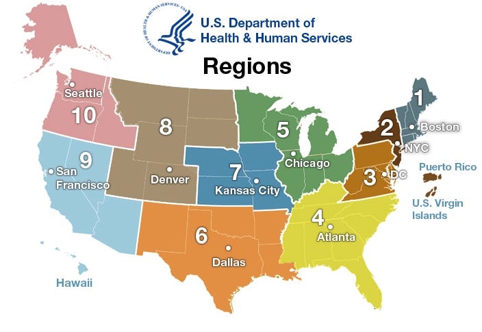
However, reading through the text, something popped out to me about Region 9 — San Francisco.
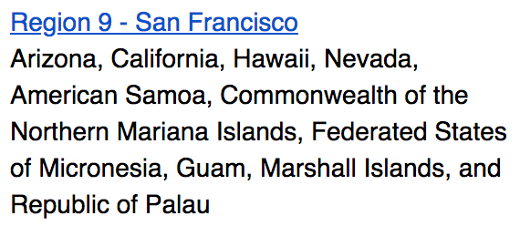
I can see Arizona, California, Nevada, and Hawaii on the map, but I can’t see the other islands. So if we want to view an interactive report by region, we’ll need to add these islands to the map and group them with the Regions they belong in.
Building the custom Regions map
First, we’ll obtain the shape files for all of the Regions: download USGS TIGER/Line® ESRI Shapefile “States”, and then export the polygons of the islands— Micronesia, Marshall Islands, and Palau — from OpenStreetMap, using the template shapefiles from GADM.org.
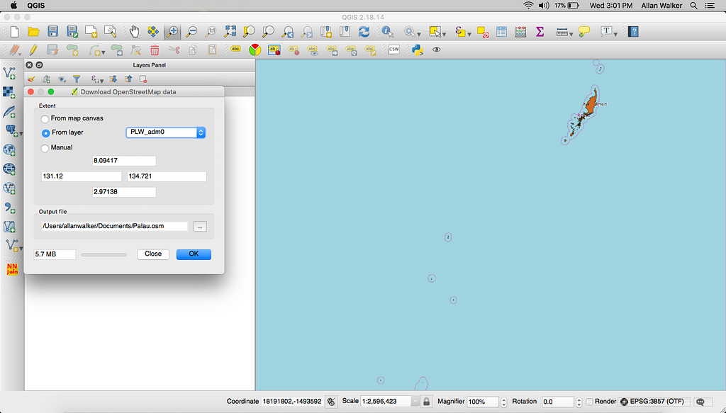
Filter down the USGS TIGER/Line® ESRI Shapefile “States” file for the States and Territories in Region 9.
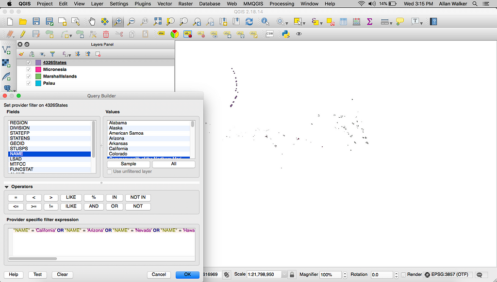
Let’s then save the States file with a projection of WGS 84 EPSG:4326 with just the NAME attribute. Do the same for Micronesia, Marshall Islands, and Palau.
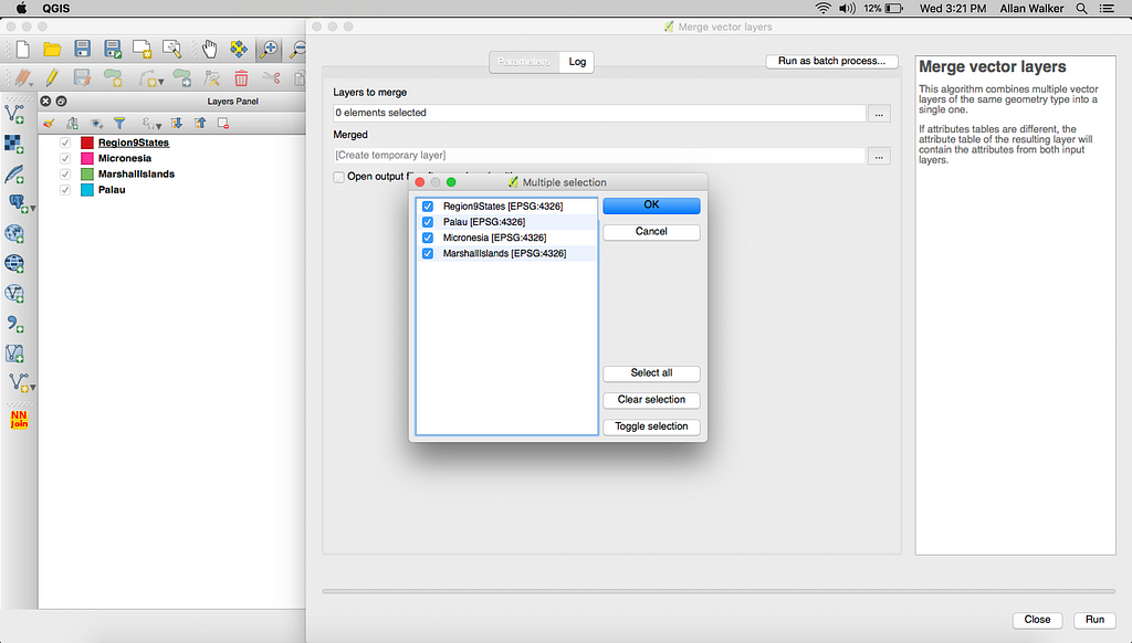
next, we’ll merge these files together (Menu → Vector → Data Management Tools → Merge Vector Layers).
We also need to merge a column called REGION to the merged file using the Field Calculator (Menu → Layer → Properties → Toggle Edit Button (Pencil Icon) → Field Calculator (Abacus Icon).
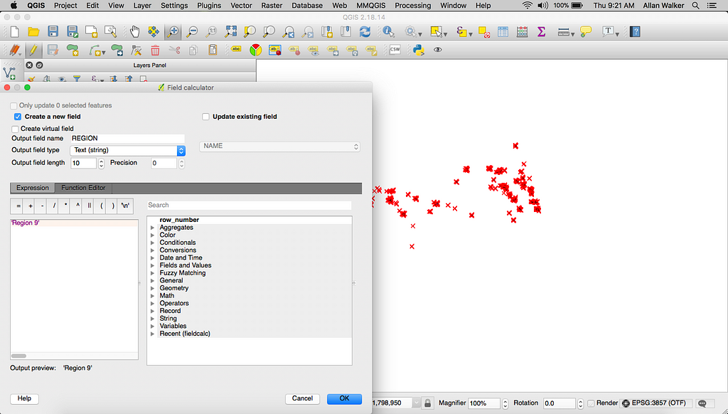
Let’s do the same for the nine other Regions, filtering down the States shapefile, adding a REGION field, and saving each one back with a CRS of WGS 84 EPSG:4326. We’ll then merge the ten shapefiles together into one shapefile called HHSRegions.shp.
As a final step, we need the centers (Menu → Vector → Geometry Tools → Centroids) of the HHSRegions for labels as the background map in Mapbox for Tableau.
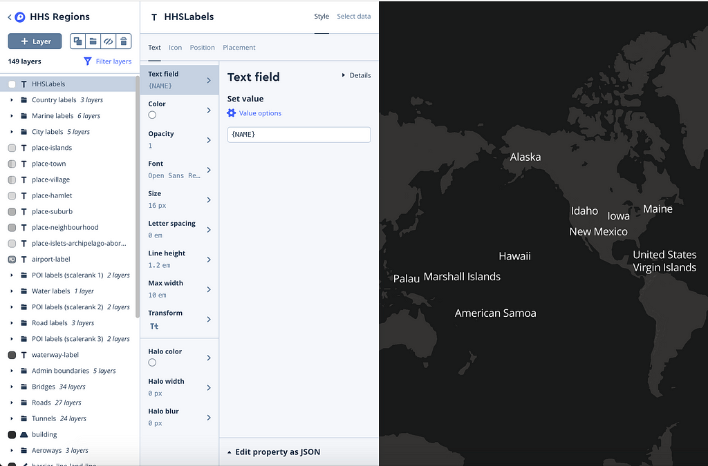
We can now save this file as HHSLabels.geojson and upload to Studio as a tileset, adding it to the “Dark” map style.
After it’s uploaded, click the Share, develop & use button next to the list of styles:

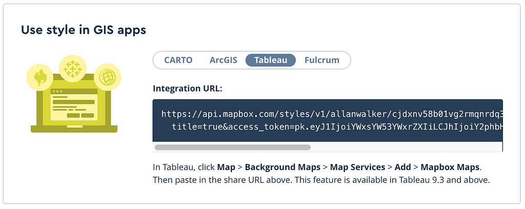
We want to select Tableau from the list, and copy/paste the Mapbox Integration URL into a notepad so we can use it later to pull the map into Tableau.
Getting the map ready for Tableau
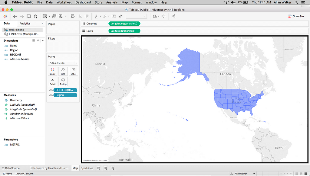
After importing the ESRI Shapefile into Tableau (Connect → Spatial File → Navigate to HHSRegions.shp), create a worksheet called Map and set it up with Longitude on Rows, Latitude on Columns, and Geometry on the detail mark shelf. Let’s set the color to blue and change the transparency but keep the same color for the outline.
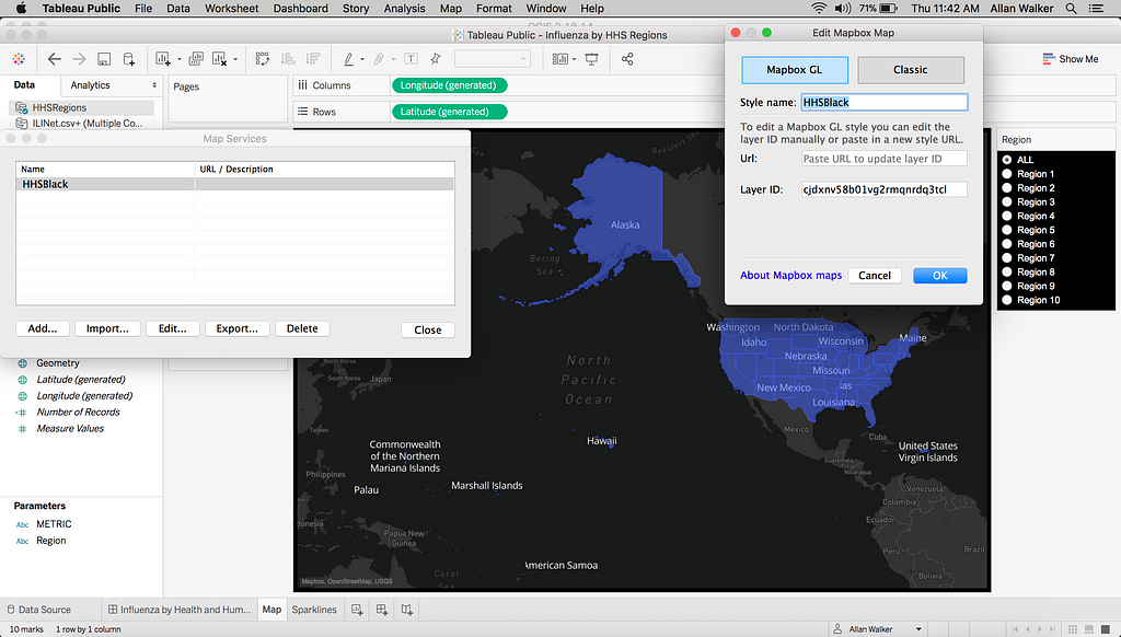
Next, we’ll paste the Mapbox Integration URL we saved in Notepad (Menu → Map → Background Maps → Map Services → Add → Mapbox Maps).
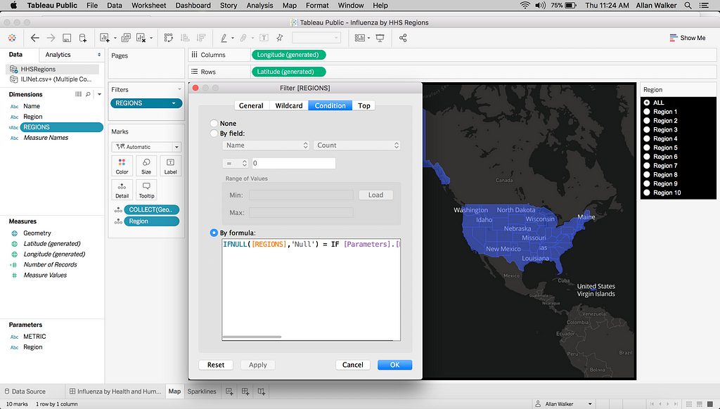
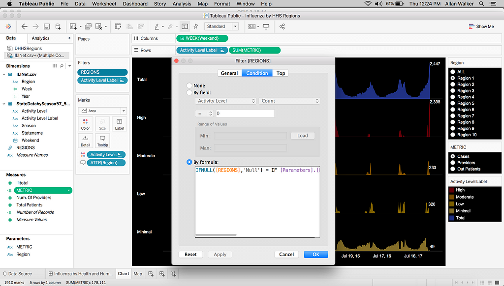
After adding the map, we need to generate a parameter called REGION, adding the Region Names and another value, ALL. We can conditionally filter the Regions with this calculation (credit Ben Sullins):
IFNULL([REGIONS],'Null') = IF [Parameters].[Region] != 'ALL' THEN [Parameters].[Region] ELSE IFNULL([REGIONS], 'Null') END
Now, when you choose “ALL” in the parameter, all of the Regions will show.
Getting the data ready for Tableau
For this project, we’ll use Influenza data from CDC GIS Fluview and select ILINet and HHS Regions to generate a CSV file.
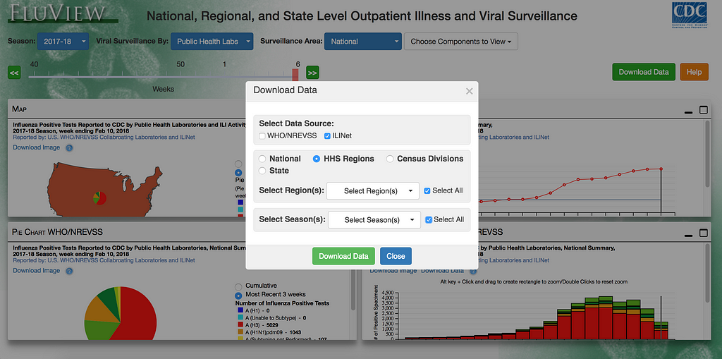
Let’s also download the ILINet State Level Indicators which generates another CSV file.
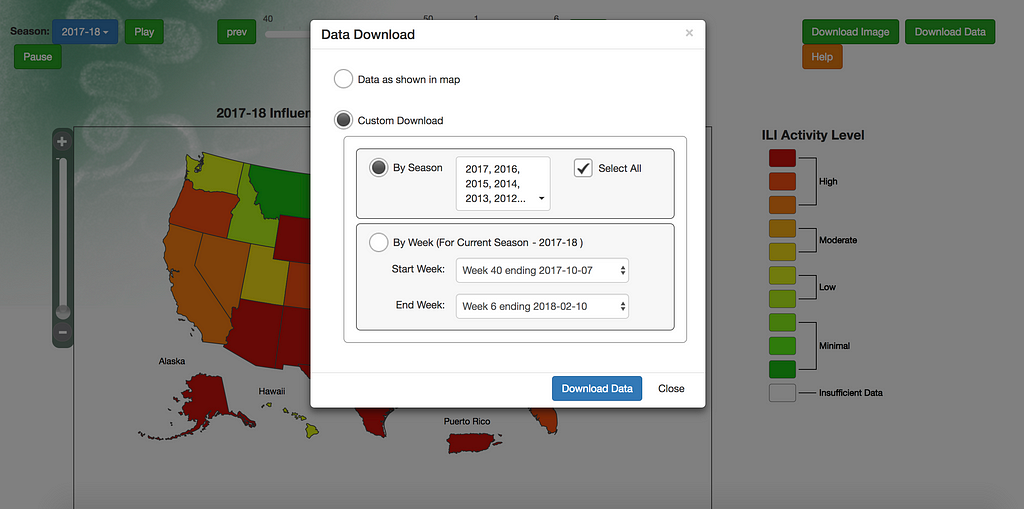
We need to join the data on Year and Week, grouping States to Regions (Connect → Text File → Navigate to ILINet 2.csv & Connect → Text File → StateDatabySeason). We can then create a new worksheet called Chart. Let’s use the same conditional filter as the map worksheet.
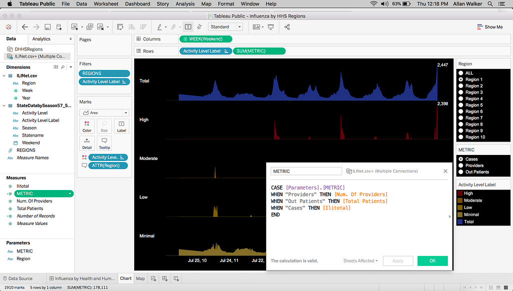
We’ll also create a metric swapper parameter and a case statement calculated field.
Building the dashboard
We need to first add the worksheets and the parameters (Menu → Analysis → Parameters), including a Title as well as a caveat recognizing the data sources. Let’s then publish to Tableau Public (Menu → File → Save to Tableau Public).
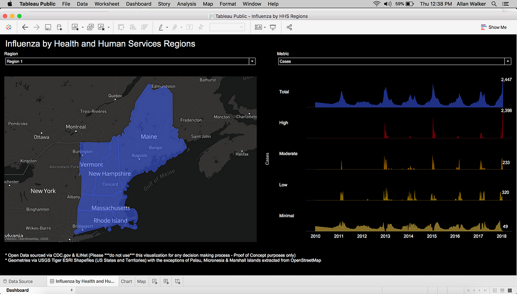
Healthcare analysts using this tool, or one like it, can select their Region and choose the metrics they want to explore. A person at the Director level could view data for all Regions they oversee.
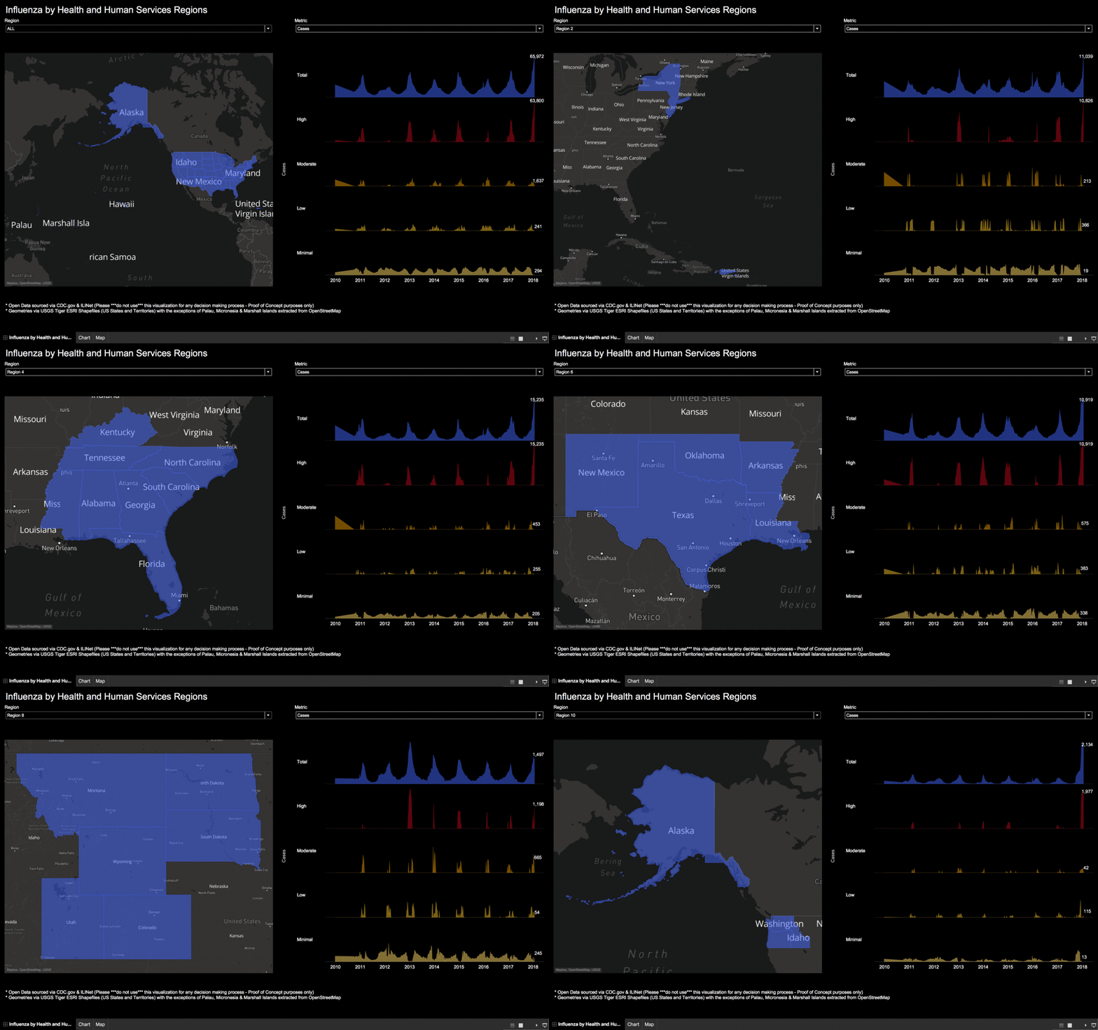
Our business intelligence tools make it easier for health organizations to track resources, staffing, and other efforts to minimize per-patient costs at every administrative level, from individual facilities to national and regional boundaries.
Create a free account and start using our platform in your BI workflow. Get in touch with our team when you’re ready to roll out a solution to your customers.
Dashboards for healthcare resource planning with Mapbox, Tableau, and QGIS — Part II was originally published in Points of interest on Medium, where people are continuing the conversation by highlighting and responding to this story.