By: Allan Walker
I’ve been using Tableau since 2013, and during that time I’ve seen some awesome data-driven maps used in dashboards. With Tableau and Mapbox, we’re able to bring additional geographic context to our maps, render massive amounts of data, and make that data interactive.
Here are just a few of my favorite collaborations, and some dashboards suggested by the Tableau Community on Twitter:
100,000 NYC taxi trips
Tableau 8.2 was a major technical breakthrough — the first 64 Bit version — it gave users the capability to plot massive amounts of data and share up to 1 million rows on Tableau Public. This allowed us to create this visualization mapping 100,000 taxi routes in NYC.
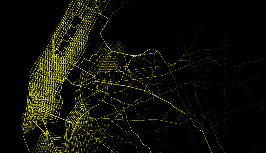
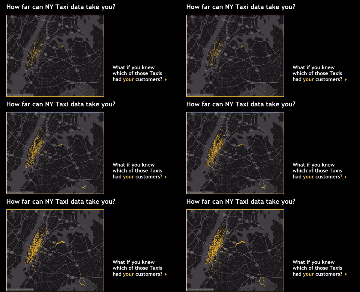
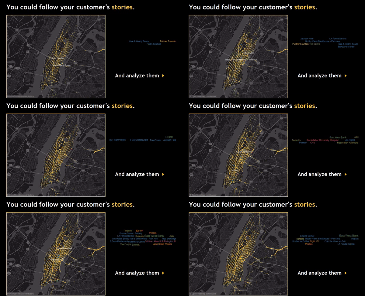
- By Allan Walker, Anya A’Hearn & Noah Salvaterra.
100,000 aircraft flights
This data visualization was made possible when Tableau (version 9.2) first integrated Mapbox Studio styles. Anya A’Hearn designed the custom map style, and Joe Mako wrote an Alteryx workflow that scheduled the download and parsing of the ADS-B JSON data into Tableau.
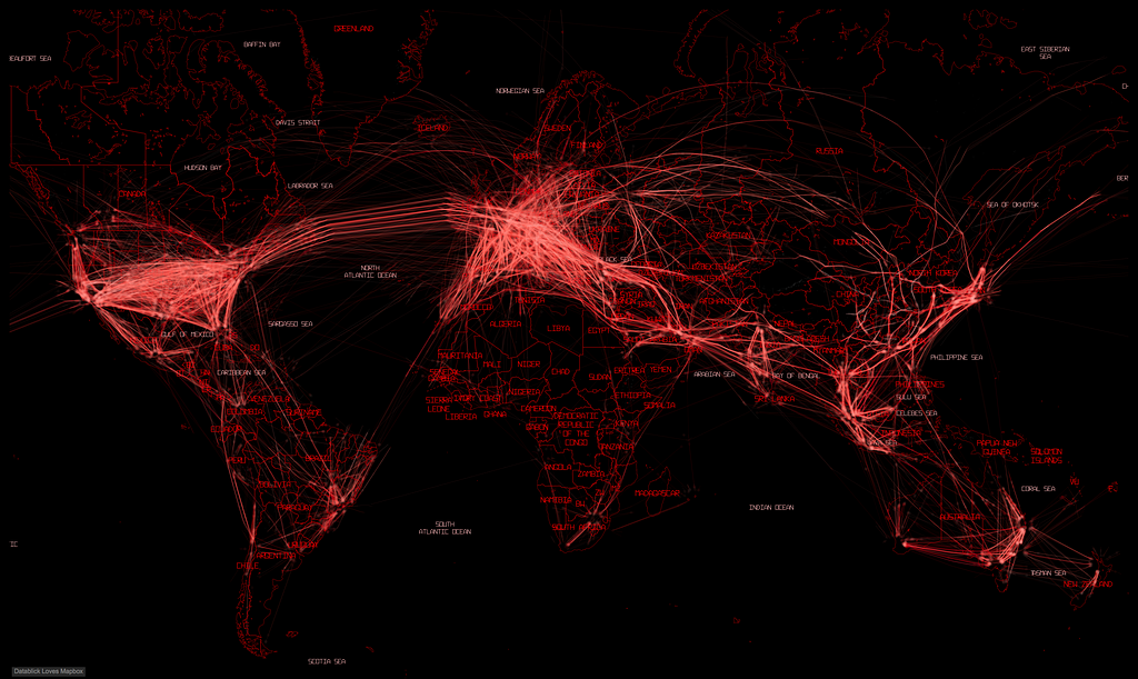
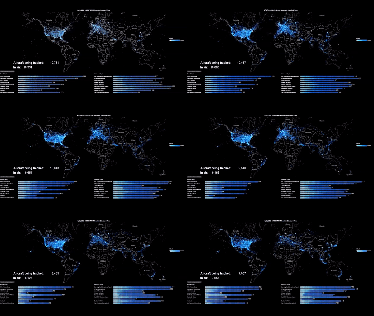
- By Allan Walker, Anya A’Hearn & Joe Mako
Wargames
Here are the nuclear missile sites and paths of the world’s nuclear arsenal, inspired by the 1983 film “Wargames.” The map uses a custom polar projection and incorporates Great Arcs, which allows us to visualize the trajectories from launch to targets.
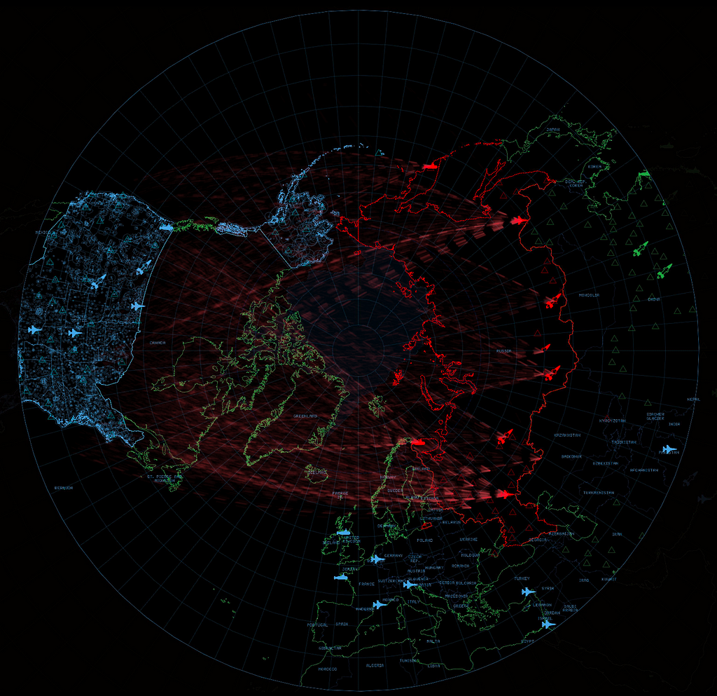
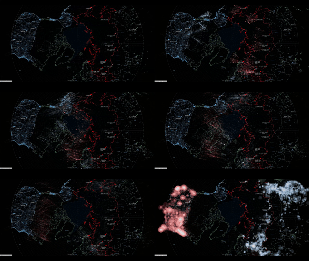
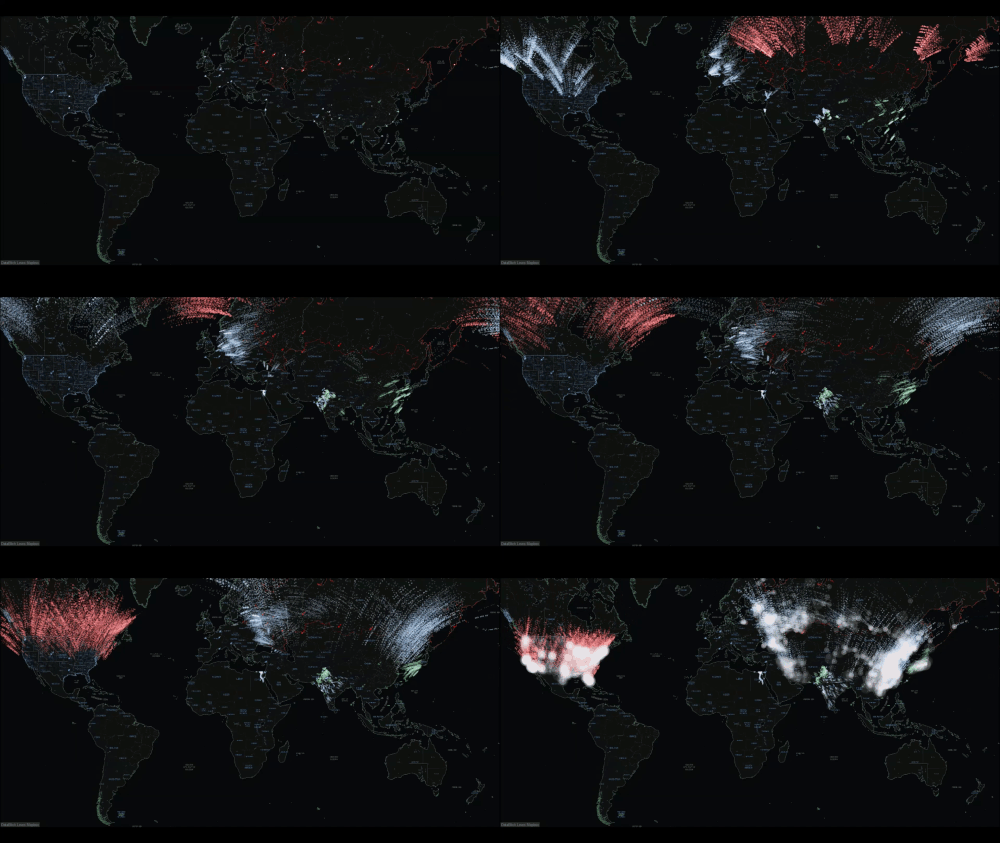
- By Allan Walker, Anya A’Hearn & Chris DeMartini
It might be a “stinky” subject matter; but Jeff uses a bar chart, small multiple line charts, a detailed data-driven map and a retina-popping, neon-effect color palette to make this a beautiful and insightful dashboard!
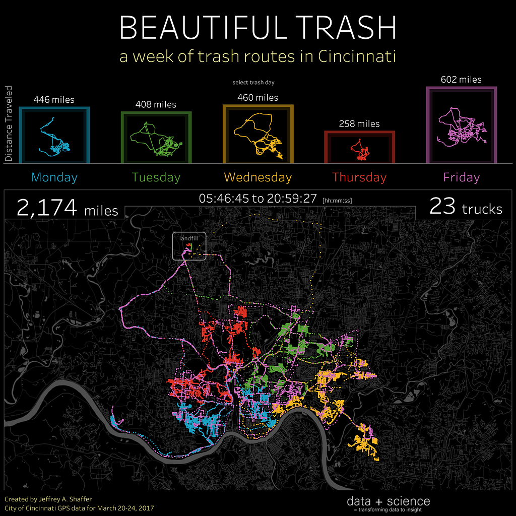
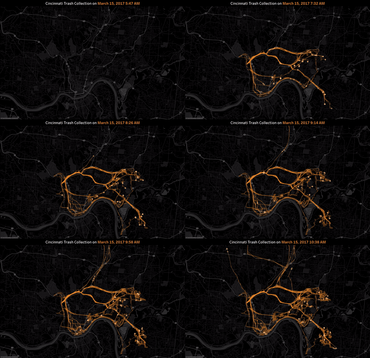
- By Jeffrey Shaffer
Reported UFO sightings
I want to believe…that this Tableau Dashboard would look great on Agent Scully and Mulder’s FBI desktop computers.
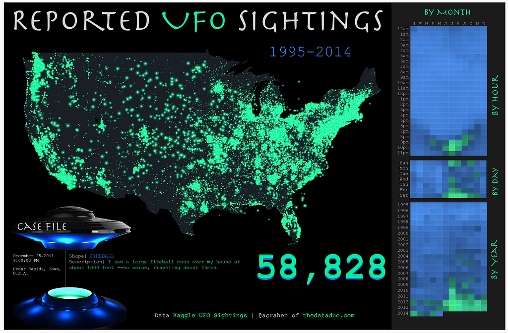
- By Adam Crahan
UK Paraglider flights
Paraglider pilots use this Tableau Dashboard to benchmark their own flights and plan how to fly further.
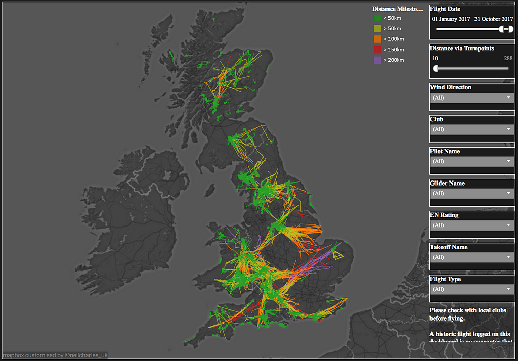
- By Neil Charles
Unaffordable country
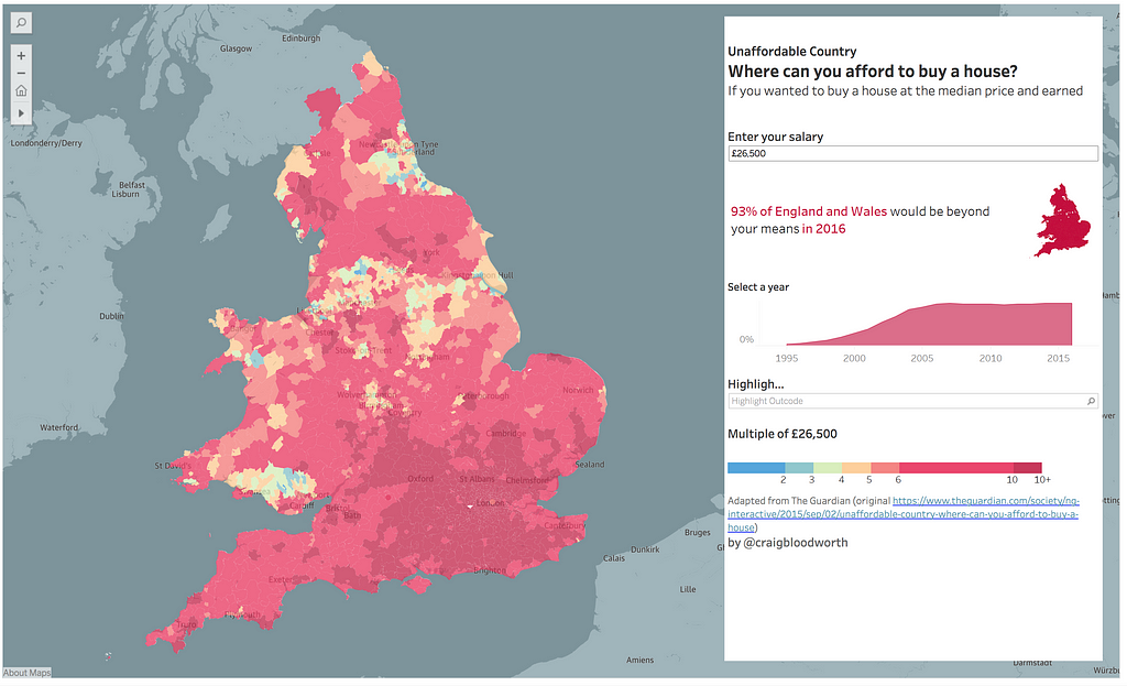
Craig uses an effective color palette and a choropleth (filled map) in this Tableau Dashboard. Users can enter their salary, and find out where in England and Wales they can afford to buy a house.
- By Craig Bloodworth
Singapore Dengue Fever analysis
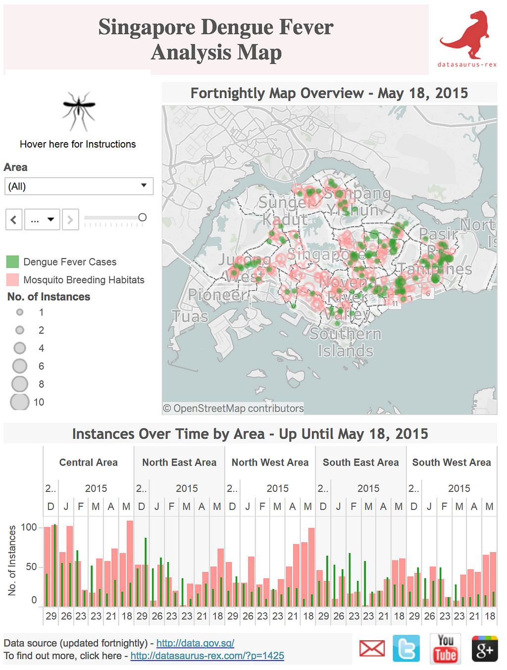
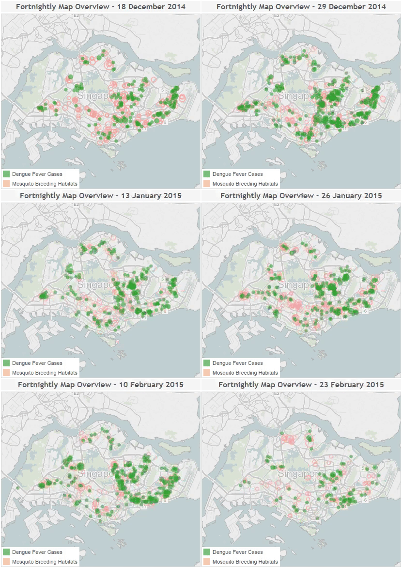
David correlates mosquito breeding habits and cases of Dengue Fever over time in Singapore with this informative Tableau Dashboard.
- By David Murphy
The Mercator problem
Ken uses a “long form” style dashboard to advocate for alternative map projections. The dashboard lets users compare areas, visually showing the difference.

- By Ken Ferlage
Fried chicken
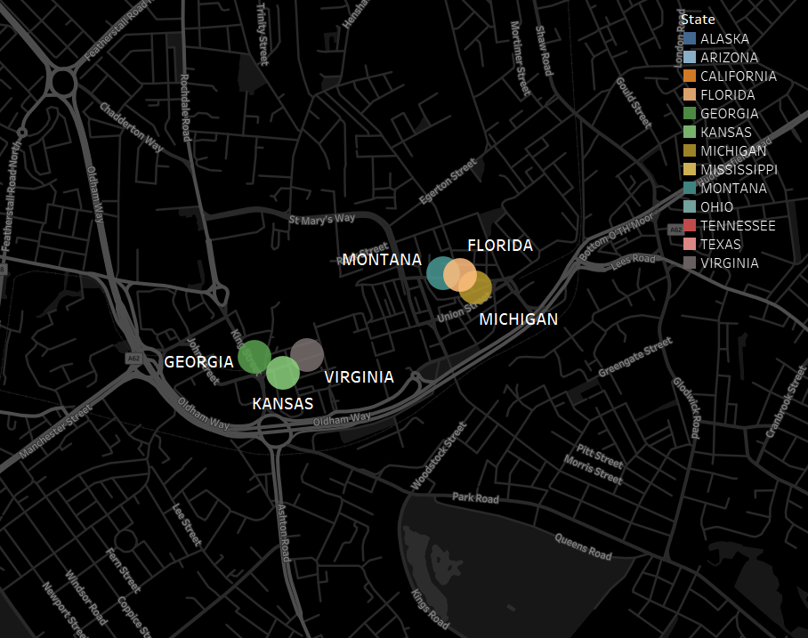
A very odd phenomenon exists in England. There are lots of chicken eateries that prefix “Fried Chicken” with states that aren’t Kentucky! In this map, Gwilym identifies Fried Chicken stores in Oldham, Greater Manchester — “Alaskan Fried Chicken” anyone?
- By Gwilym Lockwood
The subject matters of these maps are very diverse. They can be really funny and out of the left field, or very serious and insightful; but either way, the map is the hero and the star of these dashboards.
My favorite Tableau visualizations was originally published in Points of interest on Medium, where people are continuing the conversation by highlighting and responding to this story.