A better data vis tool for comparing property assessments
By: Erin Quinn
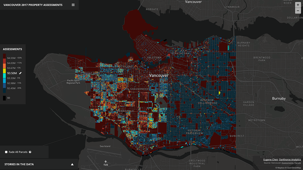
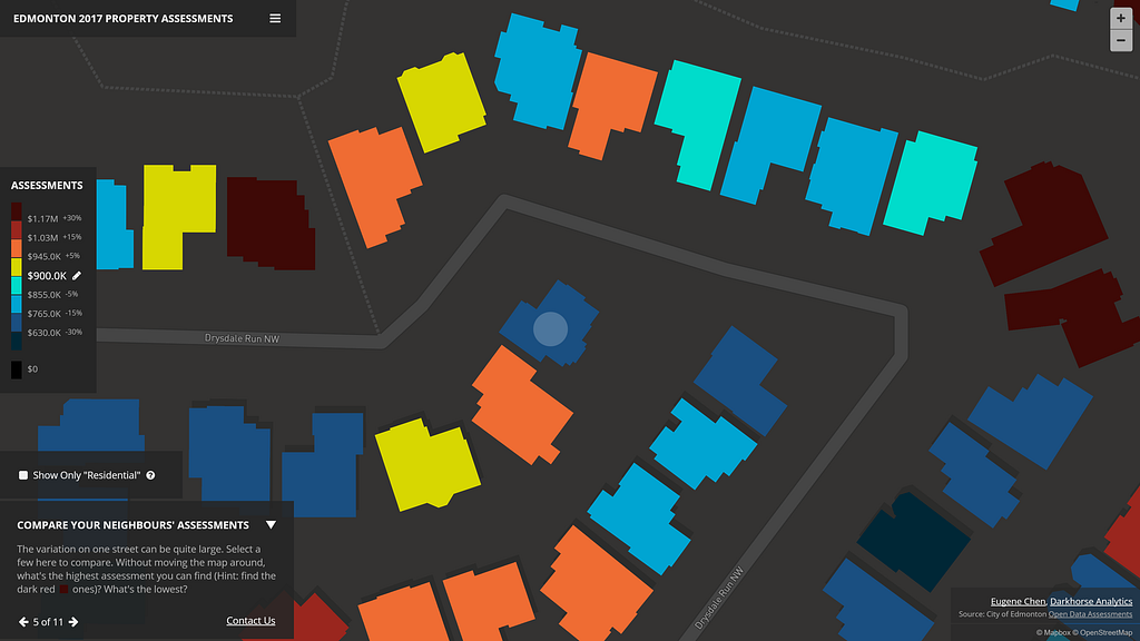
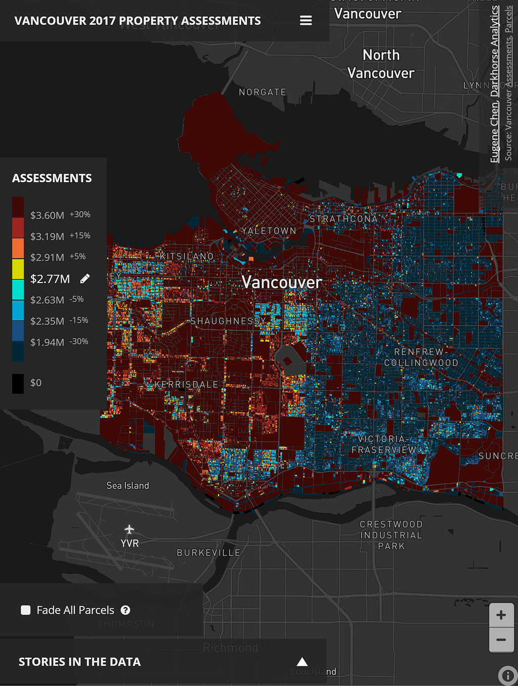
Is it possible to custom style every single building in an entire city on a map? This is the question Eugene Chen, of Darkhorse Analytics, wanted to answer while exploring better ways to visualize trends in property assessments from open data in his hometown of Edmonton, Alberta. What he envisioned would require the client-side to render hundreds of thousands of unique polygons efficiently and do so without sacrificing details of the buildings at higher zoom levels — Mapbox data visualization tools were the answer.
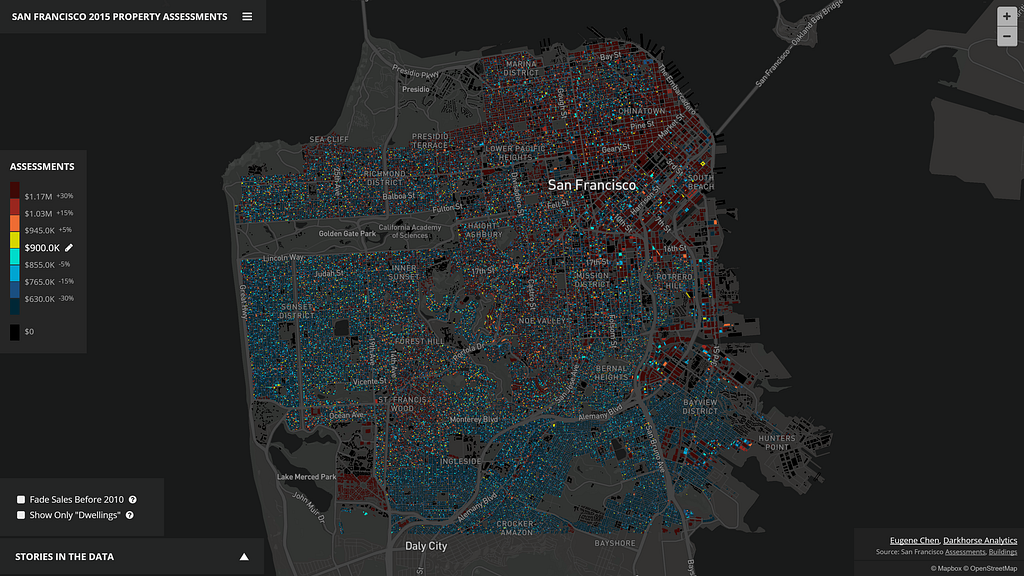
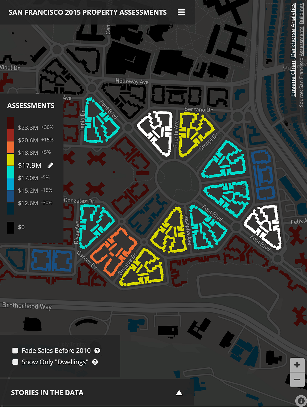
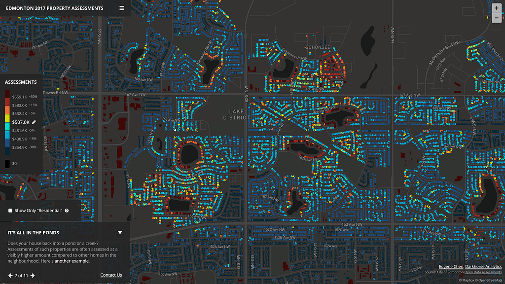
What Eugene built is an interactive tool for Edmonton, Vancouver, and San Francisco that you can use to contest or brag about your property assessment value. The visualization even includes a story mode, identifying all of the interesting trends discovered in the data for each city. Eugene tells us how it all came together:
Why use GL JS to build the tool? What other options did you explore?
Mapbox GL worked. I tried D3 and SVG first, which resulted in numerous crashes, loading and rendering times of over a minute. Canvas was next, and while better, it was still unacceptably slow. Then I tried other mapping libraries, which would always perform slowly unless the polygons were simplified at a lower zoom level (higher up in altitude). In those cases, the buildings didn’t look right; the simplifications resulted in either missing structures or strange zig-zag patterns for homes.
After exhausting the alternatives, I realized the only way to accomplish the visualization was with WebGL. I looked at Javascript libraries that provided an interface for drawing with WebGL, even as far as trying out PixiJS, a library with WebGL support meant for writing games. After a lot of time experimenting (and failing), I discovered the data-driven styling feature of Mapbox GL JS and gladly gave it a shot.
What was the biggest challenge getting started?
The initial data maps are created by combining a roofline shapefile with assessment data, and I had to make sure only the necessary information is available on the resulting polygon in the shapefile. Tie too much data to a polygon, and at lower zoom levels, it’s not possible to fit all of the polygons in without polygon simplification. Even after reducing the data, for all three cities, there’s still too much data to have it fit on one vector tileset because there’s a 500k limit on the data per tile.
So how did you build the vector tilesets given the limitations of working with so many polygons?
I ended up writing a script that took every nth polygon within the shapefile and split it to an nth shapefile, and then tried to get tippecanoe to build the vector tilesets for a zoom level that was appropriate for the given city. The lower the zoom level, the more data would compress into a tile, so I tried to pick one that shows the city at its boundaries, but no more.
The pattern of experimenting went like this: create GeoJSON from shapefile, get tippecanoe to build the Mapbox tiles (mbtiles) while specifying no reductions or simplifications. It would likely fail (couldn’t fit the polygons under the 500k limit), then I’d go to my script and split the original shapefile to, say 3 different shapefiles. I’d then go to the first of the shapefiles, convert to GeoJSON again, and try to get tippecanoe to build the tileset. If it didn’t work, you wouldn’t need to try the other split shapefiles. I’d continue this pattern until I got a number working (say, 7), but then move down to what was necessary (5 in the case of Edmonton).
Why go for a lower count? The user’s computer has to download fewer tiles, which are overlaid on top of one another. The goal is to have just one tileset if possible, so the user’s computer isn’t trying to download, render, and juggle all of these different layers. A lower count of overlaid tiles means better performance for a better user experience.
How else did you limit the amount of data rendered by the client?
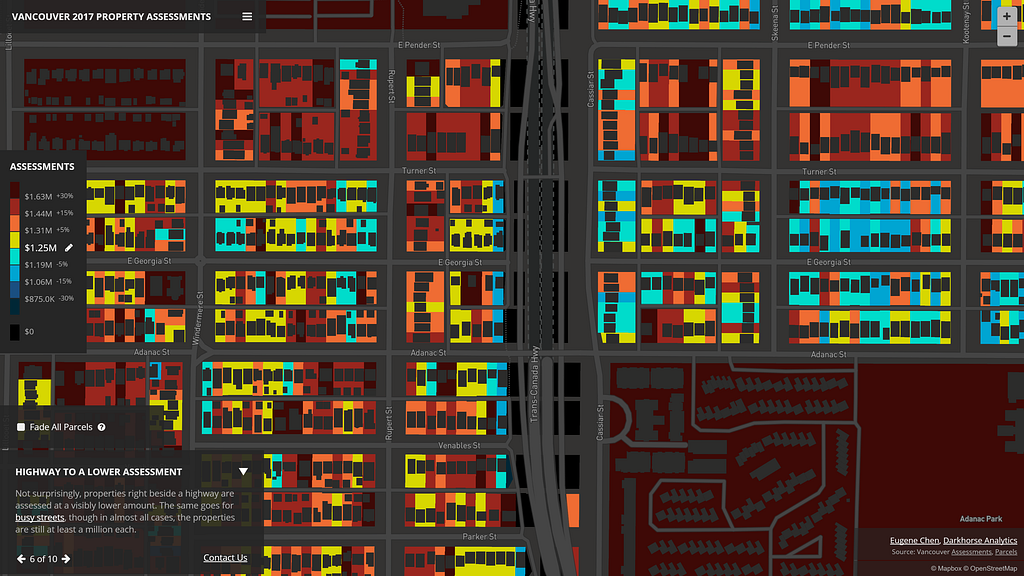
You can also create an extra map for higher zoom levels. At lower zoom levels (say 9–12) it’s necessary to split up the data into multiple tilesets. However, at a given zoom level (say 13+) it’s possible to have all the polygons and data fit since they need to fit fewer polygons per tile. Users’ browsers will then only have to download and render one tileset when reaching the zoom level.
To further reduce the number of tilesets necessary, I limited the precision on the latlng coordinates of each polygon to 8 when converting to GeoJSON — it’s harder to compress random numbers. Additionally, I looked into the source code of tippecanoe and noticed what looked a preventative cap on file sizes that were at the edge of not being compressed enough for use as a tileset. Removing that cap and rebuilding tippecanoe allowed for more polygons within the tileset that was still acceptable for uploading and use with Mapbox.
Once the tilesets were uploaded, I used D3 to create the story-driven narrative using JSON files. The colors change on the map with data-driven styling and the animations that transition to different points are powered by Mapbox’s flyto commands.
What design considerations did you make in styling the data?
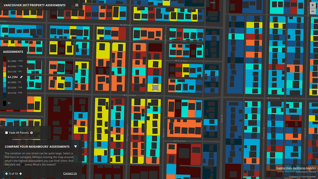
As a bit of an experiment, I chose to use a color scheme that would allow relative comparisons between a selected assessment value versus the assessments of buildings across the city. You can quickly compare if a property was higher or lower, and by how much. The buckets were made at +/- 0–5%, 5%-15%, 15%-30%, and 30%+ differences from the selected assessments, mainly to categorize a user’s mindset of “basically the same assessment”, “a little different”, “quite different”, and “wow, that’s substantially lower/higher”.
I chose relative percentage differences because they work better than straight assessment values. For example, a $4M homeowner might think his/her home is not that different from a neighbor’s at $4.2M, but the $200k difference is substantial for a homeowner of a property assessed at $400k.
You used open data from each city for this project. From the perspective of a data scientist, why is open data important?
Open data facilitates innovation. I couldn’t have created this visualization without that kind of access to data. I’m lucky to be living in Canada’s most open city, and it’s impressive to see what others have done with the continued rolling out of datasets and support from the city.
It’s also worth adding that open data creates value for citizens because it makes the local information accessible beyond the locality. I started out with Edmonton’s property assessments and building outlines, then incorporated both San Francisco’s and Vancouver’s data because they were open and available; that benefits the people who live there.
Building a data visualization with large or complex datasets? Explore our customizable tools for visualizing data and reach out to sales with any questions.
Hundreds of thousands of polygons rendered on the fly was originally published in Points of interest on Medium, where people are continuing the conversation by highlighting and responding to this story.