By: Dana Sulit
Mapbox Studio’s creative tools make your data visualizations more expressive, making it a powerful way to use maps to tell stories and understand data. A compelling basemap sets the scene and deepens the relationship between the what and the where. When you build maps in Studio, every feature of the map not only complements your data visualization but is part of it.
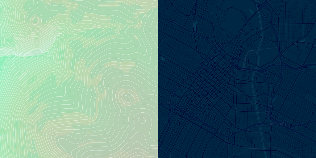
If you’re building a visualization that highlights data about the outdoors, climate, or natural resources, your map might start with hillshade and contour layers from Mapbox Terrain. Or, if your data highlights an automotive use case, your map can emphasize road networks.

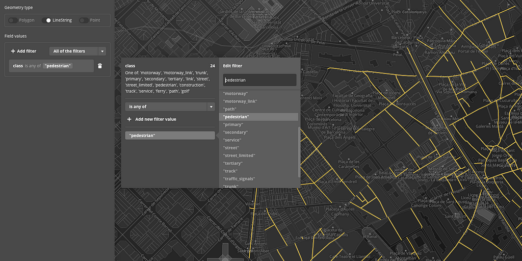
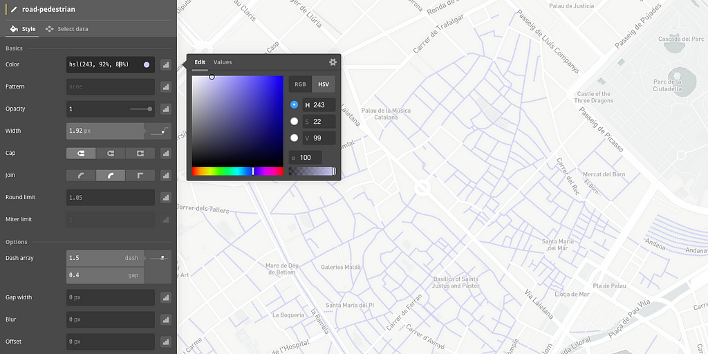
To hone your narrative even further, add filters to build layers that style more detailed chunks of data. Say you’re creating a visualization of a city’s foot traffic. You can use filters to create a layer that just styles pedestrian roads.

With these flexible data controls, alongside a range of styling tools, you can create a basemap that is unique to your visualization and vision.

Looking for more inspiration on how to use custom map styles to elevate your data visualizations? Take a look at how I customized our Dark style with de-emphasized country borders to demonstrate the connectedness of international flight paths:
Or check out how David used a desaturated Satellite layer in a live demo of wildfires, giving the map natural texture and context without distracting from the data:
Start telling your own stories with data. Sign up for a Studio account, and share your data visualizations with us using #BuiltWithMapbox.
Crafting the right basemap for your visualization was originally published in Points of interest on Medium, where people are continuing the conversation by highlighting and responding to this story.